
Retail moves fast. If your checkout trays are stuck in the last decade, you aren't just losing style points—you're losing impulse sales to competitors who adapted.
PDQs (Pretty Darn Quick) had to evolve from simple shipping boxes into sophisticated marketing tools because modern retail environments demand higher visual impact and faster stocking speeds. These Point-of-Purchase (POP) displays now integrate complex structural engineering to support heavy merchandise while minimizing waste through sustainable materials.

It started as a joke about speed, but it turned into a billion-dollar merchandising strategy.
What does PDQ mean in slang?
Shoppers ignore boring shelves. You need a "speed bump" at the register that screams "buy me now" before they pull out their credit card.
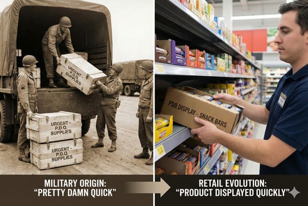
PDQ mean is slang for "Pretty Darn Quick" or "Pretty Damn Quick," a phrase characterizing the rapidity of merchandise turnover. In commercial retail, this acronym broadly describes counter-accessible Point-of-Purchase (POP) trays designed to accelerate impulse transactions by placing products within the immediate reach of the shopper.

The Psychology of "Pretty Damn Quick" Sales
When we talk about "Pretty Damn Quick," we aren't just talking about stocking speed; we are talking about the speed of the human eye. A shopper decides to buy a lip balm or a battery pack in less than 3 seconds. But here is the messy reality I deal with on the factory floor: physics often fights against psychology.
I learned this the hard way with a client from New York launching a tall energy shot display. They wanted a massive header to grab attention. I warned them, but they insisted on a 15-inch (38 cm) height for a shallow tray to save counter space. The result? The "Tipping Point" disaster. As soon as customers bought the first few items from the front, the center of gravity shifted back, and the whole unit toppled over backwards. It was a mess. A falling display isn't "quick"; it's a liability.
Now, I refuse to build a Countertop PDQ1 without enforcing the "2:3 Ratio2" rule. For every 2 inches (5 cm) of depth, you can safely go up 3 inches (8 cm) in height. If a brand wants to go taller for visual impact, we install a hidden "False Bottom" with a double-thick corrugated pad. This adds necessary ballast weight to the base.
Also, we have to talk about the "Lip Height3." Inexperienced designers make the front lip 3 inches (8 cm) tall to print a logo, hiding 30% of the product. That kills the "quick" recognition. I force the lip down to 1 inch (2.5 cm) or use a clear PVC window so the product is the hero, not the cardboard. I also simulate the "Empty Front Test" in my sample room—removing 80% of the product to ensure the display doesn't wobble. If it moves, we add a weighted insert immediately. We also check the "Friction Coefficient4" for gravity-feed trays. If the angle is too shallow, cans get stuck; too steep, and they smash. We test this with your actual product to ensure a smooth "Pretty Damn Quick" dispensing action.
| Design Feature | Effect on Sales Speed | Manufacturing Fix |
|---|---|---|
| High Front Lip (>2" / 5cm) | Slows recognition; hides product label. | Die-Cut Dip or Clear PVC Window to reveal 85% of product. |
| Tall Header Card | Increases visibility but risks tipping. | Extended Easel Back or Weighted False Bottom for stability. |
| Complex Assembly | Store staff won't build it; stays in backroom. | Pre-glued "Pop-Up" design; ready in 3 seconds. |
I always check the stability with an "Empty Front Test" before shipping a single unit to ensure your brand stays upright.
What did PDQ stand for?
Historically, it was just a shipping box with a tear-away lid. Today, that lazy design gets your brand rejected by premium buyers.
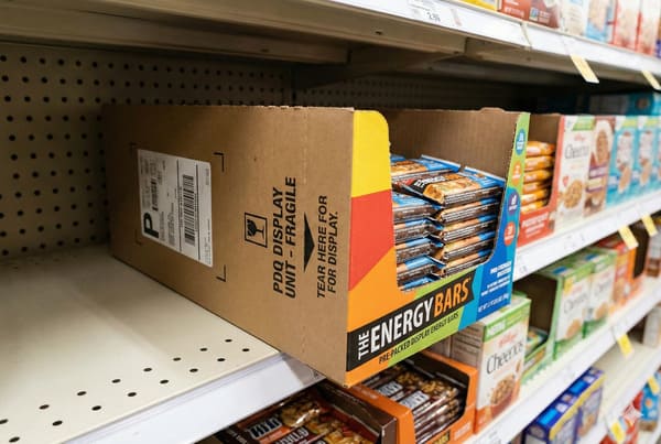
PDQ stand for "Pretty Darn Quick," though historically in logistics, it functioned as "Product Displayed Quickly." This term originally defined a category of dual-purpose shipping cartons featuring perforated tear-away sections, allowing store personnel to stock shelves without tools, thereby reducing labor costs and stocking time significantly.
From Brown Box to Brand Fortress
Back in the day, a PDQ was literally just a brown shipping box with a perforated line. You ripped the top off, and boom—it was on the shelf. But let me tell you, "tearing" cardboard is a nightmare. I've seen thousands of dollars of product ruined because the perforation was too tough. The clerk pulls too hard, the box rips diagonally, and now your premium packaging looks like garbage.
We had to evolve from "Perforation" to "Slide-in Trays." The old perforated boxes used what we call a "Nicking Ratio5" of 3mm cut to 3mm tie. It was strong for shipping but impossible to open cleanly. Often, store staff would get frustrated with the tearing and just use a box cutter, slicing right through the product inside. Now, I use a specific "Zipper Rule" perforation or, better yet, a separate tray and hood design. This ensures the "tear" is clean every time and eliminates the risk of "Knife Injury" to the product.
Another history lesson that cost me money: Material Grades. In the early days, everyone used Recycled Testliner (GD2) because it was cheap. But recycled fibers are short. When you fold them 90 degrees, they crack. We call it "bursting." White cracks on a black box look terrible. Today, for any structural PDQ, I mandate Virgin Kraft Liner6 for the load-bearing walls. The long fibers don't snap under pressure. It costs about 5% more, but it stops your display from looking like it's been in a wrestling match after one week in the store. We also had to solve the "Rough Edge" problem. Old die-cutters left sharp edges that gave store employees paper cuts. Now, I use Wave-Cut blades7 that create a scalloped edge—it's safe to touch and keeps the store staff happy.
| Feature | Old School PDQ (1990s) | Modern Evolved PDQ (2025) |
|---|---|---|
| Opening Mechanism | Manual Tear-Away Perforation (High Failure Risk) | Removable Hood or Slide-Off Cover (Zero Damage) |
| Material | Standard Brown Kraft (C-Flute) | High-Resolution Litho-Lam on E-Flute |
| Graphics | Flexo print (Direct ink on box) | Offset/Litho print (Magazine quality) |
I pushed for the separate hood design because it guarantees your branding looks pristine every single time.
What does PDQ mean at Walmart?
Walmart doesn't care about your design awards. They care if your display fits their shelf rules and doesn't get crushed in the truck.
At Walmart, PDQ stands for "Pretty Darn Quick," but technically designates a specific category of Retail Ready Packaging (RRP). These modular display units must adhere to strict dimensional standards, such as 14 or 22 inch (35 or 55 cm) depths, ensuring seamless integration with automated supply chains and standardized shelf planograms.

Surviving the "Retailer Rulebook" Gauntlet
You can have the most beautiful design in the world, but if it doesn't fit the Walmart Style Guide8, it's dead on arrival. I deal with this constantly. A client will send me a design that is 10 inches (25 cm) deep. I have to tell them: "Stop. Walmart shelves are standardizing to specific depths. If you don't fit the grid, you don't get placed." It's not just about fitting the shelf; it's about the "Price Channel9" rule. In the US, price tags are usually 1.25 inches (3.2 cm) high. If your design has important text on the bottom 1.5 inches (3.8 cm), the plastic price rail on the shelf will cover it up. I automatically adjust every Walmart PDQ file to have a "Safe Zone" at the bottom. It's not creative; it's compliance.
The biggest headache recently has been the RFID Mandate10. Walmart is pushing hard for inventory tracking. I had a client try to use a metallic foil paper for a "luxury" look on a Walmart PDQ. I had to kill the project immediately. Why? Because the metallic foil acts like a Faraday cage—it blocks the RFID signal. If the scanner can't read the tag, the product is "ghost inventory," and you get fined or delisted. I now have to ensure the "Quiet Zone" around the RFID tag is free of any metallic inks or foil stamping.
Furthermore, we deal with the "Club Store" Hardline. Costco requirements are totally different from Walmart. Costco requires a "Shop-Through" capability where product is accessible from three sides, and the display must support a 2,500 lbs (1,133 kg) dynamic load. If you send a Walmart-spec display to Costco, it gets crushed. I keep an internal database of these retailer specs so we fix these errors before the cutting die is even made.
| Requirement | The "Rookie Mistake" | The Factory Standard |
|---|---|---|
| Shelf Depth | Random sizes (e.g., 9.5" / 24cm) | Strict 14" or 22" (35cm / 56cm) matches |
| Weight Limit | Overloading tray (>50 lbs / 22kg) | Max 35-40 lbs (16-18 kg) for safety |
| Material | Foil Stamping | Cold Foil or Metallic Ink (RFID Friendly) |
I keep an internal database of these retailer specs so we fix these errors before the cutting die is even made.
What does a PDQ stand for?
A PDQ isn't just paper. It is a structural engineering feat standing between your product and a concrete floor.
A PDQ stand for "Pretty Darn Quick" represents a structural display fixture engineered for vertical load stability. These Point-of-Purchase units utilize high-strength corrugated profiles, such as E-flute, to support product weights exceeding 50 pounds (23 kg) while maintaining structural integrity in high-traffic commercial environments.
The Hidden Engineering of Cardboard
Clients think cardboard is just cardboard. They are wrong. The structural difference between a cheap display and a robust one usually comes down to two invisible things: Flute Profile11 and Grain Direction.
I recently quoted a job where the competitor was 15% cheaper. The client almost walked. I asked to see the competitor's spec. They were using B-Flute (about 1/8 inch or 3mm thick) with the grain running horizontally across the shelf. That is a recipe for disaster. Cardboard is like wood; it has a grain. If the grain runs horizontal, the shelf will bow and collapse under humidity within days. I explained that we use E-Flute (thinner, tighter waves) laminated to a solid bleached top sheet, with the grain oriented vertically for maximum Box Compression Test (BCT)12 strength.
Also, we have to talk about the "Washboard Effect13." On standard B-flute, you can see the lines of the corrugation through the print. It looks cheap. For premium cosmetics or tech PDQs, I only use E-flute or F-flute. The waves are so tight they are invisible, giving you a smooth, glossy finish that looks like rigid plastic but recycles like paper. It costs a few pennies more, but it saves your brand image. Another trick we use is the "Mop Guard" coating. We apply a clear, water-resistant varnish to the bottom 2 inches (5 cm) of floor displays. This prevents the cardboard from wicking up dirty mop water and collapsing the base—a common failure point in grocery stores. I also calculate the Safety Factor of 3.5. If your product weighs 10 lbs, I build the box to hold 35 lbs. Why? Because humidity kills cardboard strength. We often perform "Vibration Testing" to simulate a truck hitting a pothole, ensuring the internal dividers don't pop out before arrival.
| Technical Spec | Why It Matters | My Recommendation |
|---|---|---|
| Grain Direction | Horizontal grain causes shelf sagging. | Vertical Grain always for load-bearing walls. |
| Flute Type | B-Flute shows "washboarding" lines. | E-Flute for premium/cosmetic prints. |
| Lamination | Standard Gloss cracks at folds. | Anti-Scuff Matte or Elastic Water-Based Varnish. |
I guarantee the structure by over-engineering the load capacity by 3.5 times the actual product weight.
Conclusion
PDQs have evolved from disposable shipping boxes into precision-engineered retail assets. Whether it is navigating Walmart's RFID rules or ensuring your tray doesn't tip over, the details matter.
If you are worried about your current design surviving the supply chain, get a Free Structural 3D Rendering from me, or ask for a White Sample to test the physical strength yourself.
Explore the design principles of Countertop PDQs to maximize product visibility and sales efficiency. ↩
Understanding the 2:3 Ratio can help you create stable and effective product displays that enhance sales. ↩
Learn how Lip Height impacts customer recognition and sales, ensuring your products are seen and sold. ↩
Discover how the Friction Coefficient influences product dispensing, ensuring a smooth customer experience. ↩
Find out how the Nicking Ratio impacts packaging functionality and product protection, crucial for effective display solutions. ↩
Learn why Virgin Kraft Liner is essential for durability and aesthetics in packaging, ensuring your products look their best. ↩
Discover the advantages of Wave-Cut blades in packaging design, promoting safety and quality for both products and staff. ↩
Understanding the Walmart Style Guide is crucial for compliance and successful product placement in stores. ↩
Learn about the Price Channel rule to ensure your designs meet retail standards and avoid costly mistakes. ↩
Explore the RFID Mandate to understand its significance in modern inventory management and compliance. ↩
Understanding Flute Profile can enhance your knowledge of cardboard strength and design, crucial for effective packaging. ↩
Exploring BCT will provide insights into packaging durability, essential for ensuring product safety during transport. ↩
Learning about the Washboard Effect can help you choose better materials for a premium look and feel in your products. ↩


