Visitors get lost, staff repeat directions, and promotions go unseen. I fix this with clear indoor signage. It guides, sells, and protects. It also lifts brand trust.
Indoor signage makes spaces easy to navigate, speeds decisions, and boosts sales. It reduces questions, errors, and risk. It also carries your brand at every step. Clear signs change behavior fast and make facilities feel organized, safe, and professional.

I will break this topic into work, retail, visual merchandising, and basics. I will share how I design signs, how I measure them, and how I build cardboard displays that work.
Why is signage important in the workplace?
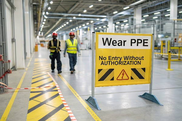
New hires feel lost, accidents happen, and productivity drops. Workplace signage sets rules, shows paths, and reminds best practice. It supports culture and keeps teams focused.
Workplace signage prevents confusion and harm, shortens onboarding, and keeps workflows tight. It shows where to go, what to do, and what to avoid. Clear signs save time, cut incidents, and raise morale.
Core functions I rely on
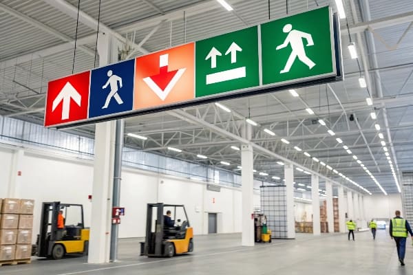
I use workplace signs to do four jobs. They guide movement. They show hazards. They set standards. They reinforce culture. Wayfinding arrows and zone markers reduce detours and backtracking. Safety icons and lockout tags stop risky moves. SOP placards1 and 5S labels keep tools and stock in place. Value signs and brand walls remind teams what we stand for. Cardboard displays help here because they set up fast and cost less. I update them often when a process changes. I also recycle them, so waste stays low.
A simple design checklist
| Sign type | Purpose | Best placement | Cardboard display idea |
|---|---|---|---|
| Wayfinding arrow2 | Direct movement | Junctions and doors | Slim freestanding totem |
| Safety notice3 | Prevent harm | Machines and storage | Rigid corrugated board |
| SOP placard | Standardize steps | Workstations | Counter card with QR |
| Culture wall | Boost pride | Break rooms | Large flat panel |
A quick shop-floor story
I once watched a line stop three times in one hour. The reason was simple. New staff could not find the QA rack. I placed a tall floor display4 with a big "QA Hold5" header and a map. I added a QR code with a 30-second video. The stoppages dropped to zero the next shift. Supervisors gave fewer verbal directions. The team felt calmer. The fix cost less than a team lunch and took one day to print. This is why I start with signs before new training.
Why is signage important in a store?
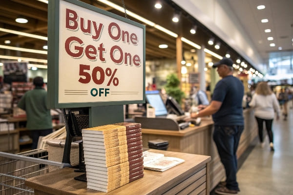
Shoppers rush, options crowd the aisles, and staff time is short. Store signage guides choices fast. It explains value and reduces returns.
Store signage draws traffic, clarifies price and benefits, and increases basket size. It speeds decisions at the shelf, supports staff, and turns browsers into buyers with clear claims and proof.
How I think about retail impact
Retail signs must win three seconds. I plan for the eye path: entrance, aisle, shelf, checkout. I use a hierarchy. Entrance banners set the promise. Aisle blades sort categories. Endcaps do the "stop." Shelf talkers answer doubts. Queue signs sell add-ons. Cardboard displays shine because they stand where shelves cannot. They ship flat, set fast, and carry bold print. I keep copy short: one benefit, one proof, one price. I test with a simple rule. If a stranger cannot repeat the offer after three seconds, I rewrite.
My retail sign kit
| Zone | Goal | Best message | Display format |
|---|---|---|---|
| Entrance | Pull traffic6 | One big promise | Hanging banner or arch |
| Aisle | Orient | Category and icon | Blade or header |
| Endcap | Stop and showcase | New or bundle | Floor display with header |
| Shelf | Convert7 | Benefit + price + proof | Shelf talker or tray |
| Checkout | Add-on | Small, fast item | PDQ counter unit |
A client case I can share
A hunting brand asked for a seasonal launch8. The team had strict dates because opening day was near. They wanted strong product focus and rugged mood. I built a corrugated floor display with a 3D header and a simple message: "Quiet. Fast. Ready." I added a small QR that showed setup tips. We used water-based inks and a matte finish to cut glare. We shipped flat in one box, with a color-coded assembly map. The store set took 6 minutes. The sell-through beat the control stores by a clear margin in week one. Staff liked it because the sign answered the top two questions. The unit was recyclable9, so removal was easy.
Why is signage important in visual merchandising?
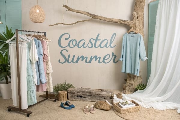
Products compete for attention, lighting changes, and space is tight. Visual merchandising signage creates order. It builds a scene that tells one idea at a time.
Visual merchandising signage sets the story, controls the eye flow, and highlights hero items. It turns a pile into a narrative, so shoppers feel the value and act with less doubt.
Story, focus, and rhythm
I write a simple story for each set. I pick a hero product10 and one theme, like "lightweight power." I use signs to build rhythm: entry card, mid-range banner, close-up spec tag. I keep type large and words few. I avoid mixed tones. I match color to the product or the season. I use negative space11 to let the hero breathe. Cardboard displays help because I can cut forms, add layers, and create depth. I also swap parts fast when the story changes. This keeps the set fresh without a full rebuild.
My visual hierarchy12 table
| Element | Role | Tip | Cardboard display idea13 |
|---|---|---|---|
| Header | Set theme | 5–7 words max | Die-cut logo panel |
| Subheader | Support claim | One clear proof | Clip-on strip |
| Callout | Close the sale | Price or bundle | Shelf talker |
| Prop | Add mood | Keep simple | Layered cutouts |
A practical test I use
I stand five meters away and take one photo. I ask one person, "What did you see first? What does it promise?" If answers differ, I adjust size, contrast, or copy. I move signs to steer the eye in a "Z" path. I place the highest contrast at the start and the price near the hand reach. I check glare and height for kids and older shoppers. I use sturdy corrugated board with a protective coat when traffic is heavy. I choose recyclable stock14 and water-based ink, so the set stays green and safe. These small checks protect results and help teams repeat wins.
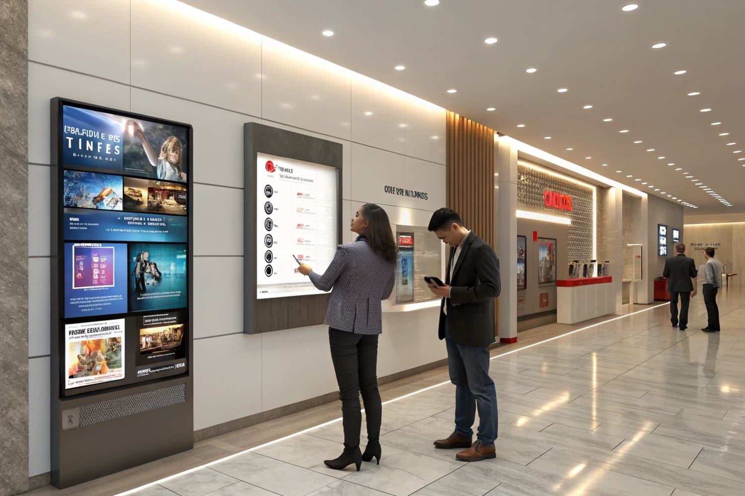
What is indoor signage?
People use this term for all signs placed inside buildings. It includes wayfinding, safety, brand, and sales messages. It appears in offices, stores, schools, clinics, and venues.
Indoor signage is any on-premise message inside a building that guides, informs, warns, or sells. It can be wall-mounted, hanging, freestanding, digital, or cardboard-based, and it should be consistent, readable, and easy to maintain.
Types, materials, and when I choose them
I group indoor signage by job and by build. Wayfinding signs use arrows, icons, and maps. Safety signs use icons and color codes. Brand signs use logos, values, and tone. Sales signs use claims, price, and proof. I choose materials by time, budget, and footprint. Cardboard works for promotions and seasonal sets because it prints rich color, ships flat, and assembles fast. Rigid plastics or metal suit long-term rules. Digital screens handle live pricing or queues, but they need power and care. I run three production lines, so I can move from sample to mass fast. I do load tests and transport tests, so displays survive a busy floor. I use water-based inks15 and recyclable boards when specs allow.
Quick material guide
| Category | Materials | When to choose | Notes |
|---|---|---|---|
| Wayfinding16 | Cardboard, PVC, aluminum | New layout or event | Use large arrows and icons |
| Safety17 | Corrugated board with coat, ACM | Heavy traffic or hazards | Follow local standards |
| Brand | Cardboard, acrylic | Lobbies, lounges | Keep color consistent |
| Sales | Corrugated board, foamboard | Seasonal and promos | Short copy, strong price |
| Digital | LCD/LED + holders | Dynamic content | Needs power and upkeep |
A setup playbook that saves time
I audit the space. I map entry points, choke points, and decision points18. I sketch the sign plan with sizes and heights. I write copy with a three-part rule: action, benefit, proof19. I print a small pilot. I test in one zone for one week. I watch dwell and questions. I fix weak parts. Then I roll out. My team builds samples fast and adjusts at no charge until the layout works. This keeps stress low for buyers with tight dates. It also protects color and strength from sample to mass run.
Conclusion
Indoor signage guides, sells, and protects. I design it to be clear, fast to read, and easy to swap. Good signs make busy places simple and help teams perform.
Learn how SOP placards standardize operations, ensuring consistency and clarity in processes for better productivity. ↩
Explore this link to understand how wayfinding arrows enhance navigation and improve user experience in various environments. ↩
This resource will provide insights on creating impactful safety notices that ensure workplace safety and compliance. ↩
Exploring effective floor display strategies can help you optimize product visibility and boost sales in your store. ↩
Understanding QA Hold can enhance your knowledge of quality assurance processes and improve operational efficiency. ↩
Discover proven techniques to attract more customers to your retail space. ↩
Learn essential tips to increase your sales conversion rates effectively. ↩
Explore this link to discover effective strategies that can enhance your seasonal launch, ensuring maximum impact and sales. ↩
Learn about the benefits of recyclable materials in product displays, promoting sustainability and appealing to eco-conscious consumers. ↩
Understanding the concept of a hero product can enhance your marketing strategy and storytelling. ↩
Exploring negative space in design can improve your visual communication and create more impactful displays. ↩
Understanding visual hierarchy is crucial for effective design, helping you prioritize elements for better communication. ↩
Exploring creative cardboard display ideas can inspire unique and engaging presentations for your products. ↩
Exploring the benefits of recyclable stock can help you make eco-friendly choices in your printing projects, promoting sustainability. ↩
Discover the advantages of water-based inks, including environmental benefits and print quality, to make informed choices for your projects. ↩
Explore this link to discover effective materials and design tips for wayfinding signs that enhance navigation. ↩
Check this resource for insights on materials that meet safety standards and ensure visibility in high-traffic areas. ↩
Understanding these concepts can enhance your project planning and execution, ensuring smoother workflows. ↩
Exploring this rule can improve your copywriting skills, making your messaging more effective and persuasive. ↩


