I see brands lose money from miscut packages. Edges do not align. Retailers complain. I fix this with accurate dielines that save time, cost, and trust.
Dielines matter because they turn design into precise, repeatable shapes that print, cut, fold, and pack without errors, which saves material, speeds production, and keeps retailers happy.

I run POP display projects where seconds at the shelf decide wins or losses. I use dielines to connect design, print, and assembly. I show how and why below, with simple rules you can use today.
Why are dielines important?
Many teams treat dielines as a final step. Then they rush. Mistakes multiply. I start with dielines early, so design choices stay real and safe.
Dielines are important because they define cut, fold, glue, bleed, and safety zones, align printers and die-makers, prevent waste and returns, and unlock faster approvals across teams.
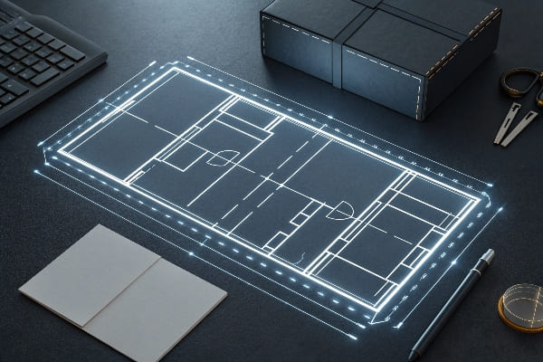
What a dieline1 sets
A dieline tells every knife, crease, and glue gun where to act. It turns a flat sheet into a 3D item. It locks key sizes like width, depth, and height. It locks flaps, tabs, and windows. It locks where barcodes and warnings sit. I run jobs for floor, counter, and pallet displays. I cannot ship without a locked dieline, because retail audits are strict. Large chains check footprint, overhang, and safety marks. If my dieline is wrong, stores reject the load. I lose weeks. My client loses a sales window. That is why I set dielines before final art. I let the art flow into safe zones. I freeze critical panels first, like the hero face and the price strip edge. I keep copy out of creases. I also align the dieline to pallet and shelf sizes, so teams can move fast during setup.
Business impact for POP displays
| Risk | Without Dieline Control | With Accurate Dieline | Impact on Cost/Time |
|---|---|---|---|
| Cutter misalignment | Random trims | Registered trims | -5% waste, fewer reprints |
| Fold cracks | Art crosses creases | Art offset from creases | Cleaner edges, fewer returns |
| Glue failures | Tabs too short | Tabs sized with tolerances | Faster assembly, less scrap |
| Barcode fails | Wrapped over edge | Flat on back panel | Fewer chargebacks |
| Retail footprint | Oversize base | Base matches planogram | Smooth audit pass |
I work in a market that moves fast. Floor POP Displays2 keep growing because they hit the eye first. My clients need speed. A good dieline removes guesswork. It moves approvals from weeks to days. That is why I treat dielines like a product spec, not an afterthought.
Why is packaging design so important?
Retail space is noisy. Shoppers scan fast. My packaging design guides eyes, protects goods, fits shelves, and tells a story in seconds.
Packaging design is important because it earns attention, explains value fast, protects products in transit, cuts logistics cost, meets retailer specs, and drives repeatable sales online and in stores.
Shelf physics
I design for how eyes move. I use bold brand blocks and short claims near the top third. I place price-friendly zones low. I avoid glare bands. I check read distance at two meters. I keep colors consistent across SKUs, so the set reads like one family. I design for easy restock. When a box loads from the back, I keep the SKU and size on the spine. When a display sits on a pallet, I build corner strength into the base. This looks simple, but it comes from hard lessons. Late trucks, damaged edges, and crushed corners all cost profit.
E-commerce reality
A package now must look good on a screen and a shelf. I design primary panels that crop clean at 1:1 and 4:5 ratios. I keep a variant badge inside the safe zone, so thumbnails stay clear. I add scannable QR codes that lead to setup videos or size charts. I keep codes away from folds, because scanner glass hates curves. I use dielines to place these items exactly. This reduces customer service calls and speeds assembly for field teams.
Design choices that move numbers
| Design Choice | Retail Effect | Logistics Effect | Sustainability Effect |
|---|---|---|---|
| Short claim (≤6 words) | Faster pick at shelf | Fewer returns from confusion | Less ink use |
| High-contrast hero | Better aisle stop | Better thumbnail | Clearer recycling sort |
| Flat-pack structure | More facings per pallet | Lower freight per unit | Lower CO₂ per unit |
| Right-size voids | Less damage | Smaller cartons | Less material waste |
I sell cardboard displays into North America and Europe. Buyers want cost control and green choices. Good packaging design3 does both. It uses strong paper grades and smart folds, not heavy plastics. It is simple. It travels well. It sells fast.
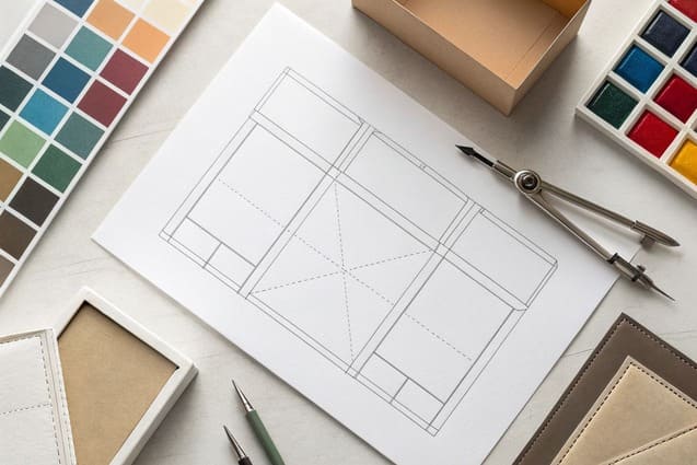
What are dielines in printing?
A dieline is a 2D map for a 3D object. Printers read it. Cutters follow it. My team builds it before art, so nothing surprises us.
In printing, a dieline is a vector outline showing trim, crease, perforation, bleed, safety, and glue areas, used to align artwork, plates, cutting tools, and assembly.
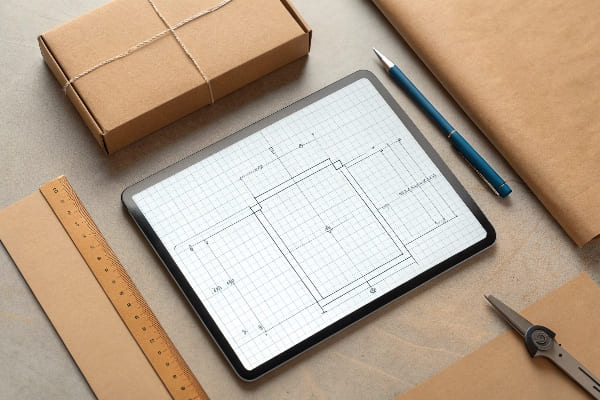
File specs that keep presses calm
I draw dielines as vectors in AI or PDF. I set a clean artboard to final flat size. I mark trim in one spot color. I mark creases in another. I never put dielines in CMYK plates. I name layers in plain words: "ART," "DIELINE," "FOLD," "GLUE," "BLEED," "SAFE." I lock the dieline layer. I ask prepress4 to keep overprint ON for dieline strokes, so they do not knock out the art. I keep stroke weight readable at 0.25–0.5 pt.
Layers and annotations
I add notes on tolerances, flute direction, and grain. I call out E-flute, B-flute, or double wall when needed. I show the lead edge for the press. I show which side gets varnish or lamination. I mark glue tabs with hash marks. I draw assembly numbers, so store teams can follow steps in order. These small lines save big money on a national rollout.
Dieline elements and purposes
| Dieline Layer | Color Type | What It Shows | Why It Matters |
|---|---|---|---|
| Trim | Spot | Final cut edge | Controls size and fit |
| Crease/Score | Spot (dashed) | Fold lines | Prevents cracking and misfolds |
| Perforation | Spot (dot-dash) | Tear lines | Easy open or coupon tear |
| Bleed | Guide | Extra art (3–5 mm) | Hides micro shifts |
| Safety | Guide | Keep text inside | Stops cutoffs |
| Glue | Spot (solid fill) | Adhesive zones | Clean assembly and no squeeze-out |
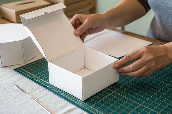
Before I release art, I print the dieline at 100% and cut a white dummy. I fold it. I check angles and tab reach. I confirm barcode flats. I confirm that my hero panel stays flat and clean.
What are the rules for dieline?
I keep simple rules. They prevent print drama. They protect deadlines. They help teams in China, the US, and Europe work as one.
Use vectors, spot colors, clear layer names, correct bleed, safe zones, tolerances, glue tabs, barcode placement, fit to flute direction, and confirm everything with a physical sample before mass production.
My practical rules
1. I draw everything in vectors. No raster dielines.
2. I assign unique spot colors5 to trim, crease, and perf.
3. I set 3–5 mm bleed on all cut edges.
4. I keep text and logos 3–5 mm inside the safety area.
5. I write clear layer names in English, not codes.
6. I mark flute direction and grain. Displays fail if flute runs the wrong way.
7. I size glue tabs with bite room. I add relief notches to avoid bulges.
8. I set tolerances6: ±1 mm for digital, ±1.5–2 mm for flexo/offset on corrugated.
9. I place barcodes flat, away from folds, with quiet zones.
10. I avoid hairline cuts near deep creases.
11. I print a 1:1 white dummy and a printed comp.
12. I log version numbers and dates, so teams track changes fast.
Tolerances by process
| Process | Typical Sheet | Registration Reality | Safe Choices |
|---|---|---|---|
| Digital on paperboard | Small to medium | Tight, but edges can curl | Keep 3 mm bleed |
| Offset on corrugated | Medium to large | Moderate drift | Keep 4–5 mm bleed |
| Flexo on corrugated | Large runs | More drift on coarse flute | Keep 5 mm bleed and bigger copy |
| Screen/UV spot | Specialty | Variable | Test panels first |
Sample and strength testing
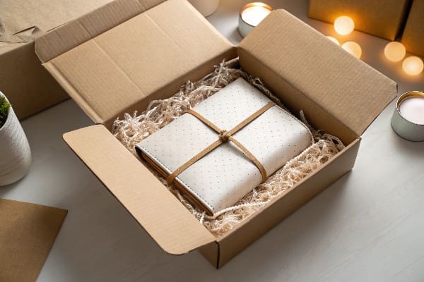
I run a factory with three production lines. I do design, prototyping, transport tests, and mass production after approval. I make white dummies and printed samples7. I test load with real products. I shake-test transport cartons8. I take photos and short videos for buyers, so decisions are quick. This matters for seasonal launches and strict dates. My buyers in sporting goods, beauty, and food need firm ship windows. My dieline rules protect those windows. I keep materials honest. I match sample board grade to mass production. I keep color charts from press tests, so final prints match the 3D render. When I do this, shipments pass audits. Displays stand straight. Teams install fast in high-traffic stores.
Conclusion
Dielines turn ideas into working displays. I use them to cut waste, speed launches, and pass audits. Clear rules make big retail wins feel simple.
Understanding dielines is crucial for effective packaging design, ensuring accuracy and efficiency in production. ↩
Exploring the benefits of POP displays can enhance your marketing strategy and improve customer engagement in retail environments. ↩
Explore this link to discover essential strategies that enhance packaging design, ensuring it is both cost-effective and environmentally friendly. ↩
Exploring prepress processes can help you grasp how to prepare your designs for printing, ensuring high-quality results. ↩
Understanding unique spot colors is crucial for achieving precise color matching in your designs. ↩
Learn about tolerances to ensure your designs meet production standards and avoid costly errors. ↩
Explore the importance of white dummies and printed samples for validating design before mass production. ↩
Discover effective methods for shake-testing transport cartons to ensure product safety during shipping. ↩


