I meet buyers who want fast growth, tight budgets, and clear results. I see crowded shelves. I feel the pressure. I use simple rules that make a product line pop.
A product line stands out when it solves one job better than rivals, tells one clear story at every touchpoint, and proves it with design, quality, speed, and sustainability that buyers can see and trust.
I will show how I build lines that win on shelf and in mind. I will keep it real. I will use lessons from factory floors, retail aisles, and launch weeks.
How does a product stand out?
I see shoppers scan fast. I accept that attention is short. I build one strong message, one strong visual, and one strong reason to pick it up.
A product stands out by owning one problem, using bold and simple visuals, showing proof fast, and removing friction from touch to checkout with clear structure, color, price, and helpful display tools.
What matters first
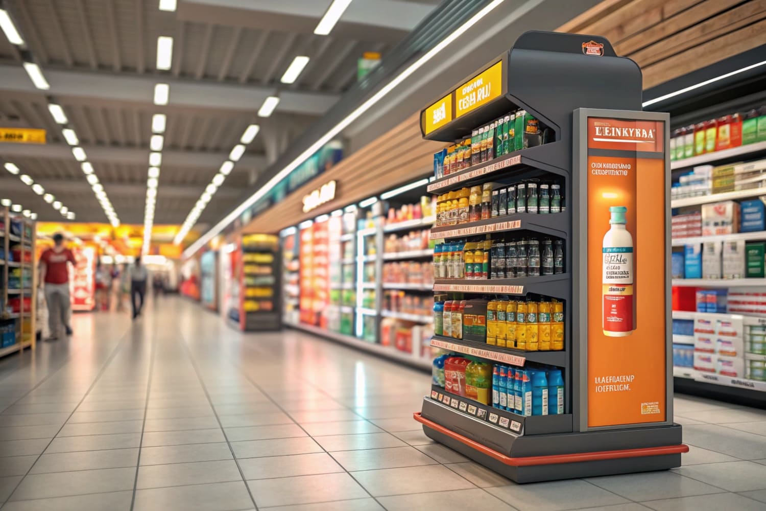
I start with a quick test: can a shopper know the benefit in three seconds from six feet away? If the answer is no, I strip the design. I cut words. I grow the claim. I raise contrast. I use floor, counter, or pallet displays to frame the product and create a small stage. In North America, I see stable demand for proven formats. In APAC, I see fast growth and more tests with digital print1 and short runs. In Europe, I see strong green rules, so I highlight recycled boards2 and water-based inks. I also think about transport and setup. Flat-pack saves cost and keeps edges clean. My team once rebuilt a bow-accessory display overnight after a print shift changed skin tones. The fix was simple: locked color profiles and one proof under store lights.
| Factor | What I do | Why it works |
|---|---|---|
| One claim | 3–5 words headline | Fast scan wins3 |
| Big contrast | Dark on light, or light on dark | Long-range read |
| Proof | Icon, rating, or test badge | Trust in seconds4 |
| Stage | Correct display type | Guides the eye |
How do you make your products stand out?
I do not chase trends first. I map the buyer's pain. I match features to one pain. I build the story into the display and the pack.
I make products stand out by choosing a single hero benefit, designing a repeatable display system, locking color and type rules, and testing read distance, load strength, and assembly time before mass runs.
My step-by-step play
I run a four-step loop: define the job, design the frame, prove the claim, and remove friction. For hunting tools and crossbows, safety and accuracy lead. I show load tests, shock tests, and a QR code to a quick demo. I set print targets with simple numbers: Delta E under 25 for brand colors, 300% total ink limit for deep blacks, and coated side out for high-wear edges. I build modular trays6 that fit both Walmart and specialty stores. I use digital print for pilot lots and offset for scale. I write an SOP for store staff with three pictures and ten words each. When deadlines hit, speed matters. Cardboard displays help because they print fast and ship flat. I can switch art in hours. I learned this in a launch where the retailer changed aisle width a week before go-live. Modular feet saved the day.
| Step | Tool | Checkpoint |
|---|---|---|
| Define job | 10 interviews | One pain statement |
| Design frame | Floor/Counter/Pallet | Fits store rules |
| Prove claim | Test badge + QR | Trust in 3s7 |
| Remove friction | Flat-pack SOP | Build < 5 min8 |
What makes up a product line?
I treat a line like a choir. Each SKU sings a note. The display is the stage. The shopper should hear one song, not noise.
A product line includes a clear architecture (good-better-best), unified naming, strict visual rules, focused formats per channel, and displays that connect the set so shoppers can compare fast and buy with confidence.
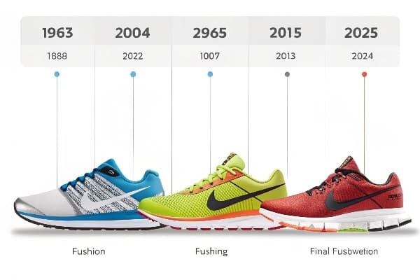
Build the architecture
I start with roles: hero, volume driver, entry, and halo. I map features to steps so trade-ups feel natural. I lock a simple naming ladder and color bands. Good is gray, better is steel, best is black and gold. I keep icon sets the same across boxes and displays. I use shelf trays9 for narrow aisles and floor towers for big seasonal spots. In club stores, I prefer pallet displays10 with PDQ inner packs. In beauty or personal care, I keep small counter units near checkout for impulse wins. For hunting products, I add accessory hooks to keep cross-sell close. I do not add more SKUs than the shopper can scan. If sales data shows confusion, I cut weak variants fast. I once removed a mid-tier SKU and doubled the space for top-tier; margin rose and returns fell.
| Role | KPI | Display |
|---|---|---|
| Hero | Awareness11 | Floor tower |
| Driver | Units | Shelf tray |
| Entry | Trial | Counter unit |
| Halo | Margin12 | Pallet bay |
What makes our brand standout?
I use proof, not hype. I show quality, green choices, and service speed. I let buyers see our process and talk to our engineers early.
Our brand stands out because we deliver custom designs fast, run real strength tests, keep color consistent, use recycled boards and water-based inks, and support buyers with clear prototypes and zero-fee changes before approval.

Proof over promise
I invite buyers to a simple workflow: design, 3D render13, sample, test, and then mass production. I include load and transport tests for every floor unit. I share photos and short clips from the lab. I publish material specs and certifications14 that buyers expect in the US, Canada, UK, and Australia. I track assembly time because store labor is tight. I design with fewer parts and bold tabs. I cut waste with tight nesting and lighter boards where safe. I also plan for e-commerce pressure. Boxes need to survive long routes. Flat-pack and reinforced corners help. When tariffs rise or pulp cost swings, I keep options ready: alternate flute, recycled content, or print method changes. Buyers see the plan and feel safe. That trust makes the brand look strong and open.
| Proof point | Evidence | Result |
|---|---|---|
| Load test15 | Photos + numbers | Fewer returns |
| Color control | Print targets | Fewer complaints |
| Green choice16 | Recycled board | Retail approval |
| Fast changes | Digital print | On-time launches |
What are the considerations of a product line?
I plan for cost, time, rules, and space. I plan for people who build displays in stores. I plan for change because markets move.
Key considerations include cost swings, material strength, print quality, certifications, transport risk, store rules, and a plan for modular parts that scale across channels without new tooling each season.
The checklist I use
I review seven areas before I greenlight a line. First, total cost17, not unit cost. I add freight, duties, and store labor. Second, material choice versus lifespan18. Not every unit needs heavy board. Third, print method versus volume. Short runs love digital; big runs prefer offset. Fourth, certification needs by region. Retailers in Europe push recycled content and water-based inks. Fifth, transport risks. I design bumpers where pallets meet doors. Sixth, store setup rules. Some chains ban loose parts. Seventh, future changes. I build a modular spine so next season's art snaps in. In one US rollout, duties rose just before ship. We stayed within budget by switching flute and tightening pack-out while keeping strength. The display still looked premium because the art did the heavy lifting.
| Area | Question | Go/No-Go |
|---|---|---|
| Cost | Full landed cost19 ok? | Go |
| Strength | Load + humidity ok? | Go |
| Color repeatable20? | Go | |
| Compliance | Docs ready? | Go |
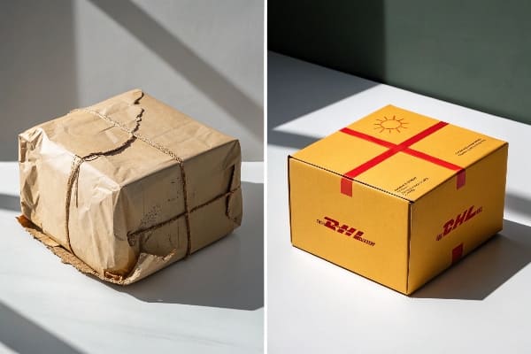
How to make your packaging stand out?
I see packaging as media. It sells when staff is busy. It must say the benefit fast. It must look new and feel right in hand.
Make packaging stand out with one bold headline, simple icons, high contrast, consistent color across SKUs, recycled materials, and a display frame that lifts packs into eye level and supports quick restocks.
From print file to shelf
I write the front panel like a billboard. I keep one headline, one image, and one proof mark. I push claims that match tests. I design the sides for specs and story. I place a QR for a short demo. I set a strict color ladder so the line blocks on shelf. I use matte where glare hurts read. I add gloss hits where I want touch. I choose recycled board and water-based inks21. I note this clearly. In high-traffic stores like club channels, I use PDQ trays that slide into pallet displays. Restock is easy. Damage drops. In launches with tight time, I start with digital print samples22. Stakeholders sign fast. When they do, I switch to offset for the run. I learned this cadence during a crossbow accessory launch where the retailer moved the date forward. We still hit it.
| Panel | Content | Rule |
|---|---|---|
| Front | Benefit + image23 | 3-second read |
| Side | Specs | Simple icons |
| Back | Story + QR | Short and clear24 |
| Top | Color band | Line blocks well |
Conclusion
A product line wins when it owns one job, shows one story, proves it with testing, and scales with simple, green, and fast display systems that staff can build in minutes.
Explore this link to understand how digital print enhances retail displays, offering flexibility and vibrant visuals. ↩
Discover the significance of using recycled boards in retail design for sustainability and eco-friendliness. ↩
Short headlines capture attention quickly, making it easier for readers to engage with your content. ↩
Visual proof like icons and ratings can significantly boost credibility and trustworthiness in your messaging. ↩
Understanding Delta E under 2 is crucial for achieving high color accuracy in printing, ensuring your designs look their best. ↩
Exploring the benefits of modular trays can enhance your retail strategy, making displays more versatile and efficient. ↩
Explore this link to discover strategies that can enhance trust-building in just a few seconds, crucial for effective communication. ↩
Check this resource for tips on streamlining assembly processes, making your operations more efficient and customer-friendly. ↩
Explore how shelf trays can optimize space and enhance product visibility in narrow aisles. ↩
Learn how pallet displays can drive sales and attract customers in high-traffic retail environments. ↩
Explore this link to discover proven strategies that can significantly boost your brand's visibility and recognition. ↩
This resource offers valuable insights and techniques to enhance your profit margins, ensuring better financial health. ↩
Exploring this link will enhance your understanding of how 3D rendering can improve product visualization and design efficiency. ↩
This resource will provide insights into the significance of material specifications and certifications in ensuring product quality and compliance. ↩
Understanding load testing can help improve system performance and reduce returns, enhancing overall user satisfaction. ↩
Exploring the benefits of recycled materials can lead to better retail approval and a positive environmental impact. ↩
Understanding total cost is crucial for effective budgeting and pricing strategies, ensuring profitability and competitiveness. ↩
Exploring this topic helps in selecting the right materials for durability, enhancing product quality and customer satisfaction. ↩
Understanding full landed cost is crucial for budgeting and avoiding unexpected expenses in shipping. ↩
Exploring color repeatability techniques can enhance print quality and consistency, vital for branding. ↩
Discover the benefits of using recycled materials and eco-friendly inks in packaging, promoting sustainability and appealing to environmentally conscious consumers. ↩
Explore this link to understand how digital print samples can streamline your product launch process and enhance stakeholder engagement. ↩
Explore how combining benefits with visuals can enhance marketing effectiveness. ↩
Learn why concise communication is key to engaging your audience effectively. ↩


