Brand colors look perfect on your glowing screen, but printing them on porous corrugated cardboard is a completely different reality. Muddy, inconsistent colors kill retail sales. Here is how we fix the disconnect.
The color matching process is a systematic manufacturing procedure aligning digital design files with physical printed output. It utilizes spectrophotometers and standard profiles to ensure exact replication of brand colors across various substrates, maintaining visual consistency for global retail marketing campaigns.
As a factory owner, I see brilliant agency designs ruined on the printing press every single day. Let's break down exactly how we translate your digital artwork into physical cardboard without losing the impact.
What is the process of color matching?
Approving packaging artwork on a bright laptop screen is dangerous. The liquid ink absorbs into the raw paper, and suddenly your vibrant red looks like rust. Let's fix that workflow immediately.
The process of color matching is a sequential methodology involving digital file calibration, physical proofing, and press adjustments. It requires RIP (Raster Image Processor) software to convert RGB data to CMYK values, followed by spectral analysis on corrugated board measuring up to 0.12 inches (3 mm) thick.
The "Muddy Color" Trap & GMG Proofing Reality
I learned this the hard way. A few years ago, a cosmetics client from New York approved a beautiful magenta floor display for a major Valentine's Day rollout. They looked at the digital PDF on their backlit screens and signed off. We printed it on standard 32ECT B-flute cardboard using standard CMYK offset plates. The result? The magenta ink soaked deep into the porous Kraft paper base and dried into a dull, bruised purple. It was a disaster. I had to scrap 5,000 units entirely. It drove me crazy.
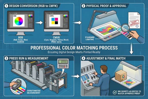
That massive failure is why I completely overhauled our prepress workflow. You cannot just hit print in Adobe Illustrator and hope for the best on a factory floor. The actual process starts with a mathematical Cutback Curve in our RIP software. Corrugated board suffers heavily from "Dot Gain1." When wet ink hits porous paper, the halftone dots physically expand. If your digital file calls for a 50% cyan dot, our prepress software automatically drops the plate output to 35% cyan to anticipate that physical spread.
But the real game-changer is our GMG Color Proofing system2. Before we ever put a metal plate on our Heidelberg Speedmaster press, I overnight a physical proof printed on the exact paper stock you ordered. Not glossy photo paper. Actual cardboard. We measure it with a spectrophotometer to ensure the Delta-E tolerance is perfect. If you are shipping displays to a dry climate like Arizona or a humid warehouse in Florida, the moisture content changes how the ink sits. We lock the color down physically in the real world, not just digitally on a screen.
| Process Step | Digital Approval (Flawed) | GMG Physical Proofing (Expert) |
|---|---|---|
| Substrate | Backlit RGB Screen | Actual Corrugated Kraft/CCNB |
| Dot Gain Compensation | None | Mathematical RIP Cutback Curve3 |
| Moisture Variable | Ignored | Accounted for in physical test |
| Accuracy Measurement | Human Eyeball | Spectrophotometer (Delta-E < 2.0)4 |
Clients hate hearing this, but your computer screen is lying to you. Do not sign off on a digital PDF for a massive retail rollout. I force my buyers to approve the physical GMG proof first. Ask me for a video of our spectrophotometer measuring your specific brand color.
What is the color matching system?
Standardizing print across different global suppliers is a massive headache. Without a universal language, your brand's blue printed in China won't match the blue printed in the USA.
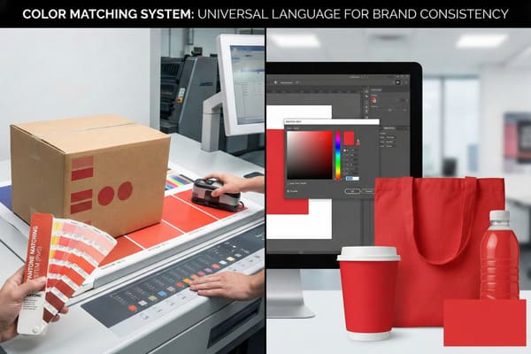
The color matching system is a standardized framework, such as the PMS (Pantone Matching System) or G7 Grayscale, used to communicate precise ink specifications globally. It provides exact mixing formulas and calibration targets, ensuring packaging produced across multiple facilities remains visually identical under retail lighting.
Bridging the US-China Gap with G7 Master Calibration
A massive misconception in this industry is that printing is just dumping colored ink onto rubber rollers. A client from Chicago insisted on using a local US printer for their primary product boxes and my factory for their temporary floor displays. They thought giving us both the exact same Pantone code was enough to make them match perfectly. When the 60-inch (152 cm) displays hit the Walmart floor right next to the retail boxes, the colors clashed horribly.
I refused to print it that way initially because I knew the risk. The US factory was calibrated to G7 standards, while my old press was using Japanese FOGRA standards. The dot structure and gray balance were fundamentally different. I had to upgrade my shop. Today, my entire production line is G7 Master Calibrated5. This is the absolute US standard. When an American designer sends me an Adobe Illustrator file with a GRACoL profile, my Heidelberg press reads it exactly as a printing press in Chicago would.
We also have to fight the raw material itself. Take the PMS 877 Silver problem. Brands love shiny silver text to look premium. But raw corrugated cardboard absorbs metallic flakes like a sponge. If you print silver directly onto a Kraft linerboard, it turns into a dirty, muddy grey. To beat this system limitation, we have to print a solid White Base Ink primer6 first to seal the paper fibers, and then lay the metallic ink on top. It adds a production step, but it is the only way the system actually translates to a retail shelf.
| System Standard | Primary Region | Grayscale Balance | Cardboard Compatibility |
|---|---|---|---|
| FOGRA | Europe / Asia (Legacy) | TVI (Tone Value Increase) based7 | Prone to muddy mid-tones |
| G7 Master | United States / North America | Visual gray balance based8 | Excellent for Kraft absorption |
| PMS (Metallic) | Global | Solid ink formulation | Requires white primer base |
System calibration is the invisible difference between cheap factories and reliable partners. I spent heavily to get G7 certified so your GRACoL files print flawlessly here without the usual US-China color shift. If you need absolute consistency across multiple packaging formats, let me run a test batch.
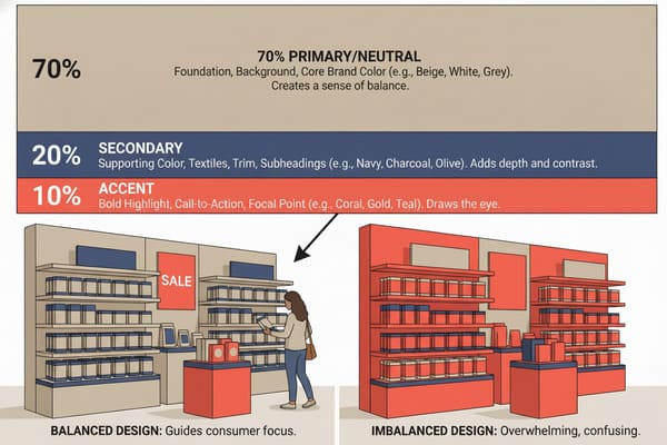
What is the 70 20 10 rule for colors?
Flooding a display structure with ten different bright colors creates visual chaos. Shoppers walk right past cluttered designs. You need strict structural hierarchy in your artwork to convert sales.
The 70 20 10 rule is a foundational design principle dictating that a layout must consist of 70 percent dominant color, 20 percent secondary color, and 10 percent accent color. This proportional distribution guides consumer attention, creates visual balance, and maximizes impulse purchases in busy retail environments.
Managing the Total Ink Limit (TIL) for Structural Integrity
Applying the 70/20/10 visual rule sounds like pure marketing theory, but on the factory floor, it is literally a matter of structural survival. Let me explain the physics behind the ink. A designer once sent me an artwork file for an energy drink dump bin where the "70%" dominant color was a massive, solid flood of "Photoshop Black" (C75 M68 Y67 K90). That equals 300% total ink coverage.
When we ran that through the press, the sheer volume of liquid ink soaked straight through the 32ECT B-flute linerboard. The cardboard turned soft and mushy on the pallet. When we ran the Box Compression Test (BCT)9, the display buckled under just 40 lbs (18.1 kg) of weight. The heavy liquid ink completely destroyed the paper's tensile strength. To fix this catastrophic failure, we now enforce a strict 260% Total Ink Limit (TIL)10 in our prepress department. We take that dangerous 300% black and mathematically convert it to a "Safe Rich Black" (C40 M30 Y30 K100). It looks identical to the human eye under Target or CVS fluorescent lights, but it uses drastically less liquid.
The 70/20/10 rule forces graphic designers to use negative space and lighter dominant colors. This keeps the corrugated board dry and rigid. When you rely on a small 10% accent color (like a bright neon yellow) to draw the shopper's eye, you save ink, lower your factory curing time, and ensure the floor display can actually hold the 150 lbs (68 kg) of product it was engineered to support.
| Design Element | Artwork Coverage | Factory Reality (Cardboard) | Structural Impact |
|---|---|---|---|
| 70% Dominant | Heavy Dark Flood (>300% TIL)11 | Board becomes saturated/soft | Fails 150 lbs (68 kg) load test |
| 70% Dominant | Light/Negative Space | Board remains dry/rigid | Passes ISTA drop testing12 |
| 10% Accent | Bright Spot Color | Fast UV curing time | Sharp visual contrast |
Beautiful artwork means nothing if the display collapses in the grocery aisle. By managing ink limits through intelligent design ratios, I protect both your brand image and your physical product. Send your AI files to my structural team before finalizing your layout.
What is the rule for color matching?
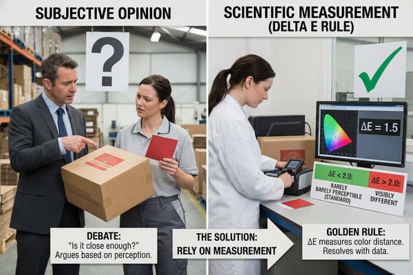
Never assume the printing machine knows what you want. Without strict mathematical rules, factory temperature, humidity, and machine wear will constantly shift your brand colors during a production run.
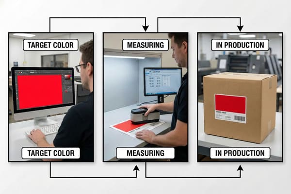
The rule for color matching is a strict quality control mandate requiring that printed output stays within a Delta-E tolerance of less than 2.0 compared to the approved master sample. This mathematical rule ensures color variations remain completely imperceptible to the human eye across large manufacturing batches.
The Golden Sample Protocol & Finish Registration
The golden rule on my production line is brutal but necessary: the 5,000th unit must look exactly identical to the 1st unit. Maintaining that consistency over a 3-day print run is incredibly tough. Press machine rollers heat up. Ambient humidity in the factory shifts from morning to night. If we do not constantly measure the output, the colors drift.
We combat this factory reality using the "Golden Sample" protocol. Before mass production starts, I personally sign off on one perfect, spectrophotometer-verified printed sheet. That physical sheet sits directly on the Heidelberg press console. Every 100th sheet pulled off the line is scanned and mathematically compared to that master standard. If the Delta-E reading creeps above 2.0, we stop the machine immediately.
But matching isn't just about CMYK liquid ink. It is also about the premium finishes. Luxury brands love adding Spot UV (a shiny clear gloss) over their logo. But corrugated cardboard stretches slightly under the immense pressure of the press cylinders. If the UV plate is cut perfectly identical to the print plate, that tiny stretch causes the gloss to "drift" off the logo, creating a blurry, misregistered mess. I fix this by engineering a 0.02-inch (0.5 mm) "Trapping" allowance in our high-viscosity screen printing process. We also pull the rigid UV mask back exactly 0.12 inches (3 mm) from any structural score lines. If dried UV polymer gets folded during store assembly, it cracks and flakes off, leaving sharp plastic debris.
| QC Checkpoint | Industry Standard | Our Factory Protocol |
|---|---|---|
| Batch Consistency | Visual eyeball check | Spectrophotometer every 100 sheets13 |
| Color Variance | Delta-E < 4.0 (Visible) | Delta-E < 2.0 (Imperceptible)14 |
| Spot UV Registration | Exact 1:1 match (Drifts) | 0.02 inches (0.5 mm) Trapping overlap |
| Crease Lines | Gloss over folds (Cracks) | 0.12 inches (3 mm) Gloss keep-out zone |
I refuse to leave your brand reputation to chance or tired machine operators. Our strict Delta-E rules and engineered trapping allowances mean zero surprises when your ocean container arrives at the distribution center. Ask me to pull a random production sample right off the press for you.
Conclusion
Mastering color on cardboard requires ruthless factory-level discipline, not just good graphic design. Stop risking your retail campaigns on muddy prints and soft structures. Get an Instant Quote and let us engineer your success.
Understanding Dot Gain is crucial for anyone involved in print production, as it directly impacts color accuracy and final print quality. ↩
Learning about the GMG Color Proofing system will help you see how advanced proofing ensures your printed colors match expectations, reducing costly errors. ↩
Learn how Mathematical RIP Cutback Curves improve print accuracy and color consistency, essential for high-quality packaging and professional proofing. ↩
Discover why using a spectrophotometer with Delta-E < 2.0 is crucial for precise color matching in print production and quality control. ↩
Understanding G7 Master Calibration helps ensure color consistency across international printing, which is crucial for global brands and designers. ↩
Learning about White Base Ink primer reveals how to achieve premium metallic finishes on packaging, avoiding dull or muddy results. ↩
Learn how TVI-based grayscale balance impacts print quality and why it's important for achieving accurate color reproduction in legacy systems. ↩
Discover the benefits of visual gray balance in printing and how it leads to superior results, especially for challenging substrates like Kraft. ↩
Discover how the Box Compression Test (BCT) evaluates packaging strength, ensuring your displays can safely support heavy products. ↩
Learn why enforcing a 260% Total Ink Limit is crucial for maintaining the structural integrity of corrugated packaging and preventing costly failures. ↩
Learn how heavy ink coverage affects packaging materials and why it can lead to board saturation and structural failure in real-world applications. ↩
Discover the significance of ISTA drop testing for packaging and how it ensures product safety and durability during shipping and handling. ↩
Learn how using a spectrophotometer every 100 sheets can significantly improve color accuracy and consistency in your print production process. ↩
Discover why maintaining Delta-E < 2.0 ensures imperceptible color differences, leading to superior print quality and customer satisfaction. ↩