
Retail space is costly. A messy floor loses sales. A clear plan wins. I use smart layouts and cardboard displays to guide shoppers, cut waste, and lift conversion.
Retail store design is the plan and build of a store's space, fixtures, and displays to guide traffic, show products, and increase sales while fitting brand, budget, and safety rules.
I will show how I choose layouts, displays, and heights. I will share simple rules you can use now. I will also share one project story that saved a tight launch.
How do retailers choose their store designs?
Most teams start with clear goals and real limits. I map shopper missions and basket size. I test displays fast. I keep the plan simple and strong.
Retailers choose designs by aligning brand goals, shopper missions, product mix, budget, and site limits, then testing layouts with samples, traffic data, and sales lifts before rollout.
The checklist I use
I follow a short list so the team moves fast. I tie brand goals to the floor. I size displays to space and safety. I balance cost and speed. I prefer flat-pack cardboard because it ships well, prints clean, and sets up fast. Floor POP displays stay a key lever. In one sector report they held about 43.7% share among POP formats, which matches what I see in stores. I also plan for growth. North America is steady and mature. Asia Pacific grows fast. In 2022, the packaging market1 there reached about $350B. I design with recycled board and water-based inks because buyers ask for it. Digital print lets me run short tests and change art in days, not weeks.
| Factor | Key question | How I measure | Display choice |
|---|---|---|---|
| Shopper mission2 | Why is the trip? | Conversion and dwell | Floor display or endcap |
| Product mix3 | Size and weight? | Facings and pick rate | Tray, PDQ, pallet |
| Space limits | Aisle width? | ADA and safety | Slim footprint |
| Budget & time | When is launch? | Unit cost and lead time | Flat-pack, digital print |
| Brand goals | What story? | Recall and clarity | Bold header, clean color |
A field story
A U.S. hunting brand faced a six-week deadline for a crossbow launch4 in the U.S. and Canada. I built a rugged floor display5 with reinforced corrugated board and a hidden steel base. I used water-based inks and a matte varnish to control glare under high bay lights. We ran drop tests, vibration tests, and a transport mock. We fixed a color shift by adding a gray balance strip and a press target. We shipped flat on a pallet and cut setup to three minutes. Sell-through beat plan by 18% in week one. The buyer ordered a second wave with a PDQ for impulse bolts at the cash wrap.
What is the concept of retail design?
Teams need a clear idea that links brand and floor. I keep the idea simple. I write one line, then I build to that line.
Retail design is the method of turning brand strategy into space, fixtures, signage, and displays that shape behavior, reduce friction, and raise profit while meeting safety, time, and cost.
Principles in practice
Retail design is a set of small, clear moves. Each move guides the eye and the feet. I place power, newness, and value in high-velocity zones. I use clear sightlines from the door. I protect basket builders near the end. I use cardboard displays as flexible tools because they print fast, cost less than metal, and recycle well. Digital print gives me one-to-one art, so I localize fast. I design in modules so staff can refresh in minutes. This saves labor and keeps stories fresh. Sustainability is not a trend now. It is a rule. Buyers ask for recycled board and water-based inks. I plan for this from day one.
| Principle | What it means | Simple action | Cardboard tip |
|---|---|---|---|
| Clarity | One idea per zone | One big header | 2–3 colors, bold type |
| Flow | Easy path, no stops | 36"+ aisles | Narrow footprints |
| Hierarchy | Guide the eye | Top: headline, mid: product | Header 8–12" tall |
| Proof | Test before scale | A/B layouts6 | Digital short runs |
| Care | Use less, waste less | Flat-pack, light7 | Recycled liners, water inks |
Trends you can use now
I track three drivers. First, sustainability8. Many chains now prefer fully recyclable displays. I remove plastic films and pick recyclable coatings. Second, speed. Digital printing and simple die-lines cut lead time. I can go from art to sample fast. Third, data. I add tiny QR codes or NFC tags to learn which message gets the most scans. The wider market supports these shifts. Display packaging stands near $23–25B around 2024–2025 and is projected to grow at about 5.4% CAGR toward 2035. Corrugated board across categories is also set for steady 6–7% annual growth into the next decade. This gives room for better design and stable supply. I keep designs simple so they scale with this growth.
What are the four main types of retail store layout?
Most stores fit one of four base plans. I pick the plan that matches the trip and the range. I keep paths clear and short.
The four main store layouts are grid, loop or racetrack, free-flow or boutique, and spine. Each controls traffic, sightlines, adjacencies, and display zones to match mission and basket.

When each layout wins
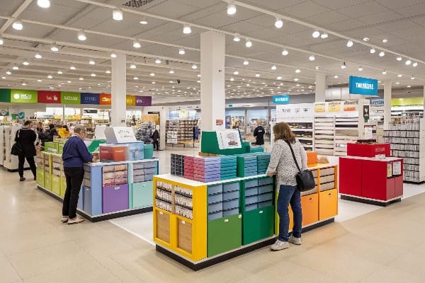
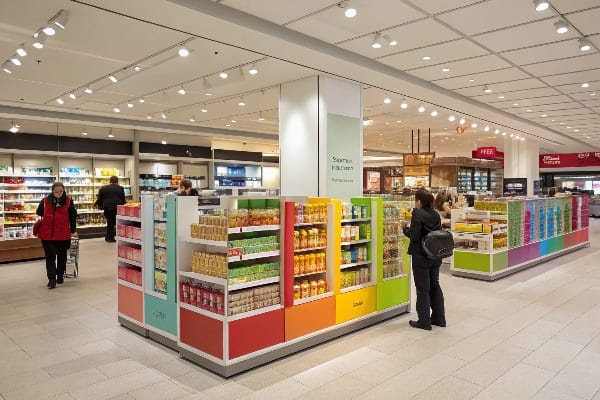
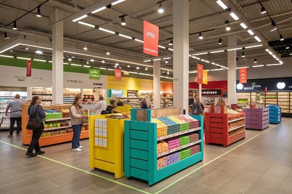
I start with mission. If shoppers want speed, I use a grid9. If they want discovery, I use a loop. If the brand wants a gallery feel, I use free-flow. If the range is wide but deep, I anchor a spine down the center. Cardboard displays fit each plan. Floor displays drive power in the loop and spine. PDQ trays spark impulse in grid checkouts. Pallet displays turn bulk into theater near the front. Shelf trays clean up small packs in any plan. Floor POP displays often grow the fastest because they deliver direct impact at eye level and cut setup time.
| Layout | Path | Best for | Display placement | Common mistake |
|---|---|---|---|---|
| Grid10 | Straight aisles | Fast list trips | PDQ at checkout, endcaps | Overlong aisles |
| Loop/Racetrack11 | One main loop | Discovery and promos | Floor displays on arcs | Blocked sightlines |
| Free-flow/Boutique | Open paths | Story and curation | Thematic floor sets | Too much visual noise |
| Spine | Central aisle | Wide range, deep stock | Landmarks on the spine | Weak wayfinding |
I used a loop plan for a seasonal launch12 in a big-box chain. I placed four cardboard floor displays on the outside arcs and one hero unit in the front. I used a spine of signage to tie the story together. Dwell time rose. The team met the launch date because the displays shipped flat and set fast. This mix also kept costs stable during a period of pulp price swings and higher tariffs on some inputs. The modular kit13 let stores flex for high-traffic weekends without a new build.
What is the height of a retail store?
Height affects sightlines, safety, and cost. I size ceilings and fixtures to the space. I size displays to eye level and reach.
Small stores often use 10–14 ft ceilings. Big-box sites use 16–24 ft. Gondola fixtures run 48–72 in. Floor displays stay 55–63 in. Always follow local code and landlord rules.
Heights that work
I design for eyes, hands, and lifts. I keep key messages between 52–66 inches from the floor. I keep heavy picks lower. I keep headers high but readable. I leave clear space under sprinklers and lights. I follow local code and ADA rules14 for paths. I keep floor displays stable and narrow enough for aisles. I lock in a base if needed. I test strength with load and transport checks15.
| Element | Typical height (US) | Metric guide | Why it works | Notes |
|---|---|---|---|---|
| Ceiling, small shop | 10–14 ft | 3.0–4.3 m | Good light and HVAC | Watch duct and sprinkler zones |
| Ceiling, big-box16 | 16–24 ft | 4.9–7.3 m | Long sightlines | Use taller signage |
| Gondola top | 54–72 in | 1.37–1.83 m | Safe reach, clear views | Keep high picks light |
| Floor display body | 48–57 in | 1.22–1.45 m | Eye-level product | Wider base for stability |
| Floor display header | +8–12 in above body | +20–30 cm | Clear message band | Keep total under 63 in in tight aisles |
| Pallet display total | 48–56 in | 1.22–1.42 m | Fork and safety friendly | Add corner posts |
| Window signage base | 42–48 in | 1.07–1.22 m | Preserve sightlines | Avoid blocking door views |
| Aisle clearance17 | 36 in min | 0.91 m | ADA path | Check chain standard |
I keep cardboard displays18 under about 63 inches (1.6 m) in narrow aisles so sightlines stay clean. I keep pallet stacks under about 56 inches (1.4 m) so lifts stay safe and stable. I use nano-coating or water-resistant liners for damp zones so the unit lasts through a long promo. I spec recycled board19 and water inks so the unit is easy to recycle at end of life. I test color with press targets so final prints match 3D renders. I ship flat-pack to cut freight and damage risk. This reduces cost and carbon, and it speeds setup on day one.
Conclusion
Good retail design is simple and clear. I plan the path, place strong displays, and set safe heights. I test fast, then scale. This wins sales and saves time.
This resource provides insights into the booming packaging market, crucial for strategic planning and investment. ↩
Understanding shopper mission can enhance customer experience and boost sales, making it essential for retailers. ↩
A well-optimized product mix can significantly influence customer satisfaction and sales performance. ↩
Explore this link to discover effective strategies that can enhance your crossbow launch success. ↩
This resource will provide insights into creating impactful retail displays that attract customers. ↩
Understanding A/B layouts can enhance your design strategy, ensuring effective testing and optimization. ↩
Exploring flat-pack design benefits can lead to more sustainable and efficient packaging solutions. ↩
Exploring this link will provide insights into innovative sustainable practices in packaging, crucial for staying competitive. ↩
Explore this link to understand how a grid layout can enhance shopper speed and efficiency in retail environments. ↩
Explore this link to understand how a Grid layout can optimize your retail space for efficiency and customer flow. ↩
Discover insights on how a Loop/Racetrack layout can improve product discovery and promotional visibility in retail. ↩
Explore effective strategies for seasonal launches to maximize impact and sales in retail environments. ↩
Learn how modular kits can enhance display efficiency and adaptability in retail settings, especially during peak times. ↩
Understanding ADA rules is crucial for creating accessible designs that comply with legal standards and enhance usability. ↩
Learning about load and transport checks ensures your designs are safe and functional, preventing potential hazards. ↩
Explore how high ceilings enhance visibility and customer experience in big-box stores. ↩
Learn about ADA standards to ensure accessibility and compliance in your retail space. ↩
Explore this link to learn effective strategies for maximizing the impact of cardboard displays in retail settings. ↩
Discover the benefits of using recycled board in packaging, including sustainability and environmental impact. ↩


