Confused by the chaos of retail terminology? You are not alone. Getting the jargon wrong doesn't just sound amateur; it can lead to expensive manufacturing errors where a "counter display" gets built too big for the counter because the terms were mixed up.
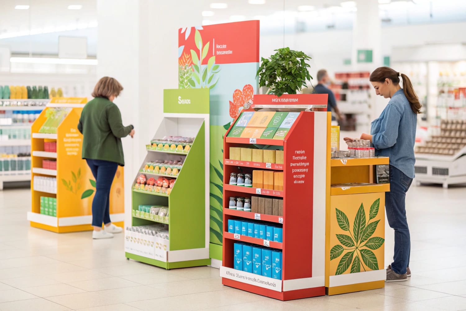
You set up store displays it is called visual merchandising or retail execution in the trade. This critical process involves the strategic placement of POP (Point of Purchase) structures and products according to a specific planogram to maximize product visibility and drive sales.
The High Stakes of Retail Execution
The term "Visual Merchandising" sounds fancy, but on the factory floor, we call it "Survival." When a brand sends me a design, they often focus on the colors. I focus on the execution environment. Why? Because the most beautiful display in the world is worthless if it collapses when the store clerk mops the floor.
This brings us to the "Soggy Bottom" Solution. In US retail environments like Walmart or grocery chains, floors are wet-mopped aggressively every night. If you use standard cardboard, the water wicks up the flutes (capillary action), and by Day 3, the bottom 2 inches (5 cm) turn into mush. The display leans, looks trashy, and gets thrown out. To fix this, I apply a biodegradable water-resistant coating to the bottom of the kick-plate. It's invisible, but it keeps the structure rigid even after four weeks of cleaning.
Furthermore, we have to talk about Grain Direction Physics. Cardboard isn't just paper; it's an engineered sandwich. It has a grain, like wood. If a designer treats a display like a simple box, they might orient the grain horizontally. Big mistake. I strictly orient the grain vertically for maximum BCT (Box Compression Test) strength. This allows a lightweight B-Flute material to hold 50 lbs (22.7 kg) without buckling. A client once ignored this advice to save on cutting die layout costs, and their entire Q4 inventory buckled in the warehouse before it even reached the trucks. Understanding what the setup is called is step one; engineering it to survive the setup is where the real work happens.
| Term | Definition | Primary Focus | Factory Implication |
|---|---|---|---|
| Visual Merchandising | The aesthetic arrangement of products. | Shopper Attention | High-quality print (Litho-lam). |
| Retail Execution | The physical act of building/stocking. | Compliance | Easy assembly structures. |
| Planogram Compliance | Following the store map. | Space Management | Strict dimension tolerances. |
| Strike Zone | The prime eye-level shelf area. | Sales Velocity | Structural reinforcement at 50" (127 cm) height. |
If you get the execution wrong, you don't just lose sales; you lose shelf space. Retailers are ruthless about removing "ugly" or broken displays.
What are store displays called?
Buying the display is easy; getting the terminology right ensures you get the structural integrity you actually paid for.
Store displays are called POP (Point of Purchase) displays, FSDUs (Free Standing Display Units), or POSM (Point of Sales Materials) within the industry. These terms specifically describe temporary fixtures made from corrugated board, metal, or plastic designed to hold products.
Decoding the Acronyms & Material Specs
I get emails all the time asking for a "standard POS display." Here is the messy reality: "Standard" doesn't exist. If you ask for a POS (Point of Sale) unit, I assume you mean a small tray for the checkout counter where people pay. But often, the client actually wants an FSDU (Free Standing Display Unit1) for the aisle. If I quote you for a counter tray but you needed a floor tower, the price difference is massive, and the structural engineering is completely different.
Let's dig into the material grades because this is where brands get burned. A "Bin" needs different paper than a "Shelf." For a heavy Dump Bin holding 50 lbs (22.7 kg) of dog toys, standard 32ECT (Edge Crush Test2) board will burst open like a cheap zipper. I've seen it happen. A client tried to save money by downgrading the liner, and the bins collapsed in the distribution center. Now, I refuse to print unless we use 44ECT or 48ECT BC-Flute for heavy items. It's thicker, tougher, and can take a beating.
Also, we need to address the "Washboard Effect." Standard corrugated board (B-Flute) has wavy lines. When you print a high-res photo of a face on it, the waves show through, making the skin look textured. It looks cheap. For premium cosmetics or tech brands, I switch to E-Flute3 (Micro-Flute) or a "Litho-Lam on SBS" method. The flutes are so tight they are invisible, giving you that glossy magazine look. So, knowing what the display is called helps, but specifying the flute profile is what makes it look professional.
| Acronym | Full Name | Typical Use Case | Recommended Material Spec |
|---|---|---|---|
| FSDU | Free Standing Display Unit | Aisle floor display | 44ECT EB-Flute (Double Wall) |
| PDQ | Product Display Quickly | Shelf/Counter tray | 32ECT B-Flute (Single Wall) |
| Sidekick | Power Wing | Hanging on end-cap | 32ECT B-Flute + Reinforced Back |
| Dump Bin | Bulk Bin | Loose items (balls, socks) | 48ECT BC-Flute + Internal Divider |
Don't just ask for a "display." Ask for the specific type so we can match the physics to the function.
Who sets up store displays?
You can engineer the perfect box, but if the human element fails, your campaign is dead on arrival.
To set up store displays effectively, retailers typically rely on three main groups depending on the execution complexity:
- Store Staff: Employees who build simple displays during stocking hours.
- Merchandisers: Third-party teams hired specifically for complex setups.
- Vendors: Brand representatives who visit stores to ensure compliance.
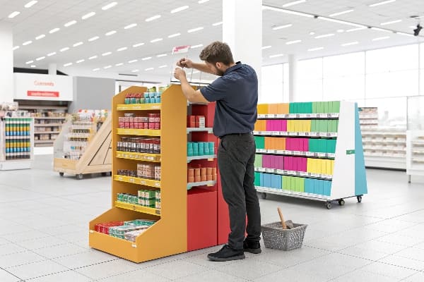
The "Instruction Manual" Reality Check
Here is a hard truth from the factory floor: Retail store employees are busy, tired, and often don't speak English as their first language. If I send a display with a dense, text-heavy instruction manual, it goes straight into the trash. They will guess how to build it. I've walked into Target and seen my displays assembled inside-out or leaning because a critical support brace was skipped. It drove me crazy.
To fight this, I implemented the "Instruction Manual" Reality Check. We stopped writing essays. Now, we use IKEA-style "No-Text" Visual Assembly Guides. But paper isn't enough. We also print a giant 3-inch (7.6 cm) QR code on the outside of the master shipper box. When the stock clerk scans it, it links instantly to a 30-second YouTube video showing a guy building that exact unit. No reading required. It cuts assembly time in half.
Another nightmare is lost parts. In a chaotic backroom, if a display is missing one single plastic clip, the manager won't look for it—they will trash the whole unit. That is $50 (£39) wasted over a $0.05 clip. My solution is the "Red Bag" Strategy. We tape a bright red emergency bag to the front of the instructions containing 5% spare hardware (extra clips or joiners). If a clip rolls under a pallet, they have a backup right there. It seems small, but this "Red Bag" protocol increased our successful installation rate from 85% to 99%. Retailers like Walmart love this because it keeps their floor clean and execution fast.
| Assembly Type | Best Application | Risk Factor | My Factory Solution |
|---|---|---|---|
| Flat-Pack | Standard FSDUs | High (Lost parts/Bad build) | Red Bag Strategy4 + Video QR. |
| Pre-Filled | Pallet Displays | Low (Arrives ready) | Requires higher freight budget. |
| Semi-Assembled | PDQ Trays | Medium (Pop-up open) | Design "Auto-Bottom" folds. |
We have to design for the tired employee at 2 AM, not the engineer at 2 PM.
What is a merchandising display?
It is more than a holder; it is a psychological trigger designed to stop a shopper in their tracks.
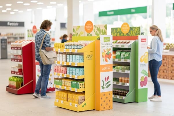
A merchandising display is a specialized fixture designed to showcase products in high-traffic retail areas to drive impulse purchases. These units disrupt the visual monotony of standard shelving, using shape and color to isolate the product for faster shopper decision-making.
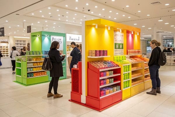
Engineering the Impulse Buy
A merchandising display has one job: Visual Disruption5. Shoppers have "Decision Fatigue." Standard metal shelves are boring and cluttered. Cardboard allows us to create curvy, die-cut shapes that metal can't match, isolating your product from the visual noise. But making it pretty isn't enough; we have to play the "Height Game."
I used to let designers put the "Hero Product" wherever it fit on the structure. Bad move. I learned that products placed too low or too high are invisible to the average shopper. Now, I enforce the "Strike Zone" Rule. We design the primary product shelf exactly at 50 to 54 inches (127–137 cm) from the floor. This is the "Eye-Level Buy Level." We use the bottom shelf—the "Stoop Zone"—only for bulk refill packs.
Another detail that brands miss is the "Shadow Zone" Lighting Fix. Retail lighting comes from the ceiling. If you design a display with deep shelves and solid side walls, the products in the middle sit in total darkness. Dark products don't sell. My design logic is to cut "Side Windows" or use White Inner Liners (bright white paper on the inside walls) to reflect ambient light. By reflecting light, we increase product visibility by 40% without using batteries or expensive LEDs. It's simple physics, but it saves sales. I've had clients see a 15% sales lift just by switching the inner liner from kraft (brown) to white.
| Feature | Standard Design | My Expert Upgrade | Why It Matters |
|---|---|---|---|
| Shelf Height | Random spacing | 50"-54" (127-137 cm) Strike Zone | Maximizes visibility for 5'4" shopper. |
| Lighting | Dark/Shadowy | White Inner Liners | Reflects ceiling light onto product. |
| Finish | Standard Matte | Anti-Scuff Matte PP | Prevents fingerprints and scratches. |
| Shape | Square Box | Die-Cut Header | Breaks the straight line of the aisle. |
Don't let your product hide in the dark. A good display highlights the product, it doesn't just hold it.
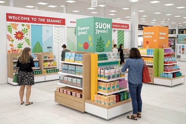
What is a store layout called?
You can have the best display in the world, but if it doesn't fit the map, it never gets on the floor.
A store layout is called a planogram (POG), which is a detailed schematic drawing illustrating where specific products and displays must reside. Retailers use this visual tool to maximize sales per square foot (0.09 sq meters) and ensure consistent branding across all locations.
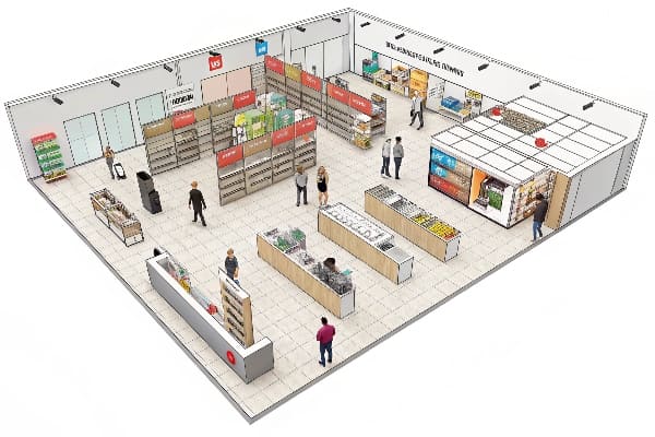
Navigating the Planogram Maze
Retailers like Walmart and Target run their stores on a strict grid. This is the "Planogram." The biggest mistake I see from new brands is designing a display that looks great in isolation but violates the grid. For example, a standard US End-Cap6 (the prime spot at the end of an aisle) is roughly 36 inches (91 cm) wide. However, due to the metal upright posts, the usable width is often only 35 inches (89 cm).
I once had a client design a display exactly 36 inches wide. It looked perfect in the 3D render. But when it arrived at the distribution center, it was rejected instantly because it was too tight to slide into the fixture. We had to scrap 500 units. It was a painful financial lesson. Now, I enforce the "Float Tolerance" Rule. We design End-Cap displays to a maximum width of 34.5 inches (87.6 cm). This ensures it slides in easily without jamming.
We also have to respect the "48×40" Pallet Science. The entire US supply chain runs on the standard GMA Pallet (48" x 40" / 122 x 102 cm). If your display footprint is 25 inches (63.5 cm) deep, it overhangs the pallet. Overhang is a death sentence in automated warehouses—it jams the conveyor belts and triggers "Repacking Fees." I strictly design every footprint to fit the 48×40 grid (e.g., 24×20 quarter pallets) so your product flows through the logistics system without friction.
| Zone | Constraint | My Compliance Fix | Consequence of Failure |
|---|---|---|---|
| End-Cap | 36" (91 cm) Nominal | Max 34.5" (87.6 cm) Width | Rejection at store level. |
| Pallet | 48"x40" (122×102 cm) | No Overhang Rule7 | Warehouse conveyor jams. |
| Shelf | Fixed Height | Modular Dividers | Inability to change SKU mix. |
| Aisle | ADA Reach | 15"-48" (38-122 cm) Zone | Legal compliance risk. |
Designing for the planogram means measuring twice and cutting once. It's not just about art; it's about fitting the puzzle.
Conclusion
Understanding the terminology—from Visual Merchandising to Planograms—is just the baseline. The real win comes from engineering displays that survive the "messy reality" of the retail floor, whether that's resisting mop water or fitting perfectly into a strict end-cap grid.
If you are ready to see how your design looks in the real world before committing to production, I can help. Get a Free Structural 3D Rendering of your concept today, or ask me for a Physical White Sample to test the stability yourself.
Explore how FSDUs can boost product visibility and sales in retail environments. ↩
Learn about the Edge Crush Test to ensure your packaging meets durability standards. ↩
Discover the benefits of E-Flute for high-quality packaging that enhances product presentation. ↩
Learn about the Red Bag Strategy to see how it can enhance installation success and minimize lost parts. ↩
Understanding Visual Disruption can enhance your merchandising strategies and improve shopper engagement. ↩
Exploring best practices for End-Cap displays can enhance your retail strategy and maximize product visibility and sales. ↩
Exploring the no overhang rule can help you avoid costly mistakes in warehouse operations. ↩


