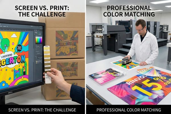
You spend weeks designing a stunning display, but the final print looks dull or completely wrong. It ruins your brand image and makes your product look cheap in the store. Why does the bright red on your computer screen look like a muddy orange on cardboard?
Color matching in printing is the precise process of adjusting ink combinations to ensure the printed output matches the original design source or a specific color standard (like Pantone). It bridges the gap between digital screens (RGB) and physical print (CMYK) to maintain brand consistency across different materials.
Let's explore how this technical process saves your marketing budget and protects your brand identity in the retail environment.
What is color matching in printing?
Seeing a competitor's display with perfect, vibrant colors while yours looks faded is frustrating. It suggests poor quality control to the customer. How do they get that perfect shade every time, regardless of the material they print on?
Color matching is the technique of translating specific color values from a design file into reproducible ink formulas on a substrate. It involves calibrating hardware and software to ensure that the visual result on materials like corrugated cardboard aligns exactly with approved physical samples or Pantone codes.
The Science of Substrate Interaction
To understand color matching in our industry, you must first recognize the difference between light and ink. Your design team works on computer screens that use RGB (Red, Green, Blue) light to create color. However, my printing presses use CMYK (Cyan, Magenta, Yellow, Black) ink to print. The challenge is that screens can show millions of bright colors that ink simply cannot reproduce. This is called the "color gamut1." When we move from a digital file to a physical cardboard display, the challenge gets even harder because of the material itself.
Cardboard is not naturally white like standard printer paper. It is often brown (kraft) or recycled gray. This base color affects the "white point" of the image. If we print a standard yellow ink on brown cardboard, the result will look muddy and dark because the brown shines through the ink. To fix this, we have to print a layer of white ink first, or use a high-quality clay-coated paper (CCNB) laminated onto the cardboard. Furthermore, different printing methods yield different results. Digital printing handles short runs well but struggles with specific Pantone matches compared to Offset printing (Lithography). In my factory, we use spectral photometers to measure the "Delta E2" (the difference between the target color and the print). For a brand like yours, a Delta E under 2.0 is usually required. This ensures that the hunting green on your crossbow packaging matches the display stand in the aisle perfectly.
| Feature | RGB (Screen)3 | CMYK (Print)4 | Pantone (PMS) |
|---|---|---|---|
| Source | Light source (Monitor) | Pigment/Ink mixing | Premixed Ink Formula |
| Use Case | Web design, Digital art | Standard printing, Photos | Brand Logos, Specific Colors |
| Range | Very Wide (Millions of colors) | Limited (Thousands of colors) | Precise and consistent |
| Consistency | Varies by monitor brand | Varies by printer calibration | Global Standard (Always same) |
We understand that your brand relies on distinct colors to stand out in a crowded hunting aisle. I insist on using physical proofs rather than digital PDFs for approval. My team calibrates our offset presses daily to ensure the red on your first display matches the thousandth one.
What is the process of color matching?
Delays happen when the sample arrives and the color is wrong. You send it back, wasting weeks of potential sales time. Why is the matching process so complex and why is it so prone to error if not managed correctly?
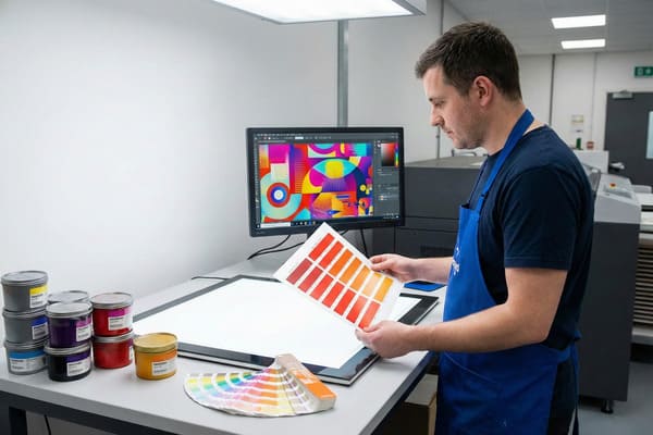
The process begins with converting digital files to CMYK, followed by selecting specific Pantone spot colors. A press operator then mixes inks and runs test prints on the actual production material. These proofs are measured against the target standard under controlled lighting to verify accuracy before mass production begins.
From Digital Art to Physical Reality
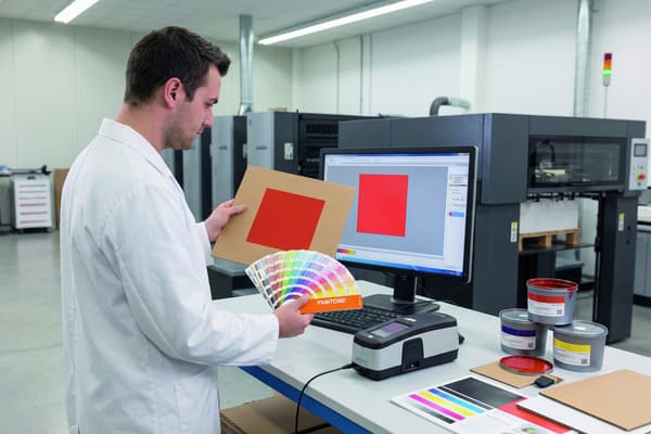
The workflow starts the moment your design team sends the artwork to my facility in Shenzhen. We do not just hit print. First, our prepress engineers check the ICC profiles embedded in your file. If you designed in RGB, we convert it to CMYK, but this shifts the colors. For critical brand elements—like a specific neon orange used for safety gear branding—we cannot rely on mixing CMYK dots. Instead, we use "Spot Colors5" (Pantone). This means we take a bucket of ink that is already mixed to that exact shade, guaranteeing consistency.
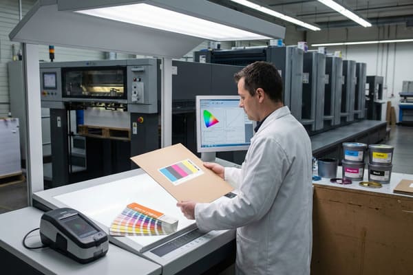
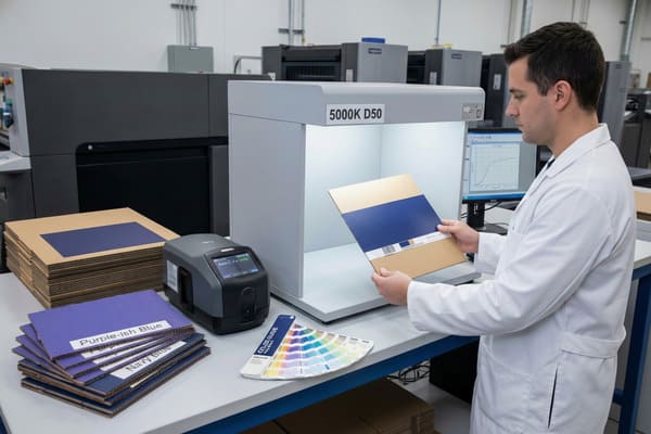
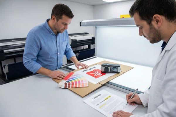
Next, we prepare the ink kitchen. Automated dispensers weigh the ink to the gram to match the formula. Then comes the "drawdown" phase. We smear a small amount of ink on the actual corrugated board you chose for the display. We inspect this under a standardized light booth (usually D50 or D65 lighting). This is crucial because of "metamerism6"—a phenomenon where colors look different under different light sources. A display might look perfect in sunlight but terrible under the fluorescent lights of a Walmart or a warehouse. We simulate the lighting conditions of your specific retail environment to ensure the display looks right where it is actually sold. Finally, we run a "wet proof" on the actual press. This is the final check. Only after you or your QC team approves this physical piece do we start the high-speed mass production runs.
| Step | Action Taken | Goal |
|---|---|---|
| 1) Pre-Flight | Check file mode (RGB/CMYK) | Identify out-of-gamut colors early |
| 2) Ink Formulation | Mix Pantone Spot Inks7 | Create exact brand colors |
| 3) Drawdown | Test ink on actual paper | Check how paper absorbs ink |
| 4) Lab Inspection | View under D50 Light8 | Eliminate lighting tricks |
| 5) Wet Proof | Run full sample on press | Final production simulation |
I know you have strict deadlines for new product launches. We speed up this process by offering onsite color approvals or sending overnight proofs. I personally review the spectral data for critical runs to ensure we catch any deviation before it delays your shipment to the US.
What is the rule of color matching?
You specify "Navy Blue," but the printer delivers "Purple-ish Blue." It looks cheap and unprofessional. Is there a universal standard or rule to prevent these arguments and guarantee consistency between batches?
The fundamental rule of color matching is the Delta E (<2.0) standard, which quantifies the distance between two colors. Additionally, colors must always be judged under standardized lighting (usually 5000K) and on the final production substrate, rather than relying on computer monitors or uncalibrated office printers.
The Delta E Standard and Tolerance
The "rule" isn't just "make it look good." It is mathematical. We use the Delta E (dE)9 metric. If the number is 0, it is a perfect match. Anything under 1.0 is generally invisible to the human eye. In the commercial printing of cardboard displays, a dE under 2.0 is the industry standard for high-quality results. Anything over 3.0 is usually considered a rejection. This removes opinion from the equation. We use a device called a spectrophotometer to scan the print and give us this number.
The second major rule is the "Rule of Absorption10" or Dot Gain. Corrugated board is like a sponge; it absorbs ink differently than glossy magazine paper. Dot gain happens when the wet ink hits the paper and spreads out, making the image look darker and muddier than intended. To follow the rules of color matching, we apply "curve corrections" in the prepress stage. We deliberately reduce the size of the dots on the printing plate (e.g., making a 50% dot into a 45% dot) so that when it spreads on the press, it hits the target 50% size. If a supplier ignores dot gain, your high-definition product photos will look blurry and dark. We also follow G7 master qualification rules to keep the gray balance neutral. This prevents strange color casts that make photos look unnatural.
| Delta E Value11 | Visual Perception12 | Acceptability |
|---|---|---|
| 0 – 1.0 | Indistinguishable | Perfect / High End |
| 1.0 – 2.0 | Very slight difference | Standard for Brand Colors |
| 2.0 – 3.0 | Noticeable at a glance | Acceptable for non-critical |
| 3.0 – 5.0 | Obvious difference | Rejected / Reprint needed |
We strictly adhere to a Delta E tolerance of less than 2.0 for all brand colors. I invested in advanced X-Rite color management systems to automate this verification. This guarantees that your brand integrity is maintained across every batch, without you needing to worry about technical deviations.
How do I get my printer to print in exact color?
You pay for high-quality displays, so you deserve high-quality results. Accepting "close enough" hurts sales and brand perception. How can you force the factory to get it right and avoid disappointment?
To get exact colors, you must provide Pantone (PMS) codes rather than relying on RGB screen views. Request physical "wet proofs" on the actual production material for approval, and establish a clear tolerance limit (Delta E) in your contract to hold the manufacturer accountable for consistency.
Strategic Communication for Color Success
Communication is usually the gap between what you want and what you get. Do not just tell your supplier to "make it pop" or "match the red on my website." Screens vary too much. You need to speak the language of the factory. First, define your colors using the Pantone Matching System (PMS)13. For example, "Barnett Red" should be "PMS 485C." Second, provide your supplier with physical samples. If you are matching an existing box or product, send that physical item to China. In my factory, we often receive a physical box from a client and use our scanners to reverse-engineer the ink formula. This is much more accurate than a digital file.
Another critical step is understanding the finish. If you want a metallic gold on raw cardboard, it won't shine without help. You need to specify a UV coating or a foil stamp. You must also consider the lamination. A matte lamination will dull the color and make it softer; a gloss lamination will make it deeper and richer. If you don't specify the finish, the result is a gamble. We always ask: "What is the final coating?" before we mix the ink. Finally, ask for a "signed proof14." This is a printed sample that you sign and mail back to the factory. We keep this "Golden Sample" next to the printing press machine. The operator checks every 100 sheets against your signature to ensure the color hasn't drifted during the run.
| Action Item | Why it is necessary |
|---|---|
| Send Physical Samples | Machines can scan the exact color of your product. |
| Specify PMS Codes15 | Eliminates guessing from digital screens. |
| Define Finish | Gloss vs. Matte changes how color appears. |
| Request Wet Proofs16 | Digital proofs do not show texture or absorption. |
| Set Tolerance | Put "Max Delta E 2.0" in your purchase order. |
I encourage you to send us a physical sample of your product packaging. We will match the display ink to your box, not just a digital number. I offer free replacement guarantees if the final production does not match the signed proof, giving you total peace of mind.
Conclusion
Color matching is the key to premium brand presentation. By understanding the process, setting clear standards like Delta E, and communicating with physical samples, you ensure your displays look professional and consistent.
Understanding the color gamut is crucial for achieving accurate color reproduction in print, ensuring your designs look as intended. ↩
Exploring Delta E will help you grasp how color differences are quantified, essential for maintaining brand consistency in packaging. ↩
Understanding RGB is crucial for digital design, as it defines how colors are displayed on screens. ↩
Exploring CMYK will enhance your knowledge of color mixing in print, essential for quality printing. ↩
Understanding Spot Colors is essential for achieving color accuracy in your designs, ensuring your brand's colors are consistently represented. ↩
Exploring metamerism will help you grasp how colors can change under different lighting, crucial for effective product displays. ↩
Understanding Pantone Spot Inks is crucial for achieving brand color accuracy in printing. ↩
Exploring D50 Light will enhance your knowledge of color consistency and quality in print production. ↩
Understanding Delta E is crucial for achieving accurate color matching in printing, ensuring high-quality results. ↩
Exploring the Rule of Absorption helps grasp how ink interacts with different paper types, vital for quality print outcomes. ↩
Understanding Delta E Value is crucial for ensuring color accuracy in design and printing. ↩
Exploring Visual Perception can enhance your knowledge of how colors are perceived, improving design outcomes. ↩
Understanding PMS is crucial for accurate color communication in manufacturing, ensuring your designs are faithfully reproduced. ↩
Exploring the concept of signed proofs can help you ensure quality control in your printing projects, preventing costly mistakes. ↩
Understanding PMS codes is crucial for accurate color reproduction in printing, ensuring your designs look exactly as intended. ↩
Wet proofs provide a realistic representation of the final product, showcasing texture and color accuracy that digital proofs can't offer. ↩


