Have you ever printed a design and realized the colors looked dull compared to your screen? This is a common frustration for brands. The issue often lies in understanding the color mode used by professional presses.
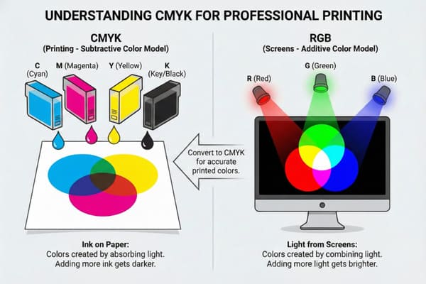
CMYK stands for Cyan, Magenta, Yellow, and Key (Black). It is the subtractive color model used in color printing. Unlike screens that use light (RGB), printers use ink dots to create colors. Understanding this difference is essential for achieving accurate, vibrant packaging and display results.

Let's break down why this matters for your cardboard displays and how to avoid costly mistakes.
Is it better to print in RGB or CMYK?
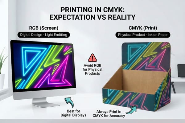
Choosing the wrong mode causes unexpected results. You might see bright neon blues on your monitor, but they turn muddy on paper. This confusion affects your brand image.
It is always better to print in CMYK for physical products. RGB is designed for digital screens that emit light, while CMYK is optimized for ink on paper. Designing in CMYK ensures that what you see on the screen matches the final printed cardboard display.
The Science Behind Color Rendering on Corrugated Board
To understand why CMYK1 is the only choice for your packaging, we must look at the physics of color. RGB is an additive color model. It works by adding light beams together to create white. This is how your computer monitor and phone screen work. They can display millions of bright, neon-like colors. However, cardboard displays do not emit light; they reflect it. This is where CMYK comes in. It is a subtractive model. We start with white paper and add ink to subtract brightness.
When we print on corrugated cardboard, the challenge increases. Cardboard is not as white or smooth as photo paper. It absorbs ink, a process we call "dot gain2." If you send an RGB file to a printing press, the machine tries to replicate light using ink. It fails because the color gamut (the range of possible colors) of RGB is much wider than CMYK. Bright electric blues and neon greens simply do not exist in the ink world. They become dull purples or dark greens.
For a brand like yours, consistency is everything. If you are selling hunting equipment, the camouflage greens and browns must be accurate. If the green shifts too much toward yellow because of a bad color mode conversion, the product looks cheap. Furthermore, printed cardboard often uses a Clay Coated News Back (CCNB) paper. This material affects how the ink sits. CMYK allows us to control the ink density specifically for this material. If we tried to print based on RGB data, the ink coverage might be too heavy. This leads to smearing and can even soften the cardboard, making the display structure weak.
| Feature | RGB (Red, Green, Blue) | CMYK (Cyan, Magenta, Yellow, Black) |
|---|---|---|
| Media Type | Digital Screens (Monitors, Phones)3 | Physical Printing (Cardboard, Paper)4 |
| Color Source | Light (Additive) | Ink (Subtractive) |
| Color Gamut | Wide range (millions of bright colors) | Narrower range (standard ink limits) |
| File Formats | JPEG, PNG, GIF | PDF, AI, EPS, TIFF |
| Best For | Web design, Social Media | Packaging, POP Displays, Flyers |
I run three production lines, and I see this issue daily. We use advanced color management software to simulate how ink reacts to specific cardboard grades before we hit the press. This saves my clients from receiving muddy, inaccurate displays.
Do printers automatically convert to CMYK?
You might hope the printer fixes your files automatically. While machines are smart, relying on auto-conversion is risky. It often leads to color shifts you did not approve.
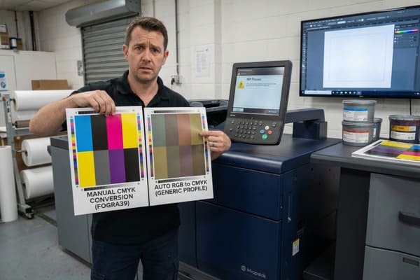
Yes, most modern commercial printers automatically convert RGB files to CMYK during the ripping process. However, this automated conversion uses generic profiles that often result in dull or muddy colors. It is safer to convert the files yourself to control the final output quality.
The Risks of Relying on Automated RIP Software
In the printing industry, we use a Raster Image Processor, or RIP. This software takes your digital file and translates it into instructions for the print heads. If you upload an RGB file, the RIP will convert it to CMYK to make printing possible. However, this is a blind conversion. The software does not know your brand guidelines. It simply mathematically swaps the values to the closest available ink combination. This is where the "Gamut Warning5" comes into play.
When an RGB color is out of the printable range, the software forces it into the nearest CMYK equivalent. This often results in a loss of vibrancy. For example, a bright "Call to Action" button on your display might turn a dirty grey-blue. Another major issue is the text. In RGB, black is created by zero light. In CMYK, black can be created in two ways: 100% Black ink (K) or "Rich Black6" (a mix of C, M, Y, and K).
Automated conversion often turns black text into Rich Black. This means the printer puts down four layers of ink for every letter. If the registration (alignment) of the press is off by even a fraction of a millimeter, your text will look blurry and have colored halos around it. This is unreadable and looks unprofessional on a retail shelf. Furthermore, on cardboard, putting down 400% total ink coverage for black text will saturate the liner paper. This causes the paper to warp or ripple, ruining the smooth finish of the display.
| Aspect | Manual Conversion (Recommended) | Auto Conversion (Risky) |
|---|---|---|
| Control | Full control over color shifts7 | No control, machine decides |
| Black Text | Can be set to 100% K (Crisp) | Often converts to 4-color black (Blurry) |
| Vibrancy | Designer can adjust curves8 | Colors often become dull/muddy |
| Surprises | You see the result on screen first | You see the result only after printing |
I never let a file go to the press without a manual pre-flight check. My team spots these auto-conversion risks immediately and alerts you. We adjust the color profiles to match our specific machines, ensuring your black text remains crisp and your logos stay true.
How to set CMYK in printer?
Sending a file to production requires the right settings. If your settings are wrong, the machine cannot read the data correctly. This leads to delays and wasted materials.
To set CMYK for a commercial printer, you do not change settings on the machine itself. Instead, you must export your design file with the correct color profile, such as FOGRA39 or GRACoL. This tells the printer exactly how to mix the Cyan, Magenta, Yellow, and Black inks.
Calibrating Files for Industrial Offset and Digital Presses
When we talk about "setting CMYK," we are really talking about ICC Profiles9. An ICC profile is a small file that describes how colors should look on a specific device. In the global packaging market, there are different standards. In the United States, the standard is often GRACoL or SWOP (Specifications for Web Offset Publications). In Europe and parts of Asia, we often use ISO Coated v2 (FOGRA39).
You cannot simply flip a switch on an industrial offset press to "CMYK Mode." The press operators need the file to contain the data for the four printing plates: Cyan, Magenta, Yellow, and Black. If you are designing for cardboard, you must also consider "Total Ink Coverage10" (TIC). This is the sum of all percentage values of the four inks. For standard paper, you might go up to 300% or 320%. For corrugated cardboard, we usually limit this to 260% or 280%.
If your file settings allow for too much ink, the cardboard acts like a sponge. It gets too wet. This leads to several technical failures. First, the ink takes too long to dry, which slows down production. Second, the "flutes" inside the cardboard can collapse under the pressure of the wet liner, reducing the stacking strength of your floor display. This is critical for heavy items like crossbows or hunting gear. The display might look fine when it leaves the factory, but it could crush in the shipping container because the structural integrity was compromised by too much ink.
| Profile Name | Region/Usage | Max Ink Coverage11 (Approx) |
|---|---|---|
| GRACoL 2006 | North America (High Quality) | 320% |
| SWOP v2 | North America (Standard) | 300% |
| FOGRA3912 | Europe/Global (Coated Paper) | 330% |
| FOGRA47 | Uncoated/Matte Cardboard | 260-280% |
I insist on using G7 certified calibration tools in my factory. When you send us artwork, we apply the specific ICC profile that matches our ink absorption limits. This prevents the cardboard from becoming soggy and ensures the structure holds up during transport.
How do I convert my photo to CMYK?
You have a great product photo, but it is in RGB. Using it directly can ruin the print. You need a reliable way to change the color mode without losing quality.
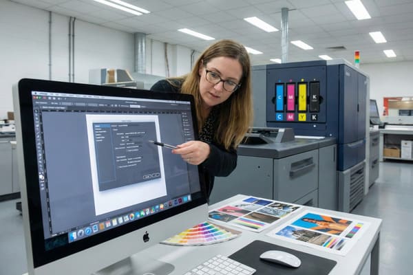
You can convert photos to CMYK using design software like Adobe Photoshop or Illustrator. In Photoshop, simply go to Image > Mode > CMYK Color. For vector graphics in Illustrator, select File > Document Color Mode > CMYK Color. Always check the colors after conversion to adjust for any shifts.

Professional Workflow for Image Color Separation
Converting a high-resolution image for a cardboard display is more than just clicking a button. It requires a professional workflow to ensure the image remains sharp and vibrant. When you select "Convert to CMYK" in Photoshop, the software has to make decisions. It uses a "Rendering Intent13." The two most common intents are "Perceptual" and "Relative Colorimetric." Perceptual tries to preserve the visual relationship between colors, which is good for photos. Relative Colorimetric changes only the colors that are out of gamut, which is better for logos.
The biggest problem we see is with the color blue. In RGB, blue is very intense. In CMYK, blue often looks purple because the ink contains Magenta. To fix this, a designer must use "Selective Color" adjustments or "Curves" after the conversion. We lower the Magenta level in the blue channels to push the color back towards a true blue. This is a manual correction that software cannot do perfectly on its own.
Resolution is another factor that works alongside color mode. An RGB image from a website is usually 72 DPI (Dots Per Inch). For printing on a floor display, we need 300 DPI at full size. Converting a low-quality RGB image to CMYK does not improve the quality; it just makes a blurry image printable. Furthermore, we must check the "channels." We inspect the Cyan, Magenta, Yellow, and Black channels individually. Sometimes, the black channel in a converted photo is too flat. We might need to boost the contrast in the K channel to give the image depth and definition on the cardboard surface.
| Step | Action | Purpose |
|---|---|---|
| 1) Check Resolution | Ensure 300 DPI14 | Prevents pixelated/blurry prints |
| 2) Convert Mode | Image > Mode > CMYK15 | Prepares file for ink separation |
| 3) Adjust Levels | Tweak Curves/Levels | Fixes dullness caused by conversion |
| 4) Correct Casts | Remove excess Magenta | Fixes "purple" blues |
| 5) Flatten/Save | Save as TIFF or PDF | Locks in the changes for print |
I know that seeing your product photos look dull is a nightmare. We offer a service where my design team manually adjusts your RGB images after conversion. We tweak the curves to bring the vibrancy back, ensuring your hunting gear looks premium on the retail floor.
Conclusion
Understanding CMYK is crucial for high-quality packaging. While RGB works for screens, your displays require precise ink management to look professional. By controlling files and profiles, we ensure your brand stands out in retail stores.
Explore this link to understand CMYK's significance in color printing, especially for packaging, ensuring your designs look professional. ↩
Learn about dot gain and its impact on color quality in printing, crucial for achieving accurate and vibrant packaging designs. ↩
Explore this link to understand how RGB enhances visual experiences on digital devices. ↩
Discover why CMYK is essential for achieving accurate colors in printed materials. ↩
Understanding Gamut Warning is crucial for maintaining color accuracy in print. Explore this link to learn how to avoid common pitfalls. ↩
Rich Black can significantly impact print quality. Discover the nuances of using Rich Black to enhance your printed materials. ↩
Understanding the importance of color control can enhance your design quality and ensure accurate results. ↩
Exploring this topic can provide insights into techniques that elevate the vibrancy and quality of your printed materials. ↩
Understanding ICC Profiles is crucial for achieving accurate color reproduction in printing, ensuring your designs look as intended. ↩
Exploring Total Ink Coverage helps you optimize ink usage, preventing issues like drying delays and structural failures in printed materials. ↩
Understanding Max Ink Coverage is crucial for achieving optimal print quality and avoiding issues like ink bleed. ↩
Exploring FOGRA39 will provide insights into its significance for coated paper printing in Europe and globally. ↩
Understanding Rendering Intent is crucial for achieving accurate color reproduction in print, making this resource invaluable for designers. ↩
Understanding 300 DPI is crucial for achieving high-quality prints without pixelation. ↩
Exploring CMYK will help you grasp why it's essential for accurate color reproduction in print. ↩


