I sell cardboard displays for fast retail launches. I meet tight dates. I also fix print errors. One small tool saves me time and money: the dieline.
A dieline is a 2D technical outline that shows where a printed piece will cut, crease, fold, glue, and bleed so designers, engineers, and printers build and finish the product correctly.

I use dielines to turn ideas into real displays. I share one file. Every partner reads the same map. We work faster. We make fewer mistakes. We ship on time.
What is a printer dieline?
Printers ask for clarity. Printers hate guesswork. A printer dieline tells the press crew and the die maker exactly where steel rules will cut and crease.
A printer dieline is the production-ready vector file that the print house and die maker use to build the cutting die and set creasing, perforation, and glue areas with exact tolerances.
Why printers rely on it
I send a dieline in vector format, usually AI or PDF. I put each function on a layer. I mark each function with a unique spot color and stroke style. The prepress team1 checks the file. The die shop builds steel rules from it. The press operator aligns artwork to it. The finisher folds and glues by it. The result stays consistent across thousands of units. My clients in the U.S., Canada, the U.K., and Australia expect this. They need speed for launches. They judge me by how well I prepare this file.
What a production dieline2 must include
I include outer cut paths, fold and score lines, perforations, vent holes, tuck tabs, locking tabs, and glue flaps. I add bleed around all print edges. I note flute direction for corrugated. I mark stacking edges that carry load. I add assembly numbers where parts join. I add pallet footprints for floor displays. I include ship-flat size to control freight. This level of detail helps retail chains and franchise buyers who plan space and plan labor time.
| Element | What it means | Why it matters |
|---|---|---|
| Cut line | Final outer edge | Die maker sets cutting rule |
| Crease/score | Fold locations | Clean folds without cracking |
| Perforation | Tear or pop-out | Easy opening in store |
| Glue area | Adhesive zone | Fast, clean assembly |
| Bleed | Extra print beyond cut | No white slivers after trim |
| Registration marks | Alignment guides | Accurate print-to-die match |
| Flute direction | Corrugation path | Strength and fold quality |
| Hang or vent holes | Handling or airflow | Merchandiser convenience |
| Part IDs | Assembly cues | Lower training time |
What are the rules for dieline?
Tight deadlines create stress. Small mistakes slip in. Clear rules stop rework. I keep a short list that my team follows on every job.
Use vector lines, unique spot colors, and separate layers for cut, crease, and perf. Add 3–5 mm bleed, 1–2 mm safety, and note flute direction. Lock scale at 1:1 and embed fonts.
Practical rules I use every day
I set line types first. I use a solid magenta spot for cuts. I use a dashed cyan spot for creases. I use a dotted green spot for perforations. I never put these into the CMYK artwork. I keep them on top layers named "DO NOT PRINT." I set overprint on these spot lines so prepress can trap safely. I add a 3–5 mm bleed3 for litho and digital. I keep a 1–2 mm safety margin inside the folds. I confirm scale at 1:1. I place a 100 mm calibration bar on the artboard. I embed fonts or outline them. I mark flute direction with an arrow. I label board grade, like E-flute or B-flute. I add pallet and case pack notes for PDQ or floor POP displays.
Tolerance, strength, and retail reality
I design for real stores, not only for screens. I allow ±0.5–1 mm for cutting drift on corrugated. I widen slots by 0.5–1 mm for tabs. I increase crease depths on heavy boards to stop cracking. I add double walls where load is high. I test a sample with real product. I shake it. I stack it. I drop it in a box test. My clients run tight dates for launches. These rules keep us on time and under budget.
| Rule | Reason | Field tip |
|---|---|---|
| Separate spot colors4 | No print confusion | Name layers "Cut," "Crease," "Perf" |
| 3–5 mm bleed | Trim drift | Extend background and images |
| 1–2 mm safety | Art stays safe | Pull logos and text inward |
| 1:1 scale | Tooling accuracy | Add 100 mm scale bar |
| Flute direction noted | Fold and strength | Arrow + board grade label |
| Tab slack 0.5–1 mm | Easy assembly | Test with product weight |
| Overprint lines | Clean trapping | Set spot lines to overprint |
| Fonts embedded | Prepress speed | Or convert to outlines |
What is the meaning of dieline?
I speak with engineers, buyers, and designers. Each person uses a different word. The dieline gives us one meaning. The dieline is our single source of truth.
The dieline is the shared technical plan for a printed structure; it defines size, shape, folds, and finish so all teams align on cost, timing, quality, and in-store performance.
One file, many decisions
I set budgets from the dieline5. Material yield comes from the flat size. Freight comes from the ship-flat size. Store labor comes from the part count and fasteners. Sustainability claims come from board grade and coatings. Brand impact comes from the print panels and sightlines. In North America, demand stays steady, and buyers want proof. In APAC, demand grows fast, so teams want speed. In Europe, teams ask for eco inks and recyclable coatings. The dieline helps me answer each market with the right choice.
How a clear meaning saves money
I see fewer revisions when the dieline is clear. I avoid color shifts at folds. I protect print on edges. I reduce returns from transport damage. I plan quick assembly for Costco and Walmart PDQs. I design with recycled content because the dieline locks flute and thickness. I plan digital print runs for small batches. I keep mass runs for big launches. I keep my prices sharp because my waste drops.
| Stakeholder | What they read in the dieline | Outcome |
|---|---|---|
| Designer | Panels, bleeds, safeties | Clean art that fits |
| Engineer | Tabs, locks, load paths | Strong structure |
| Buyer | Flat size, case pack | Clear cost model |
| Printer | Spot lines, layers | Fast makeready |
| Retail team | Assembly cues | Less labor in store |
| Sustainability lead | Board and coating | Valid eco claims |
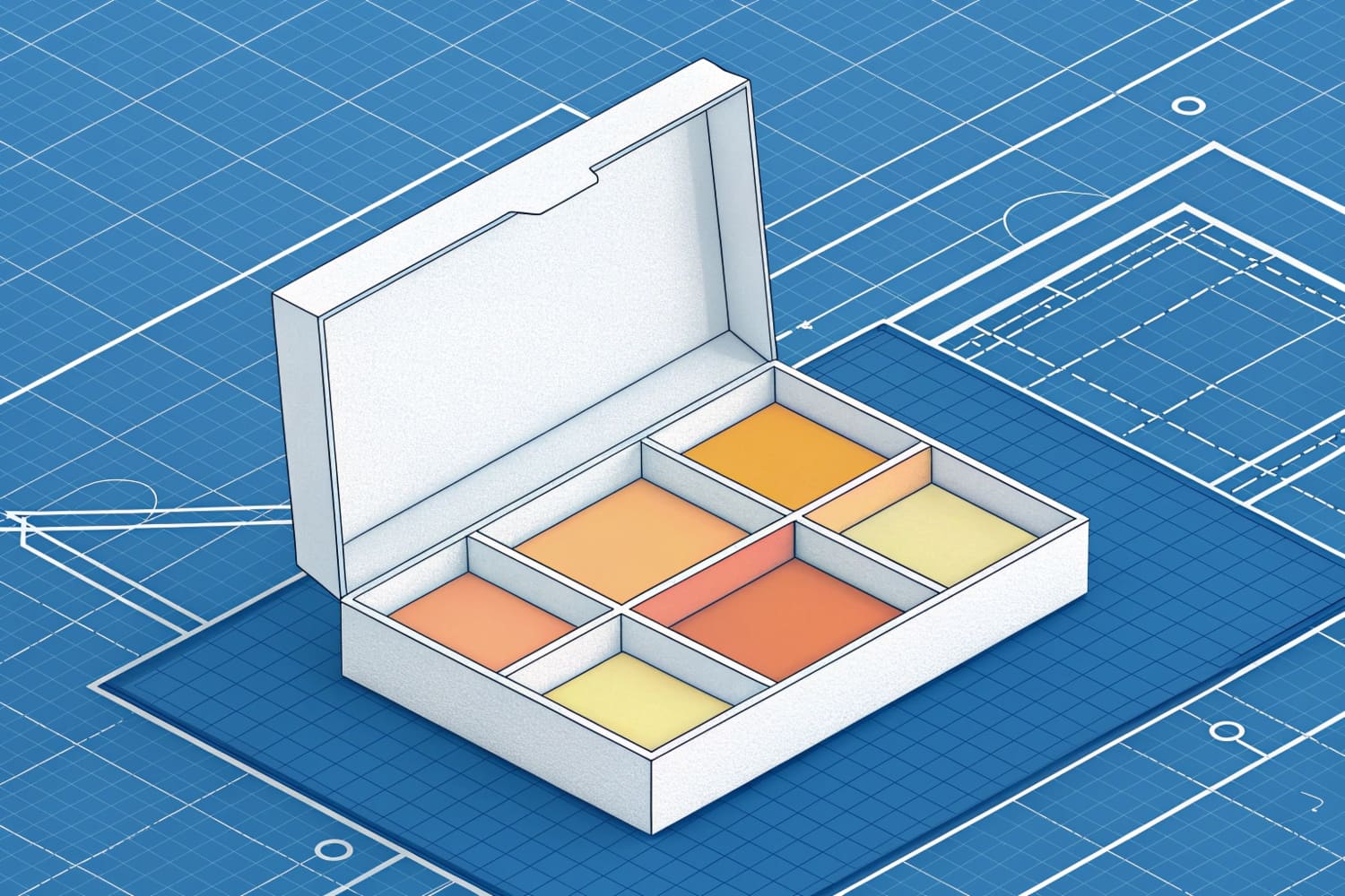
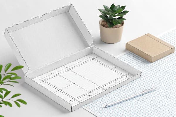
What does a dieline look like?
People ask for a picture. A dieline looks simple at first. It looks like lines and shapes. It tells a full story once you know the code.
A dieline looks like a flat outline with colored vector lines: solid for cuts, dashed for creases, dotted for perfs, plus glue flaps, tabs, bleeds, and notes on scale and flute direction.
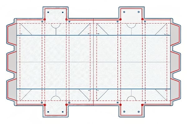
The visual anatomy
I open the file and I see a rectangle for the sheet size. I see a solid magenta path for the outer trim. I see dashed cyan lines that mark folds. I see dotted green lines for tear areas. I see pale red boxes that mark glue. I see shaded areas that show bleed. I see arrows that show flute direction. I see small labels at each part. I see an exploded view for complex floor displays. I place brand panels where shoppers can see them at three feet and at seven feet. I keep heavy products low for stability.
Example: a floor POP display6 for hunting gear
I build a four-shelf unit for crossbows and accessories. I set B-flute for the main body and E-flute for trays. I add double walls at shelf fronts. I use wide tabs for the header. I label each tray with load limits. I mark hidden glue flaps to keep the face clean. I add a QR code panel at hand level for product videos. I include a ship-flat size that fits a standard pallet. I keep assembly to under five minutes. I test it with weight and vibration. The dieline shows all of this before I cut the first sample.
| Visual element | Purpose | Notes |
|---|---|---|
| Solid cut line | Final shape | Spot magenta, overprint |
| Dashed crease | Folding line | Spot cyan, dashed 2–3 mm |
| Dotted perf | Tear or vent | Spot green, dot pattern |
| Glue area | Adhesive zone | Light tint, "NO PRINT" |
| Bleed area | Trim safety | 3–5 mm beyond cut |
| Flute arrow | Strength cue | Mark E, B, or double wall |
| Part labels | Assembly aid | 1, 2, 3… with arrows |
| Scale bar | Size check | 100 mm or 4 in |
Conclusion
A dieline is my blueprint. It keeps teams aligned. It cuts waste. It speeds launches. It makes strong, good-looking displays that sell.
Exploring the role of a prepress team can enhance your knowledge of print preparation, ensuring high-quality results. ↩
Understanding production dielines is crucial for ensuring accurate and efficient printing processes, making this resource invaluable. ↩
Learn why adding a bleed is essential for professional printing and how it affects the final product. ↩
Understanding spot colors is crucial for achieving accurate prints. Explore this link to enhance your design skills. ↩
Understanding dielines is crucial for effective packaging design, ensuring clarity and reducing revisions. ↩
Explore this link to understand the significance of floor POP displays in retail and how they enhance product visibility. ↩


