Are you confused by the endless acronyms in the retail world? You are not alone; misunderstood terms often lead to expensive mistakes on the factory floor, turning a potential bestseller into a logistical nightmare.
POP (Point of Purchase) is a marketing term referring to specialized promotional fixtures placed where customers make buying decisions. These units range from temporary corrugated floor stands to permanent digital kiosks, designed to disrupt the visual landscape and trigger impulse sales by isolating specific products from the crowded home shelf.
Many brands treat these displays as just "boxes" to hold product. That is a fatal error. In my factory, we see them as strategic assets. If you understand exactly what these acronyms mean—and the engineering compliance behind them—you stop shipping cardboard and start shipping revenue. Let's break down the definitions and the messy reality of getting them right.
What does pop stand for?
A great product sitting invisibly on a bottom shelf is a dead product. You need to interrupt the shopper's autopilot mode immediately to capture sales.
Pop stands for Point of Purchase (POP), representing the physical location where a transaction occurs and the marketing materials used there. In the display industry, this refers to off-shelf merchandising units that move products out of the aisle and into high-traffic zones, utilizing bold graphics and structural design to capture consumer attention.
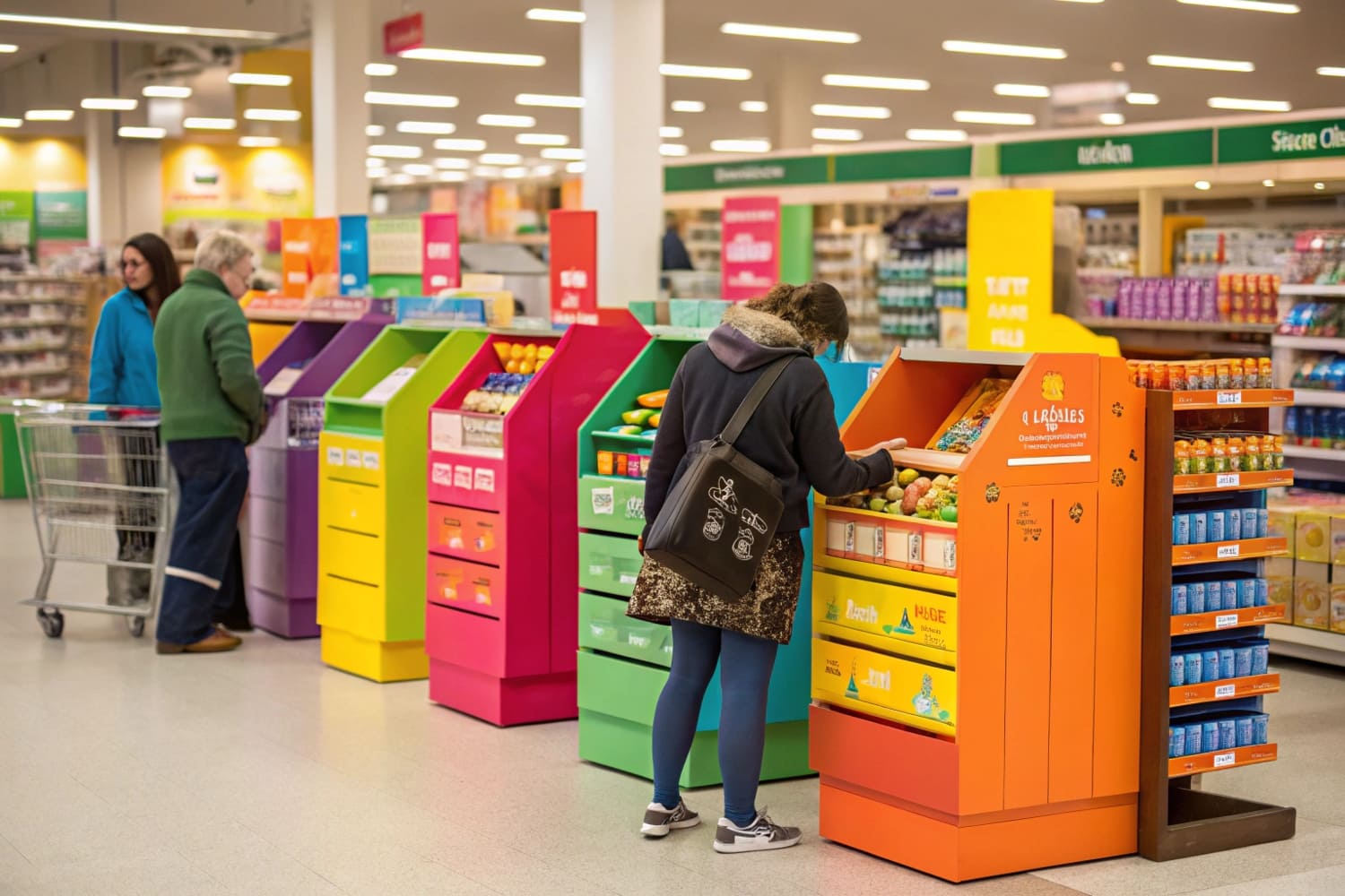
The Structural Anatomy of Visual Disruption1
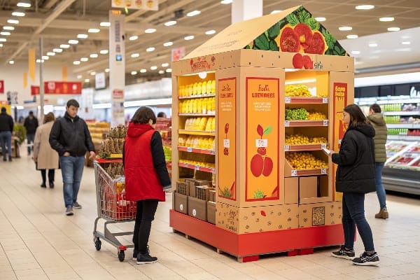
Let's get real about why brands actually buy these things and how we build them. When we talk about what POP stands for in a manufacturing context, we are talking about Visual Disruption coupled with Structural Integrity. I often see a massive disconnect between the "Marketing Dream" and the "Factory Reality." A client will send me a beautiful artwork file from a high-end agency, featuring a standard, flat bookshelf design. I have to push back immediately because if your display blends in with the store fixtures, it fails its primary purpose. To truly disrupt the visual monotony of a cluttered retail aisle, we need to leverage the unique properties of corrugated cardboard—specifically its ability to form "Curvy" die-cut shapes and 3D headers that metal fixtures simply cannot replicate cost-effectively. A curved silhouette grabs the human eye three times faster than a square box, creating a "frame" that isolates your product from the competition.
However, achieving this visual impact brings a messy physical constraint that drives me crazy: the "Soggy Bottom2" effect. You can have the best definition of POP in the world, but if the physical stand absorbs water from a supermarket mop, that definition becomes "trash." In the US market, floor cleaning is aggressive, and I have seen thousands of dollars of inventory ruined because a designer ignored moisture risks. That is why we now apply a biodegradable water-resistant coating to the bottom 2 inches (5 cm) of every floor display as a non-negotiable standard. Furthermore, we strictly use High-Grade Virgin Kraft Liner3 for all structural components. Unlike recycled testliner, which has short fibers that snap under tension, virgin fibers provide the tensile strength needed to withstand the "50-Touch Rule." If a customer interacts with your display and it feels flimsy, they subconsciously assume the product inside is cheap. We engineer these units not just to hold products, but to survive the hostile environment of a retail floor while maintaining a premium look.
| Feature | Standard Shelf | POP Display |
|---|---|---|
| Visual Isolation | Low (Lost in the clutter) | High (360-degree visibility) |
| Material | Metal / Wood | Corrugated Cardboard (B/EB Flute) |
| Shopper Engagement | Passive Search | Active Interruption |
| Lifespan | Permanent (Years) | Temporary (4-12 Weeks) |
| Moisture Risk | Low | High (Requires Mop Guards) |
I refuse to ship a display that hasn't passed our internal stress tests because I know that once it leaves my dock, it has to fight for attention and survival. If the structure holds up, the sales will follow.
What do the letters pop stand for?
Ideally, these three letters translate directly into a measurable sales spike. But achieving that requires precise ergonomic engineering, not just pretty colors.
The letters pop stand for Point of Purchase (POP), emphasizing the critical zone where marketing materials convert browsers into buyers. This acronym specifically highlights the "Purchase" moment, distinguishing these displays from general advertising by placing them within arm's reach of the product and the payment counter to drive immediate revenue.

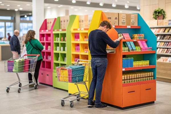
The Ergonomics of the "Strike Zone"
When we dig into what the letters P-O-P really stand for on the production line, we are talking about "Eye-Level Buy Level4" physics. It is not enough to simply place a unit on the floor; you have to engineer it to hit the biological "Strike Zone" of the average shopper. Marketing managers often obsess over the size of the logo on the header card, inadvertently pushing the actual product shelf down to the ankles or up too high. I have to stop production frequently to explain that the average American female shopper is roughly 5'4" (163 cm). If you place your high-margin "Hero Product" outside of the 50 to 54-inch (127–137 cm) window, you are practically hiding it. I recall a specific project for a toy brand where they insisted on a massive header that forced the product shelf below 30 inches. The sales data was terrible because adults didn't want to crouch, and kids couldn't reach the top items. Now, we use ArtiosCAD5 to simulate the shopper's approach angle before we cut a single sheet to ensure the product is the first thing they see.
Beyond height, we must address the "Chin-Up" visibility issue. On lower shelves, products naturally face the customer's knees, which kills label readability. To fix this, we engineer a 15-degree upward tilt into the bottom two shelves. It sounds like a minor tweak, but structurally, it is a pain to manufacture because angled shelves are harder to glue than flat ones. However, this tilt forces the product to "look up" at the customer, increasing label readability by 100% for someone standing 3 feet away. We also have to be ruthless about "Lip Height6." Inexperienced designers often make the front tray lip 3 inches tall to fit a logo, effectively hiding 30% of the product. I enforce a strict "Product First" rule: the lip must be under 1.5 inches, or we use a clear PVC window. We engineer laziness into the design so that buying feels automatic and effortless for the consumer.
| Ergonomic Factor | Common Mistake | My Factory Standard |
|---|---|---|
| Shelf Height | Too high or too low | Strike Zone: 50–54 inches (127–137 cm) |
| Lip Height | Blocking product (3"+) | Max Visibility: < 1.5 inches (3.8 cm) or Clear Window |
| Shelf Angle | Flat (90 degrees) | Chin-Up: 15-degree upward tilt on lower shelves |
| Reach Range | Ignoring ADA limits | ADA Compliant: 15–48 inches (38–122 cm) |
Calculators don't lie. I tell clients to ignore the unit cost and look at the ergonomics. If the customer has to work to see your product, they won't buy it. We engineer laziness into the design so buying feels automatic.
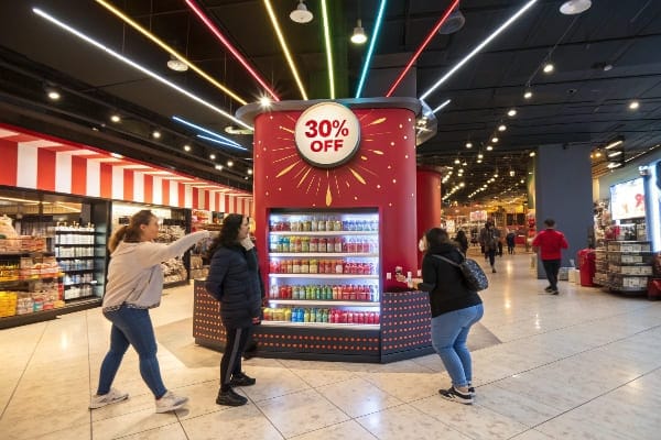
What does pop 30% mean?
This number often appears in creative briefs, but from a manufacturing standpoint, it represents a significant design constraint regarding longevity.
Pop 30% typically refers to a specific promotional campaign offering a 30 percent price reduction at the Point of Purchase (POP) to drive immediate sales volume. This tactic utilizes high-visibility signage to trigger psychological impulse buying, often requiring displays with bold, distinct call-out graphics to communicate the savings effectively.
The "Fixed Ink" Trap vs. Future-Proofing
When a client tells me, "Harvey, this is a POP 30% campaign," I immediately get nervous because they usually want to print "30% OFF" directly onto the main header card of the display. This is a classic "Fixed Ink" trap. Printing the discount percentage permanently on the structural cardboard locks you into a corner. I have seen retailers forced to trash thousands of dollars of perfectly good displays because the "30% OFF" sale ended, or worse, the sales were slow and they needed to boost the discount to 50%, but the number 30 was glued to the unit. To solve this, I refuse to print discounts on the main body. Instead, we design Double-Wall Interchangeable Headers7 or integrate standard 1.25-inch (3.1 cm) Price Channels compatible with Costco and Walmart standards. This allows store staff to swap out the "30%" sign for a "New Arrival" sign without killing the display, effectively future-proofing your investment.
Furthermore, when dealing with "POP 30%," we must also discuss the "Curl Factor." If you use a single sheet of cardboard for these high-stakes discount signs, humidity will cause them to curl up like a dying leaf within days, making your premium brand look cheap. I mandate a Folded Double-Wall structure for all header cards. The tension created by the fold forces the card to stay rigid and straight, even in humid environments like Florida. Beyond the signage, we also have to consider the "Empty Shelf" psychology. A 30% discount drives velocity, which is great, but an empty display looks abandoned. We often install Gravity Feed8 systems or "False Bottoms9" to keep products pushed to the front, ensuring the display always looks full and abundant, even as inventory sells down.
| Campaign Element | The Manufacturing Risk | My Factory Solution |
|---|---|---|
| Printing "30% OFF" | Display becomes trash when sale ends | Interchangeable Header System |
| Price Updates | Store staff using scotch tape (ugly) | Integrated 1.25" (3 cm) Price Channels |
| Signage Quality | Single sheets curl in humidity | Double-Wall Folded Headers (Rigid) |
| Sale Velocity | Product sells out, display looks empty | Gravity Feed or False Bottoms to look full |
A discount brings them in, but a broken sign drives them away. I engineer the display so you can change the deal without changing the fixture.
What does the acronym POPs stand for?
Sometimes an extra "s" changes everything. In the logistics world, pluralizing this term introduces a layer of complexity regarding color consistency and assembly.
The acronym POPs stands for Point of Purchase (POP) materials or displays, representing the collective inventory of marketing fixtures used in a retail environment. These fixtures encompass floor stands, counter trays, and signage designed to enhance brand visibility and product accessibility across various store formats.

The "Plural" Problem: Consistency & Hidden Compliance
When you order "POPs" (plural), you are rarely ordering just one type of unit. You are likely launching a campaign with 500 Floor Displays, 2,000 Counter Units (PDQs), and 5,000 Hang Tags. The hidden nightmare here is Color Consistency10. These different formats are often printed on completely different machines—large Floor Displays on a massive Heidelberg Litho press, smaller Counter Units on a smaller press, and Hang Tags potentially on a digital printer. Without strict controls, your "Coca-Cola Red" will look orange on the floor display and purple on the counter unit. I enforce a strict G7 Master Color Calibration11 across my factory, using the same CMYK profile for all machines and physically checking proofs under 5000K lighting. This ensures that your entire family of "POPs" looks consistent, regardless of which machine printed them.
However, there is a critical second meaning to "POPs" that you must be aware of as a global buyer: Persistent Organic Pollutants. While the general definition refers to displays, in the manufacturing compliance world, this acronym represents a legal landmine. Many jurisdictions are now strictly banning "forever chemicals" (like PFAS) in food packaging and recyclable paper products. In the past, factories used toxic coatings to make displays water-resistant or shiny. If your "POPs" (displays) contain "POPs" (pollutants), you face lawsuits and recalls. I had to overhaul my entire supply chain to source Certified PFAS-Free12 water-based varnishes. It costs more, but it protects you from liability. Finally, we tackle the "Spare Parts" issue. When shipping thousands of units, store staff will inevitably lose the plastic assembly clips. I implemented the "Red Bag Protocol13," taping a bright red bag with 5% spare hardware to every instruction sheet. It costs pennies, but it saves the campaign from being trashed due to a single missing screw.
| "POPs" Aspect | The Hidden Issue | The Expert Fix |
|---|---|---|
| Visual Consistency | Mismatched colors across formats | G7 Master Calibration (Unified Color) |
| Alternative Meaning | POPs (Pollutants/PFAS) in coating | PFAS-Free Water-Based Varnish |
| Assembly Parts | Lost hardware = Trashed display | Red Bag Protocol (5% Spares) |
| Shipping | Different formats mixed in container | Kitting & Co-Packing Services |
Whether you define it as "Displays" or "Pollutants," ignoring the details of POPs will cost you. I make sure your displays match visually and comply legally.
Conclusion
Understanding what POP means is the difference between a warehouse full of unsold inventory and a successful retail launch. Whether it's managing a 30% discount campaign without ruining the display, ensuring PFAS-free compliance for your POPs, or engineering a structure that survives the Strike Zone, the details matter.
If you are tired of guessing if your display will survive the journey or the mop, let's test it for real. Would you like me to send you a Free Structural 3D Rendering or a physical White Sample to prove our quality before you commit?
Understanding Visual Disruption can enhance your marketing strategies and improve brand visibility. ↩
Learn about the Soggy Bottom effect to avoid costly mistakes in display design and ensure product integrity. ↩
Discover why Virgin Kraft Liner is essential for durability and quality in retail displays. ↩
Understanding this concept can significantly enhance product visibility and sales in retail environments. ↩
Explore how this software can optimize product placement and shopper engagement in retail settings. ↩
Discover how managing Lip Height can prevent product obstruction and enhance visibility for consumers. ↩
Explore how Double-Wall Interchangeable Headers can enhance your display strategy and save costs. ↩
Discover the advantages of Gravity Feed systems for keeping your displays looking full and appealing. ↩
Find out how False Bottoms can optimize your product presentation and improve sales. ↩
Understanding Color Consistency is crucial for maintaining brand integrity across various printed materials. ↩
Explore G7 Master Color Calibration to learn how it ensures color accuracy across different printing processes. ↩
Discover the importance of Certified PFAS-Free products in ensuring safety and compliance in manufacturing. ↩
Learn about the Red Bag Protocol and how it can prevent costly errors in assembly and shipping. ↩


