Getting your brand colors wrong on a product display can ruin a product launch. It creates confusion in the aisle and makes even high-quality packaging look cheap or counterfeit to the consumer.
Color matching accuracy depends on lighting conditions, the texture of the substrate, the quality of the pigments, and human perception. In the printing industry, it requires precise calibration between the digital design file (CMYK) and the physical ink output to ensure the final result matches the approved standard.
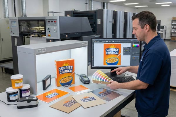
Let's break down exactly why what you see on a computer screen is rarely what you get on a finished cardboard display.
What is color matching accuracy?
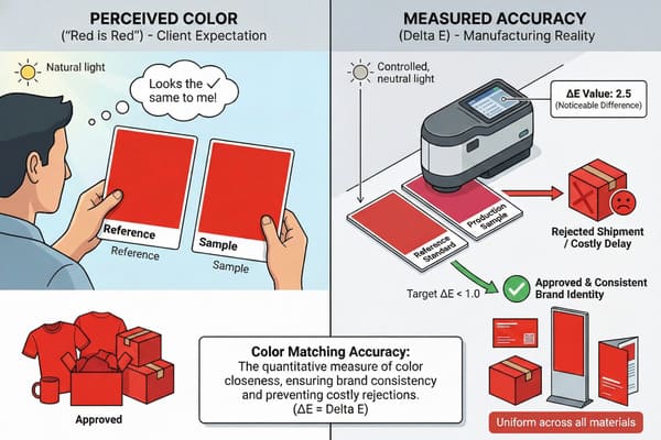
Many clients think "red is red," but in manufacturing, slight deviations can look like major errors. This often leads to rejected shipments and costly delays for retail campaigns.
Color matching accuracy is the quantitative measure of how close a produced color is to a reference standard, usually measured using Delta E (ΔE). It ensures consistency across different print runs and materials, guaranteeing that your brand identity remains uniform whether on a business card or a floor display.
The Science of Delta E in Printing
To understand color matching, we have to look beyond what our eyes tell us and look at the data. In my factory, we do not rely on "eyeballing" a print proof because everyone sees color slightly differently. Instead, we use a metric called Delta E (dE)1. This is a mathematical calculation that measures the distance between two colors in a 3D color space. If the dE is under 1.0, the difference is generally invisible to the human eye. If it is between 2.0 and 3.0, a trained eye might spot a difference. Once it goes above 5.0, even a regular shopper will notice that the colors do not match.
The challenge in the cardboard display industry is that we are often moving between two completely different color modes. Your design team works in RGB (Red, Green, Blue) on a backlit computer monitor, which creates color using light. We print using CMYK (Cyan, Magenta, Yellow, Black)2 inks, which create color by reflecting light. This conversion is where accuracy often takes the first hit. Furthermore, accuracy is not just about the ink; it is about the machine calibration. If the pressure on the print rollers changes or if the humidity in the factory shifts, the way the ink lays down changes, altering the dE value. For a brand like Barnett Outdoors, where the hunter orange needs to be consistent across thousands of units, staying within a strict dE tolerance is non-negotiable.
| Delta E Value3 | Human Perception Level4 | Acceptability in Packaging |
|---|---|---|
| 0 – 1.0 | Not perceptible | Perfect match (Ideal) |
| 1.0 – 2.0 | Barely perceptible | High quality standard |
| 2.0 – 10.0 | Perceptible at a glance | Acceptable for low-cost items |
| 11.0 – 49.0 | Colors are more similar than opposite | Rejected (Quality Control Failure) |
| 100 | Colors are exact opposites | Total mismatch |
I know how frustrating it is when a sample arrives looking wrong. That is why I invested in X-Rite color management systems for my production lines to keep Delta E under 3.0 for every batch.
What factors affect the accuracy of how a person sees color?
You might approve a sample in your office, but it looks completely different in a retail store. Lighting conditions play a huge trick on our eyes and can cause disagreements on quality.
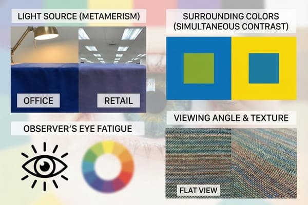
The primary factors affecting human color perception are the light source (metamerism), the observer's eye fatigue, and the surrounding colors (simultaneous contrast). Even the angle of viewing and the texture of the material can significantly shift how a color appears to the human eye.
Environmental and Biological Variables
When we discuss color accuracy, we cannot ignore the environment where the viewing takes place. The most common issue we face is a phenomenon called Metamerism5. This occurs when two colors appear to match under one light source (like the daylight in your office) but look completely different under another (like the cool white fluorescent lights in a Walmart or Costco). Retailers use very specific lighting temperatures, usually around 4000K to 5000K. If we match your display to look good in natural sunlight, it might look muddy or green when it hits the retail floor.
Another critical factor is the background context, known as simultaneous contrast6. A deep red logo will look different if it is printed on a white background versus a black background. The surrounding colors trick the brain into perceiving the tone differently. Additionally, the physical texture of the material affects perception. Cardboard is not perfectly flat; it has corrugation flutes. These tiny ridges create microscopic shadows across the print surface. These shadows absorb light, generally making colors on cardboard appear slightly darker and less saturated than they would on a glossy magazine page. For clients who are used to seeing their brand on smooth plastic or metal, the transition to corrugated cardboard requires an adjustment in expectations regarding vibrancy and brightness.
| Variable | Effect on Color Perception | Real-World Example |
|---|---|---|
| Metamerism7 | Colors shift under different lights | Matches in office, mismatches in store |
| Texture8 | Rough surfaces darken colors | Cardboard looks duller than glossy paper |
| Viewing Angle | Colors shift based on eye position | Iridescent effects or glare blocking ink |
| Background | Surrounding colors alter perception | Red looks brighter on black than on white |
We use standardized D65 light boxes in our QC lab to simulate different retail environments. I always advise my clients to check their physical samples under the actual lighting conditions of the target store to avoid surprises.
Why is my color match paint not matching?
It is baffling when you buy a "match" but it looks off once applied to the material. This happens often with spot colors on porous materials like cardboard.
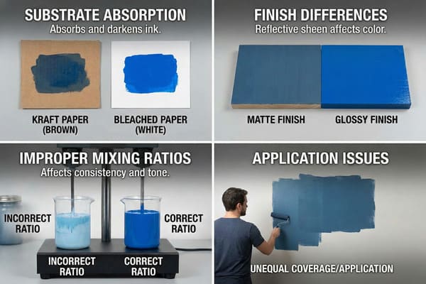
Paint or ink fails to match often because of substrate absorption, finish differences (matte vs. glossy), or improper mixing ratios. On cardboard displays, the natural brown kraft paper base can muddy the ink color, unlike printing on pure white bleached paper.
Substrate Interference and Chemical Composition
The question of why a color match fails almost always leads back to the substrate—the material you are printing or painting on. In the cardboard display industry, we deal with two main types of paper: Kraft (brown) and Bleached (white)9. Standard ink is translucent, not opaque like house paint. If you print a bright yellow logo onto brown Kraft cardboard, the brown shows through the yellow ink, turning it into a dirty ochre color. To get an accurate match, we must use a high-quality white top sheet, often referred to as CCNB (Clay Coated News Back). Even then, different mills produce "white" paper with different brightness levels. Some are blue-white, while others are yellow-white, which directly impacts the final hue of the ink.
Beyond the paper itself, the chemical finish applied after printing changes the color game entirely. A glossy lamination will make colors appear deeper, richer, and more vibrant because it reflects light directly back to the eye. Conversely, a matte lamination diffuses the light, making the same ink look softer and lighter. I have seen many production runs run into trouble because the client approved an unlaminated proof, but the final production required a matte film for durability. The addition of that film shifted the color just enough to be noticeable. Furthermore, the drying process affects color. Wet ink looks different than dry ink. This is called "dry-back10," and skilled press operators must account for this shift when they are adjusting the ink keys on the press.
| Factor | Impact on Ink/Paint Color | Solution |
|---|---|---|
| Brown Kraft Base11 | Darkens and muddies colors | Use white base or opaque white underprint |
| Paper Absorbency12 | Ink spreads (dot gain), darkening images | Use higher quality coated paper (CCNB) |
| Gloss Finish | Increases saturation and contrast | Account for this during the proofing stage |
| Matte Finish | Lowers contrast, lightens colors | Increase saturation in the design file |
I solved this by standardizing our white base material for high-end displays. We also run a "wet proof" before mass production so you can see exactly how the ink dries on the specific paper we will use.
What is the hardest paint color to match?
Some colors are notoriously difficult to reproduce consistently across different materials. These usually cause the most headaches during the approval process for brand managers.
Bright neons, metallics, and certain shades of orange and reflex blue are the hardest colors to match. These colors often fall outside the standard CMYK gamut, meaning standard four-color printing cannot reproduce them accurately without expensive spot inks.
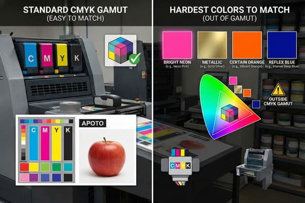
The Limitations of the CMYK Color Gamut
When we talk about "hard" colors, we are usually talking about colors that exist outside the CMYK gamut13. Standard printing mixes Cyan, Magenta, Yellow, and Black dots to create images. However, this spectrum is much smaller than the spectrum of light (RGB) or the spectrum of the human eye. The most difficult colors to hit are bright, clean oranges and vibrant greens. In CMYK, orange is made by mixing magenta and yellow. Often, this results in a color that looks more like rust or pumpkin than a bright neon safety orange. If your brand relies on a "high-vis" orange—common in the hunting industry—CMYK will almost always disappoint you because the chemistry of the ink simply cannot reach that level of brightness.
Another nightmare for printers is "Reflex Blue14." This is a deep, indigo-purple blue. Not only is it hard to color match visually because it shifts between purple and blue depending on the light, but it is also chemically difficult. The pigment in Reflex Blue is slow-drying and highly porous. It tends to smear easily and can "gas out" or fade quickly if not coated properly. Pastels are also deceptive; slight fluctuations in the ink levels on the press are very obvious in light colors. A 3% increase in Cyan in a dark blue image is invisible, but a 3% increase in Cyan in a pale cream background will turn the whole display green.
| Color Type | Why It Is Difficult | Common Defect |
|---|---|---|
| Bright Orange15 | Outside CMYK gamut | Looks muddy or rusty |
| Reflex Blue | Slow drying, chemical instability | Smearing, Scuffing, Purple shift |
| Metallics16 | Requires reflective pigments | Looks like flat gray without special ink |
| Pastels | Low ink coverage | Inconsistent color, "banding" |
We use special spot inks (Pantone) for these difficult brand colors instead of relying on CMYK mixes. I personally review the print plates for any reflex blue usage to ensure we add enough drying time to prevent smudging.
Conclusion
Color accuracy is not just about ink; it is about controlling the variables of light, material, and chemistry. By understanding these limits, we can better manage expectations and ensure your displays look professional in every store.
Understanding Delta E is crucial for achieving accurate color matching in printing, ensuring consistency and quality in your projects. ↩
Exploring the CMYK color model will enhance your knowledge of how colors are created in print, vital for any design or printing professional. ↩
Understanding Delta E Value is crucial for ensuring color accuracy in various applications, especially in packaging. ↩
Exploring Human Perception Level helps in grasping how color differences are perceived, vital for quality control in design. ↩
Understanding Metamerism is crucial for anyone involved in color matching, as it affects how colors appear under different lighting. ↩
Exploring simultaneous contrast can enhance your knowledge of color perception, vital for design and branding. ↩
Understanding metamerism can enhance your knowledge of how colors can appear differently under various lighting conditions. ↩
Exploring the relationship between texture and color can provide insights into design choices and visual aesthetics. ↩
Understanding the differences in paper types can help you choose the right substrate for your printing needs. ↩
Learning about dry-back will enhance your knowledge of color accuracy in printing processes. ↩
Understanding the effects of Brown Kraft Base can help you choose the right base for vibrant colors. ↩
Exploring this topic will guide you in selecting the best paper for your printing needs. ↩
Understanding the limitations of the CMYK gamut can help you make informed decisions about color choices in printing. ↩
Exploring the challenges of printing Reflex Blue can enhance your knowledge of color management in design and printing. ↩
Explore the complexities of printing with Bright Orange and how to achieve vibrant results. ↩
Learn about the unique properties of metallic inks and their impact on print aesthetics. ↩


