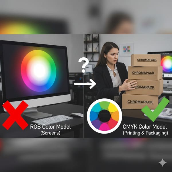
Have you ever designed a vibrant red logo on your screen, only to see it turn into a muddy brown on the printed box? That disappointment comes from physics, not bad luck.
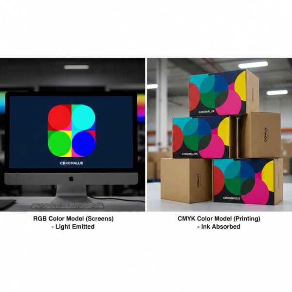
The RGB color model (Red, Green, Blue) is an additive system designed strictly for digital screens that emit light, making it physically impossible to replicate directly in printing. Commercial packaging relies on the CMYK (Cyan, Magenta, Yellow, Key/Black) subtractive model, where physical inks absorb light rather than emit it.
Now, let's look at why your monitor is lying to you about what my machines can actually produce.
Why do printers not use RGB?
It comes down to the fundamental difference between staring at a lightbulb and staring at a piece of paper. One is a light source; the other is a reflection.
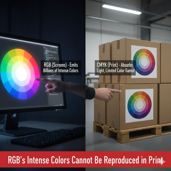
Printers do not use RGB because ink on paper works through subtractive color mixing, whereas RGB relies on additive light mixing. While RGB adds colored light to create white, printing presses layer physical pigments to subtract light from white paper, meaning they cannot physically reproduce high-intensity neon wavelengths (400–700 nm).
The Physics of Light vs. Pigment
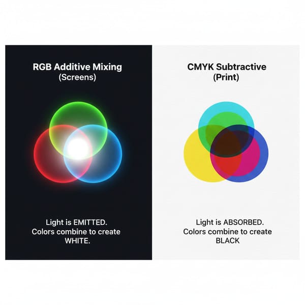
I learned this the hard way during my first year running the factory. A client from California sent us an artwork file for a cosmetic display that featured a glowing "Neon Green" background. On their calibrated 5K Retina display, it looked radioactive. It popped. But when we put that file through our Heidelberg offset press, the result was a dull, swampy forest green. The client was furious, blaming my "cheap Chinese ink." But the problem wasn't the machine; it was the laws of physics. The RGB model creates color by projecting light directly into your eyeball. If you mix Red, Green, and Blue light together at full intensity, you get pure White light. It is an Additive1 process. Your screen is essentially a flashlight pointing at you, capable of generating intense luminosities that physical objects cannot match.
Printing is the exact opposite; it is Subtractive2. We start with a white substrate (the paper). When we lay down Cyan ink, we are covering up the white paper and "subtracting" the red light that reflects back to your eye. The paper itself is the light source (by reflection). If we mix Cyan, Magenta, and Yellow together, we don't get white light—we get a dark, muddy brown (or imperfect black). Because we are relying on reflected ambient light rather than generating our own light source, physical ink simply cannot reach the high saturation levels of an LED pixel. Furthermore, the material matters. Printing on Clay Coated News Back (CCNB)3 or recycled cardboard absorbs more ink than glossy magazine paper, further dulling the color. We use the G7 Master4 calibration method in my factory to get as close as possible, but we can't break the laws of physics. If you want neon, you need fluorescent spot ink, not RGB pixels.
| Feature | RGB (Red, Green, Blue) | CMYK (Cyan, Magenta, Yellow, Key) |
|---|---|---|
| Physics | Additive (Emits Light) | Subtractive (Reflects Light) |
| Medium | Monitors, Phones, Cameras | Paper, Cardboard, Vinyl |
| Base Color | Black (Screen is dark without light) | White (Paper is bright without ink) |
| Mixing Result | R+G+B = White | C+M+Y = Dark Brown/Black |
| Color Gamut | Wide (16+ million colors) | Narrow (Limited by ink chemistry) |
My advice is simple. If you are designing for a screen, think in light. If you are designing for my factory floor, think in ink. Don't force a square peg into a round hole.
Is RGB the color model for printing?
Designers often ask if they can just "leave it in RGB" and let us handle it. The short answer is no, unless you want a massive production surprise.
No, RGB is not the color model for printing because commercial presses require artwork separation into four distinct physical channels. To produce a cardboard display, digital files must be converted into Cyan, Magenta, Yellow, and Black (CMYK) percentages so that offset lithography plates can accurately layer the ink on the substrate.

The "MacBook Trap" and The Conversion Disaster
I call this the "MacBook Trap." Marketing managers approve designs on bright, backlit screens in a dark room. It looks beautiful. Then they send that RGB JPG file to us. Here is the messy reality of what happens next on the shop floor if we don't catch it. Our RIP (Raster Image Processor)5 software has to forcefully convert that RGB data into CMYK percentages to burn the aluminum printing plates. This conversion is mathematical, not artistic. The software looks at that "Electric Blue" (R:0 G:0 B:255) and realizes it doesn't exist in the ink world. So, it crushes the color down to the nearest available match, which is usually a flat, purple-ish blue (C:100 M:80 Y:0 K:0). The vibrancy dies instantly.
I see this happen constantly with "Digital Printing6" samples versus "Litho" production. Some factories use digital printers for prototypes which have a wider gamut (often 6 or 8 colors), so the sample looks okay. But then we switch to High-Fidelity Litho (Offset) Printing7 for the mass run of 5,000 units. Litho relies strictly on 4 plates. If the conversion wasn't handled manually by a prepress expert, the mass production looks dead compared to the sample. Also, consider the text. In RGB, black text is R:0 G:0 B:0. When converted automatically by the software, this typically becomes "Rich Black" (e.g., C:70 M:60 Y:50 K:100). This means the machine has to align four different plates perfectly to print one tiny letter. If my press shifts even 0.004 inches (0.1 mm) due to vibration during the run, that text will look blurry and have colored halos (ghosting). We call this "Registration Drift8." I always force black text to be 100% K (Black) only, but RGB files hide this danger until it's too late.
| Process Step | RGB Workflow (Wrong) | CMYK Workflow (Right) |
|---|---|---|
| File Creation | Design in Photoshop (Web mode) | Design in Illustrator/InDesign (Print mode) |
| RIP Conversion | Software guesses the color (Shift happens) | Values are locked (e.g., C:100 M:0 Y:0 K:0) |
| Black Text | Becomes 4-color "Rich Black" (Blurry) | Becomes 100% K (Crisp) |
| Final Result | Unpredictable, usually duller | Consistent, accurate to proof |
I tell my clients: "I treat your 100-unit trial like a 10,000-unit rollout." That means we don't rely on auto-converters. We fix the plates manually to ensure your text is sharp and your blue is actually blue.
What are the limitations of the RGB color model?
RGB is amazing for Instagram, but it fails miserably when you need brand consistency on a supermarket shelf. It sells a fantasy that physics cannot deliver.
The limitations of the RGB color model include its inability to define metallic textures and a gamut that far exceeds the chemical capabilities of standard ink. This leads to significant "Out of Gamut" warnings and unpredictable color shifts (Delta-E errors) when files are rasterized for production on physical substrates.
The "Invisible" Colors and The Texture Problem
The biggest limitation of RGB is that it sells a fantasy. It can display saturated neons—like the bright green of a Monster Energy drink can—that standard ink just can't hit. If your brand relies on those colors, RGB is setting you up for failure. But there is another limitation that drives me crazy: Textures. In RGB (on a screen), "Silver" is just a simulation made of gray pixels. It looks flat. A client once specified Pantone 877C (Silver)9 for their logo but sent the file in RGB. On screen, it looked like a gray gradient. They expected it to shine like foil. In reality, standard CMYK ink on cardboard (especially Kraft) absorbs into the fiber. If we just print the gray values from the RGB file, it looks like dirty newsprint. To get real silver, we have to bypass the process colors entirely and use a specific spot ink or Cold Foil10 stamping. RGB cannot communicate this data. It just says "Gray."
Also, think about the "Black." In RGB, black is the absence of light (screen off). In printing, if you use 100% of all CMYK inks to try and make a deep black (mimicking the RGB black), you oversaturate the paper. We call this "Total Ink Limit11" (TIL). If the TIL goes over 300% coverage, the ink won't dry before the sheet hits the stacker. It smears all over the machines and creates "offsetting" (ink rubbing onto the back of the next sheet). I've had to scrap 500 sheets because a designer's "Ultra Black" RGB background translated to 380% ink coverage and turned the stack into a sticky brick. It was a $2,000 mistake caused by a color model that doesn't understand liquid chemistry.
| Limitation | Effect on Screen (RGB) | Reality on Cardboard (CMYK) |
|---|---|---|
| Neon Colors | Bright, glowing | Dull, flat, washed out |
| Metallic Colors | Simulated gradients | Must use Spot Ink or Foil (can't be printed via CMYK) |
| Deep Black | Perfect darkness | Risk of smearing / drying issues (Sticky Brick) |
| White | Light emitted | The color of the paper (no white ink in standard CMYK) |
If you want silver, tell me. Don't just color it gray in your RGB file. I can't print a pixel; I have to print chemistry.
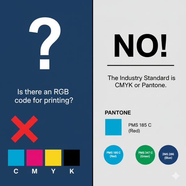
What is the RGB color for printing?
This is a trick question. There is no RGB color for printing. But there is a strict process we use to bridge the gap between screen and reality.
There is no RGB color for printing, as monitors and presses speak different languages. Instead, the industry uses the Pantone Matching System (PMS) or standardized ICC profiles (like GRACoL 2013) to map digital RGB values to the closest achievable physical ink formulation, ensuring color consistency across different substrates.
The Bridge: Pantone and The "Golden Sample"
Since we can't use RGB, we need a common language. That language is the Pantone Matching System (PMS)12. When a major US retailer like Target or Walmart orders a display, they don't say "Make it red." They say "PMS 186C." This gives us a specific chemical recipe for the ink. Even if your computer screen shows the red wrong, the ink mix is scientifically accurate. We use a Spectrophotometer13 (specifically the X-Rite eXact) to measure this. It's a device that checks the color value against a digital standard. We look for a "Delta-E" (the distance between two colors). Most commercial printing accepts a Delta-E of 3.0. For my high-end cosmetic clients, I force my team to hit a Delta-E of under 2.0.
Here is my protocol to fix the RGB mess: First, we use the "Empty Canvas" Dieline Template (Insight #16) to ensure fit. Then, we run a "Pre-Flight" check using Enfocus PitStop Pro. If it detects RGB images, we stop immediately. We convert the file to CMYK using the GRACoL 2013 (G7) profile, which is specifically designed to account for the "dot gain" (how much the ink spreads) on corrugated board. Finally, and most importantly, we create the Golden Sample. Before we run the massive 10,000-unit order, I produce one perfect unit. I sign it. My QC manager puts it on the line. Every hour, we pull a box off the line and compare it to the Golden Sample. If the color drifts even slightly, we stop the press. This is the only way to sleep at night. Relying on an RGB monitor is gambling. Relying on a Golden Sample is engineering.
| Tool | Purpose | My Factory Standard |
|---|---|---|
| Spectrophotometer | Measures exact color value | X-Rite eXact |
| Target Profile | Defines how ink sits on paper | GRACoL 2013 (G7) |
| Tolerance | Acceptable color deviation | Delta-E < 2.0 |
| Spot Colors | For logos that must be perfect | Pantone (PMS) Solid Coated |
I don't guess. I measure. That is how we keep the "Coke Red" looking like Coke Red, even on a brown box.
Conclusion
The gap between what you see on a screen and what comes off the press is the most dangerous part of packaging design. RGB is for light; CMYK is for ink.
If you are worried about your brand colors looking muddy or dull on cardboard, let me help you visualize the reality before we print. Would you like me to create a Free Structural 3D Rendering or send you a Physical White Sample to test your design?
Understanding the Additive color model is crucial for grasping how light interacts with our perception of color. ↩
Exploring the Subtractive color model will help you understand the limitations and processes involved in traditional printing. ↩
Discovering the properties of CCNB will provide insights into how different materials affect print quality and color. ↩
Learning about the G7 Master calibration method can enhance your knowledge of achieving color accuracy in print production. ↩
Understanding RIP software is crucial for ensuring accurate color conversion in printing processes. ↩
This resource will clarify the distinctions between Digital and Litho printing, helping you choose the right method. ↩
Explore this link to learn about the advantages of High-Fidelity Litho printing for high-quality production. ↩
Discover the factors that lead to Registration Drift and how to prevent it for better print quality. ↩
Explore this link to understand the significance of Pantone 877C in achieving true metallic effects in print. ↩
Discover how Cold Foil stamping can enhance your print projects with metallic finishes. ↩
Learn about Total Ink Limit to avoid costly printing mistakes and ensure high-quality results. ↩
Understanding PMS is crucial for accurate color matching in printing, ensuring your designs look exactly as intended. ↩
Exploring how spectrophotometers function can enhance your knowledge of color accuracy and quality control in printing. ↩


