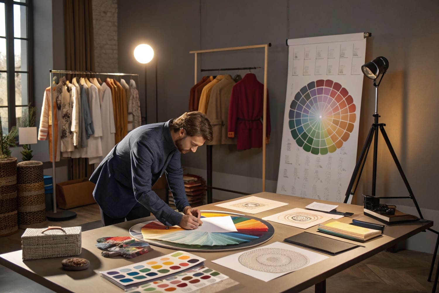
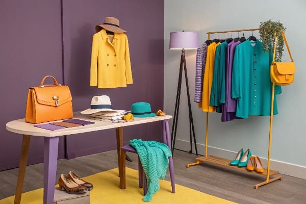
I see shoppers walk past smart products every day. The problem is weak color choices. I use a simple color wheel plan to stop scrolls, slow feet, and spark buys.
A retail color wheel is a practical map of hues, tints, and contrasts that guides display decisions so products pop, messages stay clear, and shopper attention moves by design, not by luck.
I keep readers with one promise. You will leave with a step-by-step way to plan colors that sell. I will show rules, not vague tips. I will also share factory notes from real POP jobs.
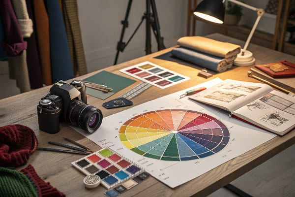
What is the color wheel in visual merchandising?
Many displays look loud but feel flat. I felt that pain on my first Costco PDQ years ago. The fix was a clean color map tied to shopper flow.
In visual merchandising, the color wheel is a tool that organizes hues to plan contrast, harmony, and focal points on displays so the eye lands on the hero, reads copy fast, and moves to the product.
How I use it on cardboard displays
I start with the hero product and one job. Do I need attention, trust, or speed? I pick a base hue for brand fit, then a high-contrast accent for calls to action. I keep the background quiet. I place warm colors at eye level to pull. I use cool fields to rest. I block color by zones: headline, price, claim, and product. This keeps scan paths simple. On Floor POP (a big share of POP volume), high contrast1 works best. On countertop pieces near checkout, soft analogs feel less pushy. I lock Pantone and Lab* values in the dieline, because retail lights shift perception2.
Quick reference table
| Display Zone | Wheel Choice | Why it works | Notes |
|---|---|---|---|
| Header | Complementary3 | Fast grab | Limit to 2 tones |
| Price/CTA | Triadic accent4 | High urgency | Red/Orange often win |
| Product bed | Analogous | Calm focus | Keep texture matte |
| Side panels | Neutral + logo hue | Brand memory | Add QR or AR mark |
What is the color theory in retail?
I once shipped a beauty launch with perfect print but weak sell-through. The colors were pretty, not purposeful. Retail color theory fixed that.
Retail color theory links hues to shopper behavior: warm hues create urgency, cool hues build trust, high contrast drives notice, and balanced neutrals frame products. I choose schemes that match category goals and store lighting.
Behavior and category fit
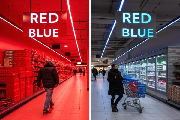
I map colors to actions. Red and orange can push speed and promo clicks. Blue and navy can say stable and safe, which helps tech and pharmacy. Green can signal natural and sustainable, which fits FMCG and eco claims. Black and charcoal can say premium and power, which suits luxury gift sets or pro tools. I also test under warm and cool LEDs. Cardboard prints shift under 3000K vs 5000K. I use viewing booths and ΔE specs so mass production matches the approved sample. My team builds one 3D render, one white sample for structure, and one color-accurate prototype5 before we run. This seems slow, but it saves a launch window. In North America, where retail is mature, shoppers expect consistency. In APAC, where growth is fast, bold palettes and QR journeys work well, but I still anchor brand hues for recall. I keep copy contrast at WCAG levels6 so seniors can read from six feet.
Color actions cheat sheet
| Color | Shopper cue7 | Good for8 | Watchouts |
|---|---|---|---|
| Red | Urgency | Clearance, limited | Overuse can feel cheap |
| Orange | Friendly push | New drops, seasonal | Can clash with skin tones |
| Yellow | Attention | Entry headers | Low contrast on white |
| Blue | Trust | Tech, pharmacy | Cold if overused |
| Green | Natural | Eco, wellness | Tone must match brand |
| Black | Premium | Pro gear, luxury | Hide dust/scratches |
| White | Clean frame | Beauty, medical | Needs texture for depth |
What are the 7 types of color theory?
Clients often ask for one "magic" scheme. I do not trust magic. I trust seven simple harmonies that cover most retail tasks.
The seven retail color harmonies are: monochromatic, analogous, complementary, split-complementary, triadic, tetradic, neutral-dominant, and warm-cool contrast. I choose one based on category, shopper goal, and in-store lighting.
When I use each harmony
I use monochromatic9 when a brand must feel calm and tight. I use analogous when I want a soft gradient behind product textures. I use complementary10 when I need a strong focal pull to price or a hero claim. I use split-complementary when I need contrast but less tension. I use triadic when I need energy on seasonal displays. I use tetradic when I manage many SKUs and need clear families. I use neutral-dominant when the product should shine more than the structure. I use warm-cool contrast on power aisles to steer flow from hot zones to resting zones. I keep swatch counts low. I keep ink coverage balanced to avoid warp on large panels. I lock inks to digital targets so the factory in Shenzhen and the brand office in the U.S. see the same color.
Harmony picker table
| Harmony | Look | Best use | Example move |
|---|---|---|---|
| Monochromatic11 | Clean, united | Premium care | Navy base, light navy CTA |
| Analogous | Soft, natural | Wellness | Green field, teal accent |
| Complementary12 | Punchy, direct | Price callouts | Blue base, orange price |
| Split-Complementary | Balanced contrast | Tech specs | Blue base, orange + lime pins |
| Triadic | Playful energy | Seasonal | Red, yellow, blue badges |
| Tetradic | Multi-family | SKU sets | Red-green-blue-orange lanes |
| Neutral-Dominant | Product-first | Luxury, tools | Charcoal shell, brand color stripes |
What color is associated with retail?
People say "retail equals red." I hear that a lot. I say it depends on category, chain rules, and buyer mood.
There is no single retail color, but red is most tied to sales and urgency; blue signals trust, green signals natural value, black signals premium, and white frames products cleanly. I choose based on shopper task and brand.
Context makes the call
I sell displays to large buyers with strict timing. One buyer runs hunting gear across the U.S. and Canada. The brand voice is rugged and precise. Pure red can feel off in that aisle. I lean on earth tones13 with high-viz accents. I use olive, charcoal, and kraft textures for fit. I use blaze orange tabs for fast safety cues and price bites. I add matte lamination to cut glare on scope imagery. I keep ΔE under 2.0 across runs. I match Pantone and Lab* in the approval round. I use G7 or similar gray balance so neutrals stay stable under store LEDs. I proof under 3000K and 5000K to avoid complaints about "color shift14." I also plan for shipping stress. I specify coatings that resist scuffs, so the color stays true on arrival. I have three lines, so I hold urgent slots for launches. This keeps color, schedule, and cost in line. The display lands on time, looks right, and sells.
Category-specific picks
| Category | Primary feel | Safer palette | Accent for action |
|---|---|---|---|
| Grocery FMCG15 | Fresh, bright | Greens, yellows | Red/orange price |
| Beauty16 | Clean, soft | Whites, blush | Gold or black |
| Tech | Trust, cool | Blues, grays | Electric cyan |
| Outdoor/Hunting | Rugged, natural | Olive, brown, kraft | Blaze orange |
| Pharmacy | Safe, clear | Blues, white | Green check marks |
Conclusion
Color is a system. I map it, test it, and lock it. Displays then guide eyes, carry messages, and move shoppers to buy.
Exploring this resource will enhance your understanding of how high contrast can improve visibility and engagement in displays. ↩
This link will provide insights into how lighting influences color choices, crucial for effective display design. ↩
Explore how complementary colors can enhance visual appeal and create a striking design. ↩
Learn how triadic color schemes can boost urgency and attract attention in your marketing materials. ↩
Understanding color-accurate prototypes can enhance your design process, ensuring your products meet visual expectations. ↩
Exploring WCAG levels will help you create more accessible content, ensuring it reaches a wider audience, including seniors. ↩
Understanding shopper cues can enhance your marketing strategy and improve customer engagement. ↩
Exploring color psychology can help you choose the right colors to attract your target audience. ↩
Exploring monochromatic schemes can help create a calm and cohesive brand identity, essential for effective marketing. ↩
Understanding complementary colors can enhance your design skills, making your visuals more impactful and engaging. ↩
Discover strategies for developing a cohesive monochromatic color scheme that enhances brand identity. ↩
Explore this link to understand how to effectively use complementary colors for impactful design. ↩
Explore this link to discover how earth tones can enhance your product displays and attract buyers effectively. ↩
Learn about techniques to avoid color shift, ensuring your displays maintain their intended look under various lighting conditions. ↩
Explore this link to discover effective color strategies that can enhance your Grocery FMCG branding and attract more customers. ↩
This resource provides insights into selecting the perfect color palettes for Beauty branding, ensuring a clean and appealing aesthetic. ↩


