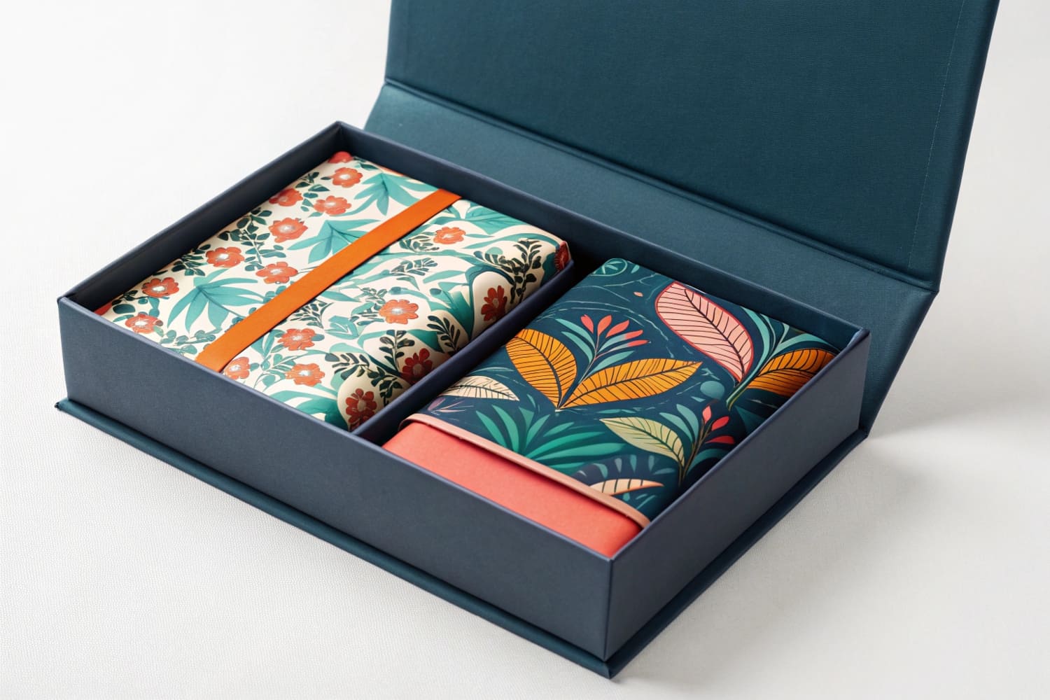
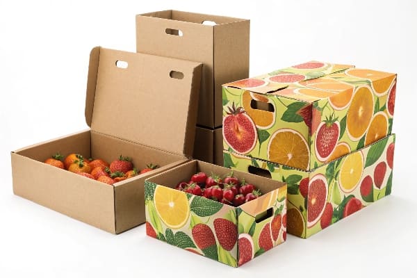
I meet brands that want to print product info on the insert itself. I see why. It looks clean and saves labels.
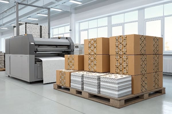
Yes. I can print directly on corrugated or paperboard inserts using flexo, digital inkjet, screen, or litho-lamination, as long as the insert design, flute, and coating match ink and registration needs.
I will explain how direct-print works on inserts. I will also share how I choose between methods, what to avoid, and how to keep color stable on kraft and white boards.
What type of printing is used for packaging?
I see many printing terms online. People mix them up. That makes quotes slow and risky.
Most packaging uses flexographic, offset (litho), digital inkjet, or screen printing; I pick based on volume, color quality, substrate, budget, and speed, then match coatings and die-cuts.
Methods, when I choose them, and why they fit inserts
I use four core methods. I keep the language simple. I tie them to real insert work, not only outer cartons.
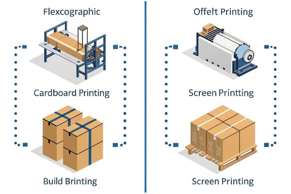
Flexographic (direct-to-board)1. I use it for mid to high volumes. It hits kraft and white-top liners well. I like water-based inks. I accept coarser screens. I plan art with solid areas, bold lines, and limited gradients. I get fast setup after plates. It shines for PDQ trays and simple inserts.
Offset via litho-lamination2 (preprint sheet, then mount). I use it when art needs photo quality, fine text, and tight branding. I print on SBS first. Then I mount to corrugated and die-cut the insert. I lock color with ICC and Pantone bridges. I add AQ or UV varnish. I respect grain to avoid cracking on folds.
Digital inkjet3 (single-pass or multi-pass). I use it for short runs, versions, and fast pilots. I print CMYK, with optional white and spot orange/violet on some lines. I print on coated corrugated and paperboard. I run variable data and QR codes. I move from render to press in hours.
Screen printing4. I use it for heavy laydown, spot whites on kraft, or special inks like metallic or rubberized grip zones. I accept slower speed. I choose it for small insert panels that need tactile pop.
| Method | Best for | MOQ guide | Speed to press | Color quality | Typical cost/unit |
|---|---|---|---|---|---|
| Flexo | Mid–high volume inserts, solids | Medium–High | Medium | Good | Low |
| Litho-lam | Premium art, photo, fine text | High | Slower | Excellent | Medium–High |
| Digital inkjet | Short runs, versions, fast tests | Low | Fast | Very good | Medium |
| Screen | Specialty spot, tactile | Low–Medium | Slow | Spot-ink strong | Medium |
I keep inks water-based or low-VOC where possible. I add primers on uncoated kraft when I need dense color. I proof on the real board, not on mock paper.
What printing method is used on cardboard?
Clients ask this daily. Cardboard means many things. I define it first.
For corrugated cardboard, I mostly use flexo for cost, digital for short runs, and litho-lamination for premium graphics; I choose by flute, liner, and target cost-per-insert.
How flute, liner, and coating decide the press
I start with structure. I check flute (E, B, C, F). Thin flutes like E or F give smoother tops for fine text. Thick flutes like B or C carry weight but show more print mottle on direct flexo. White-top liners hold color better than natural kraft. Kraft looks warm and rugged. I use that for outdoor or hunting brands. I match Barnett-style gear well on kraft plus bold black and red.
I test ink holdout5. Uncoated kraft absorbs. Colors look duller. I add a print primer or switch to a clay-coated liner. I avoid tiny 6pt text on direct kraft. I push it to 8–9pt and increase stroke.
For litho-lam, I print on SBS 200–250 gsm. Then I mount to corrugated. I keep glue windows outside live art. I talk to converting early so registration between print and die-cut lines stays clean.
For digital, I check board thickness and flatness. Some presses accept up to \~10 mm. Others need 3–5 mm. I keep inserts in a single piece if I can. If not, I gang parts and keep barcodes for kitting.
For coatings, I use aqueous for scuff resistance. I use UV for high gloss and strong rub. I avoid plastic film lamination unless the client accepts recyclability trade-offs. I can move to bio-based coatings6 if needed.
Can you print onto cardboard?
Many buyers think labels are the only way. They worry about cracking and color shift.
Yes. I can print directly onto corrugated and paperboard; I control ink, primer, board, and die-lines to prevent cracking, feathering, and color drift on folds and cut edges.
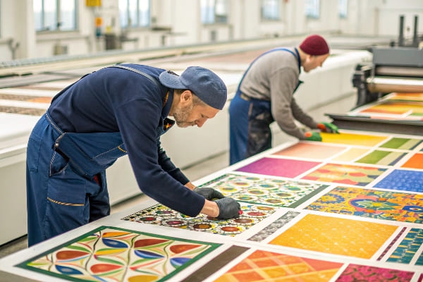
Rules I follow so printed inserts look clean and pass tests
I scale fonts, strokes, and halftones to the method. On flexo, I use 85–110 lpi screens. On litho, I use 150–175 lpi. On digital, I let the RIP manage dots and linearization, and I lock profiles per board SKU.
I avoid live art on scores. I move text at least 2–3 mm from creases. I add score relief7 if heavy ink crosses a fold. I round inner corners to reduce tear. I set a 2–3 mm bleed. I increase overprint on black keylines for inserts with tabs.
I insist on a press proof8 or production proof on the exact board. I check ΔE on key brand colors. I expect higher ΔE on kraft. I adjust curves or move to spot color if the logo needs a tight match.
I add white underprint on digital when I print light colors over kraft. I push two hits of white on screen if needed. I seal with AQ to stop rub-off during pack-out. I run transport tests with real product weight. I drop test the packed case and check edge crush and ink scuff. I train packing teams with simple diagrams printed on the insert itself. That reduces assembly mistakes and returns.
How do they print on boxes?
People see a sharp box and ask how it was done. The answer changes by spec and deadline.
We print on boxes using flexo direct print, offset-litho sheets laminated to corrugated, or digital inkjet; then we die-cut, crease, glue, and test, ready for fast kitting and shipping.
My step-by-step for boxes and matching inserts
Step 1: Brief and art. I collect dielines9, SKU count, deadlines, and target cost. I confirm flute, insert style, and pack method. I ask for critical colors with Pantone references. I request final barcodes and regulatory marks.
Step 2: Method pick. I pick flexo10 for large runs and simple art. I pick litho-lam for flagship graphics. I pick digital for pilots and seasonal drops. I align MOQ and lead time. I check that the insert and the outer box use compatible liners so color families look consistent on shelf.
Step 3: Prepress. I trap, set overprints, adjust curves for kraft, and add white underlayers if needed. I place assembly icons on inserts. I add version fields for regional SKUs. I prepare CFQ (color, font, quality) checklist.
Step 4: Proofing. I run a board-accurate proof. I sign off on dieline fit. I run rub and tape tests on edges. I check glue flaps for ink contamination risk.
Step 5: Printing and converting. I print, then die-cut and crease. I use nicking patterns that keep small insert parts intact in transit. I palletize flat. I label stacks with SKU and revision.
Step 6: QC and tests11. I test load, vibration, and drop with real products. I check color ΔE against the master. I keep first-off retains. I photograph assembly steps for the client's team.
Step 7: Pack-out and logistics. I flat-pack to reduce freight. I choose cartons that match retail programs like Walmart or Costco pallet rules. I plan buffers for customs or tariffs. I build a reorder plan so the next run is faster and cheaper.
| Task | Owner | Checkpoint |
|---|---|---|
| Method and board match | Production | Print on same liner family |
| Color management | Prepress | ΔE target agreed |
| Strength tests | QC | Load + drop passed |
| Assembly clarity | Design | Icons on insert |
| Reorder flow | Sales | Saved press settings |
Conclusion
Direct-print inserts work well when I match method to board, control color on kraft and white, protect folds, and test assembly with real product weight.
Explore the benefits of Flexographic printing, especially for mid to high volume inserts, and understand its efficiency and quality. ↩
Discover how litho-lamination enhances photo quality and branding in packaging, making it ideal for premium art. ↩
Learn about the advantages of Digital inkjet printing, particularly for short runs and variable data applications. ↩
Find out how screen printing adds unique tactile elements and special inks to enhance packaging design. ↩
Understanding ink holdout is crucial for achieving vibrant colors and optimal print quality. Explore this link to enhance your printing knowledge. ↩
Bio-based coatings offer sustainable options for printing. Discover their advantages and how they can improve your projects. ↩
Learn about score relief to enhance the durability and appearance of your printed materials. ↩
Understanding press proofs is crucial for ensuring print quality and accuracy in your projects. ↩
Understanding dielines is crucial for effective packaging design, ensuring accurate cuts and folds. ↩
Explore the benefits of flexo printing, especially for large runs, to optimize your packaging production. ↩
Learn about essential QC practices to ensure your packaging meets quality standards and performs well. ↩


