?I face two hard truths in retail: space is tight and time is short. Shoppers glance. Brands have seconds. I use displays that stop eyes fast and sell right away.
A point-of-purchase display is any branded unit placed where shoppers choose a product, such as a floor stand, pallet display, or counter unit that highlights items, removes friction, and triggers an immediate buy.
I keep things simple. I explain what works, why it works, and when to use it. I also share notes from my Cardboard Displays factory in Shenzhen. I test ideas. I learn from deadlines. I build faster each season.
What is an example of a point of purchase display?
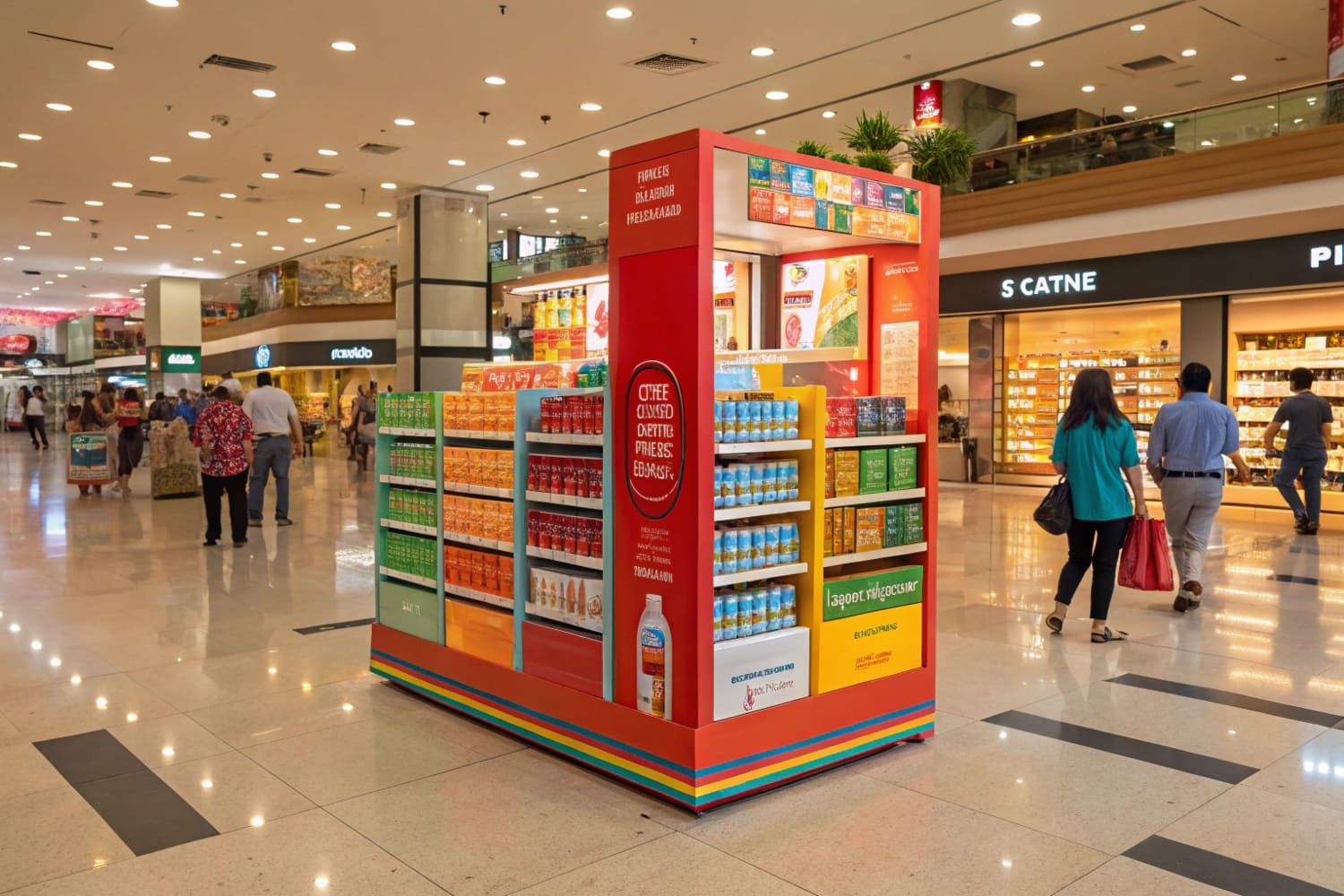
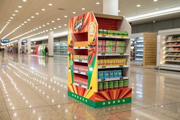
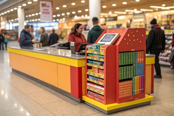
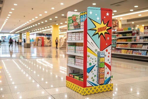
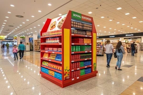
Shoppers move past shelves fast. Many miss new launches. I need a bold unit that stands on its own, loads quickly, and holds stock for weeks without help.
A classic example is a freestanding corrugated floor display with a header, shelves, and side panels, placed on the main aisle to showcase a new SKU; it carries 30–80 units, tells the story in one glance, and converts impulse buyers.
Why the floor display works for speed and scale
I use floor displays1 when I must win attention in a crowded aisle. The format owns real estate outside the shelf and can hold deep stock. In our factory, we keep the structure flat-pack. We lock tabs, not screws. A two-person team sets it up in minutes. I choose E-flute or B-flute for strength, and I add a reinforced base. When I launched a seasonal line, this format beat shelf talkers by double-digit lift. Market data I track shows floor displays lead POP share2 and keep growing because they give big graphics, clear price, and strong capacity. For rugged items, like crossbows or tools, I add PET windows and hidden ribs. I also test quick-swap headers, so the same body supports multiple campaigns. That lowers cost per week in store. Brands like this because the unit shows scale and feels "new" with a simple print change.
Setup checklist (quick)
| Item | Why it matters |
|---|---|
| Header height | Wins sightline over carts |
| Shelf pitch 5–8°3 | Holds weight and stops slide |
| 2-color price block | Improves scan and recall |
| QR to tutorial4 | Converts curious traffic |
What is a typical point of sale display?
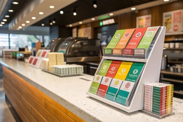
At checkout, shoppers wait and look around. I use small units that fit near payment gear and do not block staff flow. They must load fast.
A typical point-of-sale display is a compact countertop unit near the register that presents small add-ons—like blades, snacks, or batteries—with a bold callout and easy reach for quick last-second purchases.
Designing for the cash wrap
I design POS units with strict footprints because counter space is political. I set widths under 12 inches, with a shallow depth that avoids card readers. I use tear-away trays for fast refill. When I helped a U.S. hunting brand, I placed wax string, limb-care kits, and broadhead cases in a three-tier counter stand. The unit used high-contrast pricing5 and a simple "Ready for the season?" banner. Sell-through spiked during license weekends. The key is frictionless reach6: no doors, no sharp hooks. Staff like units that restock in seconds. I print barcodes on the rear panel for quick scans. I test gloss for graphics and matte for price tags to avoid glare. For chain rollouts, I keep dielines fixed and change only the face. This saves weeks and protects color. The end result is steady ticket lift that does not slow the line.
POS counter rules of thumb
| Spec | Target |
|---|---|
| Footprint7 | ≤ 12" W × 10" D |
| Tiers | 2–3 trays |
| Load time8 | < 2 minutes |
| Message | 5–7 words, one verb |
What is POS display?
People often use the term loosely. I keep the meaning tight because teams plan budgets around it. Clarity helps logistics, print, and store compliance.
A POS display is a small promotional unit placed at the checkout or payment area to drive impulse add-ons right before purchase; it differs from larger in-aisle or entrance POP units.
Scope, placement, and measurement
I define POS by its location and moment. It lives at the payment zone and speaks to a buyer who already decided to pay. It works best for low-risk items under the store's average item price. I build POS displays9 with quick assembly and sturdy liners because they sit near heavy traffic. I size copy for close viewing: big price, short benefit, small proof. I track conversion by attachment rate10, not by total unit sales, because the goal is to add one more item per basket. I also plan guardrails with store teams. No corners that snag sleeves. No heights that block sightlines. When budgets are tight, a strong POS run can fund the next in-aisle build. I learned this during a tight quarter when cash was short. We shifted to counter units, hit attach goals, then reinvested in a large seasonal POP.
POS fit test
| Question | Pass criteria |
|---|---|
| Is it at payment11? | Within arm's reach of the terminal |
| Is price simple? | Two numbers max |
| Can staff refill fast? | < 120 seconds |
| Does it add, not replace? | Boosts basket size12 |
What is the difference between POS and POP displays?
Teams mix the two terms and lose budget focus. I separate them so the brief matches the goal and the store knows where to place the unit.
POP covers the whole store and supports browsing and conversion; POS sits at checkout for last-second add-ons. POP is larger and story-driven. POS is smaller and speed-driven.
Clear roles, different jobs
I treat POP as the umbrella for in-store marketing13 near the product decision. It includes floor stands, pallet displays, end caps, and shelf trays. These units carry more copy and stock. They win attention and explain value. POS is a subset at payment. It nudges the final add-on. In North America, I see steady POP demand because retail is mature and promotions are frequent. In Europe, I get more briefs that push recycled content14 and water-based inks. In Asia-Pacific, growth runs faster due to urban retail and small-format chains. When I present to buyers, I map formats to goals. If the brand launches a crossbow, I propose a reinforced floor display with quick-swap headers. If the brand needs accessory lift, I use counter units and clip strips. Clear roles avoid mixed KPIs and waste.
Quick comparison table
| Aspect | POP | POS |
|---|---|---|
| Location | Aisle, end cap, entrance | Checkout area |
| Size | Medium to large | Small |
| Goal | Awareness + conversion15 | Basket add-on16 |
| Copy length | Story + specs | Price + one benefit |
| Stock depth | High | Low to medium |
What are point of purchase display materials?
Materials decide cost, speed, and look. I choose based on weight, time in store, and sustainability rules. I keep specs honest to avoid surprises.
Common POP materials include corrugated cardboard, paperboard, rigid board, foam core, acrylic, and metal; I select based on load, dwell time, print needs, budget, and recycling targets.
Matching material to job
Most of my units use corrugated cardboard17 because it is strong, light, cost-effective, and recyclable. I pick single-wall B-flute for standard loads and double-wall when weight climbs. For premium finishes, I mount printed litho to corrugate. For wet zones, I add water-resistant coatings or nano-layers that still allow recycling under local rules. If a retailer requires plastic-free, I design paper-only hooks and tabs. For rough transit, I design flat-pack parts with extra ribs, then we run transport and drop tests. I also consider print. Digital print helps small lots and fast turns. It suits seasonal runs with many versions. Flexo cuts cost at scale. When brands demand see-through windows for tools, I use PET that peels off cleanly for recycling. I document every change so mass production matches the sample. This step prevents the common problem of stronger samples and weaker runs.
Material selection matrix
| Material | Strength | Finish | Recyclable | Typical use |
|---|---|---|---|---|
| Corrugated cardboard18 | High | Good with litho | Yes | Floor, pallet, trays |
| Paperboard | Medium | Smooth | Yes | Sleeves, small trays |
| Foam core | Medium | Matte | Partial | Signs, headers |
| Acrylic19 | High | Gloss, clear | No (often) | Premium signs |
| Metal accents | Very high | Industrial | No (often) | Hooks, bases |
What is an example of a point of sale material?
At checkout, tiny tools do not need big structures. They need a small cue that says "take me." I pick simple items that attach fast.
A common point-of-sale material is a shelf-talker or wobble tag that clips to the counter edge and highlights a small add-on with price and benefit in a five-word message.
Small cues that punch above their weight
I like shelf-talkers and wobblers20 because they cost little and install in seconds. They extend the message without blocking devices. I print both sides so staff and shoppers see the same cue. I keep copy tight: "Sharpen blades today—$7.99." For hunting launches, I pair a mini-tray of string wax21 with a wobble tag that moves as people pass. The motion draws the eye, then the price seals the deal. I use heavier card and a clear stem so the tag survives touches. For chain rollouts, I lock size and hole positions so stores can place tags on different counters without rework. I supply a small planogram that shows distance from the terminal and the bagging area. Simple tools like these often beat larger builds when the counter is congested. They also travel well in courier boxes, which keeps freight down.
POS material quick guide
| Item | Best for | Install time | Cost level |
|---|---|---|---|
| Shelf-talker22 | Price callout | < 1 minute | Low |
| Wobbler23 | Motion cue | < 1 minute | Low |
| Clip strip | Small packs | 2–3 minutes | Low |
| Mini tray | Loose items | 2–3 minutes | Low-medium |
Conclusion
Strong POP drives discovery in the aisle. Smart POS adds one last item at checkout. I match format, material, and copy to the goal, the deadline, and the store.
Explore this link to understand how floor displays can enhance visibility and sales in retail environments. ↩
Discover strategies to boost your POP share, ensuring your products stand out and attract more customers. ↩
Understanding the optimal shelf pitch can enhance product visibility and stability, crucial for effective merchandising. ↩
Exploring QR code applications can boost customer engagement and provide valuable information quickly, enhancing the shopping experience. ↩
Exploring high-contrast pricing can reveal its impact on consumer behavior and help optimize your pricing strategy. ↩
Understanding frictionless reach can enhance your retail design strategy, improving customer experience and sales. ↩
Exploring the best footprint dimensions can help maximize space utilization in retail setups. ↩
Understanding optimal load times can enhance efficiency and customer satisfaction in retail environments. ↩
Explore this link to discover innovative design strategies that can enhance your POS displays and boost sales. ↩
This resource will provide insights on measuring attachment rates, helping you optimize your sales strategy. ↩
Understanding optimal payment terminal placement can enhance customer experience and streamline transactions. ↩
Exploring strategies to increase basket size can significantly improve sales and profitability for your business. ↩
Explore this link to discover effective strategies that can enhance your in-store marketing efforts and drive sales. ↩
Learn about the significance of recycled content in packaging and how it contributes to sustainability and brand image. ↩
Explore this link to discover proven strategies that can enhance your retail awareness and conversion rates. ↩
This resource provides insights on maximizing sales through effective basket add-on techniques. ↩
Explore this link to understand why corrugated cardboard is a top choice for packaging due to its strength, lightness, and recyclability. ↩
Explore the advantages of Corrugated cardboard for sustainable and effective packaging solutions. ↩
Discover how Acrylic can enhance your signage with its premium finish and durability. ↩
Explore this link to understand how shelf-talkers and wobblers can enhance product visibility and boost sales. ↩
Discover innovative ways to use a mini-tray of string wax to attract customers and increase engagement. ↩
Explore this link to understand how Shelf-talkers can effectively boost sales and attract customer attention. ↩
Learn about the impact of Wobblers on consumer behavior and how they can enhance product visibility. ↩


