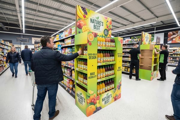
Retail environments are becoming increasingly crowded and competitive every single day. You struggle to get your product noticed by the right customers when it is hidden on a standard shelf. An effective Free Standing Display Unit (FSDU) solves this problem by giving your brand a dedicated stage.
Effective FSDU design features structural integrity for safety, high-impact graphics for brand visibility, and strategic placement for impulse buys. Key elements include durable corrugated materials, ease of assembly for store staff, and optimal product accessibility to maximize consumer interaction and sales conversion.
Let's break down exactly what makes these displays work so you can avoid costly mistakes and maximize your retail return on investment.
What are the benefits of Fsdu?
Many brands hesitate to invest in custom displays due to perceived high costs or logistical headaches. However, missing out on FSDUs means you are missing out on a massive increase in impulse purchases and brand control.
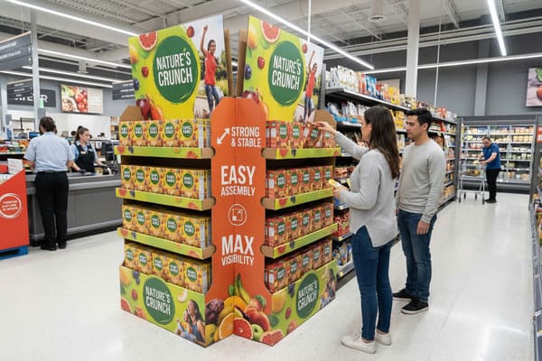
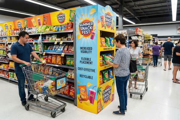
FSDUs offer significant benefits including increased brand visibility, cost-effective marketing compared to permanent fixtures, and high flexibility for seasonal promotions. They drive impulse purchases by interrupting the shopper's journey and allow for complete creative control over product presentation outside of crowded shelf space.
Strategic Cost Analysis and Market Agility
Cardboard displays1 act as a financial and operational powerhouse for your brand in the current retail landscape. Unlike permanent metal or wood fixtures which require heavy initial capital expenditure, cardboard allows for rapid adaptation and significantly lower entry costs. If you have a seasonal campaign for outdoor gear or a new product launch, you need speed above all else. Corrugated displays are lightweight. This drastically reduces shipping costs2 compared to heavier materials, which is crucial given the fluctuating fuel prices and potential tariff increases in international trade we are seeing today. They are almost always flat-packed. This saves you valuable warehouse space and simplifies logistics, allowing you to fit more units per truck.
In the APAC and North American markets, the demand for these displays is growing rapidly because brands need to move fast. Digital printing advancements now allow us to print small batches without expensive plates. This is vital for short-term promotions where the budget is tight. Furthermore, the visual impact is undeniable. Floor displays command attention. They stop the customer in the aisle. According to recent market reports, floor displays3 account for approximately 43.7% of the POP market share. They are not just shelves; they are billboards. You get to tell your brand story. You control the environment around your product. This is vital when you are competing with generic store shelves where your product blends in. The material is also recyclable. This meets the growing consumer demand for sustainability, which is a major driver in the European and North American markets where buyers prefer eco-friendly packaging4. By using high-strength corrugated board, you achieve the perfect balance of durability for the retail floor and disposability for the recycling bin.
| Benefit Category | Cardboard FSDU | Permanent Fixture |
|---|---|---|
| Cost Efficiency5 | High (Low material & shipping cost) | Low (High initial investment) |
| Speed to Market | Fast (Weeks for production) | Slow (Months for fabrication) |
| Flexibility | High (Easy to customize print/shape) | Low (Rigid structure) |
| Sustainability6 | High (Recyclable/Biodegradable) | Varies (Harder to recycle) |
| Space Usage | Efficient (Flat-packed) | Bulky (Often ships assembled) |
I understand that cost and speed are your biggest concerns when launching a new product. I operate three production lines to ensure your displays are printed and cut rapidly. I use digital printing to eliminate plate costs for your seasonal runs, ensuring you get high ROI without breaking your budget.
What factors are needed to be considered when designing the display?
A poorly designed display collapses in the store, ruins your product, and damages your brand reputation. You must consider the correct technical and environmental factors before you even begin the manufacturing process.
Critical design factors include weight capacity to prevent collapse, retail store compliance guidelines like size restrictions, and durability for the display's lifespan. Designers must also prioritize ease of assembly for store employees and select moisture-resistant materials if the display will face humid environments or aggressive cleaning.
Engineering for Retail Compliance and Durability
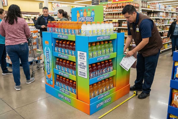
Designing an FSDU is not just about making it look pretty; it is fundamentally about engineering and physics. First, you must know the exact weight of your product. A display holding heavy items, like compound bows or hunting tools, has completely different structural needs than one holding lightweight cosmetics. We often see collapses because the cardboard grade was wrong for the load. You must consider the "flute" type and board grade. B-flute is good for printing surface quality, but double-wall structures (like BC-flute or EB-flute) are often mandatory for heavy merchandise to ensure the shelf does not bow over time. You also need to look at the Edge Crush Test (ECT) rating7 to ensure the walls can support the stacking weight during transport.
Second, you must think about the store environment. Is it humid? Regular cardboard gets soft and loses strength in high humidity. We need to apply special coatings or use specific material grades like water-resistant varnishes or even PP (polypropylene) bases to prevent this, especially for floor displays that might get mopped around by store staff. Third, retailer compliance8 is non-negotiable. Major retailers like Walmart, Costco, and Target have strict style guides. They limit height (often 55 to 60 inches), footprint dimensions (e.g., 48×40 inch pallet fit), and packaging requirements. If your display is one inch too big, they will reject it at the distribution center. That is a total financial loss for you. Ease of assembly is also a major factor. Store staff are busy. If your display takes twenty minutes to build, they will throw it away or leave it in the back room. It must pop up in seconds. Finally, consider the lifespan. Is this for a two-week promo or a three-month placement? The material choice dictates the longevity.
| Factor | Consequence of Neglect | Technical Solution |
|---|---|---|
| Weight Bearing9 | Structural collapse/Product damage | Double-wall board / Metal bars |
| Store Compliance10 | Rejection by retailer | Strict adherence to style guides |
| Environment | Soggy/Warped cardboard | UV Coating / Lamination / Mop guards |
| Assembly Time | Display discarded by staff | Pre-glued / Pop-up designs |
| Lifespan | Looks worn out quickly | Reinforced edges / Higher grade paper |
I take these technical risks seriously so you do not have to worry. I provide free white samples for you to test weight bearing before we print a single unit. I also have a dedicated design team that checks your specs against retailer guidelines to ensure your displays never get rejected by the store manager.
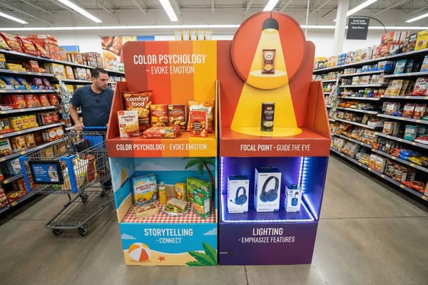
What are the four most important elements in VM?
Visual Merchandising (VM) can seem complex, but overcomplicating it often leads to confusion. Focusing on just four core elements simplifies the process and guarantees better customer engagement and sales.
The four crucial elements of Visual Merchandising are color psychology to evoke emotion, focal points to guide the eye, storytelling to connect with the customer, and lighting or structural highlighting to emphasize product features. Together, these elements create a cohesive shopping experience that guides the consumer from interest to purchase.
The Mechanics of Visual Engagement and Conversion
Visual Merchandising11 is the art of silent selling, and it relies heavily on psychology. The first element is color. It grabs attention from a distance. For outdoor gear, you might use camo patterns mixed with bright orange to signal safety and hunting tradition. For tech, you use sleek blacks and blues. The color must match the brand DNA and stand out from the beige store floor. The second element is the focal point. You cannot show everything at once with equal weight. You need a "hero" product. The display structure should physically point to this product using lines, tiers, and positioning. It guides the eye exactly where you want it—usually at eye level (approx. 1.2 to 1.6 meters high) which is the "buy zone12."
The third element is storytelling. A display is not just a holder. It tells the customer why they need the item. We use graphics to show the product in use, solving a problem. This builds an emotional connection. For example, showing a hunter successfully using the gear in the field creates aspiration. It shifts the focus from the price to the value. The fourth element is layout and accessibility. This is often overlooked. The product must be easy to pick up. If the customer is afraid they will break the display by touching the product, they will not buy it. We design "shops within shops." This creates a specific zone for your brand. It separates you from competitors. Effective VM turns a passive walker into an active buyer by removing friction. If the customer cannot interact with the product easily, all the pretty graphics in the world will not save the sale.
| VM Element | Function | Implementation Strategy |
|---|---|---|
| Color | Attracts initial attention | High-contrast brand colors13 |
| Focal Point | Directs the eye | Central placement / tiered levels |
| Storytelling | Creates emotional bond | Lifestyle imagery14 / Benefit text |
| Layout | Encourages interaction | Accessible shelves / Open design |
I know that color consistency is often a pain point for high-end brands. I use advanced color management systems to match your brand pantones exactly. My team creates 3D renderings with different merchandise layouts so you can visualize exactly how the focal point works before we cut a single sheet.
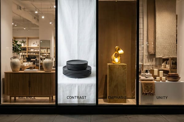
What are the principles of display design?
Ignoring basic design principles leads to cluttered and confusing displays that customers ignore. You want clarity, balance, and a strong visual hierarchy to ensure your product stands out immediately.
The fundamental principles of display design are balance, contrast, emphasis, and unity. Balance ensures stability and visual comfort, contrast draws attention to key products, emphasis creates a hierarchy of information, and unity ensures all design elements work together to reinforce the brand identity.
Structural Harmony and Brand Hierarchy
These principles are the rules of the road for effective design, and breaking them usually leads to failure. Balance15 is both physical and visual. Physically, the display must not tip over when products are removed from one side. This requires calculating the center of gravity and potentially using a weighted base or angled shelving to keep the mass centered. Visually, it must look stable to the consumer. We use symmetrical balance for a formal, trusted look, or asymmetrical balance for a dynamic, modern vibe. Contrast is what stops the eye in a busy store. If your product is dark, the background must be light. If you use a black product on a black background, it disappears. We use high-contrast printing16 to make the product pop out from the structure.
Emphasis is about hierarchy. What is the most important thing? The price? The logo? The new feature? You cannot make everything big. You must choose one main message17. The header card usually carries this main message. It acts as the headline. Unity brings it all together. The fonts, colors, and shapes must match your packaging. If the header looks modern but the base looks rustic, it confuses the brain. A confused brain does not buy. We use structural design18 to reinforce unity. For example, we use sleek lines for electronics and rugged, raw textures for outdoor gear. Every inch of the display must serve the main goal. Simple design usually wins over complex design because it communicates faster. In a store, you only have about three seconds to make an impression, so the hierarchy must be instant and obvious.
| Principle | Definition | Application in FSDU |
|---|---|---|
| Balance | Visual and physical stability19 | Weighted bases / Symmetrical layout |
| Contrast | Differentiation of elements | Light products on dark print |
| Emphasis | Hierarchy of importance20 | Large headers / Bold pricing |
| Unity | Cohesive look and feel | Matching fonts / Consistent theme |
I believe in practical design, not just theory. I offer unlimited modifications on your prototypes to get the balance right. My structural engineers test the physical balance to prevent tipping, while my designers adjust the graphical contrast to ensure your logo and product are the true heroes.
Conclusion
To succeed in retail, you need displays that are strong, compliant, and visually stunning. Focus on quality materials and smart engineering. This ensures your brand dominates the floor and drives sales.
Explore how Cardboard displays can enhance your brand's visibility and reduce costs in retail settings. ↩
Learn strategies to minimize shipping costs, crucial for maintaining profitability in today's market. ↩
Explore how floor displays can enhance your brand visibility and attract customers effectively. ↩
Learn about the significance of eco-friendly packaging in meeting consumer demands and promoting sustainability. ↩
Understanding cost efficiency can help businesses make informed decisions on display options, maximizing their budget. ↩
Exploring sustainability in retail displays can guide companies towards eco-friendly practices, enhancing their brand image. ↩
Understanding the Edge Crush Test (ECT) rating is crucial for ensuring your packaging can withstand transport and stacking, preventing costly damages. ↩
Exploring retailer compliance helps you avoid financial losses by ensuring your displays meet strict guidelines set by major retailers. ↩
Understanding weight bearing is crucial for preventing structural failures in packaging, ensuring product safety and integrity. ↩
Exploring store compliance can help businesses avoid rejection by retailers and maintain a strong market presence. ↩
Understanding Visual Merchandising can enhance your retail strategy, driving customer engagement and boosting sales. ↩
Exploring the concept of the buy zone can help optimize product placement, increasing conversion rates in your store. ↩
Discover how high-contrast colors can enhance brand visibility and attract more customers. ↩
Explore the power of lifestyle imagery in creating emotional connections with your audience. ↩
Understanding balance in design is crucial for creating visually appealing and stable displays that attract customers. ↩
Exploring high-contrast printing techniques can significantly improve product visibility and sales in retail environments. ↩
Understanding the significance of a main message can enhance your design strategy and improve customer engagement. ↩
Exploring structural design can provide insights into effective packaging strategies that attract customers and boost sales. ↩
Understanding visual and physical stability can enhance your design skills and create more effective layouts. ↩
Learning about hierarchy in design will help you prioritize elements effectively, improving user experience. ↩


