
Nothing is more frustrating than opening a shipment of new marketing materials and seeing the wrong shade of color. You spent weeks perfecting the design, but the final product looks dull or completely different from your screen.
The most reliable method to get an accurate color match is to use a physical reference standard rather than relying on a digital screen. Using a standardized color system like the Pantone Matching System (PMS) and providing your manufacturer with a physical sample ensures that the final output matches your original vision.
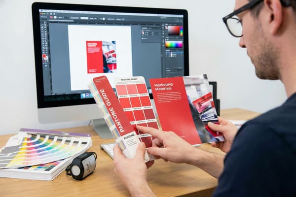
Many business owners assume that sending a high-resolution PDF is enough to guarantee results. However, screens emit light while paper absorbs it, creating fundamental differences in how our eyes perceive the image. Let us look at how we solve this technical challenge.
What is the most accurate way to match paint?
We often see clients confused because the color on their iPhone looks vibrant, but the printed sample looks muddy. This happens because different devices interpret color data in different ways.
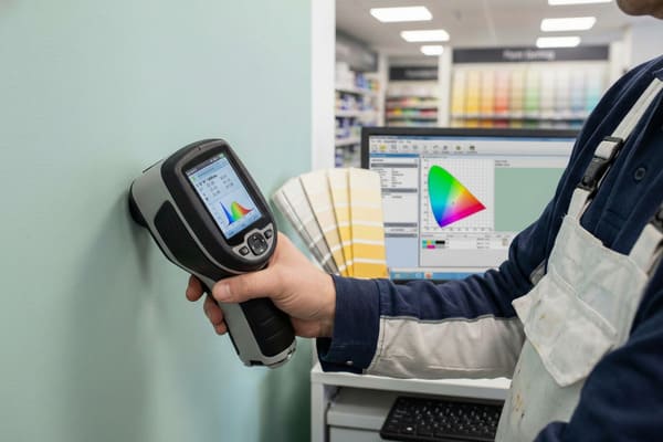
To achieve the highest level of accuracy, professionals use a device called a spectrophotometer combined with physical color chips. This device measures the specific wavelengths of light reflected off a surface, providing a mathematical "fingerprint" of the color that eliminates human error and lighting variables.
The Science of Spectrophotometry and Substrates
To understand why this is the gold standard, we must look at the technology. A spectrophotometer1 does not just "look" at a color like a camera does. It illuminates the sample with a known light source and measures the amount of light reflected at each wavelength of the visible spectrum. This generates a spectral curve. In the cardboard display industry, this is critical because the base material often varies.
When we print on corrugated cardboard, we are not printing on a pure white surface like standard office paper. We are often printing on a material that has a texture and a specific absorption rate. If we use a "White Top" liner, the ink sits differently than it does on standard Kraft (brown) paper. The brown background shifts the ink color significantly, making blues look green and yellows look orange.
Furthermore, we must consider the difference between RGB and CMYK2. Your computer monitor uses Red, Green, and Blue light (RGB) to display millions of colors. Our printing presses use Cyan, Magenta, Yellow, and Black ink (CMYK). The RGB color gamut is much wider than the CMYK gamut. There are electric blues and neon greens that exist on a screen that simply cannot be reproduced with standard ink pigments. A spectrophotometer helps us bridge this gap by finding the closest achievable data point within the CMYK color space that matches your target.
| Comparison Factor | RGB (Screen) | CMYK (Print) | Pantone (PMS) |
|---|---|---|---|
| Light Source | Emitted Light | Reflected Light | Reflected Light |
| Color Range3 | Very Wide (16+ Million) | Limited Range | Precise Formulas |
| Consistency | Varies by Device | Varies by Printer | Global Standard |
| Best Use4 | Web Design, Digital | Full-color Photos | Brand Logos, Specific Colors |
| Accuracy Tool | Monitor Calibrator | ICC Profiles | Physical Swatch Book |
I insist on using spectrophotometers in my factory to verify your brand colors. I know that for a brand like Barnett Outdoors, your specific camouflage greens and greys must be consistent across all retail channels. I use this data to calibrate our presses before a single sheet of cardboard is cut.
Can I get an exact paint match?
Clients frequently ask if the final production run will be a 100% perfect match to the sample they held in their hands. This is a complex question in the world of industrial manufacturing.
While a 100% mathematical match is theoretically possible, in industrial manufacturing, we aim for a commercial match within a strict tolerance range. Variables such as humidity, paper absorption, and ink batch differences mean that "exact" is defined by a very small margin of error rather than absolute perfection.
Managing Expectations and Material Variables
The reality of printing on cardboard is that it is an organic process. The paper itself is made from wood pulp, and the fibers vary from batch to batch. Even if we use the exact same ink formula, a change in the humidity of the factory floor can slightly alter how the paper absorbs that ink. This is why we talk about "Delta E5" tolerances, which we will discuss later, rather than "perfect" matches.
Another massive factor is a phenomenon called Metamerism6. This occurs when two colors appear to match under one light source (like the fluorescent lights in your office) but look completely different under another light source (like the LED lights in a Walmart or sunlight). This happens because the spectral reflectance curves of the two colors cross each other. For a product sold in retail stores, this is a critical detail.
We also have to account for the finish. After we print your design, we often apply a varnish or lamination to protect the display and give it strength. A gloss lamination will make colors appear deeper and more saturated, while a matte lamination will wash them out slightly. If you approve a raw ink proof but order a matte finished display, the final result will look different. We have to adjust the ink density during the prepress stage to compensate for the coating that will be applied later.
| Variable | Impact on Color | Mitigation Strategy |
|---|---|---|
| Paper Porosity7 | High absorption dulls colors | Use high-quality clay-coated liners |
| Lighting | Metamerism8 causes color shifts | Check color under D50 (Daylight) standard |
| Lamination | Gloss darkens; Matte lightens | Adjust ink curves during prepress |
| Ink Batch | Slight chemical variance | Mix large batches for full production runs |
| Drying Time | Wet ink looks different than dry | Wait 24 hours before final measurement |
I handle this by providing "wet proofs" on the actual production material with the final finish applied. I do not want you to approve a glossy photo paper proof if we are printing on matte cardboard. I ensure you see exactly what the retail buyer will see.
How accurate is color matching?
You might wonder how we decide if a color is "good enough" or if it needs to be rejected. We cannot rely on just asking someone if it looks okay, as everyone sees color differently.
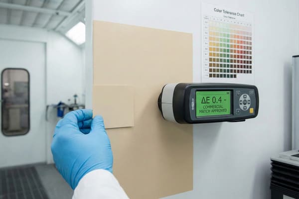
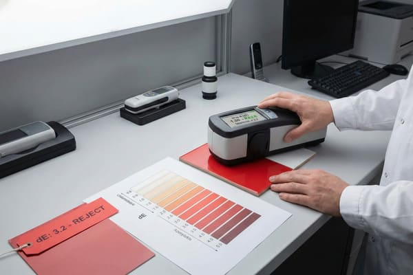
Color matching accuracy is measured using a metric called Delta E (dE), which calculates the distance between two colors in a 3D color space. A dE of less than 1.0 is undetectable to the human eye, while a dE of 2.0 to 3.0 is generally considered the acceptable standard for high-quality commercial printing.
Quantifying Accuracy with Delta E9 Standards
In the engineering world, you have tolerances for physical dimensions. If a crossbow part is off by a millimeter, it might not fit. Color works the same way. We use the CIELAB color space10, which maps color on three axes: L (Lightness), a (Red/Green), and b (Yellow/Blue). Delta E is the mathematical distance between the target color (your approved sample) and the produced color (what came off the machine).
For most commercial packaging and displays, a Delta E of under 2.0 is excellent. However, achieving this on corrugated board is harder than on glossy magazine paper. The texture of the board creates "noise" in the reading. If we print a solid black or a dark blue, the texture is hidden. But if we print a light pastel or a skin tone, the ridges of the cardboard can cast microscopic shadows that affect the color reading.
We also have to consider the "drift" throughout a production run. The first display off the line might have a Delta E of 0.5. By the 1,000th display, the press might heat up, or the ink viscosity might change, shifting the Delta E to 1.5. Professional factories have automated systems that scan sheets periodically. If the value drifts too far, the machine alerts the operator to adjust the ink keys. Without this numerical standard, "accurate" is just an opinion. With Delta E, it is a verifiable fact.
| Delta E Value11 | Visual Perception12 | Application Context |
|---|---|---|
| 0 – 1.0 | Indistinguishable by human eye | High-end art reproduction |
| 1.0 – 2.0 | Perceptible only on close inspection | Premium Brand Packaging |
| 2.0 – 3.0 | Acceptable commercial match | Standard Retail Displays |
| 3.0 – 5.0 | Visible difference | Low-cost shipping boxes |
| 5.0+ | Obvious color mismatch | Rejected Production |
I set my factory internal standards strictly. We aim for a Delta E of less than 2.5 for all primary brand colors. If I see a reading spike during your production run, I stop the machine immediately. I would rather lose time recalibrating than send you a display that hurts your brand image.
Can I color match paint with my phone?
There are dozens of apps available now that promise to scan a color from a wall or an object and tell you exactly what paint code it is. It sounds convenient for a quick check.
While mobile apps are fun for gathering inspiration, they are not accurate enough for industrial manufacturing or professional color matching. Phone cameras lack the controlled lighting and calibrated sensors required to read spectral data accurately, leading to significant errors in final production.
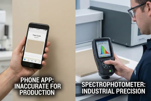
The Limitations of Mobile Colorimetry in Manufacturing
I have had clients send me screenshots from a color-matching app13 and ask me to match that data. This is dangerous for your brand. A smartphone camera is designed to make photos look "pleasing," not scientifically accurate. The software automatically adjusts white balance, saturation, and contrast based on the environment. If you scan a green hunting bow in a room with warm yellow light, the app will read the color completely differently than if you scan it outside on a cloudy day.
Furthermore, phone cameras are RGB devices. As we discussed earlier, they capture light in Red, Green, and Blue channels. They do not measure spectral reflectance. They are guessing the color based on a limited algorithm. A professional spectrophotometer14 costs thousands of dollars because it has its own calibrated internal light source and isolates the sensor from outside light interference. A phone does not have this hardware.
There is also the issue of surface texture. If you take a picture of a textured fabric or a metallic surface, the phone captures the shadows and highlights as part of the color. This results in a "dirty" reading. If we mix ink based on that reading, the result will look muddy and dark. For a brand like Barnett, where the visual appeal on the shelf drives sales, relying on a $5 app to determine your packaging color is a risk you should not take.
| Feature | Smartphone App | Professional Spectrophotometer15 |
|---|---|---|
| Lighting Control | None (Relies on ambient light) | Internal Calibrated Light Source |
| Sensor Type | Basic RGB Camera Sensor | Multi-spectral Sensor16 |
| Calibration | Auto-adjusts (often incorrectly) | Requires daily white-tile calibration |
| Texture Handling | Confuses shadow with color | Can filter out texture data |
| File Output | Approximate Hex/RGB code | Precise Lab/Spectral Data |
I advise you to never trust a phone scan for production. Instead, send me a physical sample of your product. I will scan it with my X-Rite equipment to get the true spectral data. This is the only way I can guarantee the cardboard display matches your product perfectly.
Conclusion
Getting an accurate color match is not magic; it is a mix of science, equipment, and strict process control. By understanding the limitations of screens and the importance of physical standards, we can ensure your retail presence is powerful and consistent.
Explore this link to gain a deeper understanding of spectrophotometers and their crucial role in color measurement. ↩
Understanding RGB and CMYK is essential for anyone in design or printing; this resource will clarify their differences and applications. ↩
Understanding color range is crucial for designers to choose the right format for their projects. ↩
Exploring the best uses helps in selecting the appropriate color format for various design applications. ↩
Exploring Delta E will help you grasp color tolerances in printing, ensuring your designs meet quality standards. ↩
Understanding Metamerism is crucial for ensuring color accuracy in printing, especially under different lighting conditions. ↩
Understanding paper porosity is crucial for achieving vibrant colors in printing. Explore this link for in-depth insights. ↩
Metamerism can significantly alter color appearance. Learn more about its effects and how to manage them effectively. ↩
Understanding Delta E is crucial for ensuring color accuracy in production, making this resource invaluable for professionals. ↩
Exploring the CIELAB color space will enhance your knowledge of color representation, essential for anyone in design or manufacturing. ↩
Understanding Delta E Value is crucial for achieving color accuracy in various applications, enhancing quality control. ↩
Exploring visual perception can help improve color matching techniques, essential for design and branding success. ↩
Understanding the limitations of color-matching apps can help you avoid costly mistakes in branding and product presentation. ↩
Exploring the benefits of a professional spectrophotometer will highlight its necessity for precise color matching in manufacturing. ↩
Explore this link to understand the advanced features and applications of Professional Spectrophotometers in various fields. ↩
Learn about Multi-spectral Sensors and their significance in capturing detailed color information across different wavelengths. ↩


