Seasonal traffic is high, but attention is short. Many displays look busy and waste budget. I use simple rules and cardboard engineering to turn seasons into steady sell-through.
Create the best seasonal displays by planning one clear story, choosing the right display type, building strong structure, using bold hierarchy, flat-packing for logistics, testing assembly, and measuring sell-through by SKU and week, then iterating fast.

I will walk you through practical steps that I use in real projects. I keep the language simple and the actions direct. I also add one short story from my own factory so you can see the numbers.
How can creating an attractive product display help the retailer?
Shoppers move fast, and shelves look the same. A smart display pulls eyes, removes friction, and gives staff a clear playbook. That means higher basket size and faster turns.
An attractive display helps retailers by lifting visibility, guiding choice, speeding restocking, and protecting margin. It reduces staff workload, improves planogram compliance, and turns seasonal traffic into predictable sell-through with less markdown risk.
Why the right display changes the store
I focus on four outcomes: more views, more picks, clean facings, and easier work for staff. I choose a form that fits the mission. Floor displays win when I need impact for launch or seasonal bundles. Counter displays shine when I target impulse. Tray or shelf displays work when I must live inside tight planograms. Pallet displays move volume in clubs and big-box aisles. I set a simple message line at eye level. I keep price and benefit close to the product. I add a QR code only if it adds proof or instruction. I design the structure for safe reach and quick refill. I flat-pack to cut freight and damage. I give one-page assembly steps with photos. Last fall, I built crossbow accessory floor PDQs1 for Barnett Outdoors before deer season. We used heavy single-wall corrugate with a reinforcing rib under pegs. The store team cut refill time by about one third, and weekly unit sales rose double digits as endcaps went live.
| Retailer Goal | Display Choice | What I Optimize | Result I Track |
|---|---|---|---|
| Launch a seasonal bundle2 | Floor or pallet | Eye-level claim, color block | Views and units per store per week |
| Drive impulse by checkout3 | Counter | Small footprint, quick take | Attach rate to tickets |
| Win shelf attention | Tray/Shelf | Contrast panel, clean edges | Share of facing and OSA |
| Move heavy volume | Pallet | Stability, forklift access | Cases per week and damage rate |
What is the best way to display merchandise?
Clutter kills attention. Shoppers scan from headline to price to product. I keep that path short and direct. I let form and print do most of the work.
The best way is to match form to task, use one message, build clear hierarchy, keep reach safe, group SKUs by need, and proof the print so color and barcode scan perfectly.

A simple blueprint that works in any season
I start with the job. Do I need to introduce, compare, or restock fast? For introduce, I use a floor display4 with a bold top header and a hero product at eye level. For compare, I lay out a shelf tray with three tiers and short specs, each label aligned. For restock, I design front-push trays or peg columns that hold extra units and keep the face full. I keep color blocks simple so print stays clean. I avoid glossy lamination when stores have harsh lights; matte print reads better. I engineer load paths so the bottom does not bow. I use die cuts that lock tabs fast, so staff can assemble with one person. I add a small UGS (unit guide sticker5) inside the display that shows capacity by row. When I worked on a Costco-bound PDQ, this one sticker saved calls to our sales rep for weeks. It sounds small, but it protects margin and keeps the display looking fresh.
| Step | What I Do | Why It Matters |
|---|---|---|
| Define the job | Launch, compare, or restock | Form follows function |
| Map the eye path6 | Headline → image → price → product | Faster decision, less bounce |
| Set hierarchy | One claim, two bullets, clear price | Removes confusion |
| Engineer structure | Test load, tilt, and peg pull | Safety and uptime |
| Proof printing | Solid blacks, skin tones, brand color | Trust and scan clarity |
| Plan logistics7 | Flat-pack, pallet fit, corner guards | Fewer damages and lower freight |
What makes an effective display?
Most displays fail because they try to say too much. I keep the message short. I let the packaging and the product shape do the talking.
An effective display is simple, relevant, durable, easy to assemble, and easy to refill. It blends structure, graphics, and logistics so shoppers notice, staff comply, and managers reorder.
The five-part checklist I use before any print run
I run a fast, five-part check. First, clarity: one benefit line that fits a phone screen. Second, contrast: brand color against the store backdrop, not against my own packaging. Third, reach and safety: the heaviest item sits between knee and chest. Fourth, resilience: I add a water-resistant nano-coat8 or a PET-free barrier only when needed so recyclability stays intact. Fifth, proof of value9: a small visual cue like a before/after or a verified badge. When I prepared hunting-season trays for broadhead SKUs, I printed a simple "Choose by Distance" band with 20/40/60 yards and grouped SKUs under each. Shoppers got it in seconds. Returns dropped. Staff loved the speed. I also tracked transport damage. We added corner guards and changed the flute direction. Damages fell on the next load.
| Element | Test I Run | Pass/Fail Signal |
|---|---|---|
| Clarity | 5-second read test10 | Shopper repeats claim correctly |
| Contrast | A/B against shelf photo | Header stands out at 3 meters |
| Safety | Load and tilt test | No bowing, no tip at 10° |
| Durability | Wipe and rub test | Ink holds, edges intact |
| Logistics | Pack-out audit11 | <2 minutes to assemble |
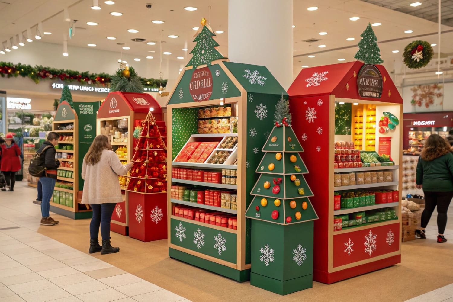
What is seasonal display?
Seasonal buying windows are short. So the display must set up fast, carry the theme, and come down without waste. I plan timelines backwards from the in-store date.
A seasonal display is a time-bound, theme-driven setup that turns peak traffic into sales using fast-to-assemble structures, focused graphics, and clear replenishment rules tied to weekly demand.
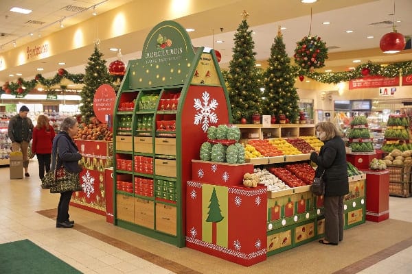
How I plan, build, and learn in short windows
I build seasonal work on a simple cadence. I start with the date when the set must go live. I count backwards for shipping, QA, and sample approval. I aim for flat-pack designs12 that build in under two minutes. I decide the right type: pallet for warehouse clubs, floor for mass retail, counter for drug and convenience, shelf tray for grocery. I match the theme with two or three visual cues. I do not flood the art with icons. I test color to avoid shifts under store lights. I write a refill rule per SKU that store teams can follow. I keep the bill of materials lean so recycling is easy. I run a quick post-season review13 on units per day, stock-outs, and damages. One spring, I supported a bow-fishing launch for a U.S. brand with 3D renderings first, then a prototype with free edits. We finished testing in two weeks and hit the window. The reorder arrived earlier because the flat-pack saved freight and time.
| Timeline Block | Typical Duration | Deliverable |
|---|---|---|
| Concept to 3D | 3–5 days | Render plus dieline |
| Sample and edits | 5–10 days | Physical prototype, strength test14 |
| Print and slotting | 7–12 days | Mass run, pallet plan15 |
| Freight and DC | 10–25 days | Flat-pack, corner-guarded cartons |
| Store setup | <2 minutes | Photo proof and checklist |
Conclusion
Plan the job, choose the right form, keep one clear message, build safe structure, print clean, ship flat, set up fast, and measure weekly so you learn and improve.
Learn best practices for designing effective PDQs that can boost sales and improve customer engagement. ↩
Explore this link to discover effective strategies for launching seasonal bundles that can boost your sales and customer engagement. ↩
This resource provides insights into driving impulse purchases at checkout, helping you maximize sales opportunities. ↩
Explore this link to learn effective strategies for creating eye-catching floor displays that enhance product visibility and sales. ↩
Discover how unit guide stickers can streamline inventory management and enhance customer experience in retail displays. ↩
Understanding eye path mapping can enhance user experience and improve conversion rates on your website. ↩
Exploring logistics planning can help reduce damages and optimize shipping costs, crucial for any business. ↩
Explore this link to understand how water-resistant nano-coats enhance product durability while maintaining recyclability. ↩
Discover strategies for showcasing proof of value that can significantly boost customer trust and sales. ↩
Understanding the 5-second read test can enhance your marketing strategies by ensuring clarity in messaging. ↩
Exploring pack-out audits can improve your logistics efficiency and reduce assembly time for products. ↩
Explore how flat-pack designs can save time and costs in shipping and storage, enhancing efficiency. ↩
Learn best practices for post-season reviews to improve future product launches and inventory management. ↩
Understanding physical prototypes and strength testing is crucial for ensuring product durability and quality. ↩
Exploring mass runs and pallet plans can enhance your knowledge of efficient production and logistics. ↩


