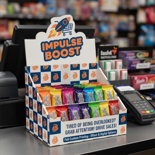
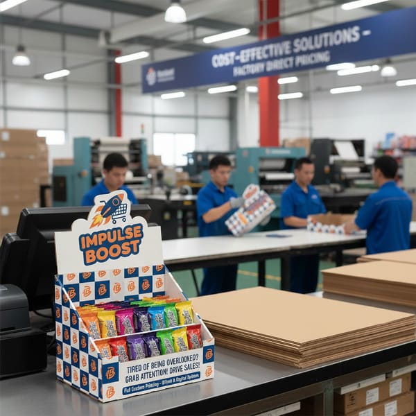
Generic brown boxes get ignored. If you want your product to survive the brutal retail environment of a US checkout lane, you need a display that screams quality before the customer even picks up the item.
Yes, we offer fully custom printing for counter top displays, utilizing high-fidelity lithographic offset printing to match strict brand color profiles (G7 Master Verification). This process allows for vibrant CMYK (Cyan, Magenta, Yellow, Key/Black) graphics and premium finishes like spot UV or anti-scuff matte lamination, ensuring your checkout units capture attention instantly.
You might be wondering exactly what defines these units and how we build them to survive the "retail jungle." Let's break down the mechanics.
What is a counter top display?
Real estate on a checkout counter is the most expensive square footage in a retail store. If your display wobbles or hides the product, the store manager will toss it in the trash within 24 hours.
A counter top display is a compact POS (Point of Sale) or PDQ (Pretty Darn Quick) fixture designed to sit on retail checkout counters to drive high-margin impulse purchases. These units typically measure under 18 inches (45 cm) in height to maintain clear sightlines for store security.
The Structural Anatomy of Impulse Buying
Designing for the counter is actually harder than designing for the floor. Why? Physics. We are dealing with the "Tipping Point1" problem. I learned this the hard way a few years ago when a client sent us a design for a tall, narrow display for energy shots. It looked great on a computer screen. But when we put it on a standard US retail counter—which is usually 36 inches (91 cm) high—and removed the first two rows of product, the center of gravity shifted backward. The whole thing flipped over. It was a disaster.
To fix this, my factory now enforces a strict protocol regarding stability. We apply a "2:3 Ratio2" rule for depth versus height. If the marketing team demands a tall header card that acts like a sail, I force them to add an "Extended Easel Back" or a "False Bottom." The False Bottom allows us to hide a double-thick corrugated pad or even a weighted insert underneath the product trays. This lowers the center of gravity, ensuring that even when the display is 80% empty, it stays rock solid.
Another massive issue is "Lip Height3." Inexperienced designers love to put a giant logo on the front lip of the tray. But if that lip is 3 inches (7.6 cm) tall, it hides the bottom third of your actual product. Shoppers in the US don't buy what they can't see. I tell my clients: "Your packaging is the hero, not my tray." We cut the lip down or use a clear PVC window if necessary, ensuring 85% of your product face is visible. This is how we convert a "box" into a "sales machine."
| Feature | Standard Cheap Display | PopDisplay "Retail Ready" Unit |
|---|---|---|
| Stability | Tips over when half-empty | Weighted False Bottom4 & Extended Easel |
| Front Lip | High wall (hides product) | Low Profile / Die-Cut Dip (Max visibility) |
| Material | Standard B-Flute (Washboard look) | E-Flute (Smooth, magazine-quality print) |
| Safety | Sharp raw edges (Paper cuts) | Wave Cut / Safety Edge (Employee safe) |
I hate wobbly displays because they damage your brand image immediately. If you are worried about your product being top-heavy, send me one physical sample of your item. I will build a white mock-up and perform a "Shake Test" on my desk to guarantee it never tips over.
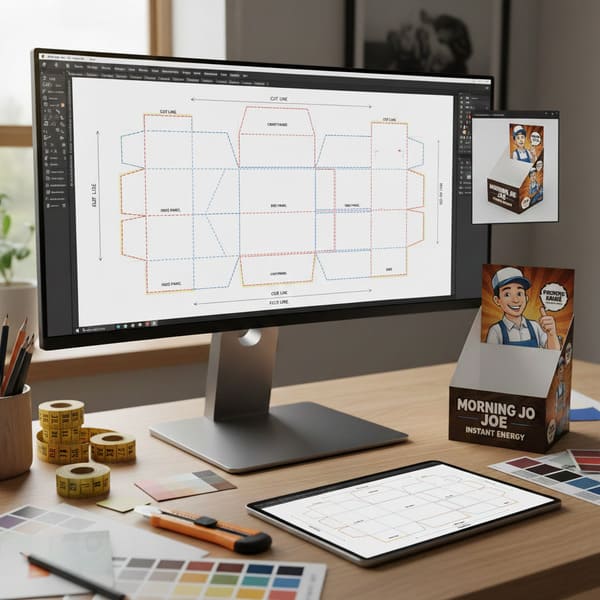
What is a counter top template?
Don't start designing in Photoshop without a map. If you just send me a JPG with your logo, we are going to have a very long, frustrating email chain about bleed lines and fold errors.
A counter top template, industry-standardized as a Dieline, is a flat 2D engineering blueprint that maps the exact cut lines, fold creases, and bleed zones for manufacturing. Created in CAD (Computer-Aided Design) software, this vector file ensures the graphic artwork aligns perfectly with the structural die-cutter to prevent production errors.
The "Empty Canvas" Engineering Protocol
The biggest bottleneck in my factory isn't the printing press; it's the "Dieline Nightmare." I see this constantly with creative agencies who are amazing at branding but terrible at structural packaging. They draw a box in Adobe Illustrator, put the logo right on the fold line, and send it to print. The problem? Cardboard has thickness. When you fold a piece of E-Flute, you lose about 1/16th of an inch (1.5 mm) at the crease. If the artwork doesn't account for this "gain," your logo gets chopped in half.
To stop this from happening, I refuse to let clients start designing until my structural engineers provide the "Master Dieline5." We use ArtiosCAD6 to generate a precise net that accounts for material thickness and folding tolerances. We also look for the "Overprint" attribute error. If your designer sets the cut lines to "Knockout" instead of "Overprint," and the die-cutter shifts by a fraction of a millimeter (which happens in mass production), you end up with an ugly white hairline on the edge of your product.
We also enforce a "Safety Zone." No text or critical graphics can be within 1/8 inch (3 mm) of a cut line or fold. It sounds strict, but it saves you from having to reprint 5,000 units because the barcode got sliced off. We also check for "Grain Direction" in the template. If the grain runs the wrong way on a load-bearing wall, the display will crush under its own weight. We orient the grain vertically for maximum stacking strength.
| Specification | The "Amateur" Mistake | The PopDisplay Standard |
|---|---|---|
| Software | Adobe Illustrator (Manual Draw) | ArtiosCAD (3D Calculated) |
| Fold Tolerance | Zero allowance (Cracking) | Material Gain Calculated (Perfect Corners) |
| Cut Lines | "Knockout" (White gaps) | "Overprint" Attribute (Clean edges) |
| Visual Check | PDF Flat Proof | 3D Video Rendering (360-degree view) |
I know technical files are boring for creative teams, so let me do the heavy lifting. Before you hire a designer, ask me for the template. I will send you the correct PDF with the "Safety Zones" marked in red so your team can just drop the artwork in and know it will fit perfectly.
How much does it cost for a counter top?
Everyone asks for the unit price first. "How much for one box?" That is the wrong question. In manufacturing, the setup costs are the killer, not the paper itself.
The cost for a counter top display typically ranges from $4 to $15 (approx. €3.70–€14) per unit, heavily dependent on quantity, material grade, and print finish. While tooling setup fees are fixed, increasing the order volume from 100 to 500 units drastically reduces the amortized cost per display.
Strategic Cost Analysis and Material Selection
Let's be real about the "Small Run" trap. I often have clients who want just 50 displays for a trial. I can do it, but I have to use High-Fidelity Litho printing7 because Digital printing often looks grainy and the colors don't match your brand (Pantone matching on digital is tricky). The issue is that the setup for the printing plates and the cutting die (knife mold) costs the same whether we run 50 units or 5,000.
For a 100-unit order, you might pay $15 (approx. €14) per unit because that $400 (approx. €370) setup cost is divided by very few boxes. But if you increase that order to 500 units, the price often drops by 60% instantly. It's simple math, but it shocks people every time. I also advise clients on material "swaps" to save money without losing quality. Many request solid white board (SBS) which is expensive. I usually switch them to Clay Coated News Back (CCNB)8. It has a bright white coating for printing, but a gray recycled back. Since the customer never looks at the inside bottom of a glued counter tray, why pay for white paper there? This switch alone saves about 20% on material costs.
Another hidden cost is "Shipping Air." Counter displays often have odd shapes with high headers. If we ship them fully assembled, you are paying to ship empty space across the ocean. I design "Matryoshka" style packing where the header tucks inside the base, or we design it to fold flat. Optimizing the carton size to fit perfectly on a 48×40 inch (122×102 cm) US pallet can save thousands in freight.
| Order Quantity | Est. Unit Cost (USD) | Est. Unit Cost (EUR) | Why? (The Logic) |
|---|---|---|---|
| 100 Units | $15.00 – $20.00 | €14.00 – €18.50 | High impact of Setup Fees (Plates/Dies) |
| 500 Units | $7.00 – $9.00 | €6.50 – €8.40 | "Sweet Spot" for Amortization |
| 2,000+ Units | $4.00 – $6.00 | €3.70 – €5.60 | Efficiency of Scale & Paper Buying Power |
I treat a 100-unit trial with the same seriousness as a Walmart rollout. I create new cutting dies and fresh printing plates for every batch to ensure razor-sharp edges. Investing in fresh tooling means your brand looks premium, even if it costs a few cents more upfront.
Conclusion
Getting a custom counter top display right requires balancing strict retailer dimensions with eye-catching design. It's not just about printing a logo; it's about engineering stability and visibility.
Would you like to see how your brand looks on a PDQ? I can create a Free Structural 3D Rendering or send you a Physical White Sample to test with your products before you commit to a full order.
Understanding the Tipping Point can help you design displays that attract customers and prevent disasters. ↩
Learn how the 2:3 Ratio enhances stability in retail displays, ensuring they remain upright and effective. ↩
Discover the impact of Lip Height on sales and how to optimize product visibility for better customer engagement. ↩
Explore how a Weighted False Bottom can improve display stability and enhance product presentation. ↩
Understanding the Master Dieline is crucial for avoiding costly design errors in packaging. ↩
Explore how ArtiosCAD enhances packaging design accuracy and efficiency, ensuring better results. ↩
Explore this link to understand how High-Fidelity Litho printing can enhance your print quality and brand consistency. ↩
Learn about CCNB's cost-effectiveness and quality benefits, making it a smart choice for your printing needs. ↩


