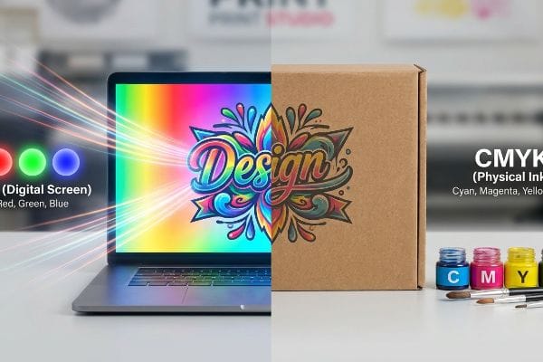
Designing a retail display on a screen feels effortless, but translating those glowing colors onto physical corrugated board requires a strict mathematical system to prevent your brand from looking muddy.
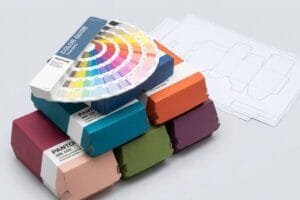
A CMYK (Cyan, Magenta, Yellow, Key) color model is a subtractive printing process primarily used in commercial packaging and paper manufacturing. By combining these four distinct ink pigments, industrial presses reproduce a vast spectrum of physical colors, ensuring brand consistency across global retail environments.
Understanding this four-color foundation is just the first step; the real challenge begins when these inks physically hit porous cardboard on the production line.
Was Genau Versteht Man Unter CMYK?
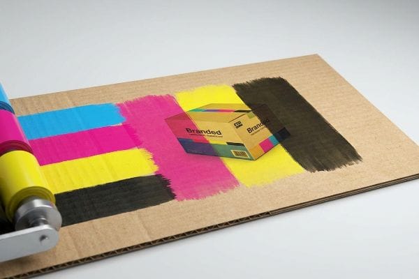
When you submit a design for mass production, you are essentially providing a recipe for four specific inks to blend optically on a physical substrate.
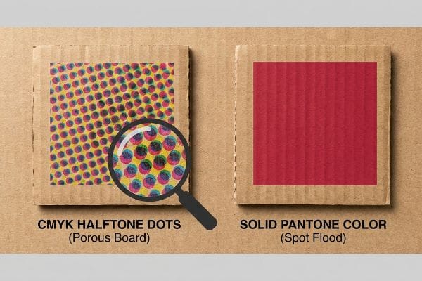
Understanding CMYK means recognizing it as the physical layering of tiny halftone ink dots on a paper surface. Unlike digital screens that emit light, this subtractive manufacturing process physically absorbs light, blending cyan, magenta, yellow, and black inks to create the final printed image on retail displays.
Knowing the definition is helpful, but seeing how these halftone dots behave on raw material changes everything.
How CMYK Halftones React on Corrugated Board
Most marketing teams naturally convert their pristine corporate logos into standard four-color process files before sending them to the printer. The assumption is that modern commercial offset presses will seamlessly overlap these primary colors to perfectly replicate the digital artwork on any given substrate.
I see this standard procedure backfire constantly when printing on raw, porous 32ECT (Edge Crush Test) testliner1. I once watched a beautifully designed four-color logo turn into a grainy, washed-out puddle of mud on the production floor because the tiny overlapping halftone dots absorbed unevenly into the raw paper fibers2. The physical friction of unsealed board ruins optical blending, making your brand look cheap under harsh fluorescent store lights. We fixed this by swapping the core logo elements to a solid Pantone flood, but relying entirely on four-color process for critical brand marks on raw cardboard is a common trap that catches even experienced procurement teams.
| Common Rookie Mistake | The Pro Fix | Retail-Floor Benefit |
|---|---|---|
| Printing logos using standard halftone dots on raw board. | Upgrading primary brand marks to a solid Pantone spot color3. | Ensures high-contrast brand visibility from 30 feet away. |
| Assuming screen vibrancy translates to porous paper. | Using high-density UV inks that cure instantly on the surface4. | Prevents ink absorption and eliminates washed-out graphics. |
| Ignoring the substrate's natural brown undertone. | Applying a white base primer5 before laying down the four colors. | Keeps brand colors mathematically accurate and vivid. |
I never let a client risk their primary brand equity on a porous surface without a solid spot color backup plan, because saving a few pennies on ink usually results in a campaign that shoppers simply ignore.
🛠️ Harvey's Desk: Not sure if your brand colors will turn muddy on raw cardboard? 👉 Get a Free Artwork Audit ↗ — Direct access to my desk. Zero automated sales spam, I promise.
Was Ist Der Unterschied Zwischen CMYK Und RGB?
The most expensive miscommunications in the packaging industry happen simply because designers and factory engineers are speaking two completely different color languages.
The difference between CMYK and RGB lies in their physical mediums. RGB (Red, Green, Blue) uses projected light for digital screens, while the four-color process uses physical ink pigments that absorb light on paper. This fundamental physics gap makes perfect color matching between monitors and physical boxes impossible.
Transitioning from a glowing screen to a physical piece of cardboard introduces a harsh reality check.
The Danger of RGB Screen Approvals in Packaging
Design agencies frequently approve retail display artwork by reviewing PDF files on high-end, backlit monitors or smartphones. They expect the physical manufacturer to magically replicate the glowing, vibrant neon colors they see on their screens6 onto thick corrugated material.
Approving physical production based on a smartphone screen is a massive blind spot that causes severe commercial friction. I remember a client angrily comparing a physical display sample to their device, wondering why the blues looked duller and less vibrant. Digital devices blast light directly into your eyes, expanding the visible color gamut artificially7. When we put that same physical box under standard D50 lighting in the factory using a spectrophotometer8, the physical ink formulation was mathematically perfect. Failing to understand that physical paper relies on ambient light reflection—not internal backlighting—will cause endless revision loops, slowing down your campaign rollout by weeks and burning through your prototyping budget.
| Common Rookie Mistake | The Pro Fix | Retail-Floor Benefit |
|---|---|---|
| Approving packaging colors exclusively on digital monitors. | Requesting a physical draw-down swatch under D50 lighting9. | Prevents mass-production color rejection by retail buyers. |
| Using glowing neon hues in the initial artwork file. | Restricting the design palette to printable gamut boundaries10. | Ensures realistic expectations and faster prepress approval. |
| Ignoring ambient lighting conditions in the physical store. | Testing color samples under harsh fluorescent retail lights11. | Guarantees the display grabs attention in real shopping aisles. |
I always force my clients to review a physical, printed swatch because relying on an auto-correcting smartphone screen to dictate a massive manufacturing run is a guaranteed path to severe supply chain delays.
🛠️ Harvey's Desk: Are you approving your critical packaging colors on a backlit screen instead of physical paper? 👉 Request a Physical Color Swatch ↗ — Download safely. My inbox is open if you have questions later.
Für Was Steht Die Abkürzung CMYK?
Knowing what the letters stand for is basic trivia; knowing how those four specific layers interact physically on a press determines whether your packaging survives or fails.
The abbreviation CMYK stands for Cyan, Magenta, Yellow, and Key. While the first three are primary pigment colors, "Key" represents black, which provides depth, contrast, and precise alignment on the printing press. Together, they form the universal standard for full-color commercial packaging and retail display manufacturing.
Once you know the four components, you must control exactly how much of each pigment is dumped onto the paper.
Managing Total Ink Limits on Corrugated Displays
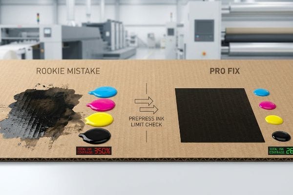
Graphic designers often try to create the richest, darkest black possible by maxing out the sliders for all four colors in their software. They assume that flooding the digital canvas with 100% of every pigment12 will seamlessly translate into a luxurious, premium shadow on the final physical product.
Pumping too much of these four inks onto a sheet creates a mechanical nightmare on the factory floor known as exceeding the Total Ink Limit13. I have had to halt the offset press because an incoming file pushed 350% total coverage. The thick, wet sludge of cyan, magenta, yellow, and black simply would not dry. The sheets stuck together in the stack, pulling the paper fibers apart and emitting a strong smell of wet PVA (Polyvinyl Acetate) glue and raw solvent. We enforce a strict 260% total ink ceiling14 in our prepress profiles, mathematically cutting back the hidden colors so the press runs at high speed without smudging, saving clients thousands in wasted material and ruined lead times.
| Common Rookie Mistake | The Pro Fix | Retail-Floor Benefit |
|---|---|---|
| Setting rich black to 100% across all four color channels. | Calibrating the total ink limit strictly below 260% coverage15. | Prevents wet ink smudging and ruined graphics during transit. |
| Assuming more pigment automatically equals better contrast. | Utilizing G7 grayscale calibration16 for optimal visual depth. | Delivers crisp, professional aesthetics that justify higher prices. |
| Skipping the prepress ink density analysis check entirely. | Running an automated pre-flight scan using PitStop Pro17. | Eliminates expensive machine downtime and reprint fees. |
I reject files that breach our strict ink limits immediately, because over-saturating the board does not make the artwork look premium; it just creates a sticky, unsellable mess on the production line.
🛠️ Harvey's Desk: Is your artwork file hiding dangerously high ink saturation levels that will smudge on the press? 👉 Claim Your Prepress Profile Check ↗ — No forms that trigger endless sales calls. Just pure value.
Warum Muss Ich CMYK Drucken?
Sticking to a standardized four-color process ensures global consistency, but using those same color channels to draw structural cutlines will severely disrupt automated machinery.
Printing CMYK ensures mass-production color consistency across diverse global manufacturing facilities. Because industrial lithographic and digital presses are physically engineered to process only these four base pigments, utilizing this standardized color model guarantees your retail packaging remains visually uniform, regardless of where the physical assembly takes place.
But knowing the color theory isn't enough when the high-speed structural machines start reading your artwork files on the floor.
Why Standard Process Black Fails on CNC Cutting Machinery
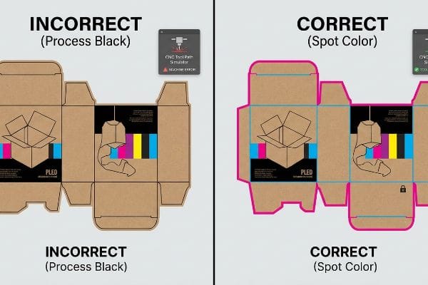
Brand teams regularly submit flat dieline files where the structural fold lines and cut lines are drawn using standard four-color process black18. They assume that as long as the lines are visually discernible on the PDF, the factory equipment will naturally understand where to cut, crease, and fold the cardboard.
In my facility, I routinely see automated manufacturing break down simply because a designer used standard black instead of a dedicated mechanical spot color. Automated CAD cutting tables, like our Kongsberg machinery, do not possess human eyes; they scan files for specific, mathematically defined spot color names19 like "Cut" or "Crease". When I measure a file and see the dieline built in standard process black, I know the machine RIP software will accidentally merge those lines directly into the printable artwork layer. This results in a physical box that has ugly black outlines printed all over it, but absolutely zero physical cuts. By intercepting these files and converting the process black strokes into 100% mechanical magenta spot colors, I prevent total line-stoppages, ensuring the CNC (Computer Numerical Control) blades engage perfectly. This exact 0.11-inch (2.79 mm) stroke conversion20 saves my clients an estimated $1,800 in wasted blank boards and completely eliminates manual repacking delays.
| Common Rookie Mistake | The Pro Fix | Retail-Floor Benefit |
|---|---|---|
| Using standard process black to draw structural cut lines. | Assigning absolute mechanical spot colors to all vector paths21. | Ensures automated machinery physically cuts the board perfectly. |
| Merging the structural dieline directly into the artwork layer. | Isolating the die-cut instructions on a locked, non-printing layer. | Prevents ugly technical lines from appearing on the final box. |
| Assuming visual lines translate into physical CNC movements. | Running a prepress RIP simulation to verify tool path engagement22. | Eliminates manual rework delays and accelerates market rollout. |
I personally separate every incoming structural path from the printable layers, because feeding four-color process dielines into a high-speed cutting table is a guaranteed recipe for expensive mechanical failure.
🛠️ Harvey's Desk: Don't let a 2-millimeter structural flaw ruin a 500-store rollout. 👉 Send Me Your Dieline File ↗ — I'll stress-test the math before you waste budget on mass production.
Conclusion
You can choose to skip prepress ink profiling, but when that overloaded 350% ink coverage fails to dry on a massive corrugated run, the resulting sticky sheets will physically tear apart on the press, slowing down automated co-packing by an estimated 40% and completely wiping out the project's profit margin. Over 500 brand managers use my prepress checklist to avoid these exact fatal early-stage mistakes. Stop guessing on total ink limits and let me personally run your files through my Free Dieline Audit ↗ to catch fatal color formatting errors before mass production begins.
"New Edge Crush Test Configuration Enhanced with Full-Field Strain …", https://pmc.ncbi.nlm.nih.gov/articles/PMC8510352/. [Technical specifications for corrugated board define the Edge Crush Test (ECT) as a measure of stacking strength and material porosity. Evidence role: technical definition; source type: industry standard. Supports: the specific material properties of the substrate used. Scope note: ECT values are standardized across packaging manufacturers.] ↩
"Corrugated Box Printing Evolution with Aqueous Inks", https://splashjet-ink.com/evolution-of-aqueous-packaging-inks-a-smarter-approach-to-corrugated-box-printing/. [Printing science documentation explains how uncoated, porous substrates cause ink bleed and dot gain, distorting halftone images. Evidence role: scientific mechanism; source type: technical printing guide. Supports: the cause of image degradation on raw board. Scope note: specifically applies to subtractive CMYK processes.] ↩
"Difference Between Spot Color and CMYK Color", https://www.deprintedbox.com/blog/spot-vs-process-color/. [Industry standards for brand identity on raw substrates detail how spot colors provide higher saturation and contrast than CMYK halftones]. Evidence role: design standard; source type: graphic design manual. Supports: spot color visibility on raw board. Scope note: Focuses on brand visibility distance. ↩
"UV-Curable Inks: Driving the Future of Sustainable and High …", https://www.bccresearch.com/industry-trends/uv-curable-inks-industry-trends-outlook?srsltid=AfmBOooZ6qAKuji3iRMFtSiNE6KWIO1GcBSrlyDo56mzVswqxM-xzpRQ. [Technical specifications on UV-curable inks explain how rapid polymerization prevents ink penetration into porous substrates to maintain color density]. Evidence role: technical specification; source type: printing industry manual. Supports: ink absorption prevention. Scope note: Specific to UV curing technology. ↩
"CMYK Color Model for Printing Boxes – Gentlever", https://gentlever.com/cmyk-for-printing-boxes/. [Printing guidelines for corrugated packaging demonstrate that a white underprint masks the substrate's natural hue to maintain the mathematical accuracy of CMYK values]. Evidence role: technical process; source type: printing guide. Supports: use of white primer for color fidelity. Scope note: Applies to brown or kraft substrates. ↩
"RGB vs. CMYK: The 2026 Guide to Perfect Print Colors", https://www.jukeboxprint.com/blog/rgb-vs-cmyk-for-print?srsltid=AfmBOopZKIYJssCbyCBse0HfBPgDZFIsLoINNfpqf10BvxTn_CmXtuLV. [A technical source on color science would explain the difference between the additive color model (RGB) of emissive light and the subtractive model (CMYK) of reflective ink, specifically highlighting the wider color gamut of RGB. Evidence role: technical validation; source type: color science manual. Supports: the physics-based limitation of replicating screen colors on physical substrates. Scope note: applicable to all screen-to-print conversions.] ↩
"RGB vs. CMYK: The 2026 Guide to Perfect Print Colors", https://www.jukeboxprint.com/blog/rgb-vs-cmyk-for-print?srsltid=AfmBOorE50nMG64cd-ivZFSc3JdAt5M6-jqdqhorzOyP81rKP4iloz4D. [Authoritative color science texts explain that additive RGB lighting can reproduce a wider range of saturated colors than subtractive CMYK ink pigments. Evidence role: technical verification; source type: scientific manual. Supports: the claim that screens display colors that cannot be replicated in physical print. Scope note: varies by display technology such as OLED vs LCD.] ↩
"Standardized color matching to ISO 3664:2009", https://www.just-normlicht.com/us/iso-3664-2009.html. [International standards like ISO 3664 establish D50 (5000K) as the benchmark illuminant for viewing and measuring color in the graphic arts industry. Evidence role: industry standard verification; source type: ISO standard. Supports: the claim that D50 is the professional standard for physical color validation. Scope note: specific to the printing and packaging industry.] ↩
"D50 Color checking for graphic arts | JUST-Normlicht", https://www.just-normlicht.com/us/d50-color-checking-graphic-arts.html. [An authoritative industry source on ISO lighting standards confirms D50 as the standard illuminant for graphic arts to ensure color consistency]. Evidence role: technical standard; source type: industry standard. Supports: The requirement for standardized lighting in color approval. Scope note: Applies specifically to the print and graphic arts industry. ↩
"RGB vs. CMYK: The 2026 Guide to Perfect Print Colors", https://www.jukeboxprint.com/blog/rgb-vs-cmyk-for-print?srsltid=AfmBOoriRmtR3N1h4DvSzOsIyPmkh6d_lBumvgq8hPP0S46xcCOYScnm. [Technical documentation on color science explains that the subtractive CMYK gamut is significantly smaller than the additive RGB gamut, necessitating boundary restrictions to prevent color shifts]. Evidence role: technical specification; source type: color science manual. Supports: The need to restrict design palettes to achievable print colors. Scope note: General to all CMYK printing processes. ↩
"Metamerism "Meets Its Match" – Konica Minolta Sensing Americas", https://sensing.konicaminolta.us/us/blog/metamerism-meets-its-match/. [Scientific research on metamerism demonstrates how the same color sample can appear different under different light sources, justifying the need for retail-specific lighting tests]. Evidence role: scientific principle; source type: optical physics paper. Supports: The necessity of testing samples under actual retail lighting conditions. Scope note: Focuses on visual perception and spectral power distribution. ↩
"FAQ – Convert Registration / Rich Blacks to CMYK – Planet Label", https://www.planetlabel.com/artwork-specs/pure-black. [Authoritative printing standards define the use of 100% of all four CMYK colors as 'Registration Black,'distinguishing it from 'Rich Black'blends meant for image areas]. Evidence role: technical definition; source type: industry manual. Supports: the description of the high-ink coverage practice. Scope note: refers to digital prepress settings. ↩
"Error x Ink coverage over 300% – Adobe Community", https://community.adobe.com/questions-652/error-x-ink-coverage-over-300-819461. A technical printing guide would define Total Ink Limit (TIL) and describe the physical consequences of excessive coverage, such as set-off and drying failure. Evidence role: technical definition; source type: industry manual. Supports: The mechanical risks of high ink coverage. Scope note: Limits vary by substrate. ↩
"Managing Ink Coverage in Print Design: A Guide to Selective Color …", https://www.printing.org/content/2024/04/23/adjustinginklimits.april2024. Professional prepress standards for various paper stocks typically establish total ink limits between 240% and 320% to ensure production efficiency and drying. Evidence role: benchmark verification; source type: technical specification. Supports: The validity of a 260% ceiling in a professional environment. Scope note: Specific limit depends on paper porosity and ink type. ↩
"Thinking inside and outside the corrugated box – Printing", https://www.agfa.com/printing/tips/corrugated-boxes/. [An industry technical guide or printing manual supports the 260% Total Area Coverage (TAC) limit to prevent ink drying issues on absorbent substrates]. Evidence role: technical specification; source type: printing industry manual. Supports: ink limit guidelines. Scope note: Specific to corrugated or offset printing. ↩
"Why G7 Calibrated Printing is So Important | INX International", https://www.inxinternational.com/blog/why-g7-calibrated-printing-is-so-important. [The G7 certification standards define a methodology for achieving consistent grayscale and color balance across different printing processes]. Evidence role: industry standard; source type: technical certification body. Supports: calibration methods. Scope note: Applies to multi-platform print production. ↩
"PitStop Pro – PDF Preflight & Editing Plugin – Enfocus", https://www.enfocus.com/en/pitstop-pro. [Product documentation for PitStop Pro verifies its capability to perform automated pre-flight scans for ink density and coverage errors]. Evidence role: tool functionality; source type: software documentation. Supports: prepress workflow efficiency. Scope note: Focused on specific software capabilities. ↩
"Spot vs. Process Color – Seattle Printworks", https://seattleprintworks.com/prepress/how-to-build-professional-files-with-spot-colors/. [Technical print production guides explain that CNC cutting and creasing machinery require designated spot color channels rather than process black to distinguish structural instructions from visual graphics]. Evidence role: technical specification; source type: industry technical manual. Supports: the inadequacy of CMYK for machine-readable dielines. Scope note: Specific to automated packaging manufacturing. ↩
"adobe illustrator – What color swatch to use for cut lines?", https://graphicdesign.stackexchange.com/questions/83118/what-color-swatch-to-use-for-cut-lines. [Technical manuals for CAD/CAM cutting systems confirm that machinery utilizes designated spot color names as non-printing markers to trigger specific tool paths]. Evidence role: technical specification; source type: manufacturer documentation. Supports: the necessity of spot colors for automation. Scope note: may vary slightly by software vendor.] ↩
"Different recommendations for stroke width for cut lines", https://sawmillcreek.org/threads/different-recommendations-for-stroke-width-for-cut-lines.293210/. [Industry guidelines for vector path thickness in CNC cutting software specify optimal stroke widths to ensure reliable blade engagement and registration]. Evidence role: technical metric; source type: technical manual. Supports: the specific stroke measurement used to prevent production errors. Scope note: measurement may be specific to certain hardware tolerances.] ↩
"More About Spot Color vs. 4-Color Process – YouTube", https://www.youtube.com/watch?v=INyc1Qzrp38. [An authoritative prepress guide would explain that CNC machinery requires distinct spot color channels to differentiate cutting paths from printed CMYK graphics]. Evidence role: technical specification; source type: industry manual. Supports: necessity of spot colors for automated cutting. Scope note: applies to digital cutting systems. ↩
"Predator Virtual CNC software for 3D CNC machine simulation …", https://www.predator-software.com/predator_virtual_cnc_software.htm. [Technical documentation on RIP software would detail how simulation identifies tool path errors and overlap before the physical cutting process begins]. Evidence role: process verification; source type: technical whitepaper. Supports: efficacy of RIP simulations in reducing waste. Scope note: specific to professional digital plotters. ↩