Brands spend millions designing the perfect packaging, only to receive a printed display that looks completely wrong under store lights. Understanding color matching fixes this costly, margin-killing disconnect entirely.
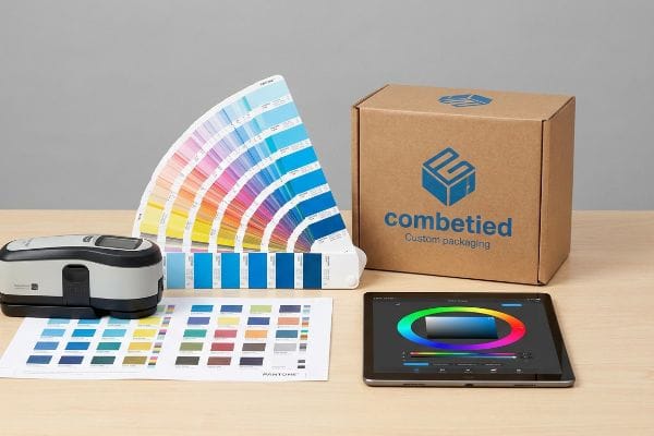
Color matching in printing is the technical process of ensuring digital artwork colors precisely align with physical ink outputs on final packaging materials. This critical standard utilizes tools like spectrophotometers and standardized color systems, such as Pantone, to guarantee consistent brand identity across various substrates globally.
Before you approve your next massive retail rollout, understanding how this science actually works on the factory floor can save you from a catastrophic product launch.
What is color matching in printing?
You might think your screen shows the exact shade you'll get, but digital monitors and physical paper speak two entirely different languages.
Color matching in printing refers to the measurable calibration between graphic design files and industrial printing presses. Facilities utilize advanced GMG proofing software and spectrophotometers to strictly monitor Delta-E tolerances, ensuring the physical ink pigment matches the intended brand guidelines with mathematical accuracy on every production run.

Understanding this definition is just the starting point; the real challenge begins when we translate pixels into wet ink.
The Science Behind Accurate Color Matching
Many marketing teams assume that if a logo looks vibrant on their Apple monitor, the factory press will naturally replicate that exact intensity. They rely on basic CMYK (Cyan, Magenta, Yellow, Black) conversions provided by their design software, expecting a seamless transition. This theoretical approach ignores the physics of how different porous materials absorb liquid pigments1.
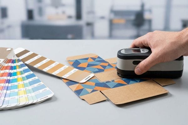
The retail reality requires a different mindset when moving from premium paper to thick corrugated boards. Teams are often surprised when their signature red turns into a muted color on the first sample run, as uncoated paper fibers absorb ink differently2 than a glossy screen displays light. The professional standard involves moving away from digital screens and demanding physical drawdowns validated by a spectrophotometer reading3. This strategic step locks in precise tolerances before mass production begins.
| Common Rookie Mistake | The Pro Fix | Retail-Floor Benefit |
|---|---|---|
| Approving colors via computer screen | Demand physical drawdown samples4 | Prevents rejected shipments upon delivery |
| Ignoring material absorption rates5 | Specify exact substrate (e.g., uncoated kraft) | Eliminates costly reprints and delays |
| Using subjective visual checks | Enforce strict numerical tolerances6 | Guarantees multi-store campaign uniformity |
Relying on mathematical color profiling removes human subjectivity, keeping your brand identity perfectly consistent while drastically cutting down on wasted approval cycles.
🛠️ Harvey's Desk: Not sure if your current artwork files are calibrated for raw corrugated material? 👉 Get A Free File Review ↗ — Direct access to my desk. Zero automated sales spam, I promise.
What is the process of color matching?
Translating a brand identity into physical reality requires a sequence of highly controlled mechanical steps, far beyond simply hitting a print button.
The process of color matching involves standardizing digital files, outputting physical test proofs, and chemically mixing inks to achieve specific Pantone values. Production teams utilize controlled D50 lighting booths and optical scanners to constantly adjust ink flow on the press until exact mathematical alignment is fully secured.
While the steps sound straightforward in a textbook, executing them in a dusty manufacturing environment is a completely different game.
How the Color Matching Process Actually Works
The standard workflow begins when prepress engineers separate your digital artwork into distinct color channels. From there, ink technicians mix raw pigments by weight, relying on global formula books7 to match specific spot colors before loading them into the massive ink fountains on the lithographic press.
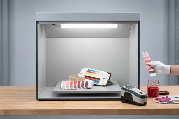
A common strategic oversight catches even experienced procurement teams—they approve a physical color sample while sitting in a warmly lit office. Later, when the display arrives under the cold fluorescent lights of a big-box retailer, the colors visually shift. This optical illusion happens because different light sources reflect ink pigments differently. The professional standard involves conducting all color evaluations inside a D50 lighting booth8 to accurately mimic exact retail settings, ensuring your displays command attention on the floor.
| Common Rookie Mistake | The Pro Fix | Retail-Floor Benefit |
|---|---|---|
| Approving proofs near office windows | Use standard D50 light booths | Prevents unpredictable color shifts in-store |
| Sending uncalibrated PDF (Portable Document Format) files | Embed correct ICC color profiles | Accelerates the initial prepress workflow |
| Assuming all inks dry identically | Factor in dry-back color shifts | Maintains visual pop for consumers |
Locking down this visual environment early drastically reduces the friction of back-and-forth rejections, accelerating your ultimate time to market.
🛠️ Harvey's Desk: Are your displays mysteriously losing their visual punch when they finally reach the store aisle? 👉 Request A Color Calibration Audit ↗ — Download safely. My inbox is open if you have questions later.
What is the rule of color matching?
If there is one fundamental law in commercial print manufacturing, it is that you cannot cheat the chemistry of paper and pigment.
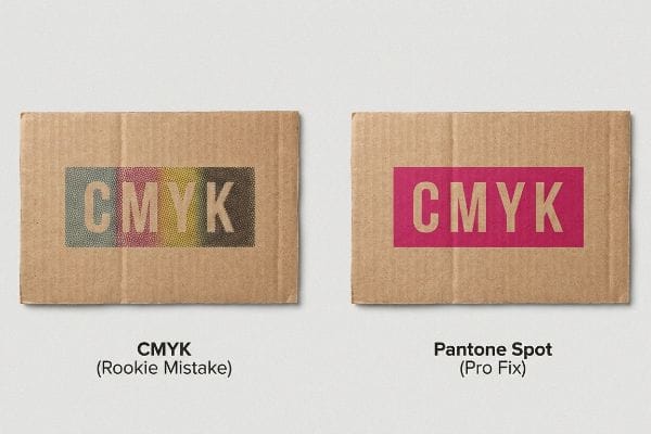
The primary rule of color matching dictates that digital CMYK conversions cannot accurately reproduce solid brand colors on highly porous materials. Manufacturers must utilize the Pantone spot color system to flood solid pigments, avoiding halftone dot grain and ensuring pure, readable brand logos from a distance.
Following this foundational rule separates premium retail campaigns from cheap-looking counterfeits that fade into the background.
Mastering the Golden Rule of Color Matching
Many design agencies intuitively set up entire packaging files in a standard CMYK four-color process, treating corrugated cardboard exactly like glossy magazine paper. They expect the cyan, magenta, yellow, and black dots to perfectly blend optically and create their vibrant corporate brand colors.
The retail reality requires a more strategic approach, as printing tiny overlapping CMYK halftone dots on raw testliner9 often creates a grainy, muted appearance. The professional standard is implementing a Spot Color Flood Protocol10 for all primary brand elements, using a single, pre-mixed bucket of Pantone ink. This strategic upgrade ensures the logo remains razor-sharp, allowing consumers to recognize your brand instantly from across a crowded store aisle.
| Common Rookie Mistake | The Pro Fix | Retail-Floor Benefit |
|---|---|---|
| Building solid logos in CMYK | Mandate Pantone spot colors11 | Ensures instant brand recognition from afar |
| Ignoring paper texture limits | Avoid fine halftone dot blending12 | Keeps text sharp and highly readable |
| Skipping ink density checks | Monitor physical ink film thickness13 | Stops colors from looking washed out |
Relying on standard four-color processing for primary logos dilutes brand equity with muddy grain. Upgrading to a dedicated spot color eliminates this risk, guaranteeing your retail displays command premium pricing across the entire store floor.
🛠️ Harvey's Desk: Is your brand logo looking inexplicably grainy or washed out on your current corrugated displays? 👉 Claim Your Artwork Diagnostics ↗ — No forms that trigger endless sales calls. Just pure value.
How do I get my printer to print in exact color?
You can provide the most perfectly calibrated files in the world, but factory machines introduce physical variables that software simply cannot predict.
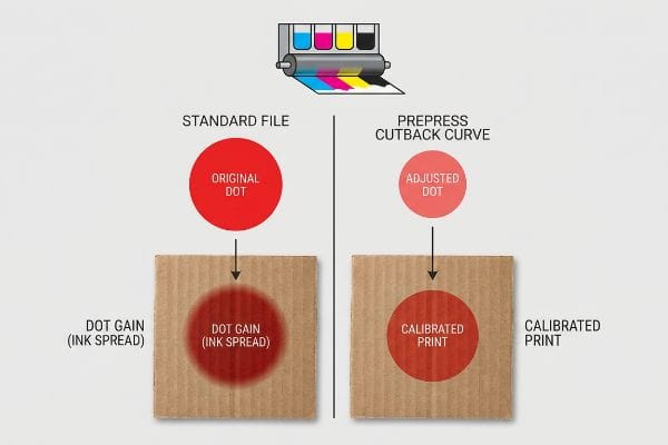
To get your printer to print in exact color, you must physically compensate for mechanical dot gain during the prepress stage. Factories achieve this by applying a mathematical cutback curve in their RIP software, adjusting the artwork files to counteract how wet ink spreads upon paper impact.
But knowing the theory isn't enough when the machines start running and thousands of sheets are feeding through the press every hour.
Why Standard Color Files Fail on the Factory Floor
A seemingly reasonable but actually dangerous assumption buyers make is that if a verified Pantone file is handed to a reputable factory, exact color reproduction is automatically guaranteed14. They assume modern printing presses act exactly like high-end office laser printers, simply laying down the exact amount of pigment dictated by the digital file without any distortion.
In my facility, I routinely see this theoretical perfection shatter the moment wet ink physically strikes porous corrugated board. The harsh reality is a phenomenon called dot gain; when the heavy rubber blankets of an offset press smash liquid ink into a 32 ECT (Edge Crush Test) board, the physical pressure causes every single microscopic dot to spread outward by up to 15%15. If I run your standard file without intervention, that physical ink bleed causes a catastrophic color shift—turning a vibrant photographic header into a dark, shadowy mess that drastically lowers the perceived value of your product. To fix this, I utilize advanced prepress software to engineer a mathematical cutback curve16, artificially shrinking your artwork dots before we even burn the printing plates. By enforcing this invisible prepress adjustment, I prevent devastating quality rejections, ensuring the final mass-produced units perfectly match the approved sample and saving clients weeks of delayed retail launch schedules.
| Common Rookie Mistake | The Pro Fix | Retail-Floor Benefit |
|---|---|---|
| Ignoring mechanical ink spread | Apply prepress cutback curves17 | Guarantees crisp, high-contrast product images |
| Printing standard files blindly | Calibrate software to substrate18 | Prevents dark, unsellable printed inventory |
| Blaming the press operator | Fix the math before plating | Eliminates costly mass-production reprints |
Leaving final color fidelity to the physical pressure of a running machine guarantees inconsistent results. Artificially compensating for ink spread before plating removes manufacturing risks entirely, delivering displays that match your exact vision.
🛠️ Harvey's Desk: Do you know the exact dot gain percentage your current supplier is applying to your corrugated artwork files? 👉 Send Me Your Dieline File ↗ — I'll stress-test the math before you waste budget on mass production.
Conclusion
You can choose a cheaper vendor, but when unexpected dot gain on porous corrugated board turns your vibrant campaign into a dark, muddy disaster, that visual failure triggers immediate retailer rejection and wipes out your entire profit margin. Over 500 brand managers use my prepress checklist to avoid these exact fatal early-stage mistakes. Stop leaving your brand equity to chance and let me personally audit your artwork through my Free Dieline Pre-Flight Audit ↗ to catch these mechanical prepress errors before you ever go to print.
"Why does paper structure affect the ink absorption performance of …", https://www.visionsub.com/why-does-paper-structure-affect-the-ink-absorption-performance-of-sublimation-paper/. [An authoritative source on print science or ink chemistry would explain how substrate porosity affects pigment absorption and subsequent color appearance]. Evidence role: technical explanation; source type: industry manual or academic textbook. Supports: the claim that material physics impacts color accuracy. Scope note: specifically concerns porous substrates like paper and cardboard. ↩
"Coated vs. Uncoated Paper: Ink Absorption & Color Guide", https://www.ybj-printing.com/coated-vs-uncoated-paper-ink-absorption-color-guide/. [An authoritative source on printing substrates would explain how the porosity and lack of coating on fibers lead to increased ink penetration and a shift in color saturation]. Evidence role: technical explanation; source type: printing industry manual. Supports: why colors appear muted on corrugated or uncoated materials. Scope note: focus on subtractive color mixing. ↩
"Color Spectrophotometer Best Practices – Datacolor", https://www.datacolor.com/business-solutions/blog/using-a-spectrophotometer-color-measurement-instrument/. [Professional printing standards detail the necessity of physical drawdowns and spectrophotometry to quantitatively verify color accuracy and Delta-E tolerances]. Evidence role: industry standard; source type: technical specification guide. Supports: the professional methodology for color verification. Scope note: applicable to industrial-scale production. ↩
"Drawdown, what does that mean? • cutpasteandprint", https://www.cutpasteandprint.com/drawdown/. [An authoritative printing manual would explain how drawdown samples provide a physical reference of ink on a specific substrate to overcome digital monitor inaccuracies]. Evidence role: technical definition; source type: printing industry manual. Supports: necessity of physical proofing. Scope note: applies to ink-on-substrate verification. ↩
"Printing Substrates in Offset Printing & Their Impact on Color Matching", https://babalrayan.com/printing-substrates-in-offset-printing-their-impact-on-color-matching/. [Technical documentation would describe how porosity and absorption of substrates like uncoated kraft affect ink saturation and the final color appearance]. Evidence role: physical principle; source type: materials science journal. Supports: influence of substrate on color. Scope note: specific to absorbent materials. ↩
"Color Accuracy and Delta E Explained: Considerations … – Formlabs", https://formlabs.com/blog/color-accuracy-delta-e/. [Industry standards such as ISO or GRACoL define numerical tolerances, specifically Delta E, to objectively measure and limit color variance]. Evidence role: industry standard; source type: technical specification. Supports: use of objective metrics over subjective checks. Scope note: focuses on quantitative color measurement. ↩
"Explaining Spot Color Ink Mixing Techniques", https://www.zxprinter.com/support/explaining-spot-color-ink-mixing-techniques.html. [Technical printing manuals describe the precision process of weighing raw pigment components using standardized formula books to achieve consistent spot color results]. Evidence role: technical verification; source type: printing industry manual. Supports: the precision of ink formulation. Scope note: focuses on commercial lithographic standards. ↩
"What is D50 for graphic arts & printing? – Waveform Lighting", https://www.waveformlighting.com/color-matching/what-is-d50-for-graphic-arts-printing. [An authoritative source on color management or ISO standards will verify that D50 (5000K) is the industry standard for viewing color proofs to ensure consistency across different environments]. Evidence role: technical specification; source type: industry standard. Supports: The requirement for standardized lighting in color matching. Scope note: Specifically applies to the graphic arts and printing sectors. ↩
"CMYK Printing Problems SOLVED – Clear Print", https://www.clearprint.com/cmyk-printing-problems-solved/. [Printing technical guides describe how the high porosity of raw testliner causes excessive ink absorption and dot gain, resulting in a muted, grainy appearance when using CMYK process colors]. Evidence role: technical validation; source type: print production manual. Supports: interaction of CMYK ink and porous substrates. Scope note: specific to raw testliner materials. ↩
"Spot color vs Process Color Printing – Pantone", https://www.pantone.com/articles/technical/spot-vs-process-color?srsltid=AfmBOookS4AieHdSYyTJPFn2q6VXdThB5n0GzpYSMzX50b81CDM6EpEu. [Industry standards for brand identity reproduction mandate the use of spot colors over CMYK for primary brand elements to ensure chromatic consistency and vibrancy across various substrates]. Evidence role: industry standard; source type: graphic arts professional guide. Supports: use of Pantone spot colors for logos. Scope note: applicable to commercial print manufacturing. ↩
"CMYK vs. Spot Colors in Packaging Printing", https://meyers.com/meyers-blog/cmyk-vs-spot-colors-in-packaging-printing-what-cpg-brands-need-to-know/. Industry standards in graphic arts explain why spot colors provide superior consistency and vibrancy for brand identities compared to four-color process mixing. Evidence role: technical best practice; source type: printing industry manual. Supports: Use of Pantone for brand recognition. Scope note: Applies to commercial offset and screen printing. ↩
"[PDF] 1. Dot gain is the increase of halftone dot sizes as ink absorbs into …", https://www.coloradomesa.edu/art/documents/student-resources/study-guide-2019.pdf. Technical specifications on substrates describe how paper tooth and porosity cause dot gain, which can blur fine halftones and degrade text sharpness. Evidence role: technical constraint; source type: printing engineering textbook. Supports: Relationship between paper texture and halftone limits. Scope note: Specifically concerns uncoated or heavily textured papers. ↩
"Study on Relationship of Ink Thickness and Color Saturation", https://www.researchgate.net/publication/276300220_Study_on_Relationship_of_Ink_Thickness_and_Color_Saturation. Ink chemistry documentation correlates the physical thickness of the ink layer (film thickness) with the resulting optical density and perceived color saturation. Evidence role: scientific metric; source type: ink chemistry guide. Supports: Prevention of washed-out colors through density monitoring. Scope note: Relevant to professional press control systems. ↩
"Why Pantone Colors Can Look Different in Print (and What to Do …", https://precisionimages.com/why-pantone-colors-can-look-different-in-print-and-what-to-do-about-it/. [Professional color management standards explain that Pantone digital files are targets that require physical press calibration to account for substrate and ink variables]. Evidence role: supporting evidence; source type: technical manual. Supports: the claim that digital files alone do not ensure color accuracy. Scope note: applies to physical ink-on-substrate printing. ↩
"Mathematical modelling and compensation strategies for printing dot …", https://pmc.ncbi.nlm.nih.gov/articles/PMC12574880/. [A technical printing manual would provide the empirical range of ink spread on porous corrugated substrates to validate the 15% figure]. Evidence role: factual verification; source type: technical manual. Supports: quantification of dot gain. Scope note: percentages vary by ink viscosity and substrate porosity. ↩
"Dot Gain Correction Curve – PrintFactory", https://support.printfactory.cloud/portal/en/kb/articles/dot-gain-correction-curve. [Industry standards for RIP software documentation describe the use of compensation curves to shrink dots in anticipation of physical gain]. Evidence role: process verification; source type: software specification. Supports: method of mechanical compensation. Scope note: refers to the prepress phase of offset printing. ↩
"Prepress Compensation", https://printplanet.com/threads/prepress-compensation.17707/. [An authoritative guide on prepress production would explain how cutback curves adjust image data to compensate for dot gain and ink spread]. Evidence role: technical specification; source type: industry manual. Supports: the use of cutback curves to maintain image contrast. Scope note: Applies primarily to offset and flexographic printing. ↩
"The Impact of Substrate Color on Feature Resolution in 3d Inkj…", https://publikationen.bibliothek.kit.edu/1000183097. [Technical documentation on color management confirms that substrate properties such as porosity and whiteness necessitate software calibration to prevent color shifts]. Evidence role: technical principle; source type: color management guide. Supports: the necessity of substrate-specific calibration to avoid dark inventory. Scope note: Applicable across various commercial printing methods. ↩