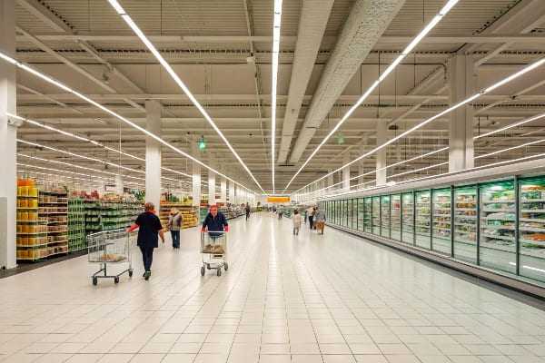
I see shoppers move fast. I want to stop them. I face tight budgets and strict deadlines. I need a clear plan to pick the right display for each store type.
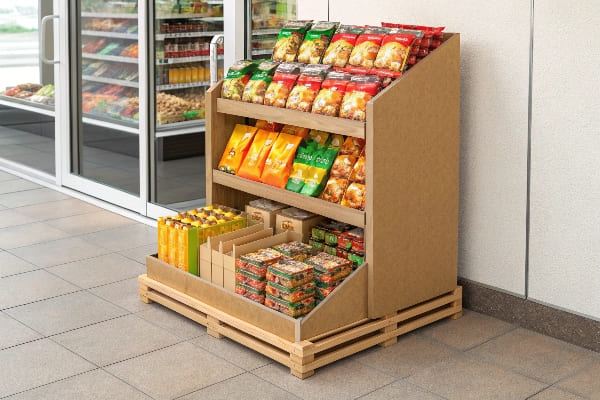
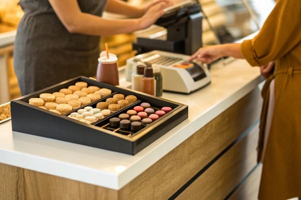
The best retail display matches store traffic flow, shopper mission, product size, and campaign length; I use floor displays for impact, countertop for impulse, pallet for scale, shelf trays for organization, and interactive units for education, while keeping sustainability, load strength, and assembly time in balance.
I will walk through common questions that buyers ask me. I will give short answers first. I will then go deep with clear steps, small stories, and simple tables.
What are 5 locations that may be used for a promotional display or stand?
Shoppers make quick choices. I must meet them at the right place. If I choose the wrong spot, I waste print, freight, and time.
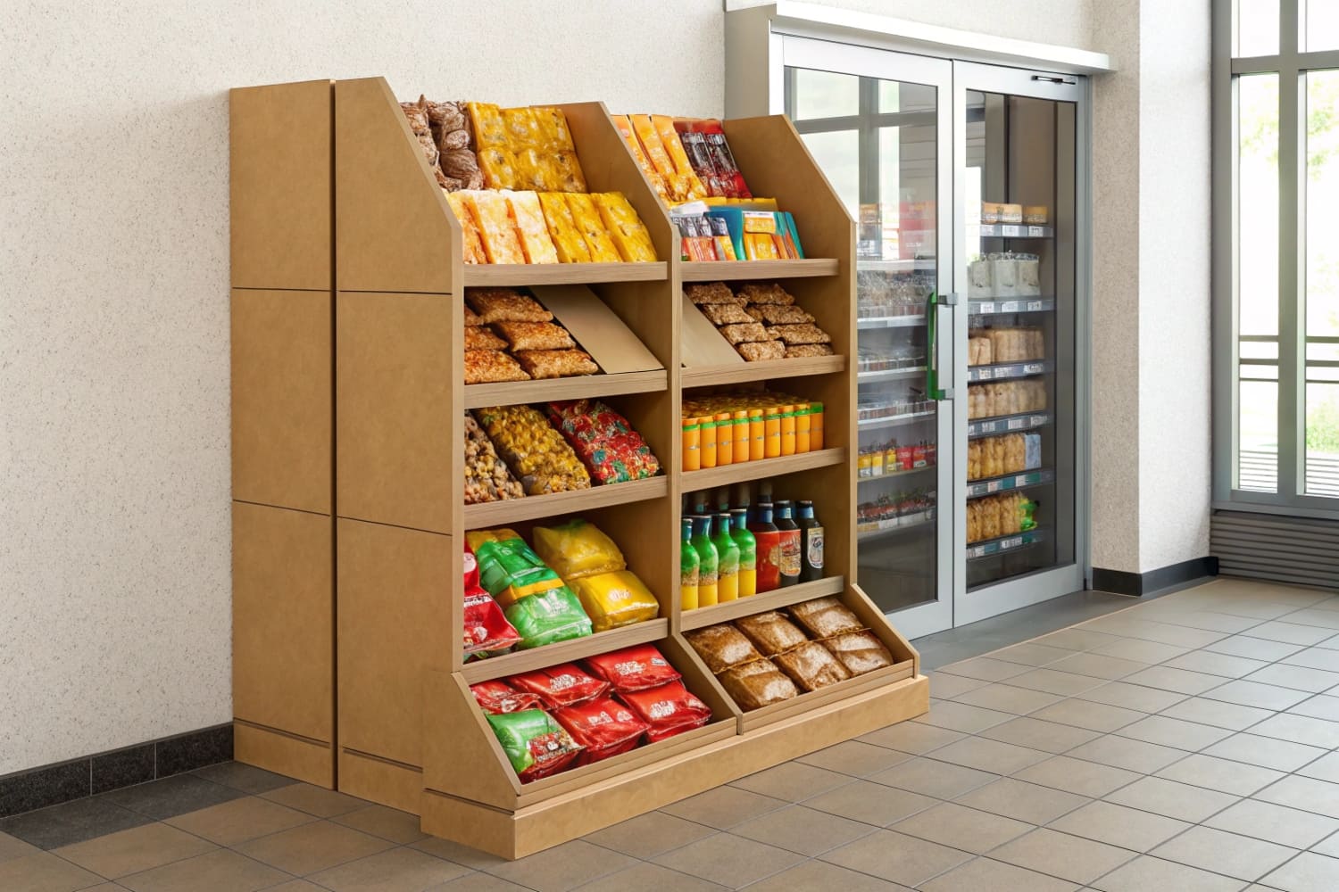
Five strong display locations are: store entrance, main aisle "racetrack," category aisle endcap, checkout counter, and seasonal or promotional zone; I choose based on foot traffic, sightlines, and impulse behavior.
Why these five spots work
I plan around how people move. The entrance sets the mood. The main aisle handles most traffic. Endcaps stop people at turning points. The checkout counter drives impulse. The seasonal zone builds urgency. I test each spot with a simple rule: can a shopper see the product fast and reach it with one step. I avoid dead zones near staff doors or narrow corners. I keep safety clearances. I leave space for carts. I keep displays within planogram limits to avoid removal.
How I match display to location
I use a simple grid to pick structure and message length. I keep copy short at high-speed points. I use more detail where dwell time is higher.
| Location | Shopper Speed | Best Display Type | Message Length | Pro Tips |
|---|---|---|---|---|
| Entrance | Fast | Floor or arch topper | 3–5 words | Big contrast, one hero visual |
| Main aisle | Medium | Floor/Pallet | 5–7 words | Angle 15–30° to flow |
| Endcap | Medium | Shelf trays + header | 7–10 words | Bold price callout |
| Checkout | Slow | Countertop | 3–5 words | Small footprint, upsell bundle |
| Seasonal zone | Variable | Floor + stackers | 5–9 words | Thematic color, countdown |
A short field story
I launched a hunting-accessories floor display1 at the main aisle of a big-box store. Traffic was high but hands were full. I moved the unit to an endcap near the archery lane. Units sold 32% faster because shoppers could stop and compare. I kept the copy to five words and one price badge. I used a QR code for specs to save space.
What job designs displays for retail stores?
Teams often push this task around. Operations wants speed. Marketing wants brand drama. I act as a bridge and keep the brief tight.
A retail display is typically designed by a POP/visual merchandising designer or a structural packaging engineer, often supported by a display manufacturer's in-house design team that handles structure, graphics, and prototyping.
Who does what on a display project2
I define clear roles early. It prevents rework. I keep one owner for structure and one for graphics. I hold a short kickoff with a checklist: size, load, dwell time, target store, and budget. I push for a one-page creative brief. I ask for shelf-ready dimensions of the product and full weight per tier. I test a flat-pack sample before art lock. I schedule a color proof and a transport drop test. I set a sign-off gate after each step.
| Role | Core Task | Deliverable | My Ask |
|---|---|---|---|
| Visual merchandiser | Shopper flow, messaging | Sketch + planogram | 1-page brief with KPIs |
| Structural engineer | Die-line, load design | CAD + prototype | Exact weights, pack-out |
| Graphic designer | Brand layout | Print-ready art | Color targets (Pantone/LAB) |
| Display manufacturer | Feasibility, costs | BOM + lead time | Approval on materials |
| Retail buyer | Placement rules | Fixture specs | Max footprint, safety notes |
My process that reduces risk
I work in four gates: concept, sample, color, and pilot. At concept, I share 3D renders and get a yes on look and size. At sample, I run a quick load test with real items. At color, I print a press proof and match to brand targets. At pilot, I build 20–50 units and ship to two store types. I gather photos and notes from staff. I fix weak points fast. This keeps speed and quality in balance, and it avoids large-scale scrap.
What is the best layout for a retail store?
There is no single perfect layout. Each format has a mission. I align the display to that mission and the way carts move.
The best layout matches store format: grid for supermarkets and pharmacies, racetrack (loop) for department and discount stores, free-flow for boutiques; I place displays to guide traffic, reduce friction, and highlight seasonal power zones.
Matching layout to display strategy
I start with the store format. A grid layout uses long aisles. It needs endcaps and pallet displays near aisle entries. A racetrack layout loops around. It needs floor features near bends and sightline breaks. A free-flow layout has islands. It needs themed zones and flexible floor displays. I measure three things: average aisle width, typical basket size, and dwell time by zone. I keep ADA clearance in mind. I avoid creating bottlenecks. I angle displays slightly to slow carts without blocking them.
| Store Layout | Traffic Pattern | Display Focus | Risks | Fix |
|---|---|---|---|---|
| Grid | Linear, fast | Endcaps, shelf trays | Blind spots | Tall headers, side wings |
| Racetrack | Loop, medium | Floor features at bends | Congestion | Narrow bases, rounded edges |
| Free-flow | Meander, slow | Themed floor sets | Weak wayfinding | Clear zone signage |
A simple placement method I use
I map a shopper path3 with sticky notes. I mark "see," "reach," and "decide" points. I place high-margin, giftable items in slow zones. I place replenishment items near straight lines. I keep the hero display within 15 feet of the seasonal table. I put cross-sell hooks at 45 degrees to the main flow. I test at one store first. I time five shoppers. I track how many touch the product and how many put it in the basket. I then scale with small tweaks for regional habits. This keeps the plan grounded and easy to repeat.
What is display in a retail store?
People use many words for the same thing. I keep it simple. A display is a tool to show and sell a product.
A retail display is a temporary or semi-permanent unit that presents products and messages in-store to attract attention, educate, and drive purchase; it includes structure, graphics, and a pack-out plan.
What goes into a good display
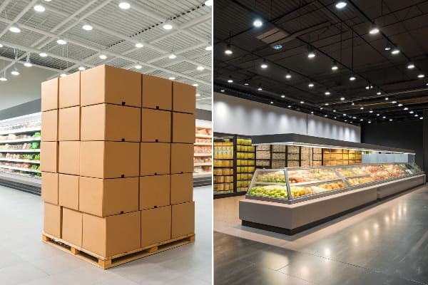
A good display has three parts: structure, graphics, and pack-out. The structure must hold weight and survive transport. The graphics must be clear at a glance. The pack-out must be simple so staff can set it fast. I focus on cardboard and corrugated because it is light, strong, and recyclable. I choose single-wall or double-wall based on load. I use water-based inks4 and simple coatings when I can. I design for flat-pack to cut freight and carbon. I include clear labels and a QR code that links to a build video.
| Element | Goal | My Checklist | Result |
|---|---|---|---|
| Structure | Hold and last | Load, drop, humidity | Safe and steady |
| Graphics | Grab and guide | 5–9 word headline | Fast read |
| Pack-out | Speed and accuracy | Step-by-step, photo icons | 10–15 min setup |
How I measure success
I keep metrics simple. I track unit sales per store per week. I track setup time and defect rate. I track damage during transit. I check color match under store lights. I run an exit survey with one question: did the display make it easier to choose. I test sustainable options5 like PCR paperboard and water-based inks. I watch cost per unit and cost per sale. I only scale when numbers beat the shelf baseline. This gives me a clear case to the buyer and keeps the team focused.
Conclusion
I match display type and store layout to shopper flow, product weight, and message length, then I test small, track simple numbers, and scale what works.
Exploring effective floor display techniques can significantly boost product visibility and sales, making your retail space more appealing. ↩
Explore this link to discover effective strategies and insights for successfully managing display projects. ↩
Learning about shopper path mapping can optimize product placement and increase sales in your store. ↩
Explore the advantages of water-based inks for sustainability and quality in packaging, enhancing your display designs. ↩
Discover various sustainable packaging materials that can improve your product's environmental impact and appeal. ↩


