I see shoppers stop for seconds, then decide. I need signs that guide them fast, and push them to act.
Use layered custom signage that fits your store journey: clear entrance messages, aisle wayfinding, shelf talkers for benefits and price, and bold POP displays near checkout; align everything with brand colors, readable type, durable materials, and sustainable cardboard for seasonal pushes.
I run PopDisplay, so I test signs with real displays. I track how long people look, and what they pick up. I change copy, fonts, and structures until the basket grows. I also use cardboard for speed, cost, and sustainability. Now let me break this down.
What signage is used in the retail store?
Shoppers move fast, and they forget. I must meet them with the right message at the right spot.
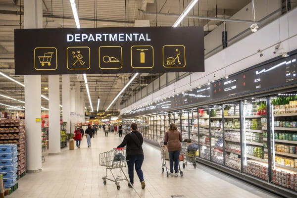
Stores use entrance banners, window graphics, aisle wayfinding, category headers, shelf talkers, price tags, floor decals, fitting-room or demo signs, checkout prompts, and POP displays to inform, guide, and convert.
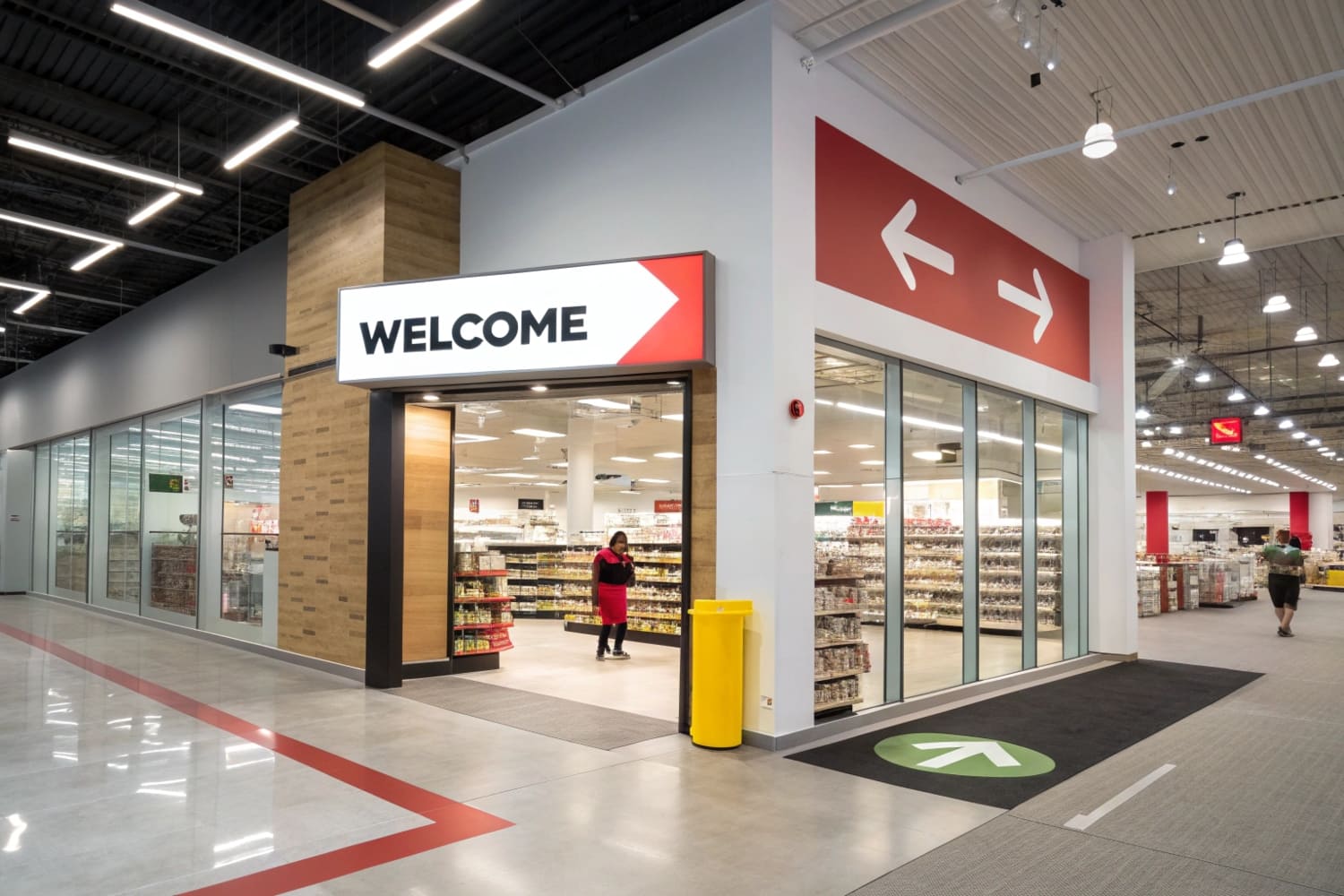
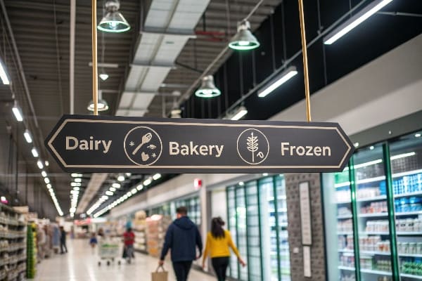
A practical map of common in-store signs1
I group signs by what they do, not by how they look. This makes planning simple. I start at the street, then I move to the aisle, then I close at the shelf or counter. I also think about speed. Some signs must work in one second, and some can take five. I also think about durability, cost, and how often I will replace them. Cardboard helps when I run short campaigns or seasonal pushes, and it lets me print fast with digital presses. When I led a regional launch, I used window clings, a floor PDQ, and five shelf talkers2. Sales jumped, and setup took one morning. The table shows a simple map I use:
Functions and Examples
| Function | Primary Signs | Typical Materials | Notes |
|---|---|---|---|
| Attract | Window graphics, flags, lightboxes | Vinyl, fabric, LED | Big contrast, short copy |
| Guide | Aisle blades, category headers | PVC, corrugate, aluminum | Use arrows and numbers |
| Inform | Shelf talkers, spec cards | Corrugated, paperboard, acrylic | Use bullets and icons |
| Convert | POP floor displays, endcaps | Corrugated board | Bold offer and CTA |
| Upsell | Counter mats, clip strips | Paperboard, PET | Link to impulse items |
When should you use in-store signage?
I do not print signs for fun. I use signs when behavior needs a nudge, or when a product needs a stage.
Use in-store signage for launches, seasonal events, price changes, wayfinding gaps, low-awareness categories, complex specs, impulse zones, and when online traffic needs an in-store bridge with QR or NFC.
Timing and triggers that justify new signs
I watch for clear triggers. A new product needs education. A price drop needs visibility. A long aisle needs direction. A complex item needs a simple claim. I also plan by calendar. I line up major retail moments like back-to-school and hunting season. I use fast-turn cardboard displays when speed matters and budgets are tight. Digital printing lets me run small batches and test. I follow a simple rule: if shoppers ask the same question twice, I make a sign that answers it once, right at the shelf. I learned this with a rugged outdoor tool brand. Customers asked about draw weight, safety, and warranty. We added three shelf talkers3 with icons and a QR that showed a 15-second demo. Returns fell, and time with staff fell too. The table keeps my team honest:
| Trigger | Sign Type | Goal | Measure |
|---|---|---|---|
| Launch | Endcap + shelf talker | Awareness | Reach, dwell |
| Price change | Price strip callout | Conversion | Uplift vs. baseline |
| Complex spec | Spec card + QR | Clarity | Fewer staff asks |
| Seasonal push | Floor PDQ | Speed to market | Days to setup |
| Traffic issue | Wayfinding blade | Flow | Heatmap balance |
What are the three types of signage?
I keep the framework simple so teams can act fast and align.
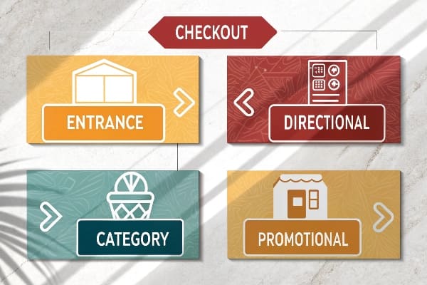
The three types are informational (wayfinding and price), promotional (offers and launches), and experiential (brand story and interaction). Each type supports a different shopper moment and KPI.
A simple framework I use on every project
I split signage by intent. Informational signs4 reduce friction. They tell people where to go, what this product is, and what it costs. I design them with high contrast and short labels. Promotional signs5 create urgency. They highlight bundles, rebates, and new arrivals. I use bold numbers and a strong verb. Experiential signs build memory. They show brand values, materials, and social proof. I keep them visual and human. In practice, I mix all three in one path. I might use a big header to set the category, a corrugated floor display to stage the hero SKU, and shelf talkers to answer two key specs. This mix works in North America, and it grows fast in APAC where retail expands and PDQ displays move volume. It fits sustainability goals in Europe because cardboard recycles well. Here is the breakdown:
| Type | Purpose | Common Formats | Design Priority |
|---|---|---|---|
| Informational | Reduce friction | Wayfinding, price, spec cards | Readability |
| Promotional | Drive action | Endcaps, shelf flags, PDQ | Contrast + CTA |
| Experiential | Build brand | Story panels, demos, AR | Emotion + imagery |
What is crucial in good signage?
I judge a sign by how fast it works, how clear it is, and how well it holds up.
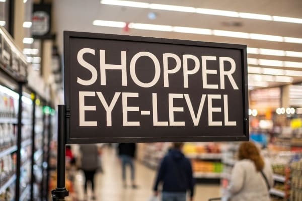
Great signage is clear, quick, consistent, and durable; it uses simple copy, strong hierarchy, readable fonts, right color contrast, sturdy materials, and a clear call to action near the decision point.
The quality checklist I run before I approve print
I test clarity6 first. I read the headline at two meters. If I cannot repeat it, I rewrite it. I check contrast with a grayscale test. I use a type size that matches distance. I keep one message per sign, and one promise per display. I align brand colors and logo spacing across the whole path. I also check materials. Cardboard works for short terms, and coatings add water and scuff resistance. I run load and transport tests on floor PDQs. I set a clean assembly flow so store teams can build fast. I add QR for specs or videos when products are technical. I track results with a simple dashboard. I compare uplift against a control store, and I watch dwell heatmaps. I fix weak signs in the next print run. This table summarizes my non-negotiables:
| Area | Checkpoint | Quick Test | Fix |
|---|---|---|---|
| Clarity | One idea | 5-second read | Cut words |
| Hierarchy | Big, then small | Squint test | Increase contrast |
| Legibility | Font + size | Two-meter read | Larger type |
| Durability | Material + finish | Rub and bend | Add coating |
| Speed | Setup steps | Timed build | Pre-fold, label |
| Action | CTA near product | Eye trace | Move CTA to hand zone |
Conclusion
Clear types, right timing, and simple rules make retail signage work. I keep messages short, structure strong, and materials fit for purpose. Then I test, learn, and repeat.
Explore this link to discover innovative strategies for maximizing the impact of in-store signs on customer engagement. ↩
Learn how shelf talkers can effectively communicate product benefits and drive sales in retail environments. ↩
Learn about the impact of shelf talkers on consumer behavior and how they can boost your sales. ↩
Explore how informational signs can enhance customer experience and streamline navigation in retail spaces. ↩
Learn about the effectiveness of promotional signs in driving sales and creating a sense of urgency for customers. ↩
Understanding clarity in print design is crucial for effective communication. Explore this resource to enhance your skills. ↩


