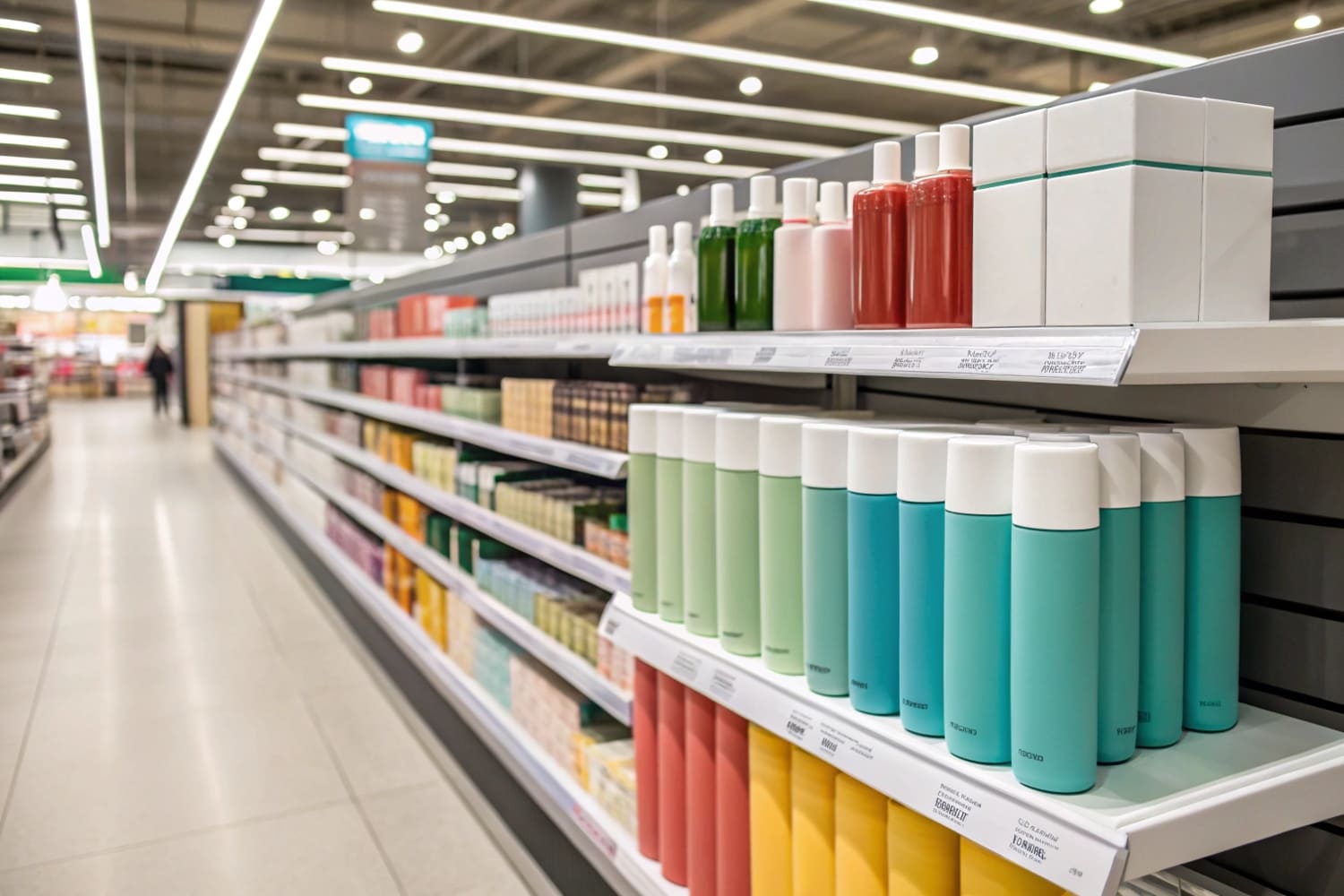
I sell in crowded aisles. Shoppers rush past. My display has seconds to talk. Wrong colors lose the sale. Right colors guide eyes, shape mood, and move hands.
Retail display colors work because they grab attention, set emotion, and signal action; warm hues push urgency, cool hues calm and guide browsing, high contrast improves readability, and natural tones imply sustainability. Always proof under store lighting and test with real shoppers.
I will break color choices into simple rules. I will map rules to goals, categories, and store formats. I will show how I test them in fast turn POP projects.
What is the best color for a retail store?
Crowded stores need fast choices. A single "best" color does not exist. The best color fits the goal, category, shopper mood, and lighting on the floor.
There is no universal "best" color; match color to your goal: warm for impulse zones, cool for dwell areas, neutral for trust, bold accents for wayfinding. Keep strong contrast for text, follow brand codes, and proof under real lights.
Color by goal
I plan color after I set a goal. I split stores into three jobs: stop, hold, convert. Floor POP Displays1 often do the "stop" job, so I use bold warm accents on headers and price callouts. Countertop displays do the "convert" job, so I keep calm bases and crisp contrast near the buy button. In North America, I see steady results with blue or charcoal bases plus red or orange price bursts. In Europe, I use earth tones and matte finishes to signal eco care. In fast-growing APAC aisles, I find saturated accents win attention in high-traffic ends. I print small batches with digital presses2 and adjust fast.
| Goal | Base Palette | Accent | Where I use it | Notes for Cardboard |
|---|---|---|---|---|
| Stop | Charcoal / Navy | Red / Orange | Floor POP at aisles | High-contrast headers reduce print banding risk3 |
| Hold | Soft Gray / Beige | Teal / Lime | Endcap storytelling | Matte film reduces glare under 4000K lights4 |
| Convert | White / Pale Gray | Brand color only | Countertop PDQ | Clean base boosts price legibility |
Lighting and materials
Cardboard behaves differently under light. Corrugated flutes can shadow. I request store CCT and CRI5 in advance. I soft-proof6 with that profile. I always print a small panel and check it at the store door. This habit saves reprints and rush freight.
What is the psychology behind visual merchandising?
Shoppers scan fast. They look for easy paths. If the display does not guide them, they bounce. Clear hierarchy turns color into a map, not noise.
Visual merchandising works when color, contrast, layout, and scale guide the eye from brand to benefit to price to product. Clear hierarchy reduces friction, lowers decision time, and lifts conversion in busy aisles.
Attention → Emotion → Action
I build a simple path. First, I grab attention with a bold accent on the top header. Second, I set emotion with a calm mid-area that shows the hero image and one clear benefit. Third, I drive action with a strong price or CTA swatch at hand level. I use the rule of three: three colors, three messages, three steps. Floor POP Displays7 have large panels that make hierarchy clear at five meters. Countertop displays8 work at one meter, so I shrink type and keep color blocks tighter.
| Principle | Tactic | Cardboard Detail | KPI I watch |
|---|---|---|---|
| Hierarchy | Big brand bar on top9 | Double-wall header for stiffness | View-from-5m recognition |
| Readability | 7:1 contrast for text | White base, rich black type | Price read time |
| Flow | Z-pattern layout10 | Left-to-right benefit tiles | Time-to-grab |
| Simplicity | Three key claims | Pre-diecut icon tiles | SKU-level conversion |
Structure supports psychology
Good color fails on weak structure. I design folds to frame color fields11 with clean edges. I lock tabs to keep panels flat. I avoid glossy floods near strong LEDs. I also plan for fast setup. My Shenzhen team ships flat-pack kits12 with pictorial guides. This reduces store setup errors that would break the color plan.
What is the psychology behind colors and marketing?
Color sets mood first, then words land. Strong hues push arousal. Soft hues reduce stress. Shoppers prefer clarity. Mixed signals slow decisions and cut sales.
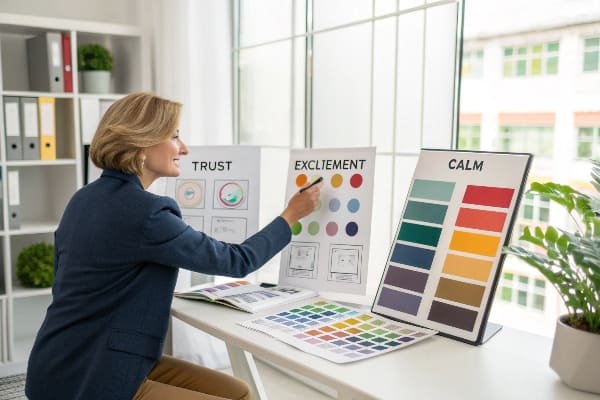
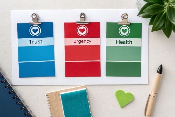
Colors shape perception before copy; red signals urgency, blue builds trust, green cues eco care, black signals premium, and yellow pulls attention. Use accents to drive action and keep large fields calm for legibility.
Emotions that drive retail
I link color to simple feelings13. Red speeds decisions near promos. Blue keeps trust for technical or high-risk buys. Green supports sustainability stories that many European shoppers value. Black and gold carry premium weight for limited editions. In hunting and outdoor categories, I add muted greens and khakis to fit the field context while keeping price tags high-contrast. Digital printing lets me run short, market-specific palettes. I test in APAC with brighter accents. I ship to North America with cooler bases. I keep brand consistency14 by locking Pantone values and Lab* targets in the spec.
| Color | Core Emotion15 | Retail Use16 | Caution |
|---|---|---|---|
| Red | Urgency, power | Promo burst, sale flags | Overuse feels cheap |
| Blue | Trust, calm | Tech specs, guidance | Too cold feels distant |
| Green | Natural, renewal | Eco claims, wellness | Hue shift under warm light |
| Black | Premium, authority | Flagship, hero SKUs | Shows scuffs on corrugate |
| Yellow | Attention, optimism | New arrival tags | Low contrast with white |
Production reality
Beautiful colors die with bad execution. I avoid oversaturated floods on thin liners. I specify rich black (C60 M40 Y40 K100) for deep headers. I request water-based inks17 when clients want eco claims. I always ask for the retailer's lighting standard. I run quick strength and transport tests so panels stay flat and edges clean, because clean edges18 make color look richer.
What does psychology say about colors?
Research says color affects attention, mood, and memory. People notice contrast first. People also prefer simple palettes. Clear rules beat complex art in busy stores.
Psychology shows color guides attention and shapes mood quickly; high contrast improves reading, limited palettes reduce cognitive load, and consistent cues help memory and brand recall in fast retail decisions.
Practical rules I use
I set a 60–30–10 palette19: calm base (60%), support color (30%), action accent (10%). I keep minimum 7:1 contrast for text on cardboard. I avoid red-on-black and yellow-on-white for small type. I plan for color-blind shoppers20 by pairing hue with icons or patterns. I confirm how seniors read small copy by using larger point sizes near price. I match finish to goal: matte reduces glare and feels natural; satin lifts premium lines without harsh shine. I prototype fast, often within days, because speed matters in seasonal pushes.
| Principle | Simple Rule | How I test | Risk if ignored |
|---|---|---|---|
| Contrast21 | 7:1 for text | Handheld contrast checker | Misreads and returns |
| Load | 3 colors max | Brand styleboard | Visual noise |
| Context | Match aisle cues | Photo under store lights | Off-brand feel |
| Consistency | Lock swatches | Pantone + Lab* sheet | Reprint costs |
| Inclusivity22 | Pair color with icon | A/B with color-blind filter | Missed shoppers |
A quick story from my floor
I built a floor POP for an outdoor launch23 with tight deadlines. Early prints looked dull under warm warehouse lights. I swapped the base to warm gray, kept a deep green accent, and moved the promo burst to orange. I reprinted only the header and price wings using digital presses. The kit shipped flat, set up in minutes, and held color through transport. Sell-through jumped because shoppers could read from five meters and decide fast. Simple rules, fast tests, clean edges—that is how color earns space in real retail24.
Conclusion
Color wins when it guides eyes, sets mood, and makes action easy. Keep palettes simple, contrast high, proofs real, and tests fast. Then displays sell.
Explore this link to learn effective strategies for using Floor POP Displays to enhance customer engagement and sales. ↩
Discover how digital presses can streamline your printing process and allow for quick adjustments in marketing materials. ↩
Understanding the advantages of high-contrast headers can enhance your design strategy and reduce print issues. ↩
Exploring the impact of matte film on glare can improve your lighting design and enhance visual comfort. ↩
Understanding CCT and CRI is crucial for achieving accurate color representation in your projects. ↩
Exploring soft-proofing techniques can enhance your printing accuracy and save costs on reprints. ↩
Explore this link to understand how Floor POP Displays can enhance visibility and sales in retail environments. ↩
Discover how Countertop displays can effectively showcase products and attract customer attention in a compact space. ↩
Explore this link to understand how a prominent brand display can enhance recognition and customer trust. ↩
Learn about the Z-pattern layout to optimize your design for better user engagement and flow. ↩
Understanding color fields can enhance your design skills and improve your projects. ↩
Exploring flat-pack kits can provide insights into efficient design and shipping solutions. ↩
Understanding the psychological effects of color can enhance your marketing strategies and improve customer engagement. ↩
Maintaining brand consistency is crucial for building trust and recognition; explore strategies to strengthen your brand identity. ↩
Understanding core emotions linked to colors can enhance your marketing strategies and customer engagement. ↩
Exploring effective retail color usage can significantly improve your promotional efforts and customer attraction. ↩
Explore this link to understand how water-based inks can enhance print quality and support eco-friendly practices. ↩
Discover why clean edges are crucial for vibrant colors and overall print aesthetics. ↩
Understanding the 60–30–10 palette can enhance your design skills, ensuring effective color usage for better visual appeal. ↩
Exploring resources on designing for color-blind shoppers can help you create inclusive products that cater to a wider audience. ↩
Understanding contrast can enhance readability and user experience, making your designs more effective. ↩
Exploring inclusivity in design helps create accessible experiences for all users, broadening your audience. ↩
Explore this link to discover effective strategies and tips for successfully executing an outdoor launch event. ↩
Learn how color psychology can impact consumer behavior and boost sales in retail environments. ↩


