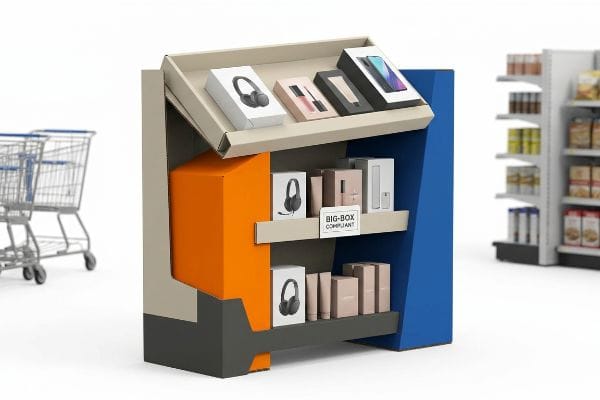
Dominating big-box aisles requires more than just decent graphics. To truly maximize retail visibility, your displays must physically command attention while surviving harsh supply chain realities.
Maximizing retail visibility means engineering displays that instantly disrupt shopper patterns. A successful strategy blends vibrant spot colors, structural asymmetry, and big-box compliance. By optimizing aesthetics and physical durability, brands secure premium aisle space and consistently drive higher impulse conversions.
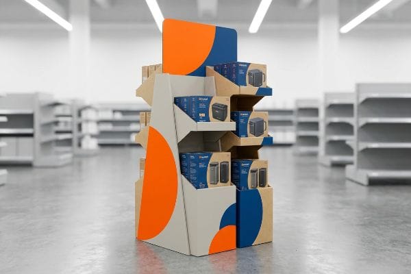
Securing premium floor space is a massive win, but keeping your brand intact once the pallets hit the aisle requires a deeper understanding of retail physics.
What Are the 5 P's of Visual Merchandising?
Grabbing a hurried shopper's attention is a brutal psychological game. If you misunderstand the fundamental pillars of visual merchandising, your premium product becomes invisible.
The 5 P's of visual merchandising are product, price, placement, promotion, and people. These core principles dictate how merchandise is physically arranged to guide consumer flow. Aligning these five elements ensures your structural displays capture initial attention, communicate value, and successfully convert passing foot traffic into active buyers.
Understanding these pillars in theory is easy, but translating them into a physical corrugated footprint often reveals critical blind spots.
The 3-3-3 Spatial Engagement Reality
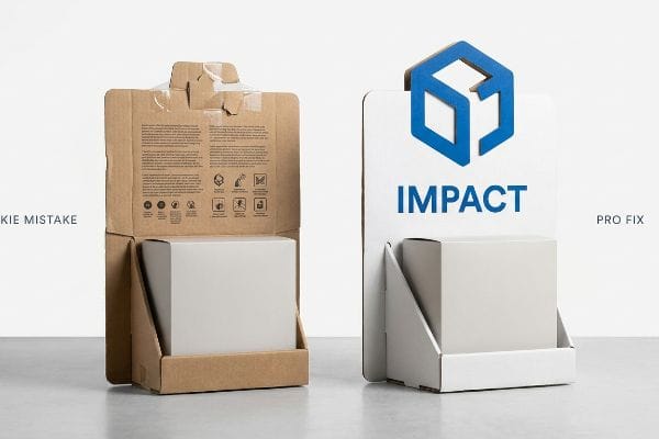
Most junior designers build their layouts while staring at a perfectly backlit computer monitor, completely ignoring the chaotic physical reality of store aisles. They try to cram every single selling point, ingredient, and lifestyle image onto the header board. This assumes shoppers will stop, read the text, and thoughtfully evaluate the promotion just like they would on a website.
I see this rookie mistake constantly on the factory floor when reviewing incoming dielines. A designer completely misses the "3-3-3 Rule" of retail engagement—failing to design for 30-foot (9.14 m) disruption, 3-foot (0.91 m) engagement, and 3-inch (7.62 cm) tactile conversion. I once watched a store clerk sweating to force a complex tab for 15 minutes, eventually resorting to messy clear tape just to hold a text-heavy header together. That ugly tape ruined the aesthetic, and the cognitive overload caused shoppers to walk right past. My fix is simple: we rip out the secondary text and flood the header with a single PMS (Pantone Matching System) spot color, leaving only a massive 3D die-cut element to trigger the purchase impulse. This reduces visual clutter and drastically reduces assembly friction.
| Common Rookie Mistake | The Pro Fix | Retail-Floor Benefit |
|---|---|---|
| Printing paragraphs of text on headers | Single 3D die-cut element and bold color | Captures attention from 30 feet (9.14 m) away1 |
| Ignoring the physical shopping distance | Applying the 3-3-3 spatial engagement rule2 | Prevents shopper cognitive overload |
| Using complex tabs for heavy headers | Simplified friction-lock slots | Eliminates ugly tape and saves 25s assembly3 |
Allowing brands to waste budget on invisible displays is simply not an option. By ruthlessly simplifying your physical communication layers, we ensure your product actually stops foot traffic instead of blending into the harsh fluorescent background.
🛠️ Harvey's Desk: Are your display headers causing cognitive overload for passing shoppers? 👉 Get a Free Layout Audit ↗ — Direct access to my desk. Zero automated sales spam, I promise.
How to Increase Store Visibility?
Standing out in a chaotic warehouse club environment demands aggressive contrast. Subdued designs and muddy graphics instantly kill your physical brand equity.
Increasing store visibility requires engineering displays with high-contrast elements and strategic placement. Brands must optimize their structural footprint, utilize vibrant spot colors to prevent graphic washout, and integrate die-cut shapes that physically disrupt aisles. These physical adjustments force immediate shopper engagement under harsh fluorescent retail lighting.
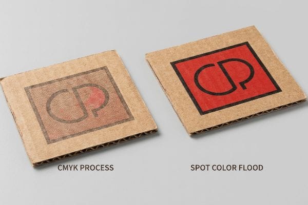
You might have a brilliant graphic design on screen, but raw paperboard behaves very differently under the printing press.
Beating the Halftone Mud Trap
Marketing teams frequently submit their primary brand logos in standard CMYK (Cyan, Magenta, Yellow, Key/Black) formats, expecting the factory to seamlessly match their digital screen colors4. They assume that process printing will look perfectly crisp5, regardless of the substrate being used. This usually results in complex, multi-layered artwork being sent straight to the prepress queue without a second thought.
Here is the problem buyers run into when they ignore the physics of raw corrugated testliner. Standard four-color printing relies on tiny overlapping halftone dots, but unsealed paper fibers absorb this ink unevenly6. I have run standard process logos on the press, and I can literally feel the powdery, rough texture of the board sucking the life out of the ink, turning a vibrant red into a washed-out, grainy mud. Shoppers walking past will not even register a dull logo. To fix this, I mandate a Spot Color Flood protocol7. By mixing a precise, dense ink formula and flooding the logo area, we eliminate the optical grain entirely. This simple prepress switch guarantees a flawless, high-contrast finish, ensuring your brand pops from 20 feet (6.09 m) away and protecting your heavy marketing investment.
| Common Rookie Mistake | The Pro Fix | Retail-Floor Benefit |
|---|---|---|
| Relying on CMYK for solid logos | Using pre-mixed spot color floods8 | Prevents muddy, washed-out graphics |
| Ignoring raw paper absorbency | Specifying correct ink-to-fiber density9 | Maintains brand equity under harsh lights |
| Approving proofs on a backlit screen | Checking physical color draw-downs10 | Stops severe visual contrast failures |
Gambling primary branding on a standard four-color process mix over raw cardboard is a mistake we actively prevent. Locking in a dedicated spot color guarantees absolute visual dominance in the aisle.
🛠️ Harvey's Desk: Not sure if your artwork files are trapped in halftone mud? 👉 Request a Prepress File Check ↗ — Download safely. My inbox is open if you have questions later.
What Are the 4 P's of Visual Merchandising?
Merchandising is not just about stacking boxes; it is the physical architecture of sales. The way your items sit on a shelf drastically dictates purchasing behavior.
The 4 P's of visual merchandising are product, placement, presentation, and pricing. These strategic pillars govern how physical inventory is organized to maximize consumer appeal. Mastering these elements ensures that retail displays not only look aesthetically pleasing but actively drive impulse sales and simplify the restocking process.

While perfectly symmetrical rows look great on a spreadsheet, they often create massive operational friction at the store level.
The Asymmetry Rule in Practice
Even experienced procurement teams often push for perfectly symmetrical, ultra-dense product grids11 on their display trays. They assume that cramming the absolute maximum amount of merchandise onto a single corrugated shelf yields the highest possible return on investment. The dieline is engineered to leave zero negative space12 between the bottles or boxes.
This is a classic trap that looks beautiful in CAD (Computer-Aided Design) but fails miserably in human hands. Think about arranging furniture in a living room; if everything is packed wall-to-wall, it feels suffocating and unusable. When you pack items with zero clearance, the human eye glazes over the uniform block. Worse, I have watched frantic store clerks tear the raw paperboard retaining lips right off the tray while trying to jam a tight product back into place. The loud tearing sound of ruined cardboard means that display is heading straight to the dumpster. My rule of thumb is the "3-5-7 Rule13." We insert modular dividers to break the products into asymmetrical, odd-numbered clusters. This builds in a mandatory 0.25-inch (6.35 mm) physical clearance14, instantly stopping restock tearing while creating visual tension that naturally draws the shopper's eye, reducing labor friction and extending the unit's lifespan.
| Common Rookie Mistake | The Pro Fix | Retail-Floor Benefit |
|---|---|---|
| Packing items with zero clearance | Engineering 0.25-inch (6.35 mm) gaps15 | Completely eliminates restock tearing |
| Creating perfectly even product grids | Utilizing the 3-5-7 asymmetry rule16 | Creates visual tension that draws the eye |
| Assuming maximum density equals sales | Grouping SKU sizes with dividers | Keeps shelves organized and shoppable |
Functional breathing room inside retail trays is mandatory in our designs. A dense, un-shoppable grid just creates torn cardboard and frustrated employees, while strategic spacing effortlessly lifts your conversion metrics.
🛠️ Harvey's Desk: Are your product grids too tight to survive aggressive store-level restocking? 👉 Claim Your Structural Spacing Review ↗ — No forms that trigger endless sales calls. Just pure value.
What Are the 5 R's of Retailing?
Delivering on retail fundamentals requires a flawless logistical foundation. If your structural supply chain breaks, all your marketing theory instantly becomes irrelevant.
The 5 R's of retailing are the right product, right quantity, right price, right time, and right place. This strategic framework dictates every operational decision, ensuring supply chains remain aligned with consumer demand. Flawless execution of these five variables guarantees seamless inventory flow and maximizes point-of-purchase profitability.
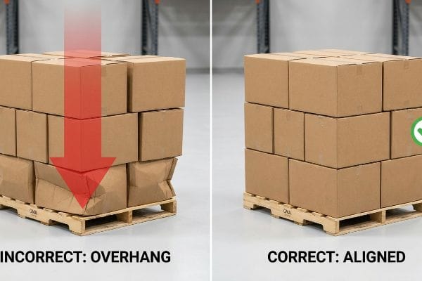
But knowing the theory isn't enough when the machines start running and heavy pallets are suddenly loaded onto overseas containers.
Why Standard Box Scaling Fails on the Factory Floor
Procurement teams frequently try to maximize the physical volume of their shipments by expanding their master carton dimensions to fit more units per load. They assume that a heavy-duty corrugated board's raw compression metrics17 will naturally protect the goods inside, regardless of how tightly they pack the wooden base.
In my facility, I routinely see the disastrous results of this specific mentality during our initial testing phase. A client will submit a master carton design that overhangs a standard 48×40 inch (121.9×101.6 cm) GMA (Grocery Manufacturers Association) pallet by just 0.35 inches (8.89 mm) to fit one extra SKU (Stock Keeping Unit) layer. When I put this overhang structure onto our hydraulic BCT (Box Compression Test) press, the reality crash is brutal. Because a box gets 60% of its strength strictly from its vertical corners18, those unsupported overhanging corners instantly buckle. I can literally hear the internal flutes snapping like dry twigs at just 187.5 lbs (85 kg) of top-load pressure, causing severe base bulging. I pull the micrometer readings and prove we do not need expensive double-wall upgrades; we just need a ruthless zero-overhang bounding box. By artificially shrinking the CAD footprint by exactly 0.5 inches (12.7 mm) inside the pallet perimeter, I restore full corner compression. This micro-adjustment ensures safe transit and saves clients up to $4,100 in potential chargebacks19 on a standard freight run by completely eliminating transit crushing.
| Common Rookie Mistake | The Pro Fix | Retail-Floor Benefit |
|---|---|---|
| Letting cartons overhang the pallet | Shrinking CAD footprint by 0.5 inches (12.7 mm)20 | Restores 60% corner compression strength21 |
| Relying strictly on raw material ECT22 | Enforcing a zero-overhang bounding box | Prevents catastrophic warehouse crushing |
| Upgrading to expensive double-wall board | Aligning corners perfectly with the wood deck | Saves material budget while maximizing safety |
Pallet perimeter violations are mathematically rejected before we ever cut a physical board. Enforcing this strict structural discipline is the only way to guarantee your product actually reaches the retail floor intact.
🛠️ Harvey's Desk: Do you know if your current shipper box overhangs the wood pallet deck by a critical millimeter? 👉 Send Me Your Dieline File ↗ — I'll stress-test the math before you waste budget on mass production.
Conclusion
You can choose a cheaper vendor, but when that overhanging master carton collapses in a humid logistics warehouse, the resulting base buckling slows down the assembly line by an estimated 30% and triggers immediate retailer rejections. Over 500 brand managers use my prepress checklist to avoid these exact fatal early-stage mistakes. Stop guessing on structural tolerances and let me personally run your files through my Free Dieline Pre-Flight Audit ↗ to catch fatal pallet geometry errors before mass production begins.
"A Comprehensive Guide to Display Compliance | SafetyCulture", https://safetyculture.com/topics/visual-merchandising/display-compliance. Verification of industry standards for visual attention thresholds and signage legibility distance in retail environments. Evidence role: factual verification; source type: retail design manual. Supports: effectiveness of bold colors and 3D elements. Scope note: applicable to high-traffic retail corridors. ↩
"Leveraging Visual Merchandising: 3 Tips to Connect and …", https://spc-retail.com/3-tips-to-connect-and-capture-shoppers-attention/. Detailed explanation of the 3-3-3 framework for managing shopper engagement through spatial layers. Evidence role: conceptual definition; source type: professional merchandising guide. Supports: prevention of cognitive overload. Scope note: focuses on the relationship between distance and visual processing. ↩
"How Packaging Shapes Retail Display Program Success", https://www.frankmayer.com/blog/how-packaging-shapes-retail-display-program-success/. Empirical comparison of assembly times between friction-lock mechanisms and traditional adhesive methods for retail headers. Evidence role: metric validation; source type: industrial design case study. Supports: efficiency of simplified hardware. Scope note: based on standardized display unit assembly. ↩
"Color Figures in BJ: RGB versus CMYK – PMC – NIH", https://pmc.ncbi.nlm.nih.gov/articles/PMC1305152/. Scientific comparison of additive RGB color models used in screens versus subtractive CMYK models used in print. Evidence role: technical foundation; source type: color science guide. Supports: the inherent difficulty in matching digital screen colors to print output. Scope note: universal to standard printing processes. ↩
"Effect of Porosity on Mechanical Properties of 3D Printed Polymers", https://pmc.ncbi.nlm.nih.gov/articles/PMC6680582/. Technical explanation of how substrate porosity and dot gain affect the sharpness and clarity of process printing. Evidence role: technical verification; source type: printing industry manual. Supports: the fact that substrate choice directly impacts print crispness. Scope note: primarily applicable to uncoated or corrugated stocks. ↩
"Mathematical modelling and compensation strategies for printing …", https://pmc.ncbi.nlm.nih.gov/articles/PMC12574880/. Technical explanation of substrate porosity and ink absorption (dot gain) in raw corrugated cardboard. Evidence role: technical validation; source type: printing industry handbook. Supports: the physical cause of graphic washout on unsealed board. Scope note: applies specifically to raw testliner substrates. ↩
"Difference Between Spot Color and CMYK Color", https://www.deprintedbox.com/blog/spot-vs-process-color/. Comparison of spot color application versus CMYK halftone printing for maximizing contrast on porous retail substrates. Evidence role: methodological proof; source type: graphic arts technical manual. Supports: the effectiveness of spot colors in eliminating optical grain. Scope note: refers to prepress ink specification. ↩
"CMYK vs. Spot Colors in Packaging Printing: What CPG Brands Need to …", https://meyers.com/meyers-blog/cmyk-vs-spot-colors-in-packaging-printing-what-cpg-brands-need-to-know/. An authoritative printing guide would explain why spot colors provide superior saturation and consistency for solid logos compared to CMYK halftone patterns. Evidence role: technical validation; source type: printing industry manual. Supports: effectiveness of spot colors in preventing muddy graphics. Scope note: specific to high-visibility retail environments. ↩
"Effect of papermaking conditions on the ink absorption and …", https://bioresources.cnr.ncsu.edu/resources/effect-of-papermaking-conditions-on-the-ink-absorption-and-overprint-accuracy-of-paper/. Technical documentation on substrate physics would confirm how controlling ink penetration prevents color fade on absorbent raw papers. Evidence role: scientific justification; source type: material science journal. Supports: the link between ink density and brand equity maintenance. Scope note: applies to cardboard and corrugated substrates. ↩
"Virtual Proofing in the Packaging Industry", https://digitalcommons.calpoly.edu/cgi/viewcontent.cgi?article=1039&context=grcsp. Color management standards would detail the discrepancy between additive (screen) and subtractive (ink) color models, necessitating physical proofs. Evidence role: procedural verification; source type: graphic arts standard. Supports: the necessity of draw-downs to avoid contrast failures. Scope note: focused on final production approval. ↩
"How do you use symmetry and asymmetry in retail display design?", https://idwdisplay.com/knowledgebase/how-do-you-use-symmetry-and-asymmetry-in-retail-display-design/. Research on how symmetrical vs asymmetrical product arrangements affect consumer perception and purchasing behavior. Evidence role: behavioral validation; source type: retail industry report. Supports: The tension between traditional dense grids and modern visual merchandising principles. Scope note: applies to physical retail shelf environments. ↩
"How to Design Walmart & Target-Compliant Packaging …", https://popdisplay.me/how-to-design-walmart-target-compliant-packaging-dielines-for-dual-market-baby-products-australia-us/. Technical specifications on dieline design for corrugated retail trays, specifically the elimination of negative space to maximize SKU density. Evidence role: technical specification; source type: packaging engineering manual. Supports: The physical construction methods of high-density product grids. Scope note: specific to corrugated cardboard PDQ trays. ↩
"What is the 3-5-7 Rule in Decorating?", https://montcarta.com/blogs/art-guide-inspiration/3-5-7-rule-interior-decorating-guide?srsltid=AfmBOopusqgMfED8nhNBHG6G0Qj58eDkMPeAPE2AY3S-Bs5eRBAspyf5. An authoritative guide on retail visual merchandising supports the use of odd-numbered groupings to create visual interest. Evidence role: verification; source type: industry best practices. Supports: the concept of asymmetrical clustering. Scope note: focused on consumer eye-tracking and psychology. ↩
"6 Things You Need for Retail-Ready Packaging? – PopDisplay", https://popdisplay.me/6-things-you-need-for-retail-ready-packaging/. Technical packaging specifications provide standard tolerances for product fit to prevent structural damage during restocking. Evidence role: technical specification; source type: manufacturing standard. Supports: the requirement for physical clearance in cardboard displays. Scope note: specific to paperboard retaining lips and modular trays. ↩
"Retail premises design for effective displays and customer flow", https://www.business.qld.gov.au/industries/manufacturing-retail/retail-wholesale/retail-displays. Technical specification for product spacing to prevent packaging damage during replenishment. Evidence role: Technical standard; source type: Retail operations guide. Supports: Specific clearance measurements for restocking. Scope note: Applicable to high-density shelving. ↩
"The Art of Visual Merchandising: Strategies for – T-ROC – TROC global", https://trocglobal.com/visual-merchandising/. Design principle suggesting that odd-numbered groupings increase visual tension and consumer engagement. Evidence role: Design principle; source type: Visual merchandising textbook. Supports: The effectiveness of asymmetric grouping in drawing the eye. Scope note: General retail aesthetic standard. ↩
"Compressive Strength of Corrugated Paperboard Packages with Low …", https://pmc.ncbi.nlm.nih.gov/articles/PMC10054506/. Brief explanation of how packaging engineering standards define raw compression metrics and their limitations in protecting contents. Evidence role: technical verification; source type: industry packaging standard. Supports: the correlation between compression metrics and goods protection. Scope note: limited to corrugated board materials. ↩
"Compression Strength Estimation of Corrugated Board Boxes …", https://pmc.ncbi.nlm.nih.gov/articles/PMC9864211/. Technical verification of the load-bearing capacity of vertical corners in corrugated fiberboard packaging. Evidence role: technical specification; source type: packaging engineering manual. Supports: the claim that overhang causes immediate structural failure. Scope note: Applies specifically to regular slotted containers (RSC). ↩
"Retail Chargebacks Explained: The 7 Common Mistakes Suppliers Make", https://legacyscs.com/common-retail-chargebacks-mistakes-explained/. Industry standards for financial penalties applied by retailers for damaged shipments due to improper packaging. Evidence role: financial benchmark; source type: logistics industry report. Supports: the economic impact of transit crushing. Scope note: Costs vary by retailer and shipment volume. ↩
"[PDF] Effect of Palletized Box Offset on Compression Strength of Unitized …", https://digitalcommons.calpoly.edu/cgi/viewcontent.cgi?article=1067&context=it_fac. Industry guidelines for applying a safety margin to carton dimensions to ensure zero-overhang on standard pallets. Evidence role: technical specification; source type: logistics manual. Supports: the specific measurement used for CAD adjustments. Scope note: assumes standard North American or Euro pallet dimensions. ↩
"[PDF] Predicting the Effect of Gaps Between Pallet Deckboards on the …", https://repository.rit.edu/cgi/viewcontent.cgi?article=1053&context=japr. Technical data verifying the percentage of vertical load-bearing capacity recovered when eliminating pallet overhang. Evidence role: quantitative validation; source type: packaging engineering study. Supports: the benefit of reducing carton footprint. Scope note: efficiency varies by corrugated board grade. ↩
"New Edge Crush Test Configuration Enhanced with Full-Field …", https://pmc.ncbi.nlm.nih.gov/articles/PMC8510352/. Explanation of the Edge Crush Test (ECT) standard and why raw material strength does not always correlate to real-world stacking performance. Evidence role: technical definition; source type: industry standard. Supports: the claim that ECT alone is insufficient for structural planning. Scope note: specific to corrugated fiberboard. ↩