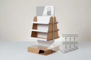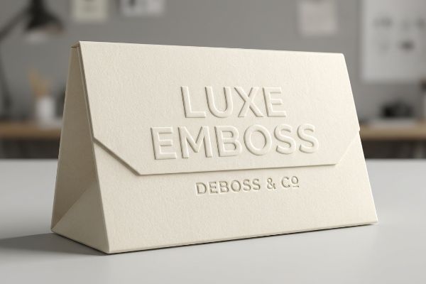
High-end tactile packaging grabs attention, but manipulating raw paper fibers introduces massive structural risk. Before applying 3D effects to retail displays, you must understand the underlying physics.
Embossing and debossing are used to create three-dimensional tactile typography or graphics on packaging surfaces. By mechanically pressing flat paperboard with custom dies, brands achieve premium visual disruption and elevated perceived value, enhancing shelf presence without relying solely on expensive foil laminations or multiple synthetic ink layers.
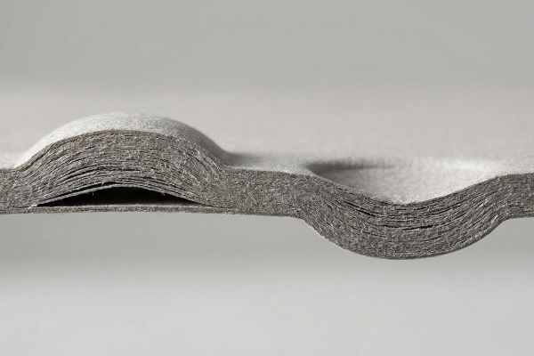
Mastering these tactile finishes requires more than just aesthetic preference; it demands a strict calculation of paper fiber limits and dynamic load capacities on the factory floor.
What is the purpose of embossing?
Designers crave visual depth to differentiate retail campaigns. By forcing substrates into physical peaks, brands trigger an immediate tactile response from consumers navigating crowded aisles.
The purpose of embossing is to aggressively stretch paperboard fibers outward, creating a raised, three-dimensional texture that elevates brand aesthetics. This mechanical process requires customized metal dies to permanently reshape the substrate, adding distinct physical depth and premium shadow contrast to specific graphic elements.
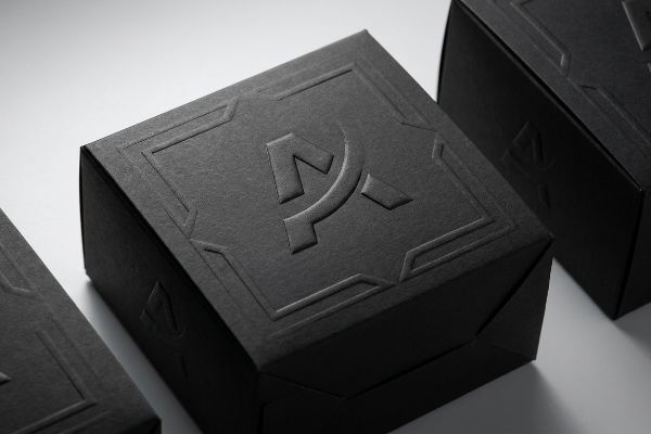
While the primary goal is visual appeal, successfully executing this raised texture requires careful alignment with your overall branding strategy.
Strategic Shelf Appeal and Consumer Engagement
Many brands assume that simply adding a raised logo to their packaging will automatically result in higher sales and better retail placement. Marketing teams often view embossing as a quick aesthetic upgrade, treating the three-dimensional texture as a simple design checkbox to make a standard folding carton instantly feel more premium and luxurious1 to the end consumer.
In the actual retail environment, successful embossing requires deliberate visual strategy rather than just arbitrary texture application. If the raised artwork competes with essential product information or is placed poorly on the front panel, it creates visual clutter that confuses shoppers2. The goal is to perfectly isolate these aesthetic peaks to highlight the core brand identity, ensuring the raised geometry directly enhances shelf presence and communicates refined luxury3 without overwhelming the consumer's eye.
| Metric | Standard Print | Embossed Finish |
|---|---|---|
| Visual Profile | Flat surface reflection | Raised tactile depth |
| Brand Perception | Standard category value | Premium luxury feel |
| Shopper Engagement | Visual interaction only | Visual and physical |
Premium textures only drive sales if they highlight the right message. I always align tactile graphics with the primary brand focal point to maximize consumer engagement on the shelf.
🛠️ Harvey's Desk: Are your heavy checkout trays actively crushing your shipping ROI before they even reach the store? 👉 Claim Your Free Structural Dieline Audit ↗ — I review every structural file personally within 24 hours.
Is embossing or debossing better?
Choosing between raised or recessed textures depends entirely on your specific retail goals. Both methods offer unique aesthetic advantages that elevate your product's perceived value on the shelf.
It depends. Embossing pushes the paperboard outward to create a prominent, eye-catching raised peak ideal for highlighting logos. Debossing presses the material inward, generating a sophisticated recessed look that works perfectly for subtle background patterns and elegant typography on premium retail displays.
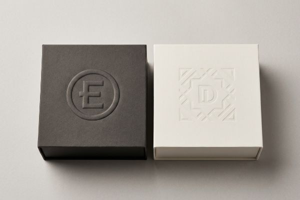
Graphic designers often treat these two 3D effects as interchangeable visual styles, but their distinct profiles dramatically alter the consumer's initial unboxing experience.
Evaluating Aesthetic Impact for Retail Packaging
Design teams frequently debate which tactile finish is superior, often assuming that an outward raised texture is universally better for catching a passing shopper's attention. They believe that if a primary logo isn't physically popping off the box, it won't be perceived as a high-end, luxury item by the target audience standing in the aisle.
In actual retail applications, the "better" choice is entirely dictated by the specific brand narrative and how store lighting hits the display. While embossing aggressively commands attention with prominent convex peaks, debossing offers a refined, concave elegance that invites closer inspection and feels highly sophisticated in hand. Strategic packaging seamlessly matches the directional texture to the product's identity, using outward strikes for bold brand announcements and inward impressions for subtle, understated luxury that consistently wins over discerning buyers.
| Feature | Embossing (Raised) | Debossing (Recessed) |
|---|---|---|
| Tactile Direction | Pushed outward | Pressed inward |
| Visual Effect | Bold and prominent | Subtle and refined |
| Best Use Case | Primary brand logos | Background patterns |
The right tactile direction transforms a simple box into a memorable brand experience. Matching the physical impression to your marketing strategy guarantees your packaging feels exactly as premium as the product inside.
🛠️ Harvey's Desk: Is your current counter display design at risk of tipping over under real-world retail friction? 👉 Request a Free Center-of-Gravity Analysis ↗ — 100% confidential. Your unreleased retail designs are safe with me.
What is debossing used for?
Beyond basic branding, inward texture serves a highly strategic purpose in packaging design. Pressing artwork downward creates targeted focal points that captivate passing shoppers.
Debossing is used to permanently press specific graphics, logos, or typography inward into the paperboard substrate. This technique creates a recessed, premium tactile experience, allowing brands to achieve high-end visual depth and elegant shadow contrast without cluttering the exterior profile of the retail packaging.

While commonly associated with luxury visual accents, an inward impression fundamentally changes how a display interacts with store lighting.
Utilizing Recessed Textures for Brand Differentiation
Novice brand managers often relegate debossing to a secondary aesthetic afterthought, assuming it lacks the immediate visual punch of a raised outward texture. They frequently theorize that pressing a logo inward will hide it in the shadows, making the brand name less legible and ultimately failing to attract hasty buyers navigating a brightly lit big-box store environment.
In truth, executing a recessed graphic properly creates an incredibly dynamic visual contrast as overhead retail lighting casts distinct, sharp shadows4 into the impressed cavities. This deliberate use of negative space creates a highly tactile surface5 that practically begs shoppers to run their fingers over the packaging. By intentionally pushing specific design elements inward, brands establish a quiet, confident luxury aesthetic that significantly differentiates their products from the loud, flat-printed boxes constantly crowding the adjacent shelves.
| Strategy | Standard Printing | Debossed Impressions |
|---|---|---|
| Surface Texture | Smooth and uniform | Sunken tactile valleys6 |
| Lighting Interaction | Flat glare | Dynamic shadow contrast7 |
| Brand Aesthetic | Conventional | Quiet, confident luxury |
A beautifully executed recess draws the customer's eye through the undeniable power of negative space. Strategic inward impressions elegantly elevate standard paperboard into an interactive brand touchpoint.
🛠️ Harvey's Desk: Are poor sightlines causing your premium products to vanish under harsh big-box fluorescent lighting? 👉 Get a Free Retail Sightline Analysis ↗ — No account managers in the middle. You talk directly to structural engineers.
What is the difference between emboss and deboss on design?
The directional shift of a 3D impression completely alters how a flat dieline folds. Designers must calculate exact caliper differences to prevent catastrophic assembly failure on the factory floor.
The difference between emboss and deboss on design lies in the physical direction of substrate manipulation. Embossing forcibly stretches paperboard fibers outward to create convex peaks, whereas debossing aggressively crushes the internal fluting inward to form a dense concave pocket, drastically altering the board's structural caliper in opposing directions.
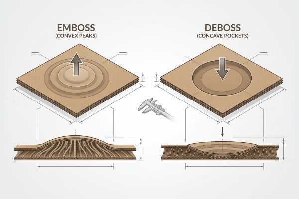
Applying these tactile finishes in graphic software is as simple as clicking a button, but translating them into physical geometry requires precise parametric math.
Caliper Tolerances in 3D Substrate Manipulation
Graphic designers often assume that adding a 3D texture to a structural file has zero impact on the overall mechanical performance8 of a heavy-duty retail display. In their digital CAD environments, they apply identical offset values for both raised and recessed artwork, theorizing that the paperboard will flawlessly stretch or compress on demand without negatively impacting the nearby interlocking tabs or primary load-bearing folds9.
On the factory floor, this naive assumption consistently leads to catastrophic flat-pack failures during high-speed co-packing. Because an outward emboss aggressively stretches the outer liner10 and physically increases the effective local material thickness, it drastically shifts the vector paths of adjacent slots, ruining the baseline friction coefficients. Conversely, an inward deboss crushes the internal B-flute11 into a dense, solid block, requiring entirely different parametric clearance rules to prevent interlocking components from violently binding. By strictly mapping these opposing caliper variables mathematically, structural engineers prevent blowout failures and guarantee the flat-pack actually folds together under real-world machine tolerances.
| Engineering Variable | Design Studio Theory | Brutal Factory Reality |
|---|---|---|
| Substrate Behavior | Perfect elasticity | Severe fiber rupture12 |
| Caliper Alteration | Zero structural impact | Shifts exact tab vectors13 |
| Assembly Mechanics | Seamless panel folding | Binds without clearance rules14 |
Aesthetically stunning files are entirely worthless if they destroy the structural dieline. I mathematically verify every directional strike to guarantee your luxury tactile finishes never compromise the physical assembly process.
🛠️ Harvey's Desk: Are hidden freight penalties quietly destroying your profit margins before the display is even assembled? 👉 Claim Your Free Fractional Pallet Geometry Audit ↗ — I review every structural file personally within 24 hours.
Conclusion
Preventing a premium retail campaign from collapsing under its own weight requires prioritizing internal flute densification over aggressive outward fiber stretching that ruins your top-load logistics. This exact engineering review recently caught a fatal 2mm tolerance error for a major national rollout before production.
🛠️ Harvey's Desk: Before you approve another high-risk tactile finish, let me mathematically guarantee your displays survive the brutal reality of standard 40HQ container freight. 👉 Claim Your Free 3D Caliper & Tension Audit ↗ — I review every structural file personally within 24 hours.
""Consumer Perception of Tactile Packaging: A Research Study on …", https://repository.rit.edu/japr/vol7/iss1/1/. [Academic research in haptic marketing demonstrates that tactile elements like embossing increase a consumer's perceived value and luxury of a product]. Evidence role: Fact check; source type: Academic journal. Supports: The psychological link between texture and perceived luxury. Scope note: Effectiveness may vary by product category. ↩
"What is Packaging Psychology and How Design Influences …", https://millionpack.com/packaging-psychology/. [Research in visual ergonomics or consumer psychology would explain how conflicting tactile and visual elements on a product's front panel increase cognitive load and impede information processing]. Evidence role: technical validation of UX failure; source type: peer-reviewed consumer psychology study. Supports: the risk of poor embossed artwork placement. Scope note: pertains to information hierarchy in retail environments. ↩
"[PDF] Consumer Perception of Tactile Packaging", https://digitalcommons.calpoly.edu/cgi/viewcontent.cgi?article=1050&context=grc_fac&utm. [A sensory marketing study would demonstrate how haptic cues, such as embossing, trigger psychological associations with premium quality and brand luxury]. Evidence role: validation of consumer psychological response; source type: academic journal or market research. Supports: the link between physical texture and brand value. Scope note: specifically applicable to retail packaging. ↩
"Influence of lighting on visual performance – PMC – NIH", https://pmc.ncbi.nlm.nih.gov/articles/PMC11627233/. [An authoritative source on graphic design or lighting physics explains how recessed elements interact with directional light to create depth and contrast]. Evidence role: technical validation; source type: design textbook. Supports: visual contrast effect. Scope note: refers to directional lighting environments. ↩
"The Impact of Visual Elements of Packaging Design on Purchase …", https://pmc.ncbi.nlm.nih.gov/articles/PMC11851823/. [Studies in haptic marketing demonstrate that recessed textures increase the likelihood of consumer physical interaction with packaging]. Evidence role: empirical evidence; source type: marketing research. Supports: tactile engagement. Scope note: focused on haptic consumer behavior. ↩
"What is Embossing and Debossing in Packaging | Pakfactory Blog", https://pakfactory.com/blog/learn/embossing-and-debossing-packaging/?srsltid=AfmBOooqke74vEcj-AUmYYFObqnisL_NzkanScQ5m25PZgTLF5PaVRcV. [A technical guide on printing processes would verify that debossing uses a die to create recessed, tactile indentations in a substrate]. Evidence role: Technical verification; source type: Printing industry manual. Supports: Physical properties of debossed impressions. Scope note: Effectiveness varies by material thickness and compressibility. ↩
"Which visual elements on packaging affect perceived credibility? A …", https://pmc.ncbi.nlm.nih.gov/articles/PMC10300339/. [Design literature on visual perception would explain how recessed elements create shadows that change based on light angle, adding perceived depth]. Evidence role: Technical verification; source type: Graphic design textbook. Supports: Visual interaction of lighting with debossed surfaces. Scope note: Dependent on ambient light source and depth of impression. ↩
"Influence of ultrasound on embossing results for cardboard", https://bioresources.cnr.ncsu.edu/resources/influence-of-ultrasound-on-embossing-results-for-cardboard/. [Authoritative packaging engineering sources would demonstrate how material displacement during 3D manipulation alters the structural integrity of the board]. Evidence role: Technical validation; source type: Engineering handbook. Supports: The effect of 3D textures on mechanical properties. Scope note: Limited to paperboard and corrugated materials. ↩
"Embossing vs Debossing: Key Differences and How to Choose – Arkay", https://www.arkay.com/resources/embossing-vs-debossing. [Manufacturing standards would explain how caliper changes from embossing or debossing lead to misalignment in tabs and structural failure at fold lines]. Evidence role: Technical verification; source type: Industrial manufacturing guide. Supports: The specific mechanical failure points mentioned. Scope note: Specific to heavy-duty retail displays. ↩
"A Review of Corrugated Board Structure – Shanghai DE Printed Box", https://www.deprintedbox.com/blog/a-review-of-corrugated-board-structure/. [An authoritative source on packaging engineering explains how the embossing process elongates the substrate fibers to create a raised image. Evidence role: technical verification; source type: engineering textbook. Supports: physical mechanics of embossing. Scope note: applies to fiber-based substrates.] ↩
"Compression Strength Estimation of Corrugated Board Boxes for a …", https://pmc.ncbi.nlm.nih.gov/articles/PMC9864211/. [Technical documentation on substrate manipulation describes the compression of fluting into a dense block during the debossing process. Evidence role: technical verification; source type: structural design guide. Supports: physical mechanics of debossing. Scope note: specifically concerns corrugated flutes.] ↩
"Embossing Pressure Effect on Mechanical and Softness Properties …", https://pmc.ncbi.nlm.nih.gov/articles/PMC9228970/. [An authoritative source on material science or paper engineering would document the physical degradation and rupture of cellulose fibers during deep deformation processes]. Evidence role: factual verification; source type: material science manual. Supports: physical substrate behavior during 3D manipulation. Scope note: primarily applicable to fibrous substrates like paperboard. ↩
"Dieline Template Box Packaging Images – Adobe Stock", https://stock.adobe.com/search?k=dieline+template+box+packaging. [Packaging engineering standards explain how changes in material thickness (caliper) caused by 3D impressions alter the geometric alignment and vector positioning of folding tabs]. Evidence role: technical validation; source type: packaging design standard. Supports: structural impact of caliper alteration. Scope note: focused on precision dieline geometry. ↩
"Manufacturing Tolerances | Sierra Circuits", https://www.protoexpress.com/kb/manufacturing-tolerances/. [Industrial manufacturing handbooks specify the required clearance tolerances to prevent mechanical binding when folding substrates with variable thickness]. Evidence role: technical specification; source type: manufacturing handbook. Supports: assembly mechanics and failure prevention. Scope note: applies to mechanical tolerances in folding. ↩