Getting color right on a corrugated display is the difference between a product that jumps off a retail shelf and one that completely fades into the background.
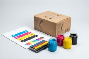
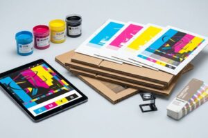
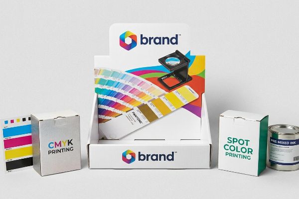
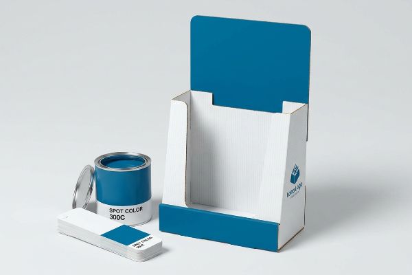
Spot colors in traditional printing use pre-mixed, precise ink formulas to achieve exact brand matching. Unlike standard four-color printing, this centralized pigment method ensures absolute visual consistency across massive retail runs, eliminating the exact graphic discrepancies that frequently cause big-box store compliance rejections.
But mastering these premium inks takes significantly more than just selecting a digital swatch on your monitor.
Can I convert spot colors to CMYK?
Many brands attempt to streamline their prepress files by universally shifting all their artwork into a single process profile.
No. You cannot safely convert a spot color to CMYK (Cyan, Magenta, Yellow, Key/Black) without risking severe optical blending failures. On porous corrugated testliner, standard process inks rely on overlapping halftone dots that absorb unevenly, creating muddy, washed-out graphics that instantly fail retail visibility standards.
Knowing the theory of optical blending is helpful, but the reality of how ink reacts with raw paper dictates your actual retail success.
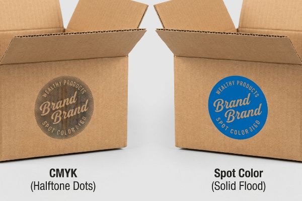
Why Converting Spot Colors to CMYK Fails on Corrugated
Even experienced marketing teams frequently convert solid corporate logos into standard four-color formats before sending art files to the factory. They incorrectly assume the commercial printing press will seamlessly match the bright digital screens in their design studio, completely ignoring the physical surface tension of the packaging material1.
In my facility, I routinely see this theoretical assumption break down on the manufacturing floor. When those tiny overlapping CMYK dots hit an unsealed 32ECT (Edge Crush Test) testliner, the paper fibers aggressively absorb the wet ink at varying rates2. I can physically feel the tacky drag of the rubber printing roller as it presses into the ridges of the B-flute, leaving behind a grainy, washed-out logo that completely loses its punch under harsh fluorescent store lighting. I replace that optical dot blending with a single Pantone spot color flood, giving the board a dense, smooth layer of pigment3. By eliminating halftone grain, I ensure your brand remains highly visible from 30 feet (9.1 m) away, directly increasing foot traffic and impulse conversions.
| Common Rookie Mistake | The Pro Fix | Retail-Floor Benefit |
|---|---|---|
| Relying on CMYK for solid logos | Using a dedicated Pantone spot flood4 | Ensures perfect logo visibility from 30 feet |
| Ignoring paper porosity | Sealing the board before printing5 | Prevents muddy, washed-out brand colors |
| Using standard commercial proofs | Requesting a physical draw-down6 | Eliminates expensive graphic chargebacks |
I refuse to run solid brand floods through a standard four-color process because I know the exact moment that testliner absorbs the halftone dots, the entire merchandising campaign loses its psychological impact.
🛠️ Harvey's Desk: Not sure if your brand logo will look muddy on raw corrugated board? 👉 Send Me Your Artwork File ↗ — Direct access to my desk. Zero automated sales spam, I promise.
When to use spot color?
Deciding exactly which elements of your packaging require specialized ink plates is a constant balancing act between production budget and brand equity.
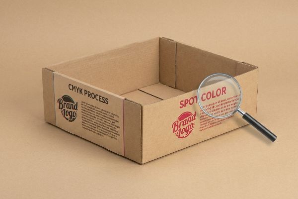
You must use spot colors when printing massive background floods, highly saturated brand logos, or microscopic compliance text. This isolated ink strategy guarantees razor-sharp edges and dense pigment coverage on thick structural boards, entirely bypassing the blurry registration drift inherent to standard four-color presses.
While solid floods are the most obvious use case, specialized inks are actually a critical tool for legal survival in strict retail environments.
Knowing When to Use Spot Colors for Maximum Impact
Knowing when to deploy these specialized inks often confuses even seasoned procurement teams. They want to keep plate costs low, so they try to run everything through a standard four-color press, assuming that high-resolution digital files will naturally produce crisp physical text on the final carton.
But relying on process colors for fine detail is like trying to paint a straight edge with a frayed brush. I recently worked on a campaign where a brand tried to print their strict TTB (Alcohol and Tobacco Tax and Trade Bureau) legal text7 using mixed cyan and magenta. During the litho-lamination phase, the strong smell of wet PVA (Polyvinyl Acetate) adhesive filled the air as it cured, causing the paper to shift just a fraction of a millimeter. That tiny registration drift caused the tiny legal letters to blur8 entirely. I immediately switched that critical text layer to a single solid spot color, locking the typography into one physical plate. This exact micro-adjustment ensures perfect legibility on the final folded tray, completely preventing compliance holds and expensive retailer rejections.
| Common Rookie Mistake | The Pro Fix | Retail-Floor Benefit |
|---|---|---|
| Printing legal text in CMYK | Moving legal copy to one solid plate | Prevents store manager compliance rejections |
| Trying to match neon on screen | Specifying a fluorescent Pantone ink | Grabs attention in crowded store aisles |
| Ignoring lamination paper shift | Adding a 0.5mm trapping tolerance | Keeps graphic edges sharp during assembly |
I explicitly isolate mandatory retail compliance data onto its own dedicated printing plate because blurry legal text is the fastest way to get your entire pallet kicked off the receiving dock.
🛠️ Harvey's Desk: Are your legal compliance disclaimers buried in a risky four-color mix? 👉 Download My Prepress Checklist ↗ — Download safely. My inbox is open if you have questions later.
Why do some printers use spot colors?
Achieving premium finishes requires physical chemistry that goes far beyond simply mixing four standard primary colors together on a press.
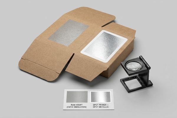
Commercial printers use spot colors to explicitly achieve premium, high-visibility finishes that standard process inks physically cannot replicate. These pre-mixed formulas create vivid metallics, bright fluorescents, and dense opaque bases, allowing factory operators to overcome the natural darkness of raw packaging substrates seamlessly.
Understanding the chemical necessity of these inks completely changes how you build your initial structural files.
Why Printers Use Spot Colors for Premium Finishes
Many buyers wonder why a factory insists on custom-mixed inks when modern digital presses boast millions of available shades9. They look at a vibrant monitor and assume a high-end commercial facility can simply simulate any metallic or specialty texture by layering enough standard process ink onto the board.
The physical reality of raw materials tells a completely different story. I constantly see clients try to print premium PMS (Pantone Matching System) 877 Silver directly onto raw brown kraft board. The porous paper just drinks the metallic flakes, leaving a flat, dull gray smudge. On the production floor, I solve this by laying down an opaque white spot color primer first. You can physically feel the stiff, chalky resistance of that white base coat locking down the loose paper fibers. Once that cures, the silver ink sits perfectly on top, creating a highly reflective luxury surface. By utilizing this strategic primer layer, I guarantee your display achieves a high-end club store aesthetic without forcing you to pay the massive material upcharges associated with hot foil stamping.
| Common Rookie Mistake | The Pro Fix | Retail-Floor Benefit |
|---|---|---|
| Printing metallics on raw kraft | Adding a white opaque primer base10 | Creates premium reflection without expensive foil |
| Assuming digital presses hit all hues | Using pre-mixed fluorescent inks | Drives immediate 3-second impulse engagement11 |
| Over-saturating CMYK to match brand | Utilizing a specific Pantone swatch12 | Guarantees brand consistency across global stores |
I mandate an opaque primer layer beneath all metallic inks because watching expensive silver pigment disappear into thirsty brown paperboard is an entirely preventable waste of your marketing budget.
🛠️ Harvey's Desk: Frustrated by metallic finishes looking dull and gray on your sample boxes? 👉 Request a Physical Color Draw-Down ↗ — No forms that trigger endless sales calls. Just pure value.
Are spot colors printed using only CMYK inks?
The definition of a color changes drastically when you move from the graphic design department to the automated manufacturing floor.
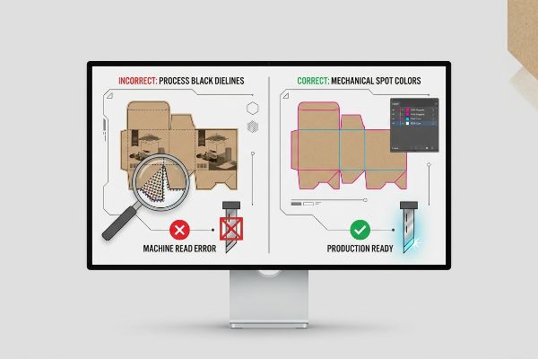
No. Spot colors are never printed using standard process inks. Beyond visual pigments, mechanical spot colors act as invisible digital commands. Factory routing machines strictly read these specific channels to engage steel blades or creasing wheels, ensuring the final cardboard structure physically assembles without friction.
Getting a printed file to look vibrant is simple, but when the automated machinery actually starts running, hidden file data dictates your survival.
Why Mechanical Spot Colors Break on the Factory Floor
Designers frequently outline their structural dielines using standard process black, assuming the automated cutting tables simply follow the visual lines drawn on the screen. They treat the engineering file exactly like a graphic illustration, completely unaware that industrial routing equipment relies entirely on absolute, separated data channels13 to function.
In my facility, I test this logic directly on our CNC (Computer Numerical Control) cutting tables, and the results are consistently disastrous if the data is dirty. Our Kongsberg machine does not possess eyes; it strictly reads non-printing spot colors assigned to vector strokes14. If a client leaves their cut lines as process black, the prepress software merges those structural lines straight into the artwork layer. You will hear the loud, aggressive vacuum suction of the table holding down a perfectly printed sheet of board that the blade absolutely refuses to cut. I intercept these flawed files, separate the layers, and convert the strokes to mechanical commands—like 100% Magenta for "Cut" and 100% Cyan for "Crease." By enforcing this strict digital parameter, I ensure your displays assemble flawlessly on the co-packing line, cutting manual labor friction and accelerating your speed to market by crucial days.
| Common Rookie Mistake | The Pro Fix | Retail-Floor Benefit |
|---|---|---|
| Leaving dielines in CMYK black | Converting strokes to mechanical colors | Ensures the machine actually cuts the board |
| Merging structure with artwork | Isolating cut lines on a locked layer | Prevents visual black lines on the final box |
| Guessing on crease tolerances | Engineering exact flute compressions | Stops raw paperboard from tearing during setup |
I strip process black out of every structural dieline because a perfectly printed display is completely worthless if the factory machinery cannot physically cut the locking tabs.
🛠️ Harvey's Desk: Does your current printer complain about dirty vector paths slowing down production? 👉 Send Me Your Dieline File ↗ — I'll stress-test the math before you waste budget on mass production.
Conclusion
You can choose a cheaper vendor, but when that muddy CMYK conversion washes out your logo on a porous testliner, the resulting visual inconsistency triggers an immediate big-box store rejection and completely wipes out your campaign's profit margin. Over 500 brand managers use my prepress checklist to avoid these exact fatal early-stage mistakes. Stop guessing on graphic and structural tolerances and let me personally run your artwork through my Free Dieline Audit ↗ to catch these hidden friction points before you pay for mass production.
"[PDF] Testing the predictability of water-based flexographic inks on plastic …", https://repository.rit.edu/cgi/viewcontent.cgi?article=4774&context=theses. [Technical documentation on print chemistry explains how the surface energy and tension of porous substrates dictate ink spread and absorption, which directly affects color saturation and accuracy]. Evidence role: technical mechanism; source type: materials science or printing industry standard. Supports: the assertion that surface properties impede color consistency. Scope note: specifically pertains to non-coated, porous packaging materials. ↩
"The effect of colorants on the content of heavy metals in recycled …", https://bioresources.cnr.ncsu.edu/resources/the-effect-of-colorants-on-the-content-of-heavy-metals-in-recycled-corrugated-board-papers/. [Technical literature on paper substrates explains how the high porosity of unsealed corrugated liners causes uneven ink absorption and significant dot gain for process colors]. Evidence role: technical verification; source type: paper science journal or printing manual. Supports: the failure of CMYK on porous substrates. Scope note: Absorption rates vary by specific liner grade and ink viscosity. ↩
"Difference Between Spot Color and CMYK Color", https://www.deprintedbox.com/blog/spot-vs-process-color/. [Industry standards for flexographic and offset printing demonstrate that solid spot colors provide higher opacity and more uniform coverage than the overlapping halftone dots of CMYK]. Evidence role: technical comparison; source type: prepress technical guide. Supports: the superiority of spot colors for visual density. Scope note: Applies specifically to high-visibility retail packaging. ↩
"What Is Spot Color For Packaging Printing?", https://bpkc.com/blogs/blog/what-is-spot-color-for-packaging-printing. [Technical guides on packaging prepress explain how spot colors provide superior opacity and color consistency on absorbent corrugated substrates compared to CMYK process blends]. Evidence role: technical justification; source type: industry manual. Supports: Use of spot colors for brand visibility. Scope note: specific to porous substrates. ↩
"Solutions for Corrugated Printing | Sun Chemical", https://www.sunchemical.com/packaging_corrugated/. [Manufacturing specifications for corrugated board demonstrate that applying a sealant or coating reduces ink penetration into the fibers, preventing muddy or washed-out colors]. Evidence role: technical process verification; source type: manufacturing specification. Supports: Prevention of color degradation. Scope note: applicable to high-porosity boards. ↩
"A Digital Process to Create Better Ink Drawdowns", https://www.pffc-online.com/news/16490-a-digital-process-to-create-better-ink-drawdowns. [Printing standards for packaging specify that physical draw-downs are required to verify actual ink-to-substrate interaction on corrugated materials, which digital proofs cannot replicate]. Evidence role: quality control standard; source type: technical standard. Supports: Accuracy of color proofs. Scope note: focus on corrugated substrates. ↩
"Labeling Resources | TTB: Alcohol and Tobacco Tax and Trade …", https://www.ttb.gov/regulated-commodities/labeling/labeling-resources. [Regulatory guidelines from the TTB specify the mandatory clarity and legibility standards for required statements on alcohol packaging]. Evidence role: regulatory proof; source type: government regulation. Supports: the necessity of sharp text to avoid compliance holds. Scope note: Specific to US alcohol and tobacco products. ↩
"Small Brown Text for Print Register, avoid blur text", https://graphicdesign.stackexchange.com/questions/118020/small-brown-text-for-print-register-avoid-blur-text. [Technical printing manuals explain how the slight misalignment of process plates, known as registration drift, results in blurred edges for small typography]. Evidence role: technical validation; source type: printing industry handbook. Supports: the risk of using process colors for fine text. Scope note: Applies to multi-plate offset processes. ↩
"What Is Color Gamut? Everything You Need to Know About …", https://www.mimakiusa.com/blog/what-is-color-gamut-everything-you-need-to-know-about-color-gamut-and-printing/. [A technical guide or industry whitepaper on digital printing would confirm the wide color gamut and the number of reproducible shades achievable via digital CMYK or extended gamut systems]. Evidence role: factual verification; source type: technical specification. Supports: digital printing color range. Scope note: refers specifically to the perceived color variety available in digital workflows. ↩
"Create white underlays for printing on transparent foil", https://help.callassoftware.com/m/pdftoolbox/l/1325593-create-white-underlays-for-printing-on-transparent-foil-using-create-spot-color-plate-based-on-ink-amount. [Technical printing guides explain that an opaque white underprint is necessary on absorbent or dark substrates like kraft to prevent ink absorption and ensure the metallic pigment reflects light properly]. Evidence role: technical validation; source type: industrial printing manual. Supports: the necessity of primers for metallic finishes on porous materials. Scope note: Applicable to most absorbent substrates. ↩
"Relationship between time pressure and consumers'impulsive …", https://pmc.ncbi.nlm.nih.gov/articles/PMC10750050/. [Visual marketing research and consumer psychology studies quantify the speed at which high-chroma fluorescent colors attract human gaze in high-stimulus retail environments]. Evidence role: empirical metric; source type: consumer behavior study. Supports: the effectiveness of fluorescent inks in triggering rapid impulse engagement. Scope note: Engagement timing may vary by product category. ↩
"Process Color vs Spot Color: The Ultimate Guide in 2026 – Dauxin", https://www.dauxin.com/blog/process-color-vs-spot-color/. [Documentation on the Pantone Matching System (PMS) demonstrates how standardized spot colors eliminate the variance inherent in CMYK process mixing across different presses and geographies]. Evidence role: industry standard verification; source type: technical specification. Supports: the claim that spot colors guarantee global brand consistency. Scope note: Specific to PMS and similar standardized systems. ↩
"[PDF] 3M Corporate Packaging Engineering Global Dieline Requirements", https://multimedia.3m.com/mws/media/2619412O/global-packaging-dieline-requirements.pdf. [Technical documentation on CAM software and CNC routing explains how machines distinguish between print and cut paths using isolated spot color channels rather than RGB/CMYK values]. Evidence role: technical verification; source type: technical manual. Supports: necessity of spot colors for mechanical routing. Scope note: Specific to automated packaging and die-cutting equipment. ↩
"Kongsberg Precision Cutting Systems: Digital cutters for every …", https://www.kongsbergsystems.com/. [Technical manuals for Kongsberg CNC systems confirm that the software interprets cut and crease paths based on specific spot color attributes rather than image pixels]. Evidence role: technical specification; source type: manufacturer documentation. Supports: machine reading logic. Scope note: applies to vector-based cutting workflows. ↩