Struggling to understand why your premium products get ignored on the retail floor? A poor store layout kills visibility, draining your marketing budget and frustrating your retail partners.
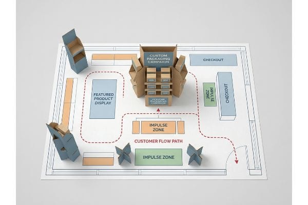
A retail store layout profoundly affects product sales by directing foot traffic and manipulating shopper eyelines. Strategic physical design forces consumers to interact with specific merchandisers, increasing impulse purchases, extending dwell time, and maximizing the return on investment for temporary cardboard marketing campaigns across big-box environments.
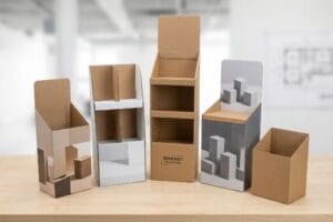
Understanding the psychology behind floor planning is just the beginning. The real challenge is engineering physical displays that actually survive and perform within these highly regulated commercial spaces.
How does the layout of a store affect sales?
Ever wonder why bottom-shelf items gather dust while mid-level products sell out instantly?
The layout of a store directly dictates product visibility by capitalizing on the human height heat map. Placing essential goods in the primary strike zone forces shopper engagement, driving up conversion rates and accelerating inventory turnover for seasonal fast-moving consumer goods within large commercial retail environments.
Theory is great, but let me show you how this plays out physically on the shop floor.
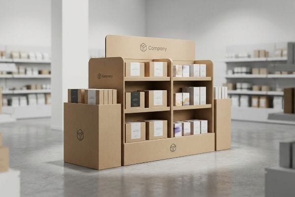
Hitting the Strike Zone in Store Layouts
Brands often design beautiful floor stands without considering vertical product placement. They distribute heavy inventory evenly from top to bottom, assuming shoppers will naturally bend down to browse the lower tiers. This beginner approach completely ignores the physical ergonomics of modern shopping, leading to massive blind spots at the base of the unit1.
I constantly see experienced marketing teams demand extra shelves near the ground to cram more units onto a single shipper. They forget that shoppers pushing heavy metal carts don't want to squat. When I review these flat dielines, I immediately flag this layout flaw. I mandate shifting the core inventory into the "strike zone"—the optimal 50 to 54 inches (1270 to 1371.6 mm) from the floor2. By inserting a false bottom made of double-wall corrugated board, you hear the satisfying, stiff resistance of the paper as it locks into place, elevating the merchandise without wasting raw material. This simple structural shift prevents bottom-tier stagnation, accelerating your sell-through rate3 and drastically improving the ROI (Return on Investment) of the campaign.
| Common Rookie Mistake | The Pro Fix | Retail-Floor Benefit |
|---|---|---|
| Placing products at floor level | Installing a double-wall false bottom4 | Eliminates shopper bending |
| Wasting graphics on the bottom 10 inches | Moving core messaging to the 50-inch strike zone5 | Increases visual engagement |
| Overloading base with heavy inventory | Elevating goods to cart-height | Accelerates inventory turnover6 |
I never let clients bury their best products at the ankles of passing shoppers. By engineering the structure to hit the human heat map, I guarantee your merchandise is seen, grabbed, and purchased without friction.
🛠️ Harvey's Desk: Are your best-selling SKUs hiding in the retail blind spot? Let me check your shelf heights. 👉 Get Your Dieline Audited ↗ — Direct access to my desk. Zero automated sales spam, I promise.
Why is store layout and design important in a retail store?
A beautiful display means nothing if the store manager refuses to let it off the loading dock.
Store layout and design strictly enforce logistical compliance and traffic flow regulations. Proper spatial engineering ensures that promotional cardboard fixtures fit seamlessly into predetermined retail zones, preventing aisle congestion, meeting safety standards, and ensuring uninterrupted consumer navigation throughout the entire shopping session.
Navigating these spatial rules requires more than just good graphic design; it requires structural math.
Navigating ADA and GMA Limits in Retail Design
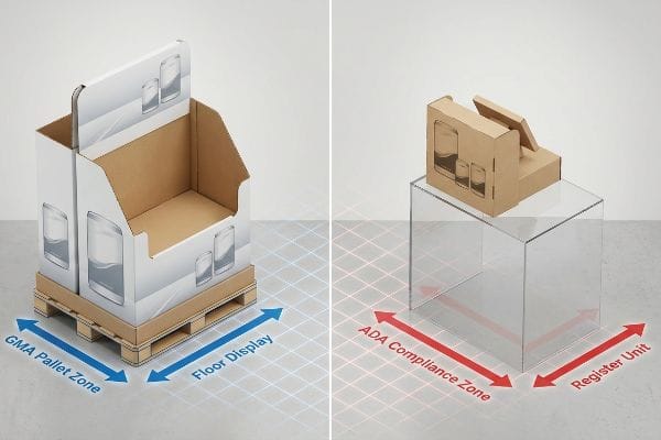
Procurement teams frequently attempt to stretch their budgets by designing a single, scalable unit that can act as both a massive floor stand and a compact register unit. They simply scale down the artwork by fifty percent, assuming the cardboard structure will still function in both layout zones. This ignores the rigid legal and spatial constraints that separate primary aisles7 from checkout lanes in big-box environments.
The layout of a retail store strictly separates POP (Point of Purchase) floor zones from POS (Point of Sale) counters. I frequently catch buyers trying to shrink a heavy-duty floor bin to fit on a glass counter. I have to remind them that floor units are strictly anchored to the standard 48×40 inch (1219.2×1016 mm) GMA8 (Grocery Manufacturers Association) wood pallet, while register zones must obey the ADA (Americans with Disabilities Act) forward reach window of 15 to 48 inches9 (381 to 1219.2 mm). If you blur these lines, you will feel the sharp, jagged edge of a store manager's box cutter slicing your display apart to make it fit. I permanently separate these engineering pipelines, ensuring your units slide effortlessly into their designated zones, preventing costly retailer chargebacks.
| Common Rookie Mistake | The Pro Fix | Retail-Floor Benefit |
|---|---|---|
| Shrinking floor units for counters | Engineering separate POS and POP pipelines | Prevents retailer rejection |
| Ignoring register height limits | Enforcing ADA forward reach compliance10 | Ensures shopper accessibility |
| Forgetting pallet base requirements | Anchoring designs to standard footprint limits11 | Streamlines warehouse logistics |
I always tell my clients that retailer compliance is not a suggestion. By engineering specifically for the store's designated layout zones, I ensure your campaign gets placed perfectly on the floor instead of thrown in the dumpster.
🛠️ Harvey's Desk: Are you worried your new floor stand might violate big-box spatial regulations? 👉 Request a Compliance Review ↗ — Download safely. My inbox is open if you have questions later.
Why is the arrangement of goods in the store important?
The battle for prime retail real estate is fierce, and bulky merchandisers are often the first casualties.
The arrangement of goods dictates revenue density by maximizing profitable inventory within restricted square footage. Strategically subdividing standard retail pallets allows multiple complementary campaigns to share high-traffic intersections, optimizing aisle flow and preventing massive out-of-stock scenarios during peak seasonal shopping periods in large grocery chains.

But trying to monopolize the floor layout is the fastest way to get your campaign rejected.
Utilizing Fractional Pallets for Smarter Arrangement
Brands often pitch massive, full-size floor standees to buyers, assuming that a larger footprint automatically commands more shopper attention. They design structures that consume an entire wooden base, ignoring the fact that modern store layouts strictly ration premium intersection space12. This aggressive, all-or-nothing approach frequently leads to outright rejection from floor managers who cannot justify dedicating that much space to a single product line.
Think of retail aisles like expensive parking spots; you don't park a bicycle in a spot meant for a semi-truck. I regularly step in when clients try to push an oversized, flimsy shipper that wastes layout space. I engineer bulk merchandisers into standard fractional dimensions—specifically Half Pallets at 48×20 inches (1219.2×508 mm) or Quarter Pallets at 24×20 inches (609.6×508 mm)13. When we lock these scaled-down modules together, you hear the tight, hollow thump of thick corrugated walls sharing a single base perfectly. By mathematically subdividing the arrangement, I allow retail buyers to seamlessly mix your brand with others, drastically increasing your chances of securing premium placement at high-traffic corners.
| Common Rookie Mistake | The Pro Fix | Retail-Floor Benefit |
|---|---|---|
| Pitching oversized full pallets | Engineering fractional half or quarter units | Increases buyer approval rates14 |
| Monopolizing intersection space | Designing shared-base modular standees | Maximizes aisle foot traffic15 |
| Wasting vertical air space | Utilizing high-density stacking math | Boosts revenue per square foot16 |
I refuse to let brands overbuild and under-deliver. By mastering fractional geometry, I align your packaging directly with the store's arrangement goals, turning inevitable rejections into easy placement wins.
🛠️ Harvey's Desk: Is your oversized floor display about to get rejected by a strict buyer? 👉 Claim Your Structural Strategy ↗ — No forms that trigger endless sales calls. Just pure value.
How does store layout affect customer experience?
Frustrated shoppers don't buy products; they walk away and buy from your competitor instead.
Store layout fundamentally shapes customer experience by minimizing physical friction and enhancing visual accessibility. Ergonomic structural merchandising ensures that shoppers can easily identify, reach, and interact with packaged goods, creating a seamless psychological journey that directly translates into higher brand loyalty and increased basket sizes.
Getting one display to stand up in a lab is easy, but here is the harsh reality when you ship 500 of them…
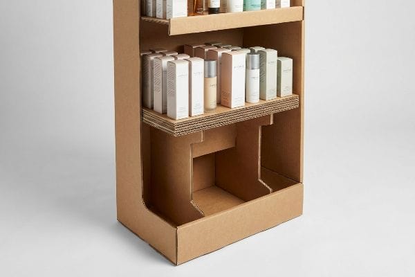
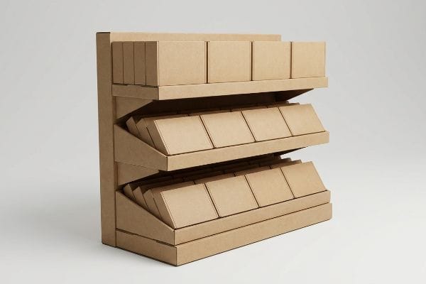
Why Flat Shelving Ruins the Shopper Experience
Junior designers frequently draft perfectly horizontal shelves for deep retail bins, assuming shoppers will eagerly dig through the shadows to find a product. They treat the layout like a flat filing cabinet, prioritizing manufacturing simplicity over actual human behavior. This leads to a massive customer experience failure, as products on the lower tiers are plunged into darkness17, making labels unreadable and drastically increasing the psychological friction of the shopping trip18.
In my facility, I routinely see brands lose thousands in potential sales because their bottom-shelf items are invisible under harsh fluorescent lights. This isn't just theory—I see this happen on the testing floor when we measure the ambient light reflecting off a flat shelf. The customer experience is ruined when a shopper has to physically crouch and pull a box out just to read the barcode. I fix this by enforcing my "Chin-Up" shelf protocol, structurally angling the bottom tiers upward by exactly 15 degrees. When I score the 32ECT (Edge Crush Test) virgin kraft liner to create this tilt, the stiff resistance of the board guarantees the shelf holds its pitch under 45 lbs (20.41 kg) of load19. By forcing the packaging to face the customer's eyeline, I eliminate the shadow zone, dramatically improving the browsing experience and saving clients from stagnant inventory losses.
| Common Rookie Mistake | The Pro Fix | Retail-Floor Benefit |
|---|---|---|
| Using flat bottom tiers | Angling shelves upward by 15 degrees20 | Increases product visibility |
| Ignoring ambient lighting shadows | Forcing packaging to catch aisle light | Enhances label readability |
| Forcing shoppers to crouch down | Tipping inventory into the natural eyeline21 | Removes physical browsing friction |
I don't believe in making the shopper work hard to buy your product. By engineering a precise 15-degree tilt into the structure, I instantly upgrade the customer experience and eliminate the dark spots on the retail floor.
🛠️ Harvey's Desk: Are your lower-tier products disappearing into the shadows of a flat shelf? 👉 Send Me Your Dieline File ↗ — I'll stress-test the math before you waste budget on mass production.
Conclusion
You can choose a cheaper vendor, but when your horizontal shelves plunge products into shadows and bottom-tier inventory stagnates, it causes massive shopper friction and completely wipes out the project's profit margin. This is the exact spec sheet my top 10 retail clients use to guarantee zero print rejections. Stop guessing on display ergonomics and let me personally run your structural files through my Free Dieline Audit ↗ to optimize your shelf angles before production begins.
"Why Do Retailers Place Products at Eye Level? – PopDisplay", https://popdisplay.me/why-do-retailers-place-products-at-eye-level/. [Research on consumer eye-tracking and retail ergonomics demonstrates that product placement below the knee level significantly reduces visibility and shopper interaction]. Evidence role: Technical verification; source type: Retail psychology study. Supports: The existence of visibility gaps in vertical displays. Scope note: Applies to adult shoppers in standard commercial retail environments. ↩
"How Tall Are Grocery Store Shelves? A Complete Guide for Retailers", https://www.hedarack.com/blogs-detail/how-tall-are-grocery-store-shelves. [Retail ergonomics and planogram standards define the 'strike zone'as the vertical range most easily accessible to the average adult shopper]. Evidence role: technical specification; source type: retail design guide. Supports: the specific height measurement for optimal visibility. Scope note: targets general adult populations. ↩
"Understanding Sell-Through Rate – SupplierWiki – SPS Commerce", https://www.spscommerce.com/community/articles/sell-through-rate. [Market research on consumer eye-level bias confirms that products placed in the primary strike zone exhibit higher sales velocity than those on lower shelves]. Evidence role: causal claim; source type: consumer behavior study. Supports: the link between placement height and inventory turnover. Scope note: effects may vary by product category. ↩
"How to Choose Wall Shelving for Supermarket Display and Gondola …", https://rackleaders.com/how-to-choose-wall-shelving-for-supermarket-display-and-gondola-shelving-for-retail-stores/. [Retail fixture design standards describe the implementation of false bottoms to raise the effective selling surface and improve ergonomic access for customers]. Evidence role: Technical specification; source type: Store design manual. Supports: Method for preventing shopper bending. Scope note: Applies to specific shelving hardware.] ↩
"Retail Store Design Guide – Layout, Ideas & Strategies – TruRating", https://trurating.com/blog/how-to-design-a-retail-store-layout/. [Academic research on consumer eyelines and retail ergonomics confirms that a height of approximately 50 inches is the optimal 'strike zone'for adult visual attention]. Evidence role: Technical specification; source type: Consumer psychology study. Supports: The effectiveness of specific height for messaging. Scope note: May vary based on target shopper demographics.] ↩
"Inventory Turnover Rate – Alexander Jarvis", https://www.alexanderjarvis.com/what-is-inventory-turnover-rate-in-ecommerce/. [Comparative retail analytics demonstrate that increasing product accessibility by elevating goods to waist-level results in higher sales velocity and faster stock rotation]. Evidence role: Performance metric; source type: Retail analytics report. Supports: Relationship between placement height and turnover. Scope note: Effect size depends on product category.] ↩
"ADA Accessibility Standards – Access-Board.gov", https://www.access-board.gov/ada/. [Regulatory standards from the ADA and GMA define specific minimum width and clearance requirements for retail aisles and checkout zones to ensure accessibility]. Evidence role: legal requirement; source type: regulatory guideline. Supports: the claim that spatial constraints differ between store zones. Scope note: applies primarily to US retail environments. ↩
"Standard Pallet Sizes | With Chart – Kamps Pallets", https://www.kampspallets.com/standard-pallet-sizes-with-chart/. [Industry logistics standards confirm the 48×40 inch dimension as the standard for GMA pallets used in retail distribution. Evidence role: technical specification; source type: industry standard. Supports: floor unit sizing. Scope note: North American retail.] ↩
"Chapter 3: Operable Parts – Access-Board.gov", https://www.access-board.gov/ada/guides/chapter-3-operable-parts/. [The ADA Standards for Accessible Design specify the permissible height range for forward reach to ensure accessibility for individuals in wheelchairs. Evidence role: legal requirement; source type: government regulation. Supports: POS zone height compliance. Scope note: US federal law.] ↩
"Chapter 9: Built-In Elements – Access-Board.gov", https://www.access-board.gov/ada/chapter/ch09/. [The ADA Standards for Accessible Design provide specific maximum height and reach requirements for retail service counters to ensure accessibility for individuals in wheelchairs]. Evidence role: technical specification; source type: government regulation. Supports: the necessity of enforcing reach compliance for registers. Scope note: Applies to US accessibility laws. ↩
"Wood Pallet Standards & Specifications", https://packagingrevolution.net/pallets/wood-pallets/wood-pallet-standards/. [Industry standards, such as those from the Grocery Manufacturers Association (GMA), define standard pallet dimensions to ensure transport and warehouse compatibility]. Evidence role: industry standard; source type: technical manual. Supports: the requirement to anchor retail designs to specific pallet footprints. Scope note: Focused on North American logistics standards. ↩
"Complete Guide to Store Layout Design and Floor Planning Strategies", https://www.reinnovation.eu/post/retail-space-optimization-techniques-complete-guide-to-store-layout-design-and-floor-planning-strat. [Industry retail management guides or spatial analytics studies provide evidence on how high-traffic intersections are rationed to maximize revenue per square foot]. Evidence role: factual support; source type: retail management guide. Supports: the claim that prime retail real estate is strictly managed. Scope note: primarily applicable to big-box and grocery retail. ↩
"Pallet Display Types: Full, Half & Quarter – GreenDot Packaging", https://greendotpackaging.com/understanding-pallet-display-types-full-half-and-quarter-pallet-displays/. [Industry standards for retail point-of-purchase displays verify these specific dimensions for subdivided pallet footprints. Evidence role: technical specification; source type: industry standard. Supports: fractional pallet sizing. Scope note: applicable primarily to North American retail standards.] ↩
"Pallet Procurement: Strategies for Food and Beverage – Fastmarkets", https://www.fastmarkets.com/insights/2025-pallet-market-trends-key-insights-for-pallet-procurement-and-supply-chain-strategies/. [Authoritative industry reports on retail merchandising confirm that flexible, smaller pallet footprints are more likely to be approved by store managers than oversized units]. Evidence role: causal link; source type: industry report. Supports: benefit of fractional units. Scope note: Specific to retail placement approvals. ↩
"Optimizing the In-Store Experience with a Well-Crafted Retail Design", https://thelookcompany.com/blog/optimizing-in-store-experiences-with-well-crafted-retail-design. [Studies on retail store layout and consumer behavior demonstrate that reducing obstacles at intersections through modular design increases customer flow and dwell time]. Evidence role: correlation; source type: retail layout study. Supports: benefit of shared-base standees. Scope note: Focuses on intersection optimization. ↩
"Revenue per Square Foot: Still a Reliable Measure of Success?", https://southpace.com/revenue-per-square-foot-still-a-reliable-measure-of-success/. [Professional literature on retail space productivity provides data on how maximizing vertical cube utilization increases overall sales density]. Evidence role: metric verification; source type: retail analytics paper. Supports: benefit of high-density stacking. Scope note: Applies to high-volume merchandise. ↩
"Benefits of Retail Dump Bin Displays – shopPOPdisplays", https://www.shoppopdisplays.com/blog/2024/04/29/benefits-of-retail-dump-bin-displays/?srsltid=AfmBOor4Q5C0W4gXUVdnY-ZH1jn_7UdTX080NOevqLr8fNMIFtuIWrib. [Authoritative merchandising guides document how deep, vertical-walled bins create light occlusion, leaving bottom-tier items obscured from view]. Evidence role: technical validation; source type: retail design manual. Supports: the claim that flat shelving reduces visual accessibility. Scope note: specific to deep bin geometry. ↩
"Can Friction Improve Your Customers'Experiences?", https://sloanreview.mit.edu/article/can-friction-improve-your-customers-experiences/. [Research on shopper behavior indicates that physical obstacles and poor product visibility increase cognitive load and frustration, defined as psychological friction]. Evidence role: causal link; source type: peer-reviewed psychology study. Supports: the link between layout inefficiency and customer experience degradation. Scope note: generalized across physical retail environments. ↩
"Understanding Shipping Box Strength – EcoEnclose", https://www.ecoenclose.com/blog/understanding-shipping-box-strength/?srsltid=AfmBOor7qv1Ki4jArOejl7rGMbjL-wzoeQdy00p-PPdlsg22QcEfIrn7. [Technical documentation on corrugated board grades verifies the maximum load capacity and structural rigidity of 32ECT kraft liner when used in shelving applications]. Evidence role: technical verification; source type: materials engineering handbook. Supports: the claim that 32ECT board can sustain a 45lb load without collapsing. Scope note: Load capacity varies based on shelf dimensions and environmental humidity. ↩
"How to Improve Product Visibility in Retail Display Cabinets", https://www.onidisplay.com/how-to-improve-product-visibility-retail-display-cabinets/. [An authoritative guide on visual merchandising or retail ergonomics would validate that a specific tilt angle, such as 15 degrees, optimizes the line of sight for bottom-tier products]. Evidence role: technical specification; source type: retail design manual. Supports: the use of angled shelving to increase visibility. Scope note: optimal angles may vary based on product height and shelf depth. ↩
"We're raising the bar to: makeup that actually feels good …", https://www.instagram.com/reel/DYOvTI4gCJ4/. [Ergonomic research on consumer behavior and line-of-sight confirms that positioning products within the natural gaze reduces physical effort and browsing friction]. Evidence role: ergonomic principle; source type: consumer behavior study. Supports: the benefit of reducing physical browsing friction. Scope note: effectiveness depends on the average height of the target demographic. ↩