
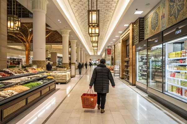
Shoppers do not buy the best product. They buy what they notice first. I face this every season. Displays win or lose sales before staff speak.
Visual merchandising psychology uses how people see, feel, and decide to guide attention, reduce effort, and trigger action. It blends design, behavior science, and retail math to lift conversion on the sales floor.
I work in cardboard displays for global brands. So I keep ideas simple, field-tested, and tied to results. I share what my team uses every week.
What is the psychology of visual merchandising?
Shoppers scan, not study. My display must lead the eye, frame the choice, and make action easy. If it fails fast, sales fall fast.
It is the practical use of attention, perception, memory, and emotion to guide a shopper from glance to grab. Good displays lower thinking cost and raise certainty, so more people buy now.
Core principles I use on the floor
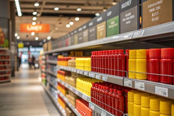
I design for fast minds. I respect limits on time and working memory. I set one clear job for each display. I remove friction. I show proof fast. I use size, contrast, and order to pull the eye. I keep touch, safety, and brand feel in balance. I also plan for markets. North America values reliability and steady supply. APAC grows fast, so I scale fast with digital print1 and quick-turn die-cuts. Europe asks for eco and certifications, so I choose recycled boards2 and water-based inks. These simple rules travel well across stores and cultures because they respect how people decide in a few seconds.
| Principle | What it means | How I use it in cardboard displays |
|---|---|---|
| Attention | First look wins | Big headline, one hero image, bold contrast |
| Perceptual fluency | Easy to read → feels right | Short words, clear icons, clean whitespace |
| Anchoring | First number sets value | "Was $X / Now $Y" or "Save $Z today" |
| Social proof3 | Others chose this | Badges, reviews, retailer picks |
| Scarcity4 | Now or miss out | "Limited run", countdown tags |
| Effort | Less effort → more buys | Eye-level reach, simple paths, no assembly by shopper |
What are the 5 R's of merchandising?
A display fails if the basics fail. I check them before I tweak color or copy.
The 5 R's are: Right Product, Right Place, Right Price, Right Time, and Right Quantity. They keep the plan simple, measurable, and easy to fix when sales lag.
The 5 R's on a real planogram
I run these checks on every rollout. Right Product5 means the SKU fits the mission. A counter unit needs small, high-margin items. Right Place means I win the traffic flow. End caps, front aisles, and checkout lanes matter. Right Price means the tag matches the shelf and the web. I also use clean price endings that match the retailer's habit. Right Time means I sync with launches and seasons. In APAC, fast cycles push quick-turn digital print. Right Quantity6 means I balance stock and space to avoid empty faces or crushed boxes. I learned this the hard way on a hunting promo. We shipped the wrong mix of crossbow accessories. The stand looked full but key SKUs sold out day two. After a replan by quantity and time, the same unit lifted weekly sales without any design change.
| "R" | Key questions | Tactics I use |
|---|---|---|
| Right Product7 | Does it fit the mission? | Basket analysis, attach rates, hero SKU choice |
| Right Place | Will most shoppers see it? | Heat maps, end caps, impulse lanes |
| Right Price8 | Is value obvious? | Price cards, bundles, anchor pricing |
| Right Time | Is this the buying moment? | Launch calendars, holidays, seasonality |
| Right Quantity | Can it stay full and neat? | Case pack fit, shelf-ready trays, PDQ inserts |
What are the 4 P's of merchandising?
I do not treat displays as art. I treat them as one part of a simple mix that drives sales.
The 4 P's are Product, Price, Place, and Promotion. A display works when these four align with one job and one clear action for the shopper.
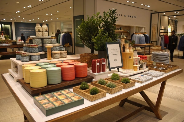
Making the 4 P's work on a display
Product sets the hero. I feature the version that most people will buy first. I put variants near but not louder. Price must be easy to decode.9 I prefer one big number and a small value proof, like "Includes 6 bolts." Place is about flow and sightlines. Floor displays win when they do not block carts and still catch eyes from 10 feet. Promotion makes the reason to act now.10 I rotate simple offers, demos, or QR videos. In Europe, I add eco points because that market rewards sustainability. In APAC, I lean on bold color and fast refresh because cycles move quicker. North America likes durable corrugated with strong edge crush for big-box handling. I set each P on a checklist so my team can build, ship, and track without guesswork.
| P | Display angle | What I measure |
|---|---|---|
| Product | One hero SKU11, clear variants | Unit mix, attach rate |
| Price | Big, clean, honest | Price compliance, discount clarity |
| Place | High-traffic, eye-level, safe | Footfall, dwell time |
| Promotion | Simple reason to act now | Redemption, scan, or lift vs control |
What is the personality of a visual merchandiser?
My job sits between art and ops. I sell with boards and ink, and I solve with tape and data.
Great visual merchandisers stay curious, patient, and decisive. They mix empathy for shoppers with discipline for tests, and they love fast feedback more than perfect ideas.

Traits that move the needle
Curiosity12 keeps me asking why a unit wins in Texas but fails in Toronto. Empathy13 keeps the shopper first. I bend designs for real hands, not mood boards. Grit matters because installs break and trucks run late. I own the fix. I keep a lab mindset. I test one change at a time, and I log every result. I also respect partners. Buyers want on-time, legal, safe, and certified materials. My factory runs recycled corrugated, water-based inks, and strength tests because trust sells. A quick story: I worked with David at Barnett Outdoors on a crossbow launch. The first header looked premium but hid specs that engineers cared about. We swapped to a spec-led callout, added a safe-touch try zone, and tightened pack density. The same footprint sold faster and shipped safer.
| Trait | Why it matters | Habit that shows it |
|---|---|---|
| Curiosity14 | Finds hidden blockers | Store walks, shopper intercepts |
| Empathy15 | Designs for real people | Hand reach tests, simple copy |
| Discipline | Makes tests count | A/B one variable, log outcomes |
| Reliability | Earns buyer trust | On-time proofs, certified materials |
| Grit | Saves launches under stress | Backup parts, rapid rework kits |
What psychological factors should be considered when merchandising stores?
I plan for human limits first. I assume low time, low patience, and low working memory.
Key factors include attention, contrast, color, eye level, reach, cognitive load, social proof, scarcity, touch, and safety. Design for speed and comfort so choices feel easy and right.

A simple factors checklist I use
Attention and contrast pull people from five to ten feet. I use bold headers and clean space. Color sets mood and code. Green and kraft cues eco in Europe. Eye level still sells more, but safety sets the limit for heavy gear. Reach and grip decide if a shopper can pick without help. Cognitive load16 must stay low. I cut choices or group by need. Social proof17 reduces risk. I add badges or top-seller tags. Scarcity gives a nudge. I mark limited runs or season ends. Touch matters. Textured boards or sample zones drive confidence, especially for tools and hunting gear. Safety is non-negotiable. All edges, weights, and fasteners must pass tests. I also watch local norms. APAC stores change fast, so I design flat-pack PDQs for quick resets. Big-box in North America needs stronger pallets and higher ECT to survive long moves.
| Factor | Notes | Display action |
|---|---|---|
| Attention | First 3 seconds | Big headline, hero image |
| Contrast | Fast legibility | Dark-light play, whitespace |
| Color | Mood and code | Brand hues, eco cues |
| Eye level | Easy scanning | Center hero at 48–60 in |
| Reach | Pick without strain | Handles, lower heavy items |
| Cognitive load18 | Fewer choices | 3-option rule, clear families |
| Social proof19 | Reduce risk | Reviews, badges |
| Scarcity | Urgency | "Limited", "Seasonal" tags |
| Touch | Confidence | Try zones, texture |
| Safety | Trust | Rounded edges, load tests |
What is the theory of visual merchandising?
I use theory as a starter, not a cage. I test rules in stores, not only on slides.
Useful theory blends Gestalt grouping, AIDA flow, motivation-ability-prompts, and jobs to be done. The goal is clarity: one job per display, one path to act, one proof to trust.
Working theory that guides my designs
Gestalt20 helps me group without clutter. I use proximity, similarity, and continuity so eyes follow a clean path. AIDA21 keeps my flow honest: catch Attention, hold Interest, build Desire, ask for Action. The Fogg model reminds me that a prompt only works when the shopper has motivation and ability. If the box is heavy or the copy is dense, the prompt fails. Jobs-To-Be-Done keeps me focused on the task the shopper hires the display to do. For a hunting setup, the job might be "Choose the right starter crossbow bundle in under two minutes." In Europe, I add a "green proof" job because many shoppers need eco certainty. In APAC, I add a "freshness" job because speed and novelty win. I anchor all this with retail math. If a unit does not improve sell-through or reduce returns, I change it.
| Theory | One-line idea | Practical rule in displays |
|---|---|---|
| Gestalt22 | Eyes like order | Group by need, align edges |
| AIDA23 | Guide the journey | Header → benefits → proof → CTA |
| Fogg (B=MAP) | Prompt needs ability | Clear steps, easy reach, simple copy |
| JTBD | Solve one job | Name the job on the header |
| Prospect theory | Loss feels strong | "Don't miss season openers" |
| Fluency | Easy feels true | Large fonts, short words, high contrast |
Conclusion
Good displays respect how people decide. I use simple rules, fast tests, and strong cardboard to win attention, trust, and action across markets.
Explore this link to understand how digital print enhances design efficiency and meets market demands. ↩
Discover the significance of using recycled boards in design for eco-friendliness and sustainability. ↩
Understanding social proof can enhance your marketing strategies by leveraging customer behavior to boost sales. ↩
Exploring the concept of scarcity can help you create urgency in your marketing, driving more immediate purchases. ↩
Understanding the Right Product concept can enhance your planogram strategy, ensuring the right items are placed for maximum sales. ↩
Exploring Right Quantity will help you optimize stock levels, preventing empty shelves and maximizing sales efficiency. ↩
Understanding the Right Product strategy can enhance your retail success by ensuring alignment with your mission. ↩
Exploring pricing strategies like anchor pricing can help you maximize sales and customer satisfaction. ↩
Understanding pricing strategies can enhance your display effectiveness and attract more customers. ↩
Exploring promotional tactics can provide insights on driving immediate customer action and boosting sales. ↩
Understanding hero SKUs can help optimize product placement and sales strategies. ↩
Exploring this link will reveal how curiosity drives innovation and problem-solving in various fields. ↩
Understanding empathy's role can enhance your approach to customer satisfaction and product development. ↩
Exploring this link will deepen your understanding of how curiosity drives innovation and uncovers hidden challenges. ↩
This resource will provide insights into how empathy shapes user-centered design, enhancing product effectiveness. ↩
Understanding cognitive load can help you design better shopping experiences that minimize confusion and enhance decision-making. ↩
Exploring social proof can reveal powerful strategies to boost sales by leveraging customer trust and validation. ↩
Understanding cognitive load can help you create designs that are user-friendly and reduce decision fatigue. ↩
Exploring social proof can enhance your marketing strategies by leveraging reviews and testimonials to build trust. ↩
Understanding Gestalt theory can enhance your design skills by helping you create more organized and visually appealing layouts. ↩
Exploring AIDA can improve your marketing strategies by ensuring you effectively capture and maintain customer attention. ↩
Exploring Gestalt principles can improve your design skills by helping you create visually appealing and organized layouts. ↩
Understanding the AIDA model can enhance your marketing strategies by effectively guiding customer journeys. ↩


