You pour budget into a striking brand palette, expecting retail dominance. Yet, when displays hit the store floor, shopper engagement flatlines and your vibrant branding vanishes into the aisles.
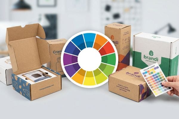
A retail merchandising color wheel is a strategic design tool used to pair contrasting or complementary hues. It helps marketers select visual palettes that direct consumer attention, trigger emotional purchasing responses, and organize product categories efficiently within high-traffic global retail environments.
Understanding the theory is only the first step. Translating that perfect digital color wheel onto physical cardboard without losing impact is where most campaigns quietly bleed margin.
What is the color wheel in visual merchandising?
Graphic designers often assume their screen's perfect color pairings will automatically materialize in the real world.
The color wheel in visual merchandising functions as a blueprint for shopper engagement. It organizes hues into distinct relationships—like primary or analogous groups—allowing designers to build retail displays that visually pop against neutral store aisles and instinctively draw foot traffic.
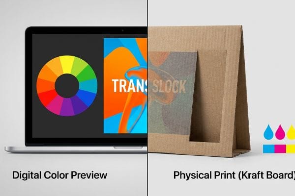
However, selecting a high-impact complementary color scheme on a monitor completely ignores the physical chemistry of the printing press.
How Digital Color Wheels Fail on Physical Retail Displays
Most brand teams confidently send their highly saturated artwork files straight to the factory, trusting standard commercial printing to capture their chosen color wheel dynamics. They rely on basic CMYK (Cyan, Magenta, Yellow, Key/Black) screen previews1 to judge how their display will look next to competitors in major US retailers like Walmart or Target.
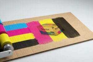
Even veteran designers often overlook this blind spot: a digital color wheel operates on emitted light, while a retail floor operates on reflected light bouncing off porous paper. I see this mismatch constantly. A buyer will specify a vibrant complementary orange and blue pairing, but when we run the raw 32ECT virgin kraft liner through the offset press, the sharp, acrid smell of fresh offset ink is quickly followed by visual disappointment. The ink sinks directly into the thirsty paper fibers, turning that vibrant digital orange into a muddy, washed-out rust. The structural integrity is fine, but the muted display causes massive optical friction, slowing down shopper conversion by an estimated 30% because it simply doesn't command attention from 20 feet (6.09 m) away.
| Common Rookie Mistake | The Pro Fix | Retail-Floor Benefit |
|---|---|---|
| Trusting digital screen colors for cardboard | Using GMG Color Proofing on actual board stock2 | Guaranteed accurate brand representation |
| Ignoring paper absorption rates | Applying white primer base under bright colors3 | Maintains high-contrast visual disruption |
| Assuming one proof matches all print runs | Utilizing a Spectrophotometer for Delta-E tolerance4 | Prevents entire batches from being rejected |
I refuse to run mass production based on an uncalibrated screen file, because utilizing strict spectrophotometer readings protects my clients from costly retailer rejections.
🛠️ Harvey's Desk: Are you worried your striking digital colors will look dull and lifeless on a physical display board? 👉 Request a GMG Color Proof ↗ — Direct access to my desk. Zero automated sales spam, I promise.
What is the color theory in retail?
Leveraging color theory requires more than just picking shades that look nice together; it demands technical execution.
Color theory in retail dictates how specific pigments influence consumer psychology and browsing behavior. It involves applying scientifically proven shade combinations to point-of-purchase structures, ensuring brand messaging communicates value, urgency, or premium quality instantly from across a crowded store floor.
Applying psychological theory is useless if your chosen shades become illegible under the harsh fluorescent lights of a big-box store.
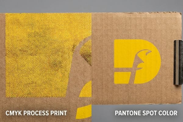
Why Theoretical Contrast Turns into "Halftone Mud"
Brand managers frequently design displays with solid, high-contrast corporate colors to trigger specific psychological responses5, assuming process printing will seamlessly match their intent. They design large flood-coated headers with their primary brand hue, expecting it to stand out sharply against the rest of the POS (Point of Sale) structure.
It is a common trap that catches even experienced procurement teams. When you print a complex color theory combination using standard four-color process printing on corrugated board, the machine creates the color using thousands of tiny, overlapping dots. If you look at the printed surface under a magnifying loupe, you can see the grainy, dotted texture of the halftones. When these dots blend on unsealed testliner, they create optical "mud."6 I had a client nearly lose their mind because their crisp, energetic brand yellow looked heavily pixelated and dirty, completely ruining the psychological "premium" effect they wanted. To fix this, I completely pull these large background areas out of the standard process run and flood them with a solid PMS (Pantone Matching System) spot color ink7 instead.
| Common Rookie Mistake | The Pro Fix | Retail-Floor Benefit |
|---|---|---|
| Printing solid brand colors using CMYK | Spot Color Flood Protocol for major graphics8 | Eliminates grain for crystal clear branding |
| Leaving raw corrugated board unsealed | Using aqueous coatings to seal the surface9 | Enhances pigment brightness and durability |
| Relying on optical blending for contrast | Using pure, pre-mixed Pantone pigments10 | Secures instant shopper recognition |
I always transition primary brand logos and solid visual anchors to dedicated spot colors to guarantee the psychological impact survives the transition to physical cardboard.
🛠️ Harvey's Desk: Does your current display printing look grainy and unprofessional when you view it up close? 👉 Get a Print Clarity Audit ↗ — Download safely. My inbox is open if you have questions later.
What are the 7 types of color theory?
Understanding the different palette frameworks allows you to organize multiple SKUs without overwhelming the shopper's eyes.
The 7 types of color theory refer to distinct harmony frameworks: monochromatic, analogous, complementary, split-complementary, triadic, tetradic, and square. Merchandisers utilize these mathematical palette rules to create visually balanced packaging and displays that prevent optical fatigue for shoppers.
A perfectly balanced triadic color scheme in your design software can easily turn into a clashing disaster in the real world.
The Danger of Choosing Schemes on a Smartphone Screen
Agencies love to build sophisticated analogous or tetradic color palettes to differentiate flavor profiles11 on a modular display tier. They routinely sign off on these complex color arrangements based on PDF proofs viewed on their high-resolution smartphones12 or glossy office monitors.
Think of it like picking a nuanced paint color in a brightly lit hardware store, only to realize it looks entirely different inside your dimly lit living room. In my facility, the reality crash happens when the printed sheets are pulled for inspection. I bring the buyer into our light-controlled viewing room, turning on the warm hum and harsh glare of the D50 standard illuminant fluorescent light booth13. Under standard retail lighting, a beautiful split-complementary scheme that looked distinct on an iPhone suddenly bleeds together, making it impossible for shoppers to tell the difference between a cherry and a strawberry flavor variant from down the aisle. If we do not manually scan physical swatches under the exact lighting temperature of the target retailer, the optical balance collapses, triggering reduced shelf velocity and a massive qualitative business impact on seasonal sales.
| Common Rookie Mistake | The Pro Fix | Retail-Floor Benefit |
|---|---|---|
| Approving color harmonies on digital screens | Physical swatch scanning under D50 lighting14 | True-to-life retail aisle accuracy |
| Ignoring store lighting temperatures | Calibrating prepress files for fluorescent environments15 | Maintains distinct SKU differentiation |
| Assuming inks dry exactly to their wet shade | Conducting dry-down density tests16 | Prevents unexpected color shifts |
I mandate physical drawdowns under calibrated D50 lighting so my clients know exactly how their carefully selected color theory will perform inside a real store.
🛠️ Harvey's Desk: Are your distinct product flavors blending together and confusing shoppers under standard store lighting? 👉 Claim Your Lighting Match Guide ↗ — No forms that trigger endless sales calls. Just pure value.
What color is associated with retail?
Different retail channels demand different visual anchors to establish market positioning.
Red is consistently the color most associated with retail sales and clearance events. Beyond promotional urgency, brands often utilize high-contrast blacks for premium positioning, or bright greens to instantly signal eco-friendly sustainability on standard corrugated merchandising units across major markets.
But knowing the theory isn't enough when the machines start running; choosing the wrong finish for these specific colors can physically destroy your campaign.
Why Premium Dark Colors Fail on the Factory Floor
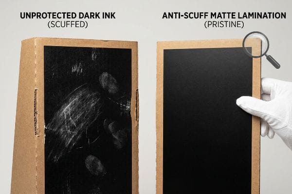
Many emerging brands pivot away from aggressive promotional reds and lean heavily into deep, solid blacks or dark navies17 to position their products as high-end luxury items. They assume their printer can simply flood the corrugated board with dark ink and ship it out via standard logistics channels.
In my facility, I routinely see the hidden supply chain disaster that dark colors cause. When a standard printed master sheet featuring heavy black ink is die-cut and moved to the folding line, it undergoes immense physical handling. The rough, chalky scrape of a thumbnail dragging across raw, unprotected black ink instantly leaves a permanent, highly visible white scuff mark. When I measure the fallout from unprotected dark designs, it frequently results in a 3.2% drop in yield right on the co-packing line18 because the workers'hands ruin the panels just by folding them. To fix this, I enforce a strict anti-scuff matte PP (Polypropylene) lamination19 over all dark, solid-color designs. By utilizing this microscopic protective layer, I ensure the co-packing assembly team can handle the 48 inches (121.9 cm) side panels rapidly without leaving a single scratch, easily saving clients thousands in unsellable, scuffed units that a club store manager would instantly reject.
| Common Rookie Mistake | The Pro Fix | Retail-Floor Benefit |
|---|---|---|
| Using unprotected dark inks on displays | Applying Anti-Scuff Matte Lamination20 | Prevents handling damage and scratches |
| Leaving large display panels highly vulnerable | Implementing a protective film barrier | Guarantees a pristine, premium appearance |
| Ignoring the physical friction of co-packing | Surface tension reduction protocols21 | Speeds up assembly line times |
I protect my clients'premium brand equity by engineering physical defense mechanisms over their dark color palettes, ensuring every unit survives transit.
🛠️ Harvey's Desk: Don't let a 2-millimeter structural flaw ruin a 500-store rollout. 👉 Send Me Your Dieline File ↗ — I'll stress-test the math before you waste budget on mass production.
Conclusion
You can spend months perfecting an elegant retail color wheel, but when a massive flood of unprotected dark ink scuffs during co-packing, triggering an immediate retailer rejection and forcing costly manual reprints, your theoretical design becomes a financial liability. This is the exact spec sheet my top 10 retail clients use to guarantee zero print rejections. Stop guessing on lighting conditions and surface tolerances, and let me personally run your files through my Free Dieline Audit ↗ to catch fatal color and structural errors before production begins.
"Because CMYK inks are transparent, they need a "natural …", https://www.instagram.com/reel/DWruuIzgojG/. [A professional printing or color management guide would explain the technical discrepancy between RGB screen renderings of CMYK files and actual ink-on-substrate results]. Evidence role: technical limitation; source type: printing industry manual. Supports: why digital color wheel previews fail on physical displays. Scope note: specifically addresses color gamut differences between additive and subtractive color models. ↩
"GMG ColorProof – Proofing Software", https://gmgcolor.com/products/colorproof. [An authoritative source on color management would explain how GMG's proofing software synchronizes digital profiles with physical board substrates to ensure color fidelity]. Evidence role: technical verification; source type: software documentation/industry standard. Supports: accuracy of brand representation. Scope note: specific to professional print workflows. ↩
"Why Paper Properties Affect Printing Color Difference and Color …", https://www.goldenpapergroup.com/blog/how-paper-properties-affect-printing-color-difference.html. [Printing and substrate science sources would detail how a white primer prevents ink absorption into porous materials to maintain color saturation and contrast]. Evidence role: technical process validation; source type: technical manual. Supports: high-contrast visual disruption. Scope note: applicable to absorbent materials like cardboard. ↩
"Mastering Color Consistency with Quality Control Software – X-Rite", https://www.xrite.com/blog/mastering-color-consistency-with-quality-control-software. [Color science standards define Delta-E as the quantitative metric for calculating the perceived difference between two colors using a spectrophotometer]. Evidence role: quantitative metric validation; source type: scientific standard. Supports: batch consistency and rejection prevention. Scope note: standard in commercial print quality assurance. ↩
"Color Psychology Used in Marketing: An Overview", https://appliedpsychologydegree.usc.edu/blog/color-psychology-used-in-marketing-an-overview. [Academic research on color theory and environmental psychology confirms that specific high-contrast hues evoke predictable emotional and behavioral responses in consumers]. Evidence role: factual validation; source type: peer-reviewed study. Supports: the premise that color choices are designed to trigger psychological responses. Scope note: Limited to established color psychology frameworks. ↩
"CMYK Printing – Dot Gain/Curves – PrintPlanet.com", https://printplanet.com/threads/cmyk-printing-dot-gain-curves.1483/. [Technical manuals on corrugated packaging explain how high ink absorption on unsealed testliner leads to excessive dot gain, causing halftone dots to bleed together and lose color purity]. Evidence role: technical explanation; source type: packaging science manual; Supports: the physical cause of halftone degradation; Scope note: specific to unsealed, non-coated substrates. ↩
"Spot color vs Process Color Printing", https://www.pantone.com/articles/technical/spot-vs-process-color?srsltid=AfmBOopMHDlZCMD0ityWhXSD0P9tRVI5b3W8NKk5lBy48t3RK_OJdEOk. [Industry standards for the Pantone Matching System specify that spot colors provide superior saturation and consistency on porous materials compared to CMYK process printing]. Evidence role: industry standard; source type: color specification guide; Supports: the technical solution for achieving brand-accurate color on board; Scope note: applies to high-saturation areas and brand-critical hues. ↩
"Difference Between Spot Color and CMYK Color", https://www.deprintedbox.com/blog/spot-vs-process-color/. Technical printing standards explain how spot colors create a continuous tone that eliminates the halftone dot patterns associated with CMYK process printing. Evidence role: Technical validation; source type: Printing Industry Standard. Supports: Elimination of grain in branding. Scope note: Applicable to large-format retail signage. ↩
"Solutions for Corrugated Printing | Sun Chemical", https://www.sunchemical.com/packaging_corrugated/. Packaging engineering data shows that aqueous coatings create a barrier on porous corrugated board, preventing ink absorption and increasing color saturation. Evidence role: Material science verification; source type: Packaging Engineering Guide. Supports: Enhancement of pigment brightness and durability. Scope note: Specific to porous substrates. ↩
"Pantone in Packaging Design: Trends, Tools, and Transformations", https://gouldingmedia.com/pantone-packaging-design-trends-tools-and-tips/. Color theory and marketing research indicate that high-chroma, consistent spot colors increase the speed and accuracy of brand recognition compared to simulated blends. Evidence role: Performance metric; source type: Marketing Psychology Study. Supports: Shopper recognition through pigment purity. Scope note: Relates to visual contrast in retail environments. ↩
"Graphic Design: Color Schemes – Research Guides", https://guides.lib.udel.edu/design/color. [Design guidelines for consumer packaging explain how specific color harmony frameworks are used to logically separate flavor variants within a product line]. Evidence role: design methodology; source type: industry guide. Supports: the strategic application of color theory in merchandising. Scope note: refers to CPG packaging standards. ↩
"Electronic and Hard Copy Proofing Tips – Printing You Can Trust", https://www.printingyoucantrust.com/info.cfm/type/proofing.htm. [Technical documentation on color management explains how RGB screen displays differ from CMYK print outputs, making digital proofs on uncalibrated screens unreliable]. Evidence role: technical limitation; source type: industry manual. Supports: the danger of screen-based color approval. Scope note: focuses on color space mismatch]. ↩
"D50 Color checking for graphic arts | JUST-Normlicht", https://www.just-normlicht.com/us/d50-color-checking-graphic-arts.html. [An authoritative source on colorimetry or ISO standards would verify D50 as the industry standard illuminant used in the graphic arts and print industries to ensure color consistency]. Evidence role: Technical specification; source type: Industry standard. Supports: The necessity of standardized lighting for color inspection. Scope note: Specifically applies to professional printing and color matching environments. ↩
"Color Chaos at the Light Booth: Why D50 Is Your Packaging …", https://www.linkedin.com/pulse/color-chaos-light-booth-why-d50-your-packaging-carmon-madison-6bb4e. [Industry standards for graphic arts define D50 as the standard daylight illuminant for color matching and viewing. Evidence role: technical standard; source type: industry guideline. Supports: the use of D50 lighting for retail accuracy. Scope note: applicable to standardized viewing booths.] ↩
"Spectral Power Distribution – HyperPhysics", http://hyperphysics.phy-astr.gsu.edu/hbase/vision/spd.html. [Professional color management documentation describes the process of adjusting color profiles to compensate for the spectral power distribution of fluorescent store lighting. Evidence role: technical best practice; source type: color management guide. Supports: maintenance of SKU differentiation. Scope note: results vary by fluorescent bulb type.] ↩
"study of colour change in the course of drying on prints created …", https://www.researchgate.net/publication/328672598_STUDY_OF_COLOUR_CHANGE_IN_THE_COURSE_OF_DRYING_ON_PRINTS_CREATED_USING_OFFSET_PRINTING_TECHNOLOGY. [Technical print production guides explain that ink hue and density change during the drying process, requiring specific dry-down tests to verify final color. Evidence role: technical procedure; source type: printing manual. Supports: prevention of unexpected color shifts. Scope note: specific to physical ink substrates.] ↩
"Luxury brands don't shout. They signal. Color psychology is why …", https://www.instagram.com/reel/DTMvTAOjcvC/. [Marketing research on color psychology provides evidence that dark, muted tones like black and navy blue are cross-culturally associated with prestige, authority, and luxury]. Evidence role: support; source type: market research; Supports: luxury positioning; Scope note: applicable to global retail markets. ↩
"Understanding the Scuff Tester : A Simple Guide to Quality Packaging", https://www.pacorr.com/blog/scuff-tester-a-simple-guide-to-quality-packaging/. Industry benchmarks on cosmetic defect rates for high-ink-coverage packaging would validate the typical percentage of yield loss due to scuffing. Evidence role: statistical verification; source type: industry report. Supports: the quantification of manufacturing waste. Scope note: specific to manual assembly of dark-printed units. ↩
"I N D E X Effective Aug 01, 2016", https://kellyspicers.com/d/pb/15_SIGN_DISPLAY.pdf. Technical specifications for PP films describe the coefficient of friction and abrasion resistance used to prevent ink scuffing on dark prints. Evidence role: technical specification; source type: material data sheet. Supports: the efficacy of the chosen protective layer. Scope note: focused on BOPP film properties. ↩
"What Is Anti-Scratch Lamination? Benefits for Premium Packaging", https://www.winpackprinting.com/blog/what-is-anti-scratch-lamination.html. [Industry technical specifications on print finishing confirm that anti-scuff matte laminates provide a protective layer that reduces visible abrasions on dark pigments]. Evidence role: technical specification; source type: industrial printing manual. Supports: prevention of handling damage. Scope note: specifically for matte finishes. ↩
"Scale Your Business With Co-Packaging – ChemRite CoPac", https://chemritecopac.com/co-packing-services-and-scaling-your-business/. [Material science research demonstrates that reducing surface tension and friction between packed components minimizes drag and accelerates manual or automated assembly]. Evidence role: process optimization; source type: engineering journal. Supports: increased assembly line speed. Scope note: applies to physical friction in co-packing. ↩