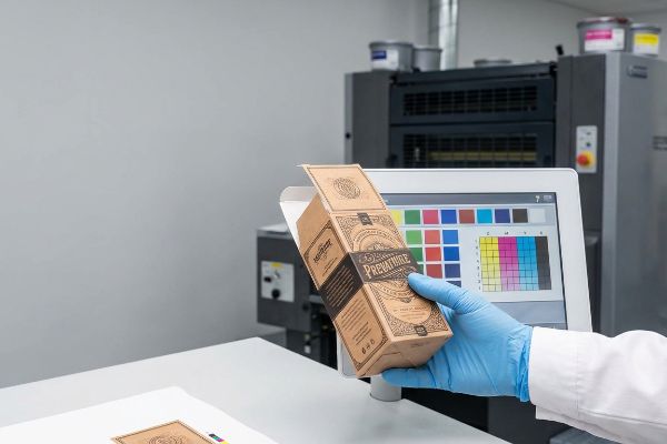
Les écrans numériques offrent un rétroéclairage exceptionnel, mais le commerce physique repose sur l'encre et le papier poreux. Ce décalage entre les espaces colorimétriques influence directement la réussite de vos emballages et présentoirs.
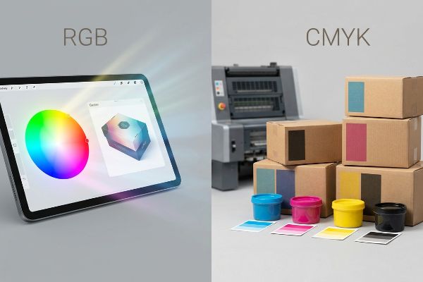
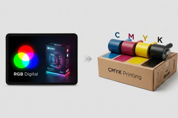
Le modèle RGB (Rouge, Vert, Bleu) est un modèle de synthèse additive utilisé exclusivement pour les écrans numériques, tandis que le modèle CMJN (Cyan, Magenta, Jaune, Noir) est un modèle soustractif indispensable à l'impression. Le passage des fichiers RGB numériques à l'encre CMJN garantit une reproduction fidèle des couleurs sur les emballages en carton ondulé et les présentoirs de vente.
Alors que votre écran affiche des millions de pixels lumineux, mes presses de lithographie-lamination fonctionnent par absorption physique des pigments. Comprendre ce phénomène est essentiel pour éviter que les couleurs de votre marque haut de gamme ne se transforment en un désastre terne sous l'éclairage agressif des magasins.
Vaut-il mieux utiliser le CMJN ou le RVB ?
Choisir le bon espace colorimétrique n'est pas une préférence artistique ; c'est une exigence mécanique stricte pour les machines de prépresse industrielles.
Cela dépend. Il est préférable d'utiliser le RGB pour les supports marketing numériques affichés à l'écran, mais le CMJN est indispensable pour tous les présentoirs physiques en point de vente. Les presses d'imprimerie ne peuvent pas traiter mécaniquement les données RGB basées sur la lumière ; une conversion stricte en pourcentages d'encre CMJN est donc nécessaire pour garantir une reproduction fidèle des couleurs.
Concevoir dans un espace colorimétrique inadapté crée une fausse attente qui se brise dès que l'encre touche le feutre de test.
La réalité commerciale « boue en demi-teintes »
Dans mon atelier, je vois constamment des graphistes soumettre des fichiers graphiques volumineux, entièrement conçus à partir de profils d'écran lumineux. Ils supposent que les verts néon éclatants et les bleus profonds qu'ils voient sur leurs moniteurs 4K se traduiront comme par magie sur un support physique brut. Cette méconnaissance fondamentale de la physique de la synthèse soustractive des couleurs ignore le comportement des points de trame microscopiques qui se chevauchent lorsqu'ils sont absorbés par des panneaux ondulésporeux¹. Lorsqu'un fichier n'est pas optimisé pour l'impression physique, l'affichage obtenu apparaît délavé à une distance de 9,1 mètres (30 pieds).
Je constate que ce piège engendre des réimpressions coûteuses lorsque les équipes d'approvisionnement négligent les audits prépresse. Le mois dernier, un client a envoyé un fichier numérique non calibré pour un tirage massif de têtes de gondole , supposant que le logiciel RIP (traitement d'images raster) gérerait parfaitement la conversion. Lors du passage de l'échantillon blanc initial (après 24 heures) sur ma table CNC Kongsberg et ma presse offset Heidelberg 6 couleurs, le mélange optique des points a échoué mécaniquement sur le panneau 32ECT (test d'écrasement des bords) non scellé.Au lieu d'un logo net et précis, il est devenu une bouillie granuleuse et délavée. J'ai immédiatement retiré le fichier, intercepté la séparation mécanique et imposé un protocole d'impression en tons directs, convertissant les éléments de marque essentiels en une teinte Pantone unieplutôt que de recourir à la superposition de cyan et de magenta. En imposant cette tolérance absolue en matière de taches, j'ai veillé à ce que la marque reste parfaitement visible sous les lumières fluorescentes agressives, éliminant ainsi tout risque de rejet par les détaillants et évitant au client une perte de marge catastrophique en magasin.
| Métrique/Fonctionnalité | Environnement d'écran | Réalité artificielle |
|---|---|---|
| Source de couleur | Pixels lumineux | Encre physique4 |
| Sortie visuelle | Haute brillance | Absorption des demi-teintes5 |
| Retour sur investissement commercial | Coût des matériaux nul | Conversion haute visibilité |
Je refuse que le rétroéclairage des écrans dicte la production de ma chaîne de production. En imposant des profils d'encre rigoureux avant le placage, je garantis que votre image de marque résistera à la transition brutale entre l'écran et le point de vente physique.
🛠️ Le bureau de Harvey : Vos couleurs éclatantes se transforment-elles en boue délavée sous l’éclairage agressif des grandes surfaces ? 👉 Obtenez un audit couleur prépresse gratuit ↗ — J’examine personnellement chaque fichier structurel sous 24 h.
Que se passe-t-il si j'imprime en RGB ?
L'envoi de fichiers numériques illuminés à une presse à imprimer physique provoque une défaillance catastrophique en prépresse avant même qu'une seule goutte d'encre ne soit appliquée.
Si vous imprimez en RVB, le logiciel de prépresse effectue automatiquement une conversion mathématique en CMJN, ce qui entraîne d'importantes variations de couleur. Les teintes néon vives apparaîtront ternes et boueuses, et les noirs profonds risquent de saturer excessivement le carton, provoquant de graves problèmes de séchage et des déformations structurelles lors de la production.
Vous ne risquez pas seulement une légère variation de couleur ; vous introduisez activement un excès d'humidité dans les fibres du papier.
Le risque de saturation de la « limite totale d'encre »
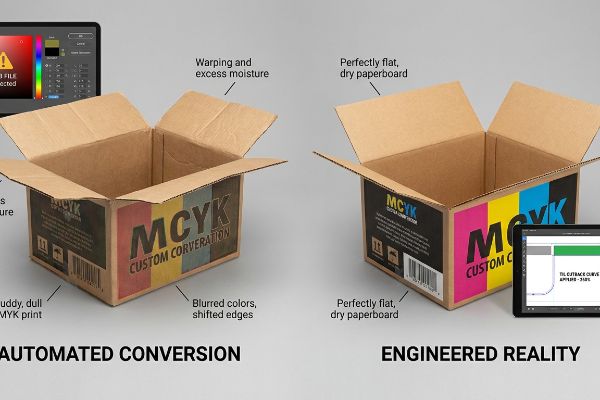
Dans mon service de prépresse, je constate régulièrement que des fichiers non calibrés provoquent d'importants déséquilibres chimiques sur la ligne de lithographie-lamination. Lorsqu'un logiciel convertit aveuglément un fichier numérique en un profil d'encre physique, il superpose souvent mathématiquement des pourcentages considérables de cyan, de magenta, de jaune et de noirpour obtenir des ombres profondes. Cette conversion amateur ignore complètement les limites physiques strictes du carton poreux,tentant de concentrer un volume impossible de pigment liquide dans une surface microscopique.
Mes vingt années d'expérience en production m'ont appris qu'accepter aveuglément une modification automatique de la couleur ne se contente pas de ruiner l'esthétique ; cela détruit physiquement le carton ondulé. Lors d'un test de préproduction pour un présentoir cosmétique de sol, une conversion de profil automatique a poussé la limite d'encre totale (TIL) à un niveau alarmant de 340 %. Lorsque j'ai retiré les feuilles supérieures encore humides de la presse, l'important volume d'encre liquide a empêché l'adhésif PVA (acétate de polyvinyle) à base d'eau de durcir correctement.Les feuilles plates se sont décollées, se courbant vers l'intérieur avec une déformation de 11,4 mm (0,45 pouce) qui aurait complètement compromis la densité du chargement des conteneurs. J'ai immédiatement arrêté la ligne et appliqué une courbe de réduction stricte de la TIL à 260 %dans le logiciel RIP de prépresse. En éliminant physiquement le volume de liquide excédentaire, j'ai garanti un séchage instantané et un collage parfait des feuilles emballées à plat, réduisant ainsi notre temps d'assemblage pour le co-emballage de plus de deux minutes par unité et permettant au client de respecter son calendrier de lancement ambitieux.
| Métrique/Fonctionnalité | Conversion automatisée | Réalité artificielle |
|---|---|---|
| Saturation de l'encre | Dépassement de la limite de 300 %10 | Strict 260% TIL11 |
| guérison physique | Délamination du PVA humide12 | Collage plat instantané |
| Impact de l'assemblage | Frictions massives du travail | Co-emballage sans friction |
Je ne fais jamais confiance à un algorithme pour comprendre la chimie du papier. En limitant mathématiquement la saturation d'encre en prépresse, je préviens les défauts structurels liés à l'humidité avant même la gravure des plaques d'impression.
🛠️ Le bureau d'Harvey : Un logiciel automatisé injecte-t-il discrètement un excès d'humidité dans vos présentoirs, compromettant ainsi leur intégrité structurelle ? 👉 Sécurisez votre chaîne d'approvisionnement ↗ — Confidentialité garantie à 100 %. Vos maquettes non commercialisées sont en sécurité chez moi.
Dois-je convertir le RGB en CMYK pour l'impression ?
Contourner le processus de conversion prépresse n'est pas un raccourci ; c'est la garantie de recevoir des remboursements massifs de la part des détaillants et de voir la valeur de la marque compromise.
Oui. Il est absolument indispensable de convertir les fichiers RGB en CMJN avant de les envoyer à l'impression. Cette conversion cruciale permet aux ingénieurs en structure de calculer précisément les proportions de pigments nécessaires pour compenser le gain de point physique, garantissant ainsi une fidélité et une homogénéité optimales des couleurs de votre marque sur des milliers de points de vente.
Laisser cette conversion à la dernière minute vous prive de tout contrôle, rendant votre emballage totalement vulnérable aux variations de la presse mécanique.
Le traumatisme de compression « Dot Gain »
Lors de mes audits de gabarits clients, je constate fréquemment que les équipes marketing s'appuient sur des listes de contrôle de conformité génériques qui réduisent la conversion des couleurs à une simple opération d'enregistrement. Elles partent du principe qu'un PDF numérique exporté directement de leur écran rétroéclairé représente une vérité technique absolue. Cet angle mort dangereux ignore la forte pression mécanique nécessaire au transfert du pigment liquide d'un blanchet en caoutchouc sur les fibres brutes du testliner, un processus qui écrase et dilate physiquement les gouttelettes d'encre<sup>13</sup>.
Ce n'est pas qu'une simple théorie : j'en ai fait l'amère expérience le mois dernier lors du lancement d'une nouvelle boisson . En 2022, j'ai demandé à Mark, mon ingénieur packaging principal, de mener un essai interne de R&D avec une exportation numérique non ajustée sur un support épais de type cannelure B de 32 ECT. Lorsque la presse rotative a frappé le support, la pression physique a provoqué un gain de point optique de 14,5 %. Je me souviens précisément d'avoir vu Mark retirer la première feuille de la chaîne : les graphismes complexes du fond avaient bavé et étaient devenus illisibles, ne respectant absolument pas la tolérance Delta-E minimale(14). Nous avons immédiatement interrompu le test et recalibré le logiciel RIP de prépresse, en appliquant une courbe de réduction mathématique pour diminuer physiquement la taille des points de trame(15) avant la fabrication des plaques. Je consacre du temps et de l'argent à des tests en laboratoire pour que vous ne perdiez pas de profits en magasin. Cette réduction précise en prépresse n'a pas seulement permis de restaurer le contraste visuel ; Cela a permis d'éliminer totalement le risque d'un refus catégorique de la part du détaillant, ce qui a permis au client d'économiser environ 30 % sur les frais de retouche potentiels.
| Métrique/Fonctionnalité | Exportation PDF générique | Réalité artificielle |
|---|---|---|
| Expansion de points | Hémorragie incontrôlée | Réduction mathématique |
| Sortie visuelle | Défaillance à delta-E élevé | Correspondance de marque de précision |
| Responsabilité du client | Rejet par le détaillant | Marge bénéficiaire protégée |
Je ne laisserai pas des exportations numériques non calibrées compromettre une production de grande envergure. En appliquant des protocoles de conversion rigoureux en laboratoire, je garantis que vos écrans physiques résisteront aux contraintes des machines d'impression offset industrielles.
🛠️ Le bureau de Harvey : Des variations d’impression imprévisibles donnent-elles à votre marque haut de gamme un aspect négligé et de mauvaise qualité en magasin ? 👉 Demandez un audit d’étalonnage Delta-E ↗ — Aucun intermédiaire. Vous échangez directement avec des ingénieurs en structure.
Comment savoir si mon image est en CMJN ou en RVB ?
L'identification du profil colorimétrique de votre fichier constitue la base absolue de l'ingénierie prépresse, déterminant si nos machines imprimeront les illustrations ou découperont physiquement le carton.
Pour déterminer si votre image est en CMJN ou en RVB, ouvrez votre logiciel de conception et vérifiez les paramètres du mode colorimétrique du document. Les plateformes numériques utilisent par défaut les profils d'écran ; vérifier ce paramètre permet donc d'éviter les goulots d'étranglement critiques en prépresse et garantit que les machines de découpe automatisées distinguent correctement les illustrations imprimées des découpes mécaniques.
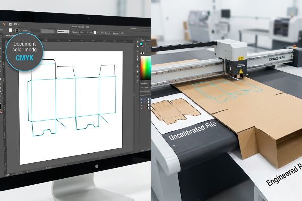
Un simple contrôle visuel sur votre écran ne permet pas de confirmer si les données vectorielles sous-jacentes sont correctement encodées pour la fabrication.
L'angle mort du « vecteur de couleur ponctuelle »
Dans mon atelier, je vois régulièrement des demandes de devis (RFQ) accompagnées de fichiers mêlant profils d'images éclairées et lignes de découpe noires standard. Les concepteurs partent du principe que si une ligne apparaît distincte à l'écran, les équipements de fabrication en comprendront automatiquement la fonction. Cette hypothèse erronée ignore totalement le fonctionnement des tables de fraisage CNC automatisées et des machines de gravure laser pour plaques à découper ; ces machines ne lisent pas les calques visuels, mais des couleurs mécaniques très spécifiques associées aux traits vectoriels<sup>16</sup>.
Lors des audits de préproduction, l'impact de ces fichiers non calibrés s'avère catastrophique pour le traitement automatisé. Récemment, une marque a soumis un présentoir complexe à plusieurs niveaux où tous les plis structurels étaient encodés par un trait noir uniforme plutôt que par une couleur d'accompagnement mécanique<sup>17</sup>. Lors de la numérisation initiale par le logiciel RIP, la machine a fusionné les lignes de découpe directement dans le calque du visuel, produisant une boîte imprimée avec des contours noirs visibles mais sans aucune découpe physique, ce qui a complètement bloqué la table Kongsberg. Après avoir obtenu l'autorisation du service des achats pour ajuster le fichier, j'ai séparé les calques et converti les traits critiques en une commande de découpe mécanique magenta à 100 %. Grâce à cette calibration vectorielle rigoureuse, j'ai évité un important goulot d'étranglement en prépresse, garantissant un fonctionnement optimal des outils et permettant le déploiement multi-magasins dans les délais impartis.
| Métrique/Fonctionnalité | Fichier non calibré | Réalité artificielle |
|---|---|---|
| Commande vectorielle | Lignes noires visuelles | Colorant d'accompagnement mécanique18 |
| Réponse de la machine | Couches d'encre fusionnées19 | Découpe CNC de précision20 |
| Impact logistique | Goulot d'étranglement en prépresse | Horaire de fret à l'heure |
Je refuse qu'une mauvaise structuration des fichiers compromette un équipement coûteux. En vérifiant minutieusement chaque trajectoire vectorielle, je garantis un contact parfait entre la machine et le substrat, éliminant ainsi les retards de production onéreux.
🛠️ Le bureau d'Harvey : Vos gabarits de découpe structurels provoquent-ils des blocages importants sur les machines automatisées et des retards de production considérables ? 👉 Demandez votre audit vectoriel gratuit de gabarits de découpe ↗ — J'examine personnellement chaque fichier structurel sous 24 h.
Conclusion
L'utilisation de l'éclairage numérique des écrans au lieu de profils d'encre physiques engendre d'importants déséquilibres chimiques, compromettant la qualité d'impression et ralentissant les chaînes de production. Ce même contrôle technique a récemment permis de déceler une erreur de tolérance critique de 2 mm lors d'un déploiement national majeur, avant même la production. Pour éviter que les conversions prépresse automatisées ne nuisent à votre image de marque, je vous propose un audit gratuit de vos profils prépresse ↗ afin de garantir une reproduction impeccable en point de vente.
« [PDF] 1. Le gain de point correspond à l’augmentation de la taille des points de trame lorsque l’encre est absorbée par… », https://www.coloradomesa.edu/art/documents/student-resources/study-guide-2019.pdf . [Une source faisant autorité en ingénierie d’impression explique le phénomène de gain de point, où l’encre se répand au contact de supports poreux, modifiant ainsi la valeur de couleur prévue]. Rôle de la preuve : explication technique ; type de source : manuel de l’industrie de l’imprimerie. Sujets abordés : la physique de l’ absorption d’encre sur les cartons ondulés. Remarque sur la portée : spécifique aux supports physiques non couchés.
« Pourquoi le RGB n'est-il pas idéal pour l'impression et l'emballage ? – PopDisplay », https://popdisplay.me/why-is-rgb-not-ideal-for-printing-packaging/. [Une source faisant autorité sur l'emballage en carton ondulé expliquerait comment la porosité du carton 32ECT non scellé affecte l'absorption d'encre et le gain de point, ce qui peut dégrader la précision des demi-teintes]. Rôle de la preuve : Spécification technique ; type de source : Norme industrielle/Manuel d'emballage. Appuie : L'affirmation selon laquelle le support du carton affecte la qualité d'impression. Note de portée : Spécifique aux supports en carton ondulé .
« Couleurs d'accompagnement vs CMJN : différences essentielles expliquées », https://unicopacking.com/en/new/spot-color-vs-process-color.html. [Les manuels de prépresse détaillent pourquoi les couleurs d'accompagnement offrent une saturation et une homogénéité visuelle supérieures sous éclairage fluorescent par rapport aux mélanges CMJN]. Niveau de preuve : Bonnes pratiques techniques ; type de source : Théorie des couleurs/Manuel de prépresse. Justifie : La supériorité des couleurs d'accompagnement pour une visibilité optimale des marques. Remarque : S'applique à l'impression offset commerciale .
« Modèle de couleurs CMJN – Wikipédia », https://en.wikipedia.org/wiki/CMYK_color_model. [La littérature scientifique sur la couleur définit la nature soustractive des encres physiques, où les couleurs sont créées par l'absorption de longueurs d'onde spécifiques de la lumière]. Rôle de la preuve : principe fondamental ; type de source : manuel universitaire. Appuie : le mécanisme physique de l'espace colorimétrique CMJN. Note sur la portée : s'applique à l'impression offset et numérique commerciale standard .
« Comment sérigraphier : que sont les demi-teintes ? – YouTube », https://www.youtube.com/watch?v=rDbtlB5BE1E. [Une source faisant autorité en matière de théorie des couleurs ou d’impression commerciale expliquerait comment l’absorption de l’encre par un support réduit la réflectance lumineuse par rapport à l’émission de lumière additive]. Rôle de la preuve : spécification technique ; type de source : manuel d’impression. Appuie : la différence de rendu visuel entre les supports numériques et physiques. Note de portée : l’efficacité varie selon la porosité du support .
« Ma méthode pour ajuster la limite d'encre (couverture totale) | Communauté », https://community.adobe.com/questions-712/my-method-for-adjusting-ink-limit-total-area-coverage-1060968 . [Les manuels techniques de gestion des couleurs expliquent comment des conversions RVB vers CMJN naïves peuvent entraîner des valeurs de couverture totale (TAC) supérieures aux limites recommandées dans les zones sombres]. Preuve : vérification technique ; type de source : manuel de l'industrie de l'imprimerie. Prend en charge : les mécanismes de saturation d'encre. Remarque: l'effet dépend du profil ICC utilisé.
« Comment déterminer la limite d'encre totale et individuelle (par des mesures) », https://printplanet.com/threads/how-to-determine-the-total-individual-ink-limit-via-measurements.13358/ . [La documentation scientifique sur les matériaux pour les supports d'impression spécifie la charge d'encre maximale que le carton poreux peut absorber avant saturation, entraînant un défaut de séchage] . Preuve : spécification physique ; source : données du fabricant du support. Appui : contraintes physiques de l'impression. Remarque : s'applique spécifiquement au carton poreux.
« Évolution de l’impression de boîtes en carton ondulé avec des encres aqueuses », https://splashjet-ink.com/evolution-of-aqueous-packaging-inks-a-smarter-approach-to-corrugated-box-printing/ . [Une source faisant autorité sur les adhésifs industriels et les supports d’impression détaillerait comment une saturation excessive en encre liquide perturbe le processus de collage et de durcissement des colles PVA à base d’eau]. Rôle de la preuve : mécanisme technique ; type de source : manuel d’impression industrielle. Appuie : le lien de causalité entre le volume d’encre et le délaminage structurel. Note de portée : spécifique aux colles à base d’eau sur supports poreux.
« Réflexions sur l’impression dans le carton ondulé », https://www.agfa.com/printing/tips/corrugated-boxes/. [Les spécifications techniques de prépresse pour le carton ondulé recommandent généralement une limite d’encre totale (TIL) comprise entre 240 % et 300 % afin de garantir un séchage optimal et l’intégrité structurelle du carton]. Rôle de la preuve : référence technique ; type de source : fiche technique de prépresse. Appuie : la validité de la limite de 260 % comme mesure corrective. Remarque : les limites peuvent varier selon la qualité du carton et le type d’encre .
« Erreur x : Couverture d’encre supérieure à 300 % – Communauté Adobe », https://community.adobe.com/questions-652/error-x-ink-coverage-over-300-819461 . [Les manuels techniques de prépresse expliquent comment les conversions RVB vers CMJN non gérées entraînent souvent une couverture d’encre totale supérieure au seuil de 300 %, provoquant des problèmes de séchage]. Niveau de preuve : spécification technique ; type de source : manuel de l’industrie de l’ imprimerie. Sujet : Risques liés à la saturation d’encre. Remarque : S’applique spécifiquement aux dépôts d’encre à haute densité.
« Réduire la quantité totale d'encre pour l'impression CMJN – YouTube », https://www.youtube.com/watch?v=a9eT9VLgSHM. [Les normes industrielles pour les papiers couchés et non couchés recommandent souvent une limite totale d'encre (LTE) d'environ 260 % afin d'assurer une absorption optimale de l'encre et d'éviter le maculage]. Niveau de preuve : norme industrielle ; type de source : spécification technique. Supporte : saturation d'encre contrôlée. Remarque : les valeurs peuvent varier légèrement en fonction de la porosité du papier .
« Impression de modèles incroyablement complexes avec du PVA – YouTube », https://www.youtube.com/watch?v=Wl_YNe9Z8Rk. [Les guides de fabrication relatifs au collage expliquent comment une saturation excessive d'encre crée une barrière empêchant les colles à base d'acétate de polyvinyle (PVA) de pénétrer le substrat, ce qui entraîne un défaut d'adhérence]. Rôle de la preuve : mécanisme causal ; type de source : manuel de science des matériaux. Justification : Défaut de polymérisation physique. Remarque sur la portée : Spécifique aux applications adhésives à base de PVA .
« Modélisation mathématique et stratégies de compensation pour l'impression de points… », https://pmc.ncbi.nlm.nih.gov/articles/PMC12574880/. [Ce guide technique de référence sur la lithographie offset explique la physique du gain de point mécanique, où la pression du blanchet en caoutchouc provoque l'étalement de l'encre sur les supports poreux]. Rôle de la preuve : vérification technique ; type de source : manuel de l'industrie de l'imprimerie. Sujet : le mécanisme physique de l'expansion de l'encre lors du transfert. Note de portée : s'applique spécifiquement à l'impression offset sur matériaux absorbants .
« Qu’est-ce que la fidélité des couleurs dans l’emballage ? Correspondance Pantone… », https://3dcolor.com/what-is-color-accuracy-in-packaging-pantone-matching-delta-e-and-why-brand-color/. [La formule Delta-E (ΔE) est la norme internationale permettant de quantifier la distance entre deux couleurs dans un espace colorimétrique 3D afin de déterminer la différence visuelle.] Rôle de la preuve : définition d’une métrique technique ; type de source : norme de colorimétrie. Appui : L’utilisation du Delta-E comme référence pour la fidélité des couleurs de marque. Remarque : Les niveaux de tolérance admissibles varient selon les directives de marque .
« Compensation personnalisée du gain de point pour la sérigraphie dans un logiciel RIP demi-teinte… », https://www.youtube.com/watch?v=BjgkGau4rdc . [Les normes industrielles relatives aux logiciels RIP de prépresse décrivent l’utilisation de courbes de compensation pour réduire la taille des points et compenser la diffusion de l’encre sur les supports poreux.] Rôle de la preuve : vérification des processus techniques ; type de source : manuel de l’industrie de l’ imprimerie. Appuie : l’utilisation de courbes de réduction mathématiques pour atténuer le gain de point. Remarque : l’efficacité dépend de l’absorption du support.
« Découpe laser vectorielle vs raster | Opérations – École de design », https://design.ncsu.edu/operations/510/laser-cutter-vector-vs-raster-laser-cutting/ . [Un guide de référence en prépresse ou en fabrication CNC confirmera que les machines de découpe automatisées identifient les trajectoires grâce à des attributs de couleur d'accompagnement spécifiques plutôt qu'à l'apparence visuelle des couches]. Rôle de la preuve : Vérification technique ; type de source : Manuel de fabrication industrielle. Justifie : L'exigence technique relative aux couleurs d'accompagnement dans les tracés de découpe. Remarque sur la portée : S'applique spécifiquement aux systèmes de découpe et de fraisage automatisés.
« Que sont les couleurs d’accompagnement ? – PopDisplay », https://popdisplay.me/what-are-spot-colors/. Les normes industrielles en matière de prépresse imposent l’utilisation de couleurs d’accompagnement spécifiques pour différencier les illustrations visuelles des instructions mécaniques des tables de découpe CNC .
« Adobe Illustrator – Quelle couleur utiliser pour les lignes de coupe ? », https://graphicdesign.stackexchange.com/questions/83118/what-color-swatch-to-use-for-cut-lines. [Les manuels techniques de prépresse expliquent comment certaines couleurs d'accompagnement sont utilisées comme marqueurs lisibles par machine pour les opérations autres que l'impression]. Niveau de preuve : définition technique ; type de source : manuel industriel. Appuie : l'utilisation des couleurs d'accompagnement pour les instructions mécaniques. Remarque sur la portée : s'applique spécifiquement aux illustrations vectorielles .
« Que se passe-t-il si j'active par erreur une couleur d'accompagnement alors que je souhaite imprimer en CMJN ? », https://community.adobe.com/questions-652/what-happens-if-by-mistake-left-spot-color-activated-when-i-want-to-print-in-cmyk-808607 . [Les normes industrielles d'impression détaillent le traitement des vecteurs non calibrés comme des encres de processus standard et non comme des marqueurs techniques]. Rôle de la preuve : analyse d'erreur ; type de source : guide de prépresse. Concerne : le résultat de l' utilisation de fichiers non calibrés en production. Remarque : se produit lorsque les définitions des couleurs d'accompagnement sont manquantes.
« Comment créer des trajectoires de découpe et définir le blanc d'accompagnement pour Roland… », https://www.youtube.com/watch?v=H2WWzz3OHuQ. [La documentation relative aux systèmes de découpe CNC explique le processus d'association des différents canaux de couleur d'accompagnement aux trajectoires de découpe physiques]. Rôle de la preuve : vérification du processus ; type de source : spécification technique. Supporte : la réponse de la machine aux couleurs d'accompagnement définies. Remarque : nécessite un logiciel RIP compatible .