Los colores de tu marca definen tu identidad comercial, pero imprimirlos en expositores de cartón corrugado es todo un reto. No entender bien los colores directos puede arruinar el impacto de la campaña incluso antes de que llegue al punto de venta.
Los colores directos son tintas sólidas prediluidas que se mezclan con una fórmula exacta antes de la impresión, a diferencia de los colores de proceso CMYK (cian, magenta, amarillo y negro), que se basan en puntos superpuestos. Ampliamente utilizados en embalajes de cartón ondulado para garantizar la coherencia de la marca, estos pigmentos especializados evitan la distorsión visual y garantizan una densidad uniforme en grandes pantallas.
Pasar de una pantalla digital a una imprenta litográfica de alta velocidad requiere más que simplemente leer un PDF a simple vista. Analicemos las realidades físicas de la gestión del color en la planta de producción.
¿Puedo convertir colores directos a CMYK?
No permita que el software de preimpresión le engañe haciéndole creer que está ahorrando dinero.
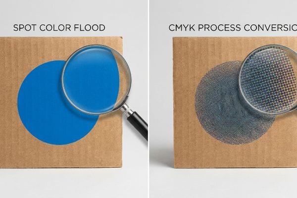
Depende. Convertir colores directos a CMYK es técnicamente posible en la preimpresión digital, pero degrada considerablemente la calidad del resultado final en cartón corrugado poroso. La impresión estándar se basa en puntos de semitono superpuestos, que se absorben de forma desigual en el soporte de prueba, reduciendo la densidad y dejando un acabado granulado.
Sustituir una plancha de un solo color por una mezcla de cuatro colores puede parecer correcto en un monitor, pero ignora la cruda realidad química del cartón industrial.
El fallo óptico del "barro de semitonos"
Cuando reviso los troqueles estructurales entrantes, veo constantemente que los equipos de marketing convierten sus logotipos corporativos sólidos en formatos de proceso estándar para evitar los costos de las planchas personalizadas. Incluso los diseñadores veteranos a menudo pasan por alto este punto ciego, asumiendo que la impresión de proceso coincidirá perfectamente con sus pantallas digitales, ignorando por completo la realidad microscópica del testliner corrugado1.
Esto no es solo teoría: lo veo suceder en la planta de pruebas cuando un archivo convertido llega a la prensa de laminación litográfica. En lugar de una pared sólida de pigmento, la conversión digital obliga a la prensa a depositar pequeños puntos de semitono superpuestos. En cartón crudo 32ECT (Edge Crush Test), estos puntos se absorben de forma desigual en las fibras a nivel microscópico. Durante una reciente prueba de preproducción, un logotipo azul convertido perdió un 14 % de densidad óptica, creando un resultado borroso y descolorido bajo las intensas luces de inspección de 5000 K. Mi solución fue inmediata: implementé un protocolo de inundación de color directo, reemplazando por completo la mezcla de puntos digitales con un único cubo de tinta Pantone mezclado con precisión. Esta modificación mecánica eliminó por completo el grano del semitono, maximizando la visibilidad de alto contraste y evitando al cliente un rechazo desastroso en la venta que habría anulado todo su retorno de inversión (ROI) promocional trimestral.
| Métrica/Característica | Conversión de proceso CMYK | Difusión de color puntual |
|---|---|---|
| Método de aplicación | Puntos de semitono superpuestos2 | Capa única de tinta sólida3 |
| Resultado visual | Granulado y descolorido | Nítido y de alto contraste |
| Impacto en el comercio minorista | Se mimetiza con el fondo del pasillo | Interrumpe líneas de visión de 30 pies (9,1 metros)4 |
Me niego a que una conversión de tinta defectuosa destruya el valor de su marca en el punto de venta. Impulsar un color directo sólido es la única garantía matemática de dominio visual en un pasillo comercial abarrotado.
🛠️ Harvey's Desk: ¿Los colores de tu marca se convierten en degradados apagados y descoloridos en cuanto tocan el cartón ondulado sin tratar? 👉 Obtén una auditoría de tinta de preimpresión gratuita ↗ — Reviso personalmente cada archivo estructural en 24 horas.
¿Un color directo se ve más nítido que un color CMYK?
El embalaje de precisión se basa en la sustracción, no en la suma.
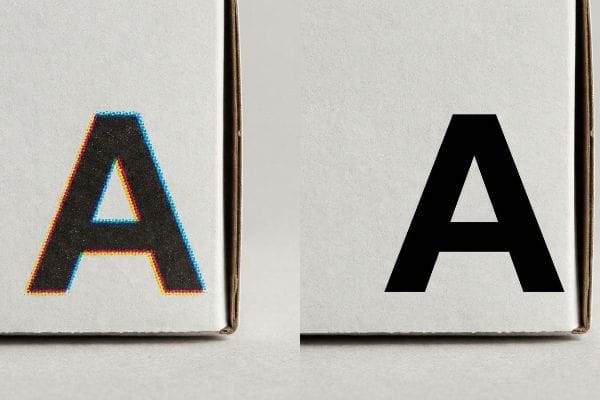
Sí. Un color directo se ve mucho más nítido que el CMYK porque se aplica como una sola capa continua de pigmento premezclado. Esto elimina por completo la ganancia de punto microscópica y el desplazamiento del registro entre planchas inherentes a la impresión a cuatro colores, lo que garantiza bordes nítidos incluso bajo la intensa iluminación fluorescente de los comercios.
Cuantas más capas de tinta húmeda apiles sobre cartón crudo, más control físico perderás sobre la tipografía final.
La realidad del sangrado de borde "Dot Gain"
En mi empresa, veo habitualmente que los equipos de compras asumen que superponer cian y amarillo producirá la misma línea verde nítida que una tinta personalizada específica. Diseñan vectores perfectamente definidos en sus monitores retroiluminados, totalmente ajenos a la mecánica física de las prensas offset de alta velocidad, donde cuatro planchas de tinta húmedas distintas deben alinearse con precisión microscópica5.
Esto no es solo teoría: lo veo suceder en la sala de pruebas cuando una capa gruesa de tinta de proceso impacta un soporte de prueba altamente poroso. A medida que las tintas húmedas se acumulan, el líquido se extiende físicamente a través de las fibras del papel, una realidad industrial conocida como ganancia de punto. Cuando mido los bordes de un logotipo impreso con una lupa, una línea teórica de 1 mm (0,03 pulgadas) a menudo se extiende hasta 1,34 mm (0,05 pulgadas), creando un efecto de halo borroso y desenfocado. Mi solución consiste en evitar por completo el riesgo mecánico cambiando los elementos críticos de la marca a una pasada de líquido premezclado y dedicado. Al aplicar un solo golpe sólido, elimino la deriva de registro de múltiples planchas y la dispersión matemática del punto, garantizando una tipografía nítida. Esta ingeniería de deriva cero eleva instantáneamente el valor percibido de la pantalla, reduciendo drásticamente el riesgo de que un comprador de cosméticos rechace el envío por una estética de empaque deficiente.
| Métrica/Característica | Mecánica de impresión por procesos | Precisión del color puntual |
|---|---|---|
| Definición de borde | Halos suaves y difusos6 | límites perfectamente definidos |
| Aplicación de tinta | Cuatro capas húmedas apiladas7 | Una capa sólida premezclada |
| Riesgo de registro | Alto potencial de deriva mecánica | Deriva de placa única cero8 |
Confío en las planchas de tinta especiales cuando la precisión visual es fundamental. Esto elimina matemáticamente las variables mecánicas de la imprenta, garantizando que la tipografía luzca tan nítida en la realidad como en el diseño asistido por ordenador (CAD).
🛠️ Harvey's Desk: ¿Los cambios de registro en las planchas de impresión hacen que las tipografías de tu marca premium se vean borrosas y desenfocadas en el estante de la tienda? 👉 Solicita un análisis gratuito de cambios de registro en la litografía ↗ — 100 % confidencial. Tus diseños para tiendas, aún no publicados, están a salvo conmigo.
¿Cómo configurar un color directo?
Las muestras digitales son el volante de la maquinaria física de la fábrica.
Para configurar un color directo, es necesario designar una capa vectorial específica en el software de preimpresión como una muestra personalizada sin mezclar. Más allá de la imagen de marca, los ingenieros de empaques utilizan colores directos para asignar comandos físicos a la máquina, como aislar los cortes de enrutamiento digital de los pliegues estructurales.
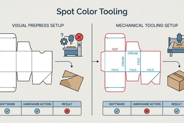
Si los colores de la línea de troquelado no están correctamente mapeados, estará enviando un archivo inválido a los robots industriales pesados.
Error en el comando "Herramienta de color directo"
Al revisar los archivos entrantes, veo constantemente troqueles enviados con líneas negras estándar para indicar dónde se debe cortar o doblar una pantalla. Es una trampa común que atrapa incluso a equipos de compras experimentados; creen erróneamente que la maquinaria de fabricación automatizada se basa en líneas visuales, ignorando el hecho de que las mesas de enrutamiento CNC (Control Numérico por Computadora) solo responden a rutas vectoriales con nombre explícito9.
Esto no es solo teoría: lo aprendí por las malas el mes pasado al probar un embalaje para palets en mi laboratorio de I+D. Le pedí a mi ingeniero jefe de embalaje, Mark, que creara un prototipo rápido directamente a partir de un archivo no auditado de un cliente. Debido a que las líneas de plegado estructurales se crearon en negro estándar en lugar de un color directo específico para "pliegues", el software de la máquina fusionó las rutas estructurales con la capa de diseño visual. La mesa automatizada ejecutó su ciclo de alta velocidad, pero no realizó ni un solo pliegue físico. Cuando intentamos plegar el cartón grueso manualmente, las fibras de kraft virgen se rompieron y delaminaron agresivamente, destruyendo por completo la capacidad de carga de la unidad en la prueba de compresión de cajas (BCT)¹⁰. Inmediatamente intercepté el archivo digital, separé las capas y asigné matemáticamente los trazos vectoriales a colores mecánicos absolutos. Esta calibración precisa de preimpresión obligó al yunque de acero a encajar perfectamente con el cartón, lo que le ahorró al cliente un estimado del 35 % en tiempo de inactividad de la máquina de co-embalaje automatizada al garantizar que los paquetes planos se plegaran sin fricción física.
| Métrica/Característica | Configuración de preimpresión visual | Configuración de herramientas mecánicas |
|---|---|---|
| Lectura de software | Fusionado en la capa de la obra de arte | Ruta de comandos de máquina aislada |
| Acción de hardware | Ignora los datos de líneas estructurales | Activa las cuchillas de corte y hendido |
| Impacto logístico | Desgarro destructivo de las fibras | Plegado automatizado sin fricción |
Invierto tiempo y dinero en mi laboratorio de pruebas para que tú no pierdas ganancias en la tienda. Sin una capa de herramientas matemáticamente separada, tu diseño de alta gama no es más que un trozo de cartón plano y sin pliega.
🛠️ Oficina de Harvey: ¿Las líneas vectoriales no mapeadas están causando que sus mecanismos de plegado de cartón corrugado se rompan y se deformen durante el ensamblaje en el almacén? 👉 Solicite una auditoría gratuita de troquelado estructural ↗ — Sin intermediarios. Hable directamente con ingenieros estructurales.
¿Es el color directo lo mismo que Pantone?
No confunda una receta de color universal con la química física de una fábrica.
No. Los colores directos no son estrictamente iguales a Pantone, aunque Pantone es el sistema estandarizado más común para mezclarlos. Un color directo se refiere a cualquier tinta mezclada a medida que se aplica en una sola capa, mientras que Pantone simplemente proporciona el catálogo universal para garantizar la uniformidad del color a nivel mundial.
Un catálogo de colores te indica cómo debería verse el pigmento, pero no lo protege de la acidez del cartón crudo.
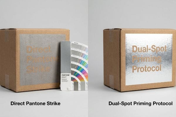
Trampa de contaminación por metales "PMS 877"
En mi empresa, veo habitualmente que los equipos de marca envían solicitudes de cotización (RFQ) especificando tintas metálicas Pantone de alta gama, dando por sentado que el catálogo de colores universal garantiza un acabado idéntico en cartón crudo. Tratan el catálogo como una ley visual absoluta, ignorando por completo la realidad química y altamente porosa del cartón corrugado sin sellar que absorbe líquidos costosos11.
Esto no es solo teoría: lo veo suceder en la práctica cuando una marca de alta gama exige un color plateado metálico específico directamente sobre cartón estándar. Debido a que las fibras de papel son altamente absorbentes, las partículas metálicas de la tinta premezclada se oxidan inmediatamentey se hunden en el sustrato. Al medir el nivel de brillo tras 24 horas de curado, el plateado brillante teórico se convierte en un gris opaco y contaminado, arruinando por completo la estética premium y arriesgándose al rechazo inmediato por parte de la tienda. Mi solución consiste en implementar un protocolo preciso de doble capa: aplico una tinta blanca opaca al 100% como imprimación selladora,espero el curado instantáneo del polímero y luego aplico la tinta metálica Pantone directamente sobre esa superficie sellada. Esta barrera química fija matemáticamente las partículas metálicas sobre las fibras porosas del papel, preservando el reflejo de alta gama y asegurando la aprobación de la venta física sin el enorme coste logístico de importar costosos sustratos laminados con lámina.
| Métrica/Característica | Golpe directo de Pantone | Protocolo de cebado de doble punto |
|---|---|---|
| Realidad química | El pigmento penetra en las fibras crudas14 | Las barreras de polímero sellan el papel poroso15 |
| Acabado visual | Gris opaco y oxidado | Reflejo metálico brillante |
| Impacto en la cadena de suministro | Gasto desperdiciado en tinta premium | Evita la costosa laminación con lámina16 |
Considero el catálogo Pantone como un objetivo químico, no como un conjuro mágico. Si no se modifican las propiedades físicas del sustrato bajo la tinta líquida, el costoso pigmento de alta calidad simplemente se disolverá en el cartón.
🛠️ Oficina de Harvey: ¿Se deterioran y oxidan sus tintas metálicas premium al contacto con el cartón corrugado crudo? 👉 Obtenga una evaluación gratuita de la química del material ↗ — Reviso personalmente cada archivo estructural en 24 horas.
Conclusión
Confiar en pantallas digitales sin calibrar para la gestión del color en sus productos minoristas es un camino directo a gráficos borrosos y graves fallas en la fibra corrugada en la planta de producción. Esta misma revisión de ingeniería detectó recientemente un error de tolerancia fatal de 2 mm (0,07 pulgadas) para un lanzamiento nacional importante antes de la producción. Deje de permitir que los puntos ciegos de la preimpresión destruyan el valor físico de su marca; permítame revisar personalmente sus archivos estructurales con mi Auditoría Física de Preimpresión Gratuita ↗ para garantizar que sus colores directos y líneas de corte CNC resistan la fabricación automatizada de alta velocidad.
"[PDF] 1. La ganancia de punto es el aumento del tamaño de los puntos de semitono a medida que la tinta se absorbe en…", https://www.coloradomesa.edu/art/documents/student-resources/study-guide-2019.pdf. [La documentación técnica sobre sustratos corrugados explica cómo la alta porosidad y la estructura de fibra del testliner provocan una absorción excesiva de tinta y una ganancia de punto en las impresiones de semitono]. Función de la evidencia: Validación técnica; tipo de fuente: Manual técnico de la industria de la impresión. Apoya: Degradación de la salida impulsada por el sustrato. Nota de alcance: Específico para cartón corrugado sin recubrimiento. ↩
"Halftone – Wikipedia", https://en.wikipedia.org/wiki/Halftone. [Una fuente autorizada sobre tecnología de impresión explicaría cómo se crean los colores CMYK mediante la superposición de puntos de semitono cian, magenta, amarillo y negro para simular un espectro de color completo.] Función de la evidencia: definición técnica; tipo de fuente: manual de la industria de la impresión. Apoya: la mecánica de la conversión de color de proceso. Nota de alcance: Se aplica a la impresión offset tradicional y digital.] ↩
"Color directo vs. Color de proceso: Diferencias clave y mejores prácticas", https://marijuanapackaging.com/blogs/comparison/understanding-spot-color-and-process-color-key-differences-and-best-practices?srsltid=AfmBOookb8Oq1JgNW3XMVigSq6IyMSWCoPwvsIaX2CfYFIIkcN4Ajjge. [Los estándares de impresión definen los colores directos como tintas premezcladas aplicadas como una sola capa uniforme en lugar de una mezcla de colores de proceso de semitonos.] Función de la evidencia: definición técnica; tipo de fuente: libro de texto de artes gráficas. Apoya: la diferencia estructural entre la impresión directa y la impresión de proceso. Nota de alcance: Se aplica a Pantone y otros sistemas de tinta premezclada.] ↩
"CMYK vs. Colores directos en la impresión de envases", https://meyers.com/meyers-blog/cmyk-vs-spot-colors-in-packaging-printing-what-cpg-brands-need-to-know/. [La investigación de marketing visual o los estudios de seguimiento ocular validarían la distancia específica a la que los colores directos de alto contraste atraen la atención del consumidor en comparación con los colores de proceso apagados en entornos minoristas.] Función de la evidencia: métrica empírica; tipo de fuente: estudio de marketing minorista. Apoya: la ventaja comercial de los colores directos en el embalaje. Nota de alcance: Los resultados pueden variar según la iluminación ambiental y la altura de los estantes.] ↩
"Registro de impresión: causas, tolerancias y correcciones de preimpresión", https://www.ketegroup.com/printing-registration/. [Los manuales técnicos para impresión offset detallan las tolerancias de registro precisas necesarias para evitar franjas de color o desenfoque al superponer tintas de proceso]. Función de evidencia: mecanismo técnico; tipo de fuente: manual de la industria de la impresión. Apoya: la causa mecánica del desplazamiento del registro en la impresión CMYK. Nota de alcance: se refiere específicamente a la litografía offset de alta velocidad. ↩
"Color directo – Wikipedia", https://en.wikipedia.org/wiki/Spot_color. [Una fuente autorizada sobre física de la impresión explicaría cómo las estructuras de puntos de semitono en la impresión CMYK pueden generar bordes más suaves o "halos" en comparación con la cobertura de tinta sólida de los colores directos]. Función de la evidencia: Explicación técnica; tipo de fuente: Manual/libro de texto de impresión. Apoya: Comparación de la definición de bordes. Nota de alcance: Aplicable a procesos de impresión offset y digital. ↩
"Guía de impresión CMYK: Consiga colores vibrantes y precisos", https://www.epackprinting.com/support/understanding-cmyk/. [La documentación técnica sobre impresión a cuatro colores describe la aplicación de cuatro capas de tinta separadas (CMYK) para lograr un color específico, aumentando el grosor total de la película de tinta]. Función de evidencia: Descripción del proceso; tipo de fuente: Especificación técnica. Soporte: Mecánica de aplicación de tinta. Nota de alcance: Específico para la impresión a cuatro colores. ↩
"Impresión con colores directos frente a impresión con colores de proceso – Pantone", https://www.pantone.com/articles/technical/spot-vs-process-color?srsltid=AfmBOoqmQPsdAg-y7P2D38OXHqL_QiSndy9HTiRDVpcbXFrDwscG2YkU. [Los estándares de la industria de la impresión explican que, dado que un color directo se aplica mediante una sola plancha, se elimina el riesgo de desalineación del registro entre varias planchas de color]. Función de la evidencia: Verificación de hechos; tipo de fuente: Estándar de la industria/guía de impresión. Apoya: Reducción del riesgo de registro. Nota de alcance: Se refiere al registro mecánico en la impresión basada en planchas. ↩
"Fresadoras CNC, trayectorias de herramientas y software: explicado en 11…", https://www.youtube.com/watch?v=cmmh7WnhYOE&vl=en-US. [La documentación técnica para maquinaria CNC especifica que las trayectorias de las herramientas se generan a partir de atributos vectoriales específicos y capas con nombre, en lugar de valores de color visuales]. Función de evidencia: Validación técnica; tipo de fuente: Manual técnico de fabricación. Apoya: La necesidad de trayectorias vectoriales con nombre para los comandos de la máquina. Nota de alcance: Se aplica específicamente al corte y fresado automatizados en la producción de embalajes. ↩
"Estimación de la resistencia a la compresión de cajas de cartón corrugado…", https://pmc.ncbi.nlm.nih.gov/articles/PMC8467740/ . [Las normas industriales para embalajes de cartón corrugado demuestran que un plegado inadecuado provoca fallos en las fibras estructurales, lo que reduce significativamente el valor de la prueba de compresión de la caja (BCT).] Función de la evidencia: prueba científica de los materiales; tipo de fuente: norma industrial. Apoya : La relación entre el plegado y la capacidad de carga estructural. Nota de alcance: Se aplica específicamente al cartón corrugado de alta resistencia.
"Idoneidad de los sustratos a base de papel para la electrónica impresa – PMC", https://pmc.ncbi.nlm.nih.gov/articles/PMC8839088/. [Un manual técnico sobre sustratos de cartón explica cómo la naturaleza porosa del testliner sin sellar provoca que la tinta penetre en las fibras, alterando el color y el acabado final en comparación con las muestras recubiertas]. Función de la evidencia: validación técnica; tipo de fuente: guía de impresión industrial. Apoya: la afirmación de que la porosidad del sustrato afecta la consistencia del color. Nota de alcance: Se aplica específicamente a materiales corrugados sin recubrimiento. ↩
"Sustrato metalizado vs. tintas metálicas – YouTube", https://www.youtube.com/watch?v=tgSiqwAhX0g. [Documentación técnica sobre la química de la tinta que explica cómo los sustratos porosos provocan la oxidación de las partículas metálicas y la pérdida de brillo por absorción]. Función de la evidencia: Explicación técnica; tipo de fuente: Guía de química de la tinta. Apoya: La afirmación de que las fibras absorbentes degradan la tinta metálica. Nota de alcance: Se aplica a sustratos sin recubrimiento. ↩
"Tinta plastisol blanca de curado rápido para serigrafía con base", https://screenprintdirect.com/products/rapid-cure-underbase-white-screen-printing-plastisol-ink?srsltid=AfmBOoqUW3DjotBID33-EvAVJSbu2V3qIm7sllJLFDIkbGyDazbClMd0. [Los estándares de la industria para la impresión de envases recomiendan una capa de bloqueo blanca para evitar la absorción de tinta y mantener la reflectividad metálica]. Función de la evidencia: Verificación del proceso; tipo de fuente: Manual técnico de impresión. Apoya: El uso de tinta base blanca para preservar el acabado metálico. Nota de alcance: Práctica estándar para impresión offset o flexográfica de alta gama. ↩
"El secreto para la serigrafía con tintas metálicas – YouTube", https://www.youtube.com/watch?v=FL3E1vrJXY4. [Una fuente autorizada sobre la química de las tintas explicaría cómo la impresión de pigmentos metálicos directamente sobre sustratos sin recubrimiento produce acción capilar y absorción del pigmento]. Función de la evidencia: verificación técnica; tipo de fuente: manual de la industria gráfica. Apoya: comportamiento físico de las tintas de impresión directa. Nota de alcance: se aplica específicamente a sustratos de papel poroso. ↩
"Polímeros para tintas digitales y recubrimientos receptivos de tinta | MCP", https://www.mcpolymers.com/applications/digital-inks-coatings. [La documentación técnica sobre capas de imprimación detallaría cómo un recubrimiento a base de polímeros evita la absorción de tinta para mantener el brillo de la superficie]. Función de la evidencia: verificación del proceso; tipo de fuente: documento técnico. Apoya: el mecanismo químico de los protocolos de imprimación. Nota de alcance: se refiere a la preparación del sustrato antes de la impresión. ↩
"Efectos de impresión tipo estampado y barniz UV selectivo: sistemas de laminación matricial...", https://www.youtube.com/watch?v=lxGNULZ7Rkg. [Los análisis de costos de la industria compararían el gasto unitario de los protocolos de imprimación con el mayor costo de la laminación en caliente o en frío]. Función de la evidencia: comparación económica; tipo de fuente: guía de costos de producción de impresión. Apoya: impacto en la cadena de suministro y los costos. Nota de alcance: la variación de costos depende del volumen de producción. ↩