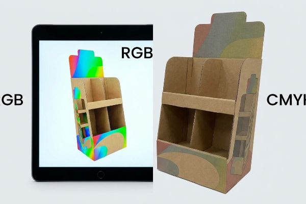
Sie genehmigen einen brillanten digitalen Entwurf auf Ihrem Monitor, doch das physische Kartondisplay wirkt blass und matt. Die Ursache ist meist ein grundlegender Fehler im Farbmodus.
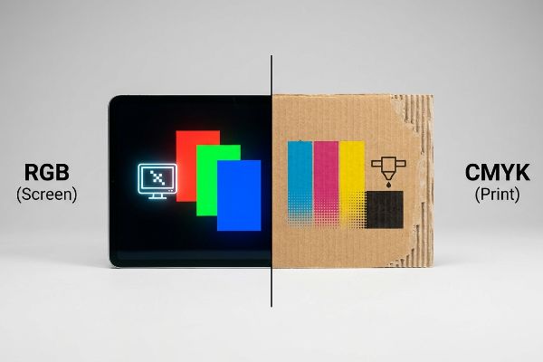
RGB und CMYK bezeichnen im Druckbereich zwei unterschiedliche Farbmodelle. RGB nutzt Licht zur Farberzeugung auf digitalen Bildschirmen, während CMYK mit Cyan, Magenta, Gelb und Schwarz arbeitet, um Licht auf physischen Bedruckstoffen zu absorbieren. Für kommerzielle Verpackungsmaschinen sind CMYK-Dateien unerlässlich, um eine präzise Farbwiedergabe auf Wellpappe zu gewährleisten.
Nur wer diesen Wandel von beleuchteten Pixeln – RGB (Rot, Grün, Blau) – zu nasser Tinte – CMYK (Cyan, Magenta, Gelb, Key/Schwarz) – versteht, kann seine Markenidentität bei der Ausweitung auf massive Einzelhandels-Rollouts schützen.
Soll ich CMYK oder RGB zum Drucken verwenden?
Die direkte Übertragung digitaler Bildschirmdateien an die Produktionshalle ist ein enormes Risiko. Die Umwandlung von leuchtenden Pixeln in physisches Papier erfordert eine präzise Druckvorstufe.
Die Verwendung von CMYK für Druckvorgänge ist obligatorisch, während RGB weiterhin digitalen Bildschirmen vorbehalten bleibt. Werden RGB-Dateien direkt an Offsetdruckmaschinen gesendet, müssen automatische Konvertierungsalgorithmen Ihre Markenfarben erraten, was zu massiven Farbunterschieden und matten Pigmenten auf unbeschichteten Wellpappenrohlingen in Ihren Verkaufsflächen führt.
Wenn Marken die physikalischen Gesetze der subtraktiven Farbmischung ignorieren, wirken die resultierenden Verkaufsdisplays unter greller Ladenbeleuchtung dauerhaft gedämpft.
Der Tarnungsfehler der „Smartphone-Autokorrektur“
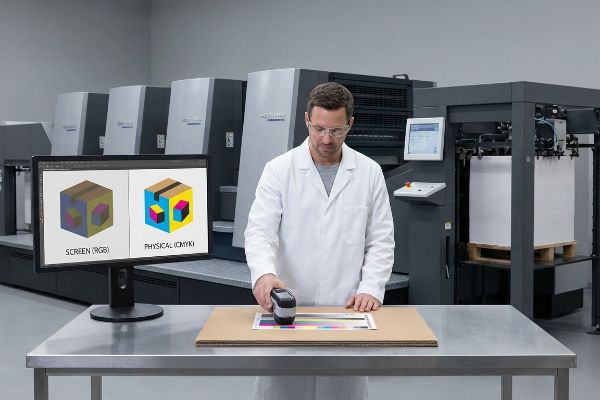
Selbst erfahrene Designer übersehen oft, dass ihre hintergrundbeleuchteten Apple-Monitore einen deutlich größeren Farbraum darstellenkönnen¹ als physische Tinte auf porösem Papier. Sie laden brillante digitale Dateien hoch und gehen davon aus, dass die Druckmaschinen die Bildschirmdarstellung perfekt wiedergeben. Tatsächlich können Offsetdruckmaschinen jedoch weder Neonfarben² noch hochgesättigte Rastertöne reproduzieren. Wenn unkalibrierte Dateien in die Druckmaschine gelangen, komprimiert die RIP-Software (Raster Image Processor) den Farbraum zwangsweise, was zu einem dauerhaften Verlust an Farbbrillanz führt und den Markenwert zerstört.
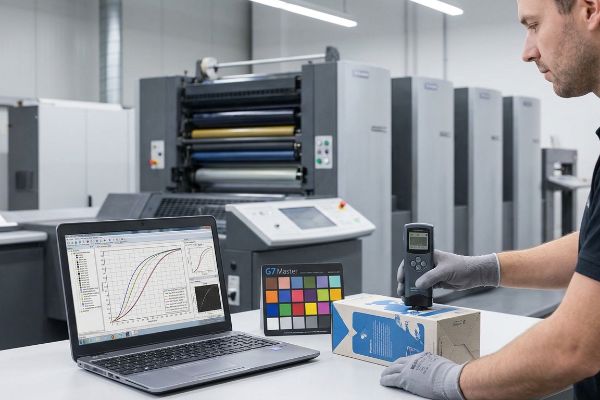
In meinem Betrieb erlebe ich regelmäßig, wie Einkaufsteams flache PDF-Proofs auf ihren Smartphones freigeben und dabei die Realität von Testlinern auf Wellpappe ignorieren. Im letzten Quartal reichte ein Kunde ein leuchtendes Digitalgrün für ein 121,9 cm breites Outdoor-Lifestyle-Display ein. Da der Datei physische Farbmuster fehlten, verschob der automatische Druckvorstufen-Rip die Farbe in ein trübes Olivgrün. Ich griff vor der Massenproduktion ein und nutzte einen physischen Spektralphotometer-Scan unter D50-Standardbeleuchtung, um das Farbprofil mathematisch neu zu berechnen. Durch die physische Neukalibrierung der Cyan- und Gelb-Farbdichte an unserer 6-Farben-Heidelberg-Druckmaschine konnte ich die gewünschte Leuchtkraft wiederherstellen. Diese Anpassung der Farbdichte um 12,5 % rettete nicht nur die visuelle Identität der Marke, sondern verhinderte auch die Verschrottung von 5.000 Deckblättern und sparte dem Kunden geschätzte 25 % der Kosten für den Nachdruck von Rohmaterial sowie eine zweiwöchige Lieferverzögerung.
| Metrik/Merkmal | Generische Druckvorstufe | Konstruierte Realität |
|---|---|---|
| Farbprüfung | Smartphone-Bildschirm | Spektralphotometer-Scan3 |
| Beleuchtungsstandard | Ambiente-Bürobeleuchtung | D50 Werksbeleuchtung4 |
| Pressekalibrierung | Auto-RIP-Konvertierung | Benutzerdefinierte Tintendichte5 |
Ich verlasse mich nie darauf, dass ein hintergrundbeleuchteter Bildschirm meine Eingaben vorgibt. Die Nutzung physikalischer Lichtgesetze anstelle digitaler Annahmen garantiert, dass Ihre Displays im Einzelhandel Aufmerksamkeit erregen.
🛠️ Harveys Schreibtisch: Wirken Ihre Markenfarben auf dem Papier trüb und uneinheitlich? 👉 Fordern Sie jetzt Ihre kostenlose Druckvorstufen-Farbanalyse an ↗ — Ich prüfe jede Druckvorlage persönlich innerhalb von 24 Stunden.
Ist RGB 255 255 255 Weiß?
Digitale Software gaukelt uns vor, Weiß sei lediglich eine weitere Farbeinstellung. In der Produktion hängt die Farbe Weiß jedoch vollständig vom physikalischen Untergrund ab.
Ja. RGB 255 255 255 entspricht in digitalen Modellen reinem Weiß. Kommerzielle Druckmaschinen können jedoch kein helles Weiß drucken. Enthält Ihr Design weiße Elemente, bleibt dieser Bereich entweder unbedruckt, sodass der Rohkarton sichtbar bleibt, oder es wird eine spezielle, deckende weiße Grundierung benötigt.
Wird nicht berücksichtigt, wie Druckmaschinen mit Weißraum umgehen, entstehen katastrophale Schichtprobleme beim Umgang mit speziellen Metallicfarben oder rohen Kraftkartons.
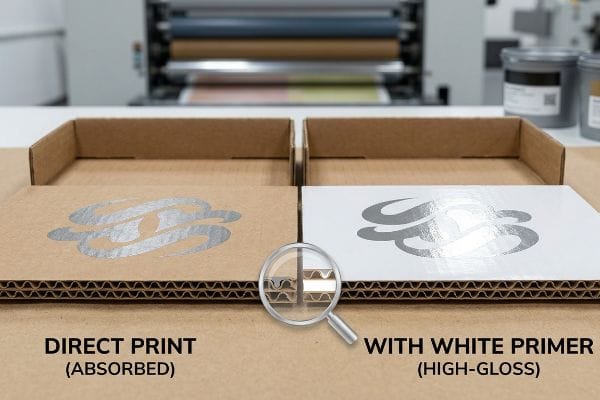
Das „PMS 877“-Silberproblem und die Basisschichtung
Grafikdesigner gehen oft fälschlicherweise davon aus, dass das Einstellen einer Ebene auf Weiß in Illustrator ein helles, deckendes Ergebnis auf dem finalen Bildschirm garantiert. Dabei vergessen sie, dass der Standard-Vierfarbdruck auf der Transparenz der Tinte<sup>6</sup> und dem natürlichen Weiß des beschichteten Deckpapiers basiert. Beim Drucken auf unbeschichtetem, braunem Testpapier oder beim Auftragen spezieller Metallic-Sonderfarben erhält man ohne Tinte lediglich blanken, stark porösen Karton, der Licht stark absorbiert<sup>7</sup> und den visuellen Kontrast beeinträchtigt.
In meiner Einrichtung sehe ich regelmäßig, dass Designer hochwertige Metallic-Akzente, wie beispielsweise PMS 877 Silber, direkt auf unbehandelte Trägermaterialien auftragen. Da Metallic -Farben physische Metallpartikel enthalten , benötigen sie eine perfekt glatte, versiegelte Oberfläche, um das Umgebungslicht im Einzelhandel optimal zu reflektieren. Bei einem Vorproduktionsversuch für ein Kosmetiktablett sog der unbehandelte B-Wellen-Karton das Metallic-Pigment sofort auf und verwandelte das hochwertige Silber in ein mattes, flaches Grau. Ich griff ein, indem ich eine präzise Abfolge von zwei Schichten weißer Grundierung entwickelte . Durch das Auftragen einer hochviskosen, deckenden weißen Grundierung versiegelte ich die porösen Papierfasern und schuf eine künstliche, extrem glatte Basis für das Silber. Diese Anpassung der Farbabfolge verhinderte das Durchbluten der Fasern vollständig und führte zu einem hochglänzenden Metallic-Finish, das den wahrgenommenen Wert des Displays steigerte und die Premium-Preisstrategie des Kunden im Einzelhandel rechtfertigte.
| Metrik/Merkmal | Generische Anwendung | Konstruierte Realität |
|---|---|---|
| Repräsentation der Weißen | Transparente Leere | Deckende Basistinte10 |
| Metallic-Lackierung | Matt Faserblutung | Hochglänzende Reflexion |
| Untergrundversiegelung | Unversiegeltes Kraftpapier | Hochviskoser Primer11 |
Digitales Licht lässt sich nicht auf porösen Karton drucken. Ich nutze die chemische Zusammensetzung der Tinte, um die Oberfläche zu verändern, bevor die eigentlichen Markenfarben das Papier berühren.
🛠️ Harveys Schreibtisch: Verlieren Ihre hochwertigen Metallic- oder Glanzlackierungen an Wirkung, weil sie in die rohen Wellpappenfasern einsinken? 👉 Fordern Sie eine kostenlose Farbsequenzstrategie an ↗ — 100 % vertraulich. Ihre unveröffentlichten Designs sind bei mir sicher.
Verwenden professionelle Drucker RGB oder CMYK?
Der Übergang von einem digitalen Prototyp zur Serienfertigung erfordert die strikte Einhaltung physikalischer Farbnormen. Fachleute verzichten daher vollständig auf bildschirmbasierte Modelle.
Professionelle Druckereien verwenden ausschließlich CMYK und standardisierte Pantone-Sonderfarben. RGB wird vollständig abgelehnt, da industrielle Druckmaschinen lichtemittierende Farbdaten physikalisch nicht verarbeiten können. Fabriken nutzen fortschrittliche Rasterbildprozessoren und Farbkalibrierungsverfahren, um Druckvorlagen in präzise physikalische Farbdichten für die Massenproduktion umzuwandeln.
Die Verwendung allgemeiner Farbumrechnungen ohne einen übergeordneten physikalischen Kalibrierungsstandard garantiert, dass Ihre Verpackung von Charge zu Charge radikal unterschiedlich aussehen wird.
Das "G7 Master" Graustufenkalibrierungs-Trauma
Viele Einkaufsteams glauben fälschlicherweise, dass die einfache Konvertierung einer Illustrator-Datei in CMYK ausreicht, um Farbgenauigkeit bei verschiedenen Druckpartnern zu gewährleisten. Sie behandeln das Farbprofil als unveränderliche, universelle Wahrheit und ignorieren dabei völlig die mechanischen Abweichungen verschiedener Offsetdruckmaschinen, Farbtemperaturen und Plattendrücke<sup>12</sup>. Ohne einen Master-Kalibrierungsstandard wirkt eine im Mai gedruckte Datei deutlich dunkler als dieselbe Datei, die im Oktober nachgedruckt wird, was die Markenkonsistenz im Einzelhandel erheblich beeinträchtigt.
Ich erinnere mich noch genau daran, wie mein leitender Ingenieur Mark letztes Jahr bei einem Probelauf einen Masterkarton von unserer neuen Offsetdruckmaschine nahm. Wir hatten gerade von hochwertigem, gebleichtem Vollkarton auf Recycling-Testkarton umgestellt, um die strengen Nachhaltigkeitsvorgaben eines Kunden zu erfüllen. Unter dem Densitometer zeigte sich, dass die Mitteltöne des markentypischen Blaus stark ins Violette verschoben waren, obwohl die digitale Datei unverändert blieb. Die Recyclingfasern reagierten physikalisch anders auf die Klebrigkeit der Cyan-Druckfarbe. Ich stoppte die Linie sofort und führte ein strenges G7-Master-Farbkalibrierungsprotokoll<sup>13</sup>. Mark und ich verbrachten sechs Stunden damit, mathematische Graustufen-Abschneidekurven direkt in der RIP-Software<sup>14</sup> zu berechnen, um die spezifische Punktzunahme des Recyclingkartons manuell zu kompensieren. Diese aufwendige manuelle Kalibrierung beseitigte die Violettverschiebung vollständig; sie sicherte eine perfekte Delta-E-Übereinstimmung für die gesamte Auflage von 10.000 Einheiten, schützte den Kunden vor massiven Reklamationen im Einzelhandel und sparte schätzungsweise 15 % Druckzeit. Ich investiere Zeit und Geld in meinem Testlabor, damit Sie im Einzelhandel keine Gewinneinbußen erleiden.
| Metrik/Merkmal | Generische Druckvorstufe | Konstruierte Realität |
|---|---|---|
| Chargenkonsistenz | Visuelles Raten | G7 Master-Kalibrierung15 |
| Tintenreaktion | Unkontrollierter Schaltvorgang | Dot Gain Compensation16 |
| Presstoleranz | Mechanische Drift | Mathematische Kurvenkorrektur |
Eine Rohdateikonvertierung ist wertlos, wenn die Druckmaschine selbst nicht mathematisch an einen Standard gebunden ist. Ich zwinge die Maschine, sich dem Papier anzupassen, niemals umgekehrt.
🛠️ Harveys Schreibtisch: Verändern sich Ihre Markenfarben merklich zwischen verschiedenen Produktionsläufen oder unterschiedlichen Kartonmaterialien? 👉 Vereinbaren Sie einen individuellen Farbtoleranz-Check ↗ – ohne Zwischenhändler. Sie sprechen direkt mit Statikern.
Warum verwenden Drucker CMYK anstelle von RGB?
Die Wahl zwischen den Farbmodellen ist keine willkürliche Branchenpräferenz. Sie stellt eine strikte Grenze dar, die durch die physikalischen Grenzen der Nasschemie auf Papier vorgegeben ist.
Drucker verwenden CMYK anstelle von RGB, da die Tinte als subtraktiver Filter wirkt und Licht absorbiert, anstatt es zu emittieren. Durch das Übereinanderlegen von Cyan, Magenta und Gelb entstehen dunklere Farben, wobei schließlich Schwarz benötigt wird, um tiefe Schatten zu erzeugen. Diese Farbschichtung muss sorgfältig gesteuert werden, um eine vollständige Sättigung des Substrats zu vermeiden.
Wenn Designer vergessen, dass sie es mit physikalischen Flüssigkeiten zu tun haben, fluten sie versehentlich den Karton, was zu katastrophalen strukturellen und ästhetischen Mängeln führt.
Die Sicherheitszone „Gesamttintenlimit“ (TIL)
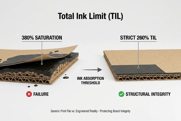
Selbst erfahrene Designer tappen in die Falle, die Farbsättigung in Photoshop aggressiv zu erhöhen, um möglichst dunkle Schatten zu erzielen. Dabei entstehen oft satte Schwarztöne, die 100 % aller vier Farbkanäle beanspruchen. Sie behandeln die digitale Arbeitsfläche als unendlich. In der Papierherstellung hat physischer Karton jedoch eine strenge Absorptionsgrenze. Wenn man eine 3 mm dicke Platte B-Welle-Testliner17, werden die Papierfasern regelrecht trocknet nicht, färbt auf die nächste Platteab 18und verzieht das Material dauerhaft.
In meiner Druckerei sehe ich regelmäßig Druckvorstufendateien, die wegen starker Übersättigung beanstandet werden. Bei einer kürzlich durchgeführten Vorproduktionsprüfung für eine robuste Palettenverkleidung reichte die Designagentur des Kunden einen tiefschwarzen Hintergrund mit einer Gesamtfarbdeckung von 380 % ein. Ohne Korrektur hätte diese Übersättigung mit Nasschemikalien dazu geführt, dass der wasserbasierte PVA-Klebstoff (Polyvinylacetat) während des Litho-Laminierungsprozesses versagt hätte<sup>19</sup>. Dies hätte zur Folge gehabt, dass sich die bedruckte Deckschicht bei der üblichen Lagerfeuchtigkeit abgelöst und Blasen gebildet hätte. Ich habe die Densitometerwerte ausgelesen und die Datei umgehend angepasst, indem ich in unserem Druckvorstufenprofil eine strikte TIL-Sicherheitszone (Total Ink Limit) von 260 % festgelegt habe. Durch Ersetzen der gesättigten CMYK-Mischung durch eine präzise, starke GCR-Kurve (Gray Component Replacement)<sup>20</sup> konnte ich dieselbe visuelle Tiefe erzielen und gleichzeitig große Mengen unnötiger Flüssigkeit entfernen. Durch diese datengestützte Chemikalienbeschränkung wurde der Trocknungsengpass in der Produktionslinie vollständig beseitigt, der Co-Packing-Zeitplan um volle 24 Stunden beschleunigt und sichergestellt, dass die 68 kg schweren Displaytafeln für die Nutzlast strukturell stabil blieben.
| Metrik/Merkmal | Generische Druckdatei | Konstruierte Realität |
|---|---|---|
| Tintendeckung | 380 % Sättigung | Strenge 260% TIL21 |
| Chemisches Risiko | Klebstoffablösung22 | Sichere PVA-Bürgschaft |
| Produktionsgeschwindigkeit | Starke Trocknungsverzögerung | 24-Stunden-Beschleunigung23 |
Man kann Papierfasern nicht mit überschüssiger Flüssigkeit schädigen. Ich entferne daher mathematisch überflüssige Farbkanäle, um die strukturelle Integrität des Kartons zu schützen, noch bevor die Druckmaschine anläuft.
🛠️ Harveys Schreibtisch: Verursachen Ihre großen Grafikdateien ungewollt Verformungen, Blasenbildung oder Ablösungen Ihrer bedruckten Wellpappendisplays? 👉 Fordern Sie Ihren kostenlosen Scan zur Ermittlung Ihres Tintenlimits an ↗ — Ich prüfe jede Strukturdatei persönlich innerhalb von 24 Stunden.
Abschluss
Ob es darum geht, zu verhindern, dass CMYK-Halbtonmuster die Sichtbarkeit Ihres Logos beeinträchtigen, oder um die mathematische Begrenzung von Farbmengen, um massive PVA-Ablösungen zu vermeiden – die Berücksichtigung der physikalischen und chemischen Gegebenheiten in der Produktion ist unerlässlich. Allein im letzten Monat half mein Struktur-Audit drei Marken, über 10.000 US-Dollar an Ausschuss und Rückbelastungen durch Händler zu vermeiden. Wenn Sie nicht länger zulassen möchten, dass Annahmen der digitalen Bildschirmdarstellung Ihre Logistik im stationären Handel beeinträchtigen, lasse ich Ihre Strukturdateien persönlich durch mein kostenloses Prepress & Struktur-Stanzlinien-Audit führen ↗, um die perfekte Einhaltung der Massenproduktionsvorgaben zu gewährleisten.
„Farbdarstellungen in BJ: RGB versus CMYK – PMC – NIH“, https://pmc.ncbi.nlm.nih.gov/articles/PMC1305152/. [Autoritative Farbwissenschaftsquellen erläutern den Unterschied zwischen dem additiven RGB-Farbraum von hintergrundbeleuchteten Displays und dem subtraktiven CMYK-Farbraum von Druckfarben]. Nachweisfunktion: Technische Spezifikation; Quellentyp: Farbmanagement-Leitfaden. Unterstützt: Die grundlegende Farbraumabweichung zwischen digitalen Bildschirmen und Druck. Anwendungsbereich: Behandelt speziell hintergrundbeleuchtete LED/OLED-Displays. ↩
„CMYK-Farbtabellen und -Werte – Mixam“, https://mixam.com/support/cmykchart. [Technische Druckhandbücher beschreiben detailliert, dass der Standard-Vierfarben-Offsetdruck (CMYK) ohne Sonderfarben keine hochgesättigten Neonfarben wiedergeben kann.] Belegfunktion: technische Einschränkung; Quellentyp: Handbuch der Druckindustrie. Beleg: Die Unfähigkeit des Offsetdrucks, die Leuchtkraft des Bildschirms zu erreichen. Anmerkung: Spezielle fluoreszierende Farben sind ausgeschlossen. ↩
„Was ist ein Kolorimeter/Spektralphotometer in der Druck- und Verpackungsindustrie?“, https://www.linshangtech.com/tech/colorimeter-spectrophotometer-in-printing-packaging-tech1524.html. [Eine maßgebliche Quelle würde erläutern, wie Spektralphotometer objektive, numerische Farbdaten liefern, um die Farbkonsistenz auf verschiedenen Substraten und Druckmaschinen sicherzustellen.] Nachweisfunktion: Technische Spezifikation; Quellentyp: Branchenstandardhandbuch. Unterstützt: Die Verwendung objektiver Werkzeuge zur Farbprüfung. Anwendungsbereich: Gilt für physische Druckproofs. ↩
„D50-Farbprüfung für die grafische Industrie | JUST-Normlicht“, https://www.just-normlicht.com/us/d50-color-checking-graphic-arts.html. [ISO 3664 definiert D50 als Standardlichtart für die Betrachtung und Beurteilung von Druckmaterialien, um die Farbkonsistenz unabhängig vom Standort sicherzustellen]. Nachweisfunktion: Industriestandard; Quellentyp: ISO-Norm. Begründung: Die Notwendigkeit standardisierter Beleuchtung für Farbgenauigkeit. Anwendungsbereich: Speziell für die grafische Industrie und die Druckindustrie. ↩
„Etwas Besseres als Dichte? – Druckkalibrierung & Profilierung“, https://www.colorforums.com/t/something-better-than-density/52. [Technische Druckhandbücher beschreiben, wie die Anpassung der Farbdichte in der Druckmaschine die Substratabsorption und Punktzunahme besser berücksichtigt als automatische RIP-Einstellungen]. Nachweisfunktion: Technischer Prozess; Quellentyp: Drucklehrbuch. Beleg: Die Bedeutung der manuellen Kalibrierung für hochwertige Druckqualität. Anwendungsbereich: Variiert je nach Druckmaschinentyp. ↩
„Weißdruck: Funktionsweise & Anwendungsbereiche – Infinity Images“, https://www.infinityimages.com/blog/the-wonders-of-white-ink. [Die Normen der Druckindustrie erklären, dass CMYK-Farben subtraktiv und transparent sind und daher ein weißes Substrat benötigen, um Licht zu reflektieren.] Nachweisfunktion: Technische Spezifikation; Quellentyp: Druckhandbuch. Begründung: Die Abhängigkeit der CMYK-Farben von der Papierweißheit. Anwendungsbereich: Standard für Offset- und Digitaldruck. ↩
„Testlinerpapier | Inviker“, https://inviker.com/en/paper-packaging/testliner-paper/. [Die technischen Spezifikationen für Testlinerkarton beschreiben dessen hohe Porosität und geringe Lichtreflexion im Vergleich zu gestrichenen Bögen]. Nachweisfunktion: Materialeigenschaft; Quellentyp: Technisches Datenblatt. Beleg: Die Behauptung, dass Rohkarton den visuellen Kontrast beeinträchtigt. Anwendungsbereich: Gilt für ungebleichte Wellpappenrohlinge. ↩
„Was Sie beim Drucken mit Metallicfarben beachten sollten – Siegwerk“, https://www.siegwerk.com/en/news-media/insights/details/what-you-should-know-when-printing-metallic-inks.html. [Eine maßgebliche Quelle zur Druckfarbenchemie würde bestätigen, dass Metallicfarben ihre reflektierenden Eigenschaften durch die Suspension mikronisierter Metallpartikel oder -flocken erzielen.] Belegfunktion: Technische Spezifikation; Quellentyp: Chemikalien-/Druckhandbuch. Unterstützt: Die physikalische Voraussetzung einer glatten Oberfläche für die Reflexion. Anwendungsbereich: Gilt für Standardformulierungen von Metallicfarben. ↩
„Metallic-Farbsimulation auf weißen Substraten – GMG-Unterstützung“, https://customercare.gmgcolor.com/hc/en-us/articles/49058391942683-Metallic-ink-simulation-on-white-substrates. [Industrielle Drucknormen beschreiben die Verwendung von deckenden weißen Unterlagen, um die Substratabsorption zu blockieren und eine neutrale Grundlage für Spezialfarben zu schaffen]. Nachweisfunktion: Technischer Prozess; Quellentyp: Leitfaden für den kommerziellen Druck. Unterstützung: Die Notwendigkeit einer Grundierung, um das Durchbluten der Fasern auf Karton zu verhindern. Anwendungsbereich: Insbesondere relevant für poröse Substrate wie B-Welle. ↩
„Best Practices für den Weißdruck für Druckprofis – ThinkSAi.com“, https://www.thinksai.com/blog/white-ink-printing-workflow/. [Autoritative Druckhandbücher erklären, warum eine deckende weiße Grundierung erforderlich ist, um Farbgenauigkeit auf nicht-weißen Substraten zu erzielen]. Nachweisfunktion: Technische Spezifikation; Quellentyp: Handbuch der Druckindustrie. Beleg: Die physikalische Anforderung an die Deckkraft von Weißtinte. Anwendungsbereich: Speziell für Offset- und Digitaldruck auf farbigen Medien. ↩
„Hochviskoses Kraftpapierklebeband, wasserfest, beschreibbar, klebend …“, https://us.shein.com/High-Viscosity-Kraft-Paper-Tape-Waterproof-Writable-Adhesive-Tear-Easily-For-Packing-And-Sealing-p-32153183.html. [Technische Leitfäden zu Industrielacken beschreiben die Verwendung hochviskoser Grundierungen zum Versiegeln poröser Substrate, um Tintenaufnahme und -verlauf zu verhindern]. Nachweisfunktion: Technische Spezifikation; Quellentyp: Leitfaden für Industrielacke. Unterstützung: Methodik der Substratvorbereitung im professionellen Druck. Anwendungsbereich: Hauptsächlich anwendbar auf poröse Materialien wie Kraftpapier. ↩
„Stabiler Druck verankert die Farbkontrolle – LinkedIn“, https://www.linkedin.com/pulse/why-stable-pressure-remains-anchor-color-control-offset-madison-a7d9e. [Technische Druckhandbücher und -normen erläutern, wie Schwankungen von Temperatur, Druck und mechanischem Verschleiß Abweichungen im Farbauftrag und der Farbdichte verursachen]. Nachweisfunktion: Technische Validierung; Quellentyp: Branchenhandbuch. Unterstützt: Die Behauptung, dass Farbprofile allein für die Farbgenauigkeit nicht ausreichen. Anwendungsbereich: Bezieht sich speziell auf den Offsetdruck. ↩
„Zertifizierte G7-Systeme“, https://idealliance.org/systems-certification/g7-system/. Die technischen Handbücher von Idealliance bestätigen die Bedeutung des G7-Standards für visuelle Neutralität und Graustufenbalance in verschiedenen Druckverfahren und auf unterschiedlichen Substraten. Nachweisfunktion: Technische Validierung; Quelltyp: Industriestandard; Anwendungsbereich: Anwendung von G7 zur Korrektur von Farbverschiebungen auf Recyclingkarton. Anmerkung zum Anwendungsbereich: Fokus auf neutrale Graustufenbalance, nicht auf spezifische Sonderfarben. ↩
„Mathematische Modellierung und Kompensationsstrategien für den Punktdruck …“, https://pmc.ncbi.nlm.nih.gov/articles/PMC12574880/. Die technische Dokumentation zu Raster Image Processors (RIP) bestätigt die Verwendung von Cutback-Kurven zur Anpassung der Tintendichte, um substratspezifische Punktzunahmen auszugleichen. Nachweisfunktion: Prozessverifizierung; Quellentyp: Technisches Handbuch; Unterstützung: Manuelle Kompensation des Tintenverhaltens auf Recyclingfasern. Anwendungsbereich: Spezifisch für professionelle industrielle RIP-Konfigurationen. ↩
„G7 Master Qualification: Präzise Farbkontrolle für die pharmazeutische Industrie …“, https://platinumpress.com/g7-master-qualification-in-pharmaceutical-printing/. [Eine maßgebliche Quelle definiert G7 als eine auf Graustufen basierende Kalibrierungsmethode zur Sicherstellung der visuellen Konsistenz über verschiedene Druckprozesse und -geräte hinweg.] Nachweisfunktion: Technische Spezifikation; Quellentyp: Industriestandard. Anwendungsbereich: Verwendung von G7 zur Sicherstellung der Chargenkonsistenz. Fokus: Graustufenkalibrierung. ↩
„Was ist Punktzuwachs beim Drucken? | Rehan Siddique hat zu diesem Thema gepostet“, https://www.linkedin.com/posts/rehan-siddique-440b5a1b1_dotgain-printing-activity-7371590745176260608-LryZ. [Technische Handbücher erklären, wie die Punktzuwachskompensation digitale Dateien anpasst, um die physikalische Ausbreitung der Tinte auf dem Papier zu berücksichtigen und so die Bildgenauigkeit zu erhalten]. Nachweisfunktion: Technischer Prozess; Quellentyp: Druckhandbuch. Unterstützt: Methode zur Steuerung der Tintenreaktion. Anwendungsbereich: Gilt für verschiedene Substrate. ↩
„[PDF] Spezifikationen für Wellpappe – Fibre Box Association“, https://www.fibrebox.org/assets/2025/09/Walmart_Corrugated-Board_Specifications_Automation_Packaging_Standards.pdf. [Technische Verpackungsstandards bestätigen die Standarddicke von B-Welle-Wellpappe und deren Tintenaufnahmekapazität]. Nachweisfunktion: Technische Spezifikation; Quellentyp: Branchenhandbuch. Unterstützt: Spezifische Substratgrenzen. Anwendungsbereich: Gilt für Standardabmessungen von B-Welle. ↩
„Meisterhaftes Drucken von Wellpappkartons: Wie man häufige Tintenprobleme löst …“, https://www.linkedin.com/pulse/mastering-corrugated-box-printing-how-solve-common-moss-vdsjc. [Drucklehrbücher beschreiben den Mechanismus des Tintenabsetzens und des Trocknungsversagens, wenn die maximale Tintenmenge (Total Ink Limit, TIL) auf porösen Substraten überschritten wird]. Belegfunktion: Kausale Erklärung; Quellentyp: Fachbuch. Unterstützung: Physikalische Folgen der Sättigung. Anwendungsbereich: Allgemein für den Nassdruck. ↩
„Verbesserung der Tintenhaftung auf Spezialpapier durch interpenetrierende …“, https://pmc.ncbi.nlm.nih.gov/articles/PMC9062711/. [Industrielle Druck- und Klebstoffnormen erläutern, wie übermäßige Tintenschichten als Barriere wirken und das Eindringen von PVA-Klebstoff in das Substrat verhindern, wodurch Haftungsversagen vermieden wird]. Nachweisfunktion: Technische Verifizierung; Quellentyp: Handbuch für industrielle Klebstoffe. Belege: Kausalzusammenhang zwischen Tintensättigung und Delamination. Anwendungsbereich: Speziell für wasserbasierte Klebstoffe auf porösen Substraten. ↩
„Eine Untersuchung der Leistungsfähigkeit des Graukomponentenersatzes“, https://repository.rit.edu/theses/3930/. [Technische Leitfäden zum Farbmanagement beschreiben, wie der Graukomponentenersatz Cyan, Magenta und Gelb durch schwarze Tinte ersetzt, um das Gesamttintenvolumen zu reduzieren und gleichzeitig die visuelle Dichte beizubehalten]. Nachweisfunktion: Konzeptuelle Überprüfung; Quellentyp: Lehrbuch zum Farbmanagement. Belege: Die Wirksamkeit des Graukomponentenersatzes bei der Reduzierung des Gesamttintenvolumens. Anwendungsbereich: Anwendbar auf CMYK-Offsetdruckprozesse. ↩
„Farbauftragsoptimierung im Printdesign: Ein Leitfaden zur selektiven Farbgebung …“, https://www.printing.org/content/2024/04/23/adjustinginklimits.april2024. [Technische Druckspezifikationen legen Standard-Schwellenwerte für den Gesamtfarbauftrag (Total Ink Limit, TIL) fest, z. B. 260 %, um eine ordnungsgemäße Trocknung zu gewährleisten und ein Abfärben zu verhindern]. Nachweisfunktion: Technische Spezifikation; Quellentyp: Branchenhandbuch. Unterstützt: Die Definition eines sicheren Farbauftragsgrenzwerts. Anmerkung: Die genauen Grenzwerte variieren je nach Papierporosität und Beschichtung. ↩
„Verhinderung von Delamination in flexiblen Verpackungen“, https://www.packagingimpressions.com/post/building-strong-bonds-preventing-delamination-flexible-packaging/. [Chemische Analysen von Druckklebstoffen zeigen, dass übermäßige Farbsättigung eine Barriere bildet, die das Eindringen der Klebstoffe in die Papierfasern verhindert und somit Delamination verursacht]. Nachweisfunktion: Kausalmechanismus; Quellentyp: Fachartikel. Belege: die chemischen Risiken, die mit hoher Farbsättigung einhergehen. Anmerkung zum Anwendungsbereich: Bezieht sich speziell auf die Farbsättigungswerte bei nasser Farbe. ↩
„Analyse der Auswirkungen eines optimalen Tintenmanagements auf die Umwelt …“, https://pmc.ncbi.nlm.nih.gov/articles/PMC11330467/. [Produktionsdaten zeigen, dass die Einhaltung niedrigerer Gesamttintenmengen die Trocknungszeit deutlich reduziert und somit schnellere Durchlaufzeiten für Weiterverarbeitungsprozesse ermöglicht]. Nachweisfunktion: Leistungskennzahl; Quellentyp: Produktionsfallstudie. Belege: Der Vorteil optimierter Tintenmengen für die Produktionsgeschwindigkeit. Anmerkung: Die Beschleunigung hängt von der verwendeten Trocknungstechnologie ab. ↩