Sie haben Ihr digitales Kunstwerk fertiggestellt, doch die Übertragung dieser leuchtenden Bildschirmfarben auf physische Verkaufsdisplays führt oft zu einem trüben, verwaschenen Ergebnis. Die Ursache liegt meist in den Grundlagen der Druckfarbe.
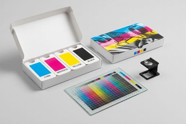
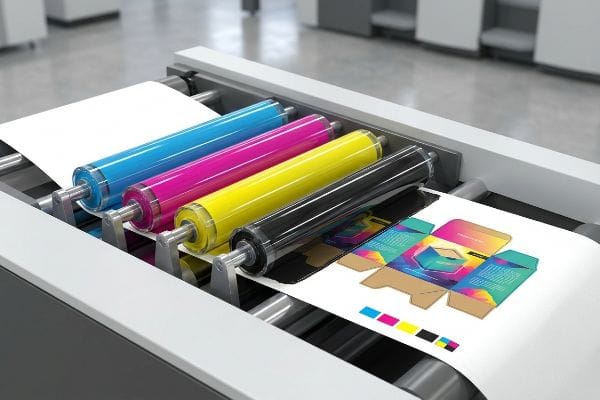
Die Komponenten des CMYK-Farbmodells sind Cyan, Magenta, Gelb und Schwarz. Dieses subtraktive Farbmodell mischt diese vier physikalischen Farben auf einer Druckmaschine, um Bilder zu erzeugen. Dabei wird Licht absorbiert statt emittiert, wodurch es zum universellen Standard für die gesamte kommerzielle Druck- und Verpackungsproduktion weltweit geworden ist.
Das Akronym zu kennen ist einfach, aber die Kontrolle darüber, wie sich diese vier flüssigen Tinten verhalten, wenn sie auf rohen Karton treffen, ist das, was eine Premium-US-Marke von einer billigen Fälschung unterscheidet.
Was sind die vier CMYK-Farben?
Das Verständnis von Cyan, Magenta, Gelb und Schwarz ist der erste Schritt, aber sie korrekt auf Wellpappenuntergründe anzuwenden, ist eine ganz andere Sache.
Die vier CMYK-Farben sind Cyan (Blaugrün), Magenta (Purpurrot), Gelb und Schwarz. Werden diese transparenten Farben als winzige, sich überlappende Punkte gedruckt, verschmelzen sie auf dem Papier optisch miteinander und erzeugen so ein breites Farbspektrum für Verpackungen und Grafiken im Einzelhandel.
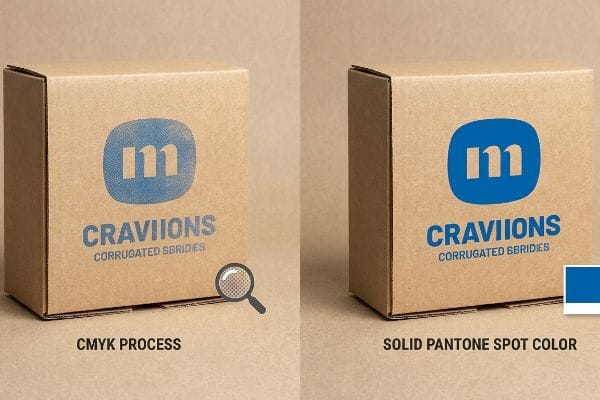
Doch die Theorie allein genügt nicht, wenn die Punkte tatsächlich auf der physischen Platine landen.
Die Halbton-Schlammfalle im Wellpappendruck
Die meisten Marketingteams gehen davon aus, dass die Umwandlung ihres Firmenlogos in das Standard-CMYK-Format eine nahtlose Wiedergabe des digitalen PDFs auf dem Bildschirm ermöglicht. Sie vertrauen darauf, dass die vier Prozessfarben im Druck perfekt miteinander verschmelzen und so ihre Markenidentität exakt reproduzieren.
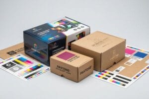
Ich beobachte diesen Fehler immer wieder in der Produktion, wenn direkt auf poröses Wellpappen-Testpapier gedruckt wird. Da das Verfahren auf winzigen, sich überlappenden Rasterpunkten basiert, nehmen die Papierfasern die nasse Farbe ungleichmäßig auf¹.Kürzlich sah ich, wie ein hochwertiges blaues Logo unter dem grellen Neonlicht eines Kaufhauses zu einem körnigen, verwaschenen Schleier wurde. Um das zu beheben, setze ich auf ein spezielles Farbauftragsverfahren und ersetze die Vierfarbenmischung durch eine einzige Volltonfarbe nach Pantone Matching System².Dadurchentsteht ein dichtes, glattes Finish, die Rasterkörnung wird vollständig beseitigt und die Marke wirkt im Regal nicht billig.
| Häufiger Anfängerfehler | Die Profi-Lösung | Vorteil für die Verkaufsfläche |
|---|---|---|
| Logos im Standardprozessdruckverfahren drucken | Verwenden Sie deckende Pantone-Sonderfarben3 | Verhindert das Ausbleichen von Markenfarben |
| auf optischer Punktmischung beruhen | Vollflächige Beschichtung mit fester Tinte4 | Maximiert die Sichtweite von 9,1 m (30 Fuß) |
| Testliner-Porosität ignorieren | Anpassung der Tinte an die Faserabsorption5 | Erzeugt gestochen scharfe Texte und Grafiken |
Ich lasse Markenlogos nie im Vierfarbdruckverfahren auf roher Wellpappe drucken. Die Verwendung einer Volltonfarbe garantiert, dass Ihr Display aus 6,1 Metern Entfernung perfekt zur Geltung kommt.
🛠️ Harveys Schreibtisch: Sie sind sich nicht sicher, ob Ihre Markenfarben auf unbehandelter Wellpappe unansehnlich werden? 👉 Kostenlose Farbprüfung für die Druckvorstufe ↗ — Direkter Kontakt zu mir. Kein automatisierter Werbe-Spam, versprochen.
Warum wird Schwarz im CMYK-Farbraum als K bezeichnet?
Es mag wie eine einfache Quizfrage klingen, aber wenn man die Schwarztöne verwechselt, kann das den Herstellungsprozess physisch beeinträchtigen.
Schwarz im CMYK-Farbmodell wird als „K“ für „Key“ bezeichnet, da es die Druckplatten ausrichtet. Im traditionellen Offsetdruck werden die Cyan-, Magenta- und Gelbplatten präzise auf die Schwarzplatte abgestimmt, die den entscheidenden Kontrast, die Details und die Konturen des endgültigen Bildes liefert.
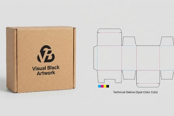
Während die Schlüsselplatte die visuelle Kontur vorgibt, führt die Verwechslung von visuellem Schwarz mit strukturellen Schnittlinien zu massiven Problemen.
Der Vector Stroke Prepress-Fehler
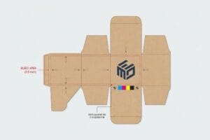
Selbst erfahrene Designer verwenden oft standardmäßige schwarze Linien, um anzuzeigen, wo ein Kartondisplay physisch geschnitten oder gefaltet werden soll. Sie gehen davon aus, dass die automatisierten CAD-Systeme (Computer-Aided Design) einfach die visuelle schwarze Kontur erkennenund wissen, was zu tun ist.
Ich sehe diese Falle, die die Vorproduktion komplett zum Erliegen bringt. Wenn eine Datei standardmäßig 100 % Schwarz für Strukturlinien verwendet, verschmilzt die RIP-Software der CNC-Maschine diese Schnittlinien einfach mit der Grafikebene7.Ich musste einen Druckvorgang stoppen, weil die Maschine zwar einen perfekt bedruckten Karton mit sichtbaren Konturen, aber ohne jegliche Schnitte ausgab. Das frustrierte Lagerteam starrte daraufhin auf die glatte, ungeschnittene Oberfläche flacher, nutzloser Platten. Deshalb fange ich jetzt jede Datei ab, um diese Striche in absolute mechanische Sonderfarben umzuwandeln8und so sicherzustellen, dass die Stahlklingen das Substrat tatsächlich erfassen.
| Häufiger Anfängerfehler | Die Profi-Lösung | Vorteil für die Verkaufsfläche |
|---|---|---|
| Visuelles Schwarz für Schnittlinien verwenden | Zuweisung absoluter Sonderfarben9 | Stellt sicher, dass die Maschinen korrekt schneiden |
| Verschmelzung von Struktur und Kunstwerk | Trennen von mechanischen Vorpressschichten10 | Verhindert flache, nicht faltbare Bretter |
| Senden von nicht geflogenen PDF-Stanzformen | Vektorschlagdaten vor dem Flug11 | Vermeidet Verzögerungen beim Co-Packing |
Bevor eine Datei überhaupt auf den Schneidetisch gelangt, trenne ich stets die Strukturberechnungen von der visuellen Tinte. Indem ich die schwarze Tinte ausschließlich für die Grafik verwende, stelle ich sicher, dass die Klingen genau das tun, was sie sollen.
🛠️ Harveys Schreibtisch: Sind Ihre Schnittpfade versehentlich in Ihren Grafikebenen versteckt? 👉 Dateistrukturprüfung anfordern ↗ — Sicher herunterladen. Bei Fragen können Sie mich gerne kontaktieren.
Warum verwenden Drucker CMYK und nicht RGB?
Was auf Ihrem digitalen Bildschirm lebendig wirkt, verhält sich auf physischem Papier völlig anders.
Drucker verwenden CMYK und nicht RGB, da für den Druck physikalische Tinten benötigt werden, die Licht absorbieren. RGB ist ein additives Farbmodell, das Licht für digitale Bildschirme nutzt. CMYK hingegen ist ein subtraktives Farbmodell, das physikalische Pigmente verwendet, um die Lichtreflexion des Papiers zu blockieren. Daher ist es mathematisch notwendig für die Herstellung von Verpackungen.
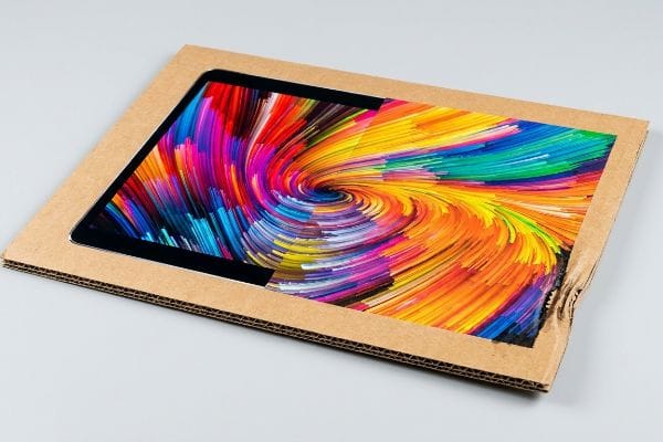
Die Konvertierung Ihrer Datei von RGB zu Prozesstinte ist einfach per Knopfdruck möglich, aber die physikalischen Volumengrenzen hinter dieser Konvertierung zu ignorieren, ist ein Rezept für eine Katastrophe.
Die Sicherheitszone für die gesamte Tintenbegrenzung
Viele Marketingleiter genehmigen brillante RGB-Grafiken auf ihren Monitoren und erwarten, dass eine einfache, automatisierte Konvertierung auf Papier exakt dasselbe Ergebnis liefert. Dabei übersehen sie völlig die physikalische Menge an Flüssigkeit, die benötigt wird, um diese tiefen, satten Farben auf einer industriellen Druckmaschine zu erzielen.
In meiner Produktionsstätte kann allein die Konvertierung einer dunklen RGB-Datei den TIL-Wert (Total Ink Limit) auf über 320 %13. Trifft diese Menge an Flüssigkeit auf Wellpappe mit einem Kantenstauchtest (Edge Crush Test, 32ECT)14, sättigen sich die Papierfasern sofort und verlieren ihre Stabilität. Ich habe schon erlebt, wie wunderschön bedruckte Display-Header sich verzogen und mit einem lauten Reißen direkt in den Händen eines Verkäufers zerrissen sind, weil die hohe Farbmenge das Substrat überlastet hat. Durch die strikte Festlegung eines Limits von 260 % im Druckvorstufenprofil begrenze ich die Flüssigkeitsmenge mathematisch, stelle so die Stabilität der Pappe sicher und vermeide kostspielige Ausschussware im Einzelhandel.
| Häufiger Anfängerfehler | Die Profi-Lösung | Vorteil für die Verkaufsfläche |
|---|---|---|
| Vertrauen in automatisierte RGB-Konvertierungen | Durchsetzung einer strikten Tintenbegrenzung von 260 %15 | Verhindert durch Feuchtigkeit geschwächte Displays16 |
| Flüssigtintenvolumen außer Acht gelassen | Kalibrierung des Prepress-RIP-Profils17 | Hält Wellblechköpfe steif |
| Verfolgung der Bildschirmsättigung | Farbprofile für Papier anpassen | Verhindert Einreißen beim Aufbau des Regals |
Ich begrenze die Materialdichte bei jedem Auftrag strikt, um die mechanische Festigkeit des Materials zu gewährleisten. Leuchtende Grafiken nützen nichts, wenn der Karton unter dem Gewicht Ihres Produkts verformt wird und sich verformt.
🛠️ Harveys Schreibtisch: Enthält Ihre Grafikdatei eine gefährliche, versteckte Flüssigkeitsdichte? 👉 Fordern Sie Ihre Druckvorstufen-Farbanalyse an ↗ – Keine Formulare, die endlose Verkaufsanrufe auslösen. Nur echter Mehrwert.
Mit welchen Farben hat CMYK Schwierigkeiten?
Während der Vierfarbendruck ein riesiges Farbspektrum abdeckt, stößt er an seine physikalischen Grenzen, wenn es darum geht, bestimmte Spezialpigmente nachzubilden.
CMYK stößt bei Metallicfarben, Neonfarben und sehr spezifischen Markenfarben an seine Grenzen. Da das subtraktive Farbverfahren auf dem Mischen transparenter Tinten basiert, kann es die Reflexionseigenschaften von Silber oder die Leuchtkraft von Neonfarben physikalisch nicht reproduzieren und erfordert daher spezielle Sonderfarben für eine präzise Fertigung.
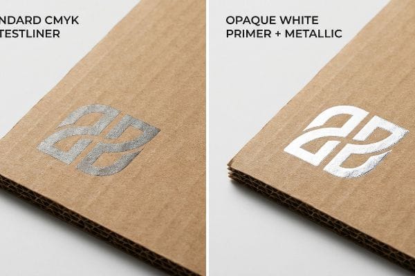
Doch die Theorie allein reicht nicht aus, wenn die Maschinen laufen und eine Marke eine erstklassige Verarbeitung ihrer Verkaufsdisplays verlangt.
Warum herkömmliche Metallic-Tinte in der Produktion versagt
Markenteams versuchen häufig, einen hochwertigen Look zu erzielen, indem sie metallisch-silberne Akzente auf ihren Verpackungen setzen, in der Annahme, dass diese genauso gedruckt werden wie Standard-Cyan oder Gelb. Sie behandeln metallische Pigmente in ihrer Designsoftware als einfachen Farbaustausch und ignorieren dabei die chemischen Gegebenheiten der Wechselwirkung von Metallflocken mit unbehandeltemKarton.
Das ist keine bloße Theorie – ich sehe es selbst in der Praxis, wenn Kunden PMS 877 Silber direkt auf Standard-Testlinern anfordern. Die porösen braunen Fasern saugen die Farbbindemittel sofort auf, sodass die Metallic-Partikel wie ein trockenes, staubiges Pulver zurückbleiben und jeglicher Premium-Glanz verloren geht. Bei der Messung des Reflexionsvermögens mit einem Spektralphotometer unter Standard-D50-Beleuchtung im Einzelhandel ist der Glanz nicht mehr vorhanden. Ich behebe dieses Problem, indem ich zunächst eine deckende weiße Grundierung auftrage und so die 0,3 mm (0,012 Zoll) dicke Oberflächenfaserschicht versiegele . Durch die Einhaltung dieser strengen Toleranz für die Grundierung stelle ich sicher, dass das Metallic-Pigment perfekt auf dem Substrat haftet, maximale Attraktivität im Regal erzielt und einen geschätzten Rückgang der Impulskäufe um 15 % aufgrund eines matten, glanzlosen Brandings verhindert
| Häufiger Anfängerfehler | Die Profi-Lösung | Vorteil für die Verkaufsfläche |
|---|---|---|
| Silber direkt auf Testliner drucken | Auftragen einer deckenden weißen Grundierung21 | Erzeugt einen kontrastreichen, metallischen Glanz |
| Metallische Tinte wie normale Tinte behandeln | Steuerung der Tintenaufnahme22 | Verhindert stumpfe, schmutzig aussehende Grafiken |
| Oberflächenfaserporosität vernachlässigen | Zuerst das Papiersubstrat versiegeln23 | Stärkt die Wahrnehmung einer Premiummarke |
Ich trage Metallicfarben niemals ohne Grundierung direkt auf unversiegelte Wellpappe auf. Die Kontrolle der chemischen Reaktion zwischen den Papierfasern und dem Pigment ist entscheidend für das hochwertige Finish im Einzelhandel.
🛠️ Harveys Schreibtisch: Lassen Sie sich nicht von einem 2 Millimeter kleinen Konstruktionsfehler die Einführung in 500 Filialen vermasseln. 👉 Senden Sie mir Ihre Stanzdatei ↗ – ich prüfe die Berechnungen, bevor Sie Ihr Budget für die Massenproduktion verschwenden.
Abschluss
Sie können sich den ganzen Tag auf standardmäßige, automatisierte Designkonvertierungen verlassen. Doch wenn eine Überlastung des 320%-Farblimits Ihre 32ECT-Platte in einem feuchten Lager physisch schwächt, führt dies zu starken Verformungen, die eine sofortige Ablehnung durch den Händler und wochenlange, kostspielige manuelle Nachbearbeitung zur Folge haben. Über 500 Markenmanager nutzen meine Checkliste für die Druckvorstufe, um genau diese fatalen Fehler in der frühen Phase zu vermeiden. Hören Sie auf, darüber zu raten, wie Ihre digitalen Dateien auf Papier wirken, und lassen Sie mich Ihre Druckvorlage persönlich durch meinen kostenlosen Stanzform-Audit ↗ , um schwerwiegende Farb- und Flüssigkeitsauftragsfehler vor Produktionsbeginn zu erkennen.
„Halochrome Tinten auf Karton zur Lebensmittelverderberkennung …“, https://pmc.ncbi.nlm.nih.gov/articles/PMC9502810/. Technische Erklärung, wie poröse Substrate zu Tintenverlauf und ungleichmäßiger Absorption beim Halbtondruck führen. Nachweisfunktion: Technische Verifizierung; Quellentyp: Materialwissenschaftliches Handbuch oder Handbuch der Druckindustrie. Unterstützt: Ursache für körnige Bildqualität auf Wellpappe. Anwendungsbereich: Speziell für poröses Testliner. ↩
„Unterschied zwischen Sonderfarben und CMYK-Farben“, https://www.deprintedbox.com/blog/spot-vs-process-color/. Ein fundierter Vergleich, der aufzeigt, warum vorgemischte Sonderfarben eine höhere Farbdichte bieten und die Rasterung auf saugfähigen Substraten verhindern. Nachweisfunktion: Methodische Validierung; Quellentyp: Grafikstandard. Unterstützt: die Wirksamkeit des Sonderfarben-Flutverfahrens. Anmerkung zum Anwendungsbereich: Fokus auf das Pantone Matching System. ↩
„PMS vs. CMYK für Verpackungen: Was ist besser?“, https://pax.solutions/corrugated-packaging/pms-vs-cmyk-for-packaging/. Bestätigung, dass Sonderfarben auf porösen Wellpappenrohlingen eine höhere Farbsättigung und -konsistenz als Prozessfarbenmischungen bieten. Nachweisfunktion: Technische Validierung; Quellentyp: Branchenleitfaden für den Druck. Unterstützt: Verwendung von Pantone-Farben zur Wahrung der Markenintegrität. Anwendungsbereich: Gilt speziell für Wellpappenrohlinge. ↩
„Was ist Flächenbeschichtung?“, https://magnuminks.com/resources/what-is-flood-coating/. Technischer Nachweis, dass Flächenbeschichtung die Rasterung eliminiert und so Kontrast und Lesbarkeit aus der Ferne erhöht. Nachweisfunktion: Leistungskennzahl; Quellentyp: Technisches Handbuch für den Druckbereich. Unterstützt: die Behauptung, dass Flächenbeschichtung die Sichtbarkeit aus der Ferne maximiert. Anmerkung zum Umfang: Fokus auf die visuelle Wirkung auf große Entfernungen. ↩
„Mathematische Modellierung und Kompensationsstrategien … – PMC“, https://pmc.ncbi.nlm.nih.gov/articles/PMC12574880/. Erläuterung, wie die Anpassung der Tintenviskosität und -formulierung basierend auf der Porosität des Testliners das Ausbluten der Tinte und die Punktzunahme verhindert. Nachweisfunktion: Validierung durch Materialwissenschaftler; Quellentyp: Papier zur Substrattechnik. Unterstützt: den Zusammenhang zwischen der Anpassung der Faserabsorption und der grafischen Schärfe. Anwendungsbereich: Speziell für gewellte Testlinermaterialien. ↩
„5 kostenlose CAD-Tools für jedes Projekt“, https://www.youtube.com/watch?v=b1hDx3aCssU. Ein branchenüblicher Leitfaden für die Druckvorstufe bestätigt, dass CAD/CAM-Maschinen in der Regel spezielle Sonderfarben oder technische Vektorebenen anstelle von visuellem CMYK-Schwarz benötigen, um Schneide- oder Faltvorgänge auszulösen. Nachweisfunktion: Technische Überprüfung; Quellentyp: Handbuch für die Verpackungsproduktion. Beleg: Die technische Ungenauigkeit der Verwendung von visuellem Schwarz für CAD-Anweisungen. Anwendungsbereich: Gilt für automatisierte Stanz- und Faltprozesse. ↩
„Erstellen Sie Ihre eigenen Grafiken für die CNC-Fräse (Teil 1) – YouTube“, https://www.youtube.com/watch?v=daFEUKuxW4w. Die technische Dokumentation der RIP-Software erklärt, warum Nicht-Sonderfarben als Druckfarbe und nicht als mechanische Schneideanweisungen interpretiert werden. Nachweisfunktion: Technische Verifizierung; Quellentyp: Technische Dokumentation. Unterstützt: Das Problem der Verwendung von 100 % Schwarz für Schnittpfade. Anwendungsbereich: Speziell für CNC-/Stanz-RIPs. ↩
„Ein Leitfaden für den gesamten Druckvorstufenprozess von Verpackungen“, https://www.esko.com/en/blog/a-guide-to-the-full-packaging-prepress-process. Richtlinien der Druckindustrie schreiben die Verwendung von Sonderfarben für Stanzlinien vor, um die mechanische Trennung von CMYK-Grafiken zu gewährleisten. Nachweisfunktion: Industriestandard; Quellentyp: Druckvorstufenleitfaden. Begründung: Die Notwendigkeit von Sonderfarben für den mechanischen Zuschnitt. Anwendungsbereich: Standardpraxis in der Vektordruckvorstufe. ↩
„Hilfe beim Stanzen – PrintPlanet.com“, https://printplanet.com/threads/help-with-die-cut.4430/. Technische Erklärung, wie Sonderfarben als nicht-drucktechnische Indikatoren für automatisierte Stanzmaschinen dienen. Nachweisfunktion: Technische Validierung; Quellentyp: Handbuch für die Druckvorstufe. Begründung: Die Notwendigkeit separater Farbkanäle für das Stanzen. Anwendungsbereich: Standard für CNC- und Stanzprozesse. ↩
„Leitfaden zur Verpackungsdesignvorbereitung: Grafikdateien, Stanzlinien …“, https://www.printingblue.com/knowledge-center/posts/packaging-design-preparation-guide. Branchenstandard zur Trennung von Konstruktionszeichnungen und visuellen Grafiken, um Produktionsfehler beim Falten zu vermeiden. Nachweisfunktion: Branchenstandard; Quellentyp: Leitfaden für Verpackungsdesign. Zweck: Vermeidung von flachen, nicht faltbaren Kartons. Anwendungsbereich: Gilt für die Konstruktion von Verpackungen. ↩
„Wie bereitet man Stanzformen für die Druckvorstufe und den Druck vor? – PopDisplay“, https://popdisplay.me/how-to-prepare-dielines-for-prepress-printing/. Erläuterung des Preflight-Prozesses zur Überprüfung der Vektorpfadintegrität und Strichstärken für die Fertigungskompatibilität. Nachweisfunktion: Prozessvalidierung; Quellentyp: Softwaredokumentation. Vorteile: Reduzierung von Co-Packing- und Produktionsverzögerungen. Anwendungsbereich: Speziell für PDF/X- und Vektorausgabestandards. ↩
„Farbsättigung und -dichte – Mixam“, https://mixam.com/support/ink. Ein technischer Druckleitfaden überprüft die Grenzen der Gesamtfarbdeckung (TIL), um Trocknungs- und Ausblutungsprobleme zu vermeiden. Belegfunktion: Technische Spezifikation; Quellentyp: Handbuch für den industriellen Druck. Belegt: Die Aussage, dass das physikalische Farbvolumen die Farbsättigung begrenzt. Anwendungsbereich: Spezifisch für die Beschränkungen industrieller Druckmaschinen. ↩
„RGB zu CMYK und Gesamtfarbmengenbegrenzung“, https://printplanet.com/threads/rgb-to-cmyk-and-total-ink-limit.14175/. Leitfäden der Druckindustrie erklären, wie standardmäßige RGB-zu-CMYK-Konvertierungen ohne Profilbeschränkungen zu einer Gesamtfarbmengenbegrenzung von über 300 % führen können. Belegfunktion: Technische Prozessbeschreibung; Quellentyp: Handbuch für die Druckvorstufe. Unterstützt die Behauptung, dass eine einfache Farbkonvertierung zu übermäßigem Farbverbrauch führen kann. Anmerkung: Die tatsächlichen Prozentsätze variieren je nach verwendetem ICC-Profil. ↩
„[PDF] Wellpappenverpackungen mit innovativem Design für verbesserte …“, https://bioresources.cnr.ncsu.edu/wp-content/uploads/2026/01/BioRes_21_1_2229_Tworzydlo_PSMPGG_Corrugated_Packaging_Design_Durability_Transport_25399.pdf. Technische Dokumentation zur Verpackungsmaterialwissenschaft, die erklärt, wie die Farbsättigung die Druckfestigkeit von Wellpappe verringert. Nachweisfunktion: Technische Spezifikation; Quellentyp: Industriestandard. Unterstützt: Die Behauptung, dass hohe Farbmengen die strukturelle Integrität von 32ECT-Karton beeinträchtigen. Anmerkung zum Anwendungsbereich: Fokus auf den Zusammenhang zwischen Flüssigkeitsaufnahme und ECT-Werten. ↩
„Wie kann die Gesamtfarbdeckung auf 240 % geändert werden …“, https://community.adobe.com/questions-652/how-to-bulk-change-total-ink-coverage-to-the-240-required-by-printer-770548. Branchenstandards für die Druckproduktion definieren Grenzwerte für die Gesamtfarbdeckung (Total Ink Limits, TIL), um eine Übersättigung zu vermeiden. Nachweisfunktion: Technische Spezifikation; Quellentyp: Handbuch der Druckindustrie. Unterstützung: Der spezifische Schwellenwert von 260 % dient als professioneller Richtwert. Anmerkung: Die Grenzwerte variieren je nach Papierporosität und Beschichtung. ↩
„Farbdeckung: Wie die Druckfläche die Verpackungskosten und -qualität beeinflusst“, https://www.presidentcontainergroup.com/ink-coverage/. Die Materialwissenschaft im Bereich Papiersubstrate erklärt, wie übermäßige Flüssigfarbe die Feuchtigkeitsaufnahme erhöht und die Fasersteifigkeit verringert. Belegfunktion: Kausalzusammenhang; Quellentyp: Fachzeitschrift für Materialwissenschaft. Unterstützt: den Zusammenhang zwischen Farbgrenzen und physikalischer Haltbarkeit. Anwendungsbereich: Betrifft hauptsächlich ungestrichene oder gewellte Papiere. ↩
„Was ist ein RIP im Druckwesen? – Printing TLDR“, https://printingtldr.com/what-is-a-rip-in-printing/. Die technische Dokumentation für Raster Image Processors (RIP) beschreibt detailliert, wie Profile die Tintendichte und das Farbmapping vor der Ausgabe steuern. Nachweisfunktion: Technischer Prozess; Quellentyp: Softwaredokumentation. Unterstützt: Die Methode der Verwendung von RIP-Profilen zur Steuerung des Tintenvolumens. Anwendungsbereich: Anwendbar auf hochwertige kommerzielle Druckworkflows. ↩
„Was Sie beim Drucken mit Metallicfarben beachten sollten – Siegwerk“, https://www.siegwerk.com/en/news-media/insights/details/what-you-should-know-when-printing-metallic-inks.html. Technische Erläuterung der physikalischen und chemischen Unterschiede zwischen Metallic-Flake-Pigmenten und standardmäßigen transparenten CMYK-Farben auf porösen Substraten. Nachweisfunktion: Technische Verifizierung; Quellentyp: Handbuch für den industriellen Druck. Begründung: Die physikalische Unmöglichkeit, Metallic-Effekte mit Standard-Prozessfarben zu erzielen. Anwendungsbereich: Gilt für Offset- und Digitaldruck auf Karton. ↩
„Analyse des Einflusses der Grundierung auf die Deckkraft der Volltonfarbe …“, https://www.academia.edu/27036093/ANALYSIS_OF_EFFECT_OF_PRIMER_COAT_ON_SOLID_INK_DENSITY_OF_METALIZED_SHEETS_PRINTED_WITH_DRY_TONER_BASED_DIGITAL_PRINTING. Technische Validierung der Standarddicke der Grundierung, die erforderlich ist, um die Farbaufnahme auf porösen Substraten zu verhindern und so die metallische Reflektivität zu erhalten. Nachweisfunktion: Technische Spezifikation; Quellentyp: Technisches Handbuch der Druckindustrie. Beleg: Die Genauigkeit der Angabe zur Grundierungsdicke. Anmerkung: Kann je nach Substratsorte variieren. ↩
„Der Einfluss visueller Elemente im Verpackungsdesign auf den Kauf …“, https://pmc.ncbi.nlm.nih.gov/articles/PMC11851823/. Marktforschungsdaten, die den Zusammenhang zwischen der visuellen Attraktivität von Verpackungen (insbesondere metallischen/hochwertigen Oberflächen) und dem Impulskaufverhalten von Konsumenten quantifizieren. Nachweisfunktion: statistische Kennzahl; Quellentyp: Konsumentenpsychologie oder Marktforschungsstudie. Unterstützt: die wirtschaftlichen Auswirkungen einer schwachen Markenführung. Anmerkung: Die Schätzungen variieren je nach Produktkategorie. ↩
„Testen von Kontrastfarben auf Silbergrundierung | Into the Dark Speed …“, https://www.youtube.com/watch?v=2kYAxy99QY0. Technische Dokumentation zu Druckverfahren, die erklärt, wie eine weiße Grundierung die Substratabsorption verhindert und die Leuchtkraft von Metallicpigmenten erhöht. Nachweisfunktion: Technische Spezifikation; Quellentyp: Handbuch der Druckindustrie. Begründung: Die Notwendigkeit von Grundierungen für Metallickontraste. Anwendungsbereich: Gilt speziell für poröse Substrate wie Testliner. ↩
„Metallische Effekte im Druckwesen (50.039) – Fogra“, https://fogra.org/en/research/packaging-print-finishing/metallic-effects-in-printing-50039. Industriestandards zur Chemie von Druckfarben und deren Einfluss auf die Absorptionsraten in porösem Papier und die Brechungseigenschaften metallischer Partikel. Nachweisfunktion: Technischer Mechanismus; Quellentyp: Materialwissenschaftliche Publikation. Unterstützt: den Zusammenhang zwischen Absorptionsmanagement und visueller Klarheit. Anmerkung zum Umfang: Fokus auf die Wechselwirkung zwischen Druckfarbenträger und Papierfasern. ↩
„Eignung papierbasierter Substrate für gedruckte Elektronik – PMC – NIH“, https://pmc.ncbi.nlm.nih.gov/articles/PMC8839088/. Richtlinien zur Substratvorbereitung und Beschichtung, um die Faserporosität zu reduzieren und das Einsinken der Tinte zu verhindern. Dadurch bleibt die reflektierende Oberfläche metallischer Tinten erhalten. Nachweisfunktion: Prozessverifizierung; Quellentyp: Leitfaden für Verpackungstechnik. Unterstützt: Die Bedeutung der Versiegelung für die Erhaltung einer hochwertigen ästhetischen Qualität. Anwendungsbereich: Betrifft minderwertige Papiersubstrate. ↩