
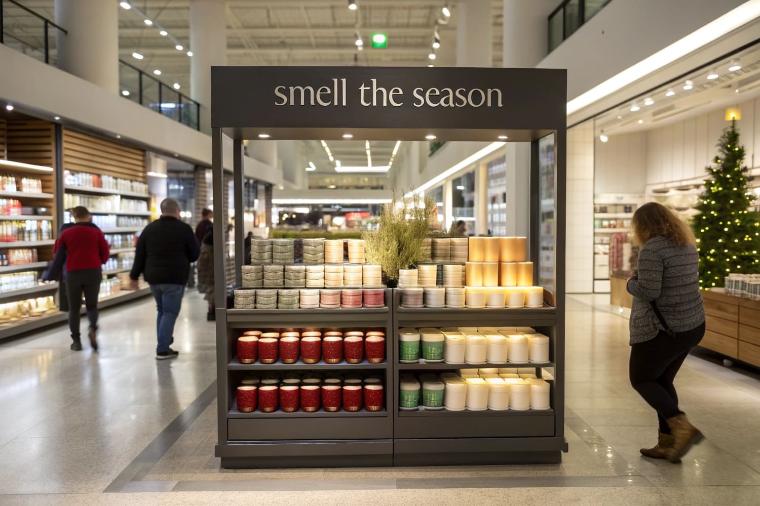
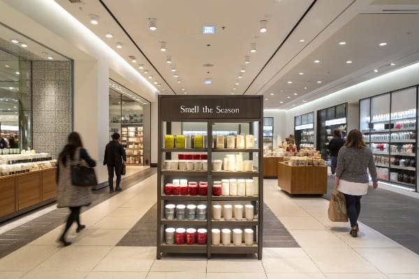
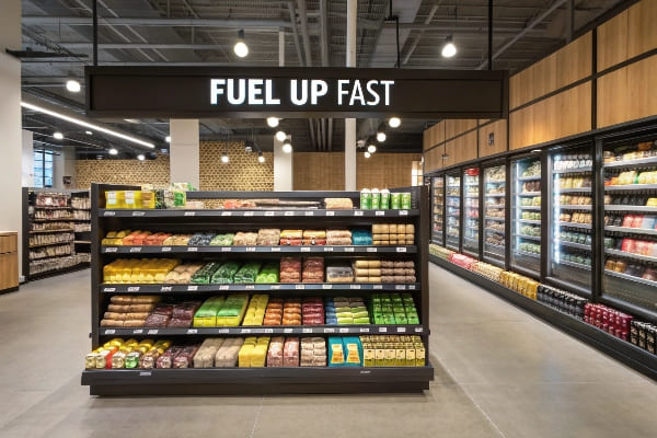
Picture a busy store aisle. Shoppers move fast. I place a bright endcap at the corner. They stop, look, and pick. Sales start rising at once.
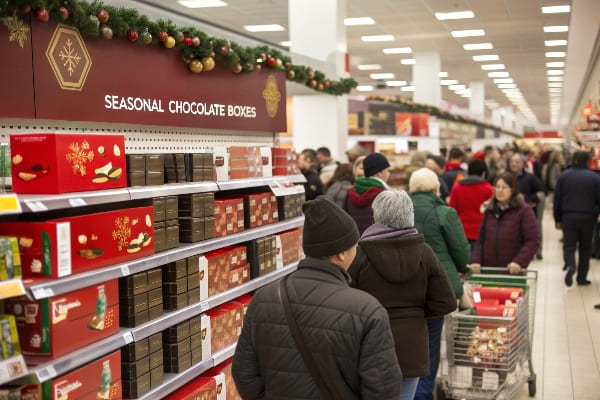
Endcap displays lift sales because they sit where traffic is highest, show one clear offer, remove shelf clutter, and give products the power of a mini billboard, turning passing interest into impulse buys in seconds.
That is the quick answer, but the idea has many layers. Stay with me and I will break each layer apart so you can use end caps like a pro.
Do end caps increase sales?
Many buyers doubt the numbers. I once ran two similar promotions, one on a shelf and one on an endcap. The difference in sell-through shocked even my finance team.
Yes, end caps can double or even triple sales in a single promotion period by moving products into the line of sight and simplifying choice, especially for seasonal or impulse items.
Real store results
Two months ago I ran a split test with a large chain in Texas. We placed my custom printed cardboard crossbow display on an endcap in twenty stores. In twenty other stores the same crossbows stayed on the main shelf. The promotion lasted one week, price and media support were identical. The outcome was clear.
| Store Type | Category | Shelf Sell-through | Endcap Sell-through | Lift |
|---|---|---|---|---|
| Rural Big Box | Outdoor | 14% | 33% | 2.4× |
| Suburban Big Box | Outdoor | 11% | 28% | 2.5× |
| Urban Compact | Outdoor | 8% | 19% | 2.3× |
The extra volume was not the only win. The chain re-ordered within ten days, which locked future space for my client. They also charged a placement fee that more than covered my production cost, so the retailer won as well.
Why the lift is real
The numbers repeat across many lines because end caps1 intercept natural traffic flow. Shoppers turn corners; their eyes land on the display before they scan shelf strips. The display offers one message and full stock, so they decide fast. The main shelf often looks crowded and forces comparison. That delay kills impulse. End caps remove the delay, so even premium items, like hunting tools, move faster. When I design the board structure to match the brand story, shoppers treat the display as part of the product value. That perceived value lets the retailer resist discounting, preserving margin.
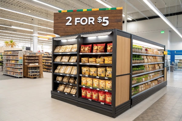
How does the display enhance your sales?
An endcap is more than extra space. It is a silent seller that works day and night. When designed well it draws the eye, then the hand, then the wallet.
The display boosts sales by telling one clear story, cutting search time, and providing instant proof of value through bold graphics, stacked inventory, and limited-time cues.
Clear narrative wins
A shopper’s brain wants quick reward. The endcap display, when printed with one dominant headline and a single product family, simplifies the choice loop. There is no neighbouring brand shouting in the same frame. This clarity cuts cognitive load2 and keeps feet from moving on.
Five senses approach
I always combine sight, touch, and sometimes sound. For a recent fishing rod launch we hung one demo rod on a hook in front of the boxed inventory. Shoppers felt the grip, then placed a box in the cart. The conversion rate3 almost tripled versus boxed stock alone. Scent diffusers or motion LEDs can add another layer, but even basic tactile elements work.
| Element | Method | Result |
|---|---|---|
| Bold headline | 5-word benefit | Stops traffic |
| Touch point | Unboxed sample | Raises trust |
| Stacked stock | Full facing | Signals availability |
| Limited badge | Red circle | Drives urgency |
Proof from reorder cycles
My business lives on repeat orders4. Endcap promotions finish fast but they spark sustainable lift. After one well-executed week the baseline shelf sales often stay up by 10-15 % because shoppers remember the product. That long tail is hidden profit.
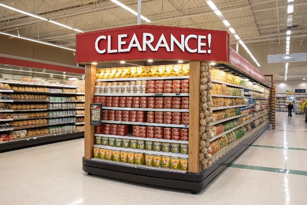
How is an end cap an effective display?
Effectiveness comes from the mix of location, design, and stock. I learned this while helping a hunting brand launch a new crossbow using a rugged, themed endcap.
An end cap works because it marries high traffic, visual hierarchy, and product availability into one compact scene that removes choice overload and drives quick action.
Location is leverage
The end of an aisle is free advertising space that every shopper must pass. Retailers monetize that space because it delivers more eyes per hour than any other square foot. When I negotiate placement for a client, I compare traffic counter data to support the cost.
Design removes doubt
Effectiveness also relies on visual hierarchy5. Large image, short headline, clear price. I print the price on a removable card so staff can update without damaging the art. The cardboard frame holds weight tests of 40 kg, so the display never bows. Straight lines signal quality.
| Design Rule | Reason | Do |
|---|---|---|
| One color family | Prevent noise | Match brand palette |
| 45-degree sight line | Align with shopper eye movement | Angle header panel |
| No more than 3 SKUs | Remove confusion | Feature hero SKU |
Stock guarantees trust
A half-empty display signals neglect. I instruct merchandisers6 to refill at 60 % capacity. That small discipline keeps conversion high7 through the whole promotion. No fancy tech is needed; just clear guidelines and a photo checklist.
What is the end cap in sales?
In sales jargon, an end cap is real estate at the aisle end. To me it is rented attention, priced by space but paid back in volume.
An end cap in sales is a premium merchandising zone designed to capture passing shoppers and convert them with a focused offer.
Definition and context
In sales language an end cap is an off-shelf display placed at the aisle head or tail. Retailers treat it as promotional real estate8 and often charge for the slot. Brands treat it as a shortcut into the shopper’s path.
Financial view
I treat an end cap like any other investment. The fee, the display cost, and the stock load all go in the left column. Lift in unit sales, brand exposure value9, and retailer partnership benefits go in the right column. If right beats left by a safe multiple, I green-light. That simple math keeps my factory busy but not reckless.
| Cost Item | Typical Share | Note |
|---|---|---|
| Placement fee | 30 % | Negotiable with multi-store deal |
| Display production | 20 % | One-time, reusable if flat-pack design |
| Inventory | 50 % | Should move within promotion |
Brand touchpoint
Unlike digital ads, an end cap lets shoppers inspect the real product. They can lift it, judge weight, and decide. That tactile experience builds trust faster than pixels do.
What is the purpose of end caps?
Every display must earn its keep. The purpose of mine is simple: stop traffic, tell one idea, and clear stock fast without cannibalizing the main shelf.
The core purpose of an end cap is to create urgency, focus attention on a single promotion, and deliver quick lift while supporting brand image.
Traffic stopper
The first purpose is to slow the shopper. Retail psychology shows that any obstacle or novel sight at the aisle edge causes a micro-pause. That pause is enough for the eye to lock onto the offer.
Message amplifier
A shelf tag holds maybe ten square centimeters. An end cap header10 holds ten thousand. I use that canvas to amplify one core message. For my crossbow client we printed a life-size deer image. Hunters immediately pictured use cases.
| Purpose | Outcome |
|---|---|
| Interrupt path | Higher dwell time |
| Isolate offer | Faster choice |
| Add theatre | Stronger memory |
| Provide excess stock | Fewer out-of-stocks |
Speed seller
End caps also serve the retailer. By pushing volume fast they free up warehouse space and cash. That makes the store manager see the brand as a partner, not a space renter.
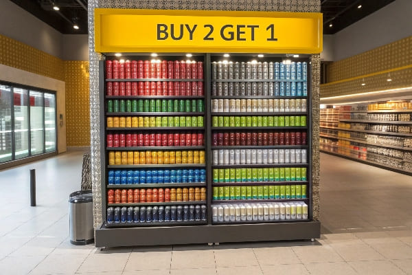
How to display stock and promotional materials to attract attention and increase sales?
Good stock flow keeps the endcap alive. I follow a simple rule: stack high, face forward, and refill before a gap shows. The graphics tell the offer instantly.
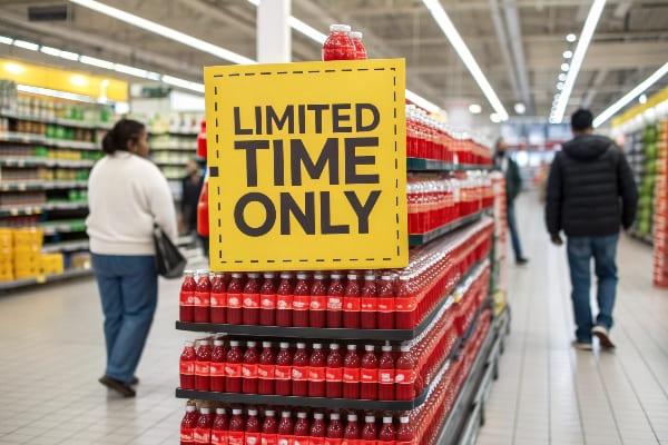
Show plenty of product, keep graphics bold yet clear, use contrasting colors, add a price callout, and refresh daily to keep shoppers engaged.
Stock management basics
Full stock equals perceived popularity. I design displays with adjustable shelves so staff can fit different box heights. Refill plans tie to store traffic patterns. High-volume hours get on-the-hour top-ups. Low-volume hours get end-of-shift checks.
Graphics for grabs
Graphics must speak from three meters away. Large product photo, benefit headline, and a price flag that breaks the color scheme just enough. I avoid fancy fonts because they slow reading. The entire message should land in one second.
| Task | Simple Action | Why it Works |
|---|---|---|
| Keep boxes flush | Use front rail | Removes gaps |
| Signal scarcity | Add countdown sticker11 | Sparks FOMO |
| Use color contrast | Yellow on black | Eye snaps to price |
| Offer demo | Mount one sample | Converts touch to buy |
Daily refresh routine
At close I instruct staff to pull empty cartons and wipe scuffs. I also rotate the front row to keep fresh boxes up front. These small tasks keep the display looking new. Shoppers notice care; they reward it with basket share. When the promotion ends, the flat-pack boards fold down and ship back to my plant for recycling, cutting waste fees.
Conclusion
Endcap displays are small stages that convert motion into money. When I place them right, design them clear, and keep them full, they push both revenue and brand value up.
Explore how end caps can enhance product visibility and sales, making them a crucial element in retail strategy. ↩
Understanding cognitive load can help retailers design better shopping experiences that enhance customer satisfaction and sales. ↩
Exploring strategies to improve conversion rates can provide valuable insights for increasing sales and customer engagement. ↩
Learning about the advantages of repeat orders can help businesses develop strategies for customer retention and long-term profitability. ↩
Understanding visual hierarchy can enhance your design skills, ensuring effective communication and engagement in your projects. ↩
Exploring best practices for merchandisers can help optimize retail strategies and boost sales effectively. ↩
Learning strategies to maintain high conversion rates can significantly impact your business’s profitability and success. ↩
Exploring promotional real estate can help you optimize your marketing efforts and maximize product visibility in stores. ↩
Learning about brand exposure value can provide insights into improving your brand’s presence and sales performance. ↩
Exploring end cap headers can provide insights into effective merchandising techniques that boost product visibility and sales. ↩
Discover how countdown stickers can effectively drive sales by creating a sense of urgency among customers. ↩