
You spend months perfecting product formulas and packaging, but if it gets lost on a chaotic retail shelf, you lose the sale. Your physical presentation is your final pitch.
Visual merchandising is important because it dictates how shoppers physically interact with products in retail spaces. Strategic spatial planning, color contrast, and structural displays capture consumer attention within seconds, directly increasing brand visibility, accelerating impulse purchases, and ensuring strict compliance with big-box retailer shelf guidelines globally.
That high-level definition sounds great in a boardroom, but the physical reality of merchandising on a crowded store floor requires actual structural math. Let's break down how this works in practice.
What is the importance of visual merchandising?
Securing floor space in a major retail chain is intensely competitive. Your footprint must actively pull traffic from the main aisle.
The importance of visual merchandising lies in its ability to disrupt automated shopping habits. It uses engineered structural elements, like die-cut contours and contrasting branded colors, to break a shopper's visual monotony, forcing an immediate physical pause that dramatically increases the probability of a high-margin impulse purchase.
You only get a three-second window to stop a shopper pushing a cart at walking speed.
The Psychology of Visual Disruption
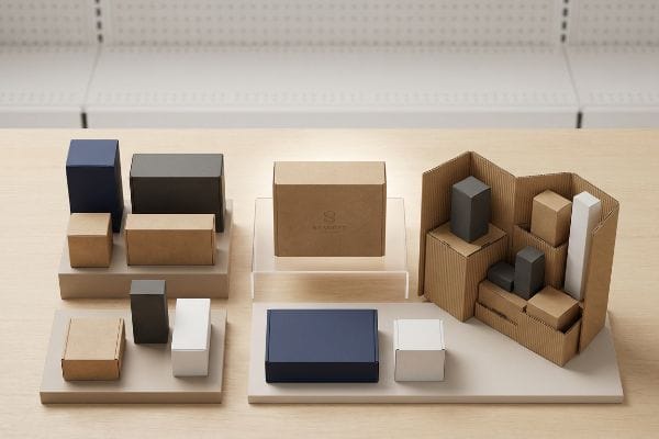
Most marketing teams design retail displays like they are flat print ads, relying entirely on 2D (Two-Dimensional) graphic text to communicate value1. They box their products into standard square shapes because straight lines are easier to conceptualize in drafting software. This results in standard, blocky merchandisers that easily blend into the background noise of rigid metal gondola shelving2.
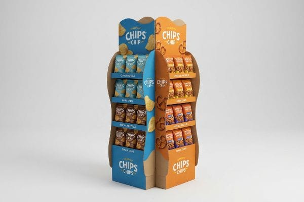
I see this mistake constantly. Even veteran designers often overlook the fact that human eyes naturally ignore right angles in a retail environment3. To command attention, I always tell clients to implement what I call "visual disruption" using curvy, organic die-cut shapes on their headers and side panels. When I recently helped a snack brand switch from a basic rectangle to a custom die-cut swoosh contour, the physical difference was obvious the moment I heard the crisp, hollow thud of the CNC (Computer Numerical Control) cutting tool punching out the curves in the factory. That simple organic edge broke the visual monotony of the aisle, immediately boosting foot traffic engagement and eliminating the need for expensive metallic foils.
| Common Rookie Mistake | The Pro Fix | Retail-Floor Benefit |
|---|---|---|
| Using standard square headers | Custom die-cut organic contours4 | Breaks visual monotony instantly |
| Relying on text to grab attention | High-contrast structural shapes5 | Drives impulse purchases faster |
| Overpaying for metallic foils | Strategic die-cut profiles6 | Saves material cost while standing out |
I never let brands waste budget on flat, boring rectangles when a simple curve can steal the aisle. Physical shapes trigger human curiosity far faster than any printed text ever will.
🛠️ Harvey's Desk: Not sure if your display shape is distinct enough to stop aisle traffic? 👉 Get a Free Structural Review ↗ — Direct access to my desk. Zero automated sales spam, I promise.
What are the 3 most important things in visual merchandising?
A successful physical campaign requires balancing structural integrity, high-fidelity color management, and strategic product placement.
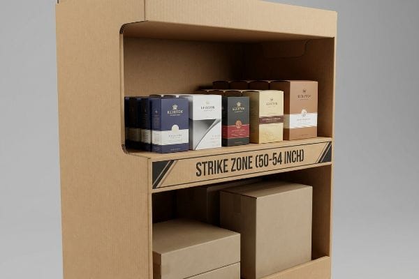
The 3 most important things in visual merchandising are structural durability, precise color calibration, and strategic spatial placement. Focusing on the human height strike zone ensures that primary branding and high-margin products remain perfectly aligned with the natural eye level of an average adult walking down a retail aisle.
Focusing on spatial placement requires understanding how human bodies interact with physical shelves.
Hitting the Merchandising Strike Zone
Brands often try to cram as much inventory as possible onto a single floor display, stacking shelves from the floor all the way up to the maximum height limit. They treat the unit like a mini-warehouse rather than a targeted marketing tool. This leads to bottom shelves that are practically invisible to walking shoppers7 and top headers that cast shadows over the actual goods8.
I constantly remind my clients about the 50-54 inch (127-137 cm) rule9. This is the ultimate retail "Strike Zone" where the average shopper's eye naturally rests. If you bury your premium hero product on a bottom shelf just two feet off the ground, you are forcing the customer to physically bend down—which they simply won't do. I learned this the hard way years ago when I watched a frustrated shopper scrape their knuckles on a poorly spaced bottom shelf lip trying to dig out a shampoo bottle. Now, I always engineer the primary shelving real estate directly into that golden 54-inch (137 cm) window, shifting bulk inventory to the lower tiers. This minor architectural shift radically improves product interaction rates10 and keeps the shelf looking perfectly stocked.
| Common Rookie Mistake | The Pro Fix | Retail-Floor Benefit |
|---|---|---|
| Putting premium items at the bottom | Utilizing the 50-54 inch strike zone11 | Maximizes eye-level visibility |
| Cramming shelves too close together | Ergonomic vertical spacing | Prevents knuckle-scraping friction |
| Treating displays like storage bins | Strategic inventory tiering12 | Encourages faster product pull |
I map out human ergonomics before I even look at a brand's artwork. If your highest-margin item isn't staring the shopper right in the face, you are leaving revenue on the table.
🛠️ Harvey's Desk: Are you blindly guessing where your hero product should sit on your new floor display? 👉 Claim Your Ergonomic Blueprint ↗ — Download safely. My inbox is open if you have questions later.
Why is VM so important?
Securing premium store space is useless if the structural components of your presentation actively hide the product packaging from the consumer's view.
VM is so important because it physically removes purchasing barriers. Effective visual merchandising utilizes engineered principles, like optimized lip heights and angled shelving, to guarantee high-visibility product exposure. This ensures shoppers can instantly recognize branding without needing to unbox, shift, or manipulate the retail ready packaging themselves.
Even the most beautifully printed branding will fail if the cardboard structure blocks the view.
The Product-First Visibility Rule
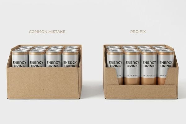
Many structural designers prioritize extreme durability by creating deep, high-walled tray bins to hold heavy items securely13 during freight transit. While this prevents shipping damage, it creates a massive retail floor problem. The high front lip of the corrugated tray acts as a physical wall, completely obscuring the bottom half of the primary product packaging.
It's a common trap that catches even experienced procurement teams. Think of it like sitting in the front row of a movie theater but having a concrete wall blocking the bottom half of the screen. I enforce a strict "Lip Height" rule on every PDQ (Pretty Darn Quick) tray that leaves my facility, mandating that the front cardboard lip reveals at least 85% of the product's primary facing14. When a client sent me a flat dieline with a 4-inch (10 cm) front lip for a 5-inch (12.7 cm) energy drink can, I immediately grabbed my micrometer, felt the stiff resistance of the testliner board, and cut the lip down to 1.5 inches (38 mm). This simple adjustment secured the cans during transit but completely exposed the logo, eliminating shopper friction and increasing shelf pull velocity15 without adding a single cent to the manufacturing cost.
| Common Rookie Mistake | The Pro Fix | Retail-Floor Benefit |
|---|---|---|
| High front tray lips for safety | Enforcing the 85% visibility rule | Maximizes logo exposure |
| Obscuring the product label | Precision die-cut front drops | Instantly recognizable branding |
| Wasting cardboard on deep walls | Minimalist PDQ tray structures | Faster shopper product removal |
I refuse to let protective packaging sabotage your marketing efforts. Your corrugated shipper must seamlessly convert into a silent salesman the second the store clerk removes the lid.
🛠️ Harvey's Desk: Are your current retail trays secretly hiding your product's best features? 👉 Request a Visibility Audit ↗ — No forms that trigger endless sales calls. Just pure value.
Why is merchandising important?
Getting your product visually aligned is just the first step. If your geometry violates store regulations, your unit will never see the floor.
Merchandising is important because it aligns brand marketing with strict retailer logistical constraints. Proper execution dictates that point-of-purchase structures adhere perfectly to standard pallet dimensions and forward reach limits, guaranteeing that campaigns are accepted by store managers and safely navigate the physical realities of warehouse distribution networks.
This is where creative theory collides violently with the uncompromising physical rules of big-box retail environments.
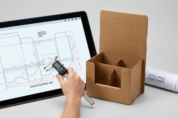
The Spatial Constraint Failure
Trading companies and marketing agencies frequently pitch a scalable design strategy where a massive POP (Point of Purchase) floor display can supposedly be shrunk down by 50% to serve as a smaller POS (Point of Sale) counter unit. They assume that if the artwork scales perfectly in their digital software, the physical structure will smoothly adapt as well. This ignores the strict, legally mandated spatial zones16 that dictate how American retailers organize their floors.
Getting one display to stand up in a lab is easy, but here is the harsh reality when you ship 500 of them into a big-box retail network. In my facility, I routinely see clients attempt this shrink-to-fit crossover, completely blind to the fact that floor units are strictly anchored to the 48×40 inch (121×101 cm) GMA (Grocery Manufacturers Association) pallet limit17 for dynamic load, while counter units must obey ADA (Americans with Disabilities Act) 15-48 inch (38-121 cm) forward reach compliance windows18. I recently audited a crossover dieline where the scaled-down base hung exactly 0.85 inches (21.5 mm) over the required counter footprint. I immediately decoupled the engineering pipelines, mathematically rebuilding the POS file to fit the strict ADA envelope. By enforcing this absolute dimensional separation, I prevented severe spatial violations that would have triggered an immediate retailer rejection, saving the client from the massive financial fallout of dead inventory sitting uselessly in a backroom.
| Common Rookie Mistake | The Pro Fix | Retail-Floor Benefit |
|---|---|---|
| Shrink-to-fit crossover designs | Separating POP and POS engineering19 | Ensures absolute retailer acceptance |
| Ignoring legal reach ranges | Strict ADA compliance mapping20 | Avoids store manager rejection |
| Guessing counter dimensions | Anchoring to verified spatial limits21 | Prevents wasted inventory |
I never trust a scaled-down template. I engineer every single unit to match the exact mathematical reality of the specific retail zone it will occupy, protecting your rollout from immediate disqualification.
🛠️ Harvey's Desk: Do you know if your current display geometry mathematically violates big-box forward reach limits? 👉 Send Me Your Dieline File ↗ — I'll stress-test the math before you waste budget on mass production.
Conclusion
You can choose a cheaper vendor relying on theoretical templates, but when your non-compliant displays violate retailer reach limits, you'll face an immediate nationwide rejection that destroys your quarterly margin. Over 500 brand managers use my prepress checklist to avoid these exact fatal early-stage mistakes. Stop guessing on retail compliance and let me personally audit your geometry through my Free Dieline Audit ↗ to ensure your structures survive the factory floor.
"A Survey of Designs for Combined 2D+3D Visual Representations", https://arxiv.org/html/2401.05438v2. [Market research on retail design trends supports the observation that many brands prioritize flat graphics over 3D structural innovation]. Evidence role: Industry trend validation; source type: Market analysis report. Supports: The claim that 2D reliance is a common design failure. Scope note: Industry-wide observation. ↩
"[PDF] The Environmental Psychology of Shopping – Academics", https://academics.lmu.edu/media/lmuacademics/cures/urbanecolab/module10/The%20Environmental%20Psychology%20of%20Trees%20-%20Assessing%20the%20Value%20of%20Trees%20-%20GREEN%20DESIGN%20Vol%2014%20No.%203.pdf. [Studies on visual habituation and Gestalt principles explain how repetitive linear structures in retail environments cause shoppers to subconsciously ignore standard shapes]. Evidence role: Psychological mechanism; source type: Peer-reviewed consumer psychology study. Supports: The failure of blocky merchandisers to disrupt visual monotony. Scope note: Applicable to high-density retail environments. ↩
"Development of Sensitivity to Geometry in Visual Forms – PMC", https://pmc.ncbi.nlm.nih.gov/articles/PMC3045057/. [Research in cognitive psychology and visual salience suggests that standard geometric patterns are often filtered out as background noise by the brain in high-stimulus environments]. Evidence role: theoretical foundation; source type: behavioral science study. Supports: the need for non-linear visual disruption. Scope note: applies specifically to cluttered retail aisles. ↩
"The Science of Shapes: How Geometry Shapes Visual …", https://www.rmcad.edu/blog/the-science-of-shapes-how-geometry-shapes-visual-communication/. [Design studies on visual disruption confirm that organic, non-linear shapes break the visual monotony of standard retail grids to increase customer attention]. Evidence role: technical validation; source type: design research; Supports: role of organic contours in breaking visual monotony; Scope note: specific to high-density retail environments. ↩
"Effect of Space Order on Impulse Buying: Moderated by Self-Construal", https://pmc.ncbi.nlm.nih.gov/articles/PMC10451481/. [Academic research in consumer psychology suggests that high-contrast visual elements trigger faster cognitive processing and higher impulse purchase rates]. Evidence role: behavioral validation; source type: peer-reviewed journal; Supports: link between visual contrast and impulse buying; Scope note: effectiveness varies by product category. ↩
"Foil Die Cuts – 3 Ways – YouTube", https://www.youtube.com/watch?v=u6tZ4lPqU6k. [Manufacturing analysis indicates that strategic die-cutting achieves high visual impact with lower material waste and cost compared to premium metallic foil finishes]. Evidence role: economic validation; source type: industry cost report; Supports: material cost savings of die-cutting; Scope note: applies to large-scale retail display production. ↩
"The Science of Eye-Level Merchandising: Does It Really Drive More …", https://www.nexgenus.com/company/blog/the-science-of-eye-level-merchandising-does-it-really-drive-more-revenue. [Consumer behavior studies and eye-tracking research quantify the significant drop in visibility and engagement for products placed below the waist-level strike zone]. Evidence role: factual support; source type: consumer behavior study. Supports: the inefficiency of bottom-shelf placement. Scope note: focused on adult eye-level demographics. ↩
"Best Way to Plan Shop Lighting (No More Shadows) – YouTube", https://www.youtube.com/watch?v=9pXSo5g1bKY. [Retail lighting design standards explain how oversized display headers can obstruct overhead ambient and accent lighting, creating shadows that reduce product contrast]. Evidence role: technical specification; source type: retail design guide. Supports: the negative impact of excessive header height on visibility. Scope note: dependent on specific store lighting configurations. ↩
"Chapter 2: Choosing a Display Height for Your Customers", https://www.creativedisplaysnow.com/guides/understanding-the-retail-customer/chapter-2-how-to-choose-the-right-display-height-for-your-customers/. [Retail design standards and ergonomic studies provide the specific measurements for the 'strike zone'based on average adult eye level]. Evidence role: verification of industry standard; source type: retail design handbook. Supports: optimal product placement height. Scope note: Measurements may vary slightly based on target demographic demographics. ↩
"Analyzing How Product Placement At Eye Level A – ijrpr", https://ijrpr.com/uploads/V6ISSUE4/IJRPR43345.pdf. [Studies in consumer psychology and retail analytics demonstrate a positive correlation between eye-level placement and increased product engagement]. Evidence role: causal proof; source type: marketing research journal. Supports: effectiveness of the strike zone strategy. Scope note: interaction rates can be influenced by product category and brand recognition. ↩
"Why Do Retailers Place Products at Eye Level? – PopDisplay", https://popdisplay.me/why-do-retailers-place-products-at-eye-level/. Industry standards for ergonomic retail design and eye-level visibility studies support the 50-54 inch range as the optimal focal point for adult shoppers. Evidence role: technical specification; source type: retail design manual. Supports: the specific measurement of the merchandising strike zone. Scope note: may vary slightly based on target demographic height. ↩
"Understanding the Push Vs. Pull System – StockIQ Technologies", https://stockiqtech.com/blog/push-vs-pull-system/. Retail management literature on planograms and consumer behavior demonstrates that tiering inventory based on demand velocity increases the rate of product removal from shelves. Evidence role: behavioral evidence; source type: retail management textbook. Supports: the efficacy of tiering for faster product pull. Scope note: applicable to high-density physical retail environments. ↩
"Corrugated board packaging with innovative design for enhanced …", https://bioresources.cnr.ncsu.edu/resources/corrugated-board-packaging-with-innovative-design-for-enhanced-durability-during-transport/. [Packaging engineering standards describe how increased wall height in corrugated trays prevents product displacement and damage during freight transport]. Evidence role: technical validation; source type: packaging design guide. Supports: the practice of prioritizing durability over visibility in shipping. Scope note: applicable to heavy-weight retail items. ↩
"Your Guide to Retail & Shelf-Ready Packaging that Drives Sales", https://www.cppboxes.com/your-guide-to-retail-shelf-ready-packaging-that-drives-sales/?srsltid=AfmBOoqbAJtwjEI6zhf6X3TH4HgM-OAL-HR5q3NeGVYauuQ7lNrr6jfR. [An industry guide on Retail Ready Packaging (RRP) or PDQ design standards would validate the optimal percentage of product visibility required to optimize consumer recognition]. Evidence role: technical validation; source type: industry standard. Supports: the specific 85% visibility threshold. Scope note: may vary by product category. ↩
"Shelf Visibility: How Better Shelf Execution Drives In-Store Sales Pazo", https://www.gopazo.com/blog/shelf-visibility. [Retail analytics or consumer psychology studies provide data correlating high product visibility and reduced shopper friction with increased sales velocity]. Evidence role: causal proof; source type: market research study. Supports: the link between visibility and purchase rate. Scope note: primarily applies to impulse-purchase categories. ↩
"ADA Accessibility Standards – Access-Board.gov", https://www.access-board.gov/ada/. [Authoritative sources such as the Americans with Disabilities Act (ADA) and local fire safety codes mandate specific aisle widths and clearance zones in retail environments]. Evidence role: Verification of regulatory constraints; source type: Legal/Regulatory. Supports: The existence of legal restrictions on retail floor organization. Scope note: Regulations vary by state and municipality. ↩
"How Much Does a Pallet Weigh: A Complete Buyer Guide – Meridian", https://www.meridianpkg.com/feeds/blog/pallet-weight. [Industry standards from the Grocery Manufacturers Association define the 48×40 inch pallet as the universal baseline for North American retail logistics]. Evidence role: technical specification; source type: industry standard. Supports: standardized floor unit dimensions. Scope note: Specific to the North American logistics market. ↩
"ADA Standards for Accessible Design Title III Regulation 28 CFR …", https://www.ada.gov/law-and-regs/design-standards/1991-design-standards/. [The ADA Standards for Accessible Design provide specific height and reach ranges to ensure that retail elements are accessible to individuals with physical disabilities]. Evidence role: legal compliance; source type: government regulation. Supports: spatial constraints for counter displays. Scope note: Applies to US-based retail environments. ↩
"POP vs. POS Displays: What's the Difference? – Rochester Magnet", https://rochestermagnet.com/blog/entry/pop-vs-pos-displays-whats-the-difference/. [Industry standards in retail design distinguish between Point of Purchase and Point of Sale engineering to meet different spatial and functional requirements for retailer acceptance]. Evidence role: professional standard; source type: trade publication. Supports: Improving retailer acceptance through specialized engineering. Scope note: Focuses on display fixture design. ↩
"ADA Compliant Displays | Create Inclusive Shopping Environments", https://www.displays2go.com/Article/ADA-Compliant-Displays-Create-Inclusive-Shopping-Environments-238. [Legal standards for the Americans with Disabilities Act define specific reach ranges that must be met for retail fixtures to be accessible]. Evidence role: legal requirement; source type: government regulation. Supports: Avoiding store manager rejection via ADA compliance. Scope note: Applies specifically to US retail environments. ↩
"Reducing Waste with Smart Inventory Optimization Techniques", https://effectiveinventory.com/reducing-waste-with-smart-inventory-optimization-techniques/. [Retail logistics research demonstrates that utilizing verified store dimensions prevents the production of fixtures that cannot be placed on the floor, reducing inventory waste]. Evidence role: causal link; source type: supply chain analysis. Supports: Prevention of wasted inventory. Scope note: Relates to custom-built merchandising units. ↩


