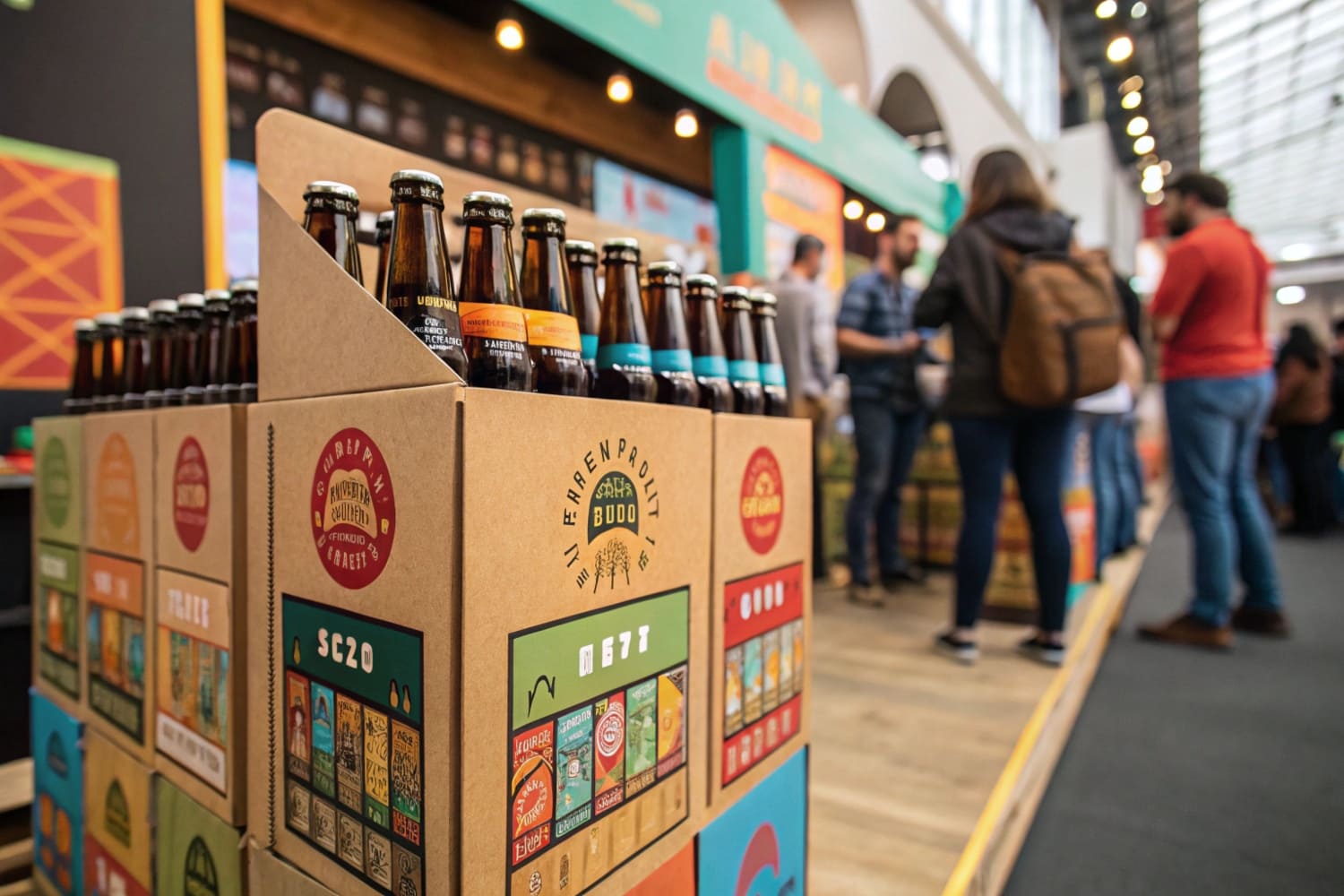
Beer is an impulse buy, but if your product is hidden on a messy shelf, you are invisible. A custom display is the only way to stop the shopper's cart.
Beer displays (Point of Sale Merchandising Units) are specialized freestanding fixtures designed to showcase beverage products in high-traffic retail areas. These units, typically ranging from 48 to 60 inches (122–152 cm) in height, utilize reinforced corrugated structures to support heavy liquid loads while increasing brand visibility and driving impulse purchases.
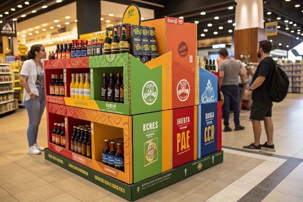
But simply putting cardboard on the floor isn't enough; the engineering has to handle the weight and the environment.
What is the point of a widget in beer?
Premium widgets create draft-quality foam, but invisible tech doesn't justify a $15 price tag. Your display must visually scream "creamy texture" to stop shoppers from grabbing the cheaper domestic lager.
The point of a widget in beer (Nitrogen Release Device) is to surge gas through the liquid upon opening, creating a creamy head and smooth texture similar to a draft pour. This technology differentiates premium stouts and ales from standard carbonated lagers, justifying a higher price point on the retail shelf.
The Strategic Anatomy of Value Communication
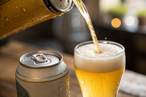
You have this incredible technology inside your can—the widget—that makes the beer taste like it was poured from a tap. But here is the brutal truth: the customer walking down the aisle at a massive retailer like Walmart or Kroger doesn't know it's there. They just see a can that costs $2 more than the domestic lager next to it. If your display doesn't scream the value proposition, you lose. I learned this the hard way with a craft brewery client last year. They had a nitrogen-infused IPA, but they treated the display artwork like wallpaper—just a logo and a color. Sales were flat. Why? Because nobody reads the tiny text on a can. We had to redesign the entire header card to feature a "visual explosion" graphic showing the widget in action.
To get that visual to pop, we couldn't use standard digital printing. We switched to Lithographic printing1, which uses wet ink plates instead of digital toner. Digital is fine for 50 units, but for a rollout, it looks flat and grainy because of "Dot Gain"—where the ink soaks into the paper and spreads. Litho gives you that glossy, high-definition magazine look that makes the condensation on the beer glass look real. But there is a technical snag here: Color Management. You approve a design on a bright RGB MacBook screen, but we print in CMYK ink on paper. I've seen vibrant "Nitrogen Blue" turn into a muddy gray on the press. It looks cheap.
That is why I now insist on using the G7 Master Color Calibration2 standard. We don't guess. We use a spectrophotometer to match the specific Pantone (PMS) color of your brand. If the Delta-E (color difference) is off by more than 2.0, we stop the machine. It sounds obsessive, but when you are trying to convince a guy to buy a premium 4-pack, the blue has to look electric, not tired. Also, we had to fight the "Washboard Effect3." Standard B-Flute cardboard has waves that show through the print. To fix this for the premium look, I often switch to E-Flute4 or a Clay Coated News Back (CCNB) sheet, which provides a smoother surface for the ink to sit on, ensuring the text about the widget is razor sharp.
| Feature | Standard Digital Print | High-Fidelity Litho (Offset) |
|---|---|---|
| Color Space | CMYK (Limited Gamut) | Pantone + CMYK (Full Gamut) |
| Resolution | 150-300 DPI | 2400+ DPI |
| Substrate Impact | "Washboard" visible | Smooth, Premium Finish |
| Visual Impact | Flat, Matte, Grainy | Glossy, Vibrant, Premium |
| Ideal Use | Short-run prototypes | Mass retail rollouts |
The display is your silent salesman. If the print quality doesn't match the premium nature of the widget inside the can, the customer assumes the beer is low quality too.
Why use a beer glass?
Aromatics vanish in a can. To unlock the beer's full profile, customers need the right vessel. Merchandising glassware right next to the brew forces an immediate, high-margin upsell.
Use a beer glass to significantly enhance the sensory experience by optimizing aroma retention and carbonation release. Consequently, retailers leverage cross-merchandising displays to pair specific glassware styles (like tulips or snifters) with compatible brews, thereby increasing the average transaction value and reinforcing the brand's premium positioning.

Engineering the Cross-Merchandising Sidekick
It makes perfect sense to sell branded pint glasses right next to the beer. But physically getting them onto the shelf is a nightmare that most designers underestimate. We call these "Sidekicks" or "Power Wings"—those displays hanging off the side of the main aisle. Here is the messy reality: Glass is heavy, and it breaks. I had a disaster early in my career where we used standard cardboard hooks for a glassware promo. The humidity in the store rose, the cardboard softened, and the hooks tore right off. Glass shattered everywhere. It was a liability nightmare.
Since then, I strictly enforce the "Universal Bracket" System. I don't trust cardboard to hold glass. We install a reinforced metal S-Clip or a universal metal bracket that locks onto the steel gondola shelving. It costs about $0.40 more per unit, but it prevents your brand from being kicked out of the store for safety violations. But weight creates another problem: "Parasitic" Weight Distribution. When you load heavy pint glasses into a hanging display, gravity wants to pull the top of the display away from the shelf. It leans forward, looking sloppy and dangerous. To fix this, I engineer a "Trapezoidal Back Panel." We taper the back structure and use a double-layer corrugated spine right where the hook attaches. This keeps the center of gravity tight against the gondola wall.
And don't forget the "Sidekick" Height Standardization. A standard US gondola has specific slot spacing. If you design your sidekick to be 50 inches (127 cm) tall, it might drag on the floor or hit the shelf above. I standardize everything to exactly 48 inches (122 cm) height by 14 inches (36 cm) width. This ensures it fits 90% of US retail fixtures (like Lozier or Madix) without the store manager having to rearrange the entire aisle for you. We also have to use Safety Edge5 wave-cut blades on the cardboard openings. Why? Because when a customer reaches in to grab a glass, we don't want them getting a paper cut. Freshly cut cardboard is like a razor. It's these tiny details that stop a customer from suing you.
| Component | Standard Cardboard Spec | My "Glass-Ready" Spec |
|---|---|---|
| Mounting Hardware | Cardboard Tab | Metal Universal Bracket |
| Spine Strength | Single Wall (32 ECT) | Double Wall (48 ECT) |
| Max Load | 10 lbs (4.5 kg) | 35 lbs (15.8 kg) |
| Leaning Prevention | None | Trapezoidal Geometry |
Spending the extra forty cents on metal hardware isn't a cost; it's an insurance policy. If your display falls, you don't just lose the product; you lose the retailer's trust forever.
Why is beer gut a thing?
Biology dictates shopping behavior. Men with bellies hate bending down. If you place high-margin IPAs in the "Stoop Zone," you force your core demographic to ignore your product completely.
A beer gut (Abdominal Obesity) is the accumulation of visceral fat around the abdomen, typically caused by excess caloric intake and genetics. In retail ergonomics, this physical trait implies that the target male demographic may experience discomfort when bending, necessitating strategic product placement in the primary "Strike Zone" to maximize sales velocity.

The Ergonomics of the "Strike Zone" and Shopper Comfort
We can't ignore the physiology of the customer. The average beer shopper isn't doing yoga in the aisle; they don't want to crouch down. This brings us to the "Human Height" Heat Map, or what I call the "Strike Zone." Designers often make the mistake of putting the most profitable product on the bottom shelf because it looks "grounded" in the artwork. That is a fatal error.
The "Strike Zone"—the area of highest sales velocity—is exactly 50 to 54 inches (127–137 cm) from the floor. This is the "Eye-Level Buy Level." If your customer has a "beer gut" or simply values convenience, they are statistically unlikely to bend past 30 degrees to pick up a product. We relegate the bottom shelf (the "Stoop Zone") to bulk items or refill packs that people will work to get. The high-margin impulse cans go right at chest height. But sometimes, you have to put product on the bottom. So, how do we fix the visibility issue? I use the "Chin-Up" Angled Shelf. We engineer the bottom two shelves to angle upwards by 15 degrees. Instead of the label facing the customer's knees, the product "looks up" at their face. This simple structural tweak increases label readability by 100% for a shopper standing 3 feet away.
It also helps with the "Lip Height" Visibility Rule. Inexperienced designers make the front lip of the tray 3 inches tall to print a logo, hiding the beer label. I limit the lip to 1.5 inches (3.8 cm) or use a clear PVC window. If the customer can't see the brand without bending over, they keep walking. Furthermore, we must consider "Tier Sag6". If you put heavy cases on that bottom shelf, standard cardboard will bow. I reinforce the "Stoop Zone" with a hidden Metal Support Bar (a square steel tube) under the front lip. This ensures that even if the customer does look down, they see a clean, straight shelf, not a collapsing mess.
| Shelf Position | Shopper Behavior | Design Strategy |
|---|---|---|
| Top (60"+) | "Stretch Zone" | Lightweight / Signs only |
| Strike Zone (50-54") | "Impulse Zone" | Hero Product / New Flavors |
| Mid (30-50") | "Grab Zone" | Core Sellers |
| Bottom (0-30") | "Stoop Zone" | Bulk / Angled Shelves (15°) |
You aren't just designing a box; you are designing for the human body. If you make it hard for a guy with a belly to grab your beer, he will just grab the competitor's beer on the shelf above.
Why are beer glasses shaped differently?
A pilsner flute falls over easier than a pint. Odd shapes create display nightmares. If you don't engineer specific friction angles, your gravity feed becomes a glass-shattering liability.
Beer glasses are shaped differently (Geometric Variation) to enhance the specific aromatic and flavor profiles of different beer styles. Consequently, retail displays must utilize custom die-cut inserts and calculated friction angles to securely hold and dispense these irregular packaging shapes without breakage or jamming.
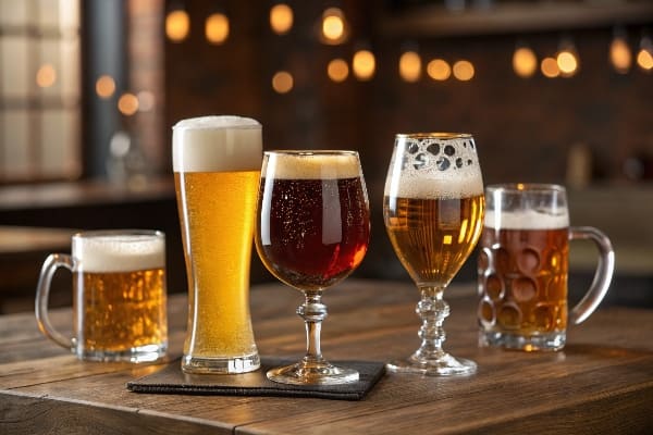
Gravity Feed Dynamics and Friction Coefficients
When we design displays for cans versus bottles, the physics changes completely. Cans are cylinders; they roll. Bottles are tapered; they roll crookedly. If you want a "Gravity Feed" display where the next beer rolls forward as one is taken, you can't just guess the angle. I've had production runs where we guessed the angle, and it was a disaster. Either the cans sat there and didn't move (angle too shallow), or they flew down like missiles and smashed into the front lip (angle too steep).
Now, we calculate the Coefficient of Friction7 based on the packaging material. For aluminum cans on a coated cardboard shelf, a 12-degree angle is usually the sweet spot. But for glass bottles, which have higher friction and irregular shapes, we often need 16 to 18 degrees. But the real nightmare is the "Fresh Tooling" Protocol. Custom shapes require complex die-cutting. If the cutting die (the knife mold) is old or rusty, you get "fuzzy edges" or burrs. On a gravity feed, a tiny burr of paper can act like a brake, stopping the can halfway down. It drives customers crazy. Unless a client has continuous monthly orders, I create a NEW cutting die for every batch. It costs me a bit more, but it ensures razor-sharp edges so the product flows smoothly.
We also have to consider the "Dump Bin Bulge8." If you just throw odd-shaped merchandise into a bin, the walls push out. It looks like the bin is pregnant. To fix this, I engineer an internal "H-Divider" or a "Belly Band" reinforcement structure hidden inside the bin. This acts like a skeleton, tying the front wall to the back wall. Even if you dump 50 lbs (22 kg) of product inside, the walls remain perfectly 90-degree vertical. And finally, for dry environments like Arizona, we use a specific "Anti-Crack" film lamination. Standard black ink cracks at the fold lines when the air is dry, showing white paper underneath. My lamination stretches, keeping the display looking black and premium.
| Variable | Aluminum Cans | Glass Bottles |
|---|---|---|
| Friction Angle | ~12 Degrees | ~16-18 Degrees |
| Risk Factor | Denting speed | Breakage/Stalling |
| Shelf Coating | Standard Varnish | High-Slip Varnish |
| Structural need | Rail Guides | Full Dividers |
A gravity feed that doesn't feed is just a broken shelf. We test your actual physical product on the line—shaking it, tilting it, rolling it—before we cut a single sheet for mass production.
Conclusion
Beer displays are heavy, high-risk, and essential for sales. Whether you need Free Structural 3D Rendering to visualize the load-bearing capacity or a Physical White Sample to test the gravity feed angle yourself, we handle the messy engineering so you don't have to. Get a Free Quote today and let's build a structure that actually lasts on the floor.
Explore the advantages of Lithographic printing for achieving high-quality packaging that stands out on shelves. ↩
Learn about G7 Master Color Calibration to ensure your printed colors are accurate and vibrant, enhancing product appeal. ↩
Discover techniques to eliminate the Washboard Effect for a smoother, more professional print finish. ↩
Find out how E-Flute enhances packaging quality by providing a smoother surface for printing. ↩
Discover the importance of Safety Edge in packaging design to prevent injuries and enhance customer experience. ↩
Discover how to prevent Tier Sag to maintain a clean and appealing product display, enhancing shopper experience. ↩
Understanding the Coefficient of Friction is crucial for optimizing product displays and ensuring smooth operation. ↩
Learn effective strategies to prevent Dump Bin Bulge, ensuring your displays remain visually appealing and functional. ↩
