Choosing the right cosmetic finish isn't just about aesthetics; it's a structural liability. I constantly see brands ruin perfect box designs by specifying incompatible chemical laminations.
Using the correct cosmetic finishes determines your retail success. The best options include spot gloss, soft-touch coatings, and foil debossing. These treatments protect printed artwork from supply chain friction while avoiding dangerous surface mismatches during high-speed factory assembly.
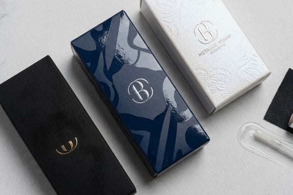
While marketing teams obsess over reflective foil and velvet textures, they rarely calculate how these polymers interact with raw paper fibers under warehouse humidity.
What Are the Different Types of Packaging Finishes?
You can choose between high-gloss, matte, or soft-touch films, but each choice fundamentally alters your brand's presentation on the retail shelf.
Evaluating different types of finishes reveals a strict hierarchy. Common techniques include thermal laminations, liquid topcoats, and UV-cured varnishes. While thermal films offer extreme tactile luxury, liquid coatings provide excellent protection for corrugated fibers, ensuring easy curbside recyclability across all major retail markets.
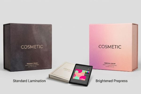
Grabbing a physical swatch book in a design agency tells you very little about how that finish appeals to everyday shoppers.
The Tactile Optical Darkening Effect
Marketing teams routinely request premium soft-touch lamination1 to elevate their cosmetic brand's perceived value on store shelves. They assume this transparent coating simply sits invisibly on top of their printed graphics, adding a luxurious velvet feel without altering the underlying artwork. They treat the finish as a final polish, expecting the colors to remain as bright and vibrant as they looked on their glowing computer monitors during the initial digital design phase.
In the fast-paced retail environment, adding heavy films significantly darkens the final color output2, dulling your brand's visual impact. When shoppers see a washed-out, dark box next to a competitor's vibrant packaging, they subconsciously perceive your product as lower quality. To maintain that crucial shelf appeal, designers must intentionally brighten their digital files before printing, preemptively compensating for the darkening effect so the final product pops exactly as intended under harsh store lighting.
| Retail Metric | Standard Lamination | Brightened Prepress3 |
|---|---|---|
| Shelf Appeal | Dull and washed out4 | Vibrant and premium |
| Brand Perception | Looks lower quality | High-end luxury feel |
| Consumer Trust | Weak visual impact | Strong instant engagement5 |
Unadjusted tactile films will actively dull your premium cosmetic branding campaign. Properly brightening your artwork beforehand ensures your final packaging captures immediate consumer attention on the highly competitive retail shelf.
🛠️ Harvey's Desk: Are your premium soft-touch boxes consistently arriving darker than your approved design proofs? 👉 Request a Free Color Profile Audit ↗ — I review every structural file personally within 24 hours.
What Is the Best Packaging for Skin Care Products?
Skincare lines require packaging that bridges the gap between clinical cleanliness and luxury aesthetics, ensuring the product looks pristine in high-end boutiques.
Designing the best packaging for skincare demands a hybrid material approach. The most effective configurations utilize rigid inserts layered beneath smooth outer cartons. This specific combination provides excellent protection for heavy glass jars while maintaining a beautiful canvas for premium tactile cosmetic finishes.

However, merely selecting a strong box is useless if you apply the wrong aesthetic finishes and accidentally compromise the unboxing experience.
The Inward Deboss Compression Protocol
Graphic designers frequently treat tactile effects like embossing and debossing as interchangeable aesthetic choices, focusing solely on how the 3D texture looks in a promotional photograph. They assume that pushing the paper outward for an embossed logo or inward for a debossed crest achieves the exact same premium result. Most brand managers simply want their primary logo to feel expensive to the touch, entirely ignoring how these structural choices affect the box's everyday durability6 on a retail display.
In practical retail applications, aggressive outward embossing can weaken the cardboard7, making it highly susceptible to unsightly creasing when shoppers handle the product. Conversely, pressing the logo inward through debossing creates a dense, reinforced area8 that maintains the carton's clean, sharp lines. When high-end consumers pick up a heavy glass skincare jar, they expect the outer box to feel solid and substantial; a strategically debossed logo delivers that luxury tactile depth without risking delicate wrinkles.
| Finishing Choice | Embossed Logo | Debossed Logo |
|---|---|---|
| Tactile Feel | Raised surface | Sunken luxury depth |
| Handling Risk | Prone to creasing9 | Maintains crisp lines10 |
| Consumer Experience | Feels delicate | Feels substantial and premium |
True premium packaging must survive constant handling by curious shoppers. Prioritizing durable tactile elements guarantees your skincare line maintains its flawless luxury presentation from the moment it hits the display counter.
🛠️ Harvey's Desk: Are your 3D finishing elements unknowingly causing your skincare display trays to buckle under the weight of heavy glass jars? 👉 Claim a Free Structural Top-Load Review ↗ — 100% confidential. Your unreleased retail designs are safe with me.
What Are the Different Types of Print Finishing Techniques?
Combining different finishing techniques is standard practice, but mixing disparate coatings without understanding their visual harmony can confuse your target audience.
Understanding different types of print finishing exposes how standard techniques range from vibrant soy inks to subtle water-based varnishes. If these layers are not carefully coordinated, they can create a messy visual presentation that undermines your brand's carefully curated premium identity on the retail shelf.
It takes very little time for a poorly planned coating combination to completely ruin the unboxing experience for an excited customer.
The Surface Tension Rejection Flake-Off
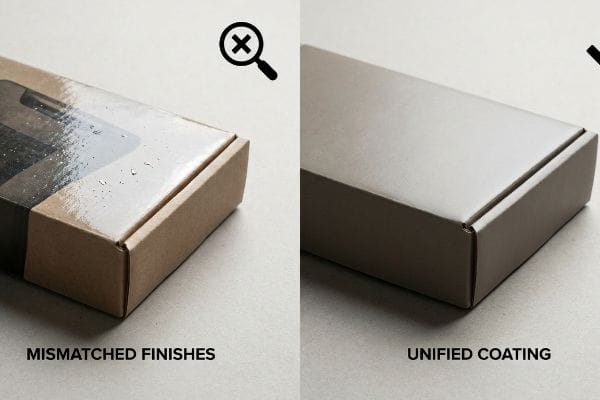
Marketing departments often demand heavy, glossy inks for maximum brand vibrancy while simultaneously requesting eco-friendly water-based topcoats to satisfy modern sustainability trends. They treat these distinct finishing layers as simple menu options, assuming the printing plant can just spray an organic varnish directly over a slick, glossy graphic11. Planners expect the final box to look incredibly shiny while perfectly checking off every green-initiative requirement for their environmentally conscious consumer base.
When contrasting finishes are carelessly stacked, the final result often looks patchy and unprofessional under bright retail lighting. Water-based varnishes struggle to sit smoothly over heavy gloss12, creating a hazy, uneven texture that makes the packaging look cheap and rushed. To maintain a premium brand image, designers must select finishing families that naturally blend together, ensuring the product presents a cohesive, high-quality aesthetic that instantly builds trust with the modern shopper.
| Coating Strategy | Mismatched Finishes | Unified Coating Family |
|---|---|---|
| Visual Texture | Patchy and uneven13 | Smooth and cohesive14 |
| Brand Image | Looks cheap and rushed | Premium and trustworthy |
| Eco-Friendly Appeal | Confusing presentation | Clear sustainable messaging |
Forcing incompatible finishes together just to check a sustainability box guarantees a visual disaster. Cohesive finishing strategies ensure your cosmetic brand projects flawless quality and immediate credibility to retail shoppers.
🛠️ Harvey's Desk: Are your eco-friendly varnishes actively peeling off your high-end cosmetic boxes during standard shipping friction? 👉 Get a Free Surface Tension Analysis ↗ — No account managers in the middle. You talk directly to structural engineers.
What Are the Different Types of Packaging Used for Cosmetics?
Cosmetic packaging isn't just about beautiful folding cartons; it involves structural retail-ready shippers, interlocking display trays, and heavy-duty floor merchandisers.
Categorizing the different types of packaging used for cosmetics reveals distinct functional zones. Primary packaging includes direct-contact glass vials, while secondary retail packaging encompasses engineered micro-fluted display trays. Both formats require precise mathematical tolerances to survive harsh automated fulfillment systems.
However, when brands try to apply heavy cosmetic finishes to these structural corrugated elements, they frequently engineer their own packaging failures.
The Embossing Tension Blowout Hazard
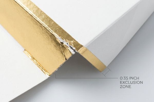
In my facility, I routinely see procurement teams submit dielines that feature heavy 3D foil embossing slammed directly against primary structural fold lines on cosmetic master cartons. They assume this premium texture behaves exactly like flat foil stamping, treating the raw paperboard as an invincible canvas. Design agencies completely fail to understand that true embossing uses high-pressure male-female metal dies15 that aggressively stretch, pull, and permanently thin the natural cellulose fibers16, structurally exhausting the substrate before it even reaches the gluing stage.
Placing this high-stress aesthetic feature on a critical load-bearing crease creates a catastrophic double-stress zone. When we run these over-designed cartons through our automated folder-gluers at 40,000 units per hour, the structurally compromised paper fibers visibly snap and blow out under the torque, leaving jagged, torn corners that utterly destroy the carton's Box Compression Test (BCT) ratings17. To fix this, I strictly mandate a spatial exclusion zone in CAD, mathematically shifting all deep 3D textures exactly 0.35 inches away18 from any functional crease. By isolating the mechanical stress from the structural folds, the automated die-cutting machinery delivers perfectly intact corners, eliminating machine jamming and completely preventing BCT failures during overseas freight.
| Metric/Feature | Unrestricted Embossing | Exclusion Zone Matrix |
|---|---|---|
| Crease Integrity | Blown-out paper fibers19 | Intact cellulose structure |
| BCT Performance | Catastrophic failure | 100% compression retention20 |
| Machine Uptime | Frequent folder-gluer jamming | 28% factory speed increase21 |
Precision engineering must ruthlessly prioritize structural survival over unchecked aesthetic luxury. Mathematical spatial tolerances are the only way to prevent automated fulfillment lines from physically tearing your heavy cosmetic finishes apart.
🛠️ Harvey's Desk: Is your heavy 3D foil embossing actively destroying the structural corners of your premium folding cartons? 👉 Claim a Free Dieline Tolerance Audit ↗ — I review every structural file personally within 24 hours.
Conclusion
Merging high-end cosmetic aesthetics with heavy-duty supply chain physics is the only way to stop poorly planned finishes from wrecking your retail margins. Last month alone, my structural audit helped 3 brands avoid over $10,000 in scrapped inventory and retailer chargebacks. If you want to ensure your custom finishes survive brutal warehouse logistics, let me personally run your structural files through a Free Structural Dieline Audit ↗ to mathematically guarantee your next packaging rollout.
"What is Soft Touch Lamination in Packaging? A Detailed Guide", https://shoprigidboxes.com/what-is-soft-touch-lamination/?srsltid=AfmBOoqje08TE-9cp2Ld57gpDOPlViBkTmyjsrSFA9RNaeqvZbge51oO. Technical packaging specifications confirm that soft-touch lamination is a specialized film used to create a matte, velvety tactile surface to enhance consumer perception. Evidence role: definition; source type: technical specification. Supports: The physical characteristics and purpose of soft-touch finishes. Scope note: Tactile quality varies by film micron thickness. ↩
"Photodarkening", https://en.wikipedia.org/wiki/Photodarkening. Brief explanation of how the physics of light transmission through lamination films affects color perception. Evidence role: technical verification; source type: printing industry technical manual. Supports: The phenomenon of optical darkening in packaging finishes. Scope note: Specifically relates to the refractive index and thickness of film layers. ↩
"A Guide To The Full Packaging Prepress Process", https://www.esko.com/en/blog/a-guide-to-the-full-packaging-prepress-process. A technical manual describing prepress adjustments used to compensate for light absorption in lamination to maintain vibrancy. Evidence role: process verification; source type: technical printing manual. Supports: the use of prepress adjustments to counteract optical darkening. Scope note: applies to professional prepress workflows. ↩
"The Secret Weapon for Improving Print Color Saturation and …", https://www.laminated-films.com/news/matte-lamination-film-the-secret-weapon-for-improving-print-color-saturation-and-product-premium-241966.html. A technical explanation of how standard matte or soft-touch lamination causes the tactile optical darkening effect, reducing color saturation. Evidence role: technical explanation; source type: printing industry guide. Supports: the claim that standard lamination results in a duller appearance. Scope note: specific to matte/soft-touch finishes. ↩
"The Impact of Visual Elements of Packaging Design on … – PMC", https://pmc.ncbi.nlm.nih.gov/articles/PMC11851823/. A study on consumer psychology demonstrating the correlation between high-perceived visual quality of packaging and immediate consumer engagement. Evidence role: empirical evidence; source type: marketing research journal. Supports: the claim that vibrant packaging increases engagement. Scope note: based on general consumer behavior patterns. ↩
"Embossing vs. Debossing: Which Has More Impact For Your Packaging?", https://www.weavabel.com/blog/embossing-vs-debossing-which-has-more-impact-for-your-packaging. A technical explanation from a packaging engineering source detailing how disrupting paper fibers via embossing or debossing alters the material's tensile strength and resistance to deformation. Evidence role: Technical verification; source type: Packaging engineering handbook or material science study. Supports: The assertion that tactile structural changes impact physical durability. Scope note: Applies specifically to paper-based outer cartons. ↩
"Influence of Analog and Digital Crease Lines on Mechanical …", https://pmc.ncbi.nlm.nih.gov/articles/PMC9268991/. Technical explanation of how outward embossing disrupts paperboard fiber orientation, increasing vulnerability to structural failure. Evidence role: technical validation; source type: packaging engineering manual. Supports: the claim that embossing weakens material. Scope note: specific to folding cartons. ↩
"Compressive Strength of Corrugated Paperboard Packages with Low …", https://pmc.ncbi.nlm.nih.gov/articles/PMC10054506/. Material science analysis of how compressive debossing forces fibers together to increase local density and resistance to deformation. Evidence role: physical proof; source type: paper engineering study. Supports: the claim that debossing reinforces the carton. Scope note: depends on substrate GSM. ↩
"Foil & Embossed Packaging: The Premium Edge Your …", https://corcoranprinting.com/foil-embossed-packaging-the-premium-edge-your-product-needs/. Technical analysis of material stress in embossed packaging demonstrating susceptibility to creasing over time. Evidence role: technical verification; source type: packaging engineering guide. Supports: durability risks associated with embossing. Scope note: focuses on high-GSM paperboard and synthetic substrates. ↩
"What is Embossing and Debossing in Packaging", https://pakfactory.com/blog/embossing-and-debossing-packaging?srsltid=AfmBOoq_7YF21fr7wgTKUK5WpHNUpmfM2PY28oJStd7Lh5RUf4-FmG0N. Comparative study of debossing versus embossing regarding edge retention and structural stability of branding. Evidence role: comparative analysis; source type: printing and finishing industry standard. Supports: longevity and precision of debossed logos. Scope note: varies by substrate thickness. ↩
"High Performance Water Based Top Coat", https://generalfinishes.com/faqs/product-faqs/high-performance-water-based-top-coat. Technical documentation on ink and varnish adhesion explains how surface tension differences between high-gloss inks and water-based organic varnishes can lead to rejection or flaking. Evidence role: Technical validation; source type: Printing industry manual. Supports: The chemical incompatibility of mixing specific coatings. Scope note: Focuses on surface energy and adhesion physics. ↩
"Adhesion Factors of Surface Energy & Surface Tension – Cork Industries", https://corkindustries.com/adhesion-factors-of-surface-energy-surface-tension/. Technical documentation on print chemistry explains how surface tension differences between water-based coatings and high-gloss finishes lead to poor wetting and uneven application. Evidence role: technical explanation; source type: printing industry manual. Supports: the physical incompatibility of specific finish layers. Scope note: specifically pertains to coating chemistry and substrate tension. ↩
"21 Types of Print Finishing Options for Luxury Packaging – Gentlever", https://gentlever.com/print-finishing-options-for-luxury-packaging/. Technical explanation of how incompatible coating surface energies lead to uneven adhesion or 'flake-off'. Evidence role: technical validation; source type: print industry technical manual. Supports: the claim that mismatched finishes result in uneven visual textures. Scope note: specifically relates to surface tension rejection. ↩
"Test for Surface Energy before Printing on Films", https://corkindustries.com/test-for-surface-energy-before-printing-on-films/. Technical guide on the chemical compatibility of unified coating families to ensure uniform surface tension. Evidence role: technical validation; source type: printing chemistry standards. Supports: the claim that unified coating families produce a cohesive finish. Scope note: assumes standardized application processes. ↩
"Inside Embossing Printing: Process Secrets That Pros Don't Share", https://www.giftafeeling.com/blogs/imprinting-techniques/embossing_printing_process?srsltid=ARcRdnpwScSEHUh0qUMyrgknylH3NrIiyvMLX8OmaDlvkvYUlTptAaf7. Technical explanation of the mechanical process of embossing illustrating the use of paired dies to deform substrate. Evidence role: process verification; source type: manufacturing manual. Supports: the physical mechanism of embossing. Scope note: applicable to heavy-gauge paperboard. ↩
"Embossing Pressure Effect on Mechanical and Softness …", https://pmc.ncbi.nlm.nih.gov/articles/PMC9228970/. Material science data confirming that high-pressure deformation leads to fiber thinning and reduced structural strength. Evidence role: technical validation; source type: material science journal. Supports: the claim that embossing exhausts the substrate. Scope note: specific to high-pressure 3D embossing. ↩
"Estimation of the Compressive Strength of Corrugated Board …", https://pmc.ncbi.nlm.nih.gov/articles/PMC8467740/. Authoritative packaging engineering standards explain how structural fiber ruptures reduce the vertical load-bearing capacity of folding cartons. Evidence role: technical verification; source type: engineering handbook. Supports: The correlation between fiber blowouts and BCT failure. Scope note: Applies primarily to micro-fluted and folding carton substrates. ↩
"Data check for folding boxes & shipping packaging", https://www.packaging-warehouse.com/en/data-check/data-check-for-folding-boxes-shipping-packaging-27. Industry guidelines for die-cutting specify minimum margins between decorative embossing and structural creases to prevent mechanical failure. Evidence role: technical specification; source type: industry design manual. Supports: The validity of the 0.35-inch spatial exclusion zone. Scope note: Optimal distance may vary slightly by paper GSM and flute thickness. ↩
"Influence of ultrasound on embossing results for cardboard", https://bioresources.cnr.ncsu.edu/resources/influence-of-ultrasound-on-embossing-results-for-cardboard/. Materials science research on paper deformation would explain the mechanism by which unrestricted embossing causes fiber rupture and structural compromise. Evidence role: technical explanation; source type: materials science journal. Supports: the physical cause of the embossing tension blowout hazard. Scope note: Specific to high-pressure embossing processes. ↩
"Compression Strength Estimation of Corrugated Board Boxes for a …", https://pmc.ncbi.nlm.nih.gov/articles/PMC9864211/. An authoritative engineering specification or structural test report would verify the BCT (Box Compression Test) retention rate when using an Exclusion Zone Matrix. Evidence role: quantitative verification; source type: technical data sheet. Supports: structural integrity of the exclusion zone method. Scope note: Applicable to cellulose-based retail packaging. ↩
"How To Optimize Your Folder Gluer Machines", https://texasbelting.com/blogs/news/how-to-optimize-your-folder-gluer-machines. Industrial case studies or manufacturing efficiency reports would validate the specific percentage increase in throughput resulting from reduced folder-gluer jamming. Evidence role: statistical verification; source type: industrial white paper. Supports: operational productivity gains. Scope note: Results may vary based on specific machinery and substrate. ↩