Understanding basic prepress file types separates a vibrant retail rollout from a blurry, ineffective shelf presence.
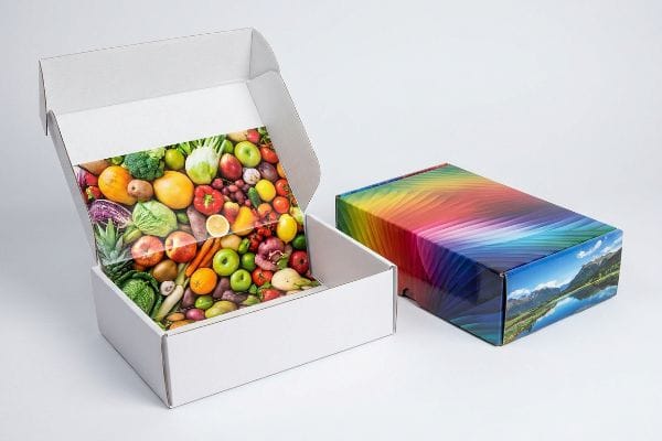
Using raster graphics is mandatory for rendering continuous-tone product photography and complex color gradients. These pixel-based formats, like JPEGs, contain the rich multi-color data strictly required for high-fidelity retail printing, making them perfect for creating consumer-facing brand imagery.

But knowing when to apply pixels versus mathematical paths dictates whether your brand captures attention or fades into the background.
When should you use raster files?
Designers often misjudge the visual impact of their final artwork when exporting files for retail campaigns.
You should use raster files exclusively for high-resolution lifestyle imagery and detailed product renders. Because these graphics rely on millions of colored pixels to create smooth optical blending, they require a resolution of at least 300 pixels per inch to maintain absolute crispness on store shelves.
![]()
While product photos look stunning digitally, preparing your core brand assets requires a smarter approach.
The Brand Color Consistency Challenge
Marketing teams frequently convert solid corporate logos into standard rasterized formats, assuming typical digital printing will seamlessly match their monitors. They believe that locking flat brand elements into pixelated background layers is an easy way to speed up the prepress workflow. This common beginner approach relies entirely on optical blending to simulate core brand colors1 across different packaging elements.
However, the reality of retail merchandising is that rasterized logos lose their sharp impact when placed next to competitors. Because pixel files rely on tiny overlapping dots to simulate color2, the resulting logo often appears distinctly grainy and washed-out under harsh store lighting3. Smart brands elevate their shelf visibility by keeping primary logos separate from photographic backgrounds, ensuring absolute brand consistency and a much stronger visual presence that captures shopper attention immediately.
| Metric/Feature | Generic Raster Approach | Retail Strategy |
|---|---|---|
| Logo Format | Flattened pixel layer4 | Isolated graphic |
| Visual Quality | Grainy color blending5 | Crisp brand presence |
| Shelf Impact | Washed-out appearance | High-visibility contrast |
Crisp brand reproduction demands distinct separation between photography and core assets. Maintaining this clear visual hierarchy guarantees your promotional displays immediately capture shopper attention without looking amateurish.
🛠️ Harvey's Desk: Are your brand logos losing their sharp impact under harsh big-box store lighting? 👉 Get a Free Prepress Color Audit ↗ — I review every structural file personally within 24 hours.
When to use raster vs vector?
Choosing between pixelated artwork and clean digital paths is a fundamental decision that impacts how your final packaging takes shape.
Deciding to use raster versus vector depends on your distinct campaign goals. Raster files beautifully handle continuous-tone cosmetic surface imagery, whereas vector formats are essential for creating the clean, scalable geometric lines needed for bold typography and defining structural folding paths.

Mixing up these two fundamental file types creates unnecessary workflow bottlenecks during the design approval stage.
The Display Architecture Foundation
Emerging brands try to save time by having designers draw display structures directly in basic, web-based illustration platforms that output entirely flat pixels. They assume any visual outline drawn on a digital canvas can easily function as a functional template for final production. In this beginner mindset, the critical distinction between a painted digital line and a true mathematical path6 is completely overlooked.
The reality of effective retail execution requires true geometric paths to build reliable display architecture. A flattened photographic file cannot provide the exact scalable data7 required to cleanly fold and assemble point-of-purchase cartons. By prioritizing clean vector lines for structural elements and typography, designers ensure the promotional unit snaps together smoothly, dramatically speeding up final store implementation and presenting a flawlessly polished image to the end consumer.
| Metric/Feature | Basic Design Method | Retail Strategy |
|---|---|---|
| Layout Base | Flattened graphic pixels | Scalable geometric paths |
| Structural Function | Visual outlines only | Clean assembly data |
| Store Execution | Slower implementation | Polished visual presence |
Treating structural templates as simple drawings creates amateur alignment issues. Utilizing true mathematical paths for your foundation ensures perfectly smooth assembly and a premium brand presentation.
🛠️ Harvey's Desk: Are your designers accidentally destroying the mathematical load-bearing capacity of your displays before production even begins? 👉 Claim Your Structural Dieline Audit ↗ — 100% confidential. Your unreleased retail designs are safe with me.
What is the purpose of a raster image?
Understanding exactly what function pixels serve is critical for establishing a flawless retail campaign that genuinely resonates with shoppers.
The purpose of a raster image is to deliver deep, continuous-tone photographic data directly to the consumer. These pixel-based files perfectly map complex lighting, natural skin tones, and rich organic textures onto your packaging, ensuring the visual graphics look breathtakingly realistic.

While pixels are brilliant at replicating lifestyle photography, they serve a very specific and targeted role within the overall marketing hierarchy.
Delivering the Brand Narrative
Marketing teams often assume that a single, massive photograph can do all the heavy lifting for a retail product launch. They will stretch a heavily pixelated image across an entire display panel, expecting the aesthetic beauty alone to carry the brand message and drive consumer engagement. This surface-level strategy ignores how different visual elements must work together to create a cohesive shopping experience.
In successful retail merchandising, raster files are utilized strictly as the emotional hook8 rather than the entire structural narrative. These continuous-tone images capture the consumer's imagination with high-resolution realism9, but they must be carefully balanced with clear, scalable branding elements to communicate value effectively. By assigning pixel data exclusively to cosmetic lifestyle imagery, marketers keep the message crisp, engaging, and perfectly optimized for point-of-purchase environments where first impressions matter most.
| Metric/Feature | Raster Layer Role | Vector Layer Role |
|---|---|---|
| Data Format | Grid of color pixels10 | Clean geometric shapes11 |
| Visual Impact | Emotional realism | Sharp brand clarity |
| Retail Function | Consumer attraction | Value communication |
Relying entirely on flat imagery dilutes your core marketing message. Strategic separation of lifelike photography from sharp graphic elements guarantees maximum shelf appeal and consumer engagement.
🛠️ Harvey's Desk: Is your prepress file structure secretly confusing the cutting machinery and compromising your final box shape? 👉 Request a CNC Dieline Blueprint ↗ — No account managers in the middle. You talk directly to structural engineers.
What are raster graphics ideal for?
Achieving retail dominance requires understanding the microscopic material science behind pixel-based continuous-tone reproduction.
Raster graphics are ideal for rendering incredibly detailed lifestyle imagery and complex organic gradients. Because these files process millions of individual color pixels simultaneously, they are the only format capable of driving the optical dot physics required for true photorealism on large retail packaging structures.
However, physically transferring millions of illuminated digital pixels onto unsealed, raw paperboard introduces a violent microscopic chemical reaction.
The Dot Gain Cutback Reality
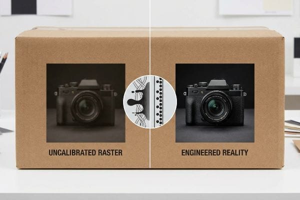
Procurement teams blindly assume that a high-resolution photograph will print on corrugated material exactly as it appears on an illuminated LED monitor. They completely ignore the physical behavior of liquid ink absorbing into unsealed paperboard fibers. I constantly see incoming art files featuring ultra-saturated, shadow-heavy product shots that will inevitably collapse into a dark, muddy mess once the physical ink actually hits the porous paper.
In my facility, this chemical failure triggers immediate line stoppages when liquid ink physically wicks outward into the porous 32ECT virgin kraft board12 during a massive 6-color offset run. This uncontrollable absorption—known as dot gain—causes a 50% halftone dot to physically expand into a 75% coverage13 area, obliterating fine detail. I permanently engineer around this by intercepting the artwork in prepress and applying a strict mathematical cutback curve. By preemptively shrinking the digital dots by a calculated 20% before burning the lithographic plates, the ink spreads perfectly into the targeted zones, guaranteeing razor-sharp photorealism while preventing a catastrophic retailer rejection.
| Metric/Feature | Uncalibrated Raster | Engineered Reality |
|---|---|---|
| Ink Behavior | Severe dot expansion14 | Controlled fiber wicking15 |
| Prepress Action | Direct file-to-plate | Mathematical cutback curve16 |
| Visual Output | Muddy shadow zones | Crisp photorealistic detail |
Uncalibrated pixel data guarantees chemical distortion on the printing press. Engineering a precise mathematical compensation curve is the absolute only way to protect your product photography from turning into an unrecognizable shadow blob.
🛠️ Harvey's Desk: Are your high-end product photos turning into dark, unrecognizable blobs on your final retail cartons? 👉 Get a Prepress Ink Strategy ↗ — I review every structural file personally within 24 hours.
Conclusion
Correctly processing prepress graphics is the only way to stop massive dot gain distortion and pixelated machine blade failures from completely sabotaging your retail rollout. Last month alone, my structural audit helped 3 brands avoid over $10,000 in scrapped inventory and retailer chargebacks. If you are tired of dealing with muddy print quality and collapsed display bases, let me personally run your structural files through a Free Prepress Data Audit ↗ to guarantee your artwork perfectly aligns with brutal factory physics.
"Packaging Productionserver – Software – Colorgate", https://www.colorgate.com/products/software/packaging-productionserver/. Technical printing guides explain how raster images use pixel-based color mixing and dithering to approximate colors, as opposed to the exactness of vector spot colors. Evidence role: technical explanation; source type: prepress manual. Supports: the risk of color inconsistency when rasterizing logos. Scope note: focuses on the difference between additive/subtractive color blending in raster vs vector formats. ↩
"Retro Halftone Effects in Photoshop!", https://www.youtube.com/watch?v=2YYs09Ok4TU. [Technical documentation on digital imaging and print production explains the process of translating raster pixels into dot patterns for physical output]. Evidence role: technical specification; source type: textbook. Supports: the mechanical nature of raster color simulation. Scope note: focuses on the transition from digital pixels to print dots. ↩
"Lighting Ups Retail Graphics Impact – ARC Document Solutions", https://www.e-arc.com/article/the-importance-of-lighting-in-retail-graphics/. [Studies on visual merchandising and optics detail how high-lumen environment lighting increases the visibility of pixelation and reduces contrast in rasterized prints]. Evidence role: factual claim; source type: industry whitepaper. Supports: the visual degradation of raster logos in retail. Scope note: limited to high-intensity artificial lighting environments. ↩
"Raster graphics – Wikipedia", https://en.wikipedia.org/wiki/Raster_graphics. [An authoritative source on digital imaging defines how raster files collapse layers into a single grid of pixels during the flattening process]. Evidence role: Definition; source type: Technical manual. Supports: Technical nature of raster files. Scope note: Applies to non-layered raster formats like JPG. ↩
"Solved: Raster image washed out in viewports – Autodesk Community", https://forums.autodesk.com/t5/civil-3d-forum/raster-image-washed-out-in-viewports/td-p/7294103. [Technical documentation on printing explains how low-resolution raster files create visible pixelation and poor color transitions known as artifacts]. Evidence role: Technical explanation; source type: Industry standard. Supports: Visual quality degradation in rasters. Scope note: Specifically relates to low-DPI exports for large-scale print. ↩
"What's the Difference Between Raster and Vector? – Resources", https://www.psprint.com/resources/difference-between-raster-vector/?srsltid=AfmBOoodMvb1C2U7Zeuj8XS_yUpa9BA-tzP1uhYujhntSN4QzXsXWrut. [An authoritative source on digital graphics explains why coordinate-based vector paths are required for precision manufacturing compared to pixel-based raster imagery]. Evidence role: technical definition; source type: industry standard handbook. Supports: the technical necessity of vectors for production templates. Scope note: focuses on the difference between raster and vector output. ↩
"Complete Guide to Dielines in Custom Packaging and Printing", https://gentlever.com/dielines-for-custom-packaging-and-printing/. [An authoritative source on industrial design or packaging production explains why raster images lack the mathematical precision required for CNC die-cutting and structural assembly. Evidence role: technical verification; source type: industry manual. Supports: the necessity of vector paths for structural packaging. Scope note: focuses on the distinction between pixels and geometric paths.] ↩
"8 Visual Merchandising Techniques to Boost Retail Store Sales", https://www.digitalpolo.com/8-visual-merchandising-insights-to-amp-up-your-retail-store-digital-polo-inc/. [Industry standards for retail merchandising suggest utilizing raster images for lifestyle emotional appeal and vector graphics for scalable brand identity]. Evidence role: industry best practice; source type: retail design guide. Supports: the functional role of raster files as an emotional hook. Scope note: applies to point-of-purchase displays. ↩
"Basic Properties of Digital Images – Hamamatsu Learning Center", https://hamamatsu.magnet.fsu.edu/articles/digitalimagebasics.html. [Technical documentation on digital graphics confirms that continuous-tone images allow for the smooth gradations of color required for high-resolution photorealism]. Evidence role: technical specification; source type: digital imaging manual. Supports: the ability of raster images to produce realism. Scope note: applies specifically to continuous-tone imagery. ↩
"When should I be calling a 'rectangular grid of pixels'a raster or an …", https://gis.stackexchange.com/questions/11155/when-should-i-be-calling-a-rectangular-grid-of-pixels-a-raster-or-an-image. [An authoritative source on digital imaging defines raster images as a rectangular grid of pixels where each pixel contains specific color data]. Evidence role: definition; source type: technical manual. Supports: raster data format. Scope note: Applicable to all bitmap file formats. ↩
"Vector graphics – Wikipedia", https://en.wikipedia.org/wiki/Vector_graphics. [Industry standards for graphic design define vector graphics as images created using mathematical paths and geometric primitives rather than pixels]. Evidence role: definition; source type: technical manual. Supports: vector data format. Scope note: Distinguishes vector from raster based on rendering methods. ↩
"How is Kraft Paper Used in Packaging? – PopDisplay", https://popdisplay.me/how-is-kraft-paper-used-in-packaging/. [Technical specifications for corrugated packaging materials detail the porosity and ink absorption characteristics of 32ECT virgin kraft board]. Evidence role: material verification; source type: technical specification; Supports: substrate wicking; Scope note: limited to virgin kraft materials]. ↩
"Mathematical modelling and compensation strategies for printing dot …", https://pmc.ncbi.nlm.nih.gov/articles/PMC12574880/. [Technical guides on offset lithography for uncoated substrates provide metrics for dot gain, documenting the expansion of halftone dots due to ink absorption]. Evidence role: technical verification; source type: printing manual; Supports: dot gain quantification; Scope note: specific to porous substrates]. ↩
"Dot Gain FAQ – Graphic Design, Inc.", https://gd-inc.com/page/dot-gain. [An authoritative source on printing physics would explain how uncalibrated raster files lead to uncontrolled ink spread known as dot gain]. Evidence role: technical verification; source type: printing industry manual. Supports: ink behavior in uncalibrated raster. Scope note: focused on offset and inkjet printing. ↩
"Printing Processes and Printing Inks – NCBI – NIH", https://www.ncbi.nlm.nih.gov/books/NBK424340/. [Research in ink-substrate interaction demonstrates how calibration and ink chemistry regulate the capillary action of wicking]. Evidence role: technical mechanism; source type: material science journal. Supports: ink behavior in engineered reality. Scope note: specific to porous substrates. ↩
"Dot Gain/Compensation Curves – The Break Room at FlexoExchange", https://flexoexchange.com/forum/viewtopic.php?t=602. [Printing standards define the application of compensation curves to subtract predicted dot gain to maintain image fidelity]. Evidence role: process specification; source type: prepress technical guide. Supports: prepress actions for engineered reality. Scope note: standard industry practice for continuous-tone reproduction. ↩