Shoppers decide fast. Displays must work in seconds. I build cardboard displays every day, so I test what drives sales, what fails, and what lasts.
Good display stands grab attention, guide choice, hold stock safely, and tell a clear brand story within three seconds. They fit the store, assemble fast, survive transport, and stay eco-friendly, affordable, and measurable. If it drives trial and repeat sales, it is good.
I will break this big question into four parts. I will share field notes from my factory and from retail floors. I will keep the ideas simple and practical so you can act today.
What makes an effective display?
Shoppers move quickly. They touch what they notice first. My job is to place your product in that first glance.
An effective display wins attention fast, answers one key benefit, puts product within easy reach, and stays full and tidy. It sets up quickly, survives shipping, and supports simple reorders and refreshes.

The 3-second test and the "sell, stock, survive1" rule
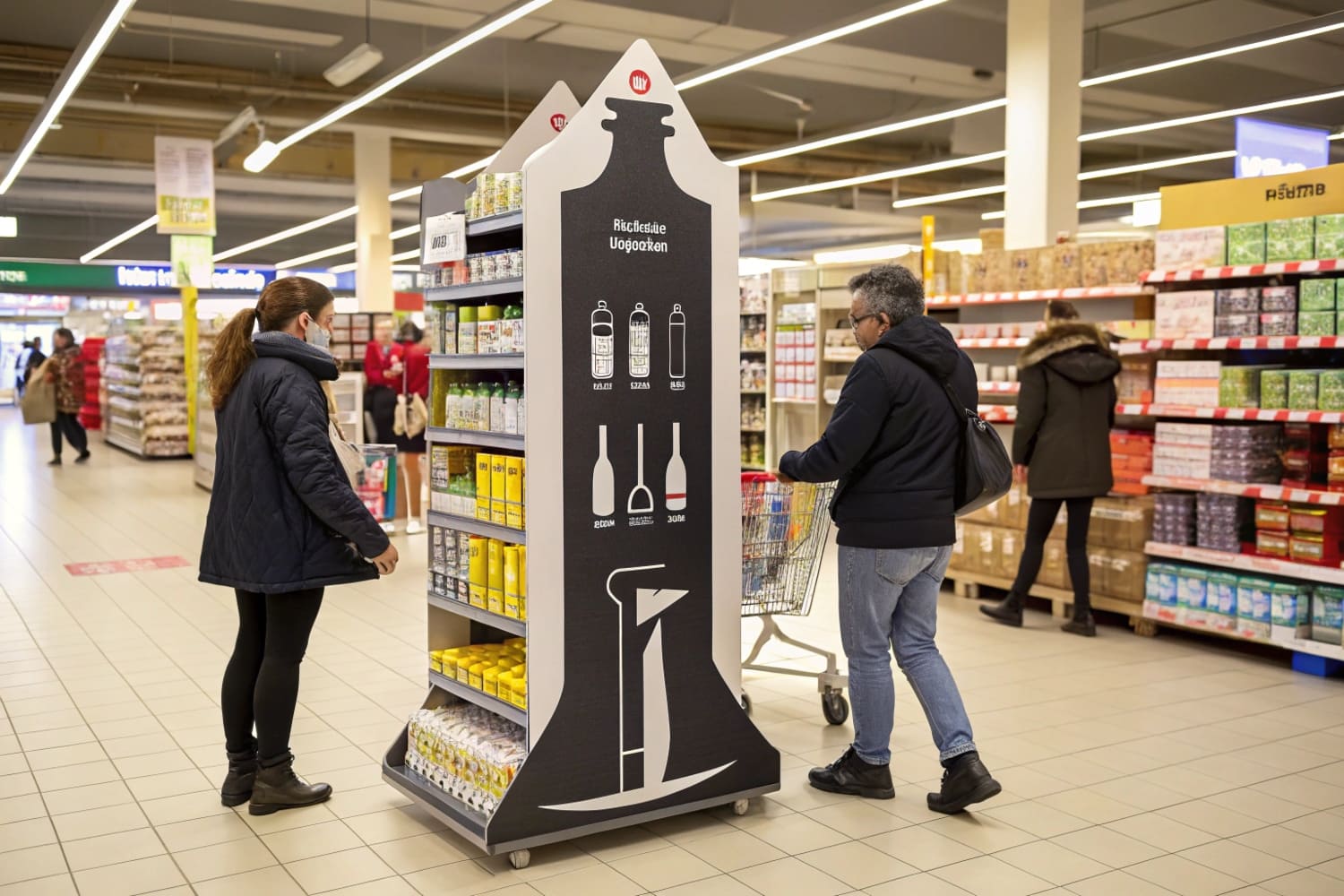
I use a simple rule on every program: sell, stock, survive. The display must sell with a clear claim in three seconds. The display must stock enough units to last a shift. The display must survive the truck, the backroom, and the store floor. Floor displays often lead the growth in POP because they create strong impact and hold real stock. Counter units work near checkout because they trigger impulse picks. In North America, this pattern is stable. In Asia Pacific, rapid retail growth increases the need for fast setups and PDQ trays. My team builds for both cases, so I measure time-to-build and time-to-fill2 on every sample. I aim for under five minutes for assembly and under three minutes for refill. If a part breaks in a drop test, I change the board grade or the joint.
| Factor | Why it matters | What I check | Quick benchmark |
|---|---|---|---|
| Attention | Stops the eye | Header height, contrast | Read at 2–3 meters |
| Clarity | Reduces doubt | One-line value prop | ≤ 8 words |
| Capacity | Keeps it selling | Units per facing | ≥ 1 shift of stock |
| Durability | Lowers returns | ECT, joint design | Pass 1.2 m drop |
| Speed | Cuts labor | Steps to build | ≤ 6 steps |
What are the criteria of a good retail display?
Retail space is tight. Staff time is short. A good display respects both.
Good retail displays meet clear criteria: fast setup, safe load, tidy presentation, easy refill, accurate color, fit-to-planogram, compliant labels, sustainable materials, and fair cost per unit sold.
A simple checklist I use with buyers and store teams
I run a factory with three production lines in Shenzhen. I build samples, I test them, and I change them until they meet this list. I keep the language plain so everyone can agree fast. I share this checklist with large buyers in the US, UK, Canada, and Australia. It works across categories like FMCG, beauty, and outdoor gear. It also speaks to real risks: color shifts, weak shelves, late trucks, and missing labels. When we follow it, projects launch on time. When we skip it, we pay later. I learned this the hard way on a holiday launch. The header looked great in 3D, but the E-flute could not hold a heavy product. We lost a week. Now I never skip the load test3.
| Criterion | How I measure | Target |
|---|---|---|
| Setup speed | Time from flat to ready | ≤ 5 minutes |
| Build steps | Count of unique steps | ≤ 6 steps |
| Load safety | Shelf deflection under load | < 3 mm at max load |
| Structural grade | ECT/BCT by SKUs | Match weight + 20% |
| Color accuracy | ΔE on key brand colors | ≤ 2.0 |
| Planogram fit | Dimensions vs. retailer spec | 100% fit, no overhang |
| Refill ease | Seconds to replace tray | ≤ 60 seconds |
| Labeling | UPC, warnings, country of origin | Complete and visible |
| Sustainability | Recycled content, inks, coatings | ≥ 60% recycled fiber, water-based ink |
| Cost efficiency | Cost per incremental unit sold | Improves baseline by ≥ 15% |
What are display stands made of?
Most of my programs use paper-based materials. I choose the grade based on weight, time on floor, and moisture risk.
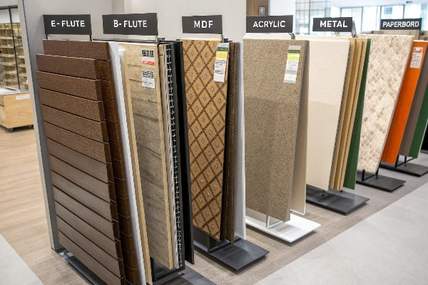
Displays are usually made from corrugated cardboard, paperboard, or honeycomb board with water-based inks and glues. Some projects add recyclable coatings, plastics, metal, or wood for extra life or security, based on product and store rules.
Picking the right board and finish for the job
Corrugated cardboard4 is my default. I use single-wall B or C flute for most shelves. I use double-wall when units are heavy or the season is long. Paperboard works for sleeves, headers, and PDQ trays. Honeycomb adds strength for pallets. I prefer recycled fiber and water-based inks because buyers and shoppers ask for it, and it prints clean on modern digital presses. If the store is humid, I add an aqueous or nano barrier that stays recyclable. For hunting gear or tools, stores may need locks, hooks, or metal feet. I only add them when required, because extra parts slow assembly and add cost. When I ship to big-box chains, I test the pack to ISTA drop and vibration. I keep the packaging simple so returns are rare and recycling is easy.
| Material | Pros | Cons | Best use |
|---|---|---|---|
| Corrugated (B/C/E) | Strong, light, low cost, printable | Sensitive to water | Floor displays, shelves |
| Paperboard | Smooth print, low cost | Lower strength | Headers, trays, sleeves |
| Honeycomb board | Very strong, flat | Higher cost, bulk | Pallets, large backs |
| Recyclable coating5 | Moisture resistance | Adds steps | Damp stores, long runs |
| Metal/wood accents | Security, long life | Cost, weight | High-risk items, premium |
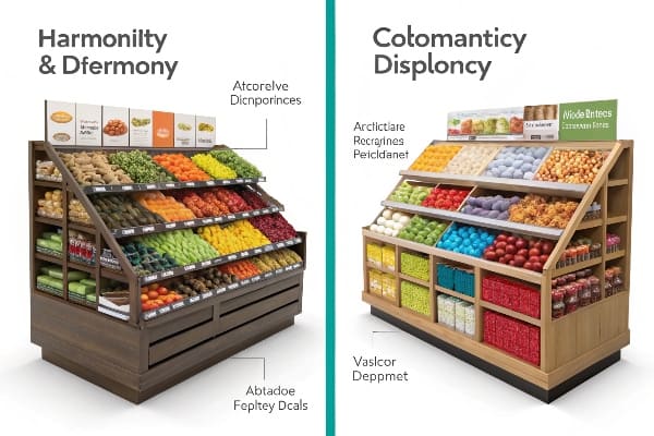
What makes a display attractive?
Attractive displays look simple and clear. They look safe to touch. They look easy to buy.
Attractive displays use contrast, one focal point, clean type, clear benefit, tidy stock, and honest sustainability cues. They avoid clutter, weak photos, small logos, and mixed messages. They match the shopper path and the store rules.
Design choices that pull eyes and hands
I design for fast reading. I pick one hero element: the product, the result, or the offer. I give it space. I keep the headline short. I avoid more than two fonts. I keep color contrast high so the claim reads at a distance. I place the first grab at waist to chest height. I keep the brand mark large enough to spot in motion. I add a simple proof point, like a spec or a badge. For Gen Z, I show clear eco facts6, like recycled content or plastic-free coating, not vague icons. For a hunting launch with Barnett Outdoors, I used a dark base, bold safety callouts, and strong shelf lips. The look matched the category, and the build held heavy bows. The unit felt premium, but the parts were simple and quick to assemble.
| Design lever | Why it works | Quick check |
|---|---|---|
| Focal point | Guides the eye | One hero per face |
| Contrast | Aids legibility | 4.5:1 text/background |
| Headline | Sets the promise | ≤ 8 words |
| Space | Reduces noise | 30–40% open area |
| Touch point | Invites action | First pick at 1.0–1.4 m |
| Eco proof | Builds trust | Specific claim, not vague icon |
Conclusion
Good displays sell fast, stay full, and stand strong. Keep the message simple. Choose the right board. Test the build. Measure the lift. Repeat what works.
Understanding this rule can enhance your retail strategy, ensuring effective displays that drive sales. ↩
Learning about these metrics can optimize your display efficiency, leading to better inventory management and customer satisfaction. ↩
Understanding load tests can help ensure product safety and prevent costly delays in production. ↩
Explore this link to understand why corrugated cardboard is a preferred choice for packaging due to its strength and cost-effectiveness. ↩
Learn about recyclable coatings and their role in enhancing packaging durability while maintaining eco-friendliness. ↩
Explore this link to understand how clear eco facts can enhance product appeal and build consumer trust. ↩


