
Crowded shelves and infinite online listings overwhelm buyers. They skip faster than ever. I must grab their eye, hold their trust, and nudge them toward checkout, or my effort dies.
A product line stands out when every item carries a clear promise, looks unmistakable at first glance, and solves a pain so plainly that buyers feel foolish to ignore it.
Shoppers’ attention is brittle. Before I explore each factor, let me bridge the gap between curiosity and clarity. Stay with me and you will learn a repeatable system that I apply daily in my display factory to win orders from giants like Barnett Outdoors.
How does a product stand out?
Pain stings hardest at launch. A new item arrives, yet no one notices. I feel the clock ticking, budgets burning, and competitors cheering. The tension forces action.
A product stands out by broadcasting one benefit louder than the surrounding noise, anchoring that claim in proof, and dressing itself in visuals that echo the same story.

Identify the Loudest Benefit
I strip every feature until only one value survives. For Barnett’s crossbows, that value is “precision under pressure1.” Everything else supports it.
Wrap Proof Around the Claim
I print load-test badges2 right on the cardboard display. I show micro-videos of torque tests on loop. Tangible proof flips skepticism into belief.
Align Visual Storytelling
Colors, fonts, and shapes must whisper the same word: precision. Angular cut-outs mimic bow limbs; crisp black lines echo scope reticles.
| Element | Action | Outcome |
|---|---|---|
| Core benefit | Reduce to one sentence | Instant recall |
| Proof | Display certifications and tests | Trust spike |
| Visual echo | Repeat theme in shape and color | Cohesive memory |
A product that unifies message, evidence, and aesthetics cannot stay invisible.
How do you make your products stand out?
Launch nerves push me to overhaul rather than refine. I resist that urge. Instead I follow a surgical checklist that I honed after thousands of display prototypes.
I make products stand out by isolating their single promise, amplifying it through headline, palette, and structure, then reinforcing it with user-seen proof and irresistible touchpoints.
Start With User Tension
David, my buyer at Barnett, worries about missed deadlines. I print a countdown timer3 on the prototype carton—every glance reminds him we stay on schedule.
Engineer Visual Contrast
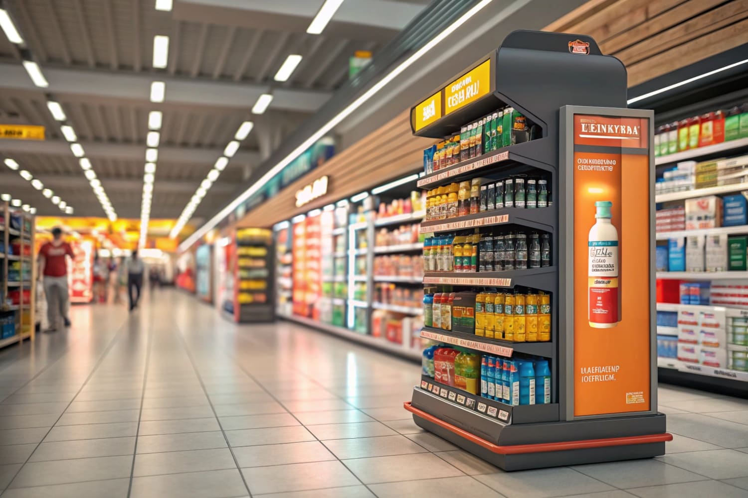
I set muted shelf colors behind a neon focal panel4. Contrast steals eyes. Simple shapes around one bold angle guide gaze to the headline.
Insert Interactive Touchpoints
I embed QR codes that open a 360-degree AR model5 of the bow on any phone. Touch breeds memory.
| Step | Tool | Metric Tracked |
|---|---|---|
| User tension audit | Customer interviews | Top three anxieties |
| Visual contrast draft | Figma mock-ups | Eye-track heat maps |
| Interactive proof | QR + AR render | Scan-through rate |
Reliably following this list keeps me from random creativity and focuses every design dollar on visibility.
What makes up a product line?
I once believed a product line was just a family of SKUs. Experience taught me it is a living ecosystem with roles, rhythms, and built-in evolution.
A product line is a curated series of items that share a core promise, show clear step-up logic, and sustain demand through planned refresh cycles.
Core Promise Unity
Every display I ship, from countertop units to floor stands, guarantees effortless assembly in under two minutes6. That unity cements our identity.
Step-Up Ladder
Good-Better-Best tiers7 let buyers self-select. A hunter grabs the entry stand today, then upgrades next season without leaving our brand.
Refresh Rhythm
| I schedule seasonal artwork swaps8. Autumn camo, winter whiteouts, spring green. Familiar structure, fresh skin. | Component | Purpose | Example in Popdisplay |
|---|---|---|---|
| Core promise | Brand glue | “Assemble in 2 minutes” | |
| Tier ladder | Up-sell path | Counter—Floor—Endcap | |
| Refresh cycle | Ongoing buzz | Quarterly graphics |
When each part works together, the line feels alive, not crowded.
What makes our brand standout?
Running a factory in Guangzhou means competitors sit next door. I cannot rely on location. I rely on relentless transparency and custom care.
Popdisplay stands out because we show real test videos, open our production schedule to clients, and absorb sample costs to prove skin in the game.

Radical Transparency
Live cameras stream my die-cutting line.9 David can log in and watch his order run. Trust accelerates.
Service Before Profit
Free prototypes10 look risky, yet repeat orders repay the investment tenfold. Clients remember who believed first.
Continuous Improvement Loop
Post-shipment, I collect handling damage data from carriers11. I tweak flute grade or corner padding within a week.
| Brand Trait | Action | Client Reaction |
|---|---|---|
| Transparency | Live cams, open QC sheets | Lower anxiety |
| Upfront investment | Free samples | Faster approvals |
| Rapid iteration | Data-driven tweaks | Loyal reorders |
Trust built on visibility beats any price war.
What are the considerations of a product line?
A broader line tempts me to chase trends. Without guardrails I risk dilution. These considerations keep me disciplined.
I weigh market need, manufacturability, margin, and message consistency before adding or killing any product line SKU.

Market Need
I survey retail partners quarterly. If demand score12 dips below six of ten, I redesign or retire.
Manufacturability
Shared die lines cut costs. A new length that forces tool change must forecast 40% higher volume to justify.
Margin Integrity
I track gross profit per square meter13 of board. If a flashy endcap eats margin, tweak structure before launch.
Message Fit
Does it still scream “Assembly in 2 minutes”? If not, edit or exit.
| Consideration | KPI | Threshold |
|---|---|---|
| Demand | Partner survey index | ≥6 |
| Manufacturability | Shared tool ratio | ≥80% |
| Margin | Profit per m² | ≥30% |
| Message fit | Promise match | 100% |
These numbers filter emotion out of line decisions.
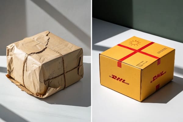
How to make your packaging stand out?
Packaging often dies at the last mile—literally crushed in transit. I learned to treat every box as a silent salesperson that travels dangerous roads.
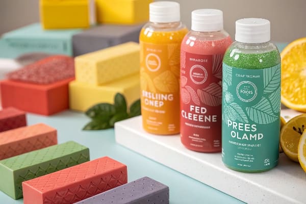
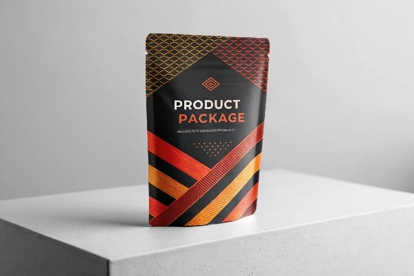
Packaging stands out through clear hierarchy, tactile cues, transit resilience, and eco-scores that buyers can see at first touch.
Visual Hierarchy
I place the hero benefit14 at the upper third face. Secondary specs sit under a thin rule line. Nothing competes with the hero.
Tactile Cues
Soft-touch varnish rings the grip zone. It invites fingers, which invites engagement.
Transit Resilience
Triple-wall corners absorb drops. An internal brace locks in the crossbow limbs. Arrive flawless or refund.
Eco-Score Display
I print FSC and CO2 footprint in a badge the size of a thumb. Shoppers notice and feel better.
| Feature | Technique | Buyer Emotion |
|---|---|---|
| Hierarchy | Rule of thirds | Instant understanding |
| Tactile | Soft-touch varnish | Curiosity |
| Resilience | Triple-wall corners | Confidence |
| Eco score | Visible badge | Guilt-free |
Strong packaging protects both product and brand story.
Conclusion
A disciplined promise, proven by evidence and carried through every SKU, display, and carton, makes a product line impossible to ignore and effortless to remember.
Understanding this concept is crucial for appreciating the performance of Barnett’s crossbows, ensuring you make an informed choice. ↩
Load-test badges provide essential proof of product reliability, helping you trust the quality of crossbows before purchase. ↩
Explore how countdown timers can enhance product visibility and keep projects on track, ensuring deadlines are met. ↩
Learn how neon focal panels can attract attention and improve customer engagement in marketing strategies. ↩
Discover how 360-degree AR models can create immersive experiences that enhance customer interaction and memory retention. ↩
Discover how quick assembly can enhance customer satisfaction and streamline operations in retail displays. ↩
Learn how tiered pricing strategies can effectively drive sales and customer loyalty in your business. ↩
Explore how seasonal changes in display graphics can keep your brand fresh and engaging for customers. ↩
Explore how live cameras enhance transparency and trust in manufacturing, improving client relationships and operational efficiency. ↩
Discover the strategic advantages of offering free prototypes and how they can lead to increased customer loyalty and repeat business. ↩
Learn about the significance of handling damage data in logistics and how it can drive continuous improvement in operations. ↩
Understanding demand scores can help you make informed decisions about product redesign or retirement. ↩
Calculating gross profit per square meter is crucial for maintaining margin integrity and making strategic decisions. ↩
Understanding the hero benefit can enhance your product’s appeal and effectiveness in marketing. ↩