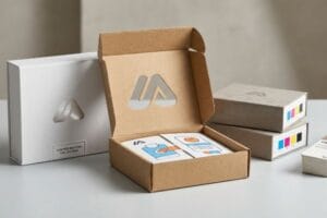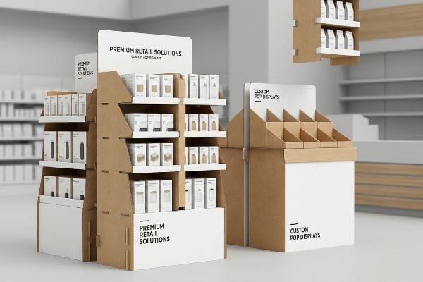
Brands pour budgets into retail environments, but without structural anchors, merchandise gets lost in the aisles. Understanding the physical mechanics of retail packaging separates profitable rollouts from ignored inventory.
The main purpose of POP (Point of Purchase) material is to secure strategic retail floor space, disrupt shopper navigation, and drive immediate impulse conversions. These structural marketing assets elevate physical merchandise above standard store shelving, fundamentally bridging the critical gap between advertising awareness and active transactional engagement.
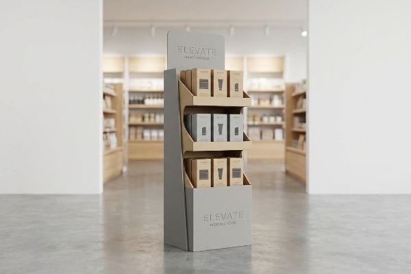
Knowing the conceptual goal is just the starting line. The real friction happens when you try to manifest these marketing goals using raw paperboard and wet glue.
What Is POP Material?
Many procurement teams assume all cardboard is identical, viewing physical merchandisers purely as disposable paper commodities rather than engineered load-bearing systems.
POP material primarily consists of engineered corrugated testliner, virgin kraft paperboard, and structural adhesives. These physical substrates are specifically manufactured and die-cut to create temporary retail fixtures, engineered to safely bear dynamic merchandise weight while simultaneously displaying high-resolution brand graphics in highly trafficked commercial aisles.
Grasping the basic definition is easy, but applying the right fiber mix on a mass production line requires strict attention to material science.
The Hidden Limits of Sustainable POP Material
It is a common practice for modern brands to mandate 100% recycled content for their retail campaigns1 to meet sustainability goals. Designers often assume that a recycled sheet of cardboard possesses the exact same structural integrity as a fresh sheet directly from the mill. This optimistic view treats paper fibers as infinitely renewable building blocks that simply require repulping.
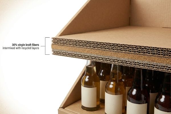
I see this blind spot frequently when evaluating heavy-duty floor bins. The reality of paper repulping is that cellulose fibers physically shorten and become exhausted after about five recycling cycles2. I once watched a co-packer try to load 50 lbs (22.6 kg) of beverage bottles into a 100% recycled tray; I could actually hear the microscopic internal flutes tearing and popping under the pressure. The short, over-recycled fibers lacked the necessary tension, causing the base to bow out instantly. To prevent this, I mandate a precise 30% injection of virgin kraft material directly into the load-bearing flutes. This restores the dynamic compression strength needed to survive rough warehouse handling while still keeping the retailer's sustainability auditors happy.
| Common Rookie Mistake | The Pro Fix | Retail-Floor Benefit |
|---|---|---|
| Using 100% recycled flutes | Injecting 30% virgin kraft3 | Prevents heavy base collapse |
| Ignoring fiber exhaustion | Specifying long-fiber liner4 | Keeps display perfectly square |
| Relying on flat board tests | Testing assembled 3D limits5 | Eliminates manual rework time |
I refuse to let cosmetic sustainability goals compromise physical load capacities. Mixing fresh structural fibers into the internal architecture guarantees the unit survives multi-tier stacking, preventing transit damages that quickly wipe out your campaign's profit margins.
🛠️ Harvey's Desk: Not sure if your current corrugated specs have enough virgin fiber to support your heavy merchandise? 👉 Request a Material Audit ↗ — Direct access to my desk. Zero automated sales spam, I promise.
What Are the Objectives of POP?
Striking visuals might look great on a monitor, but the primary objective of a floor fixture is to force a rushing shopper to physically stop their cart.
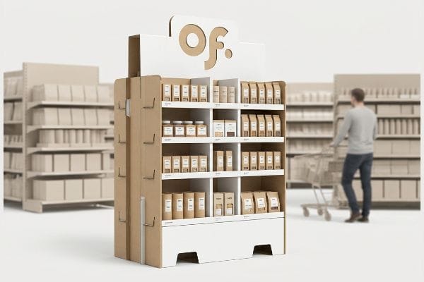
The primary objectives of POP installations are maximizing visual disruption, controlling shopper navigation, and accelerating impulse purchase decisions. By strategically placing engineered merchandise displays directly in high-traffic retail intersections, brands can actively bypass standard shelf competition and significantly increase their localized sales velocity and market share.
Defining those objectives is standard marketing practice, but physically executing them requires a strict spatial methodology on the floor.
Executing the 3-3-3 Engagement Objective
Marketing departments often design intricate retail structures strictly for up-close viewing, optimizing the graphics and text for a buyer standing directly in front of the unit. They attempt to cram detailed product benefits, origin stories, and QR codes into every available inch of the header. This approach assumes that consumers will treat the fixture like a brochure, patiently reading the entire narrative.
The harsh truth of retail aisles is that overloaded text causes massive cognitive friction, leading rushing shoppers to ignore the unit entirely. I constantly remind clients about the 3-3-3 rule of retail engagement6. A display must grab attention from thirty feet (9.1 m) away, spark specific interest at three feet (0.9 m), and drive the tactile conversion at three inches (76.2 mm). I recently had to physically cut away a cluttered header panel with my box cutter because the dense text was distracting from the actual product. By simplifying the top panel to a single, massive die-cut logo in a spot color, we instantly created the necessary 30-foot (9.1 m) visual anchor. I then optimized the 50-inch (127 cm) strike zone7 to make grabbing the item completely frictionless for the buyer.
| Common Rookie Mistake | The Pro Fix | Retail-Floor Benefit |
|---|---|---|
| Printing heavy text blocks | Using massive die-cut logos | Grabs attention from 30 feet8 |
| Cluttering the strike zone | Simplifying SKU access | Increases impulse grab speed9 |
| Designing for close viewing | Applying the 3-3-3 spatial rule10 | Stops fast-moving foot traffic |
I always strip away secondary marketing copy that clogs up the primary visual objective. Distilling your message into high-contrast structural shapes activates the psychological trigger within a harsh three-second interaction window, drastically lifting your conversion rates.
🛠️ Harvey's Desk: Are you worried your current artwork file has too much text and lacks a 30-foot visual anchor? 👉 Get a Spatial Review ↗ — Download safely. My inbox is open if you have questions later.
What Is a POP Used For?
Securing prime real estate in a big-box store is a battle, and merchandisers are the physical weapons used to claim and hold that highly contested ground.
A POP is used for physically staging inventory outside of permanent store aisles, driving promotional product visibility, and managing seasonal inventory rollouts. These temporary modular units act as freestanding structural platforms that organize physical SKUs while functioning as independent, three-dimensional billboards across the retail floor.

Using a fixture to hold stock is the baseline, but how that fixture frames the individual item dictates the success of the campaign.
Using Retail Trays for Maximum Product Visibility
A fundamental use of these temporary structures is to safely transport and present consumer packaged goods directly on the retail shelf. Packaging teams frequently engineer deep front retaining lips on these corrugated trays to ensure the bottles or boxes do not tip over during the chaotic stocking process. They prioritize absolute stability, assuming a high front wall is the safest method to secure the inventory.
While stability is important, an excessively high retaining lip completely destroys the primary marketing use of the tray. Think of it like putting a beautiful painting behind a thick window frame that covers the bottom half of the canvas. I frequently catch designs where the front cardboard panel obscures the critical weight claims or varietal text on the primary packaging. When I test these deep trays, my hand often scrapes against the rigid corrugated edge just trying to pull an item out. I strictly enforce the 85 percent visibility rule11. By using our CAD (Computer-Aided Design) software to mathematically map the primary bottle's exact label dieline, I swoop the tray's front lip down to precisely reveal the product's core messaging while maintaining a safe friction lock at the base.
| Common Rookie Mistake | The Pro Fix | Retail-Floor Benefit |
|---|---|---|
| Engineering tall front lips | Enforcing 85% visibility12 | Showcases primary label claims |
| Hiding critical product data | Swooping the die-cut front13 | Accelerates tactile interaction |
| Prioritizing strict enclosure | Mapping label clearance zones14 | Prevents hand scraping friction |
I engineer shelves and trays to elevate the merchandise, not hide it behind brown walls. Guaranteeing an unobstructed view of your primary packaging drastically cuts down on customer hesitation and speeds up the final physical conversion.
🛠️ Harvey's Desk: Does your current retail ready tray hide your expensive primary label behind a thick retaining wall? 👉 Claim a Structural Assessment ↗ — No forms that trigger endless sales calls. Just pure value.
What Does POP Material in Advertising Mean?
Incorporating advertising into physical displays isn't just about importing an illustrator file; it is a complex translation of digital pixels into physical wet ink.
POP material in advertising means directly integrating brand messaging, promotional graphics, and color psychology onto physical retail fixtures. It transforms standard load-bearing paperboard into highly visible, strategic communication tools that physically interact with consumers, effectively bridging the gap between broad marketing campaigns and targeted point-of-sale action.
But knowing the theory isn't enough when the machines start running; translating a digital advertisement onto porous paperboard introduces brutal chemical realities.
Why Standard Advertising Files Fail on the Factory Floor
Marketing teams consistently build out beautiful advertising assets using standard CMYK (Cyan, Magenta, Yellow, Key) color profiles, expecting process printing to perfectly match their glowing digital screens. They assume that if a corporate logo looks sharp on a PDF, the standard four-color printing process will seamlessly replicate that exact tone on any substrate15. This leads designers to export flat CMYK files directly to the factory without questioning the physical behavior of the target material.
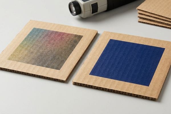
In my facility, I routinely see these standard advertising files break down the moment they hit raw testliner. This isn't just theory—I see this happen on the testing floor when we run proofing draws. Standard CMYK relies on tiny overlapping halftone dots to create a composite color. When those microscopic wet dots hit an unsealed, highly porous corrugated board, they absorb unevenly and spread16. I recently measured a 4.6% dot gain expansion on a client's navy blue logo, which turned their sharp branding into a grainy, muddy mess under harsh fluorescent store lights. I pulled the spectrophotometer readings and proved I didn't need to change the entire design—I just needed to mandate a Spot Color Flood Protocol. By replacing optical CMYK dot blending with a precisely mixed, single Pantone spot color ink17, I ensured a dense, solid pigment application. This simple prepress pivot eliminates halftone grain entirely, making the advertising pop from 20 feet (6.1 m) away and preventing thousands of dollars in retailer print-quality rejections.
| Common Rookie Mistake | The Pro Fix | Retail-Floor Benefit |
|---|---|---|
| Printing CMYK on raw boards | Mandating Pantone spot colors18 | Prevents muddy logo reproduction |
| Ignoring paper porosity | Eliminating halftone dot layers19 | Maximizes high-contrast visibility |
| Trusting backlit screen colors | Scanning physical ink draw-downs20 | Stops print quality chargebacks |
Mechanically controlling how wet ink hits porous paper guarantees brand equity remains sharp. This prepress precision ensures your marketing budget actually survives the physical printing press.
🛠️ Harvey's Desk: Do you know if your graphic designer applied a proper spot color separation for your primary logo on corrugated board? 👉 Send Me Your Prepress File ↗ — I'll stress-test the math before you waste budget on mass production.
Conclusion
You can rely on basic digital proofs for your retail advertising, but when standard CMYK halftone dots bleed into unsealed corrugated board, it triggers an immediate print rejection, stalling your campaign and wasting thousands in unrecoverable setup fees. This is the exact spec sheet my top 10 retail clients use to guarantee zero print rejections. Stop guessing on ink behavior and let me personally run your artwork through my Free Prepress Ink Audit ↗ to catch fatal color shifts before the presses start rolling.
"What's New in Packaging Policy? Packaging Policy Roundup", https://sustainablepackaging.org/2026/05/21/packaging-policy-news/. Verification of industry trends where brands require 100% recycled content for Point of Purchase materials to meet ESG goals. Evidence role: Industry practice; source type: Corporate sustainability reports. Supports: The commonality of recycled content mandates. Scope note: Applies primarily to global CPG brands. ↩
"Changing quality of recycled fiber material. Part 1. Factors affecting …", https://bioresources.cnr.ncsu.edu/resources/changing-quality-of-recycled-fiber-material-part-1-factors-affecting-the-quality-and-an-approach-for-characterisation-of-the-strength-potential/. Validation of the physical degradation limit of cellulose fibers during the repulping process. Evidence role: factual verification; source type: material science journal. Supports: The claim that paper fibers have a finite recycling lifespan. Scope note: Actual cycle limits may vary based on pulping methods and initial fiber quality. ↩
"[PDF] Investigating the mechanical properties of paperboard packaging …", https://repository.rit.edu/cgi/viewcontent.cgi?article=1066&context=japr. Technical documentation proving that adding virgin kraft fibers to recycled fluting increases vertical compression strength and prevents structural collapse. Evidence role: technical validation; source type: material science journal. Supports: impact of virgin fiber on load-bearing capacity. Scope note: Percentage of virgin fiber may vary by board grade. ↩
"[PDF] Corrugated Board Packaging with Innovative Design for Enhanced …", https://bioresources.cnr.ncsu.edu/wp-content/uploads/2026/01/BioRes_21_1_2229_Tworzydlo_PSMPGG_Corrugated_Packaging_Design_Durability_Transport_25399.pdf. Engineering data explaining how long-fiber liners mitigate fiber exhaustion and maintain the geometric squareness of load-bearing structures. Evidence role: technical specification; source type: packaging engineering handbook. Supports: role of fiber length in structural stability. Scope note: Applies specifically to liners subjected to repetitive stress. ↩
"DISPLAY STRUCTURAL DESIGN FOR INTERACTIVE RETAIL …", https://www.bcipkg.com/display-structural-design-for-interactive-retail-displays/. Comparison of 2D compression tests (e.g., ECT) versus assembled structural tests to identify failure points in 3D displays. Evidence role: methodology validation; source type: industry quality control standard. Supports: superiority of 3D testing for eliminating rework. Scope note: Focuses on structural failure rather than material purity. ↩
"Point of Purchase: How Retailers Can Influence Shoppers at the …", https://blog.intouch.com/posts/points-of-purchase-displays. Authoritative retail design guides or visual merchandising textbooks would validate the specific distances and stages of shopper engagement. Evidence role: validation; source type: industry standard/textbook. Supports: the 3-3-3 engagement heuristic. Scope note: may vary by retail environment. ↩
"Retail premises design for effective displays and customer flow", https://www.business.qld.gov.au/industries/manufacturing-retail/retail-wholesale/retail-displays. Ergonomic studies or retail fixture specifications would confirm the optimal height range for the strike zone to maximize consumer reach and conversion. Evidence role: technical specification; source type: ergonomic study. Supports: the 50-inch strike zone measurement. Scope note: based on average human reach statistics. ↩
"The Role of Visibility & Signage in Retail Site Selection – KennMar", https://kennmar.com/the-role-of-visibility-signage-in-retail-site-selection/. Evidence from visual merchandising standards regarding the effective viewing distance for large-scale graphics to attract shoppers. Evidence role: verification of metric; source type: industry guide. Supports: the claim that large die-cut logos are visible from 30 feet. Scope note: applicable to open-floor retail layouts. ↩
"Effect of Space Order on Impulse Buying: Moderated by Self-Construal", https://pmc.ncbi.nlm.nih.gov/articles/PMC10451481/. Research on the correlation between simplified product accessibility and the reduction of friction in impulse buying behavior. Evidence role: causal verification; source type: consumer behavior study. Supports: the benefit of simplifying SKU access for faster conversion. Scope note: focused on point-of-purchase interaction. ↩
"How Packaging Shapes Retail Display Program Success", https://www.frankmayer.com/blog/how-packaging-shapes-retail-display-program-success/. Verification of the '3-3-3 rule'as a recognized framework in point-of-purchase design for managing shopper engagement timing and distance. Evidence role: definition of technical standard; source type: professional design manual. Supports: the methodology used to stop fast-moving foot traffic. Scope note: standard may vary across different retail formats. ↩
"AG 1091A: Retail Merchandise Displays in the Frontage Zone", https://www.seattle.gov/transportation/permits-and-services/permits/applicant-guides/ag-1091a. An authoritative source on retail merchandising or POP display design would verify if the 85 percent visibility threshold is a recognized benchmark for product accessibility and visibility. Evidence role: industry standard; source type: retail design manual. Supports: the claim that specific visibility percentages are required for effective POP trays. Scope note: may vary by product category. ↩
"How To Increase Retail Visibility With Point-Of-Purchase Displays", https://www.industrialpackaging.com/blog/increased-retail-visibility. Industry guidelines or ergonomic studies confirming the optimal percentage of product visibility required to maintain consumer attention and brand recognition. Evidence role: technical specification; source type: merchandising guide. Supports: 85% visibility threshold. Scope note: May vary based on product size and shelf height. ↩
"14 Types Of Retail Displays | Chicago, IL – Wertheimer Box", https://wertheimerbox.com/types-of-retail-displays/. Technical packaging documentation explaining how curved or swooped die-cut edges in retail trays reduce physical barriers and increase tactile consumer engagement. Evidence role: design principle; source type: packaging engineering manual. Supports: acceleration of tactile interaction. Scope note: Specific to corrugated or plastic retail trays. ↩
"Merchandising Best Practices: Compliance – Vanguard Companies", https://www.vanguardpkg.com/merchandising-best-practices-compliance/. Professional packaging standards regarding the identification of clearance zones to ensure primary packaging labels remain unobstructed by the display's structural walls. Evidence role: industry best practice; source type: graphic design manual for packaging. Supports: prevention of label obstruction. Scope note: Focused on shelf-ready packaging (SRP) design. ↩
"CMYK color model – Wikipedia", https://en.wikipedia.org/wiki/CMYK_color_model. Technical explanation of how substrate porosity and material composition affect the final color of CMYK process printing. Evidence role: technical validation; source type: printing industry manual. Supports: the fact that CMYK results vary by material. Scope note: focuses on substrate-specific ink interaction. ↩
"Mathematical modelling and compensation strategies for printing dot …", https://pmc.ncbi.nlm.nih.gov/articles/PMC12574880/. Technical documentation on ink-substrate interaction confirms that unsealed porous materials increase ink absorption and dot gain. Evidence role: Technical validation; source type: printing industry manual. Supports: explanation of why CMYK fails on raw testliner. Scope note: Applies specifically to non-coated porous substrates. ↩
"What's the Difference Between Spot Colors (PMS) vs. CMYK for …", https://blog.fantastapack.com/difference-between-spot-colors-vs.-cmyk-packaging. Printing standards explain that spot colors provide higher pigment density and consistency on absorbent materials compared to CMYK halftone blends. Evidence role: Procedural validation; source type: prepress standard. Supports: the use of spot colors to eliminate halftone grain. Scope note: Focuses on brand-critical color accuracy in POP displays. ↩
"Spot color vs Process Color Printing – Pantone", https://www.pantone.com/articles/technical/spot-vs-process-color?srsltid=AfmBOork_CKeHMf8P_JhP8XAdQdfnwIi58vEROhgE315mW8TP_6ctH38. Technical guide explaining why spot colors prevent muddy reproduction on absorbent, non-coated materials compared to CMYK layering. Evidence role: technical specification; source type: printing industry manual. Supports: color accuracy on raw substrates. Scope note: Specific to raw board materials. ↩
"[PDF] HALFTONE – Getty Museum", https://www.getty.edu/conservation/publications_resources/pdf_publications/pdf/atlas_halftone.pdf. Industry research on how ink bleed and dot gain in porous substrates degrade image sharpness, making solid layers preferable for contrast. Evidence role: technical cause-and-effect; source type: print science journal. Supports: high-contrast visibility through layer elimination. Scope note: Focuses on high-porosity substrates. ↩
"A Digital Process to Create Better Ink Drawdowns", https://www.pffc-online.com/news/16490-a-digital-process-to-create-better-ink-drawdowns. Standard operating procedure for verifying physical ink behavior on a substrate to avoid the discrepancy between RGB screen light and physical pigment. Evidence role: industry standard; source type: print production guide. Supports: use of physical proofs to stop quality chargebacks. Scope note: Application to large scale POP displays. ↩