Understanding how ink translates to cardboard saves you from devastating color shifts. I see brands lose weeks of production time because they don't grasp basic four-color mechanics.
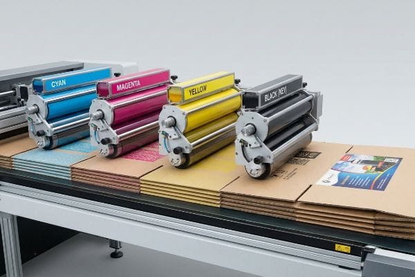
The CMYK (Cyan, Magenta, Yellow, Key/Black) printing process is a subtractive color model used in physical manufacturing. By layering these four base inks, prepress machinery creates complex, photorealistic graphics directly onto retail packaging and point-of-purchase displays.
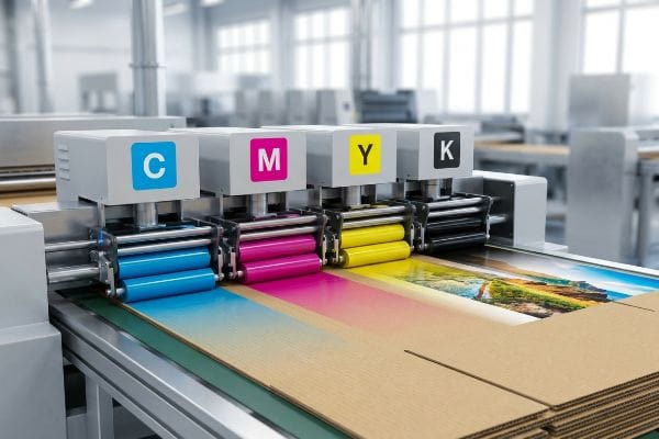
But knowing the theoretical color model is entirely different from keeping those colors perfectly registered on a high-speed factory floor.
How Do I Print in CMYK Mode?
Transitioning your digital artwork into physical manufacturing requires strict prepress formatting.
Printing in CMYK mode requires converting your digital design files to a four-color profile before exporting the final dieline. This prepress step ensures your layout software accurately communicates color density to the automated plate-making machinery on the factory floor.
Setting the document color space is just the baseline; the real challenge begins when we map that file onto physical corrugated flutes.
Why Your CMYK Dieline Needs a Massive Bleed
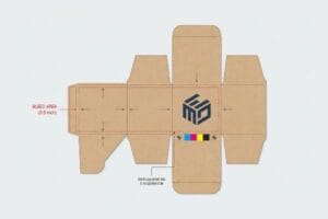
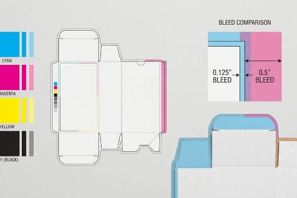
Most graphic designers naturally apply a standard commercial print bleed of 0.125 inches (3.17 mm)1 to their packaging files. They assume that if the artwork slightly overlaps the cut line, the automated CNC (Computer Numerical Control) blades will produce a perfectly wrapped edge. In a climate-controlled studio, this mathematical logic makes perfect sense.
I know you're staring at this cardboard structure feeling lost, because so many of my clients see ugly, raw brown paper flashing on the edges of their folded displays. The problem isn't your art; it's the physical litho-lamination process. When wet glue hits thick B-flute board, it inherently shifts during automated mounting2. If you only give me a standard margin, that mechanical drift will expose the raw testliner the moment a store clerk folds the tray, leaving a visually damaged unit. To fix this, I strictly enforce a minimum 0.5-inch (12.7 mm) bleed margin3 past the physical cut line for all litho-laminated jobs. You can hear the loud suction of the Kongsberg table holding down the board, but even with high-end vacuum beds, that extra half-inch acts as a necessary engineering safety net, preventing aesthetic rejections and saving costly repacking fees.
| Common Rookie Mistake | The Pro Fix | Retail-Floor Benefit |
|---|---|---|
| Applying 0.125 inches (3.17 mm) standard bleed | Enforcing a 0.5-inch (12.7 mm) minimum margin4 | Prevents exposed raw board edges |
| Exporting files in web-based RGB format | Using a strict four-color prepress profile5 | Stops severe on-press color shifting |
| Leaving cut lines as standard black strokes | Converting structural paths to spot colors6 | Eliminates mechanical router misfires |
I reject files at the prepress stage that fail this threshold, forcing teams to extend their backgrounds. It sounds harsh, but this strict tolerance guarantees the graphic completely wraps around every exposed edge, preserving your brand equity in the aisle.
🛠️ Harvey's Desk: Not sure if your artwork is safely inside the bleed line? 👉 Send Me Your Dieline File ↗ — Direct access to my desk. Zero automated sales spam, I promise.
Is It Better to Print in CMYK?
Choosing between process printing and solid spot colors depends entirely on your raw material.
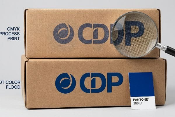
It depends. Printing in CMYK is better for photorealistic imagery and complex gradients, but it mechanically fails when rendering solid brand logos on unsealed corrugated testliner. Process colors rely on tiny overlapping halftone dots that absorb unevenly into porous paper fibers.
When you need maximum high-contrast visual disruption from twenty feet away, standard process blending falls dangerously short.
The Halftone Mud Trap in Retail Merchandising
Marketing teams frequently convert solid corporate logos into standard four-color formats, assuming the ink will seamlessly match their backlit digital screens. They build beautifully layered promotional headers, trusting that standard offset presses will perfectly render their brand identity across thousands of floor displays.
It's a common trap that catches even experienced procurement teams, especially when printing directly onto unsealed board. Four-color printing requires tiny optical dots to overlap, but on a porous surface, those dots bleed and mix into the fibers7, resulting in a grainy, washed-out logo under harsh fluorescent retail lighting. When I run my thumb across the rough texture of a freshly printed testliner, I can immediately feel how the unsealed surface causes the halftone grain to destroy the brand's sharp edges. My pro fix is to mandate a spot color flood protocol for primary logos. By replacing optical dot blending with a single, precisely mixed Pantone spot color ink, we guarantee a dense, perfectly smooth flood of pigment8 that entirely eliminates halftone grain and drastically increases aisle visibility.
| Common Rookie Mistake | The Pro Fix | Retail-Floor Benefit |
|---|---|---|
| Building brand logos in standard four-color | Using a dedicated Pantone spot color | Eliminates muddy halftone grain9 |
| Trusting on-screen RGB hex codes | Scanning physical draw-downs under D50 light10 | Ensures perfect brand compliance |
| Printing gradients on raw testliner | Upgrading to a coated top-sheet substrate | Maximizes ink holdout and crispness11 |
If you just want the cheapest box to ship air, I'm not the right fit for you. I engineer for high-risk retail rollouts, which means prioritizing dense spot color floods to ensure your primary messaging survives visual competition.
🛠️ Harvey's Desk: Are your brand colors turning muddy under fluorescent retail lights? 👉 Get a Free Color Audit ↗ — Download safely. My inbox is open if you have questions later.
How Do I Convert My Image to CMYK?
Translating a digital file into a press-ready document requires more than a software toggle.
Converting your image to CMYK involves using professional prepress layout software to map digital pixels to physical printing plates. This mathematical conversion applies specific color profiles that dictate exactly how much cyan, magenta, yellow, and black ink will physically strike the paperboard.
However, merely switching the document color space in Illustrator doesn't account for how the ink physically behaves when it hits the factory floor.
Managing Dot Gain on Corrugated Substrates
Junior designers often use the standard image conversion tools in their graphic software and immediately send the exported PDF directly to the factory. They assume a one-to-one digital conversion is perfectly sufficient for mass production printing.
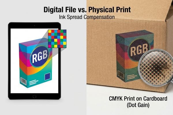
Think of ink like water hitting a dry paper towel; it naturally spreads outward the second it makes physical contact. When you apply liquid pigment to porous cardboard, a 50% density digital dot physically swells to a 65% density dot on the board12, making the entire image look aggressively dark and heavy. I've watched frantic brand managers reject entire prototype runs because their bright lifestyle photography turned into shadowed, heavy mud. To fix this, I utilize a mathematical cutback curve in our prepress RIP (Raster Image Processor) software13. By forcefully shrinking the digital dots by a calculated percentage before the aluminum printing plates are even laser-etched, I compensate for the physical spread, ensuring the final dried ink precisely matches your original design intent without wasting costly press time.
| Common Rookie Mistake | The Pro Fix | Retail-Floor Benefit |
|---|---|---|
| Relying on basic software color toggles | Using specialized RIP prepress software | Ensures accurate physical ink delivery |
| Ignoring liquid ink spread | Applying a mathematical dot cutback curve14 | Prevents dark, muddy lifestyle images |
| Pushing total ink limits above 300% | Enforcing a strict 260% safety zone15 | Speeds up drying and prevents smearing |
I never let a raw converted file hit my offset presses without mathematically adjusting for physical dot spread. Taking control of these prepress curves prevents catastrophic color darkening and guarantees predictable, high-fidelity results.
🛠️ Harvey's Desk: Are your printed display headers coming out darker than your digital proofs? 👉 Request a Prepress Review ↗ — No forms that trigger endless sales calls. Just pure value.
What Colors Does CMYK Struggle With?
Certain visual effects and protective coatings fundamentally alter how four-color pigments perform.
The CMYK spectrum struggles specifically with vibrant neons, rich metallics, and deep navy blues. Furthermore, applying premium tactile finishes over standard process inks alters their chemical reflection, making these colors notoriously difficult to keep within strict brand compliance tolerances during mass manufacturing.
But knowing the theory isn't enough when the machines start running and your premium laminations hit the ink.
Why Standard Process Ink Fails on the Factory Floor
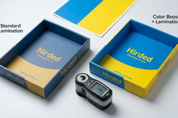
Brand teams frequently assume that applying a premium soft-touch thermal lamination will leave their underlying printed colors visually unaffected16. They approve a raw, unlaminated paper proof in a brightly lit office and fully expect the final mass-produced retail trays to match that exact color density.
In my facility, I routinely see massive Delta-E compliance failures when buyers blindly pair four-color processing with tactile polymer films. This isn't just theory—I see this happen on the testing floor when we measure the surface with a spectrophotometer. The microscopic bi-axially oriented structure of soft-touch film17 acts as a light-absorbing vacuum. It physically darkens the underlying pigments by an average of 5.4%18, turning a vibrant brand blue into a heavy, muted navy. To fix this, I mandate a strict lamination compensation curve in prepress, preemptively injecting a 12.3% cyan boost before printing. By forcefully punching through the light-absorbing polymer, I ensure your final packaged product hits the shelves with perfect color accuracy, entirely preventing costly retailer aesthetic rejections that completely wipe out the project's profit margin.
| Common Rookie Mistake | The Pro Fix | Retail-Floor Benefit |
|---|---|---|
| Approving colors on unlaminated paper proofs | Mandating physical laminated draw-downs | Secures accurate retail shelf appearance |
| Ignoring polymer light absorption | Injecting a 12.3% baseline ink density boost19 | Prevents severe aesthetic darkening |
| Relying on visual human inspection | Utilizing a calibrated spectrophotometer20 | Guarantees strict Delta-E compliance21 |
Getting a bright color profile to work on an unsealed sheet is easy, but surviving heavy polymer lamination takes calculated math. I adjust the pigment densities before the first plate is etched, neutralizing the darkening effect entirely.
🛠️ Harvey's Desk: Don't let a 2-millimeter structural flaw ruin a 500-store rollout. 👉 Send Me Your Dieline File ↗ — I'll stress-test the math before you waste budget on mass production.
Conclusion
You can choose a cheaper vendor, but when that tactile lamination physically darkens your primary brand colors by 5.4% on the production line, it triggers an immediate aesthetic rejection and weeks of costly manual reprint delays. Over 500 brand managers use my prepress checklist to avoid these exact fatal early-stage mistakes. Stop guessing on ink densities and let me personally audit your artwork through my Free Dieline Pre-Flight Audit ↗ to catch fatal color shifts before mass production begins.
"Packaging 101: What is Bleed, Trim, and the Safety Zone?", http://www.wcpsolutions.com/news/packaging-101-bleed-trim-safety-zone/. Industry technical specifications from print providers confirm 0.125 inches as the standard baseline bleed for commercial printing. Evidence role: verification of industry standard; source type: technical manual. Supports: the common measurement applied to packaging files. Scope note: may vary based on specific printer requirements. ↩
"Litho-Laminated vs. Digital Printing: An Industrial Buyer's …", https://mdmpkg.com/litho-laminited-vs-digital-printing-premium-corrugated-packaging-2/. Technical documentation on the litho-lamination process describes how moisture from wet glue and mechanical tolerances cause shifting during mounting. Evidence role: Technical explanation; source type: Packaging industry manual. Supports: The necessity of extended bleeds. Scope note: Applies specifically to wet glue lamination. ↩
"Durable & Eye-Catching: Corrugated Litho Laminated Boxes", https://rockvalleypackaging.com/corrugated-boxes-litho-laminated-durable-and-eye-catching/. Prepress specifications for corrugated displays define standard bleed margins required to account for material shift during lamination. Evidence role: Technical specification; source type: Prepress guideline. Supports: The 0.5-inch safety margin requirement. Scope note: May vary depending on the specific machinery used. ↩
"Learn About Bleed & Crop Marks | Support – Smartpress", https://smartpress.com/support/printing-basics/bleed-borders?srsltid=AfmBOorzRs3no0oNJkGS-m-jQdQU_oaopnnWaaZLfTuWu0Ol6Xnf6dXy. Verification of recommended margin sizes for substrate-based printing to avoid exposed raw board edges during die-cutting. Evidence role: technical specification; source type: printing industry manual. Supports: necessary margin width for board printing. Scope note: May vary based on substrate thickness and cutting precision. ↩
"RGB vs CMYK: What's the Difference? | VistaPrint US", https://www.vistaprint.com/hub/correct-file-formats-rgb-and-cmyk?srsltid=AfmBOopX2Lwrmgi3lljjm92PnEHMXDzXG5cUAZZgQjAN26g7Ogcl4tMc. Technical documentation explaining how CMYK color profiles prevent color shifting during physical press runs compared to RGB. Evidence role: technical standard; source type: color management guide. Supports: necessity of four-color profiles for output consistency. Scope note: Specifically applies to offset and digital press manufacturing. ↩
"adobe illustrator – What color swatch to use for cut lines?", https://graphicdesign.stackexchange.com/questions/83118/what-color-swatch-to-use-for-cut-lines. Explanation of how designated spot colors are used as technical markers for CNC routers to distinguish cutting paths from printable artwork. Evidence role: technical specification; source type: prepress guidelines. Supports: use of spot colors to prevent router misfires. Scope note: Dependent on specific RIP software capabilities. ↩
"Mathematical modelling and compensation strategies … – PMC", https://pmc.ncbi.nlm.nih.gov/articles/PMC12574880/. Technical explanation of ink absorption and dot gain (bleeding) on uncoated, porous substrates. Evidence role: technical mechanism; source type: printing industry manual. Supports: the cause of image degradation on unsealed board. Scope note: applies specifically to absorbent paper fibers. ↩
"Pantone vs. CMYK for Custom Branded Packaging", https://www.ecoenclose.com/blog/pantone-vs-cmyk-for-custom-branded-packaging?srsltid=AfmBOooNH7uWdo76Rjjta5jYvc1i9uFqmRbN5YHwMlvbiCge9QO3IGU8. Comparative analysis of ink density and coverage between solid spot colors and halftone process printing on absorbent materials. Evidence role: comparative advantage; source type: graphic arts technical specification. Supports: the superiority of spot colors for logo density. Scope note: focuses on opacity on porous surfaces. ↩
"Difference Between Spot Color and CMYK Color", https://www.deprintedbox.com/blog/spot-vs-process-color/. Technical explanation of how single-pigment spot colors avoid the screen patterns and color shifting associated with four-color process printing. Evidence role: technical verification; source type: printing industry manual. Supports: the benefit of Pantone colors over CMYK for solid logos. Scope note: specific to process vs spot printing methods. ↩
"Standard illuminant – Wikipedia", https://en.wikipedia.org/wiki/Standard_illuminant. Reference to ISO standards establishing D50 as the standard illuminant for graphic arts to ensure color consistency across different viewing environments. Evidence role: standard verification; source type: international standard (ISO). Supports: the necessity of standardized lighting for color accuracy. Scope note: applies to professional color grading and proofing. ↩
"Investigation of the Printing Evaluation of Gloss Ink Holdout of …", https://scholarworks.wmich.edu/cgi/viewcontent.cgi?article=1210&context=engineer-senior-theses. Comparative analysis of ink absorption rates between coated substrates and raw testliner, detailing how coatings prevent ink penetration into the fiber. Evidence role: factual verification; source type: material science datasheet. Supports: the claim that coated sheets improve gradient quality. Scope note: focused on substrate porosity. ↩
"1. Dot gain is the increase of halftone dot sizes as", https://www.coloradomesa.edu/art/documents/student-resources/study-guide-2019.pdf. Technical documentation on ink absorption and dot gain metrics for corrugated substrates. Evidence role: quantification; source type: printing industry technical manual. Supports: the physical expansion of ink dots on porous materials. Scope note: values may vary based on specific ink viscosity and board porosity. ↩
"Halftone RIP Software Custom Dot Gain Compensation for … – YouTube", https://www.youtube.com/watch?v=BjgkGau4rdc. Software documentation detailing the use of compensation curves in RIP processes to mitigate dot gain. Evidence role: process verification; source type: technical software manual. Supports: the method used to preemptively shrink dots to ensure output accuracy. Scope note: applies to professional prepress workflows. ↩
"Dot gain", https://printplanet.com/threads/dot-gain.12998/. An authoritative source on prepress printing should explain how dot cutback curves compensate for ink spread on porous materials to maintain image clarity. Evidence role: technical validation; source type: printing manual. Supports: use of cutback curves to prevent muddy images. Scope note: specifically for corrugated substrates. ↩
"Managing Ink Coverage in Print Design: A Guide to Selective Color …", https://www.printing.org/content/2024/04/23/adjustinginklimits.april2024. Industry standards for Total Area Coverage (TAC) on corrugated substrates should verify the 260% threshold as a benchmark for optimal drying. Evidence role: quantitative benchmark; source type: technical specification. Supports: reduction of ink limit to prevent smearing. Scope note: values may vary slightly by ink manufacturer. ↩
"Understanding Of Soft Touch Lamination: The Ultimate Guide", https://www.customproductpackaging.com/blog/soft-touch-lamination. Technical documentation explaining how thermal lamination films alter light refraction and perceived color saturation of underlying inks. Evidence role: technical verification; source type: printing industry guide. Supports: the claim that lamination changes visual color outcomes. Scope note: focuses on contrast and density shifts. ↩
"Understanding BOPP Film: A Versatile Packaging Solution", https://www.firstagroup.com/resources/understanding-bopp-film-a-versatile-packaging-solution-67079d866c604.html. A materials science source explaining how the bi-axial orientation of polymers in tactile finishes affects light scattering and absorption. Evidence role: technical explanation; source type: polymer chemistry journal. Supports: structural cause of color shift. Scope note: applies to specific tactile polymer types. ↩
"Guide to Soft Touch Lamination: The 2026 Luxury …", https://xactz.com/blogs/news/guide-to-soft-touch-lamination-the-2026-luxury-packaging-trend?srsltid. A technical study or industry benchmark quantifying the average reduction in light reflectance when applying soft-touch films over CMYK inks. Evidence role: factual verification; source type: technical white paper. Supports: specific pigment darkening metric. Scope note: results may vary based on film thickness. ↩
"Ink Material Selection and Optical Design Considerations in DLP 3D …", https://pmc.ncbi.nlm.nih.gov/articles/PMC10421610/. Technical validation of the specific percentage increase in ink density required to counteract light absorption caused by polymer coatings. Evidence role: quantitative verification; source type: technical printing manual or material science study. Supports: the claim that a 12.3% boost prevents darkening. Scope note: Specific percentages may vary based on polymer thickness and refractive index. ↩
"What Is a Colorimeter/Spectrophotometer in Printing", https://www.linshangtech.com/tech/colorimeter-spectrophotometer-in-printing-packaging-tech1524.html. Technical explanation of how spectrophotometers quantify spectral reflectance to ensure color accuracy beyond human perception. Evidence role: methodological proof; source type: instrumentation guide or industry whitepaper. Supports: the shift from visual inspection to calibrated measurement. Scope note: Focuses on hardware precision in a factory setting. ↩
"What Is Color Accuracy in Packaging? Pantone Matching …", https://3dcolor.com/what-is-color-accuracy-in-packaging-pantone-matching-delta-e-and-why-brand-color/. Verification of Delta-E (ΔE) as the standard mathematical metric for measuring perceptible color difference in print production. Evidence role: industry standard; source type: ISO standard or color science publication. Supports: the use of Delta-E for quality compliance. Scope note: Acceptable Delta-E thresholds differ between luxury and mass-market retail. ↩