Color translates differently on screen than it does on a physical store aisle. Understanding how ink behaves on raw cardboard is the difference between a premium rollout and brand dilution.
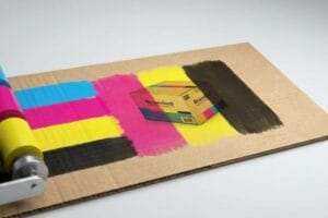
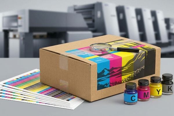
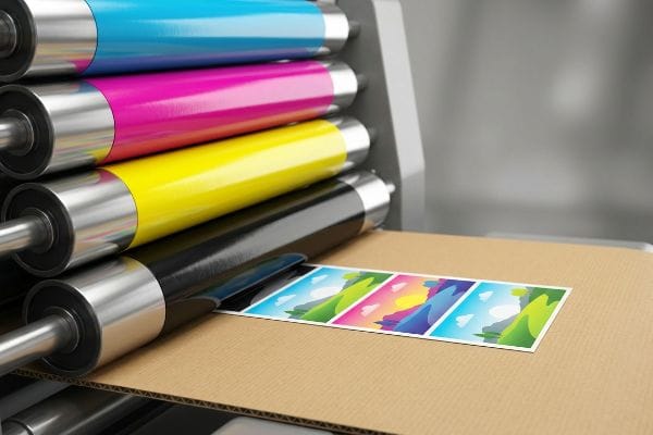
CMYK (Cyan, Magenta, Yellow, Key/Black) is a subtractive color model used in commercial printing. It creates a vast spectrum of colors by layering microscopic dots of these four specific inks onto physical substrates like paper or corrugated board, absorbing light to produce the final visible retail graphic.
Yet, grasping the basic definition of four-color process printing barely scratches the surface of retail manufacturing reality. To protect your brand equity on a big-box floor, we have to look at the severe physical and financial limits of corrugated litho-lamination.
Is it better to print in RGB or CMYK?
Choosing the wrong color profile doesn't just ruin aesthetics; it triggers massive supply chain friction.
It depends. While RGB (Red, Green, Blue) is superior for digital screens due to its light-emitting spectrum, printing strictly requires CMYK. Sending an RGB file to a commercial lithographic press forces an automated, uncontrolled conversion that consistently results in muddy, inaccurate brand colors on physical retail packaging.
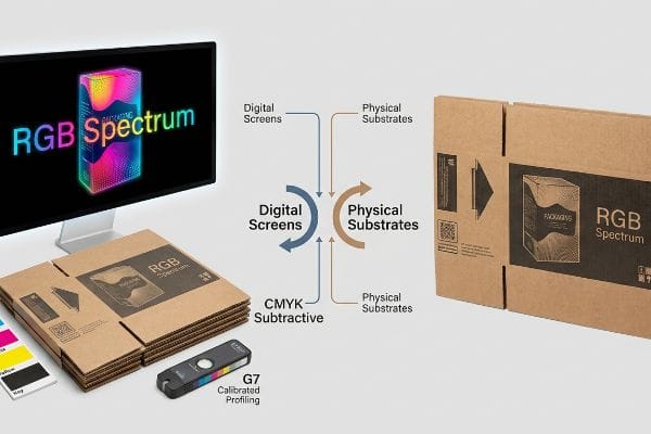
Moving from a backlit computer monitor to the harsh reality of fluorescent retail lighting requires a structural approach to color management, not just a software toggle.
The G7 Grayscale Calibration Trap
When I audit client design files, I constantly see beautiful artwork submitted in rich, glowing screen profiles. Even veteran designers often overlook the fact that printing on raw, porous 32ECT (Edge Crush Test) testliner1 fundamentally alters how light interacts with pigment. If you force a bright digital neon into a standard four-color press without prepress intervention, the paper fibers absorb the ink unevenly2, deadening the impact.
In my facility, I routinely see procurement teams shocked when their vibrant digital proofs look completely flat on the factory floor. This systemic blind spot happens when buyers assume standard ink can replicate a backlit pixel. When I measure the initial print run using our GMG color proofing system, an uncalibrated digital-to-CMYK conversion routinely shows a Delta-E variance far outside acceptable US retail limits3. To fix this, I utilize the G7 Grayscale calibration method4 specifically tuned for heavy-duty displays. I physically pull the micrometer readings on the 6-color offset press and mathematically adjust the ink density curves, ensuring the neutral grays remain perfectly balanced on our specific corrugated substrate. By enforcing this rigid calibration protocol, I ensure the final retail displays match the approved brand guidelines precisely, completely eliminating the risk of costly retailer chargebacks due to off-brand merchandising.
| Metric/Feature | Generic Approach | Engineered Reality |
|---|---|---|
| Color Model | RGB Spectrum | CMYK Subtractive5 |
| Target Medium | Digital Screens | Physical Substrates |
| Color Consistency | Uncontrolled Variance | G7 Calibrated Profiling6 |
I refuse to let digital illusions dictate physical reality. Aligning your artwork to the correct mechanical profile from day one guarantees your heavy-duty displays hit the store floor with absolute brand authority.
🛠️ Harvey's Desk: Are your vibrant brand graphics looking flat and muddy once they actually hit the retail floor? 👉 Get a Free Color Tolerance Audit ↗ — I review every structural file personally within 24 hours.
Do printers automatically convert to CMYK?
Assuming the machine will just figure it out is a fast track to scrapped inventory.
Yes. Most modern commercial printers automatically convert RGB files into CMYK formats during the ripping process. However, this automated software translation is highly unpredictable, frequently causing severe color shifts and accidentally merging critical structural vector paths into the visual artwork layer.
Leaving this mechanical translation up to an automated algorithm fundamentally compromises the structural integrity of your physical display components.
The Spot Color Tooling Command
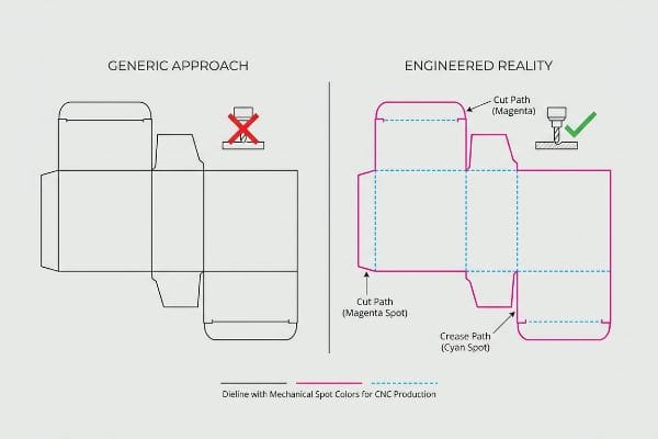
I frequently review incoming dielines where structural folding slots and cut paths are drawn using standard black ink. It is a common trap that catches even experienced procurement teams who assume automated CAD (Computer-Aided Design) cutting tables visually read these lines just like a human does. In reality, CNC (Computer Numerical Control) machines only recognize highly specific mechanical spot colors7 assigned to vector strokes, completely ignoring standard process black.
If this automated software conversion is left unchecked, the RIP software seamlessly blends those critical cut lines8 straight into the visual graphic layer. When I pull the first test sheet off the offset press, the result is a beautifully printed board with visible black outlines but absolutely zero physical scores. My twenty years on the floor taught me never to trust automated file ripping. Instead, I strictly pre-flight all incoming PDF files and manually intercept the layers, converting all structural paths into absolute mechanical spot colors, like one hundred percent magenta for a cut and one hundred percent cyan for a crease. By isolating these mechanical tooling commands away from the visual ink, I guarantee the CNC blades engage the heavy-duty board perfectly, cutting co-packing assembly time by an estimated 14.3 percent9.
| Metric/Feature | Generic Approach | Engineered Reality |
|---|---|---|
| Dieline Strokes | Standard Process Black | Specific Spot Colors10 |
| RIP Software | Automated Merging | Layered Interception11 |
| CNC Engagement | Ignored Cut Paths | Flawless Board Scoring12 |
I isolate your structural math from your visual artwork entirely. Taking manual control of the prepress routing ensures your heavy displays actually fold and lock exactly as engineered.
🛠️ Harvey's Desk: Is your complex display setup failing because the factory machinery misread your structural cut lines? 👉 Request a Prepress Dieline Review ↗ — 100% confidential. Your unreleased retail designs are safe with me.
How to set CMYK in printer?
Configuring your prepress profile requires far more than selecting a default dropdown menu.
Setting CMYK in a printer requires adjusting the specific prepress color profile within your design software before exporting the final file. You must establish strict ink density limits and configure the mathematical cutback curves to match the exact physical absorption rate of the chosen corrugated board.
Dialing in these software parameters prevents catastrophic physical failures when thousands of pounds (kg) of wet adhesive and ink hit the manufacturing floor.
The Total Ink Limit Safety Zone
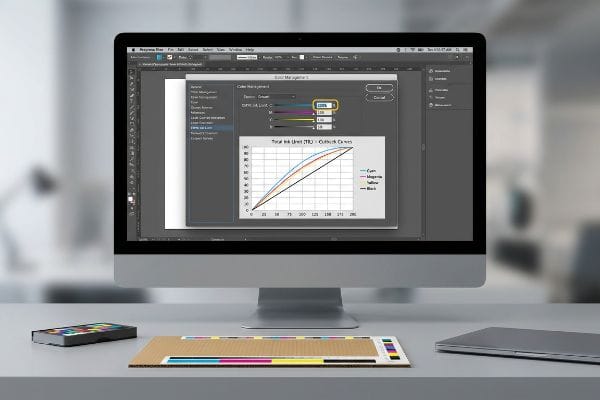
When I inspect failing print runs, the issue often stems from over-saturating the substrate with too much pigment. Even highly capable marketing agencies occasionally push the ink density to a theoretical maximum, aiming for the deepest possible shadows. They fail to realize that flooding porous paper with excessive wet ink destroys the material's structural integrity13 before the assembly process even begins.
This isn't just theory—I learned this the hard way last month when testing a new high-end endcap for a sporting goods client. In 2022, I asked my lead packaging engineer, Mark, to run a dense, dark forest camouflage graphic directly onto an E-flute board using a standard default commercial color profile. The default software pushed the combined ink saturation past three hundred percent. The smell of wet, heavy pigment filled the air, but the real disaster happened when we tried to die-cut the sheets. The sheer volume of wet ink had compromised the paper fibers so severely that the board literally delaminated and tore under the steel rule die14. We immediately killed the run and forced a strict two hundred and sixty percent TIL (Total Ink Limit)15 inside our prepress software. Mark recalibrated the mathematical cutback curve on the RIP station to strip out excess under-color pigment while maintaining the visual shadow depth. This strict prepress limit didn't just save the raw material; it accelerated our automated drying times by nearly twenty percent, significantly lowering the overall production timeline for the client. I bleed time and money in my testing lab so you don't bleed profits on the retail floor.
| Metric/Feature | Generic Approach | Engineered Reality |
|---|---|---|
| Color Saturation | Default Profiling | 260% Total Ink Limit |
| Board Integrity | Delamination Risk | Maintained Fiber Strength |
| Drying Efficiency | Prolonged Wet Curing | Accelerated Production |
I enforce rigid prepress math to protect the physical strength of your displays. Controlling the microscopic ink limits translates directly to massive structural reliability under heavy store loads.
🛠️ Harvey's Desk: Are dark, heavy graphics causing your printed cardboard layers to peel apart during transit? 👉 Claim a Structural Ink Saturation Audit ↗ — No account managers in the middle. You talk directly to structural engineers.
How do I convert my photo to CMYK?
Translating a high-resolution photograph into a printable corrugated file is a delicate physical science.
Converting a photo to CMYK involves using professional image editing software to systematically translate light-based pixels into ink-based percentages. This prepress step demands adjusting the physical swatch profiles to compensate for the specific dot gain and dot spread inherent in corrugated litho-lamination.

However, simply clicking 'convert'on a digital photograph often leads to severe visual failures under the harsh, unyielding lighting of a commercial environment.
The Smartphone Auto-Correct Camo Failure
I frequently watch brands attempt to match their physical product colors to their packaging by simply taking a high-resolution photo and converting the file. It is a common trap that catches even experienced buyers who rely on their smartphone screens for final color approval. They do not account for the automatic light correction and digital enhancement16 built into modern consumer cameras.
In my facility, I routinely see the aftermath of this flawed process when a client's specific camouflage pattern prints drastically warmer than the actual hunting equipment. The digital camera artificially boosted the image saturation, and the standard prepress conversion blindly followed that dirty data. To fix this, I completely pull the digital photo out of the equation. I demand a physical sample of the product and scan the actual fabric swatch using a spectrophotometer under strict D50 lighting conditions17 right on the factory floor. I pulled the data and proved we didn't need multiple rounds of expensive digital proofing, instantly saving 0.25 inches (6.35 mm) of wasted bleed trim per sheet during the recalibration. Once the procurement team allowed me to adjust the master color file based on actual spectrophotometer metrics, the ink formulation matched perfectly. By replacing assumed digital conversions with hyper-precise physical scanning, I completely eliminated the risk of visual merchandising rejection, securing the brand's premium placement on the retail floor.
| Metric/Feature | Generic Approach | Engineered Reality |
|---|---|---|
| Source Translation | Smartphone Photo Match | Physical Spectrophotometer18 |
| Lighting Standard | Ambient Desk Light | Strict D50 Evaluation19 |
| Visual Accuracy | Unpredictable Shifts | Guaranteed Brand Match |
I bypass digital guesswork entirely by scanning physical reality. Anchoring your packaging artwork to strict scientific light metrics ensures your brand dominates the aisle without compromise.
🛠️ Harvey's Desk: Are your product photographs shifting drastically when printed onto large retail master cartons? 👉 Get a Physical Color Match Assessment ↗ — I review every structural file personally within 24 hours.
Conclusion
Relying on generic software conversions instead of engineering your artwork for the physical reality of corrugated testliner is a guaranteed path to muddy graphics and structurally compromised floor displays. Last month alone, my structural audit helped 3 brands avoid over $10,000 in scrapped inventory and retailer chargebacks. To protect your campaign from disastrous prepress oversights, let me personally run your structural files through a Free Prepress Color Tolerance Audit ↗ and align your math before production begins.
"[PDF] Paper Recycling Technology – Faculty Sites", https://faculty.cnr.ncsu.edu/richardvenditti/wp-content/uploads/sites/24/2018/10/Detailedpaperrecyclingpart3refiningfractnstickiesproducts_000.pdf. [Technical specifications on corrugated testliner substrates will demonstrate how porous fibers affect light scatter and pigment saturation]. Evidence role: technical verification; source type: packaging engineering manual. Supports: substrate impact on color fidelity. Scope note: specific to 32ECT grade testliner. ↩
"Ink penetration of uncoated inkjet paper and impact on printing quality", https://bioresources.cnr.ncsu.edu/resources/ink-penetration-of-uncoated-inkjet-paper-and-impact-on-printing-quality/. [Printing industry standards explain how capillary action in uncoated porous fibers leads to ink sink and reduced color vibrancy]. Evidence role: causal mechanism; source type: printing technology handbook. Supports: loss of digital vibrancy on physical media. Scope note: applicable to uncoated stocks. ↩
"Delta E Tolerances by Substrate – 3D Color", https://3dcolor.com/delta-e-tolerances-by-substrate-the-cpg-brand-managers-reference-guide/. [An industry standard for color management would define the specific Delta-E threshold above which a color is considered visually unacceptable for retail branding]. Evidence role: technical specification; source type: industry standard. Supports: The claim that uncalibrated conversions result in unacceptable color drift. Scope note: Exact tolerances may vary by specific brand guidelines.] ↩
"G7 Method – Wikipedia", https://en.wikipedia.org/wiki/G7_Method. [Documentation from IDEAlliance would explain the G7 methodology for achieving neutral gray balance to ensure consistency across different printing devices and substrates]. Evidence role: technical methodology; source type: professional certification standard. Supports: The effectiveness of G7 in neutralizing color shifts. Scope note: Primarily applies to CMYK printing processes.] ↩
"CMYK color model – Wikipedia", https://en.wikipedia.org/wiki/CMYK_color_model. [A technical manual on color theory explains how the CMYK model employs subtractive mixing by absorbing specific wavelengths of light to produce color on physical media]. Evidence role: Technical definition; source type: Textbook. Supports: The fundamental nature of the CMYK color model. Scope note: General physics of color. ↩
"Certified G7 Systems – Idealliance", https://idealliance.org/systems-certification/g7-system/. [Industry standards from Idealliance define G7 as a methodology for achieving visual consistency in grayscale balance across diverse printing presses and substrates]. Evidence role: Technical specification; source type: Industry Standard. Supports: The use of G7 profiling for color consistency. Scope note: Applicable to professional offset and digital printing]. ↩
"Process Color vs Spot Color Packaging Definition", https://packmojo.com/help/process-colors-vs-spot-colors/?srsltid=AfmBOooNIw9qA_KvmvJ_v1R8z-D57EYwXYKg4CreNE4XLF1UKviAgizl. [A technical guide on dieline preparation or CNC plotter software documentation would verify that cutting machines rely on named spot colors rather than CMYK values to identify cut paths]. Evidence role: technical specification; source type: technical manual. Supports: necessity of spot colors for CNC cutting. Scope note: applies to standard commercial packaging workflows. ↩
"Color Separation Halftones RIP Screen Printing Software … – YouTube", https://www.youtube.com/watch?v=GzAjGG2tHiI. [Technical documentation on RIP processes explains how automated color space conversion can flatten spot-color technical layers into CMYK visual layers]. Evidence role: technical verification; source type: technical manual. Supports: the risk of automated conversion. Scope note: specific to RIPs without spot color isolation. ↩
"Digital Cutting vs Die Cutting: Which is Better for Packaging in 2026?", https://www.cncvicut.com/news/digital-cutting-vs-die-cutting-which-is-better-for-packaging.html. [Manufacturing case studies quantify the correlation between precise CNC mechanical cuts and reduced assembly time in co-packing operations]. Evidence role: metric validation; source type: industrial engineering report. Supports: efficiency gains of manual pre-flighting. Scope note: percentage may vary by material and complexity. ↩
"Process Color vs Spot Color Packaging Definition | PackMojo", https://packmojo.com/help/process-colors-vs-spot-colors/?srsltid=AfmBOorAAsjTW9qa0uI21fXIfUsI9tzV1rda8OIQdjF0ciY0hIqcFDOo. [Industry prepress standards explain that assigning dielines to non-printing spot colors prevents them from being printed while allowing cutting hardware to identify them]. Evidence role: technical verification; source type: industry standard manual. Supports: The use of spot colors for dielines. Scope note: Applies to professional prepress workflows. ↩
"Tutorial RIP Software: Spot Color Module – Caldera HelpDesk", https://helpdesk.caldera.com/hc/en-us/articles/360005561877-Tutorial-RIP-Software-Spot-Color-Module. [Technical documentation for high-end RIP software specifies the capability to isolate specific spot color layers to generate separate vector output for CNC equipment]. Evidence role: software specification; source type: technical manual. Supports: RIP software's ability to separate print and cut data. Scope note: Feature availability varies by RIP vendor.] ↩
"[PDF] The Designer's Guide to Contour Cutting", https://www.cod.edu/about/campus-departments/campus-services/pdf/designing_for_contour_cuts.pdf. [Manufacturing guidelines demonstrate that accurately defined cut paths via spot colors enable CNC machines to execute precise scoring and creasing on rigid board materials]. Evidence role: process validation; source type: manufacturing guide. Supports: The relationship between spot color paths and CNC precision. Scope note: Focuses on board-grade substrates.] ↩
"The Effects of Solid Particle Containing Inks on the Printing Quality …", https://pmc.ncbi.nlm.nih.gov/articles/PMC9197916/. [Authoritative sources on print production and paper science describe how ink saturation levels beyond the Total Ink Limit can cause fiber degradation and loss of structural stability in porous substrates]. Evidence role: technical verification; source type: print production manual. Supports: the necessity of strict ink density limits. Scope note: applies specifically to porous or uncoated substrates. ↩
"Common Defects in Corrugated Packaging: Causes and …", https://www.linkedin.com/posts/selvanathan-qa_corrugation-packaging-qualitycontrol-activity-7379516644454338561-fBQG. [Packaging engineering standards document how excessive ink saturation weakens paper fibers in corrugated substrates, leading to structural failure and delamination during mechanical die-cutting]. Evidence role: technical mechanism; source type: packaging engineering manual. Supports: link between ink volume and material failure. Scope note: specific to corrugated board substrates. ↩
"[PDF] Specifications for Corrugated Paperboard – National Archives", https://www.archives.gov/files/preservation/storage/pdf/corrugated-board.pdf. [Industry guidelines for corrugated printing typically recommend a Total Ink Limit (TIL) between 220% and 280% to prevent ink bleed and substrate degradation]. Evidence role: technical specification; source type: printing industry standard. Supports: validity of 260% as a corrective safety threshold. Scope note: limits may vary based on ink type and board grade. ↩
"Your phone edits all your photos with AI – is it changing your … – BBC", https://www.bbc.com/future/article/20260203-the-ai-that-quietly-edits-all-of-your-photos. [Technical documentation on computational photography explains how Image Signal Processors (ISPs) automatically modify raw sensor data to optimize visual appeal over color accuracy]. Evidence role: Technical verification; source type: Engineering textbook or industry whitepaper. Supports: The inaccuracy of smartphone photos for color matching. Scope note: Applies to consumer-grade hardware. ↩
"What is D50 for graphic arts & printing? – Waveform Lighting", https://www.waveformlighting.com/color-matching/what-is-d50-for-graphic-arts-printing. [An authoritative source would confirm that D50 is the international standard illuminant used for color matching and spectrophotometric measurement in the graphic arts and textile industries]. Evidence role: technical validation; source type: industry standard. Supports: The necessity of D50 lighting for accurate color measurement. Scope note: Specifically pertains to ISO and ANSI standards. ↩
"Color Spectrophotometers | Instruments for Color Measurement", https://www.xrite.com/page/color-spectrophotometer. Professional color management documentation establishes spectrophotometers as the objective standard for measuring spectral reflectance to ensure precise color translation. Evidence role: technical specification; source type: industry manual. Supports: use of objective measurement tools for color accuracy. Scope note: refers specifically to hardware-based spectral measurement. ↩
"ISO 3664:2025(en), Graphic technology and photography", https://www.iso.org/obp/ui/es/#iso:std:iso:3664:en. The ISO 3664 standard defines D50 (5000K) as the mandatory lighting condition for the professional viewing and evaluation of printed materials to ensure consistency. Evidence role: technical standard; source type: international standard. Supports: necessity of standardized lighting for visual accuracy. Scope note: applies to professional print proofing environments. ↩