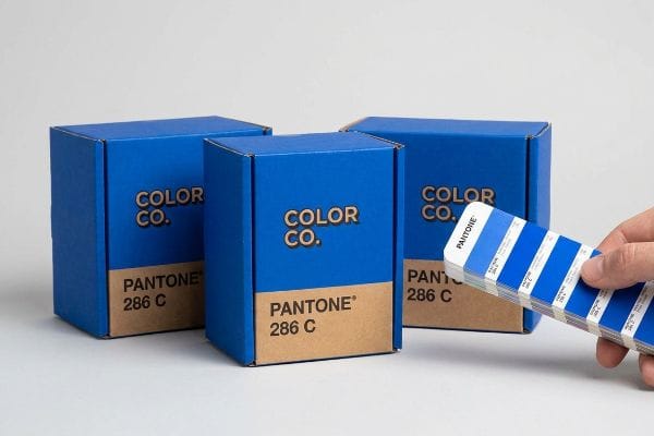
You've seen the swatches, but guessing colors ruins brands on the retail floor. Getting your exact hue right requires physical chemistry, not a glowing digital screen.
Pantone is a global color matching system used universally to ensure consistent ink production across different printing presses and substrates. It relies on exact chemical ink formulations rather than optical dot blending, guaranteeing your brand identity remains physically accurate from the design file to the final retail display.
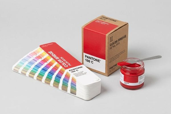
That basic definition makes sense in an office, but translating those swatches onto raw, porous retail packaging is a completely different beast.
What is the purpose of Pantone color?
The goal isn't just looking pretty; it's about survival under harsh store lights. Without a standardized system, your logo becomes an unpredictable variable across different printing facilities.
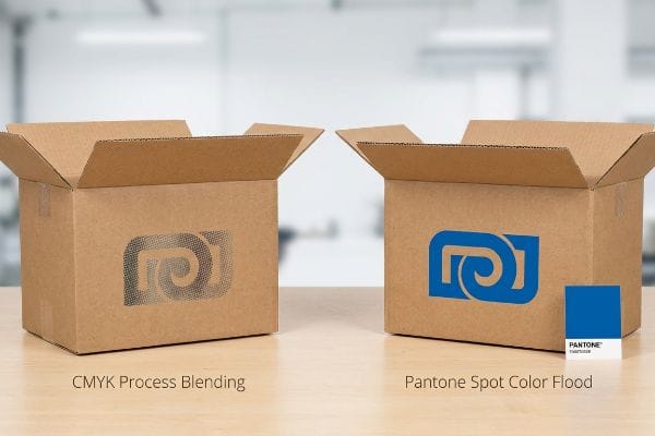
The purpose of Pantone color is to eliminate printing variables by providing an exact, universal ink formulation. This prevents the muddy, washed-out appearance caused by standard CMYK (Cyan, Magenta, Yellow, Key/Black) halftone dot blending, ensuring solid, dense brand colors regardless of the material or manufacturing facility.
But knowing why it exists isn't enough when the heavy printing machines actually start running the job.
Why Process Blending Fails on Raw Cardboard
Marketing teams frequently assume that converting their digital corporate logos into standard four-color formats will seamlessly match their monitors1. They design beautiful, solid-looking brand assets and hand them over to procurement, expecting the physical output to perfectly mirror the PDF (Portable Document Format) file.
Even veteran designers often overlook the physical texture of raw corrugated testliner. When I watch standard process printing run on unsealed paperboard, I see the tiny overlapping halftone dots absorbing unevenly into the rough, dusty fibers2. This optical blending fails mechanically, creating a grainy, washed-out logo that looks like mud under harsh fluorescent store lighting. To fix this, I always mandate a spot color flood protocol, using a precisely mixed single ink vat to deliver a dense, perfectly smooth flood of pigment that completely eliminates halftone grain3 and boosts high-contrast visibility from 20 feet away.
| Common Rookie Mistake | The Pro Fix | Retail-Floor Benefit |
|---|---|---|
| Relying on process inks for solid logos | Formulate a custom spot color mix | Eliminates washed-out halftone grain4 |
| Printing directly on raw brown testliner5 | Using a dedicated flood protocol | Ensures high-contrast brand visibility |
| Assuming screen colors match physical ink6 | Mixing ink via physical formulations | Protects brand identity across channels |
I refuse to let a high-stakes retail campaign look like a cheap counterfeit just because of dot gain. Switching to a dedicated spot mix is the only way to guarantee your logo actually pops off the shelf.
🛠️ Harvey's Desk: Not sure if your brand logo will turn into muddy dots on a raw corrugated board? 👉 Get a Free Pre-Flight Audit ↗ — Direct access to my desk. Zero automated sales spam, I promise.
Does Pantone actually own colors?
It sounds like a strange monopoly, but nobody owns a wavelength of light. What they actually own is the recipe required to replicate that specific light reflection reliably.
No. Pantone does not own the colors themselves; they own the proprietary chemical formulations and the standardized communication system used to reproduce them. You are paying for the exact mathematical recipe that guarantees a specific blue printed in Chicago matches the exact same blue manufactured overseas.
Understanding this distinction is critical because trusting a digital screen to match a physical recipe will destroy your brand identity.
The Digital Screen Illusion
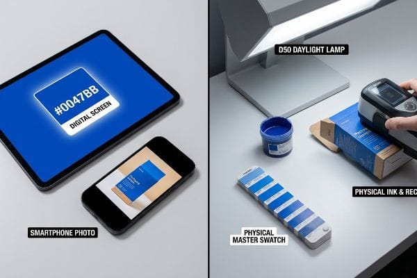
Brand managers often pull up a hex code on their high-resolution tablet and assume that is the absolute truth of their brand. They believe that as long as the digital file has the correct numeric value, the factory's printing press will automatically output the correct visual hue7.
I see this digital reliance cause serious delays when clients try to approve physical samples using smartphone photos sent over email. A phone camera auto-corrects the lighting, and when the client holds their backlit screen up to the physical sample, the hues clash violently. In my facility, I never rely on a smartphone lens; I physically scan the printed top-sheet with a spectrophotometer under strict D50 daylight bulbs8, measuring the exact light reflection against the proprietary master recipe to guarantee the ink formulation is mathematically perfect before we run the presses.
| Common Rookie Mistake | The Pro Fix | Retail-Floor Benefit |
|---|---|---|
| Approving colors via smartphone photos | Scanning with a spectrophotometer9 | Removes lighting and lens variables |
| Trusting backlit computer screen codes | Matching to a physical master swatch | Guarantees exact chemical ink formulation10 |
| Ignoring ambient lighting conditions | Evaluating under D50 daylight bulbs11 | Prevents color shifts in retail stores |
I always tell my clients that screens lie. Until you have measured the physical ink on the actual paper substrate under controlled lighting, you are just guessing at your own brand guidelines.
🛠️ Harvey's Desk: Are you still approving your factory's print samples using smartphone photos sent over email? 👉 Request a Color Match Consultation ↗ — Download safely. My inbox is open if you have questions later.
Is Pantone used anymore?
With digital presses booming, some assume custom ink mixing is obsolete. But when your brand requires highly specific metallic or fluorescent finishes, digital process colors fall completely flat.
Yes. Pantone is still heavily used, especially for specialty inks, metallics, and highly specific brand identities that digital presses cannot physically reproduce. High-fidelity offset lithography relies on these exact spot color formulations to maintain strict brand consistency across major retail and packaging rollouts globally.
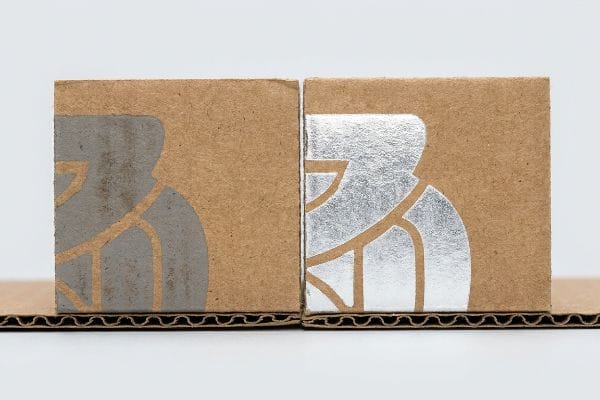
While digital printing is great for fast prototypes, large-scale retail rollouts still demand the physical chemistry of specialized ink formulations.
The Specialty Ink Trap on Corrugated
Designers frequently include stunning metallic silver or fluorescent accents in their artwork, assuming the standard digital presses can just magically simulate these unique light-reflecting properties. They expect a premium finish without realizing that standard process inks contain zero actual metallic flakes12.
It's a common trap that catches even experienced procurement teams when they try to print PMS 877 Silver directly onto porous kraft board. When I run this on the line without preparation, the raw paper completely absorbs the metallic flakes13, leaving behind a dull, muddy grey that smells sharply of wet clay. To achieve that premium metallic snap on a massive 48-inch (121.9 cm) display panel, I have to engineer a strict protocol where we lay down a specialized white base primer ink first14, sealing the board's pores so the silver spot color sits perfectly on top and actually reflects the store lighting.
| Common Rookie Mistake | The Pro Fix | Retail-Floor Benefit |
|---|---|---|
| Expecting digital presses to print metallics15 | Using physical metallic spot inks | Delivers true premium brand aesthetics |
| Printing silver directly on bare kraft board16 | Applying a white base primer first | Prevents dull, muddy ink absorption |
| Assuming digital handles all specialty hues | Utilizing offset lithography presses17 | Maintains strict specialty finish quality |
I've seen too many premium product launches ruined by dull, lifeless grey ink. If your brand relies on a specialty finish, you must engineer the chemical layers, not just send a digital file.
🛠️ Harvey's Desk: Is your packaging looking washed out because the factory skipped the primer layer? 👉 Claim Your Print Strategy Review ↗ — No forms that trigger endless sales calls. Just pure value.
When should I use Pantone?
Deciding when to invest in custom ink mixes comes down to one factor: risk. If brand equity is your primary driver, precision is non-negotiable.
You should use Pantone when strict brand equity is required, such as matching corporate logos, printing massive multi-national campaigns, or utilizing specialty metallic inks. It becomes necessary when consistency must be perfectly maintained across different packaging materials like plastics, corrugated boards, and labels.
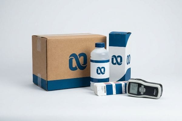
But knowing the theory isn't enough when the heavy machinery starts running and material variables threaten your brand identity.
Why Standard Color Targets Fail on the Factory Floor
Procurement managers often try to cut costs by allowing their vendors to visually match a spot color using cheaper process printing18. They assume that as long as the color looks close enough to the naked eye on the initial sample, it will hold up across an entire production run of thousands of units.
In my facility, I routinely see how this visual match assumption breaks down during mass production, causing massive friction and completely wiping out a project's profit margin through retailer rejections. When I measure the first-off-the-line litho-laminated sheets, a slight shift in humidity or a 0.05 oz (1.4 g) fluctuation in ink density across a massive 6-color Heidelberg offset press causes drastic visual shifts in the printed output. Instead of letting buyers risk a chargeback, I ruthlessly enforce a strict Delta-E tolerance using GMG Color Proofing systems and dedicated spot inks, ensuring the exact chemical hue remains mathematically locked. By locking in this specific physical chemistry, I ensure the color variation remains invisible to the human eye, drastically cutting prepress adjustment time by an estimated 40% and saving clients from rejected batches.
| Common Rookie Mistake | The Pro Fix | Retail-Floor Benefit |
|---|---|---|
| Relying on visual color matching | Enforcing mathematical Delta-E limits19 | Prevents massive retailer chargebacks |
| Using process inks to save short-term costs | Committing to a dedicated spot ink mix20 | Guarantees identical brand consistency |
| Ignoring press ink density fluctuations | Utilizing dedicated color proofing systems21 | Accelerates safe production timelines |
I never let my clients play roulette with their brand colors. Enforcing a strict, measurable tolerance is the only way to sleep at night when you have a national product rollout on the line.
🛠️ Harvey's Desk: Do you know the exact Delta-E tolerance your current printer is maintaining across your multi-component packaging? 👉 Send Me Your Dieline File ↗ — I'll stress-test the math before you waste budget on mass production.
Conclusion
You can choose a printer who simply guesses at your brand colors to save a few dollars, but when that inconsistent halftone mud hits the shelves, diluting your brand equity and triggering an immediate retailer rejection, the resulting manual rework will completely wipe out your profit margins. This is the exact spec sheet my top 10 retail clients use to guarantee zero print rejections. Stop gambling with your visual identity and let me personally run your artwork files through my Free Dieline Pre-Flight Audit ↗ to lock in your chemistry before you go to print.
"RGB vs. CMYK: The 2026 Guide to Perfect Print Colors", https://www.jukeboxprint.com/blog/rgb-vs-cmyk-for-print?srsltid=AfmBOopW01XrtTdLzROm5p90NW19GHekeKl9SopWJ1iGzWTlIz3Xcl3Z. [Industry standards for color management explain the technical discrepancy between additive RGB light used by monitors and subtractive CMYK ink used in printing]. Evidence role: technical explanation; source type: industry manual. Supports: the inherent difficulty in matching digital colors to physical prints. Scope note: applies to standard process printing. ↩
"effects of corrugated board and halftone dot deformations", https://www.academia.edu/60461055/Print_uniformity_of_corrugated_board_in_flexo_printing_effects_of_corrugated_board_and_halftone_dot_deformations. [Technical documentation on printing substrates explains how the high porosity of unsealed paperboard leads to uneven ink absorption and dot gain in CMYK process printing]. Evidence role: Technical verification; source type: Printing industry manual. Supports: The mechanical failure of optical blending on raw cardboard. Scope note: Applies specifically to unsealed substrates. ↩
"4 Color Process VS Halftone VS Spot Color", https://www.interplas.com/product_images/Tools/Custom-Printing.pdf. [Industry standards for color management confirm that solid spot colors provide a uniform pigment layer that removes the dot pattern inherent in process printing]. Evidence role: Technical verification; source type: Ink formulation guide. Supports: The use of spot color floods to eliminate grain. Scope note: Contrast between spot and halftone application. ↩
"Spot color vs. process color | Adobe", https://www.adobe.com/creativecloud/design/discover/spot-vs-process-color.html. [Technical manuals on color reproduction explain that spot colors provide solid, opaque coverage while process (CMYK) inks rely on halftones that can appear grainy in large solid areas]. Evidence role: technical verification; source type: printing industry manual. Supports: the benefit of custom spot color mixes. Scope note: primarily applies to offset and flexographic printing.] ↩
"White Printing on Kraft (Brown) Corrugated Boxes – Salazar Packaging", https://www.salazarpackaging.com/white-printing-kraft-brown-corrugated-boxes/. [Packaging standards specify that printing on brown testliner requires a white underprint or flood coat to prevent the porous substrate from absorbing ink and dulling brand colors]. Evidence role: technical requirement; source type: packaging technical guide. Supports: the necessity of dedicated flood protocols. Scope note: specific to brown kraft/corrugated substrates.] ↩
"Why are red, yellow, and blue the primary colors in painting but …", https://www.wtamu.edu/~cbaird/sq/2015/01/22/why-are-red-yellow-and-blue-the-primary-colors-in-painting-but-computer-screens-use-red-green-and-blue/. [Color science literature details the discrepancy between additive light-based screen colors (RGB) and subtractive pigment-based physical inks (CMYK/Pantone)]. Evidence role: fundamental principle; source type: color theory textbook. Supports: the need for physical ink formulations for brand consistency. Scope note: general color science.] ↩
"A Comprehensive Comparison of RGB, CMYK, and HEX – QPMN", https://www.qpmarketnetwork.com/printing/understanding-color-spaces-a-comprehensive-comparison-of-rgb-cmyk-and-hex/. [An authoritative source on color management or print production explains the technical discrepancy between additive RGB values (hex) and subtractive ink processes]. Evidence role: technical clarification; source type: industry standard. Supports: the claim that digital numeric values do not translate directly to physical ink hues. Scope note: Focuses on the difference between screen-based and press-based color spaces. ↩
"Color Chaos at the Light Booth: Why D50 Is Your Packaging …", https://www.linkedin.com/pulse/color-chaos-light-booth-why-d50-your-packaging-carmon-madison-6bb4e. [Technical manuals on color management and ISO standards specify the use of D50 daylight illuminants for consistent spectrophotometer readings in the printing industry]. Evidence role: technical specification; source type: industry standard. Supports: The use of standardized lighting for precise color verification. Scope note: Specifically applies to graphic arts and colorimetric measurement. ↩
"[PDF] Comparison of color accuracy of commercial digital cameras and …", https://researchrepository.wvu.edu/cgi/viewcontent.cgi?article=1182&context=etd. [An authoritative source on colorimetry would explain how spectrophotometers measure spectral reflectance to eliminate variables such as lens distortion and ambient lighting]. Evidence role: technical validation; source type: technical manual. Supports: the claim that spectrophotometers remove lighting and lens variables. Scope note: Applies to professional color grading. ↩
"Pantone Color Systems – Introduction", https://www.pantone.com/color-systems/pantone-color-systems-explained?srsltid=AfmBOori5edIm70OaaAdl3mBqGVf9HqH0xFHq3USfMeDsual-F7DARdK. [Industry standards for spot colors describe the process of creating specific pigment mixtures to ensure consistency regardless of the output device]. Evidence role: factual verification; source type: printing industry standard. Supports: the link between physical master swatches and specific ink chemistry. Scope note: Specific to subtractive color mixing. ↩
"What is D50 for graphic arts & printing? – Waveform Lighting", https://www.waveformlighting.com/color-matching/what-is-d50-for-graphic-arts-printing. [ISO standards for lighting in the graphic arts industry specify D50 as the standard illuminant to ensure consistent color perception and prevent metamerism]. Evidence role: technical specification; source type: ISO standard. Supports: the use of D50 lighting to prevent color shifts. Scope note: Focused on professional color matching environments. ↩
"CMYK vs. Spot Color: Which is Process is Best | Prime Line Packaging", https://www.primelinepackaging.com/blog/cmyk-spot-color/. [An authoritative printing or ink chemistry manual explains that standard CMYK process inks are pigment-based and lack the physical metallic particles required for true light reflectivity]. Evidence role: technical specification; source type: industry technical handbook. Supports: the physical limitation of digital process printing regarding metallics. Scope note: applies specifically to standard CMYK formulations. ↩
"Paper and board, metallic foil, films and multi-layer constructions", http://www.labelsandlabeling.com/label-academy/article/flexible-packaging-paper-and-board-metallic-foil-films-and-multi-layer-constructions. [Industry manuals on substrate porosity explain how un-coated kraft board absorbs ink pigments and flakes, which disrupts the surface layer and reduces reflectivity.] Evidence role: Technical validation; source type: Industry handbook. Supports: The cause of dull appearance when printing metallics on porous board. Scope note: Specific to un-primed substrates. ↩
"White Ink Underneath Gold Printing | Foil Pouch Color Guide", https://achievepack.com/knowledge/white-ink-underprint?srsltid=AfmBOop0iLvOntTKU9l0xo_b9RGysJiz7QTJbECjgrIZzQLtYjs_J5O9. [Technical printing guides specify that a white under-layer is necessary on non-white or porous substrates to seal the board and ensure metallic inks maintain their brilliance.] Evidence role: Process verification; source type: Technical data sheet. Supports: The requirement for white primer to achieve metallic reflectivity. Scope note: Standard practice for specialty spot colors. ↩
"Spot Colors vs CMYK Digital Printing | DIYPack", https://www.diypack.com/blog/spot-colors-vs-cmyk-digital-printing?srsltid=AfmBOoqX0MBQY3ycjdG_D0Sc4yM4VxvEBOH0Grp-4L7YuCU6FqiLqwos. [An authoritative print production guide explains that standard digital presses cannot replicate the physical metallic pigments found in spot inks. Evidence role: technical limitation; source type: printing industry manual. Supports: the need for physical metallic spot inks. Scope note: refers to standard CMYK digital presses.] ↩
"How to Print Clearly on Kraft Packaging – PackifyMe", https://packifyme.com/how-to-print-clearly-on-kraft-packaging/. [Technical documentation on corrugated printing specifies that a white base primer is required to prevent the dark, absorbent nature of kraft board from muddying reflective metallic inks. Evidence role: technical specification; source type: print production guide. Supports: the use of white base primers for silver inks. Scope note: specific to opaque/reflective inks on brown substrates.] ↩
"Digital Printing vs Offset Printing: Which to Choose?", https://www.mimeo.com/blog/digital-printing-vs-offset-printing/. [Industry technical comparisons highlight that offset lithography allows for precise custom ink mixing, ensuring stricter quality control for specialty finishes than digital process simulations. Evidence role: technical comparison; source type: printing technology whitepaper. Supports: the superiority of offset for specialty hue consistency. Scope note: focuses on Pantone and specialty spot color accuracy.] ↩
"CMYK vs. Spot Colors in Packaging Printing", https://meyers.com/meyers-blog/cmyk-vs-spot-colors-in-packaging-printing-what-cpg-brands-need-to-know/. [Industry standards for color management detail the inherent variance in CMYK process printing compared to the stability of premixed spot colors in high-volume production]. Evidence role: technical validation; source type: industry manual. Supports: the risk of substituting spot colors with process printing. Scope note: focuses on commercial offset and digital printing. ↩
"Best Practices for Delta E Tolerance Standards – Datacolor", https://www.datacolor.com/business-solutions/blog/best-practices-delta-e-tolerances/. [An authoritative source on colorimetry would define the specific Delta-E thresholds used by retailers to trigger quality penalties or chargebacks]. Evidence role: Technical verification; source type: Industry standard. Supports: The link between mathematical color measurement and financial risk mitigation. Scope note: Thresholds vary by industry and retailer. ↩
"Process Color vs Spot Color Packaging Definition | PackMojo", https://packmojo.com/help/process-colors-vs-spot-colors/?srsltid=AfmBOop4vzxkSu27yYR9xMGMUoADdZJvq5dS5_s_6h0Si622kkoF7qmw. [Comparative technical guides on ink chemistry would explain why dedicated spot inks eliminate the variability inherent in CMYK process overlays]. Evidence role: Technical justification; source type: Printing manual. Supports: The claim that spot inks guarantee superior brand consistency. Scope note: Primarily relevant for high-volume commercial printing. ↩
"Prepress proofing – Wikipedia", https://en.wikipedia.org/wiki/Prepress_proofing. [Industry case studies on print production workflows would demonstrate how automated proofing reduces press-side adjustments and setup time]. Evidence role: Process optimization proof; source type: Technical case study. Supports: The claim that proofing systems accelerate production timelines. Scope note: Effectiveness depends on the level of system integration. ↩