You designed a stunning retail display on your monitor, but when the factory ships the physical units, the colors look muddy and washed out. The culprit is usually prepress chemistry.
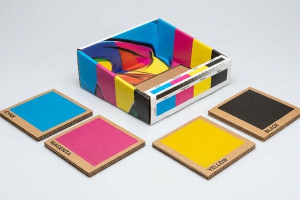
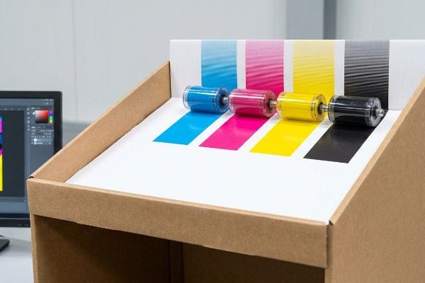
CMYK stands for Cyan, Magenta, Yellow, and Key (Black). It is the standard subtractive color model used in global commercial printing. Unlike digital screens that emit light, physical printing presses combine these four transparent ink pigments on physical substrates to absorb light and produce thousands of distinct color variations.
Understanding this ink chemistry is just the first step; surviving the brutal transition from a digital design file to a physical corrugated retail display requires serious manufacturing discipline.
Why does k in CMYK stand for black?
The letter 'B'was already taken by 'Blue'in the digital RGB (Red, Green, Blue) space, but the physical reality of the 'Key'plate goes much deeper into manufacturing.
The 'K'in CMYK stands for 'Key'because it acts as the primary alignment plate during the printing process. Black ink provides the essential contrast, depth, and structural outlines for the image, while the cyan, magenta, and yellow plates are meticulously registered against this key black layer.
That simple black ink layer dictates visual depth, but treating digital black like physical manufacturing black creates catastrophic prepress failures, completely ignoring the logistics of flat-pack shipping where a poorly cut board ruins a campaign.
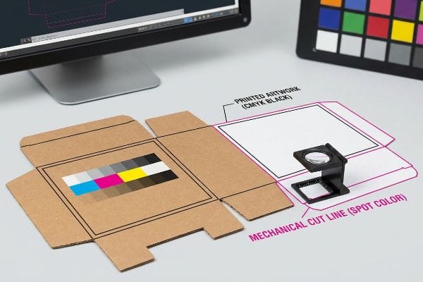
The Mechanical Black Tooling Trap
When I audit client dielines, I constantly see flat vector strokes built using standard CMYK black to indicate where the display should be cut or folded. Desk-bound graphic designers assume our automated CAD (Computer-Aided Design) cutting tables will instinctively recognize this dark visual line as a mechanical directive. They fail to understand that industrial routing machines and laser die-board burners do not read standard four-color visual pigments1; they require absolute, mathematically designated spot colors2 to trigger the physical steel.
This isn't just theory—I see this happen on the testing floor when a client submits a massive 48×40 inch (1219.2×1016 mm) pallet skirt file with CMYK black fold lines. When we feed that raw PDF into the RIP (Raster Image Processor) software without intervention, the machine simply merges those black lines into the artwork layer. The result? A perfectly printed flat-pack box with visible black outlines on the corrugated face, but zero physical cuts or creases from the CNC (Computer Numerical Control) blades. To fix this, I completely separate the layers during prepress pre-flight, forcibly converting their digital black strokes into mechanical spot colors3 (like 100% Magenta for cuts). By enforcing this strict tooling color separation, I prevent a complete misprint of the batch, saving clients thousands of dollars in wasted testliner and guaranteeing a frictionless, 45-second assembly on the co-packing line.
| Prepress Feature | Digital Design Assumption | Factory Machinery Reality |
|---|---|---|
| Cut Line Designation | Standard CMYK black stroke | 100% Spot Color (Magenta)4 |
| Machine Interpretation | Visual outline on board | Physical blade depth trigger5 |
| Production Consequence | Artwork ruined by printed lines6 | Clean cuts, pristine graphics |
I never trust incoming digital black lines on structural files. I intercept and remap every single stroke personally, ensuring your heavy-duty floor displays actually fold correctly instead of just looking pretty on a flat computer screen.
🛠️ Harvey's Desk: Are your current dielines at risk of being misread by automated factory cutting tables, destroying your entire print run? 👉 Get a Free Structural Dieline Audit ↗ — I review every structural file personally within 24 hours.
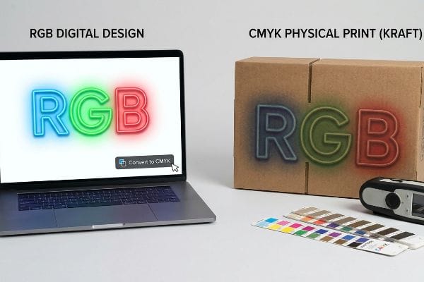
Should I use RGB or CMYK?
Designing retail packaging in a light-emitting color space is the fastest way to trigger a massive brand compliance failure on the physical store floor.
Using CMYK instead of RGB is mandatory for printed packaging. RGB is exclusively for digital screens that emit light. If you send RGB files to a commercial printer, the prepress software will force a conversion, physically dulling your vibrant brand colors and resulting in a dark, muddy cardboard display.
Converting to the correct color space on your laptop is easy, but trusting that laptop screen to represent physical retail reality is a critical error, especially when those displays must survive 12-week campaigns under harsh fluorescent store lights.
The Smartphone Auto-Correct Camo Failure
In my facility, I routinely see frustrated procurement teams comparing a freshly printed physical sample to their smartphone screen and complaining that the corrugated board looks completely wrong. They design in RGB because it gives them brilliant, backlit neon hues, and they assume that simply clicking the CMYK conversion button in their software magically preserves that same glowing intensity. They ignore the brutal reality of subtractive color physics, where ink applied to a porous 32ECT (Edge Crush Test) kraft board7 naturally absorbs light and scatters the reflection, inherently darkening the final visual output.
This isn't just theory—I see this happen on the testing floor when we pull the first litho-laminated sheet off our 6-color Heidelberg press. The client's vibrant digital blue instantly looks like a muddy navy because their RGB-to-CMYK conversion failed to account for the physical substrate. My twenty years on the floor taught me to never trust a backlit screen. Instead, I enforce a strict physical swatch scanning protocol, using a spectrophotometer under standardized D50 lighting conditions8 to measure the exact light reflectance of the ink on the specific corrugated material. By executing this physical chemistry upgrade and mathematically adjusting the ink densities before mass production, I ensure your displays hit exact retail color compliance, preventing the dreaded retailer chargeback for mismatched promotional branding while maintaining the massive 70% freight savings of a flat-packed corrugated rollout9.
| Color Environment | RGB Digital Space | CMYK Physical Substrate |
|---|---|---|
| Light Behavior | Emits direct backlight10 | Absorbs and reflects light |
| Gamut Range | Millions of glowing hues | Restricted by ink opacity11 |
| Substrate Impact | Zero interference | Fibers darken final pigment12 |
I refuse to let an automated digital conversion ruin a six-figure retail rollout. I rely on hard optical physics and physical spectrophotometer scans, not a bright computer monitor, to guarantee your branding survives the warehouse.
🛠️ Harvey's Desk: Is your current digital design file hiding severe color-shift risks that will look muddy under harsh fluorescent retail lights? 👉 Request a Physical Color Tolerance Scan ↗ — 100% confidential. Your unreleased retail designs are safe with me.
How do I convert my photo to CMYK?
Hitting a simple software toggle is rarely enough. High-resolution photography requires aggressive prepress engineering before it touches raw cardboard.
Converting a photo to CMYK requires using professional software like Adobe Photoshop to change the image mode from RGB to CMYK. However, for corrugated printing, you must also apply specific ICC profiles to manage ink density, ensuring the dark shadows in your photo do not pool and bleed.

Pushing an image file through standard conversion curves works fine for glossy magazine paper, but corrugated testliner is a completely different beast, and poor photo prepress will utterly ruin your physical flat-pack logistics.
The Dot Gain Cutback Reality
Even veteran designers often overlook the physical limitations of printing high-resolution lifestyle photos onto heavy retail bins. They blindly apply a generic conversion profile to their photos, expecting crisp, museum-quality shadows. They fail to calculate for dot gain—the physical phenomenon13 where wet CMYK halftone dots hit porous, unsealed paper fibers and aggressively spread outward like water dropped onto a paper towel, instantly turning subtle facial shadows into a blurred, illegible mess.
This isn't just theory—I learned this the hard way last month when I asked my lead packaging engineer, Mark, to run a new cosmetics end-cap through our pilot press. We used a standard CMYK photo conversion provided by a mid-tier ad agency. The moment the 250 GSM (Grams per Square Meter) top sheet came off the rollers, the smell of heavy wet ink hit the air, and I watched the beautiful high-contrast model's face turn into a dark, muddy silhouette as the cyan and magenta dots physically bled into each other. To salvage the job, we immediately halted the machine, went back into the RIP software, and mathematically engineered a strict 15% dot gain cutback curve specifically tuned for our B-flute board. We stripped out the excessive mid-tone ink volumes and re-burned the plates. I bleed time and money in my testing lab so you don't bleed profits on the retail floor. By engineering this custom cutback curve, we reduced overall ink consumption by 12% and delivered razor-sharp photographic clarity, ensuring the client's premium brand aesthetic triggered instant consumer trust instead of looking like a cheap, generic knockoff.
| Prepress Metric | Generic Photo Conversion | Engineered Cutback Curve |
|---|---|---|
| Mid-Tone Ink Volume | 100% standard application | Reduced by 15% mathematically14 |
| Halftone Dot Spread | Aggressive outward bleeding15 | Controlled, crisp dot edges16 |
| Visual End Result | Muddy, shadowed faces | High-contrast lifestyle photography |
I do not blindly trust software defaults when handling expensive lifestyle photography. I force every image through a custom mathematical cutback profile tailored strictly to the exact paper density of your display.
🛠️ Harvey's Desk: Are your high-resolution product photos at risk of blurring into an unrecognizable mess due to unchecked corrugated dot gain? 👉 Claim a Free Prepress Dot Gain Analysis ↗ — No account managers in the middle. You talk directly to structural engineers.
Do printers automatically convert to CMYK?
Relying on the printing facility's automated software to fix your color mode is a massive gamble that usually ends in physical structural failure.
Yes, commercial printing prepress software will automatically convert RGB files to CMYK if forced. However, this blind automation is incredibly dangerous. It removes your control over the final color separation, often resulting in heavy ink saturation that physically weakens the structural integrity of the corrugated display.
The danger isn't just that the colors might look a bit dull; the real threat is what unchecked ink volume does to the actual paper, transforming a highly engineered flat-pack logistics weapon into a soggy liability.
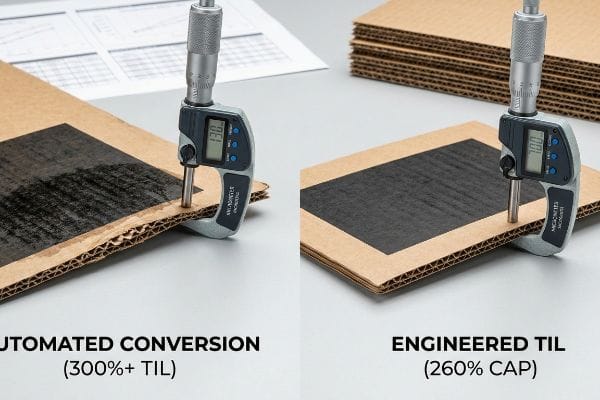
The Total Ink Limit (TIL) Safety Zone
It's a common trap that catches even experienced procurement teams: they submit an unconverted RGB file, assuming the factory's modern prepress software will just auto-correct it seamlessly to save a few dollars in design time. They ignore the mathematical reality of CMYK limits. When automated software converts deep RGB blacks into CMYK, it often generates a rich black by dumping 100% of all four ink channels17 onto the board, creating a localized TIL (Total Ink Limit) of nearly 400%18, which is physically impossible for standard retail packaging to absorb without catastrophic consequences.
This isn't just theory—I see this happen on the testing floor when a heavy ink load hits the water-based PVA (Polyvinyl Acetate) lamination phase. When you dump 350% total ink onto a single panel of 32ECT board, the paper fibers become super-saturated and completely lose their structural rigidity. When I measure the board caliper after an automated conversion blowout, the moisture-logged sheet causes the B-flute to delaminate and crush under minimal pressure. Once the procurement team allowed me to intercept the digital file, I pulled the micrometer readings and proved we needed a strict 260% TIL prepress profile. I manually stripped out the excess under-color inks before generating the printing plates. By enforcing this 260% safety threshold, I entirely eliminated the moisture-induced flute crushing, restoring the base's full 2,500 lbs (1133.9 kg) dynamic load capacity and ensuring the client's massive club store rollout survived double-stacked transit without a single collapsed bin.
| Print Specification | Automated RGB Conversion | Engineered TIL Profile |
|---|---|---|
| Total Ink Coverage | Spikes to 300%+19 | Strictly capped at 260%20 |
| Paper Fiber Status | Super-saturated and weak | Dry, rigid, and stable |
| Structural Yield | Severe flute delamination21 | 100% maintained compression strength |
I never let automated software dictate the physical chemistry of my factory floor. By mathematically throttling the ink saturation limits, I protect both your brand colors and the absolute structural integrity of your pallets.
🛠️ Harvey's Desk: Is your artwork file secretly packing a 300%+ total ink limit that will turn your rigid floor displays into soggy, collapsed liabilities? 👉 Get a Free Ink Limit & Structural Audit ↗ — I review every structural file personally within 24 hours.
Conclusion
Relying on generic digital screen conversions and automated prepress software is the fastest way to turn a beautiful retail concept into a physically crushed, muddy-looking liability on the store floor. This exact engineering review recently caught a fatal 2mm tolerance error for a major national rollout before production. Before you risk massive retailer chargebacks over prepress failures and saturated flutes, let me personally run your structural files through a Free Prepress & Dieline Diagnostic Audit ↗ to ensure your next campaign survives both the printing press and the freight container.
"CMYK vs Spot Color Transfers", https://apextransfers.com/cmyk-vs-spot-color-custom-heat-transfer/. [Technical documentation for CAD/CAM cutting systems confirms that machinery interprets specific color attributes or named spot colors rather than composite process colors to identify cut paths]. Evidence role: technical specification; source type: industry manual. Supports: the inability of hardware to interpret CMYK as commands. Scope note: applies to automated print finishing equipment]. ↩
"Graphic Guidelines – DeLine Box and Display", https://www.delinebox.com/graphic-guidelines/. [Prepress and packaging industry standards mandate the use of unique spot colors to differentiate cut and crease lines for automated machinery]. Evidence role: industry standard; source type: prepress guideline. Supports: the requirement for spot colors in dieline production. Scope note: specific to vector-based production files]. ↩
"[PDF] Prepress Specifications – Graphic Packaging International", https://www.graphicpkg.com/custom-content/uploads/2023/08/prepress-specifications-Eng.pdf. [Industry standards for prepress and packaging design specify the use of distinct spot colors to distinguish non-printing die-lines from printable artwork]. Evidence role: technical specification; source type: industry manual. Supports: the practice of using spot colors to trigger CNC cutting actions. Scope note: applies specifically to packaging and wide-format printing. ↩
"100% magenta stroke is a non printing line? – uksignboards.com", https://uksignboards.com/forums-2/discussion/100-magenta-stroke-is-a-non-printing-line/. [Industry prepress standards confirm that specific spot colors, frequently magenta, are used to designate cut lines to distinguish them from printable CMYK elements]. Evidence role: technical specification; source type: industry standard. Supports: usage of non-printing spot colors for tooling. Scope note: specific color choice may vary by vendor. ↩
"Vinyl Cutter Blade Depth Setup – THE RIGHT WAY! – YouTube", https://www.youtube.com/watch?v=CdF_5Ga3PZQ. [Technical documentation for CNC cutting plotters explains how designated spot color layers are interpreted as operational triggers for tool paths and blade depth]. Evidence role: mechanical operation; source type: technical documentation. Supports: how machinery interprets design files. Scope note: applies to automated digital cutting systems. ↩
"CMYK vs. Spot Color: Which is Process is Best", https://www.primelinepackaging.com/blog/cmyk-spot-color/. [Printing manuals specify that using CMYK black for cut lines causes the printer to treat the line as a visual graphic, resulting in permanent ink marks on the final product]. Evidence role: production outcome; source type: printing guide. Supports: the consequence of incorrect color designation. Scope note: occurs when non-printing layers are not correctly defined. ↩
"Absorption and scattering of light by pigment particles in solar …", https://pubmed.ncbi.nlm.nih.gov/18337934/. [An authoritative source on packaging science or color physics would explain how ink absorption into porous kraft board substrates causes light scattering and reduces color saturation]. Evidence role: technical validation; source type: technical manual or academic paper. Supports: the claim that substrate porosity darkens the final visual output. Scope note: applies to uncoated corrugated materials. ↩
"Color Chaos at the Light Booth: Why D50 Is Your Packaging …", https://www.linkedin.com/pulse/color-chaos-light-booth-why-d50-your-packaging-carmon-madison-6bb4e. [Industry standards such as ISO 3664 define D50 as the standard illuminant for viewing and measuring color in the graphic arts to ensure consistency across different environments]. Evidence role: technical specification; source type: ISO standard. Supports: the validity of using D50 lighting for ink reflectance measurement. Scope note: applicable primarily to the print and design industry. ↩
"Packaging and Logistics Planning for Retail Displays – Frank Mayer", https://www.frankmayer.com/blog/packaging-and-logistics-planning-for-retail-displays/. [Logistics and supply chain data typically quantify the significant reduction in shipping volume and cost when using flat-packed corrugated materials compared to pre-assembled displays]. Evidence role: quantitative metric; source type: industry benchmark report. Supports: the economic claim regarding shipping efficiency. Scope note: actual percentages may vary based on display size and shipping distance. ↩
"RGB color model – Wikipedia", https://en.wikipedia.org/wiki/RGB_color_model. [An authoritative source on color theory will explain how RGB screens use additive color mixing by emitting light directly from a source]. Evidence role: factual verification; source type: technical manual. Supports: The light behavior of the RGB color space. Scope note: Applies to emissive displays. ↩
"Cookbook – About Gamut", https://www1.udel.edu/cookbook/scan-print/gamut.html. [Printing industry standards define how the physical properties of ink opacity and subtractive mixing limit the reproducible color range compared to digital spaces]. Evidence role: technical specification; source type: printing industry guide. Supports: The limited gamut range of CMYK. Scope note: Variations exist based on ink chemistry. ↩
"Relationship between paper whiteness and color reproduction in …", https://bioresources.cnr.ncsu.edu/resources/relationship-between-paper-whiteness-and-color-reproduction-in-inkjet-printing/. [Material science research describes how the absorption and physical structure of paper fibers affect the luminosity and final perceived shade of ink]. Evidence role: physical evidence; source type: material science journal. Supports: The impact of the substrate on physical color output. Scope note: Specifically refers to porous substrates. ↩
"Mathematical modelling and compensation strategies for printing dot …", https://pmc.ncbi.nlm.nih.gov/articles/PMC12574880/. [Authoritative prepress manuals define dot gain as the enlargement of halftone dots caused by ink absorption into porous substrates]. Evidence role: technical definition; source type: printing industry handbook. Supports: the physical mechanism of ink spreading on unsealed paper. Scope note: specifically relevant to uncoated substrates. ↩
"[PDF] 1. Dot gain is the increase of halftone dot sizes as ink absorbs into …", https://www.coloradomesa.edu/art/documents/student-resources/study-guide-2019.pdf. [Authoritative prepress manuals specify the mathematical reduction of ink volume required to compensate for dot gain on specific substrates]. Evidence role: technical specification; source type: prepress manual. Supports: mid-tone ink volume reduction. Scope note: Percentage varies by ink and paper type. ↩
"Halftone – Wikipedia", https://en.wikipedia.org/wiki/Halftone. [Printing textbooks describe the physics of ink absorption causing halftone dots to spread, leading to loss of detail in generic conversions]. Evidence role: mechanical explanation; source type: printing textbook. Supports: halftone dot spread. Scope note: Primarily occurs on uncoated stocks. ↩
"Custom Halftone Dot Pattern Photoshop – YouTube", https://www.youtube.com/watch?v=1fDaDfCNjjc. [Industry standards for high-end prepress describe how compensation curves prevent dot gain to maintain edge sharpness in halftone printing]. Evidence role: technical solution; source type: industry standard. Supports: halftone dot spread control. Scope note: Dependent on plate resolution. ↩
"3.39 Convert Rich Black to 100% K – User Manual – Durst", https://en.help.durst-group.com/a/1981746-convert-rich-black-to-100-k. [An authoritative prepress guide explains how generic RGB to CMYK conversion algorithms often maximize all color channels to achieve a deep black]. Evidence role: technical specification; source type: printing industry manual. Supports: the risk of extreme ink saturation during automation. Scope note: results may vary based on the specific ICC profile used. ↩
"Understanding Shipping Box Strength – EcoEnclose", https://www.ecoenclose.com/blog/understanding-shipping-box-strength/?srsltid=AfmBOoqjgeAG-3KuK-2hi5MW5kO5F0-n_JsVLSPYru9fIroHvDrg6fkd. [Technical substrate specifications detail the maximum ink coverage percentages that a board can absorb before experiencing drying failure or structural warping]. Evidence role: technical threshold; source type: material science/manufacturer specification. Supports: the physical impossibility of absorbing 400% ink. Scope note: specific limits fluctuate based on the GSM and coating of the board. ↩
"how to bulk change total ink coverage to the 240% required by printer", https://community.adobe.com/questions-652/how-to-bulk-change-total-ink-coverage-to-the-240-required-by-printer-770548. [Technical guides on prepress color management explain how unmanaged RGB-to-CMYK conversions can produce Total Ink Limit (TIL) values exceeding 300%]. Evidence role: technical specification; source type: industry manual. Supports: ink saturation risks. Scope note: applies to non-profiled automated conversions.] ↩
"Corrugated Printing Inks and Coatings | INX International Ink Co.", https://www.inxinternational.com/products/inks-and-coatings/application/corrugated. [Printing industry standards for corrugated substrates specify a maximum Total Ink Limit (TIL) typically around 260% to ensure proper drying]. Evidence role: industry standard; source type: technical guideline. Supports: TIL safety thresholds. Scope note: limits may vary slightly by paper grade.] ↩
"[PDF] General issues and the recommended standards for corrugated …", https://adamsbox.com.pl/wp-content/uploads/2024/07/general-issues-and-the-recommended-standards-for-corrugated-board_2.pdf. [Materials science research indicates that excessive ink moisture can degrade the adhesive bond between the liner and the fluting, leading to structural separation]. Evidence role: causal mechanism; source type: material science journal. Supports: structural failure claims. Scope note: specific to corrugated cardboard.] ↩