Your store has busy aisles, many SKUs, and little time. Shoppers scan and move on. Confusion kills sales. Clear custom signage fixes that fast and pays back quickly.
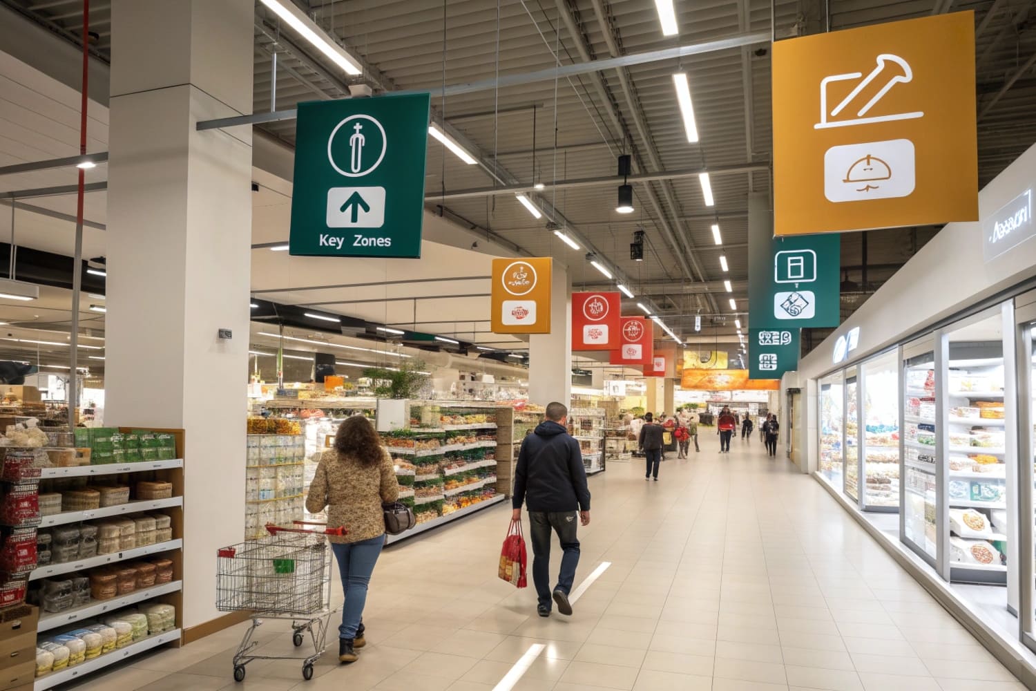
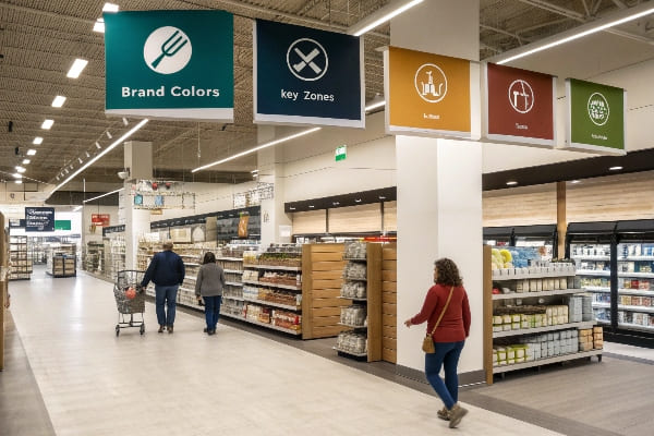
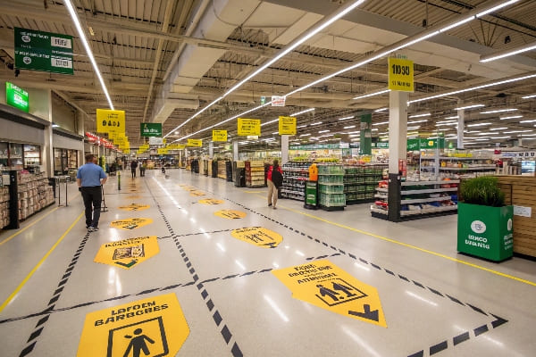
Use a simple mix: exterior identity, window promos, directional signs, category markers, shelf talkers, price tags, POP floor or counter displays, and compliance labels. Start with high-traffic zones. Keep one message per sign, high contrast, brand colors, standard sizes, and recyclable materials.
In my factory in Shenzhen, I build cardboard displays for global brands. I learned simple rules that work across Walmart, Costco, and small shops. I share them here for fast wins.
What signage is used in the retail store?
Too many sign types can confuse teams. Shoppers scan fast and leave. I keep a simple map of sign families. It removes chaos and helps staff act.
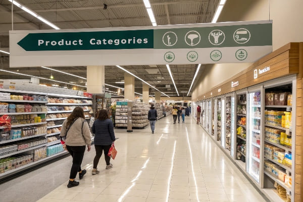
Stores use exterior signs, window graphics, wayfinding, category headers, shelf talkers, wobblers, price tags, digital screens, floor POP displays, PDQ trays, endcap headers, and compliance notices. Choose by goal, viewing distance, and dwell time.
Core categories I use in most rollouts
I group signs by the job they do. This helps buyers, designers, and store teams speak the same language. Exterior signs pull people in. Window graphics set the offer and the mood. Wayfinding1 keeps shoppers moving. Category headers frame choice. Shelf talkers and wobblers nudge. Price tags confirm value. POP floor and counter displays hold featured stock and tell a fast story. Compliance and safety signs protect trust. I prefer cardboard for promotional bodies because it ships flat, sets up fast, and recycles. I add water-based inks2 and clean dielines. I avoid mixed plastics when I can. This keeps cost and waste low. It also fits U.S. and EU preferences for greener materials.
| Type | Main Job | Best Distance | Best Use Case | Typical Body |
|---|---|---|---|---|
| Exterior/Facade | Attract | 20–100 m | Brand and hours | Rigid board/ACM |
| Window Graphics | Promote | 5–20 m | New drop, seasonal | Vinyl/Cardboard |
| Wayfinding/Directional3 | Guide | 3–15 m | Aisle navigation | Foamboard/Cardboard |
| Category Headers | Frame | 2–8 m | Group SKUs | Corrugated board |
| Shelf Talkers/Wobblers | Nudge | 0.5–1 m | Feature specs or claims | Cardboard/PET-free |
| Price/Offer Tags4 | Confirm | 0.3–1 m | Price and promo | Paperboard |
| POP Floor/Counter/PDQ | Convert | 1–5 m | Launch or trial packs | Corrugated board |
| Compliance/Safety | Assure | 1–5 m | Returns, warnings, policies | Paperboard |
Placement and simple rules that stick
I place each type by traffic and sightlines. I keep fonts large and simple. I use one claim per sign. I match color to brand and contrast to light. I plan heights for eye level and hand reach. I keep QR codes5 only where dwell time is real, like service desks or try-me zones. I print dates and store codes on the back. This helps rotation and audits. I spec recycled corrugate6 where supply allows. I run load and edge tests for floor units. I kit signs by zone to reduce setup errors. This turns a messy plan into a smooth routine for staff.
What is one of the most important types of signage?
We chase trends and forget the moment of choice. Shoppers decide in seconds. I place proof right there. It moves units now and not later.
Point-of-purchase displays are one of the most important types because they sit where decisions happen. They frame price and benefits, remove friction, and drive basket lift without extra staff.
Why POP earns space near the decision
POP displays7 work because they combine message, product, and reach. The shopper sees the claim, grabs the pack, and checks out within minutes. This is true in grocery, beauty, tools, and outdoor gear. In my shop, we ship flat PDQ trays8 and floor displays that set fast in clubs and chains. I keep structures simple: strong base, clear header, clean trays, and safe edges. I design graphics to read in three seconds. I show the product first, then one claim, then the price or the promo. I proof color on the same substrate I will mass produce. This avoids mismatch later.
| POP Rule | Reason it Works | Quick Check |
|---|---|---|
| Product first9 | Shoppers trust what they can see | 70% of the face shows real product |
| One message | Brain loads fast, then decides | Header has under eight words |
| Price clarity10 | Value ends doubt | Price or deal sits in a clean badge |
| Touch access | Hands close the sale | Shelf edge height between knee and chest |
| Stable structure | Safety and uptime | Passes tilt and edge crush test |
| Clean replenishment | Staff keeps it full | Front lip and backstop guide the refill path |
A short story from my floor tests
I once placed a premium hunting accessory beside bows but without a POP unit. Shoppers liked the brochure, but pickups were low. We added a narrow PDQ tray with a bold "Ready to Mount11" claim and a price badge. We cut one confusing icon. We raised the header by 5 cm to clear sightlines. Sell-through doubled in two weeks with the same traffic. No extra staff time. The lesson was simple. If I meet the shopper at the moment of choice with a clear promise and easy reach, I win the basket.
Why is retail signage important?
Good product fails without signals. Staff cannot greet every shopper. Signs work all day, every day. They lower questions and raise trust.
Retail signage is important because it guides shoppers, speeds choices, builds trust, protects margin, and reduces labor. Clear signs turn confusion into action and convert traffic into sales at a low cost.
The three jobs I expect every sign to do
I ask each sign to do one of three jobs. It must attract, guide, or convert. Attract signs12 bring people in and set the offer. Guide signs move people through aisles with less stress. Convert signs13 close the sale near the shelf or the counter. This frame keeps teams aligned. It also helps me cut clutter. If a sign does two jobs, it often does none well. I keep the copy short. I keep the color bold. I keep the structure simple and safe. I use cardboard for speed and cost. I run strength and transport tests so the promise looks fresh after freight.
| Job | What It Solves | Simple Metric | Field Test |
|---|---|---|---|
| Attract | Low door traffic14 | Door counts | A/B one big window claim vs many small |
| Guide | Lost shoppers and bottlenecks15 | Path heatmaps/time | Track time to find a category |
| Convert | Hesitation at shelf or counter | Unit lift / margin | Compare with and without shelf talkers |
Cost, payoff, and risk if ignored
Signs are cheap compared to media or labor. A flat-pack PDQ ships in bulk and sets up in minutes. A shelf talker costs less than a coffee. Yet both can lift units and reduce returns when they clarify use or size. Good signs also protect price. A clear value badge16 stops discount creep because the value is visible and fair. If I skip signs, I create hidden costs17. Staff answers the same questions. Shoppers feel lost and buy less or leave. Damaged displays hurt trust. The fix is clear specs, clean art files, substrate tests, and a simple change log that store teams can follow without training.
When should you use in-store signage?
Bad timing wastes perfect design. I plan signage like a supply run. I tie it to launches and seasons. Then I pull it when jobs are done.
Use in-store signage for launches, price changes, promotions, resets, seasonal peaks, overstock moves, service adds, safety updates, and regional needs. Match timing to shopper missions and the retail calendar.
Timing rules I follow in real rollouts
I use a simple cadence. I launch big exterior and window pieces two weeks before a drop. I add POP floor units18 and PDQ trays19 at floor set. I place shelf talkers on day one. I switch endcap headers at mid-promo to keep it fresh. I run price and offer tags with every change or compliance rule. I remove or recycle at promo end. I print dates on the back so store teams know when to pull. For club stores, I use PDQ and pallet wraps that pass load tests. For drug and beauty, I use slim counter units to save space.
| Trigger/Event | Signage to Use | When to Deploy | Typical Duration |
|---|---|---|---|
| New product launch20 | Window teaser, POP floor | −14 days to launch | 4–8 weeks |
| Seasonal peak21 | Exterior banner, endcaps | −21 days to peak | Season |
| Price change | Shelf/price tags | Same day as change | Until next change |
| Aisle reset/planogram | Wayfinding, category headers | Reset week | Until next reset |
| Overstock/slow mover | Offer badge, PDQ tray | As needed | 2–4 weeks |
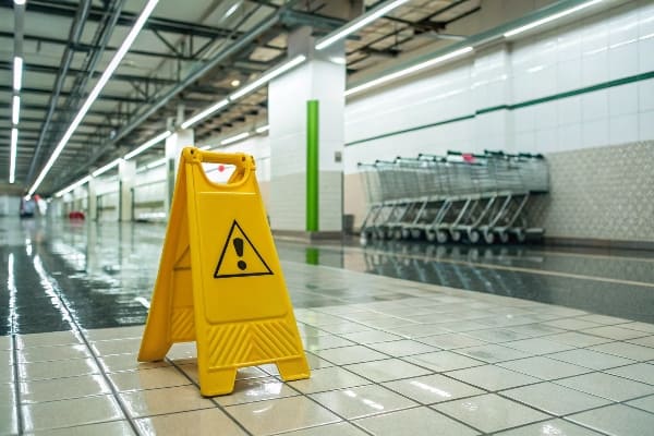
| Safety/compliance | Policy and warning signs | Immediate | As required |
| Cross-sell | Shelf talker, clip strip | With promo partner | 2–6 weeks |
Operational checklist that keeps timing tight
I kit by zone, not by store. This makes packing simple and cuts misses. I ship with a one-page map and photo of the final look. I include spare headers and feet for floor units. I mark recyclable parts clearly. I align art deadlines22 with retailer proof cycles. I lock color early with substrate-matched proofs. I keep a change log with version codes. I build a return or recycle plan23 so stores are not stuck with waste. When I follow this list, installs start on time, look right, and end clean. That rhythm builds trust with buyers and keeps reorders coming.
Conclusion
Pick a simple mix, place it by intent, keep one message, and time it to the calendar. Then measure and refine. Your store will look clear and sell more.
Understanding wayfinding can enhance customer experience and improve store navigation, making it a crucial aspect of retail design. ↩
Exploring the benefits of water-based inks reveals their eco-friendliness and safety, making them a better choice for sustainable printing. ↩
Explore this link to understand effective wayfinding strategies that enhance navigation and improve user experience. ↩
Discover insights on creating compelling price tags that attract customers and boost sales. ↩
Explore this link to learn effective strategies for integrating QR codes into your signage for better engagement. ↩
Discover the benefits of using recycled materials in signage, promoting sustainability and reducing environmental impact. ↩
Understanding POP displays can enhance your marketing strategy by effectively combining messaging and product visibility. ↩
Exploring PDQ trays can provide insights into efficient product display solutions that drive sales in retail environments. ↩
Understanding the 'Product first'rule can enhance your retail strategy by building customer trust. ↩
Exploring price clarity can help you optimize pricing strategies and improve customer satisfaction. ↩
Understanding this phrase can enhance your marketing strategies and improve product visibility. ↩
Explore this link to learn how attract signs can effectively draw customers and enhance your marketing strategy. ↩
Discover insights on how convert signs can significantly impact sales and improve your retail environment. ↩
Explore this link to discover proven strategies that can help increase foot traffic and improve sales. ↩
This resource offers insights into optimizing store layouts and improving customer flow, essential for enhancing the shopping experience. ↩
Understanding the role of a clear value badge can help you enhance pricing strategies and improve customer trust. ↩
Exploring hidden costs can reveal ways to optimize your business operations and increase profitability. ↩
Understanding POP floor units can enhance your merchandising strategy and improve customer engagement. ↩
Exploring PDQ trays will provide insights into effective product display techniques that can boost sales. ↩
Explore this link to discover proven strategies that can enhance your new product launch success. ↩
This resource offers insights on optimizing sales strategies during seasonal peaks, ensuring you capitalize on high-demand periods. ↩
Aligning art deadlines effectively can improve your workflow and ensure timely product launches, boosting your business efficiency. ↩
Understanding a return or recycle plan can help streamline your operations and reduce waste, enhancing sustainability. ↩


