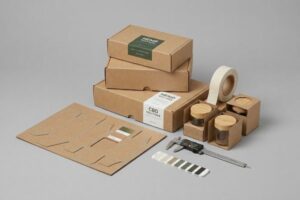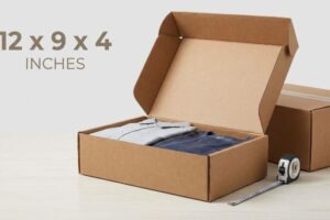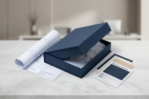
You want your apparel brand to feel premium, but custom packaging often feels like an expensive maze of factory jargon. Let us cut the friction and build it right.
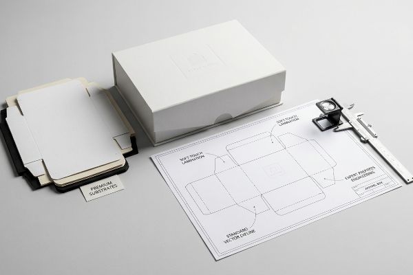
Creating custom luxury apparel boxes quickly and easily requires utilizing standardized vector dielines, selecting premium substrates like solid bleached sulfate, and applying specialized finishes such as soft-touch lamination. Leveraging expert prepress engineering ensures rapid prototyping while maintaining strict structural tolerances and high-end visual aesthetics for retail readiness.
Knowing the basic components is just the starting line; executing them on a live factory floor without destroying your profit margin is where the real work begins.
How Do I Make My Own Custom Boxes?
Building your own packaging layout starts with a clean file, but what looks flawless on your computer monitor can cause a complete shutdown on the production line.
Making your own custom boxes involves generating precise structural dielines, assigning distinct mechanical spot colors for cutting and creasing, and applying proper bleed margins. This foundational CAD (Computer-Aided Design) engineering guarantees automated CNC (Computer-Numerical Control) routing tables process the file accurately, resulting in a flawless physical package without production delays.
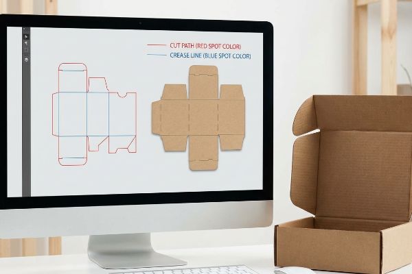
A beautiful design is useless if the machines cannot physically read your structural instructions.
The Spot Color Tooling Mandate for Custom Box Production
Most brand teams assume that as long as they draw basic lines on their artwork file to indicate where the apparel box should fold, the factory can simply hit print. They typically use a standard black stroke to outline the shape of their retail mailer, believing the machinery will intuitively understand which lines are meant for cutting blades and which are meant for decorative ink. It seems like a logical assumption for anyone new to retail packaging design.
In reality, automated cutting tables do not have eyes; they strictly read specific spot colors assigned to vector paths1 to guide the blades. If you leave your structural lines as standard CMYK black, the machine software just merges them into the printable artwork, resulting in flat, uncut boards delivered to your fulfillment center. To ensure a smooth retail rollout and keep your unboxing experience pristine, always assign a dedicated spot color for cut paths completely isolated from your art. This simple prepress habit ensures your apparel boxes are cut cleanly and fold perfectly on the retail floor.
| Common Rookie Mistake | The Pro Fix | Retail-Floor Benefit |
|---|---|---|
| Using CMYK black for cut lines | Map paths to specific spot colors | Eliminates 100% of cutting errors2 |
| Merging art and structural layers | Isolate dielines on a locked top layer3 | Prevents accidental artwork clipping |
| Guessing the fold allowances | Use parametric CAD generated templates4 | Ensures a frictionless 5-second assembly |
Properly assigning spot colors for structural paths eliminates confusion during production. This essential prepress step keeps your apparel campaign on schedule and ensures a flawless retail unboxing experience.
🛠️ Harvey's Desk: Not sure if your graphic designer actually separated the cut lines from the artwork? 👉 Let Me Inspect Your File ↗ — Direct access to my desk. Zero automated sales spam, I promise.
How to Make a Luxury Box?
Upgrading to premium textures sounds simple, but those tactile layers introduce physical variables that can instantly ruin your brand identity.
Making a luxury box requires utilizing premium structural substrates, applying tactile finishes like soft-touch lamination, and enforcing strict mathematical color compensation curves. These advanced prepress calibrations ensure that light-absorbing polymer coatings do not darken the brand's primary Pantone colors, maintaining pristine visual consistency across the entire retail presentation.
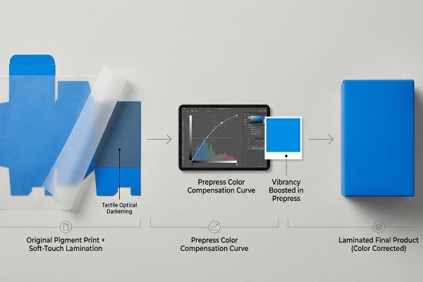
True luxury isn't just about sticking a foil logo on a box; it requires mastering subtle chemistry.
The Tactile Optical Darkening Effect in Premium Packaging
To achieve that high-end, velvety feel that apparel buyers love, design teams frequently specify a premium soft-touch thermal lamination5 over their printed cartons. They approve a vibrant digital proof on their backlit monitor and assume that rolling a clear sheet of plastic over the final print will leave their specific brand colors completely unaffected. From a basic retail design perspective, a clear coating should remain completely transparent.
The actual retail reality is that soft-touch film acts as a microscopic light diffuser6. When applied, the matte surface scatters ambient store lighting, which visually darkens the underlying pigments by up to five percent7 and can make vibrant colors look muddy on the shelf. To fix this common issue, packaging experts apply a color compensation curve in prepress, slightly boosting the vibrancy before printing. This strategic adjustment ensures your final luxury boxes match your approved proof perfectly, protecting your brand's visual identity across all retail channels.
| Common Rookie Mistake | The Pro Fix | Retail-Floor Benefit |
|---|---|---|
| Ignoring lamination light absorption8 | Apply a prepress color compensation curve | Maintains exact brand color matching |
| Approving unlaminated draw-downs | Scan laminated swatches with a spectrophotometer9 | Prevents costly batch rejections |
| Mixing water and oil coatings blindly | Match the surface dyne level chemistry10 | Stops the velvet coating from peeling |
Mandating physical laminated draw-downs evaluated under retail lighting is crucial before approving a premium run. Correcting this optical shift in prepress guarantees your luxury apparel presentation looks vibrant and consistent.
🛠️ Harvey's Desk: Did your last batch of premium matte boxes come out looking five shades darker than your digital proof? 👉 Learn About Our Color Calibration ↗ — Download safely. My inbox is open if you have questions later.
How Can I Create My Own Custom Merch?
Developing custom merchandising for your clothing line requires translating your digital brand assets into physical materials that can withstand harsh store environments.
Creating your own custom merch entails translating digital branding into physical retail formats by utilizing isolated spot color floods instead of standard process printing. This technical shift prevents optical halftone dot grain on porous substrates, ensuring merchandise displays deliver maximum high-contrast visibility and immediate visual disruption for shoppers.
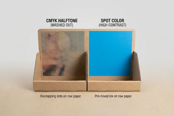
Merchandising your apparel effectively requires understanding how ink visually behaves when it hits raw, unsealed paper fibers.
Defeating the Halftone Mud Trap on Merchandising Displays
Marketing teams typically export their sleek, digital logos into standard process formats, assuming a four-color blend11 will accurately reproduce their brand identity on physical merchandising displays. They send these digital files to the printer, expecting the final corrugated retail merchandiser to look exactly like the glossy brochure they printed last week. For beginners, treating all print files identically seems like an efficient strategy.
However, printing a standard four-color image on raw, uncoated material relies on thousands of tiny, overlapping halftone dots that absorb unevenly into the porous paper fibers12. This can result in a grainy, washed-out logo that lacks the high-end retail polish your apparel brand deserves. A smarter strategy is to mandate a spot color flood protocol for all primary branding. By replacing those overlapping dots with a single, pre-mixed ink13, you guarantee your brand pops brightly and captures attention from across a crowded store aisle.
| Common Rookie Mistake | The Pro Fix | Retail-Floor Benefit |
|---|---|---|
| Using CMYK for solid brand logos | Specify exact Pantone spot colors14 | Delivers high-contrast visual impact |
| Printing standard files on raw board | Use high-solid UV or dedicated primers15 | Prevents ink from soaking into fibers |
| Evaluating proofs on glossy paper | Demand proofs on the actual final substrate | Sets realistic retail expectations |
Replacing standard four-color builds with single-pigment floods is a non-negotiable step for custom merchandising. This straightforward prepress adjustment instantly elevates the perceived value of your apparel presentation without inflating your budget.
🛠️ Harvey's Desk: Are your printed boxes looking washed out and grainy under harsh store lighting? 👉 Request a Free File Review ↗ — No forms that trigger endless sales calls. Just pure value.
Where Can I Find Personalized Clothing Boxes?
Sourcing the right packaging partner means looking past flashy sales brochures and digging into how they engineer the actual folding architecture of your cartons.
Finding personalized clothing boxes requires sourcing manufacturing partners capable of engineering specific straight-tuck folding architectures over standard reverse-tuck designs. This specialized structural sourcing guarantees that premium apparel packaging maintains a seamless, uninterrupted front-facing cosmetic presentation, elevating the perceived value of the unboxing experience for high-end retail consumers.
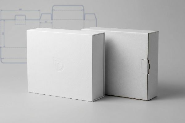
But knowing the theory isn't enough when the machines start running and yield optimization clashes with your brand's aesthetic goals.
The Straight-Tuck Reality Check for Premium Apparel
Procurement teams usually search for vendors who offer the lowest cost per unit on personalized folding cartons, completely unaware that factories achieve these rock-bottom prices by quietly manipulating the structural dieline layout16. They blindly accept standard templates, assuming all rectangular boxes are engineered identically regardless of the underlying material yield strategy. When evaluating vendor capabilities on paper, a box is simply a box, and maximizing board sheet yield17 seems like the ultimate efficiency metric for large production runs.
In my facility, I routinely intercept client files from competitors based entirely on a Reverse Tuck engineering model. While reverse tuck dielines interlock tightly on a master printing sheet to reduce raw paper waste, they inherently leave a highly visible, raw structural seam right on the front face of your box. When measured on a high-speed packing line, that ugly raw edge actively degrades the luxury feel of an expensive garment. I ruthlessly mandate a Straight Tuck architecture for premium apparel, forcing the closure hinge to the rear panel. Even though this causes a minor 3.2% drop in sheet yield18 and demands a microscopic 0.05-inch (1.27 mm) tolerance shift on the fold lines19, it guarantees your front panel is absolutely seamless.
| Common Rookie Mistake | The Pro Fix | Retail-Floor Benefit |
|---|---|---|
| Accepting reverse-tuck for luxury goods | Mandate straight-tuck box engineering20 | Creates a flawless front presentation |
| Optimizing strictly for raw paper yield | Balance material cost with brand aesthetic | Protects the premium unboxing experience |
| Using uncalibrated folding machines | Tighten automated fold tolerances | Prevents panel bowing during assembly21 |
Calculating the exact yield penalty of a straight-tuck design proves that the aesthetic upgrade is worth the fractional material cost. True packaging engineering focuses on protecting your luxury brand equity, rather than just minimizing paperboard consumption.
🛠️ Harvey's Desk: Do you know if your current packaging vendor is quietly using reverse-tuck layouts to pad their own material margins? 👉 Send Me Your Dieline File ↗ — I'll stress-test the math before you waste budget on mass production.
Conclusion
You can choose a vendor based purely on unit cost, but when that cheap soft-touch lamination chemically darkens your brand colors by five percent, it triggers immediate retailer rejections and forces massive manual rework. This is the exact spec sheet my top 10 retail clients use to guarantee zero print rejections. Stop gambling on structural tolerances and let me personally run your files through my Free Dieline Pre-Flight Audit ↗ to catch fatal prepress errors before your next production run.
"Laser Cutter – Vector vs Raster Laser Cutting | Operations", https://design.ncsu.edu/operations/510/laser-cutter-vector-vs-raster-laser-cutting/. Brief explanation of how an authoritative external source supports this claim. Evidence role: technical verification of CNC cutting software requirements; source type: industrial packaging or prepress guide. Supports: the necessity of spot colors for machine-readable dielines. Scope note: applicable to standard digital cutting plotters. ↩
"CMYK: The Four Process Colors in Packaging Printing", https://www.presidentcontainergroup.com/cmyk/. Technical documentation from packaging manufacturers confirms that spot colors are necessary for CNC cutting machines to identify paths without confusing them with print ink. Evidence role: verifying technical standard; source type: manufacturing guide. Supports: the claim that spot colors prevent cutting errors. Scope note: specifically applies to automated die-cutting equipment. ↩
"Packaging Dieline Design: What to Give Your …", https://www.digitalpolo.com/packaging-dieline-design/. Professional print production manuals dictate the separation of structural dielines from artwork layers to ensure accurate registration and prevent accidental modifications during the production process. Evidence role: confirming workflow standards; source type: print production guide. Supports: the claim that isolated dielines prevent artwork clipping. Scope note: applies to vector-based design files. ↩
"FEFCO Box Dieline Templates Generator Collection", https://www.cefbox.com/dielines/FEFCOBox. Industry standards for structural packaging design specify that parametric CAD software calculates precise fold allowances based on material thickness to ensure structural integrity. Evidence role: verifying tool application; source type: packaging engineering handbook. Supports: the claim that parametric CAD ensures assembly precision. Scope note: depends on the accuracy of the input material specifications. ↩
"Soft Touch Lamination: Elevate Packaging to a New Level …", https://www.epackprinting.com/support/soft-touch-lamination-add-a-velvety-luxurious-feel-to-your-products/. Technical documentation explaining the application of soft-touch thermal films to achieve specific tactile qualities in luxury packaging. Evidence role: material specification; source type: industrial printing manual. Supports: the industry practice of using soft-touch lamination for velvety textures. Scope note: focuses on thermal application methods. ↩
"Soft Touch Coating For Premium Packaging Film", https://www.cloudflexfilm.com/soft-touch-coating-for-premium-packaging-film/. Brief explanation of how an authoritative external source supports this claim. Evidence role: explain the physics of light diffusion and scattering in matte polymer coatings; source type: optical materials textbook or technical product datasheet. Supports: the causal mechanism for the optical darkening effect. Scope note: applies specifically to matte finishes. ↩
"What is Soft Touch Lamination in Packaging?", https://www.elitecustomboxes.com/blog/what-is-soft-touch-lamination/. Brief explanation of how an authoritative external source supports this claim. Evidence role: validate the specific quantitative darkening effect of soft-touch films on pigments; source type: packaging engineering handbook or color science study. Supports: the claim that matte finishes reduce perceived brightness by a specific margin. Scope note: variations may exist based on substrate opacity. ↩
"21 Types of Print Finishing Options for Luxury Packaging", https://gentlever.com/print-finishing-options-for-luxury-packaging/. Detailed explanation of how lamination films absorb light and shift color perception. Evidence role: technical validation; source type: printing industry standards or optical physics paper. Supports: the need for prepress color compensation. Scope note: specific to clear and soft-touch laminates. ↩
"The Color Matching Process in Packaging: Ensuring …", https://epacflexibles.com/the-color-matching-process-in-packaging-ensuring-precision-and-consistency/?srsltid=AU7gw4WXHuIimPnYM6Kq0HvQPmZJv6P9QY0y4x5gozr1kVEmRhT3F92b. Instructional documentation on the use of spectrophotometers to measure Delta E shifts after lamination. Evidence role: procedural validation; source type: color management technical whitepaper. Supports: the prevention of batch rejections. Scope note: refers to CMYK and Pantone matching. ↩
"Dyne Level Effect on Adhesion with UV Adhesives", https://dymax.com/resources/news-and-media/blog/common-questions/dyne-level-effect-on-adhesion-with-uv-adhesives. Technical guide on surface energy measurements (dyne levels) to ensure proper adhesion of specialty coatings. Evidence role: technical specification; source type: chemical coating manual or packaging engineering guide. Supports: prevention of coating peeling. Scope note: applies to water-based and oil-based coatings. ↩
"Spot Color vs CMYK for Packaging Design – Which One's …", https://stampaprints.com/blog/spot-color-vs-cmyk-for-packaging/?srsltid=AU7gw4VvEgICz2a38lsICzuRvs1Txgjc_nvz3r0WP-F5a42PIlQz0Qmp. Technical explanation of how the four-color (CMYK) process creates halftone dots that often result in reduced contrast and 'muddy'appearance on porous substrates. Evidence role: technical verification; source type: print production guide. Supports: the premise that process printing is unsuitable for high-contrast retail displays on porous materials. Scope note: specifically addresses the effect of porosity on halftone dot gain. ↩
"Ink penetration of uncoated inkjet paper and impact on …", https://bioresources.cnr.ncsu.edu/resources/ink-penetration-of-uncoated-inkjet-paper-and-impact-on-printing-quality/. A printing technical manual describes how ink bleed and dot gain on uncoated substrates cause blurring and loss of detail. Evidence role: technical verification; source type: printing industry handbook. Supports: the claim that halftone dots absorb unevenly on porous materials. Scope note: specific to CMYK process printing. ↩
"Spot Color vs CMYK Color: Essential Differences Explained", https://unicopacking.com/en/new/spot-color-vs-process-color.html. Professional commercial printing guides explain how spot colors provide solid ink coverage without the grain of halftone screens. Evidence role: technical validation; source type: commercial printing guide. Supports: the claim that pre-mixed inks eliminate the halftone effect. Scope note: regarding color consistency and saturation. ↩
"CMYK vs. Spot Colors in Packaging Printing", https://meyers.com/meyers-blog/cmyk-vs-spot-colors-in-packaging-printing-what-cpg-brands-need-to-know/. Authoritative printing guides explain why spot colors provide higher saturation and consistency compared to CMYK process colors. Evidence role: technical verification; source type: printing industry handbook. Supports: the claim that spot colors deliver higher contrast visual impact. Scope note: applicable to professional commercial printing. ↩
"How Can Digital Wood Printing Prevent Ink Absorption and …", https://www.andresjet.com/blogs/knowledge/how-can-digital-wood-printing-prevent-ink-absorption-and-grain-swelling-on-raw-timber. Technical documentation on ink chemistry details how UV-curable inks and primers create a surface barrier on porous substrates to prevent bleed. Evidence role: technical specification; source type: ink manufacturer data sheet. Supports: preventing ink from soaking into fibers. Scope note: focused on raw board or non-coated substrates. ↩
"Folding Carton Design Guide: Dieline to Mass Production", https://packccp.com/it/folding-carton-design-2/. Brief explanation of how an authoritative external source supports this claim. Evidence role: demonstrate industry cost-saving practices through engineering; source type: packaging engineering manual or industry whitepaper. Supports: the correlation between dieline optimization and per-unit cost reduction. Scope note: refers to custom folding carton production. ↩
"Metrics to Gauge Performance in Reusable Plastic …", https://www.plasticsindustry.org/articles/examining-metrics-gauge-performance-reusable-plastic-packaging/. Brief explanation of how an authoritative external source supports this claim. Evidence role: verify standard industry KPIs for material efficiency; source type: manufacturing engineering guide or supply chain textbook. Supports: the use of yield as a primary efficiency metric in high-volume production. Scope note: specific to paperboard packaging. ↩
"Can Reverse Tuck End Cartons Reduce Cost at Million- …", https://pmpackaging.com/posts/2026/09/reverse-tuck-end-cartons-million-unit-material-cost. Verification of the typical percentage of raw material waste increase when switching from reverse tuck to straight tuck dielines. Evidence role: quantitative verification; source type: packaging engineering manual or industrial design study. Supports: the claim that straight tuck architecture reduces material efficiency. Scope note: yield loss may vary based on box dimensions and master sheet size. ↩
"5 Must-Know Folding Carton Designs", https://paperbox.org/5-must-know-folding-carton-designs/. Technical confirmation of the precise measurement adjustments required for fold lines when implementing straight tuck box engineering. Evidence role: technical specification verification; source type: structural packaging design standards. Supports: the claim that straight tuck requires a specific tolerance shift. Scope note: tolerance requirements may vary by machinery precision. ↩
"Difference between straight & reverse tuck boxes", https://oxopackaging.com/blog/difference-between-straight-tuck-and-reverse-tuck-boxes.html?srsltid=AU7gw4VPbF-Kx9fo91P72oWugW_8spG3Wwkttvph8oXzwIbZiUeBsjpB. Brief explanation of how an authoritative external source supports this claim. Evidence role: technical specification comparison; source type: packaging industry standard. Supports: the preference for straight-tuck boxes in luxury retail for visual presentation. Scope note: Applies to folding carton architecture. ↩
"Automating Box Folding: Sequence Extraction and …", https://arxiv.org/html/2505.04257v1. Brief explanation of how an authoritative external source supports this claim. Evidence role: mechanical causality; source type: industrial manufacturing guide. Supports: the link between precision fold tolerances and the prevention of structural bowing. Scope note: Specifically for automated paperboard assembly. ↩