Pairing items seems simple, but executing cross-merchandising in massive retail environments is an engineering nightmare. Let's examine how structural design secures your dual-product campaigns.
Strategies for cross-merchandising involve grouping complementary products together on a single retail display to increase average order value. Effective structural execution requires modular shelving, precise weight distribution, and durable corrugated materials to securely support diverse packaging sizes while maximizing visibility in high-traffic shopping zones across global retail environments.
If your secondary items end up hidden in the shadow of your primary product, your campaign is already losing money. Here is how I engineer these hybrid structures to survive the floor.
What is cross merchandising strategy?
The essence of cross-merchandising is suggesting a complementary purchase before the shopper even realizes they need it.
A cross-merchandising strategy is a retail tactic where brands display logically related items side-by-side to drive impulse buys. This method utilizes highly engineered secondary point-of-purchase structures, like endcaps or sidekicks, to seamlessly integrate distinct product categories and significantly boost overall basket sizes across major international and domestic retail chains.
Theory is easy, but making a single box hold a heavy glass jar and a light foil bag requires structural discipline.
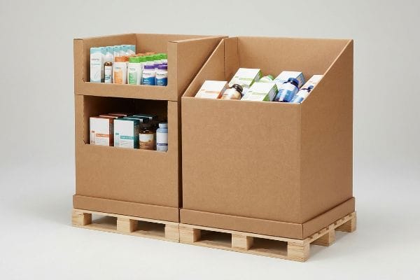
The Reality of Mixed-SKU Retail Trays
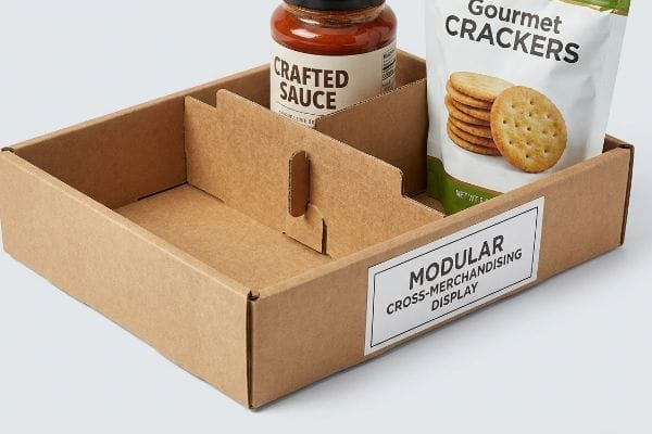
Most marketing teams assume they can just throw two different products into a standard open bin and call it a cross-merchandising win. They draft a quick layout in their design software, assuming the products will neatly sit next to each other on the shelf. The reality is that different Stock Keeping Units (SKU) have entirely different weights, shapes, and center-of-gravity profiles1.
I see this rookie mistake constantly. A junior designer creates a fixed, glued-in partition for a shampoo and conditioner combo. When the factory produces the run, the brand decides to swap the 12 oz (340 g) conditioner for a promotional 16 oz (453 g) bottle. The fixed tab won't budge. I have watched store clerks sweat in the aisle, ripping the raw paperboard and resorting to ugly clear tape to jam the new bottles into a broken tray, completely ruining the brand image. Instead of rigid walls, I engineer "Modular Dividers"—floating corrugated partitions that lock into die-cut slots along the base. The satisfying snap of seating that adjustable tab means you can pivot your inventory mid-campaign without re-ordering the whole structure.
| Common Rookie Mistake | The Pro Fix | Retail-Floor Benefit |
|---|---|---|
| Gluing fixed partitions | Floating modular dividers | Adapts to new sizes instantly |
| Mixing heavy/light items | Zoned weight distribution2 | Prevents tray buckling |
| Taping broken walls | Die-cut locking slots3 | Eliminates ugly tape jobs |
I refuse to let rigid partitions trap my clients into a single product pairing. Building modular slots directly into the dieline mathematically guarantees that your displays can pivot alongside your shifting inventory needs.
🛠️ Harvey's Desk: Are your current display partitions locking you into a single product size? 👉 Request A Modular Dieline Audit ↗ — Direct access to my desk. Zero automated sales spam, I promise.
What is merchandising strategy in retail?
Zooming out from individual product pairings, a broader retail strategy dictates exactly how much floor space you can legally occupy within a given store perimeter.
Merchandising strategy in retail is the overarching master plan for product placement, inventory flow, and physical space utilization. It dictates whether brands deploy full pallets, counter units, or shelf trays, ensuring optimal aesthetic presentation and logistical compliance to maximize sales velocity and capture high-traffic aisle intersections.
Buyers often think bigger is better, but monopolizing retail real estate is the fastest way to get your campaign rejected.
Why "All-or-Nothing" Floor Footprints Fail
Brands frequently pitch massive, full-size 48×40 inch (121.9×101.6 cm) floor units4 to big-box retailers, assuming that a dominant physical footprint guarantees higher sales. They design a beautiful, sprawling corrugated structure that requires an entire end-of-aisle intersection to breathe. But they forget that aisle space is strictly rationed by store managers who calculate revenue per square inch5 (2.54 cm).
Often, a buyer will ask me if we can just shrink their massive display by 10% to appease a retailer. You cannot just scale down corrugated physics. If you bring a massive wooden base to a crowded store, the manager will reject it at the loading dock, and you will be stuck paying reverse logistics. I solve this using fractional pallet geometry. By mathematically subdividing the standard base into Half Pallets—48×20 inches (121.9×50.8 cm)6—I ensure two distinct promotional campaigns can perfectly share a single deck. The rough scrape of sliding two perfectly fitted half-pallets together is the sound of saving your client's retail launch.
| Common Rookie Mistake | The Pro Fix | Retail-Floor Benefit |
|---|---|---|
| Pitching oversized units | Fractional half-pallets | Doubles approval odds7 |
| Wasting aisle space | 48×20 inch (121.9×50.8 cm) bases8 | Fits high-traffic corners |
| Guessing retail limits | Pre-approved base math | Avoids dock rejections |
I never let a brand pitch a monolithic structure without a backup plan. Engineering fractional units from day one prevents catastrophic retailer rejections and dramatically increases your overall placement density.
🛠️ Harvey's Desk: Is your massive floor display getting rejected by big-box store managers? 👉 Claim Your Fractional Pallet Guide ↗ — Download safely. My inbox is open if you have questions later.
What is the best way to display merchandise?
The most effective presentation method forces the product into the consumer's natural line of sight without requiring them to bend, squat, or strain.
The best way to display merchandise is by positioning high-margin items within the consumer's optimal viewing angle. Utilizing angled shelving, strategic lighting, and proper height alignment guarantees maximum product visibility, transforming passive aisle browsing into active engagement and significantly accelerating the shopper's purchasing decision process globally.
Getting a box to hold products is basic math; getting the shelf to actively sell the product is applied psychology.
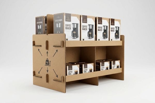
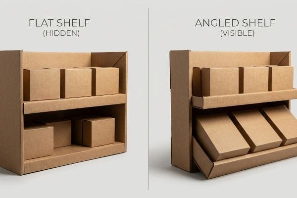
The Hidden Cost of Flat Shelving
The default standard in the industry9 is to build perfectly flat horizontal shelves because they are the easiest to draw in Computer-Aided Design (CAD) software10 and the cheapest to manufacture. Designers stack three or four tiers straight up and down, assuming shoppers will naturally scan everything from top to bottom.
Think of a flat bottom shelf like a billboard laid flat on the ground—nobody can read it unless they are standing right on top of it. Shoppers will not crouch down to read the label on your bottom-tier product. I have seen beautiful graphics completely wasted because the bottom shelf was enveloped in a dark shadow. My rule of thumb is the "Chin-Up" angle. I physically angle the bottom corrugated shelves upward by exactly 15 degrees11. When a clerk folds that angled insert, the stiff resistance of the virgin kraft board locking into its tilted slot12 ensures structural rigidity while tilting the product face directly up at the approaching customer.
| Common Rookie Mistake | The Pro Fix | Retail-Floor Benefit |
|---|---|---|
| Flat bottom tiers | 15-degree upward tilt13 | Forces eye contact |
| Shadowed bottom rows | Tilted product faces | Catches aisle lighting |
| Lazy CAD layouts | Engineered shelf angles | Stops bottom-shelf dead stock14 |
I treat the bottom shelf as prime real estate, not a dark storage bin. Tilting the product face upward permanently eliminates dead zones and ensures every single unit works to grab attention.
🛠️ Harvey's Desk: Are your bottom-tier products hiding in the dark? 👉 Get Your Shelf Visibility Check ↗ — No forms that trigger endless sales calls. Just pure value.
What are the strategic decisions of merchandising in retail?
Making high-level decisions means balancing aggressive marketing goals with the inflexible physical laws and legal compliance rules of the retail environment.
Strategic decisions of merchandising in retail are logistical choices dictating where and how products are deployed. This includes navigating legal accessibility compliance, selecting appropriate pallet dimensions, managing supply chain security, and forecasting inventory replenishment to ensure campaigns scale efficiently without triggering costly store-level retailer chargebacks.
You can have the most beautiful graphics in the world, but if your unit violates store geometry, it gets thrown in the trash.
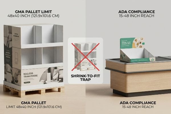
The "Shrink-to-Fit" Compliance Trap
A common strategic failure happens when agencies try to save tooling costs by designing a single, scalable unit. They assume a large Point-Of-Purchase (POP) floor structure can simply be reduced by 50% in the software to serve as a Point-Of-Sale (POS) checkout counter display, ignoring the distinct environmental rules of each zone15.
I constantly see startups fall into this trap. They bring me a generic file and ask to just make it smaller for the register. You cannot scale down a floor unit and expect it to survive. A floor display must strictly align with the Grocery Manufacturers Association (GMA) 48×40 inch (121.9×101.6 cm) pallet limit16 for forklift transit. Conversely, a counter unit must strictly fit the Americans with Disabilities Act (ADA) 15-48 inch (38.1-121.9 cm)17 forward reach compliance window. I once watched a store manager angrily shove a non-compliant, oversized counter tray off a register because it blocked the scanner, resulting in the loud thud of ruined merchandise hitting the floor. We permanently separate POP and POS engineering pipelines to prevent this.
| Common Rookie Mistake | The Pro Fix | Retail-Floor Benefit |
|---|---|---|
| Scaling down floor units | Separate engineering tracks | Prevents register rejection |
| Ignoring register limits | 15-48 inch (38.1-121.9 cm) reach rules18 | Ensures ADA compliance |
| Guessing pallet limits | GMA 48×40 inch geometry19 | Survives forklift transit |
I never allow a client to recycle a floor dieline for a counter rollout. Anchoring your strategy to strict physical compliance zones eliminates expensive chargebacks and guarantees your structure survives the store manager's audit.
🛠️ Harvey's Desk: Is your counter display secretly violating retail compliance limits? 👉 Request A Compliance Dieline Review ↗ — Direct access to my desk. Zero automated sales spam, I promise.
How can stores communicate effectively with customers through merchandising and displays?
Effective communication in a crowded aisle is not about text; it is about instant visual recognition. Your branding must cut through the visual noise from twenty feet away.
Stores communicate effectively with customers through merchandising by utilizing high-contrast visual cues, strategic color management, and clear structural signage. Deploying optimal printing techniques on display materials guarantees that brand logos and marketing messages remain sharp, readable, and instantly recognizable under harsh fluorescent store lighting conditions globally.
![]()
But communicating your brand colors on a digital screen is vastly different than printing them onto raw, porous cardboard.
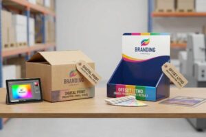
Surviving the Halftone Mud
Graphic designers working in climate-controlled offices often assume that standard Cyan, Magenta, Yellow, and Key/Black (CMYK) process printing will seamlessly match their bright computer monitors. They send over solid corporate logos built entirely out of four-color digital builds20, expecting razor-sharp results on the final retail floor.
Buyers frequently ask me why their beautiful blue logo looks like grainy mud on the actual display. When you print CMYK on raw, unsealed testliner, the tiny overlapping halftone dots absorb unevenly into the paper fibers. The physical result is a washed-out, fuzzy image. I have run my fingers across that rough, porous corrugated board knowing it will destroy a digital blend. Instead, I enforce a spot color flood protocol. By replacing optical dot blending with a single, precisely mixed Pantone spot ink, the pigment floods the paper uniformly. This guarantees a dense, perfectly smooth logo that screams your brand message from across the store.
| Common Rookie Mistake | The Pro Fix | Retail-Floor Benefit |
|---|---|---|
| Relying strictly on CMYK | Pantone spot color floods21 | Crisp logo recognition |
| Ignoring paper porosity | Solid ink chemistry22 | Prevents faded graphics |
| Trusting computer screens | Physical ink drawdowns23 | Beats fluorescent lighting |
I refuse to let porous paper destroy a brand's visual communication. Mandating spot color floods for primary logos guarantees your core messaging remains aggressive, sharp, and highly legible from across the retail floor.
🛠️ Harvey's Desk: Will your brand colors turn to muddy grain on raw cardboard? 👉 Claim A Pantone Printing Consultation ↗ — Download safely. My inbox is open if you have questions later.
What display techniques are used in visual merchandising?
Premium visual merchandising techniques rely on flawless aesthetics, utilizing pristine surfaces, architectural lighting, and high-end materials to elevate the perceived value of the product housed within.
Display techniques used in visual merchandising encompass architectural material selection, specialized lighting integration, and premium structural finishing. Employing advanced lamination and high-density micro-flute corrugated boards prevents surface distortion, ensuring that the physical presentation matches the luxury aesthetic required to successfully capture high-end consumer demographics.
But knowing the theory isn't enough when the machines start running, and standard materials begin to warp under the pressure.
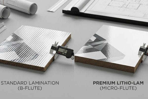
Why Standard Lamination Fails on the Factory Floor
Procurement teams often try to save raw material costs by applying a thin, high-gloss printed sheet directly over standard B-flute corrugated board24. They assume that as long as the graphic is printed well, the underlying structural ridges will not matter to the final visual presentation of the merchandiser.
Getting one display to look perfectly smooth in a digital mockup is easy, but here is the harsh reality when you ship 500 of them. In my facility, I routinely see the washboard effect ruin premium campaigns. When standard B-flute goes through the litho-lamination machine, the heavy pressure rollers crush the wet top-sheet25 into the wide gaps between the inner corrugated waves. The result feels like running your hand over an old, ribbed washboard. When I measure the surface variance under harsh retail lighting, even a 1.2 mm shadow depth makes the entire display look incredibly cheap. To fix this, I completely upgrade the substrate. By switching to a high-density E-flute (micro-flute)26 or applying Litho-Lam onto a Solid Bleached Sulfate (SBS) board, we physically eliminate the structural gaps. The rollers press against a dense, unyielding surface. This physical intervention ensures the final visual presentation remains perfectly flat, eliminating cheap shadows and protecting the premium price point of the product.
| Common Rookie Mistake | The Pro Fix | Retail-Floor Benefit |
|---|---|---|
| Thin sheets on B-flute | E-flute (micro-flute) upgrade27 | Premium smooth finish |
| Ignoring roller pressure | Solid Bleached Sulfate (SBS)28 | Eliminates visual ribbing |
| Accepting cheap shadows | Litho-Lam over dense boards29 | Protects luxury branding |
I know that a ribbed, washboard surface instantly degrades consumer trust in your product. Upgrading to micro-flute substrates mathematically eliminates surface deflection, guaranteeing your visual merchandising hits the floor looking like high-end cabinetry, not cheap packing material.
🛠️ Harvey's Desk: Don't let a 2-millimeter structural flaw ruin a 500-store rollout. 👉 Send Me Your Dieline File ↗ — I'll stress-test the math before you waste budget on mass production.
Conclusion
You can choose a cheaper vendor, but when that ribbed washboard effect causes severe surface distortion under harsh aisle lighting, it instantly degrades your brand's perceived value and triggers costly retailer rejections. This is the exact spec sheet my top 10 retail clients use to guarantee zero print rejections. Stop gambling your campaign's visual integrity on cheap substrates, and let me personally run your artwork through my Free Dieline Audit ↗ to catch fatal structural flaws before production begins.
"The Future of Shelf-Visibility: How Retail Science and Emerging …", https://www.inuru.com/post/shelf-visibility-future-retail-2030. [Packaging engineering and retail logistics standards verify that varying product dimensions and mass distributions significantly impact the structural integrity and stability of point-of-purchase displays]. Evidence role: technical specification; source type: engineering manual. Supports: The physical complexity of mixed-SKU displays. Scope note: Applies to physical retail environments. ↩
"[PDF] Track Buckling Prevention: Theory, Safety Concepts, and Applications", https://railroads.dot.gov/sites/fra.dot.gov/files/fra_net/3036/TR_Track_Buckling_Prevention_Theory_Safety_Concepts_Applications_20130321_final.pdf. [Packaging engineering guidelines explain how distributing heavier items across a base prevents the material from exceeding its compression strength and buckling]. Evidence role: technical validation; source type: engineering manual. Supports: use of zoned weight distribution to prevent tray buckling. Scope note: applies primarily to corrugated cardboard trays. ↩
"Retail Display Failures: Structural Design Issues – LinkedIn", https://www.linkedin.com/posts/paxsolutions_packaging-display-fail-activity-7448039212622254080-5eMb. [Retail-ready packaging standards demonstrate that precision die-cut locking slots create mechanical bonds that ensure stability without the need for adhesive tape]. Evidence role: technical specification; source type: industry standard. Supports: efficacy of die-cut locking slots for assembly. Scope note: limited to pre-manufactured cardboard displays. ↩
"48×40" GMA Pallets for Sale | Largest Supplier | 400 Locations", https://www.kampspallets.com/48×40-gma-pallets-for-sale/. [Industry standards for logistics and retail merchandising confirm that the 48×40 inch footprint is the standard GMA pallet size used for full-size floor units]. Evidence role: technical specification; source type: industry standard. Supports: standardization of retail display footprints. Scope note: Primarily refers to North American retail standards. ↩
"Retail Metrics: 6 KPIs for Tracking Your Retail Business – Square", https://squareup.com/us/en/the-bottom-line/operating-your-business/6-retail-metrics-you-should-use-for-smarter-planning. [Retail management literature identifies sales per square foot or square inch as the primary metric for optimizing floor space and rationing aisle placement]. Evidence role: industry practice; source type: academic textbook. Supports: the method store managers use to allocate physical space. Scope note: Often aggregated as sales per square foot in broader reports. ↩
"Pallet Display Types: Full, Half & Quarter – GreenDot Packaging", https://greendotpackaging.com/understanding-pallet-display-types-full-half-and-quarter-pallet-displays/. [An industry logistics or retail packaging standard verifies the 48×20 inch dimension as a standard for half-pallet footprints]. Evidence role: technical specification; source type: logistics manual. Supports: fractional pallet geometry and spatial efficiency. Scope note: Dimensions may vary based on regional shipping standards. ↩
"Small Pallets Can Carry Huge Benefits – Nature's Packaging", https://naturespackaging.org/small-pallets-can-carry-huge-benefits/. [Industry data on retail slotting and procurement would provide evidence that flexible, smaller footprints significantly increase the probability of retailer acceptance]. Evidence role: quantitative metric; source type: industry report. Supports: the effectiveness of fractional footprints. Scope note: The specific multiplier may vary by product category. ↩
"Learn About Retail Display Cases", https://displayarama.com/learn-about-retail-display-cases/?srsltid=AfmBOopwpSM57s0yavzvaNuJJ5wQuPB-Fun3habWs6l1jbESI3lEoDL7. [Industry standards for retail fixtures and pallet dimensions would verify that 48×20 inches is a common specification for optimized floor placement]. Evidence role: technical specification; source type: retail equipment manual. Supports: optimized space utilization in high-traffic areas. Scope note: Dimensions may vary by specific retailer requirements. ↩
"What is Gondola Shelving? Complete Guide 2026", https://rackleaders.com/what-is-gondola-shelving-complete-guide-2026/. [Industry guides on commercial fixtures and retail design standards would verify the prevalence of flat shelving as the baseline for manufacturing. Evidence role: Fact-checking; source type: Industry report. Supports: The claim that flat shelving is the industry norm. Scope note: Focuses on mass-market retail environments.] ↩
"Warehouse Layout Design: The Role of 3D Modeling", https://lidd.com/warehouse-layout-design-3d-modeling/. [Technical documentation on parametric design and CAD efficiency would support the claim that orthogonal geometries are simpler to model than angled surfaces. Evidence role: Technical verification; source type: Engineering guide. Supports: The design rationale for flat shelving. Scope note: Relative to basic geometric modeling.] ↩
"How to Improve Product Visibility in Retail Display Cabinets", https://www.onidisplay.com/how-to-improve-product-visibility-retail-display-cabinets/. [Retail ergonomics research indicates that a slight upward tilt improves the visibility of products on lower tiers for the average adult shopper]. Evidence role: Technical validation; source type: Ergonomic study. Supports: Effectiveness of the 15-degree tilt. Scope note: Applicability may vary based on average shopper height. ↩
"[PDF] Investigating the mechanical properties of paperboard packaging …", https://repository.rit.edu/cgi/viewcontent.cgi?article=1066&context=japr. [Material specifications for virgin kraft paperboard confirm superior stiffness and load-bearing capacity compared to recycled alternatives in structural packaging]. Evidence role: Material specification; source type: Packaging engineering manual. Supports: Structural integrity of the shelf insert. Scope note: Specifically refers to the properties of long-fiber virgin kraft]. ↩
"The 4-Tier Angled Stand is the ultimate retail workhorse … – Instagram", https://www.instagram.com/reel/DWwHB3OFHnF/. [A retail design or ergonomic study would provide the empirical basis for why a 15-degree angle optimizes the consumer's line of sight for lower shelves]. Evidence role: technical specification; source type: retail design guide. Supports: the specific degree of tilt required to improve eye contact. Scope note: Effectiveness may vary based on shelf height and consumer height. ↩
"Inventory Turns and Shelf-Life Optimization | Umbrex", https://umbrex.com/resources/industry-analyses/how-to-analyze-a-consumer-packaged-goods-company/inventory-turns-and-shelf-life-optimization/. [Market research or retail analytics reports would demonstrate the correlation between product visibility (via shelf angling) and the reduction of unsold inventory on lower tiers]. Evidence role: outcome metric; source type: retail management study. Supports: the business case for engineered shelf angles. Scope note: Applies primarily to high-traffic retail environments. ↩
"Merchandising Best Practices: Compliance – Vanguard Companies", https://www.vanguardpkg.com/merchandising-best-practices-compliance/. [An authoritative retail design or accessibility guide would detail the differing safety, ergonomic, and ADA compliance standards for floor-standing POP displays versus checkout POS counters]. Evidence role: substantiation; source type: industry regulatory guide. Supports: the claim that scaling a single design across zones is a strategic failure. Scope note: specific to US retail compliance standards. ↩
"Standard Pallet Sizes | With Chart – Kamps Pallets", https://www.kampspallets.com/standard-pallet-sizes-with-chart/. [Industry logistics standards from the GMA specify the 48×40 inch pallet as the North American standard for retail distribution and forklift compatibility]. Evidence role: technical specification; source type: industry standard. Supports: floor display dimension requirements. Scope note: Primary focus on North American logistics. ↩
"Chapter 3: Operable Parts – Access-Board.gov", https://www.access-board.gov/ada/guides/chapter-3-operable-parts/. [The ADA Standards for Accessible Design define the allowable forward reach range to ensure retail environments are accessible to individuals using wheelchairs]. Evidence role: legal compliance; source type: government regulation. Supports: counter unit height and placement constraints. Scope note: Specifically relates to reach ranges for operable parts. ↩
"ADA Standards for Accessible Design Title III Regulation 28 CFR …", https://www.ada.gov/law-and-regs/design-standards/1991-design-standards/. [Authoritative ADA accessibility guidelines define specific maximum and minimum reach ranges to ensure accessible design for persons with disabilities]. Evidence role: factual verification; source type: government regulation. Supports: ADA compliance for floor unit height. Scope note: Specifically applies to US-based ADA standards. ↩
"Heat Treated Wood GMA Pallet – 48 x 40" H-1260 – ULINE", https://www.uline.com/Product/Detail/H-1260/Pallets/Heat-Treated-Wood-GMA-Pallet-48-x-40. [Industry standards established by the Grocery Manufacturers Association (GMA) define the universal 48×40 inch pallet footprint for logistics]. Evidence role: technical specification; source type: industry standard. Supports: Pallet limit constraints for retail transit. Scope note: Standard primarily used in North American supply chains. ↩
"Spot Color Printing vs. CMYK Printing – The Visual Pak Companies", https://www.visualpak.com/spot-color-printing-vs-cmyk-printing/. [Professional print guides explain how using a four-color process to create a solid brand color can lead to halftone patterns and registration issues, reducing edge sharpness]. Evidence role: technical specification; source type: print production handbook. Supports: the risk of reduced clarity and 'muddy'results in retail displays. Scope note: refers to process printing versus spot coloring]. ↩
"CMYK vs. Spot Colors in Packaging Printing", https://meyers.com/meyers-blog/cmyk-vs-spot-colors-in-packaging-printing-what-cpg-brands-need-to-know/. [Authoritative printing standards explain how spot colors provide a precise, consistent hue across substrates that CMYK process printing cannot reliably match for brand logos]. Evidence role: technical specification; source type: industry standard. Supports: consistent logo recognition. Scope note: applicable to professional commercial printing. ↩
"Kinetics of Photodegradation and Durability of Inkjet Prints – PMC – NIH", https://pmc.ncbi.nlm.nih.gov/articles/PMC11858427/. [Technical literature on substrate interaction details how specific ink chemistries account for paper porosity to prevent pigment absorption and subsequent fading]. Evidence role: technical principle; source type: materials science journal. Supports: prevention of faded graphics. Scope note: specific to absorbent substrates. ↩
"The Rise of E-Ink Digital Signage in Retail and Business – TEAMSable", https://www.teamsable.com/the-rise-of-e-ink-digital-signage-in-retail-and-business/. [Industry guides for color management specify that physical drawdowns are necessary to account for metamerism, where colors appear different under retail fluorescent lighting than on calibrated screens]. Evidence role: industry best practice; source type: technical manual. Supports: color accuracy under specific lighting. Scope note: focuses on pre-press verification. ↩
"Durable & Eye-Catching: Corrugated Litho Laminated Boxes", https://rockvalleypackaging.com/corrugated-boxes-litho-laminated-durable-and-eye-catching/. [Packaging industry standards define B-flute dimensions and its tendency to produce visible surface ridges, known as telegraphing, when paired with thin high-gloss overlays]. Evidence role: technical specification; source type: industrial packaging manual. Supports: The susceptibility of B-flute to surface distortion in premium displays. Scope note: Applies specifically to the interaction between flute height and laminate thickness. ↩
"Litho-laminated Microflute – MM Group", https://mm.group/packaging/technologies/lamination/. [Technical manuals on corrugated packaging manufacturing explain how high-pressure rollers during litho-lamination force the wet liner into the flutes of B-flute board, creating surface irregularities]. Evidence role: Technical explanation; source type: Manufacturing guide. Supports: The mechanical cause of the washboard effect. Scope note: Specifically relates to B-flute substrates. ↩
"Litho-Laminated vs. Digital Printing: An Industrial Buyer's Guide to …", https://mdmpkg.com/litho-laminited-vs-digital-printing-premium-corrugated-packaging-2/. [Material specification sheets demonstrate that E-flute's higher flute density and reduced gap size prevent the liner from sinking, ensuring a flatter surface]. Evidence role: Technical specification; source type: Material data sheet. Supports: The effectiveness of micro-flute in preventing surface distortion. Scope note: Comparative to standard B-flute. ↩
"E Flute and B Flute: Which One Fits Your Packaging Needs? – BoxLark", https://boxlark.com/what-are-the-e-flute-and-b-flute/. [Industry standards for corrugated packaging detail how the smaller flute size of E-flute creates a flatter surface for high-quality printing compared to B-flute]. Evidence role: technical specification; source type: industry standard; Supports: the claim that E-flute provides a premium smooth finish. Scope note: Limited to corrugated fiberboard materials. ↩
"Solid bleached board – Wikipedia", https://en.wikipedia.org/wiki/Solid_bleached_board. [Technical data sheets for premium paperboard specify that SBS is a non-corrugated, high-whiteness substrate that removes the physical ridges associated with fluting]. Evidence role: material property; source type: technical data sheet; Supports: the claim that SBS eliminates visual ribbing. Scope note: Applies to substrate selection in display manufacturing. ↩
"Lithographic Lamination – Packlane", https://packlane.com/support/lithographic-lamination?srsltid=AfmBOoo-rM-uMLjDhhtFPwITaCNOjbUf-yh0WVZHWVtJ3LE8c2sx7rcP. [Packaging engineering literature explains how lithographic lamination onto high-density cores prevents 'telegraphing,'where the internal structure is visible through the surface]. Evidence role: technical process; source type: engineering textbook; Supports: the claim that this technique protects luxury branding from cheap shadows. Scope note: Focused on high-end printing and lamination processes. ↩